It’s tea time! Tea drinking is one of the oldest traditions of the civilized world, and the culture and customs vary greatly from country to country, often defined by the way tea is made and consumed, by the way, the people interact with tea, and by the aesthetics surrounding tea drinking. One thing common is the effort and love put into the packagings. Inspired by our grey Wednesday afternoon tea break, we collected 12+ creative tea packaging designs.
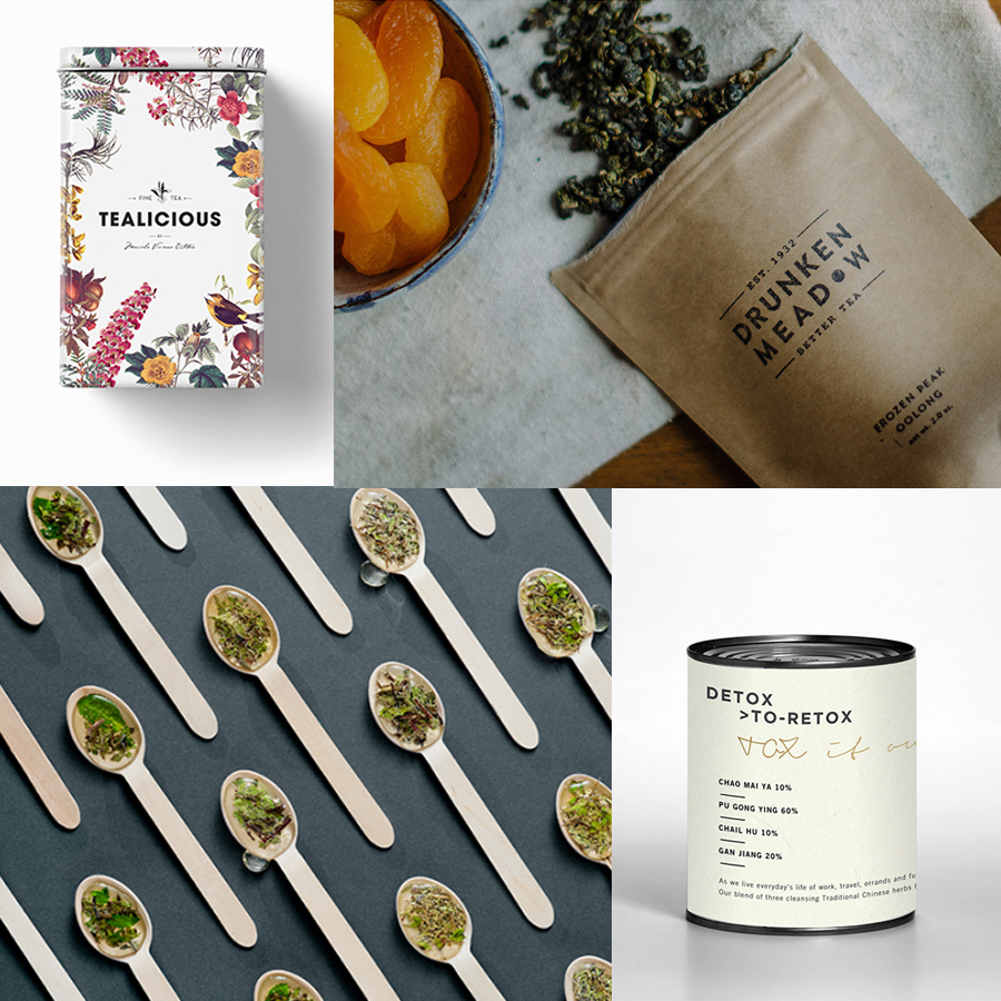
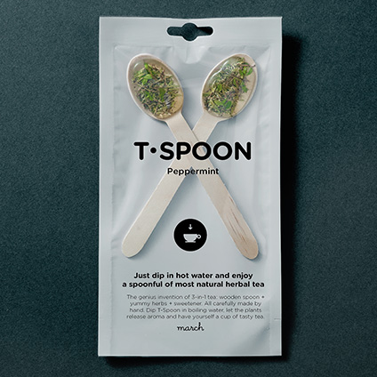
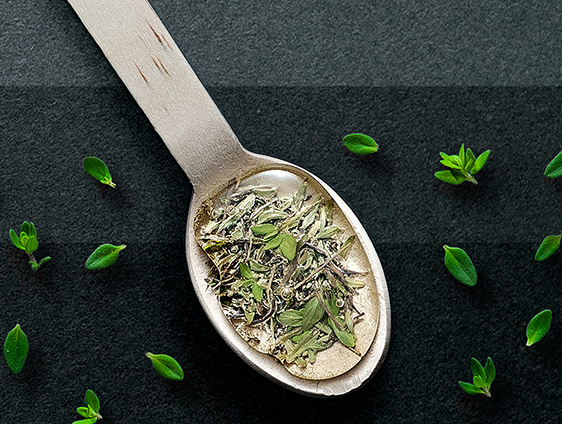
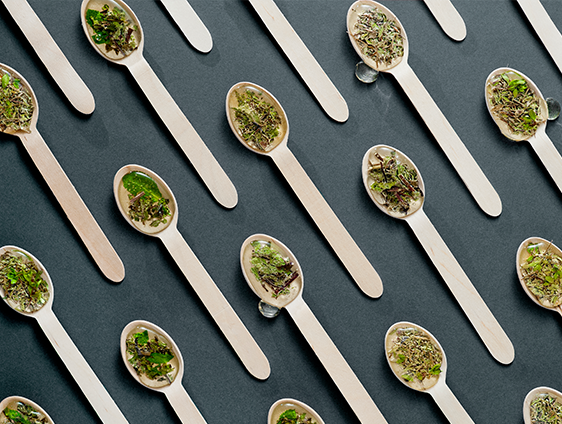
MARCH is a product invention studio based in Vilnius, Lithuania, and their genius invention of 3-in-1 tea consists of a wooden spoon + yummy herbs + sweetness. All carefully made by hand. Dip T-Spoon in boiling water, let the plant’s release aroma and catapult yourself into the land of natural herbs. I love this, it sounds very practical and the packaging is simply stunning.
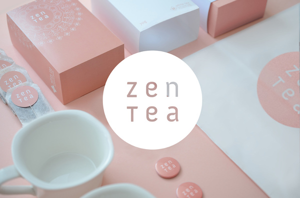
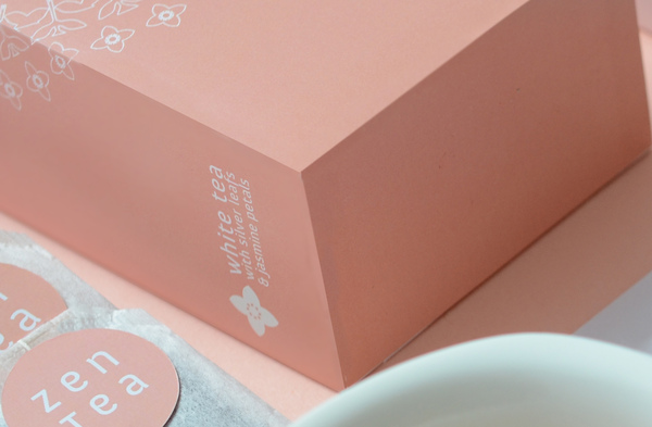
For Warsaw-based designer Kondrad Sybilski tea embodies peace and harmony. After removing the minimalist part of the package (a metaphor for peace), he found a clear pattern for the packaging (a metaphor for harmony). The Pattern design consists of a doily, leaves and jasmine blossoms. It is a call to nature. Via
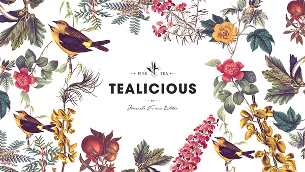
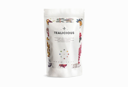
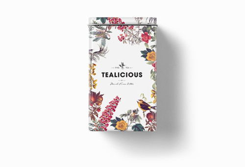
Tealicious is a small Tea Shop in the heart of Florence, Italy. Marcela, her owner, and creator is a tea sommelier from Argentina, she is a true tea fanatic and her idea is to share this passion with anyone who’s interested in discovering a new world of colors, fragrance and flavors. Local designer Alvarez Juana designed a beautiful illustrated, flower-inspired packaging for her own tea brand.
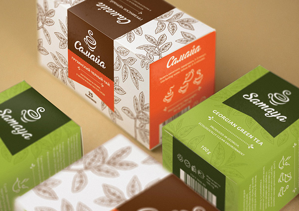
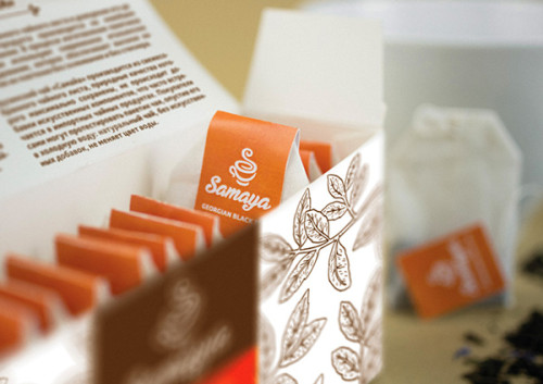
ViaSamaya tea is cultivated and collected atKobuleti Agro’s plantations in ecologically friendly districts of Georgia. And the packaging design by Russian Hattomonkey Studio outlines the quality and naturalness of the product. A premium and at the same time a very domestic visual identity was created because the tea is a symbol of hope, comfort, and warmth.
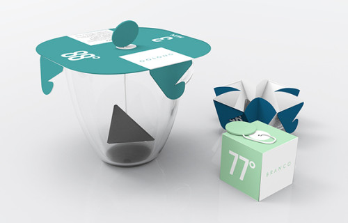
ViaPuritea branding, including packaging design by Brazilian Vinicius Hideki, inspired by the quality and age-old tradition of preparing tea, adapted to the present day, with more practicality. The project concept is the multifaceted packaging, giving a new function to it, in this case, it replaces the saucer that during preparation is used to cap the cup and maintain its internal temperature.
Via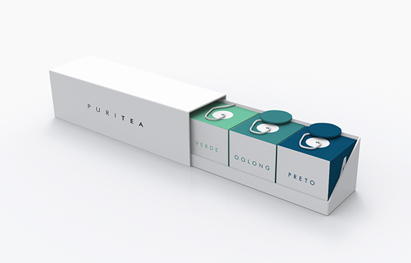
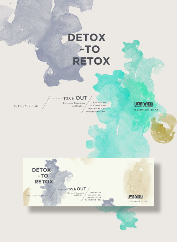
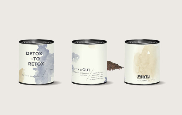
Detox to Retox is a new premium brand based in NYC specialized in detox tea. Miami based creative studio Bunker3022 designed options for their branding. The pastel color, natural materials, and modern typography hit the current trend to the tee, wanting me to have these cute little jars on my kitchen shelf. Via
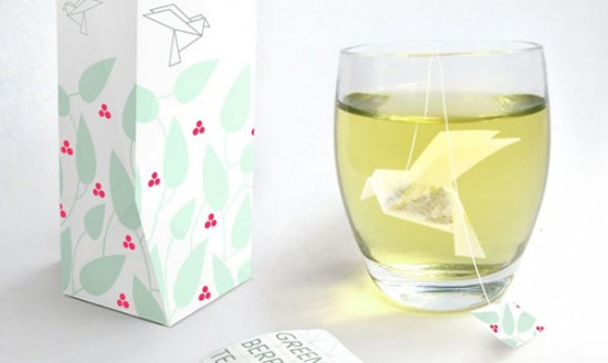
Directed by artist Natalia Ponomareva from Russia, here is an amazing project with the packaging of tea bags produced under the principles of origami. The bird forms and unfolds gradually while the tea infuses.
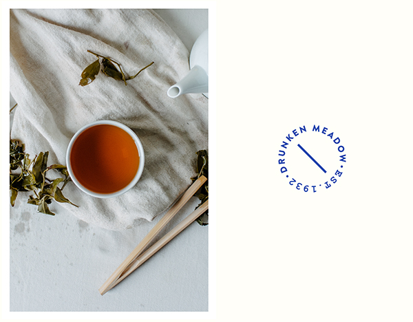
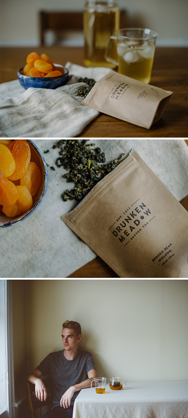
ViaDrunken Meadow is a family tea business originally from Taiwan, based in NY. They have been growing oolong tea since 1932 in Nantou. Brooklyn based designer Yu Ping Chung brought a fresh look to the brand yet keeping its original cultural history. The color blue has been used for centuries on Chinese containers. The circular shape represents the movement of making oolong tea and the shape in a teacup.
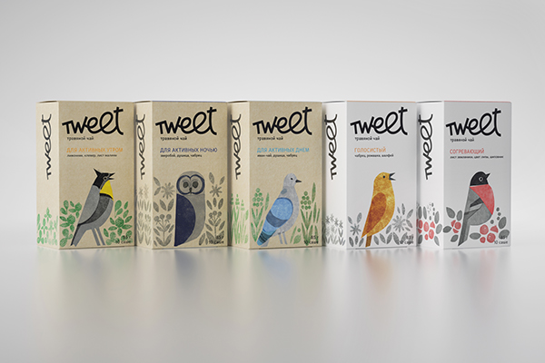
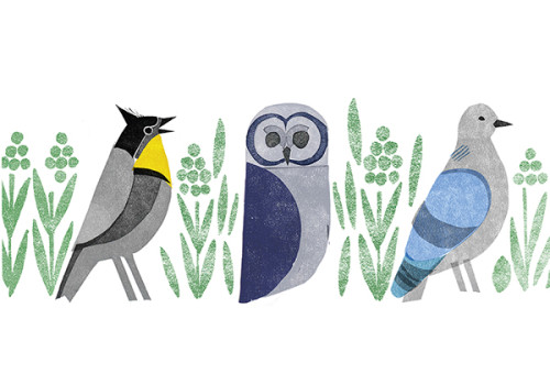
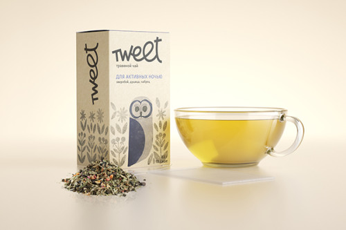
ViaHerbal tea for supporters of a healthy lifestyle. A certain individual biorhythm is defined by a chronotype that is a working capacity depending on the time of the day, which allows for us to categorize people into “larks”, “owls” or “pigeons”. Tweet tea is for people who live in different time modes. The energy of herbs works conformably with human biorhythms. The Tweet tea branding design was done by Russian designer Marina Apevalina.
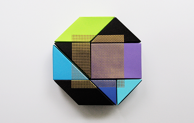
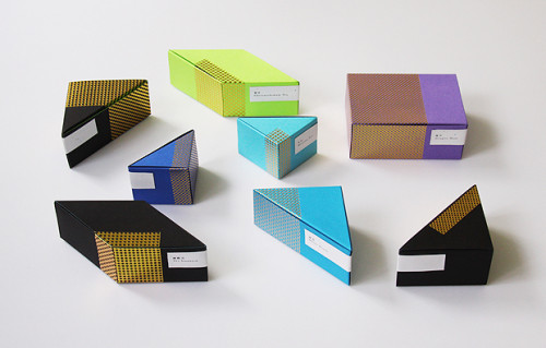
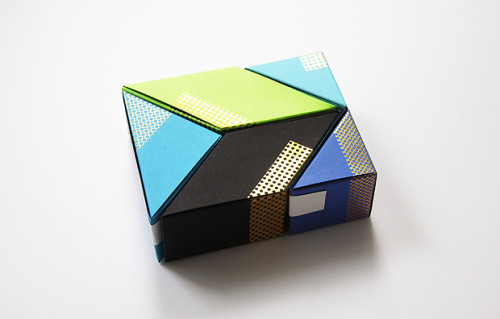
ViaHong Kong-based design agency BLOW created a modular tea packaging highlighting different tea species with different colors and textured papers. The beautiful range of color is obviously carefully selected and creates a stunning brand of Chi Tea.
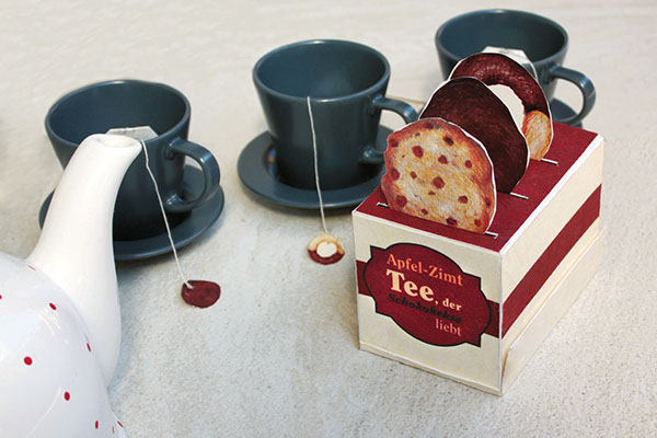
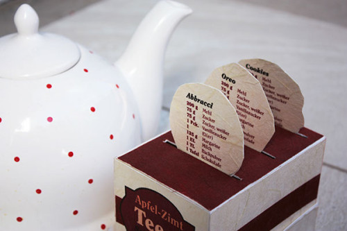
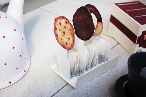
ViaApfel-Zimt Tee, der Schokokekse liebt – Apple Cinnamon Tea loves Chocolate Cookies, the absolute best name I’ve ever seen on a tea brand! Vienna local, Dina Bukva is the designer of this hilariously creative tea packaging.
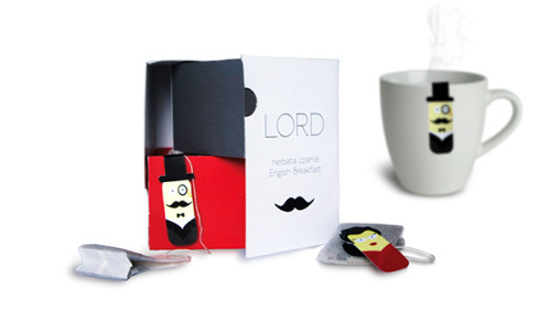
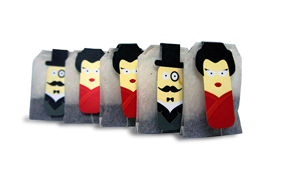
ViaPolish designer Kamila Lelas designed an entertaining tea packaging consisting of two different types of tea. One for gentlemen and one for the ladies.
Via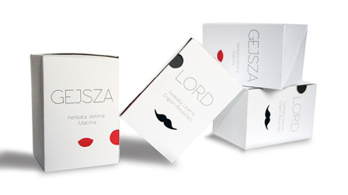
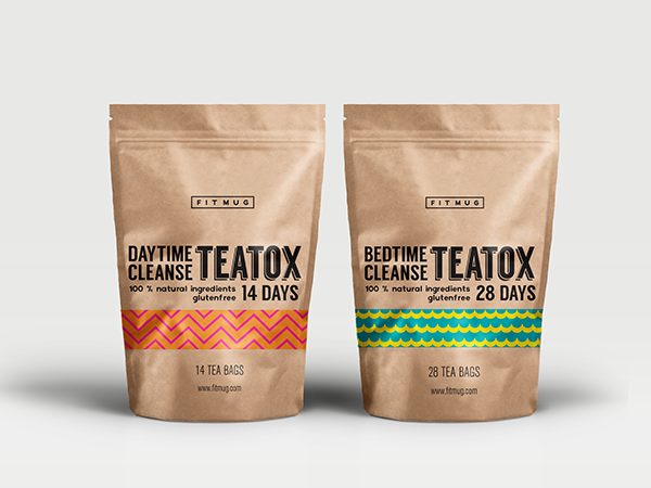
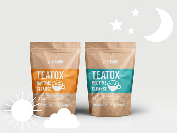
How a brand can highlight their product on the shelves? asks Poznan based creative Claudia Olejnik. With FitMug, tea bags are packaged in resealable kraft bags. For quick and easy differentation there is a colourful pattern or uniform background shape with a big cup and clear typography. A great example of strong tea branding.
Via