
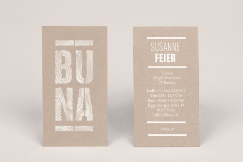
In Graz, Buna stands for the finest artisan coffee. Owned by a renowned barista Susanne Feier, Buna offers high quality and delicious coffee made with the utmost dedication and care. In the heart of the shop you can find a large purple coffee machine, so it was only fitting that graphic designer Kristina Bartosova chose that to be the color to represent the shop in their visual identity. With two shops now on opposite sides of the city, Buna is taking over the city, one coffee cup at a time.
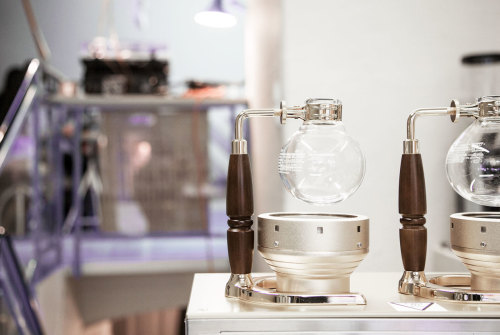
The first Buna (meaning coffee in Ethiopian) was opened in 2007 in the heart of Graz on Schmiedgasse, and the second tiny coffee shop Buna Espresso & Saftbar is located on prime real estate, right opposite of FH Joanneum, the largest University of Applied Sciences in the whole of Austria. Serving numerous hungry workers and making sure students keep awake during lectures by offering some of the finest artisan coffee in town, Buna has been successful since its opening. Serving everything from warm exotic soups at lunch, bagels and sandwiches and always having a selection of cakes and snacks, coffee is their real passion. Aeropress, cold brew, Chemex, fair trade… they got them all! They also sell specialized high-end brewing equipment for enthusiasts and organize workshops. So if you haven’t figured it out yet, Buna is a must visit for any coffee lover in Graz.

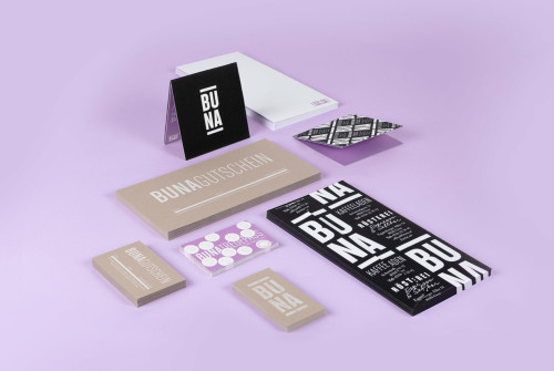
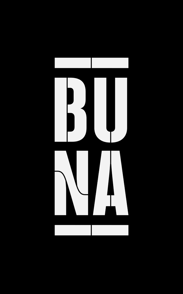
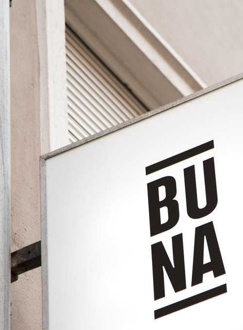
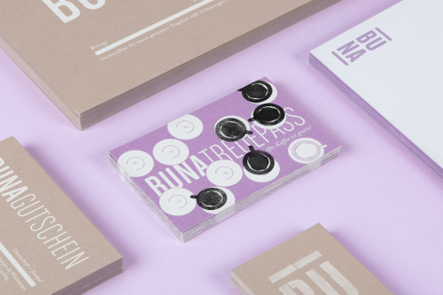
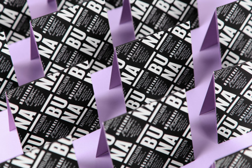
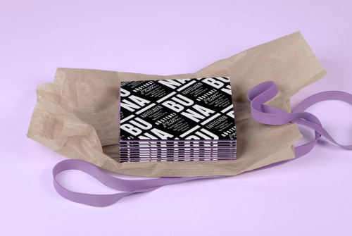
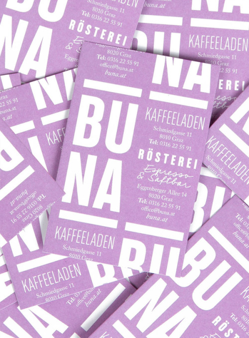
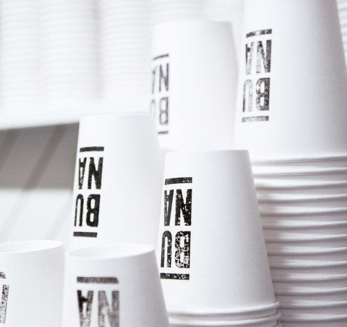
To make the place even more irresistible, last year they commissioned the great Graz branding house Engarde to design a new visual identity for them. The task got given to the young in-house graphic designer from Slovakia; Kristina Bartosova. She did a great job with the cool outlook which is full of contrasts and is still relevant after a few years in use. The monochrome look is highlighted with light purple, a color that can be found across the shop from coffee cups to the grand coffee machine sitting on top of the counter, spilling a cup after a cup of that brown liquid gold.
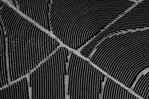
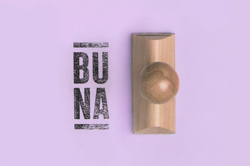
One of the most interesting and unique ideas in visual identity is the delicate linear pattern on the logo. Inspired by aerial shots of coffee plantations that show the systematic formation the rows coffee plants form. A structure that is organized and man-made yet seems surprisingly organic somehow. Bartosova transformed this image into a pattern that can be seen inside the letters in the logo, creating a great contrast for the other vice bold overall look. Contrast that can be seen throughout the material from color choices to typeface combinations. All in all, it works!
Buna Espresso & Saftbar Eggenberger Allee 14, Graz
Buna Kaffeeladen Schmiedgasse 11, Graz
Buna on facebook
Client — BUNA
Studio — EN GARDE Interdisciplinary
Creative Direction — Valentin Zhuber-Okrog
Art Direction and Graphic Design — Kristina Bartosova
Creative Direction — Valentin Zhuber-Okrog
Art Direction and Graphic Design — Kristina Bartosova
Photography — Josephine Hetkamp
Editing — Kristina Bartosova
Silkscreen — Das Voyeur
Photos © Kristina Bartosova