
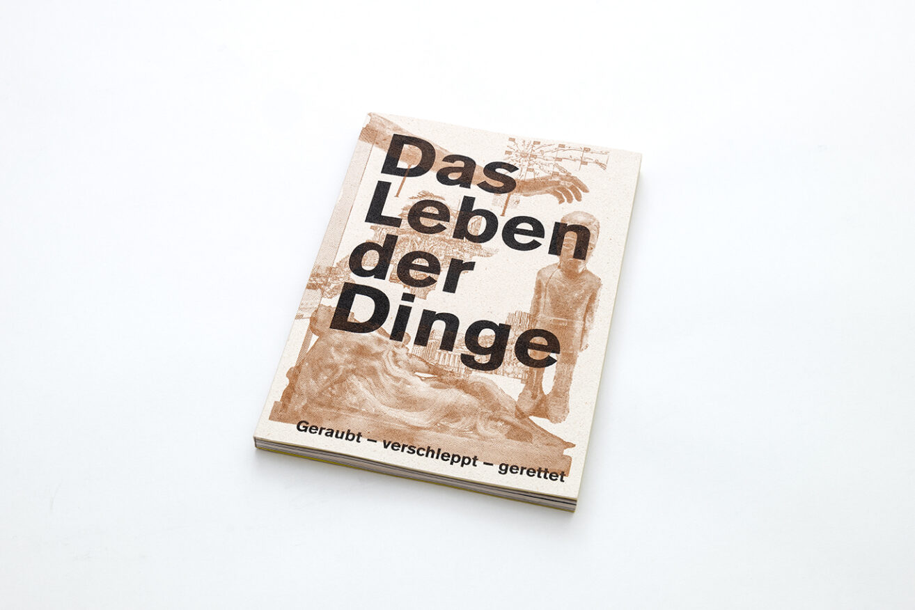
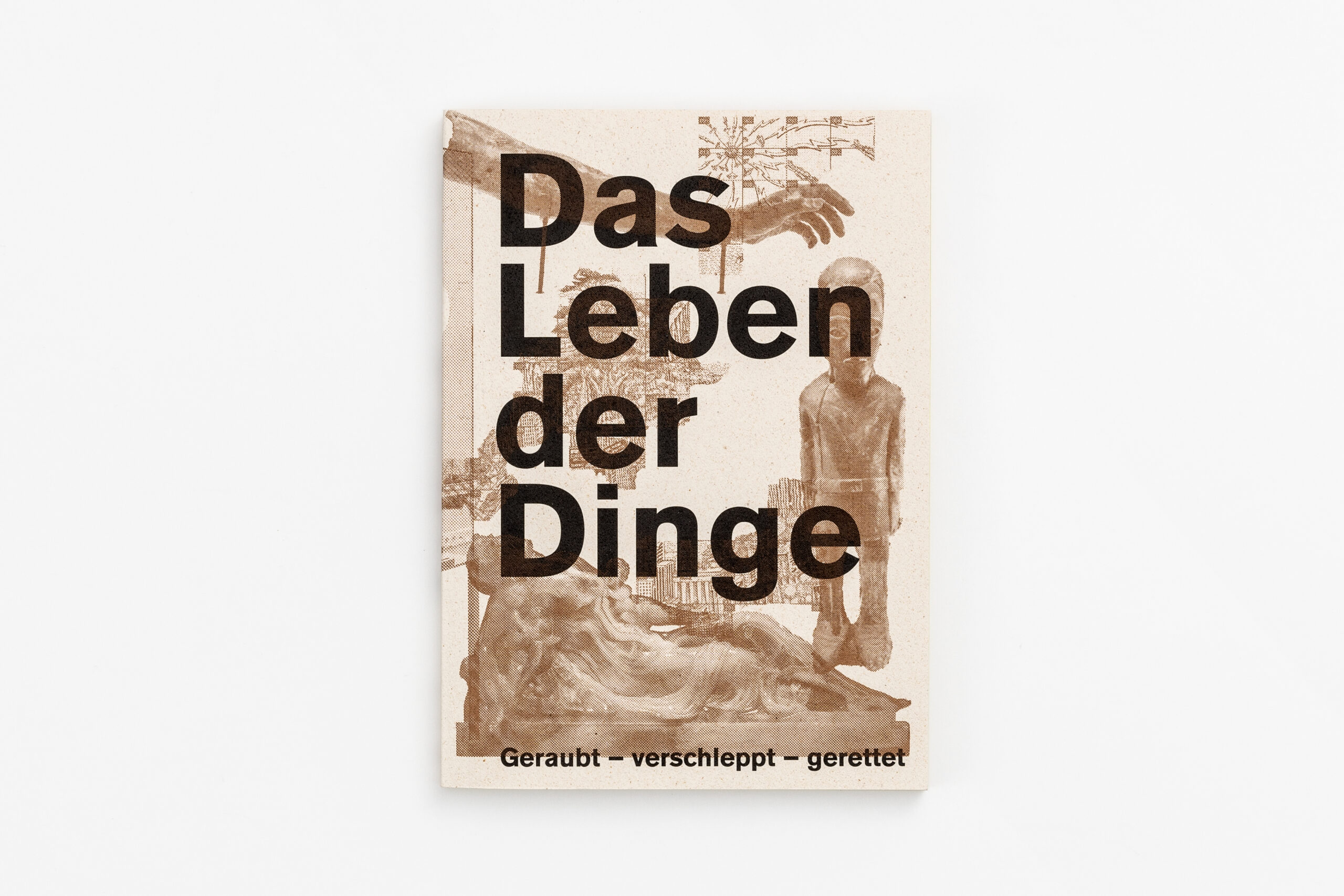
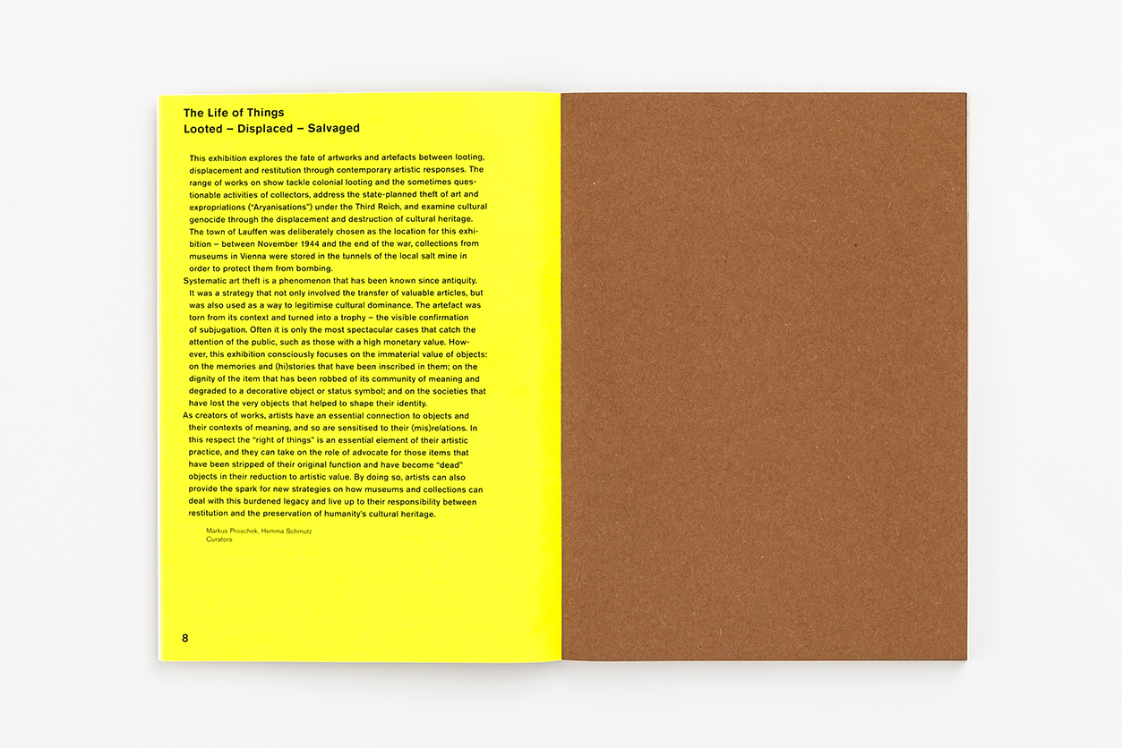
The catalogue The Life of Things (orig. Das Leben der Dinge) accompanies the exhibition The Life of Things: Looted – Displaced – Salvaged, presented by the Lentos Kunstmuseum Linz in Lauffen/Bad Ischl as part of the European Capital of Culture Bad Ischl Salzkammergut 2024. The exhibition presents contemporary perspectives on the fate of artworks and artifacts in the context of looting, removal, and restitution, exploring questions of memory, justice, and cultural identity.
Systematic art theft is a phenomenon that has been known since antiquity. Beyond being a strategy for the transfer of valuables, it has also served as a means of legitimizing cultural dominance. Yet, in the public perception, it is often only the spectacular cases, those tied to high monetary value, that receive attention. The exhibition deliberately shifts the focus. It highlights the immaterial values of objects, the stories and memories embedded within them, and the dignity of both the artefacts and the societies that lost these identity-forming things.
The spectrum of works on display is wide-ranging: from explorations of colonial looting and questionable collecting practices, to state-organised art theft and expropriation in the Third Reich, and the cultural genocide carried out through the destruction of treasures. The artists provide impulses for new strategies, challenging museums and collections to navigate between restitution and the preservation of our shared cultural heritage.
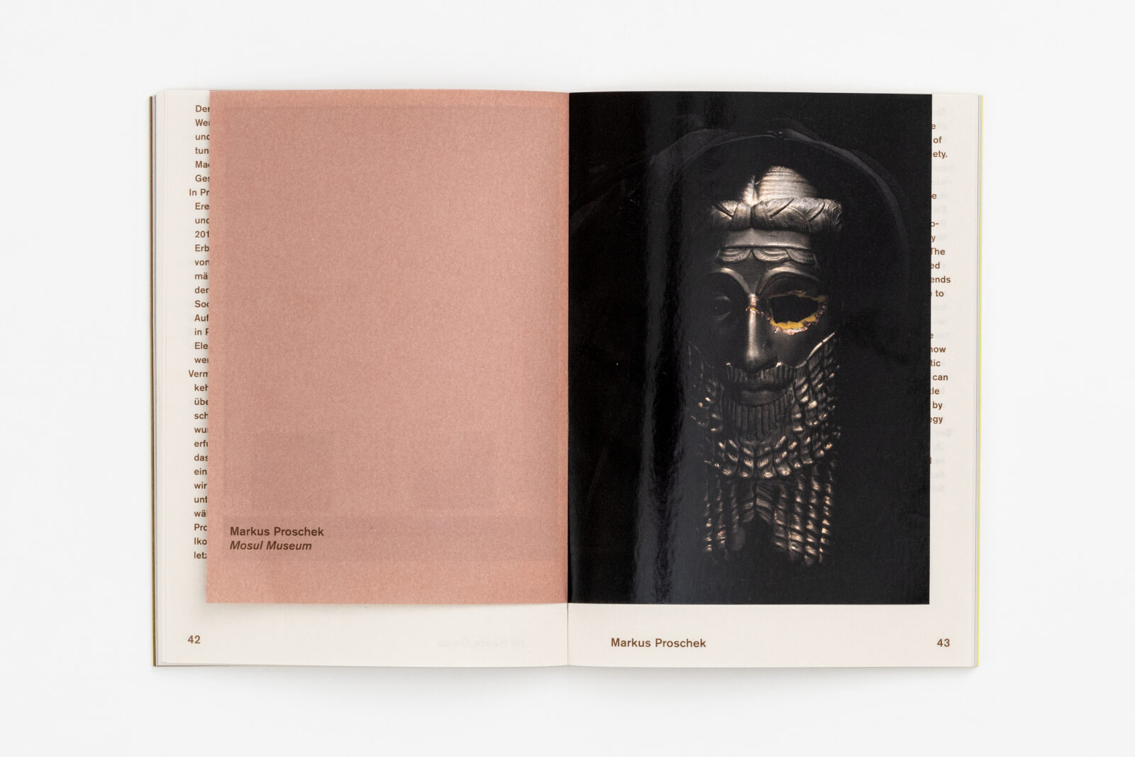
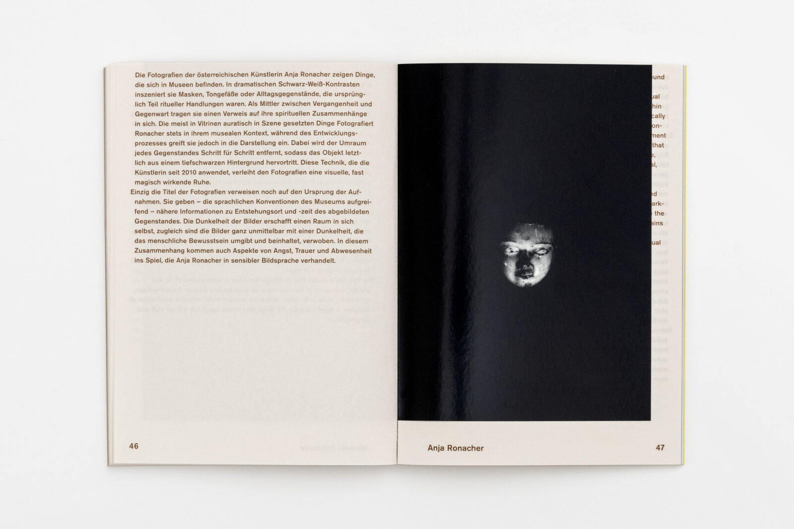
Participating artists include Said Baalbaki, Hera Büyüktaşçıyan, CATPC / Renzo Martens, Ines Doujak, Assaf Hinden, Moussa Kone, Oliver Laric, Markus Proschek, Anja Ronacher, Dierk Schmidt, Philip Topolovac, among others.
The catalogue The Life of Things goes beyond documenting the exhibition, as it embodies the curatorial narrative through its paper choices and thoughtful design.
The catalogue was created by Katarina Schildgen and Paul Gasser, a designer couple who have been living and working together since 2011. The creative couples’ practice often centers around books and paper as primary media, weaving together materiality, concept, and narrative. We’ve featured their work before in A Stack of Perspectives: The Archiving of the Presence, which similarly highlighted their sensitivity to the tactile and structural possibilities of paper.
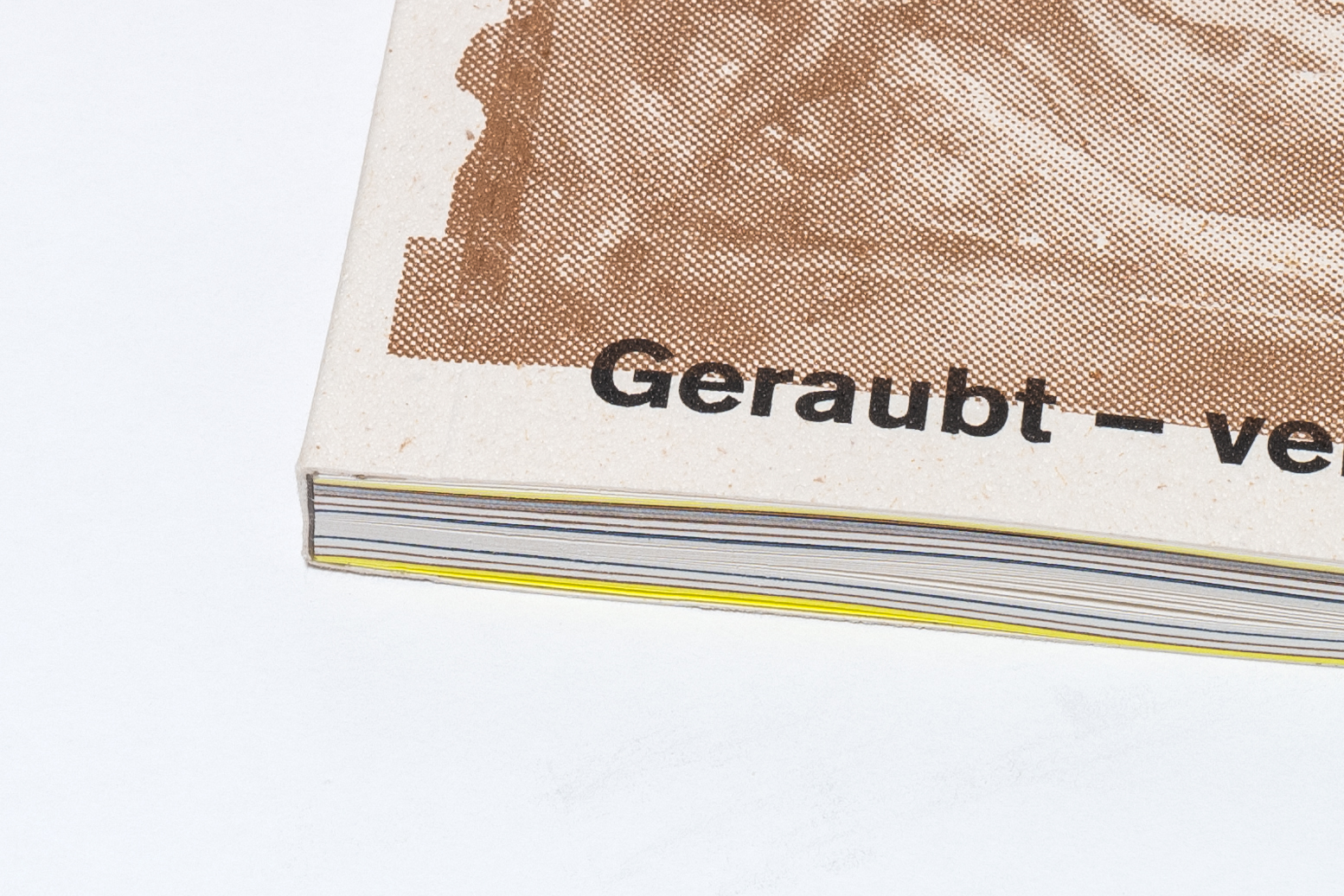
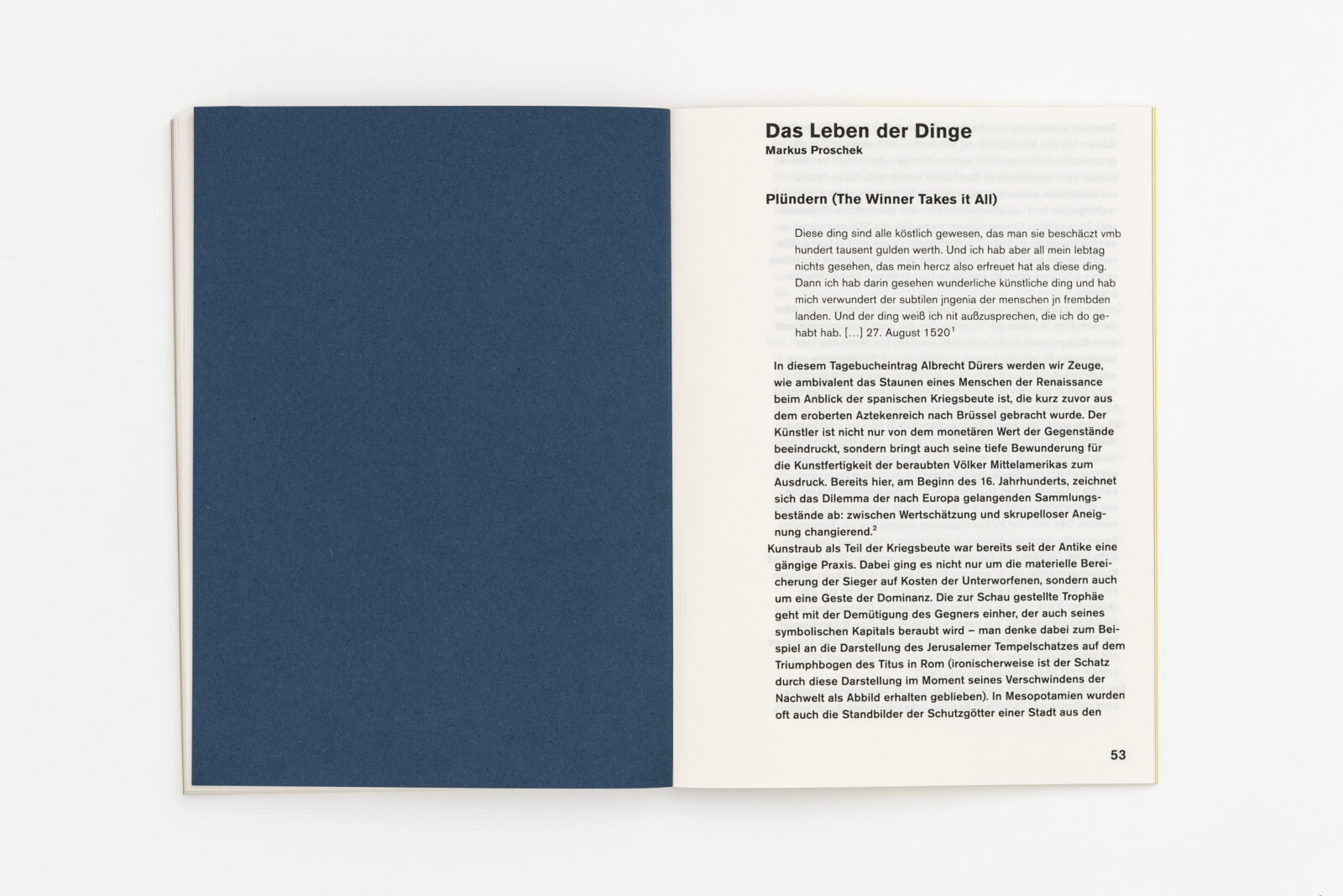
Schildgen and Gasser describe the design of the small, handy reader as follows. “The catalogue is structured by the use of 8 very different papers. The images are printed on shortened super-glossy paper with a metallic Pantone backside. The brown metallic printing color and earthy, rough papers in beige and cream contrast with neon yellow spreads, black, or metallic brown type. The 5C Offset print publication is cold-glued for the best long-term durability of the binding and opening properties.”
We wanted to achieve a publication that feels alive, vibrant, sparkling. The Remake oyster cover with its beautiful Carapace embossing tactility gives the publication on the outside a very distinct, lively feel and supports the simple, two-tone black and metallic graphic with depth and texture.
In this way, the variety of materials creates a vibrant, tactile reading experience that mirrors the layered and complex histories told within. Special care was taken to balance durability with sensory richness. As Schildgen and Gasser explain, “We wanted to achieve a publication that feels alive, vibrant, sparkling. The Remake oyster cover with its beautiful Carapace embossing tactility gives the publication on the outside a very distinct, lively feel and supports the simple, two-tone black and metallic graphic with depth and texture. The papers inside are used to structure and divide the contents, and to make these differences visible at first sight.” Munken Pure Rough 90 g/m², IQ Color Neon Yellow 80 g/m², Bindakote white 80 g/m², Esprit de Nature ocre 110 g/m² are used, as well as Color STYLE Recycling tobacco 120 g/m² and Crush Lavender 120 g/m² are used as separators.”
The thoughtful selection of papers not only reflects but also enhances the narrative of The Life of Things, turning the catalogue into an object that “feels alive” in the reader’s hands.
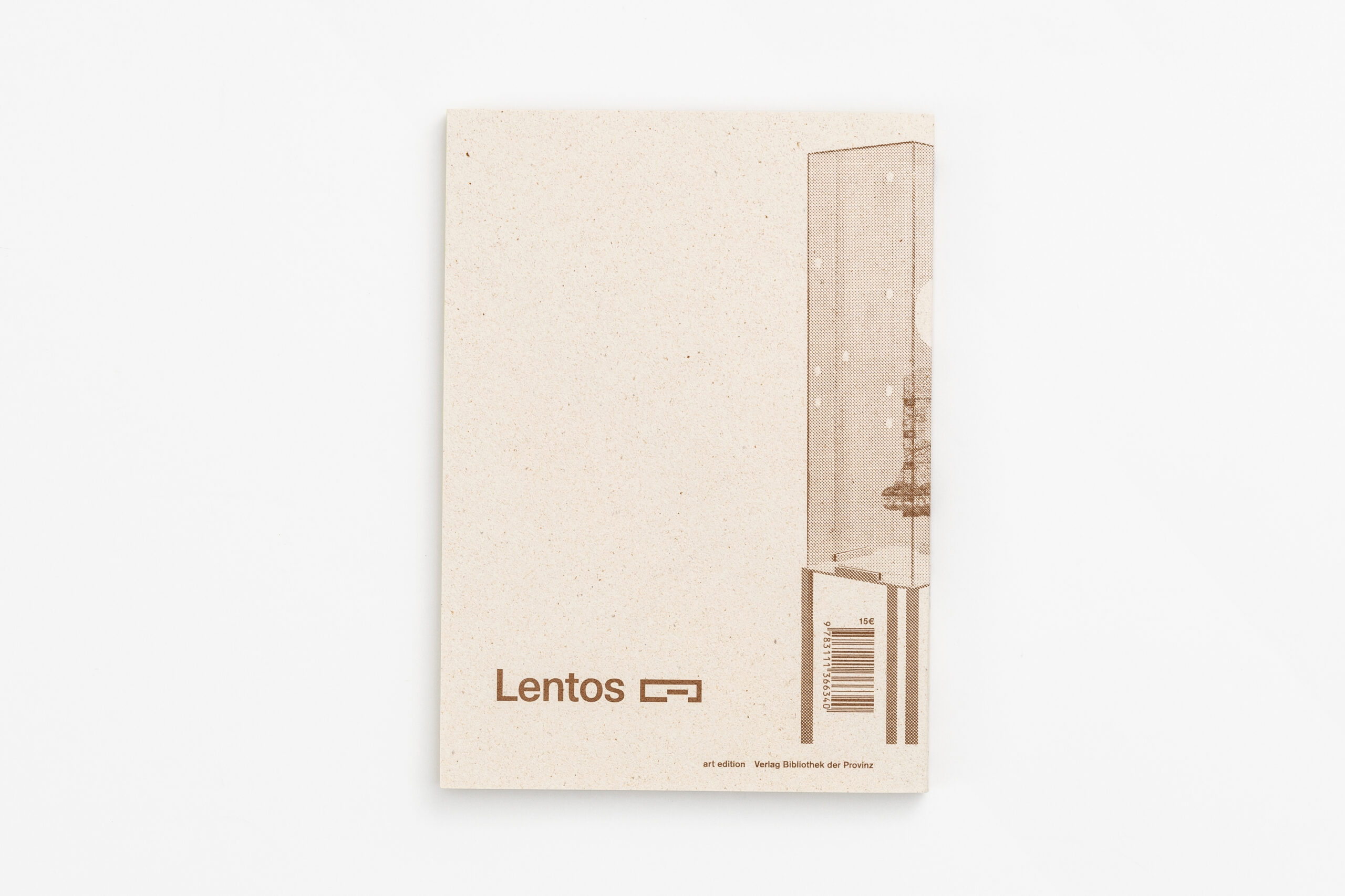
The bilingual catalogue, with texts in both German and English, is available for purchase here. For those interested in the intersection of design, history, and material storytelling, The Life of Things is a great companion to the exhibition while also a carefully crafted object that carries its own message.
Images © Paul Gasser