Every autumn, Dutch Design Week becomes a window into the future of design—and at its center stands Design Academy Eindhoven (DAE), one of Europe’s leading schools for experimental, socially engaged, and forward-thinking design. Known for its interdisciplinary approach and emphasis on conceptual depth, DAE places the designer’s personal voice and position at the heart of its pedagogy. This philosophy lives on each year in the school’s Graduation Catalogue, a publication that not only documents the work of bachelor’s and master’s graduates but also captures the spirit of the academy itself.
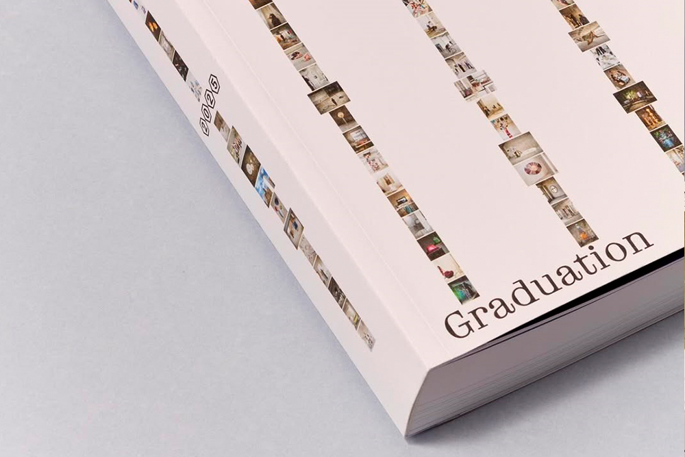
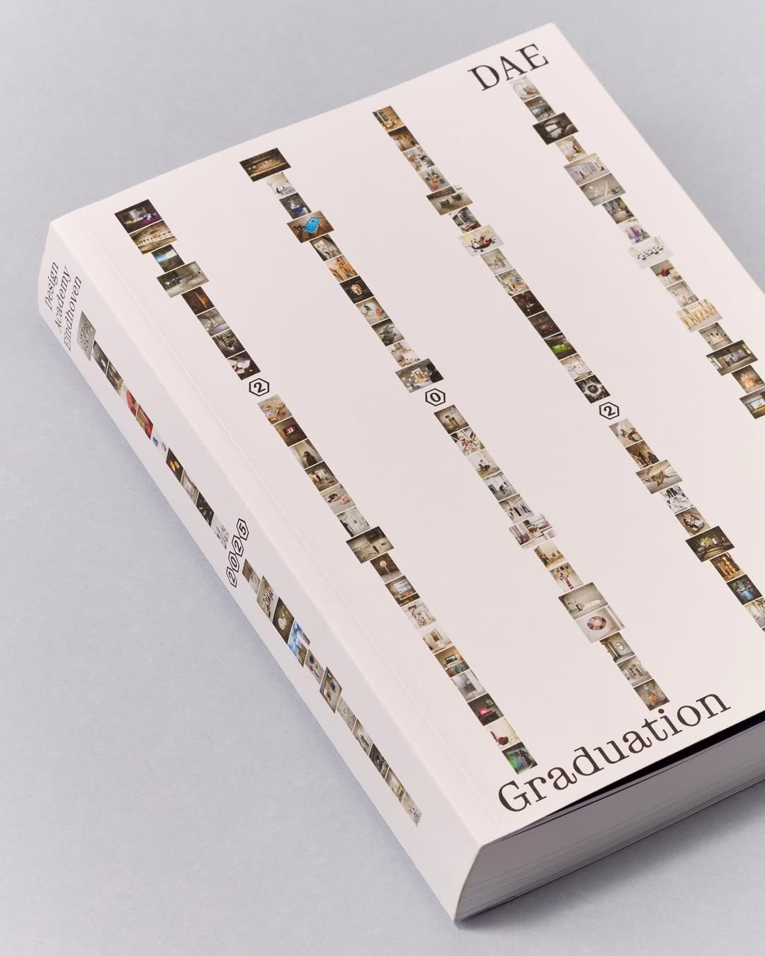
For 2025, the catalogue has taken on a fresh and thought-provoking form. Designed by Philipp Doringer, it moves beyond the traditional format of a showcase book and instead becomes a layered, multifaceted portrait of contemporary design practice.
A catalogue that reflects the thoughts and processes of the people behind the projects
Every year, DAE publishes a graduation catalogue — an anchor publication in the Dutch Design Week programme and a coveted item for visitors and design enthusiasts alike. The 2025 edition continues this tradition, but with a distinctly human-centered twist.
Doringer’s guiding intention was to move past the “flatness” of conventional design representation, foregrounding the realities, contradictions, and complexities of creative practice instead. The book brings together polished outcomes with equally important but often unseen layers: processes, personal perspectives, and the contexts from which each project emerges.
My aim for the design was to move past a flat view of design, as the process itself is anything but polished. It emerged from a post-AI desire to make the human process, and its imperfections, visible.
“My aim for the design was to move past a flat view of design, as the process itself is anything but polished. It emerged from a post-AI desire to make the human process, and its imperfections, visible,” explains Doringer. “The catalogue becomes a layered, multifaceted space where voices, stories, and processes coexist, showing the graduates through both their outcomes and the complexity that shapes them.”
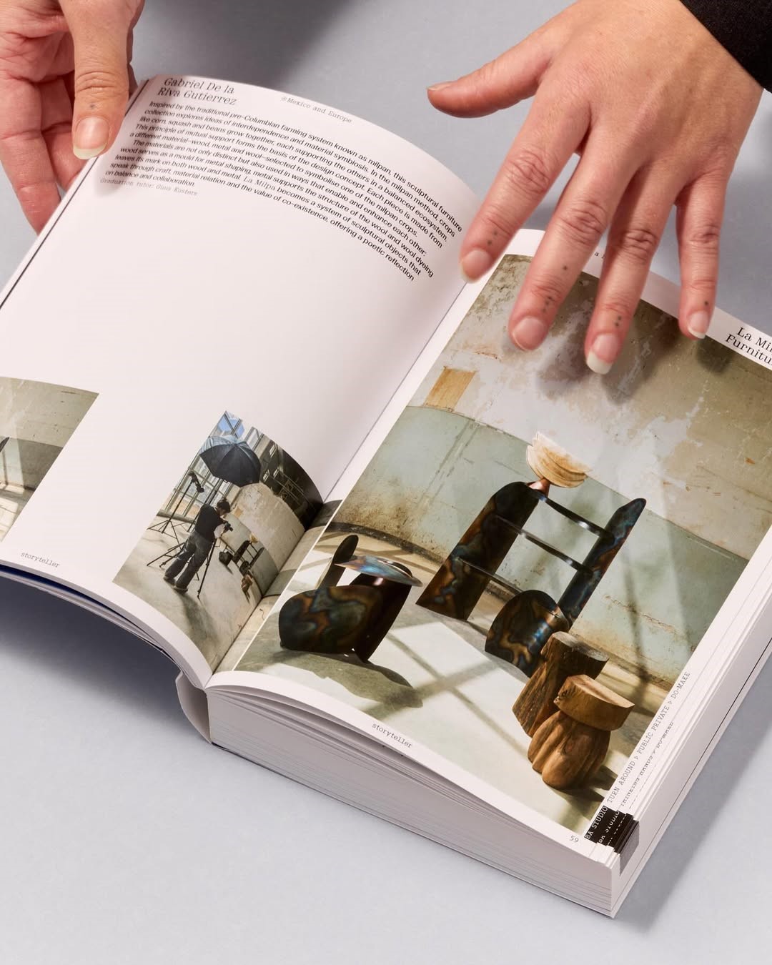
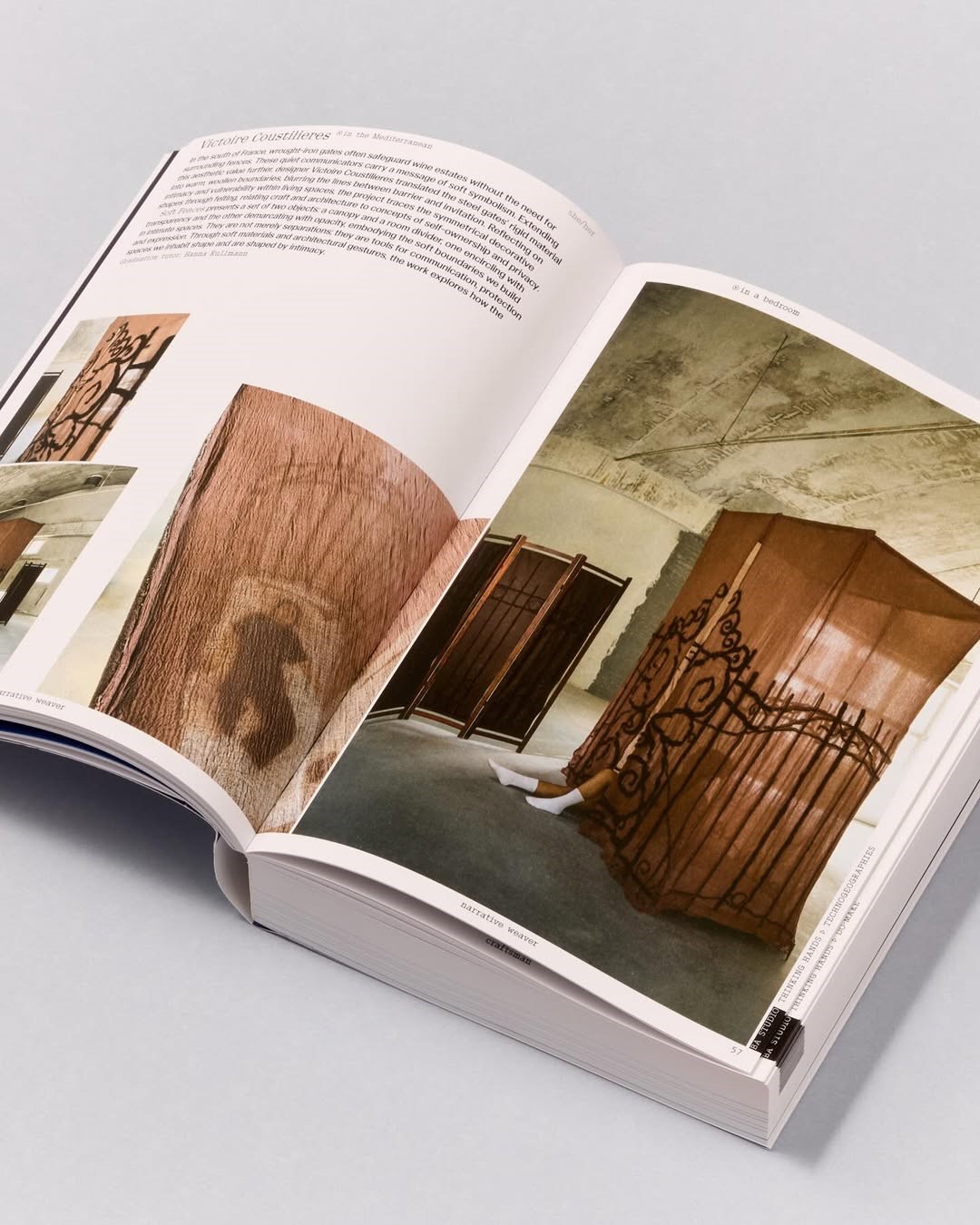
This sentiment runs throughout the structure of each spread. With the left page showcasing the designer’s voice: personal images, process material, notes, and individual perspectives, printed without gloss for a tactile, experimental feel. And the right page, the project outcome: professionally shot images enhanced with high-gloss UV varnish, drawing attention to the refinement and clarity of the final work. The result is a visual and conceptual dialogue — two sides meeting, merging, and informing one another.
The material and printing choices of the 2025 catalogue play an unusually integral role in its conceptual framework
From the outset, Doringer knew he wanted to apply UV varnish to only one side of each spread to reinforce the tension and dialogue between the process-driven and polished aspects of design. “To use a UV varnish, the paper must be coated for the effect to be visible. Since the left page was meant to reflect the student’s rougher, process-driven side, Garda Matt Rough proved to be the ideal choice: it allowed for a UV finish while still feeling more tactile and uncoated than typical coated paper, perfectly supporting the concept and beautifully showcasing the images,” he explains.
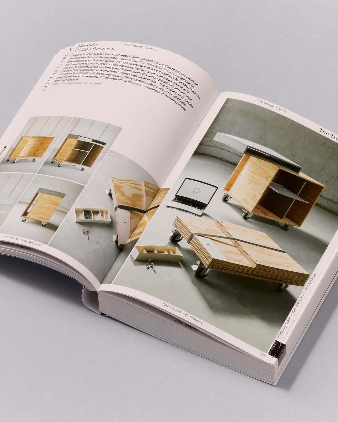
The core of the catalogue uses Garda Matt Rough 120 g/m², which enables the gloss on the right-hand pages while maintaining a soft, almost uncoated feel on the left. The high-gloss UV varnish amplifies the professional photography, highlighting precision and refinement, while the untreated pages create space for messiness, experimentation, and human touch.
To create a clear shift in tone and texture, the designer paired the Garda stock with Clairbook 1.5 Natural, chosen for both its tactile warmth and high volume. The 90 g/m² Clairbook forms the essay sections at the beginning and end of the catalogue, while the 300 g/m² Clairbook provides a sturdy, richly textured cover. Around it sits a delicate yet durable dust jacket made from Starkraft Shopper 70 g/m², thin enough to subtly reveal the cover below but strong enough to function as the book’s outermost layer. “I needed a thin yet opaque paper to use as a dust jacket over the cover, allowing the students’ work to subtly show through,” Doringer notes. “Starkraft proved to be the perfect choice.” Together, these papers and printing techniques form a physical expression of the catalogue’s conceptual framework, turning the book into a tactile experience where materiality and meaning are inseparable.
Behind the elegant, controlled appearance of the printed volume lies a project of significant scale and complexity
With over 200 graduates contributing multiple images — professional shots and self-made process documentation— along with varied pronouns and multilingual names, the making of the catalogue required immense editorial and data-management effort. The collaboration between Philipp Doringer (design & concept), Jeannette Petrik (editor), and Anne Smolders (project supervisor) ensured that this abundance of material was shaped into a coherent, fluid publication.
As part of a long-running annual series, the 2025 Graduation Catalogue not only documents emerging designers but also reflects the layered identities, processes, and personal narratives that define their work. With its thoughtful material choices, conceptual clarity, and sensitive interplay between matte and gloss, refinement and experimentation, it becomes far more than a record of projects — it stands as a tactile, beautifully crafted portrait of a generation stepping forward into the world of design. You can purchase your own copy of the catalogue here.