In a quest for always discovering the best, most memorable and impactful paper assortments out there, we at Europapier are constantly in touch with paper creators from all over Europe.
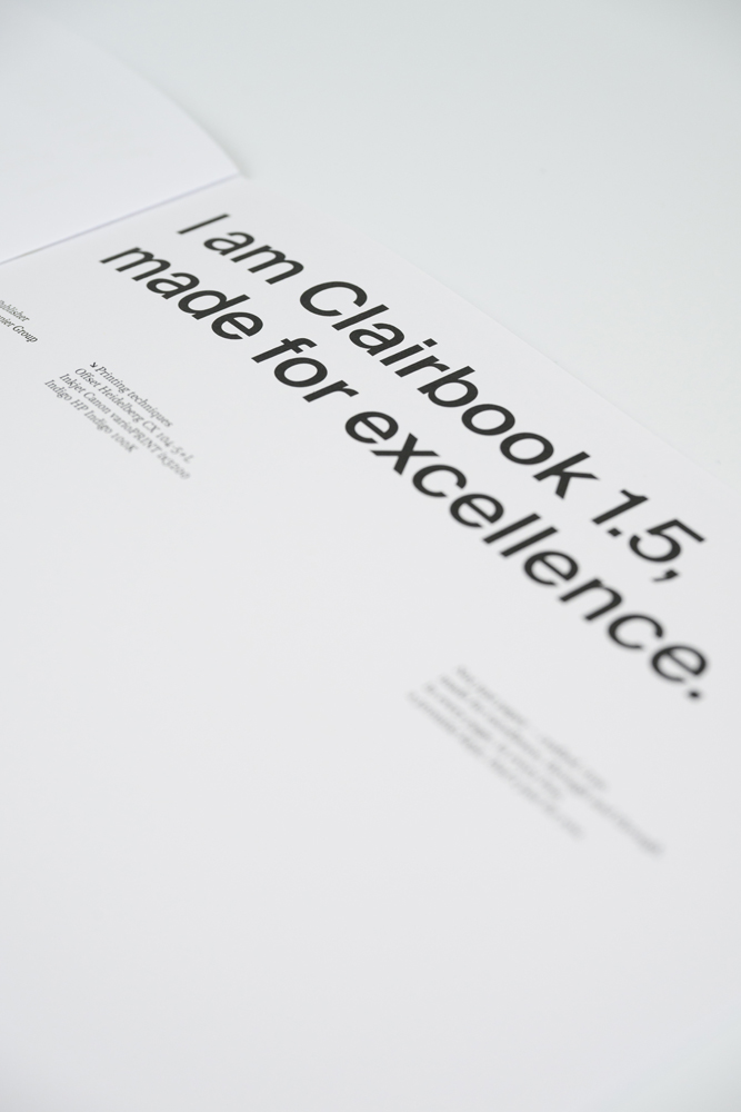
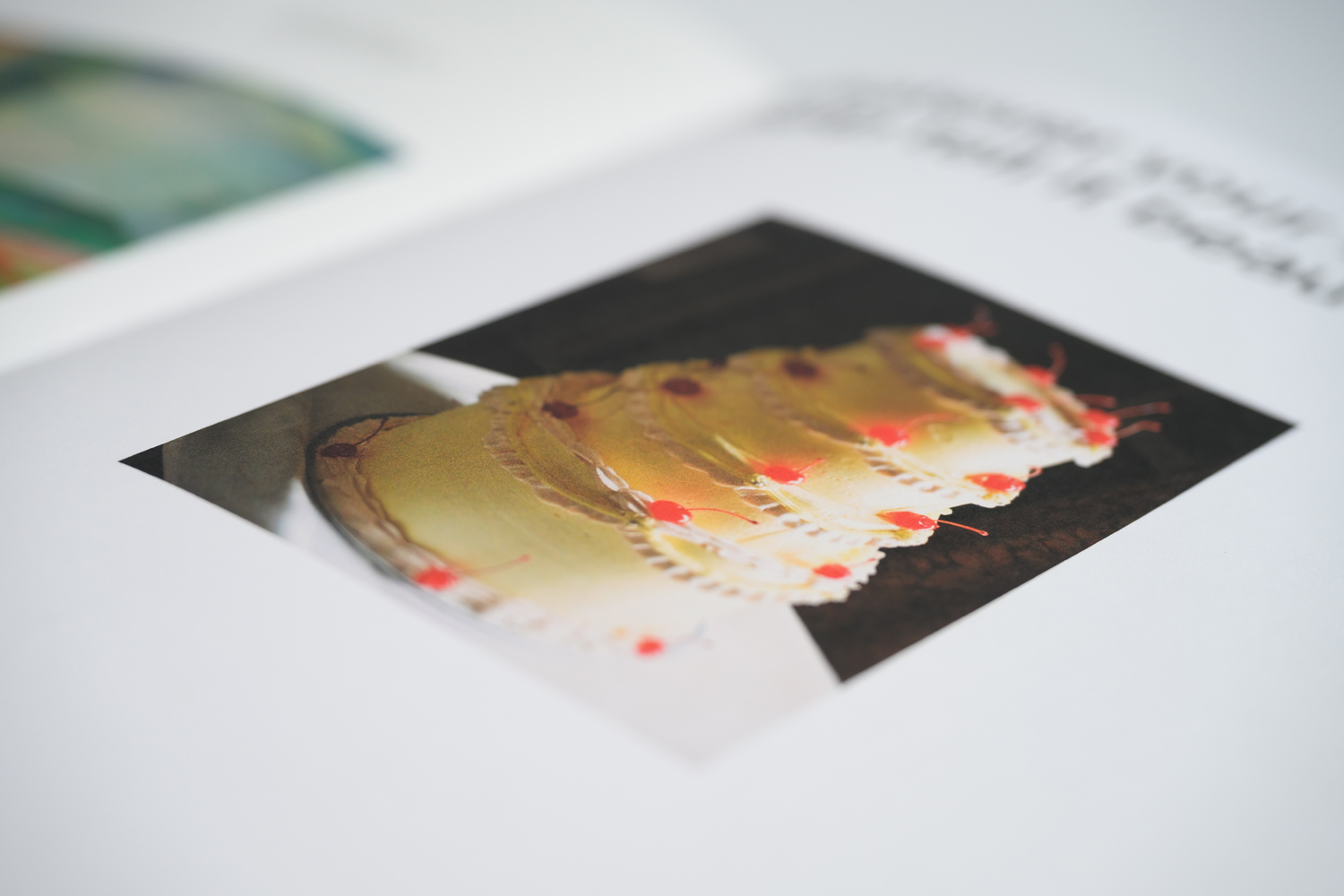
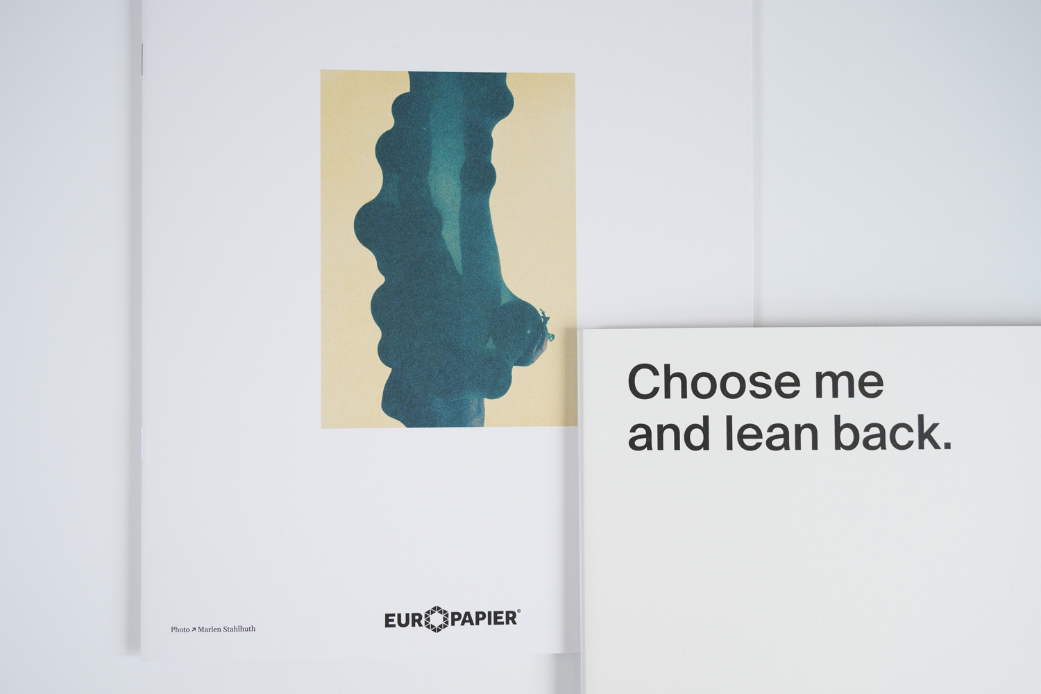
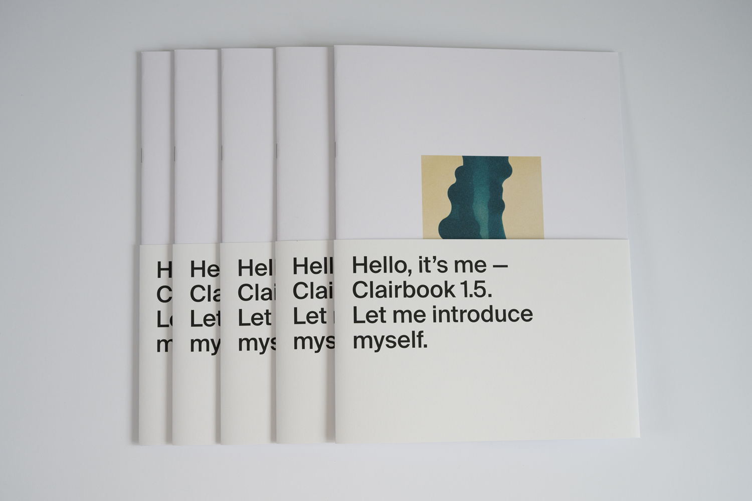
Clairbook 1.5 is among our latest discoveries, a paper so impressive on its own, that when developing the brochure to promote the new assortment, we actually took a step back and allowed it to introduce itself. Today we’re proud to share this story also with our online community from Design&Paper.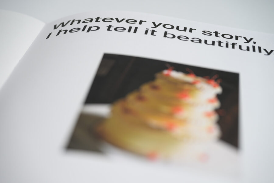
This idea of giving voice to our papers has received so much positive feedback, in line with our overall concept I AM PAPER for our new Design Papers Collection, that we’re going to continue in the same line in today’s article. The brochure to showcase this beautiful fine paper was conceived together with the full service agency 101 from Vienna.
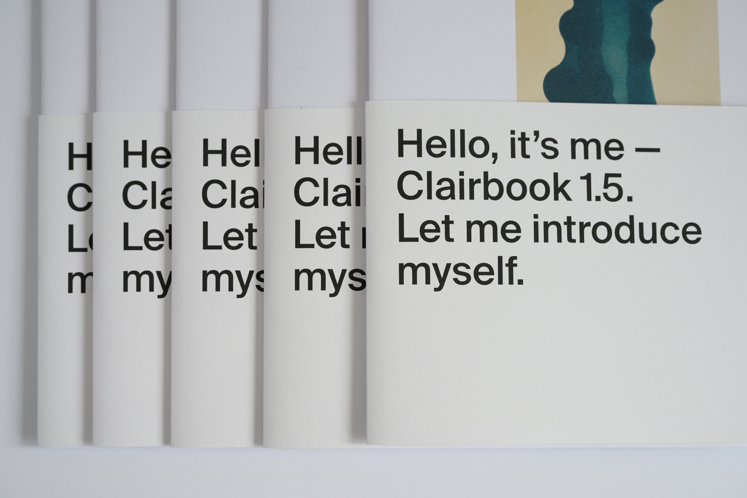
Who is Clairbook 1.5? Tell us about yourself.
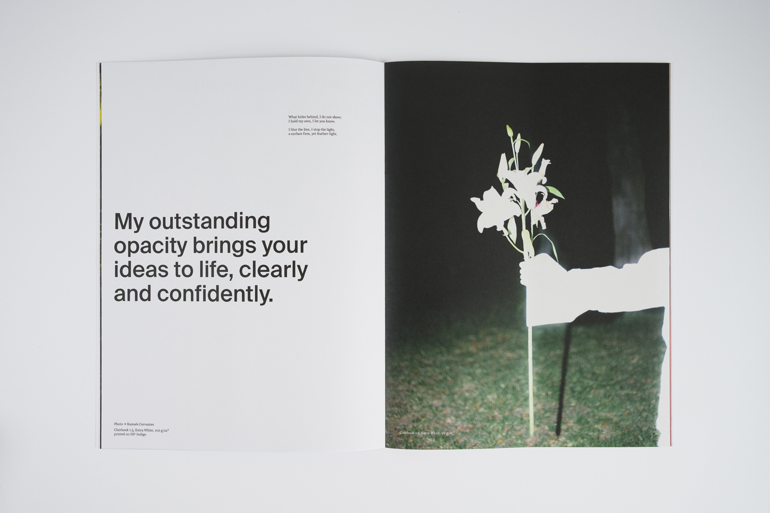
I’m a premium uncoated paper with a volume of 1.5 and one of the first striking things you’ll notice about me is my very rough surface, combined with the airy feel of a bulky book paper with the addition that I am wood-free. Furthermore, I impress with my excellent opacity, very low two-sidedness, and above-average sheet formation for this category of paper.
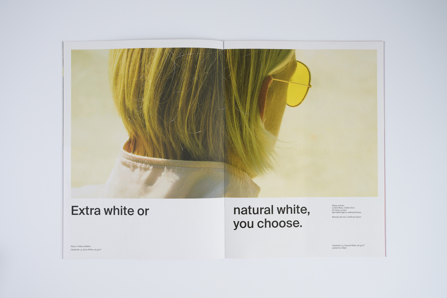
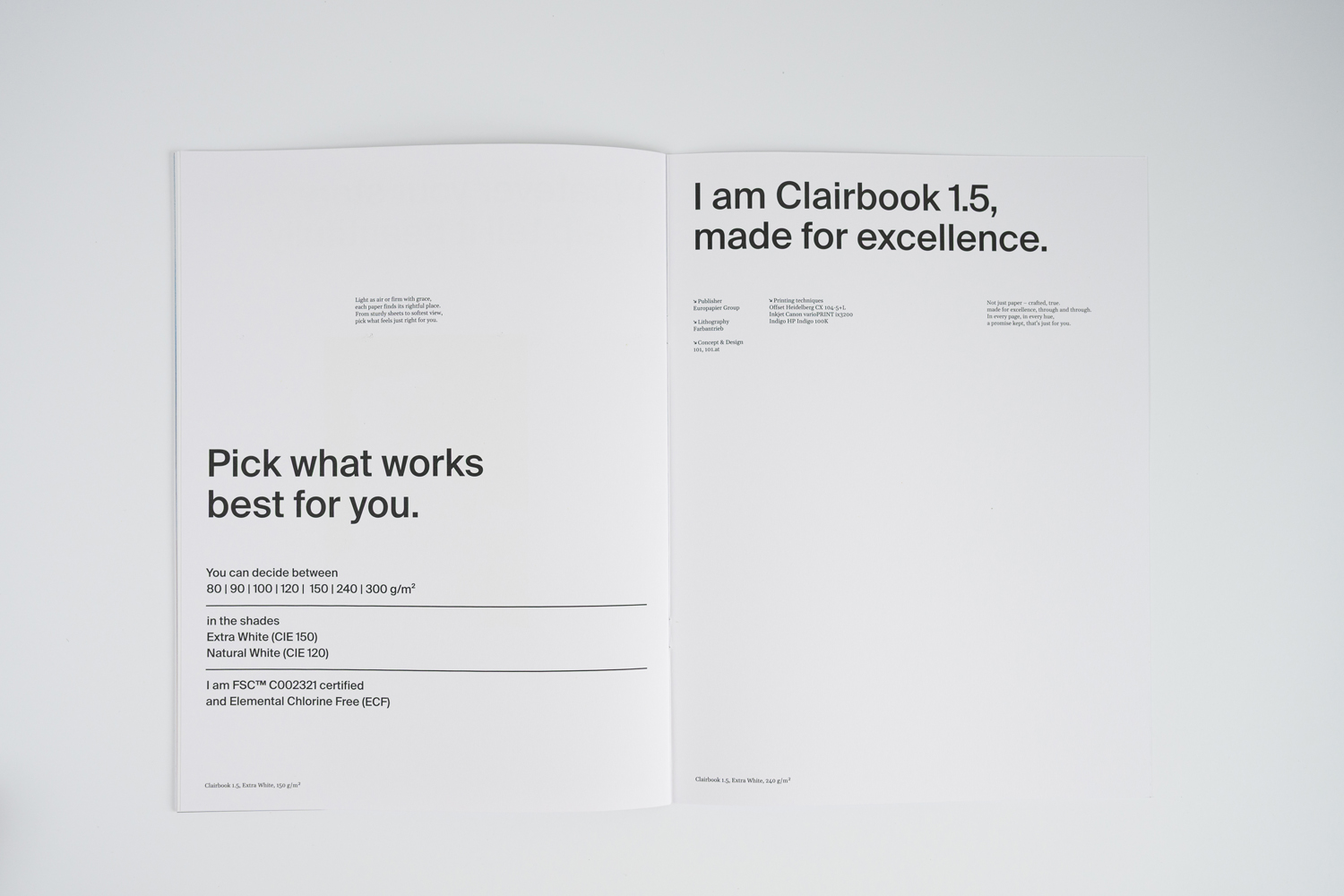
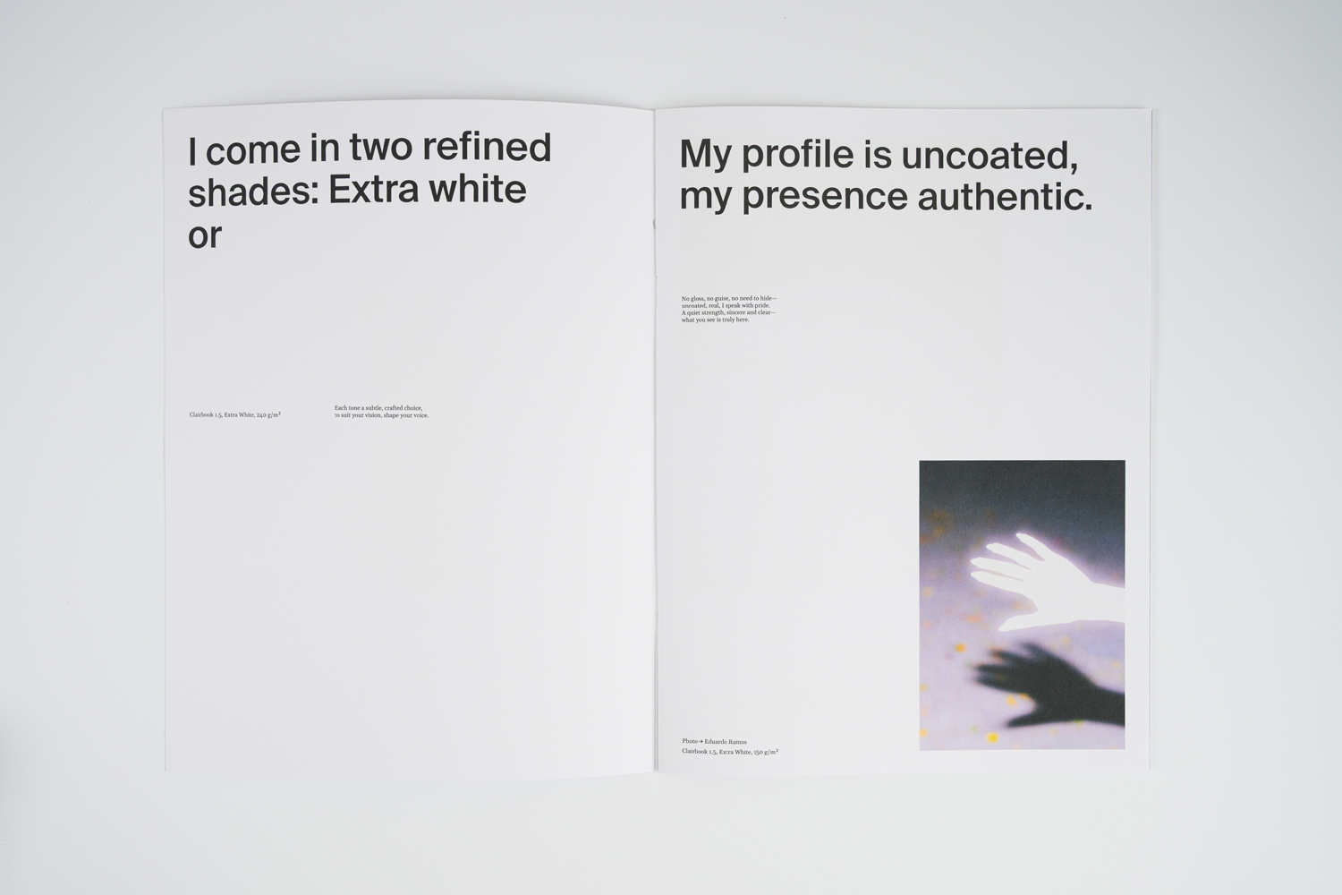
I come in two refined shades: Extra White or Natural
My profile is uncoated, my presence authentic.
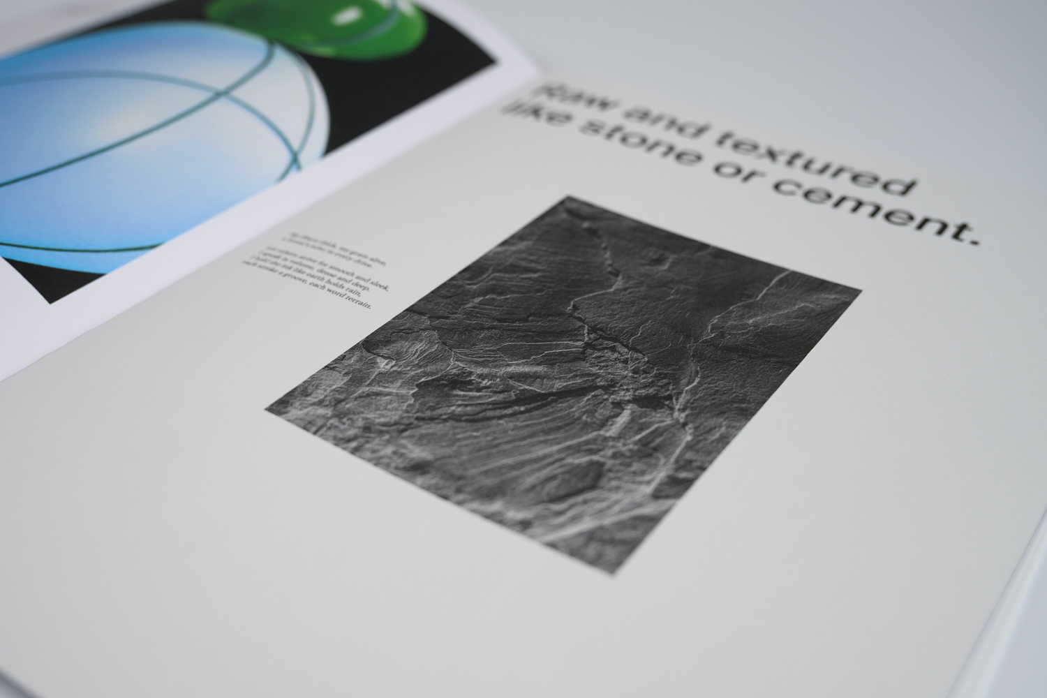
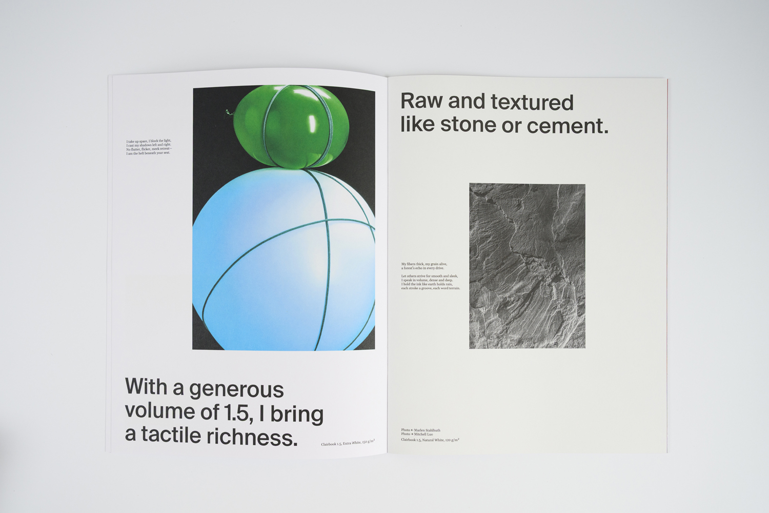
Raw and textured like stone or cement
With a generous volume of 1.5, I bring a tactile richness.
And while I may look rugged at first glance, don’t be fooled — there is a quiet sophistication woven into every layer of me. I’m the kind of paper that reveals myself slowly: first through texture, then through weight, and finally through the way ink settles into my fibres with effortless grace.
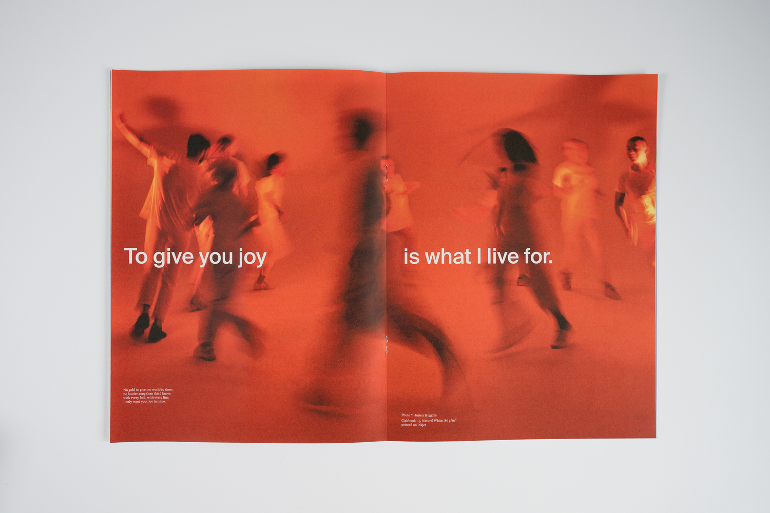
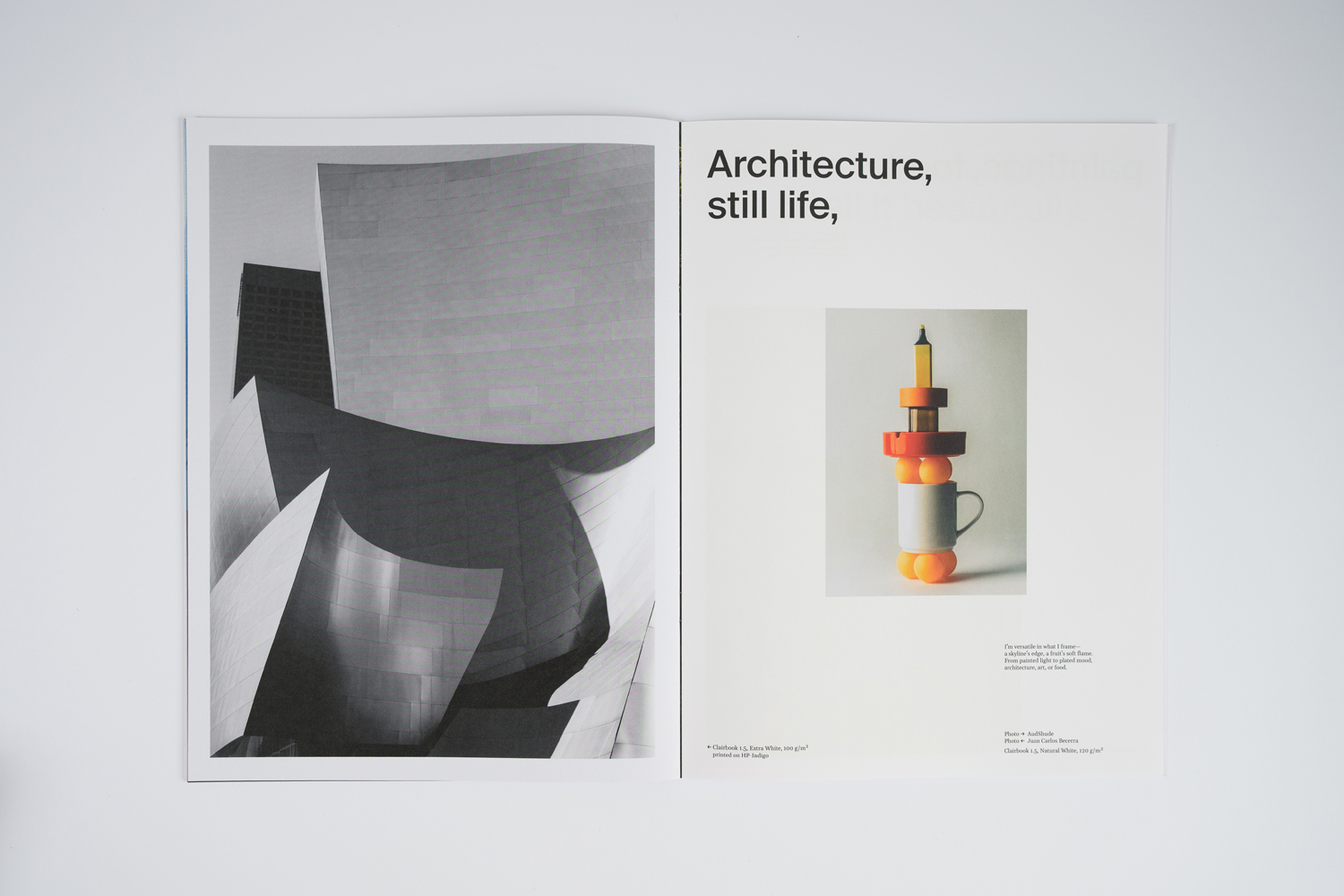
My personality truly shines in editorial work. Think art catalogues that need a tactile backbone, photobooks that demand steady, confident opacity, and cultural publications where every page turn should feel intentional. I thrive in spaces where rhythm matters — where pacing, texture, and the interplay of blank space and printed detail are part of the storytelling itself. I’m not here just to hold content; I help shape the experience.
Every fibre in me is designed to elevate content, not distract from it.
Whether you choose a soft, silent layout or a daring composition with deep contrasts, my surface embraces every nuance: rich blacks, delicate greys, subtle tones — nothing gets lost, everything finds clarity.
I carry the visual message, but I also add feeling — that quiet moment when fingertips pause, noticing texture before the eyes begin to read.
That pause is where connection happens.