As we kick off 2026, the world of branding and packaging design is brimming with fresh energy and renewed focus. After years of minimalism and digital saturation, designers are now embracing richer sensory experiences, deeper emotional connections, and a stronger sense of place. And say what you may about the somewhat controversial Pantone’s Color of the Year: Cloud Dancer (PANTONE 11-4201), a tone chosen to reflect a collective yearning for calm, clarity, and clean starts, it does serve as a perfect quiet yet powerful backdrop for identity work across disciplines, as brands are increasingly looking to design not just what they communicate, but how it feels. And whether you’re refreshing a brand or crafting something new, 2026 is all about how subtle elements can speak volumes as branding and packaging design is expanding beyond logos and color swatches — but becoming tactile, expressive, and grounded in authenticity.
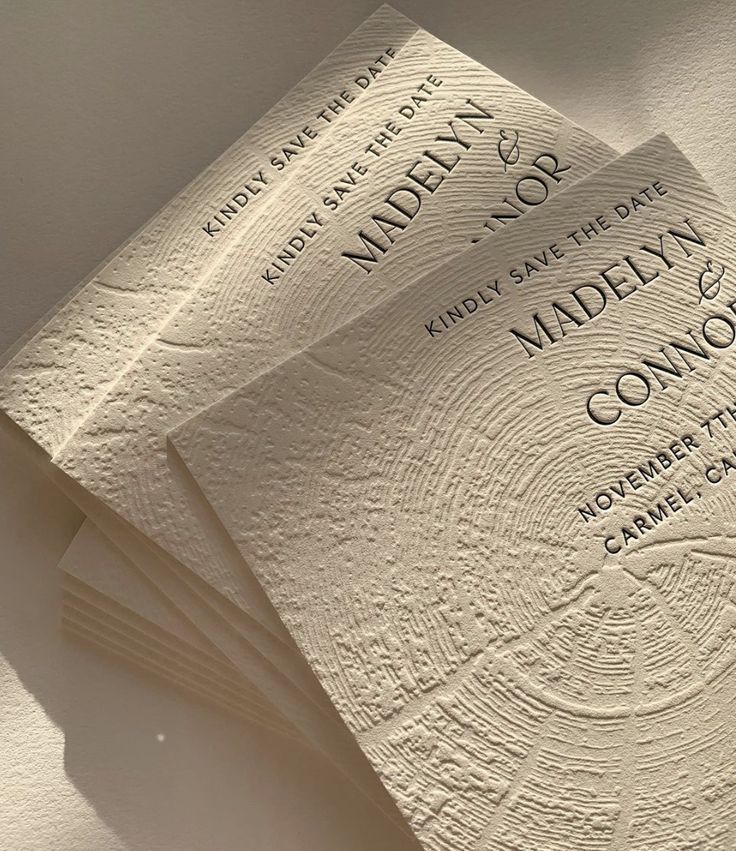
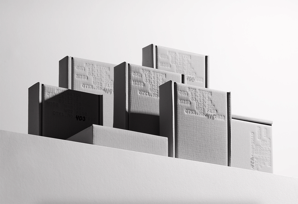
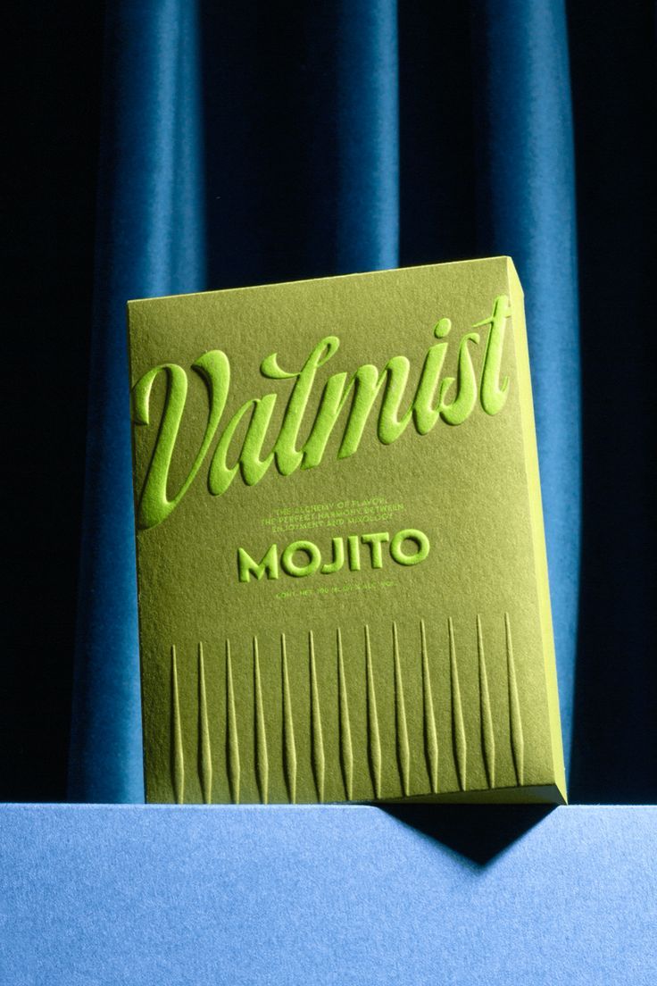
Texture as Identity: Feel Before You See
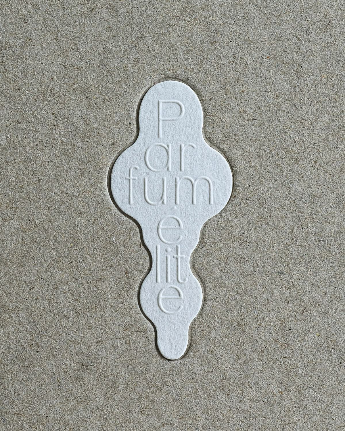
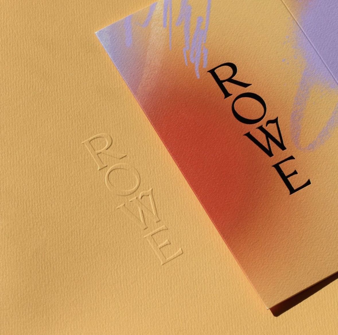
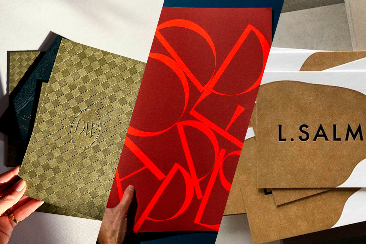
The first major trend emerging this year is the use of texture as a defining element of a brand’s identity. Instead of flat, digital-only visuals, designers are incorporating physical or digitally simulated textures: think soft paper grain, woven fabrics, embossed surfaces, or even brushed metallic looks. Texture adds depth, warmth, and personality, bridging the gap between digital and physical experiences.
Texture isn’t just a decorative add-on — it’s becoming a defining part of how brands communicate who they are. From digital interfaces to printed materials, tactile and implied texture adds depth and personality, helping identities feel more tangible and less flat.
Why now? As brands aim to stand out in an oversaturated visual landscape, texture brings a sensory richness that grabs attention. It evokes emotion, creates memorable tactile associations, and reinforces brand values in unexpected ways. Whether it’s through packaging, print, or digital animation, texture is becoming a core part of how we recognize a brand.
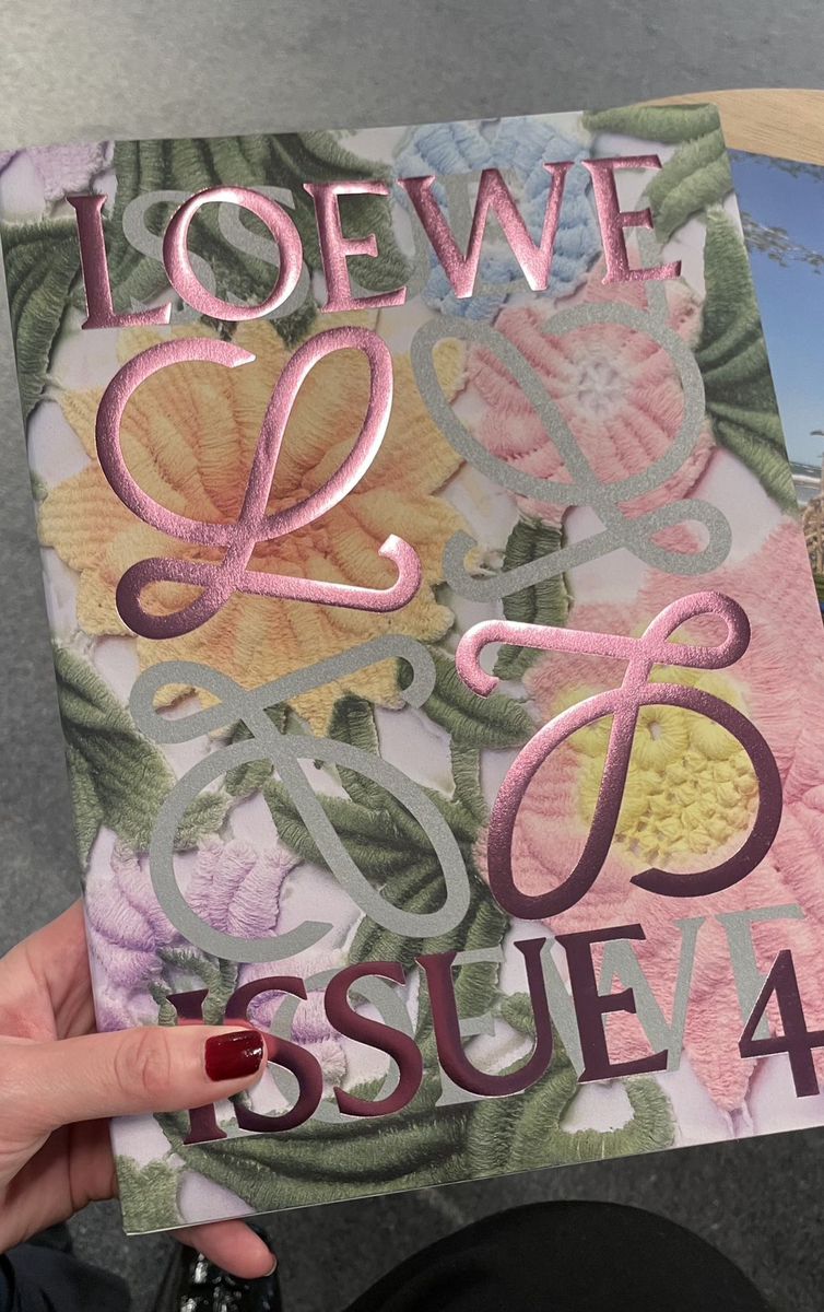
Typography as Identity: Letters With Personality
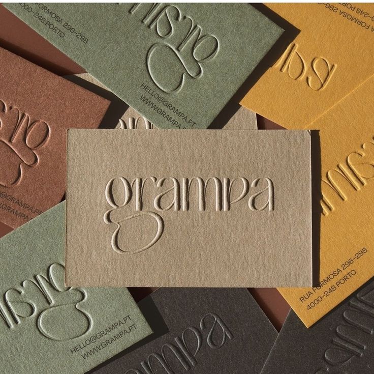
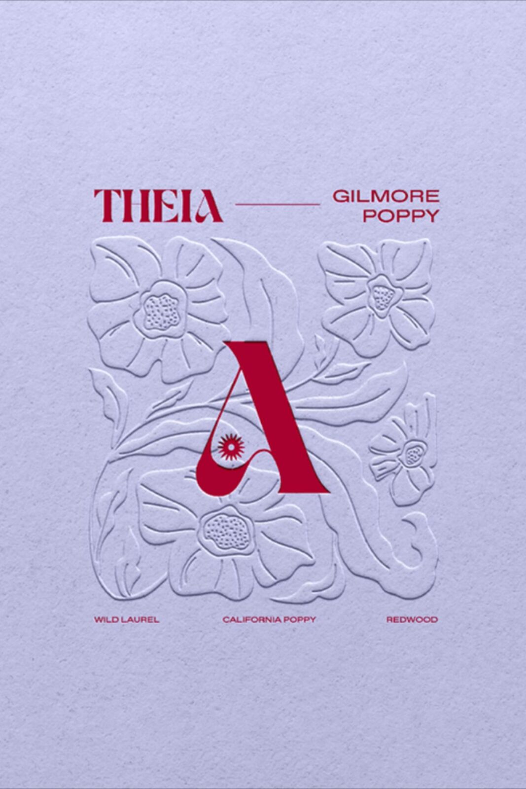
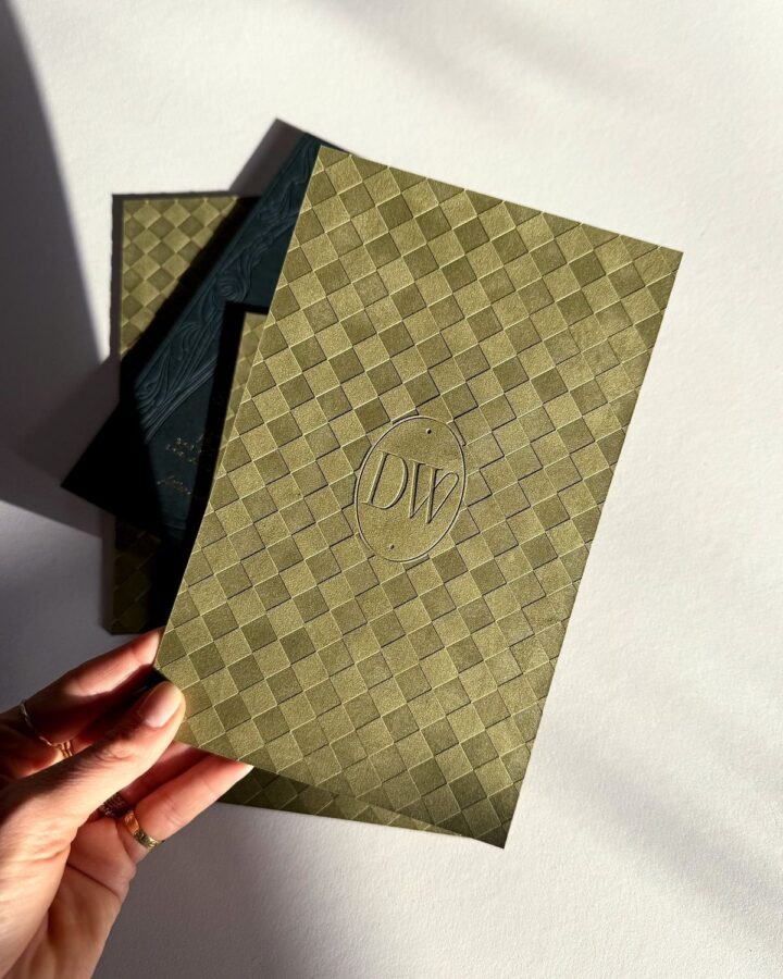
In 2026, typography is stepping into the spotlight as more than just a vehicle for words; it’s becoming the brand’s voice in a visual form. Custom typefaces, expressive letterforms, and kinetic typographic layouts are all helping brands express personality without saying a word. This trend reflects a cultural shift toward individuality and nuanced communication.
Typography has always been more than just text — but in 2026 it’s stepping fully into the spotlight when it comes to the voice of the brands. We expect to see custom typefaces and expressive lettering become central to brand personalities.
As companies strive to be more human and relatable, bespoke typography communicates uniqueness and care. From variable fonts that adapt to context, to bold, character-driven letter shapes used as standalone graphic elements, typography is no longer an afterthought but central to the brand’s identity.
Earthy Colors as Identity: Grounded & Sustainable Palettes
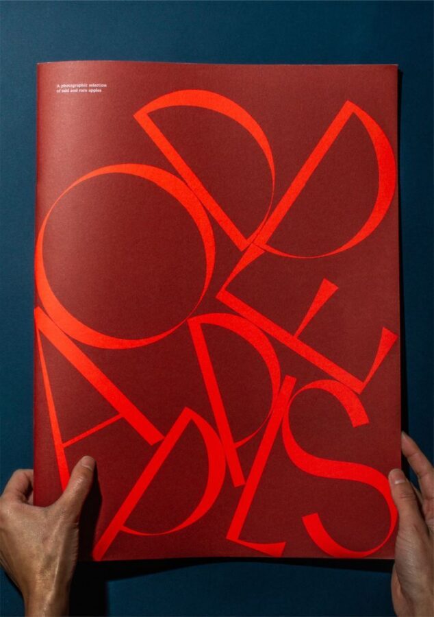
Finally, the rise of earthy, nature-inspired color palettes is reshaping how brands present themselves. Warm browns, muted greens, soft terracottas, and sun-washed neutrals are replacing stark neon and overly saturated digital hues. These tones evoke calm, sustainability, and trust — perfect for brands seeking authenticity and emotional connection.
While Pantone’s Cloud Dancer sets a serene foundational tone for the year, a parallel trend is emerging: earthy colors are becoming identity powerhouses. Think warm ochres, deep terracottas, mossy greens, rich browns, and clay-like hues that evoke nature and grounded simplicity.
This trend mirrors broader societal values of environmental awareness, mindfulness, and a desire for balance in an increasingly digital world. Earthy colors help identities feel rooted and approachable, while still offering a versatile and contemporary aesthetic across both digital and print platforms.
Turning the Brand’s Message into a Brand Feeling
We believe 2026 is shaping up to be a year where identity design grows richer, more nuanced, and more thoughtful. Whether it’s through the tactile allure of texture, the expressive power of custom typography, or the emotional grounding of earthy color palettes, brands have new tools to shape how they’re perceived and felt. As you explore these trends in your own work, think about how they can support not just visual cohesion, but brand feeling. The future of identity design is tactile, expressive, and rooted in the world around us — and it’s only just beginning.