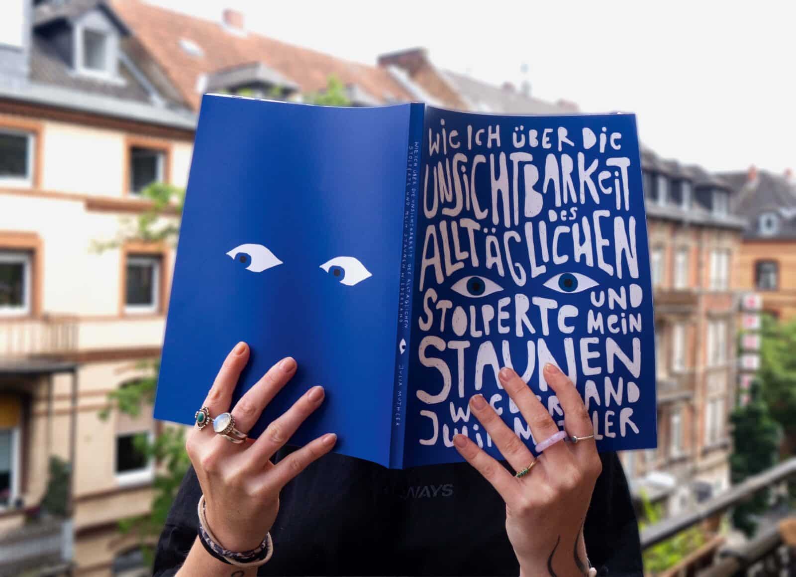
At Design&Paper, we’re lucky enough to experience wonderful books on a regular basis: art books, designer books, luxury catalogues, photography books, coffee table books – you name it. Our creative customers astound us with their ideas and their implementation of those ideas on our papers. And we couldn’t be more proud. Once in a while, however, comes a book which speaks to us in a personal way, almost impossible to describe. Such was for me in a chance encounter at Frankfurt Book Fair 2024, when Julia Muthler, a design student at the RheinMain University of Applied Sciences, Wiesbaden, visited our stand and shared her graduation thesis book with me. From the title – “How I stumbled over the invisibility of the everyday and found my sense of wonder again”, which completely reflects the author’s warm demeanour, not to mention the cover – I was hooked. I instantly knew I had to share this book with our community. A book about rediscovering wonder in the ordinary.
So I got in touch with Julia and she was kind enough to share the many layers of her book with all of us (original German Title: Wie ich über die Unsichtbarkeit des Alltäglichen stolperte und mein Staunen wiederfand) and answer my many questions. Perhaps an atypical fact for Design&Paper is that the book exists in only three copies, the ones she realized for her graduation thesis. Although this makes it even more special, – hello, limited-limited edition – I can’t help but hope that one day there will be many more copies of it flooding the world reflecting her thoughtful presence and refined creative sensibility, and that if that time comes, she will trust our papers to serve as the backdrop of her ideas.

What happens when everyday life becomes invisible to us?
D&P: Please tell our readers about the concept and the inspiration behind the book.
J.M: The book is rooted in a central question that accompanied me throughout the entire project: What happens when everyday life becomes invisible to us? The concept emerged from a personal realization. In a world shaped by speed, constant stimulation, performance pressure, and digital distraction, we often move through our lives efficiently, but without real presence. I noticed how easily routines, habits, and external expectations dull our perception, and how rarely we consciously pause to really see, hear, feel, or reflect.
The inspiration came from moments of friction: feeling overstimulated yet disconnected, productive yet emotionally distant. Instead of approaching the topic theoretically or didactically, I chose a personal and experiential perspective. The book does not aim to explain perception, but to make it tangible.
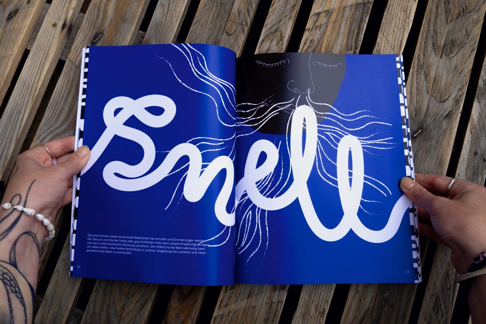
Rather than offering instructions or solutions, the project is conceived as an invitation. It explores conscious perception through everyday experiences, personal reflections, visual impulses, and small exercises. The senses serve as the central entry point, guiding the reader through different states of noticing, from distraction and doubt to stillness, nature, introspection, and renewed awareness.
Ultimately, the project is about rediscovering wonder in the ordinary.
Narative Structure & Composition
The book is structured into three chapters, each representing a different phase of perception and inner movement.
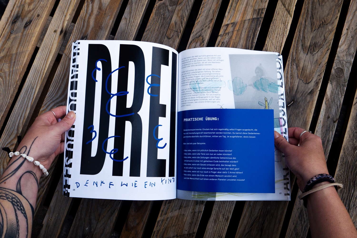
The first chapter, Recognizing, focuses on awareness of the present state. It addresses distraction, habit, performance pressure, and the constant pull of attention in everyday life. This chapter is about noticing what is, and acknowledging how easily focus and presence are lost.
 The second chapter, Breaking Out, explores the possibility of change. Through reflections and simple exercises, it invites the reader to interrupt routines, shift perspectives, and actively question familiar patterns. It marks the transition from passive observation to conscious engagement with one’s own perception.
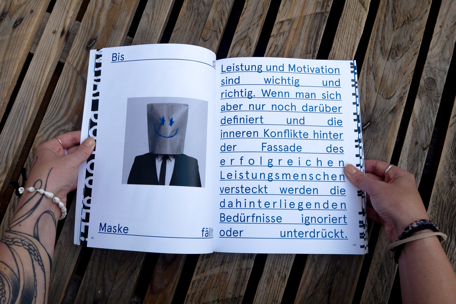
The third chapter, Immersing, turns inward. It is the most personal part of the book, dealing with self-perception, doubt, stillness, nature, friendship, and inner dialogue. Here, perception becomes quieter and more introspective, allowing space for vulnerability, imagination, and a deeper connection to both the inner and outer world.
Creative Design Process And Briging The Book To Life
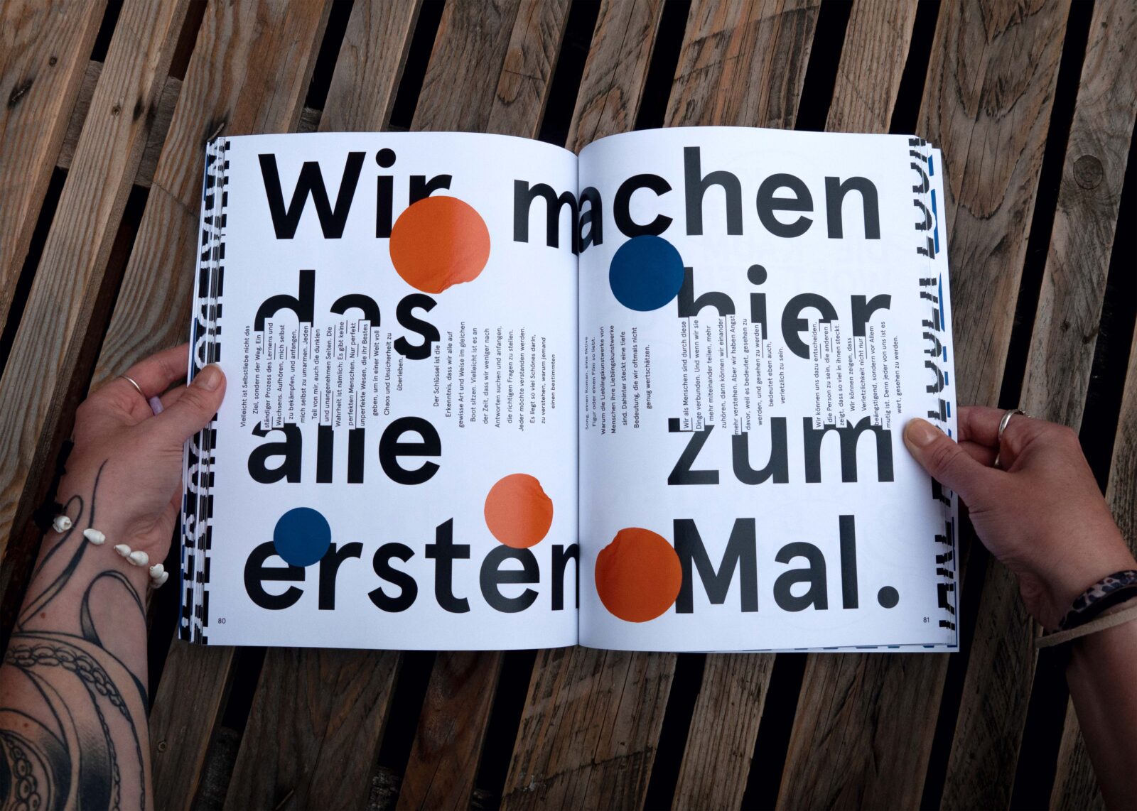
J.M: The design and production process was deliberately slow, exploratory, and iterative. From the very beginning, the book was not treated as a neutral container for content, but as an experience in itself. As something that should be felt as much as read. The process constantly moved back and forth between writing, visual exploration, research, and reflection. Texts were written, questioned, rewritten, or removed. Images were tested, layered, reduced, and sometimes discarded entirely. Layouts were continuously adjusted to find the right balance between density and pause. White space, rhythm, sequencing, and scale became essential design tools rather than neutral background elements.
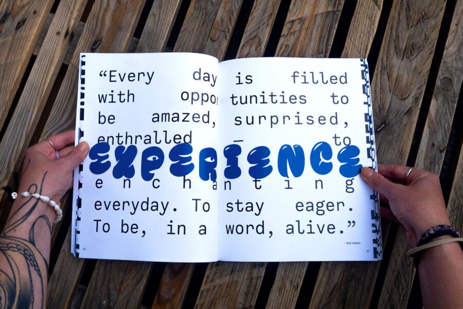
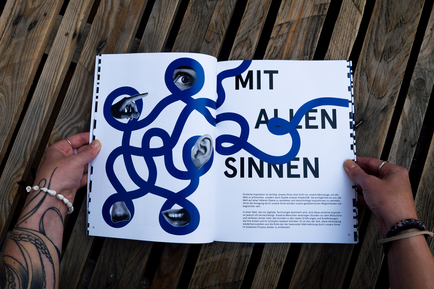
Photography, illustrations, scribbles, and typography were developed intuitively and often in direct response to the texts. Visual elements are not illustrations of the content. They are parallel narratives that add emotional and perceptual layers. Many design decisions were guided by simple questions: Does this slow the reader down? Does it sharpen awareness, or does it distract?
Overall, the process was less about efficiency and more about attentiveness. It required patience, experimentation, uncertainty, and trust in intuition. Much like the topic of the book itself.
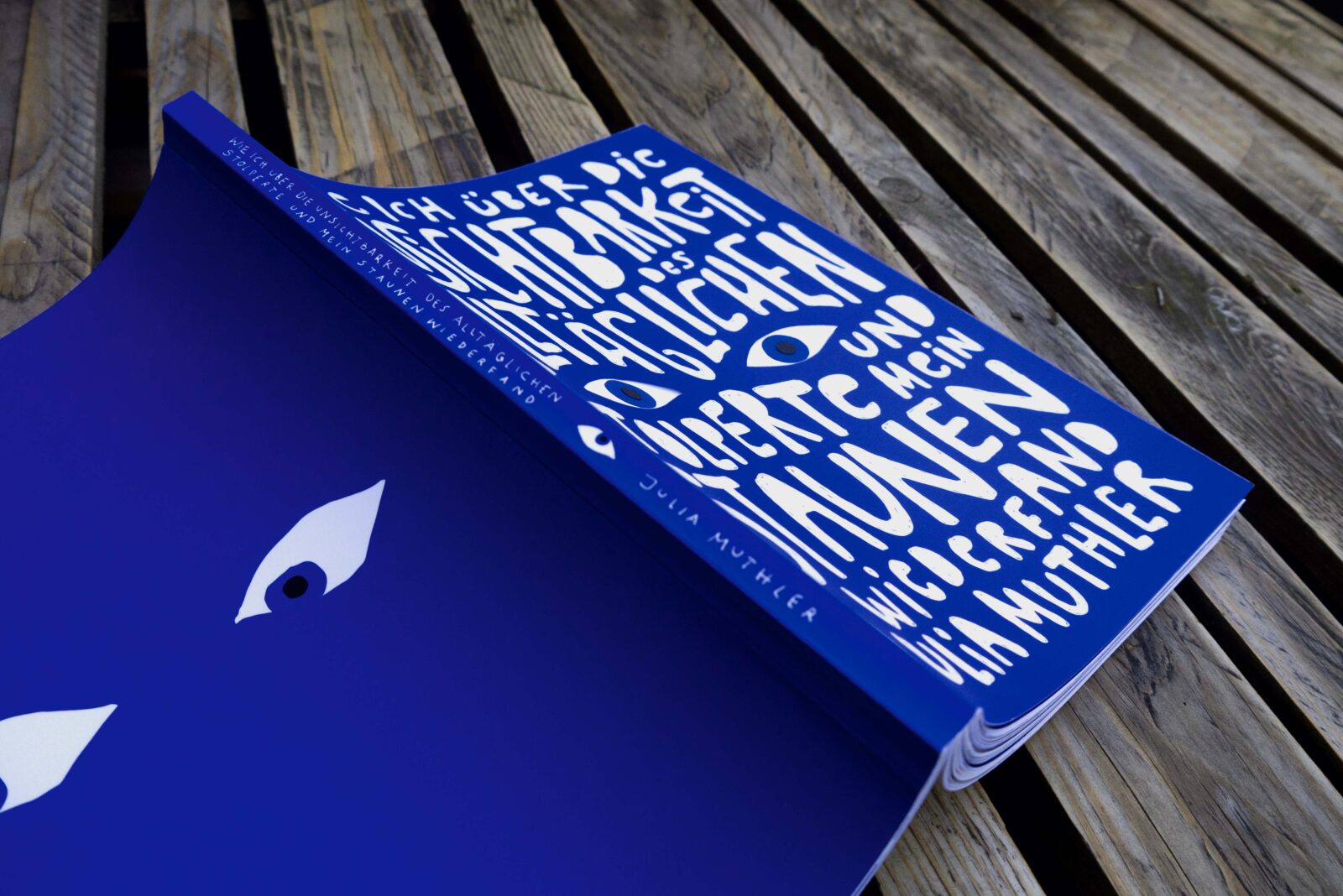
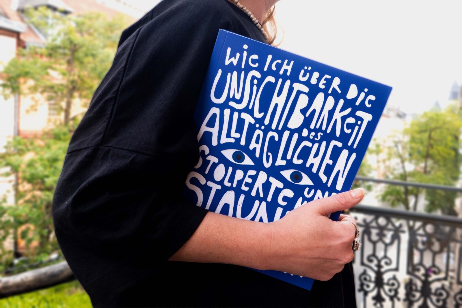
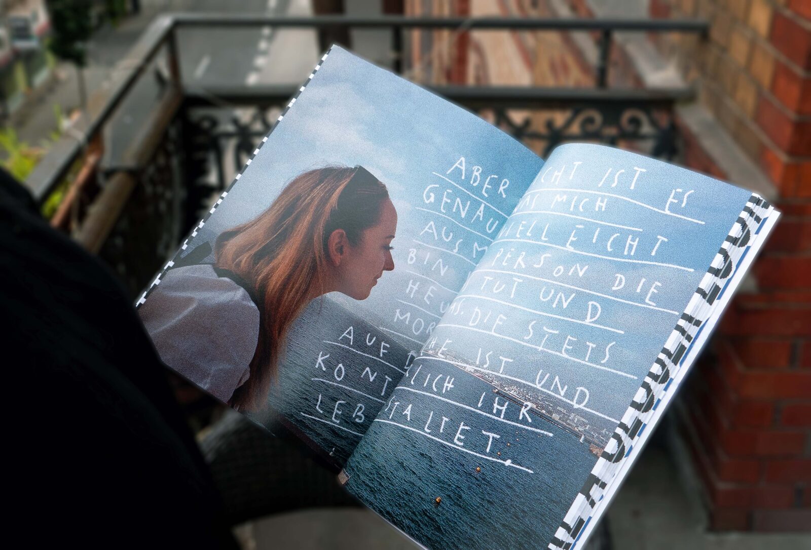
Materiality played a central role in production. Paper choice, color, finish, binding, transparent pages, die cuts, and the fore-edge print were all carefully considered as part of the conceptual language. The way the book opens, how pages overlap, how layers reveal themselves, and how the blue interacts with light were integral to the design thinking.
Overall, the process was less about efficiency and more about attentiveness. It required patience, experimentation, uncertainty, and trust in intuition. In this sense, the way the book was made directly reflects what it talks about: noticing, pausing, and allowing meaning to emerge over time.
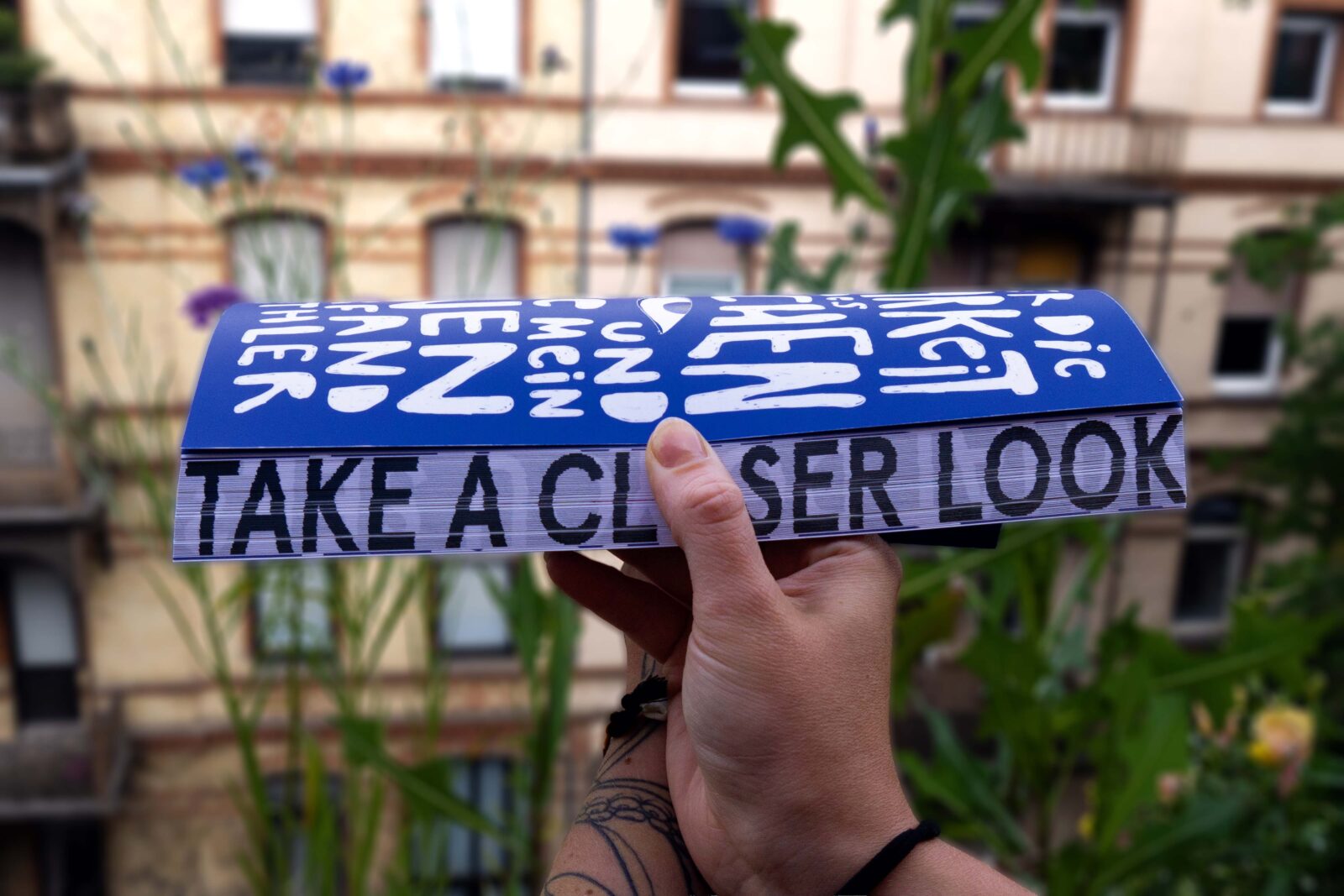
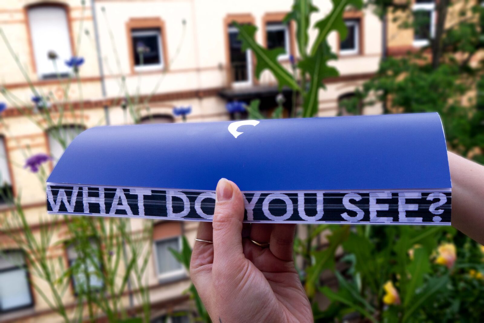
Take a Closer Look – What Do You See?
D&P: Are there any particular design elements or stories in the book you would highlight?

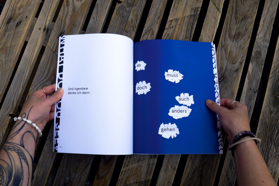
One element I would especially highlight is the way layers are used throughout the book, conceptually and materially. Transparent pages, overlapping imagery, and cut-outs create moments where content only becomes readable when you slow down, turn the page carefully, or look twice. These elements are not decorative. They physically translate the idea that perception is shaped by filters, habits, and prior assumptions.
A recurring material intervention is the use of die cuts, particularly the eye-shaped cut-outs. They interrupt the reading flow and make the act of seeing tangible. All of the cut-outs were deliberately made by hand, introducing subtle imperfections that emphasize the human, non-automated nature of the book.
A central material element is the use of standard transparent tracing paper within the book. These semi-transparent pages function as visual filters, allowing underlying content to appear gradually and reinforcing the book’s core themes of perception, layering, and attentive seeing.

Another important layer is the inclusion of augmented reality elements. Selected pages can be activated via smartphone, revealing additional visual or narrative content. These AR moments are not meant to replace the physical experience, but to extend it into the room. They create a conscious contrast between analog presence and digital mediation by asking the reader to reflect on how technology can either distance us from perception or, when used deliberately, sharpen awareness.
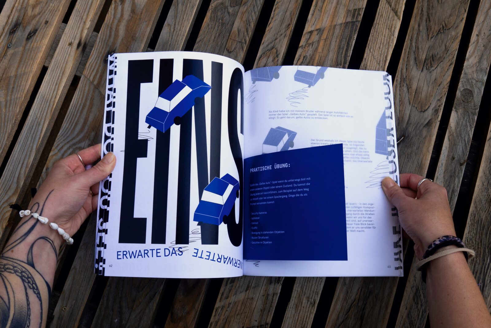
On a narrative level, I would highlight the small exercises and everyday observations woven throughout the book. These prompts invite not only creative people but readers in general to notice overlooked details, question routines, or shift perspective in simple ways. They turn the book into a participatory experience rather than a passive one.
Visually, the contrast between classical imagery and contemporary symbols, such as ancient sculptures interacting with modern technology, forms another recurring story.
Finally, the fore-edge print is a quiet but meaningful detail. Its messages only appears when the book is physically bent and handled in a specific way. It cannot be consumed at first glance. Like the book itself, it reveals meaning through interaction and attention.
Together, these elements — material, visual, interactive, and digital — form a coherent language. The book asks the reader not only to read, but to engage, pause, and become aware of how perception is constructed across analog and digital realities.