When a Polish tomato producer decided to become one of the most dynamic and expansive companies in Poland, while keeping its traditional look, three designers were called in for help. Monika Ostaszewska-Olszewska, Zofia Konarska, and Katarzyna Minasowicz made such a good job in creating a completely new visual identity for the company, that their design won the RedDot Design Award in 2012.
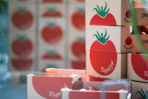
The taunting task the three designers faced was to create a fully new visual outlook including promotional gadgets, online presence as well as a new packaging design range for the Łęgajny Horticultural Farm, which specializes in growing tomatoes. A traditional illustration image of a big red tomato was chosen to be the symbol of the brand, keeping the style traditional and commercial but still giving it an innovative touch. 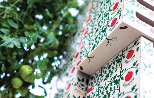
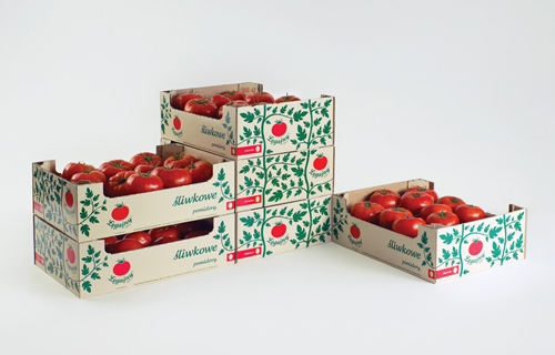
The graphic tomato bush grows as the the tomato boxes are stacked up on top of each other.
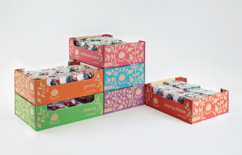
The simple idea behind the graphic design on the packaging was to treat every single box as a part of a jigsaw puzzle. The box functions independently but the pattern of the graphic tomato bush can expand in any direction, regardless of how the box is set. Thanks to it a large-scale artwork is created when boxes are stacked up on top of each other. The same idea and technique can be used in advertising from magazines to moving images, as well as in stores and product presentation. This idea is not just visually attractive but also very functional in different situations. 
The traditional yet modern packaging design is perfect for the tomato company
The whole design process is very well thought out, as the values of the company were taken into consideration in every aspect. In all of the packaging, only natural materials are used – felt, cotton recycled paper and cardboard. The home-like feel you get from the branding is very suitable for the company. And Łęgajny Horticultural Farm has become the perfect example of how much the visual outlook can affect the conception of the customer.
The recognizable visual look goes from product packaging to their homepage and everything in between. The cute “sliced tomato” coasters are incredibly thoughtful, and the promotional gift ornaments which resemble tomatoes are so adorable we want some of our own!
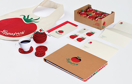
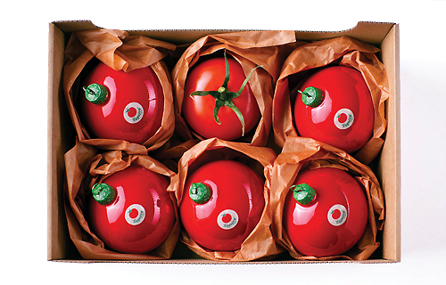
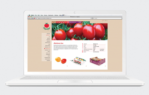
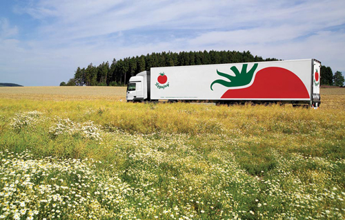
The same visual theme is carried through the whole branding, from online to the delivery trucks.
Photo © monikaostaszewska.com

