When a brand dares to break the mold, its packaging becomes more than a container – it becomes a manifesto. That is exactly what Ukrainian designer Yuliia Hrabynska has achieved with the packaging concept for Atelier C, a modern chocolate brand that celebrates confidence, curiosity, and boldness. Passionate about crafting “visually compelling narratives that resonate”, Hrabynska brings her signature mix of innovation and precision to the project, elevating chocolate branding into an artful experience.
Chocolate for today’s tastes
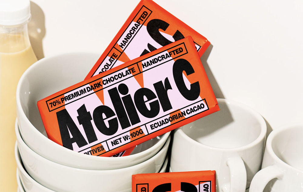
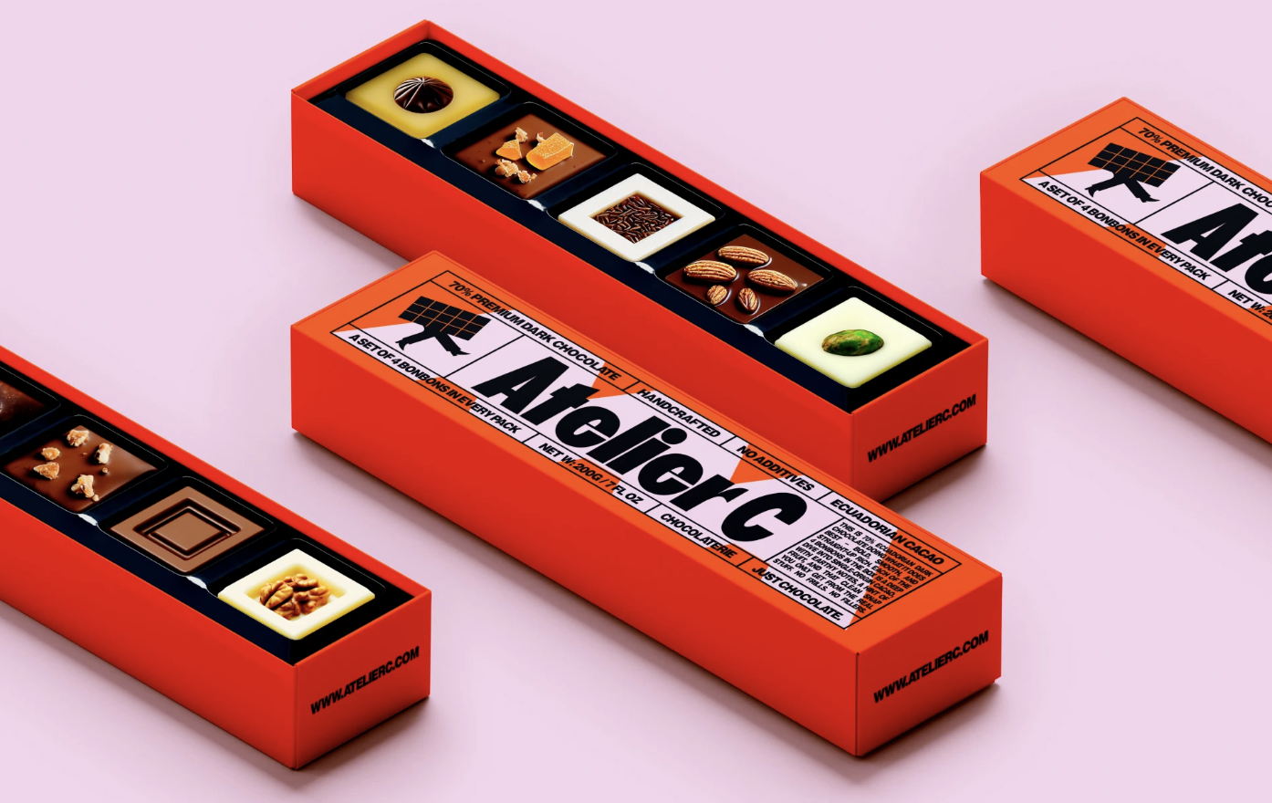
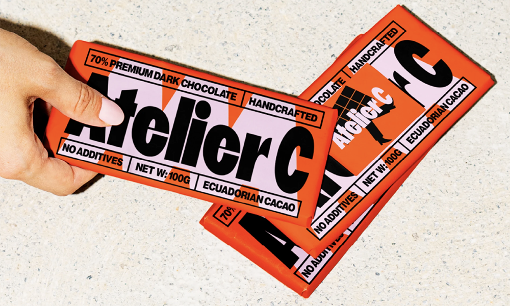
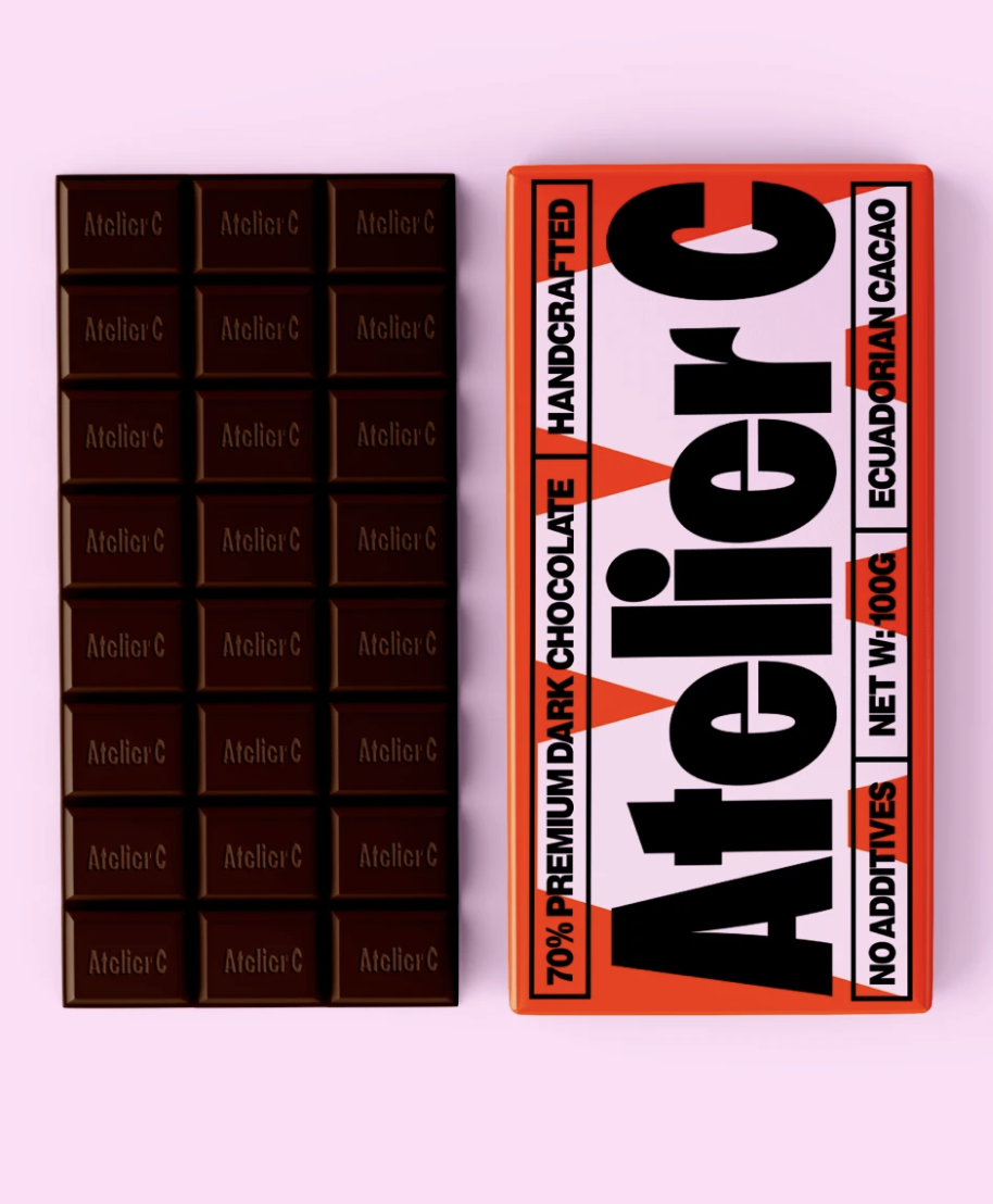
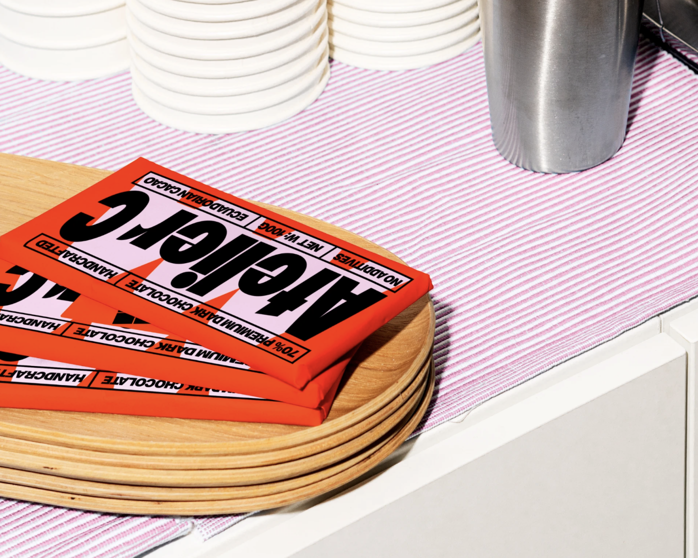
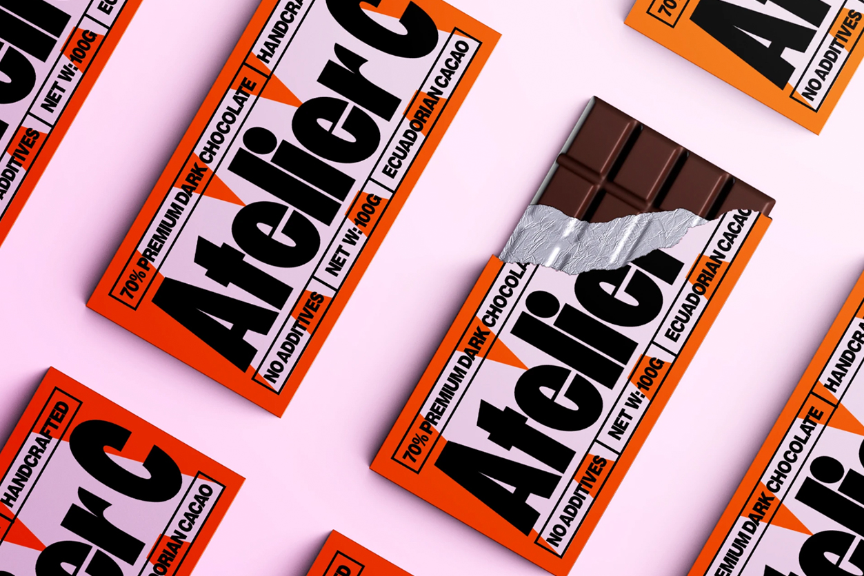
Atelier C was born from the idea that premium chocolate shouldn’t be stuck in tradition. As the brand itself explains: “We don’t follow old rules of what chocolate should be – we make chocolate that reflects how people actually live and taste today: confident, curious, and always craving more.” Their bonbons are crafted with high-quality, single-origin cacao, including a signature 70% Ecuadorian dark, chosen for depth, balance, and character. Every flavor is designed to spark surprise and delight, capturing moments of intensity and discovery. “Premium isn’t about being perfect, it’s about being real and exceptional,” as the brand puts it. This philosophy of boldness and authenticity forms the foundation of Atelier C’s visual identity.
We don’t follow old rules of what chocolate should be – we make chocolate that reflects how people actually live and taste today: confident, curious, and always craving more.
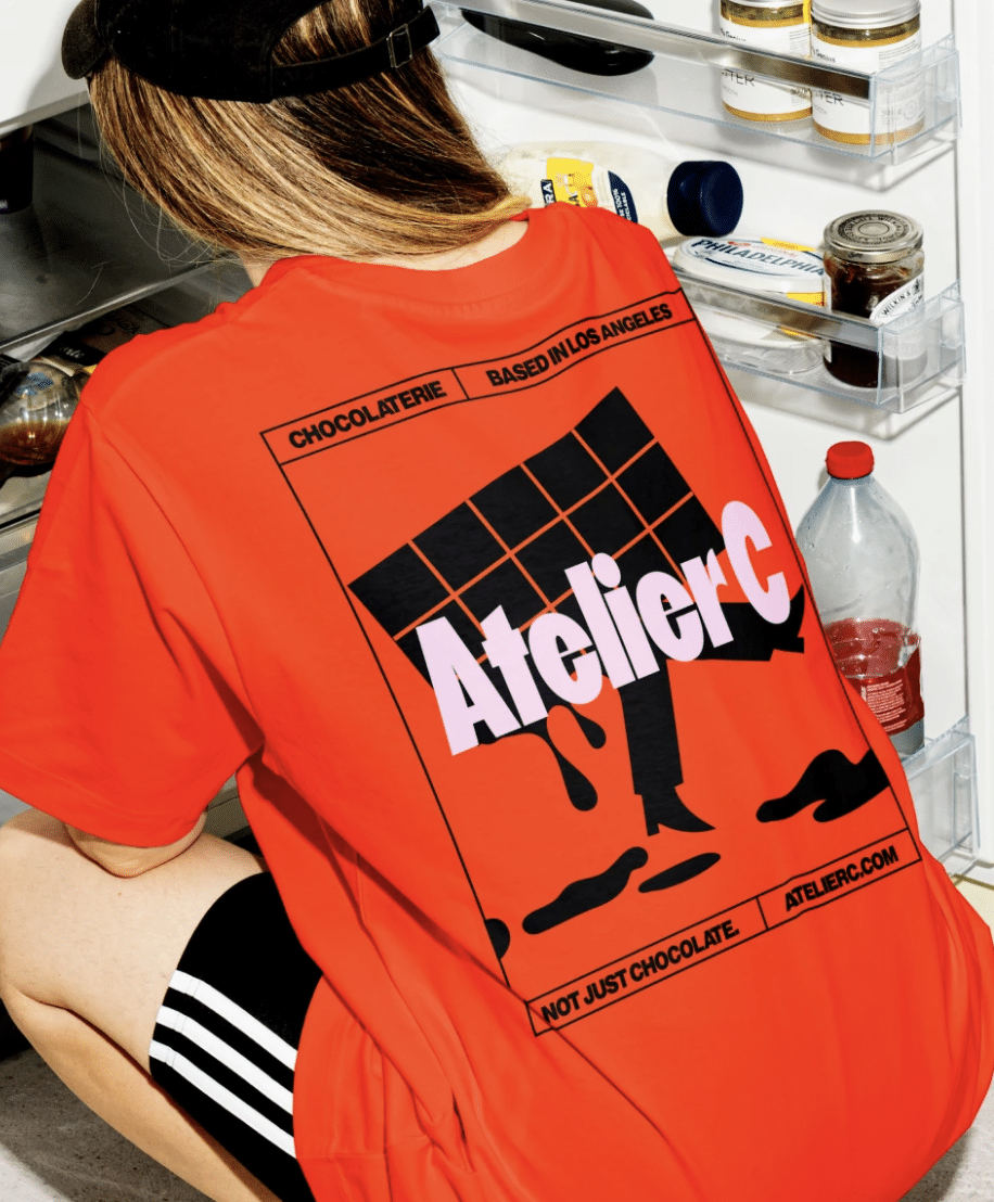
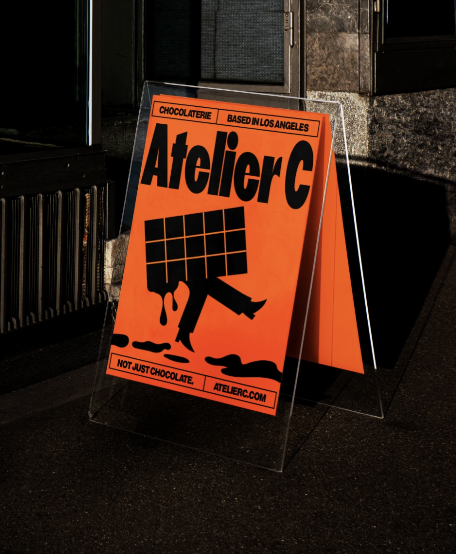
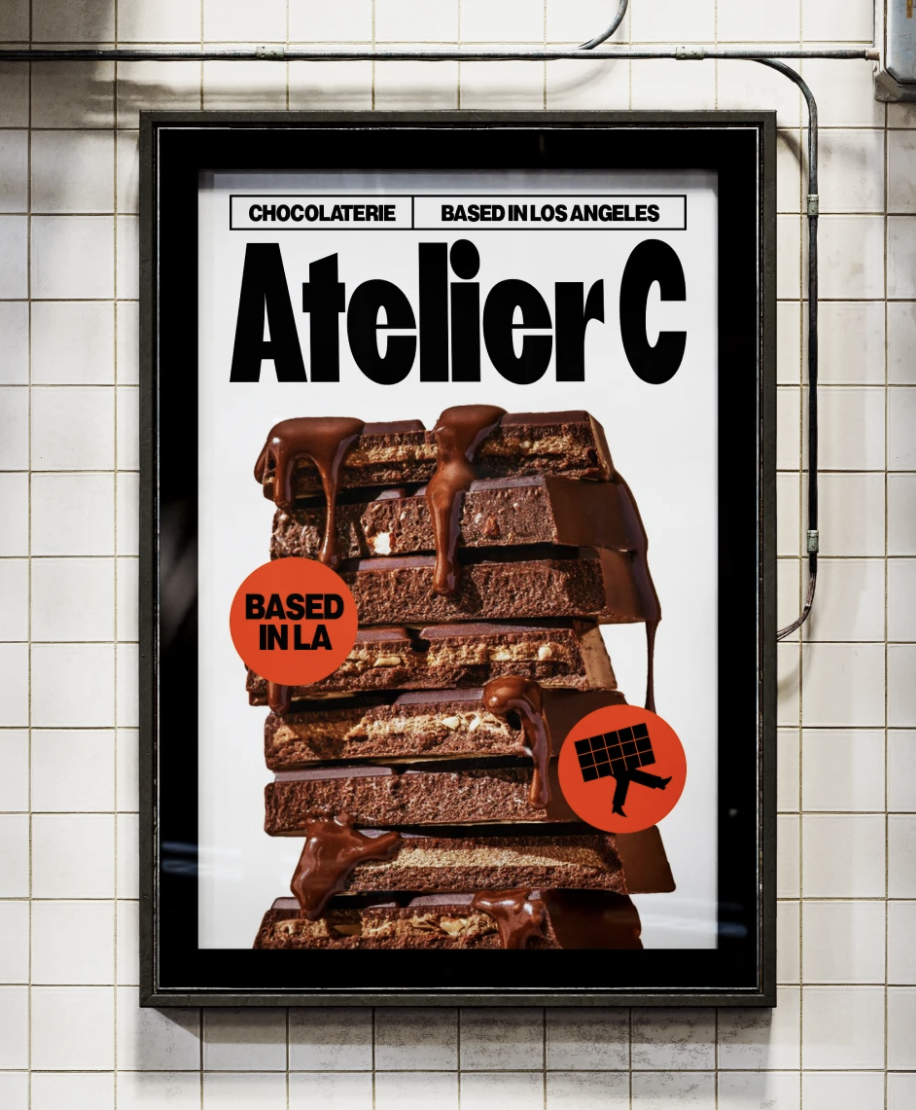
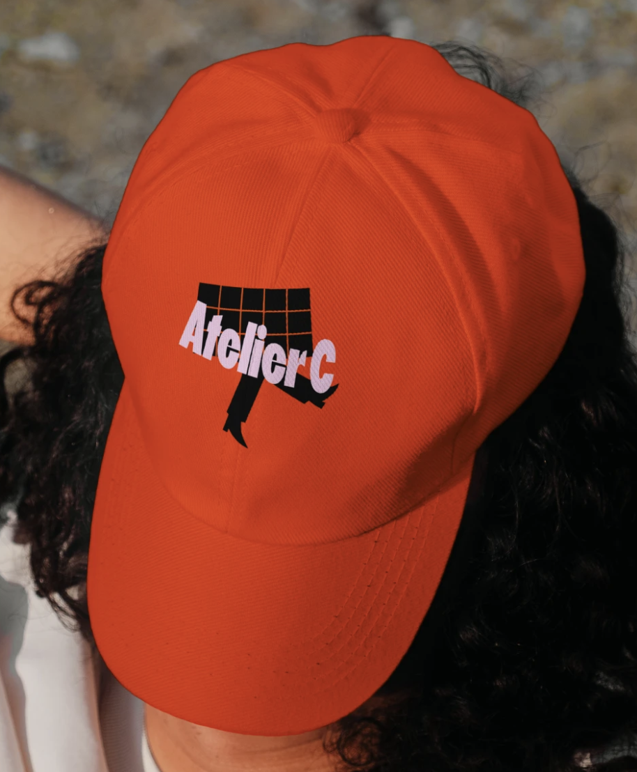
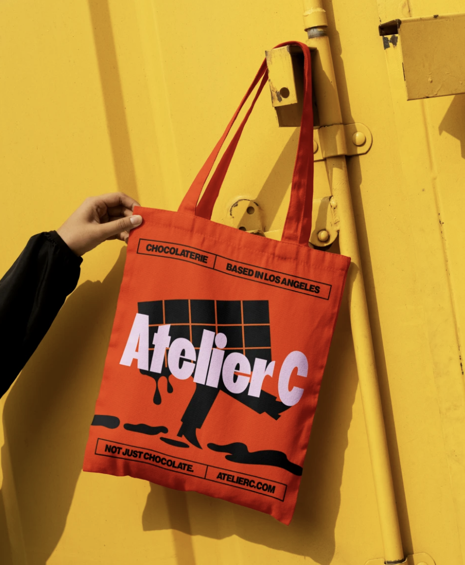
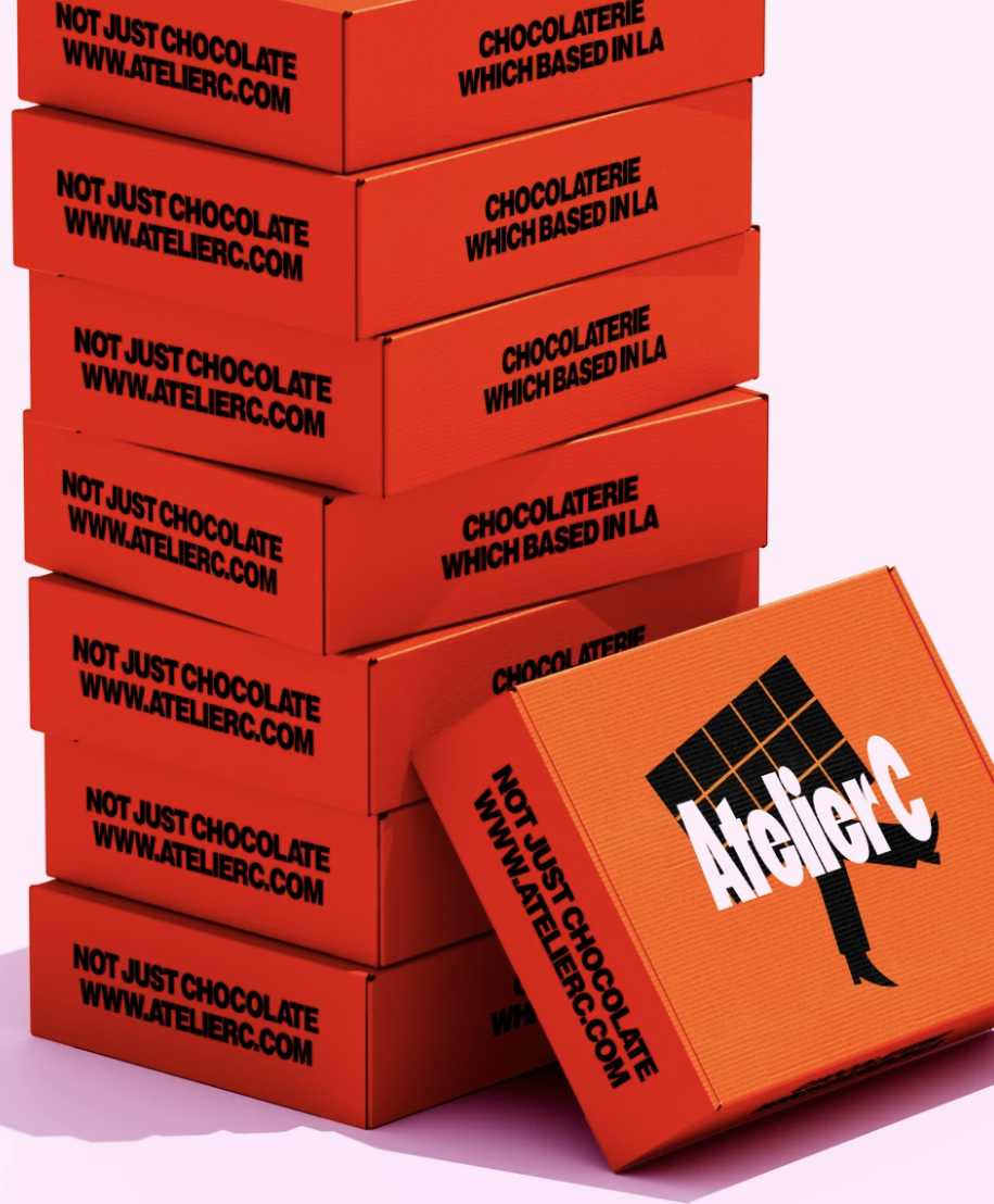
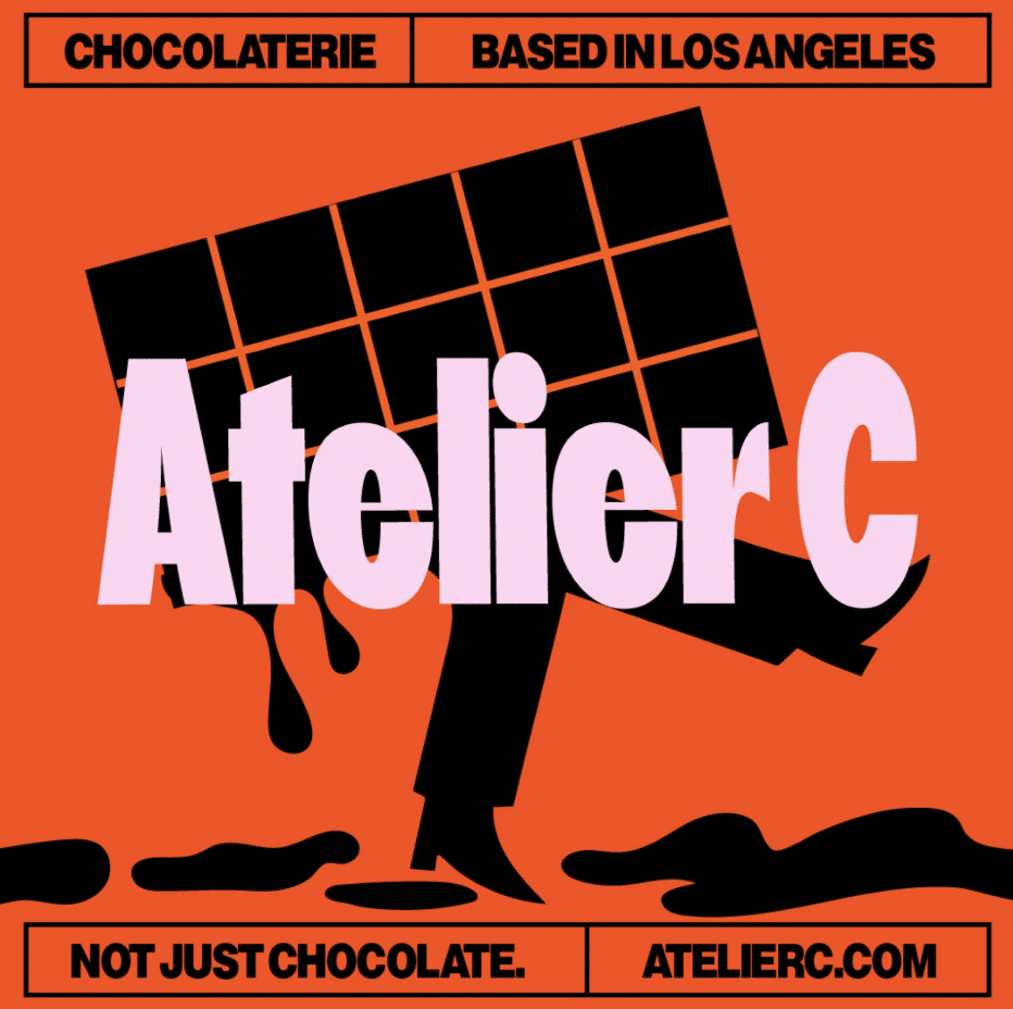
At the center of the brand world is a playful yet premium illustrated character – a melting piece of chocolate with abstract, expressive legs mid-walk. Far from a typical mascot, it embodies forward motion, flavor exploration, and the courage to break convention. Just like the bonbons themselves, this character is unexpected yet refined. It serves as a living metaphor for Atelier C’s vision, signaling that chocolate can have personality, energy, and an unapologetic sense of fun.
Packaging that refuses to blend in
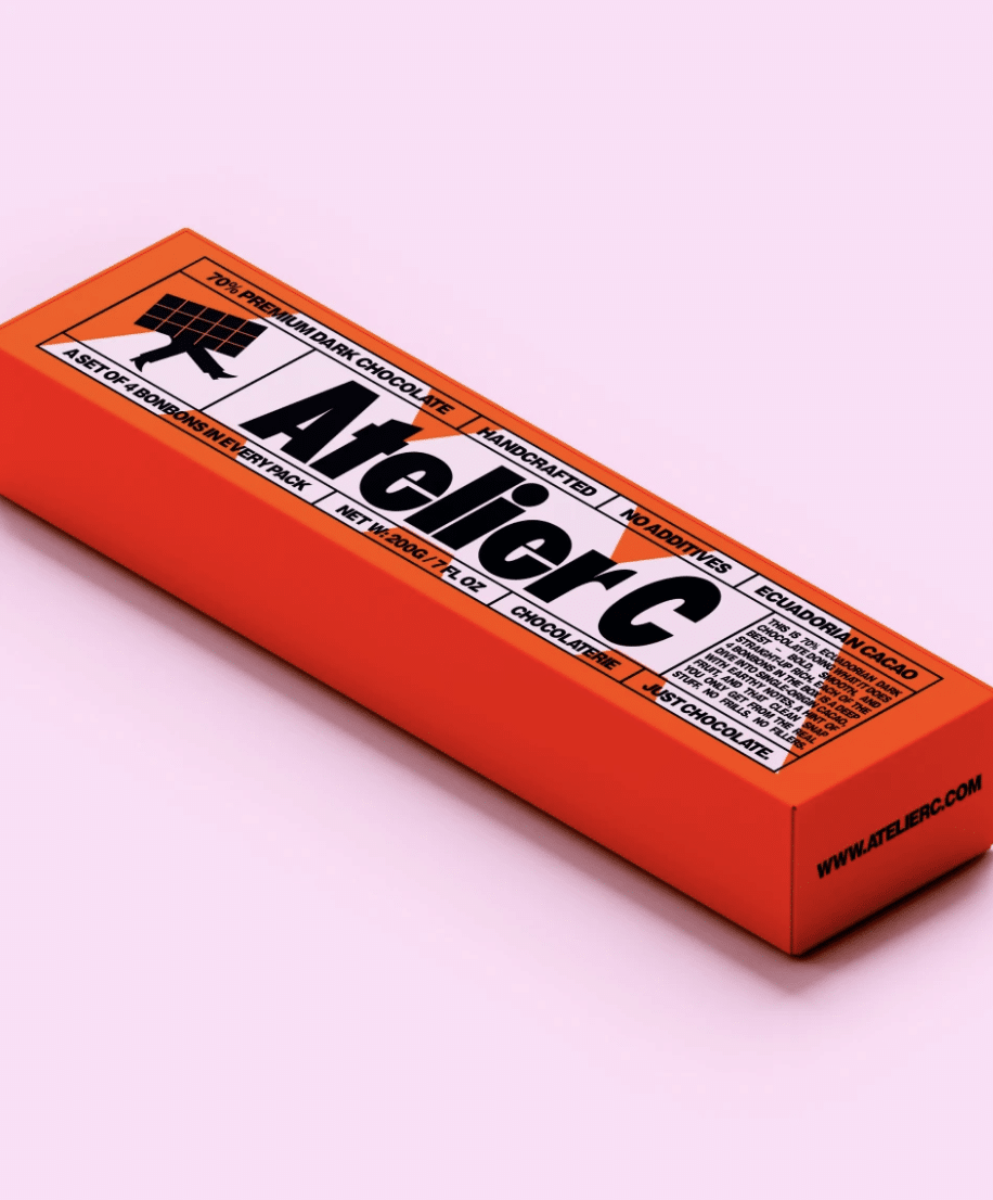
Hrabynska’s design choices lean into a palette that is at once stylish and striking. A punchy pink brings vibrancy and modernity, while deep black anchors the identity with richness and depth. To complete the trio, bright orange injects confidence and creativity. Together, these colors create a visual language that is powerful, stylish, and fearless, echoing the brand’s tagline that “bold is not just allowed – it’s celebrated.”
It tells the world that bold is premium, and chocolate can absolutely walk its own path.
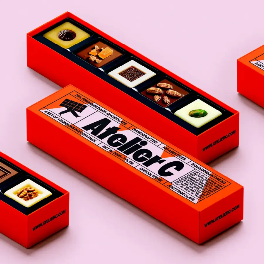
The packaging concept is designed to turn every box into a statement piece. Clean yet disruptive layouts pair bold typography with high-contrast visuals, giving the playful illustration the center stage. The result is packaging that doesn’t just wrap the product – it tells a story. Each box feels like a collectible art object – something worth gifting, photographing, or treasuring. In this way, the packaging amplifies the chocolate’s appeal: indulgence is not only in taste, but also in the experience of unboxing, holding, and sharing. As Hrabynska’s work demonstrates, Atelier C’s design is not an afterthought but an integral part of the brand narrative. “It tells the world that bold is premium, and chocolate can absolutely walk its own path.”
With Atelier C, Hrabynska has crafted more than a brand identity – it has designed an invitation to embrace flavor, personality, and movement. The result is chocolate that feels as contemporary and expressive as the people who enjoy it. By daring to be bold, Atelier C proves that premium chocolate doesn’t have to whisper tradition – it can stride confidently into the future.