Neon has a reputation — and it’s a loud one. It’s bold, unapologetic, and impossible to ignore. The kind of color that doesn’t quietly blend in, but walks into the room wearing roller skates, a spiked collar, and a neon-pink mullet yelling LOOK AT ME. Some hate it, some worship it… yet one thing is certain: just like the cyclical return of platform shoes and synth basslines — neon is back, baby.
And we’re here for it.
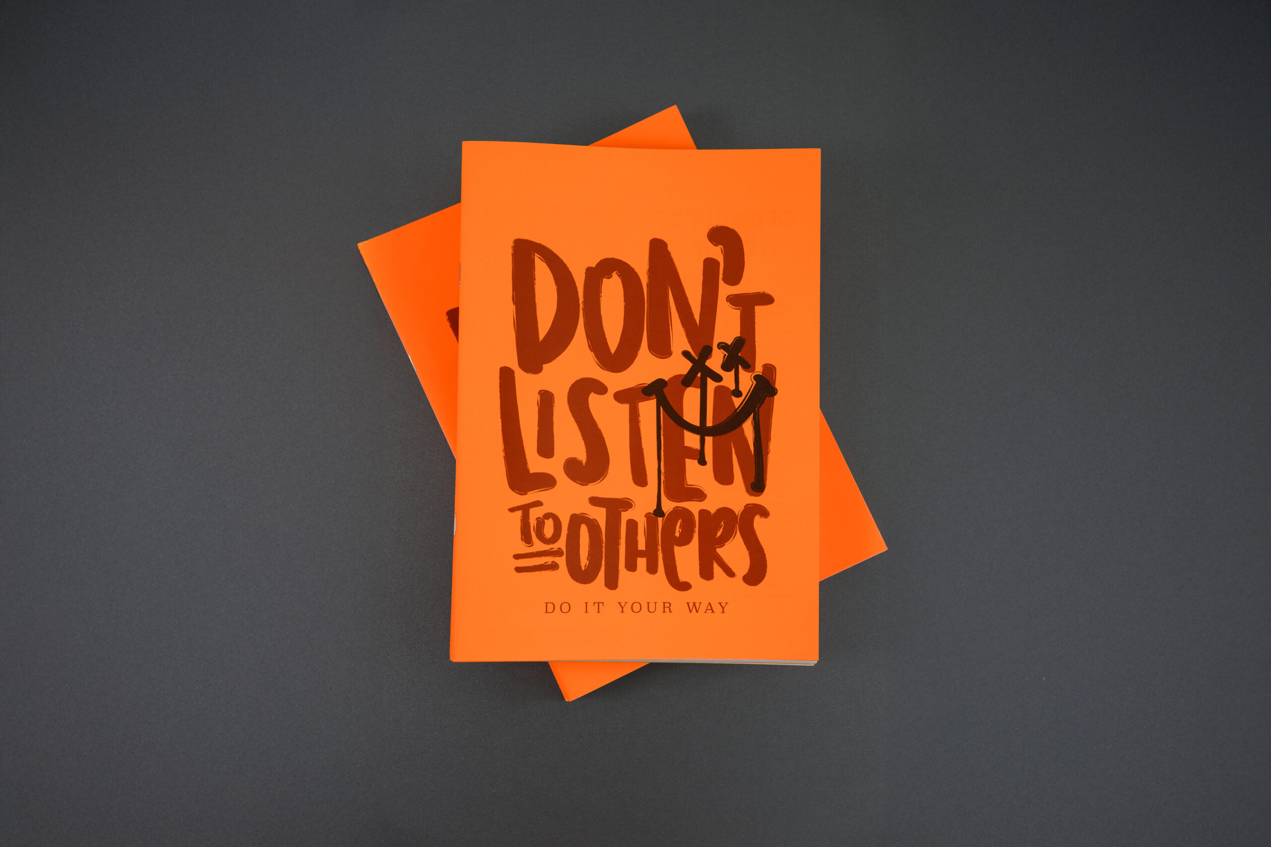
A Love Letter to Rebellion: The New Europapier Neon Brochure
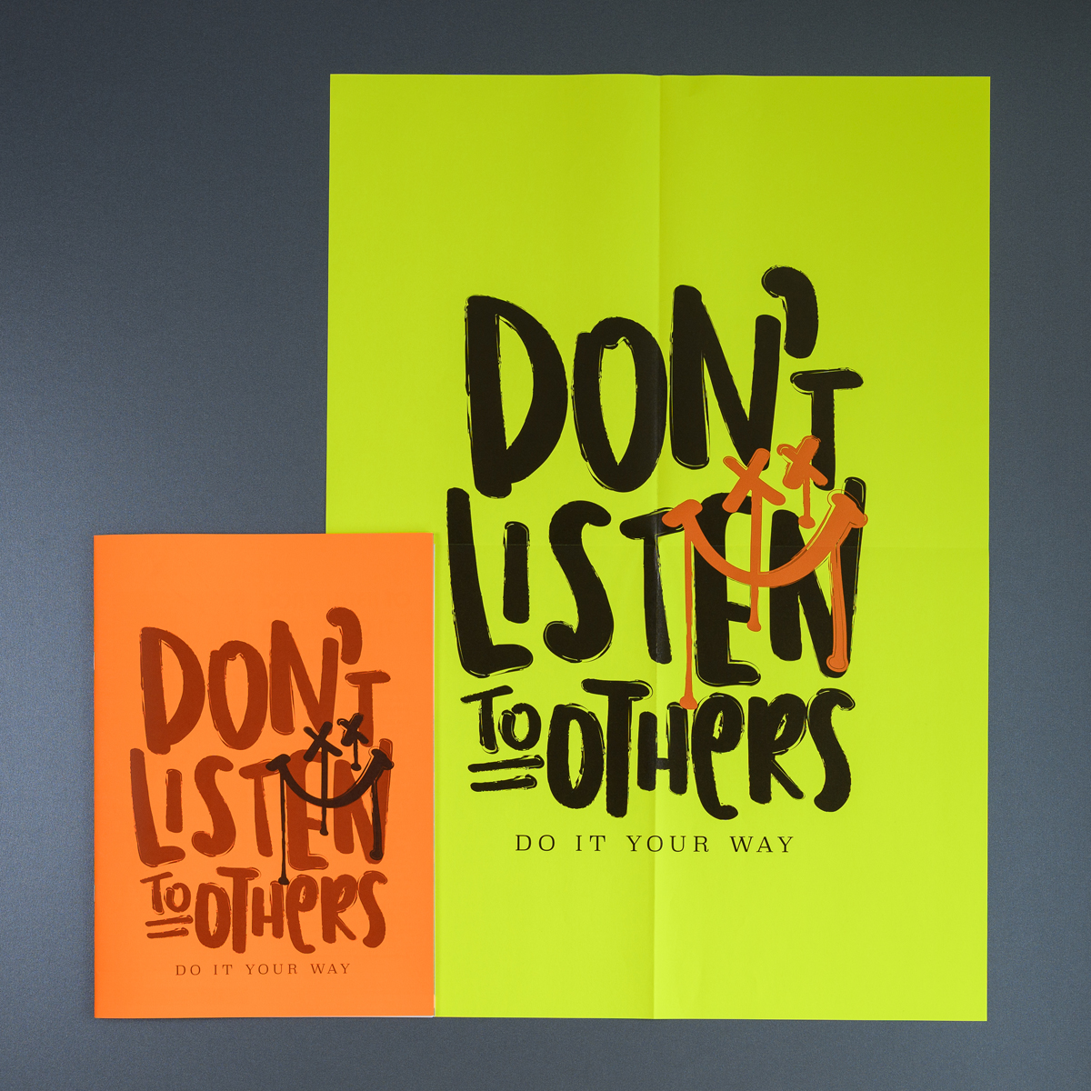
To celebrate neon’s unstoppable comeback, we at Europapier have developed a brand-new brochure with a title that sums up the neon mindset perfectly: DON’T LISTEN TO OTHERS — DO IT YOUR OWN WAY.
Because neon colors aren’t just visual elements — they’re an attitude. A refusal to play it safe. A reminder that creativity thrives in rule-breaking, play, and fearless self-expression. Neon has always been the color language of subcultures: skateboarding, punk, electronic music, surfing, raves, underground festivals, street art, sci-fi arcades, dirt-covered BMX ramps, and sweaty nightclubs bathed in UV light. It’s not clean. It’s not polite. It’s a statement — one that says: “I’m here, I’m loud and I’m not shrinking to fit your expectations.”
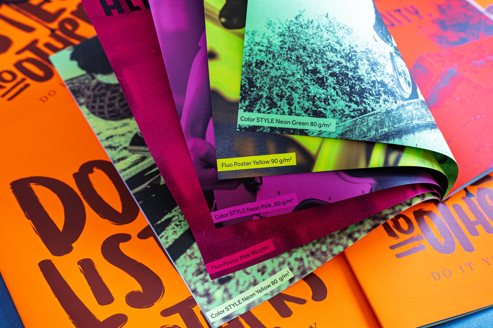
 What’s Inside: Two Neon Paper Collections, One Bold Message
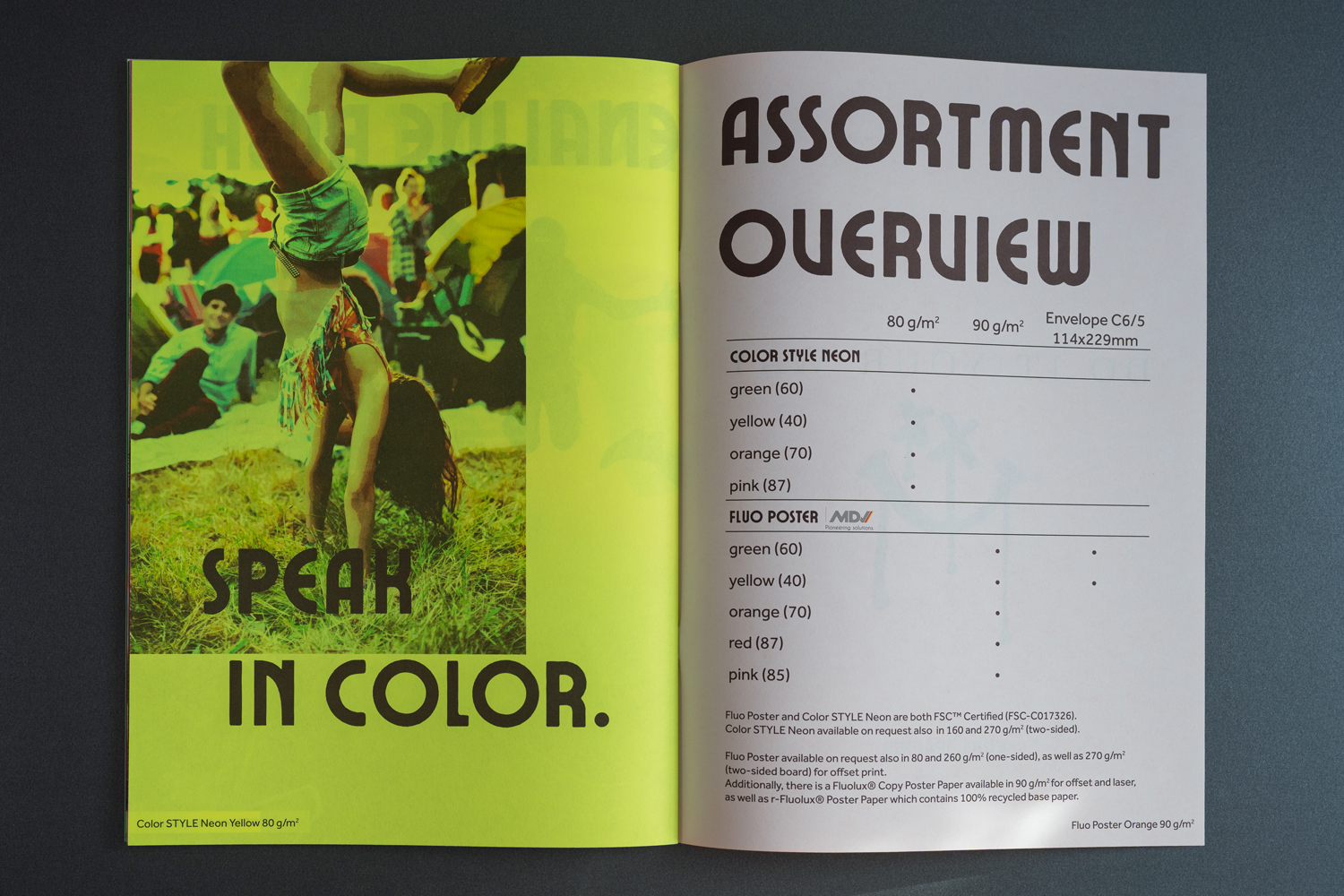
The brochure showcases the two neon assortments available at Europapier, in an attempt to energize, inspire and shake up creativity in designers everywhere:
Fluo Poster. A high-impact fluorescent paper, available in five shades in 90 g/m2, which is designed to stand out. Coated on one side with vibrant fluorescent ink, it features a striking, luminous surface that enhances visibility and grabs attention instantly. Compatible with conventional printing processes, it offers optimal printability and smooth runnability, making it ideal for posters, books, magazines, signage and promotional materials that demand bold, eye-catching colour and professional performance. See all previous articles on it from Design&Paper.
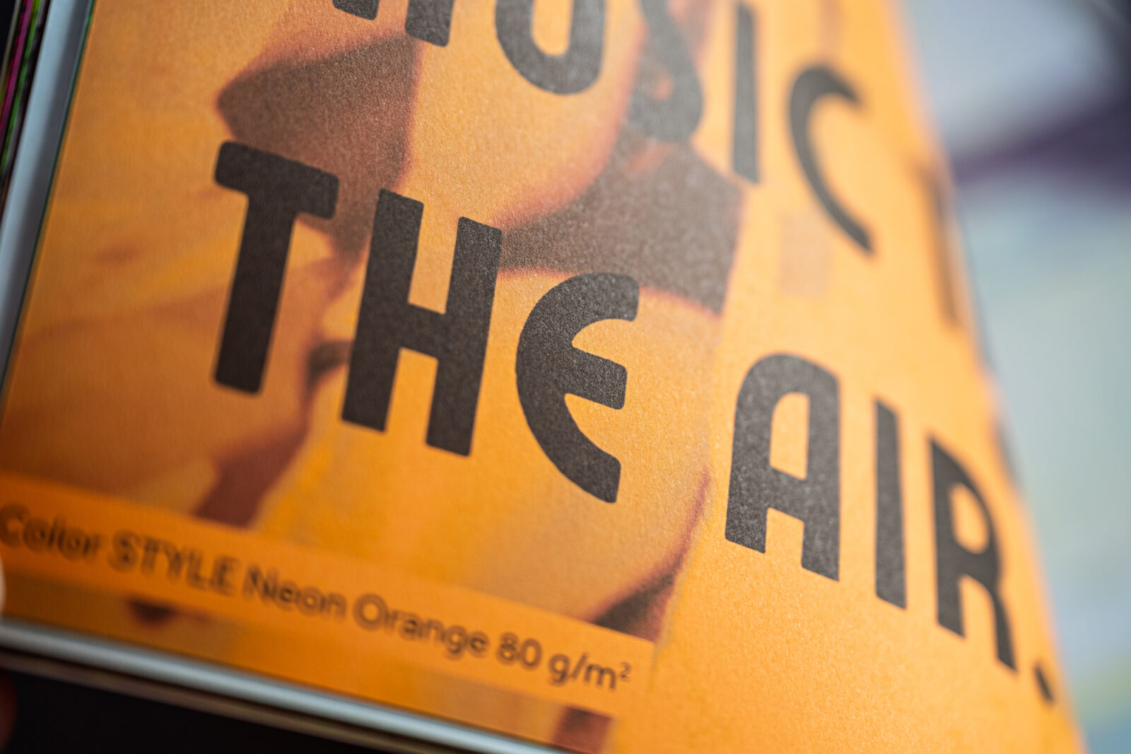
Color STYLE Neon is a premium double-sided fluorescent paper available in four shades in 80 g/m2, designed for vibrant, lasting impact. Its carefully crafted formulation ensures unbeatable lightfastness, preserving the brilliance and freshness of its neon colours over time. Ideal for bold communication tools, attention-grabbing messages, or vivid, publishing tools, Color STYLE Neon delivers consistent quality year after year—perfect for making a statement that lasts.
In total? 36 pages of creative chaos, typographic energy, and unapologetic color.
“Because in a world full of repetition and imitation, there’s nothing more refreshing — or more necessary — than doing things your own way.” -Andra Stingl, Product Manager Design Europapier Group
The brochure is A4 format and printed in offset — proving neon works beautifully in real-world print production. Because neon shouldn’t just live in Pinterest moodboards or digital mockups — it belongs in books, magazines, catalogues, posters, flyers, and tactile creative worlds.
Neon in Publishing — More Than a Gimmick
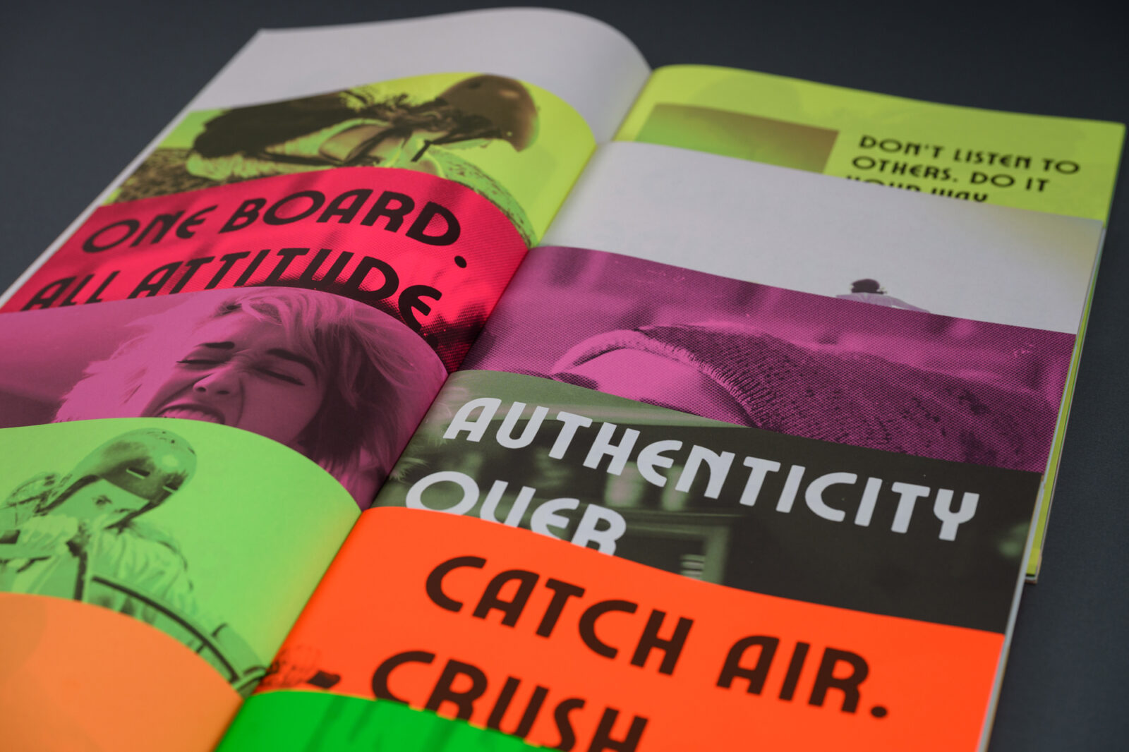
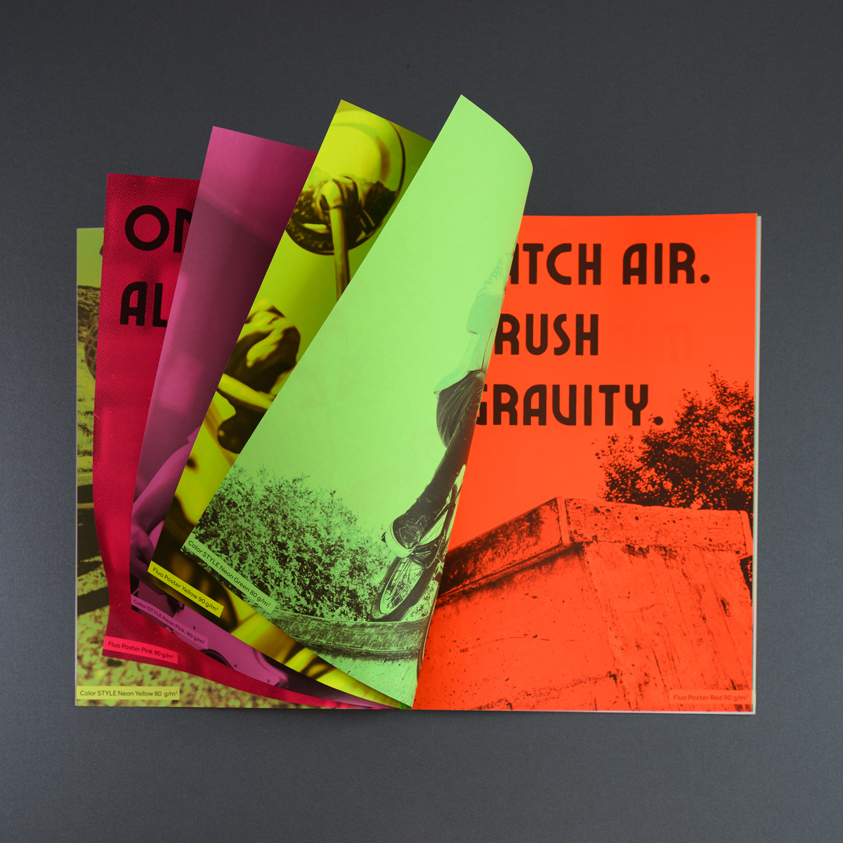
While neon often evokes streetwear runways, nightclub flyers, or skateboard graphics, its role in publishing is growing rapidly — and for good reason. When placed in context, neon doesn’t simply decorate; it transforms. It turns typography into a graphic statement, full-page imagery into immersive experiences, and mixed layouts into dynamic visual storytelling.
The brochure demonstrates that neon isn’t limited to black-only print. With both one-color and four-color printing showcased, it becomes clear that neon can support complexity — and even subtlety — without losing its energy.
In the brochure, neon is presented in multiple forms to show just how adaptable it can be: as large-scale typographic layouts reminiscent of poster culture, as full-spread imagery perfect for editorial or art publishing, and in combinations of text and visuals that remain surprisingly legible and refined. And perhaps most importantly, the brochure demonstrates that neon isn’t limited to black-only print.
With both one-color and four-color printing showcased, it becomes clear that neon can support complexity — and even subtlety — without losing its energy.
In publishing, where emotion and communication meet on the printed page, neon feels more relevant than ever.
What emerges is a powerful reminder: neon isn’t just a trend—it’s a statement here to stay. A design language capable of emphasizing hierarchy, mood, urgency, or playfulness. When thoughtfully applied, it brings clarity and attitude at once. In publishing, where emotion and communication meet on the printed page, neon feels more relevant than ever.
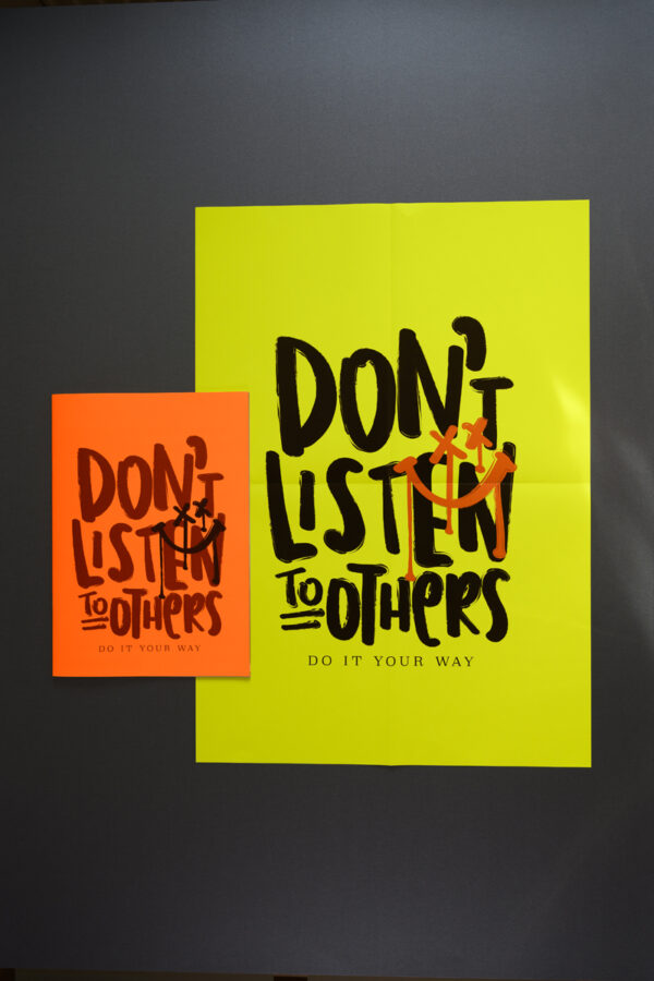
The Poster: A Loud Invitation to Break Rules
At the very heart of the brochure lies a surprise — a bold, unapologetic poster printed in UV offset, inserted like a spark of rebellion waiting to be discovered. It mirrors the headline from the cover, reinforcing the message: DON’T LISTEN TO OTHERS — DO IT YOUR OWN WAY. This is more than just a printed extra — it’s a manifesto disguised as a design object.
The poster serves as a reminder of why neon resonates so deeply with creativity: because it refuses to behave. It takes up space. It demands attention. It celebrates the fearless spirit of experimentation that drives publishing, graphic design, art, and subcultures alike.
Whether you frame it in your studio, tape it to a wall at the office, or pin it to your studio corkboard, the intention remains the same: let it accompany you as a visual nudge to resist conformity and embrace bold ideas. Creativity isn’t tidy — and neon shouldn’t be either.
Neon Is Not Just Trend — It’s Energy
From streetwear to branding, from festival graphics to book covers — neon is popping up everywhere again. Fashion knows it. Print designers feel it. And now publishing is ready for it. Because sometimes the world is too grey, too expected, too quiet.
And print — real, tactile, emotional print — deserves to be loud again.
So, what happens next?
We hope this brochure energizes designers, artists, publishers, and printers to step into neon with confidence. To use it fearlessly. To experiment. To break rules. To push boundaries. Because in a world full of repetition and imitation, there’s nothing more refreshing — or more necessary — than doing things your own way.