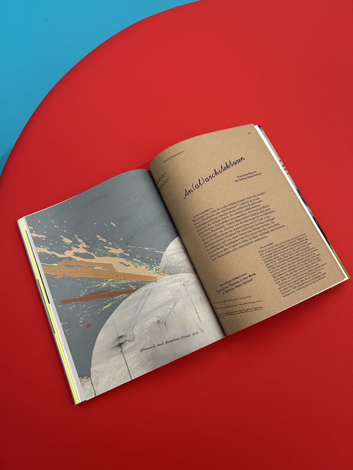
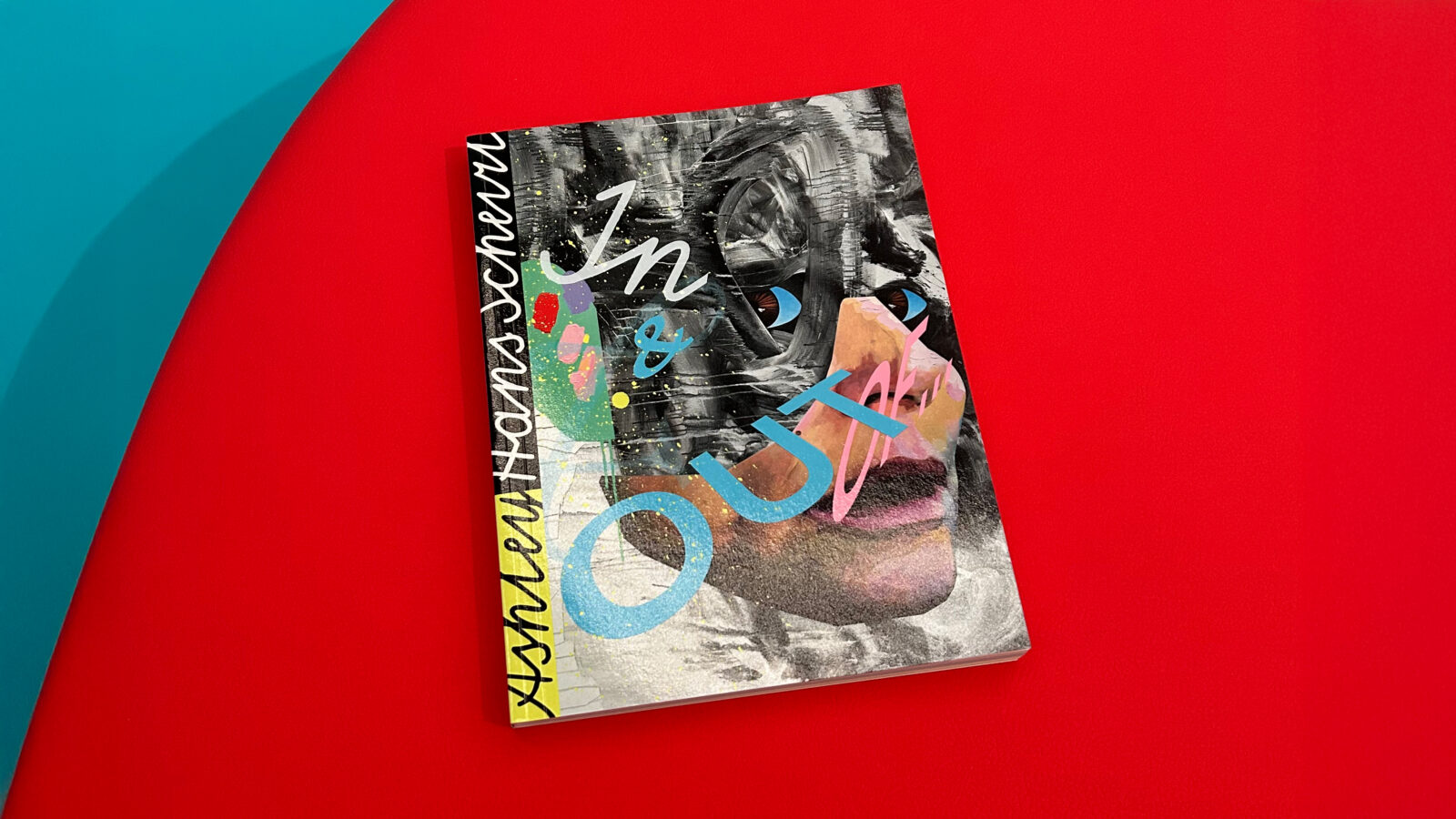
Exhibition catalogues often aim to capture a moment in time, fixing artworks into a specific narrative. Yet some resist this stillness, carrying forward the energy and unpredictability of the practice they represent. In & Out of Painting — published on the occasion of the major retrospective of Ashley Hans Scheirl at Belvedere 21 — belongs to the latter category. Much like Scheirl’s practice, the book resists containment. It is not a linear retrospective, but a vivid, multi-layered object that traces a trajectory from the 1970s to the present, weaving together decades of artistic experimentation across painting, film, performance, and sound. The result is a publication that feels as fluid and boundary-breaking as the work it presents.
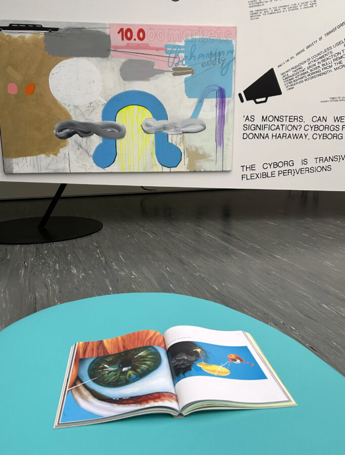
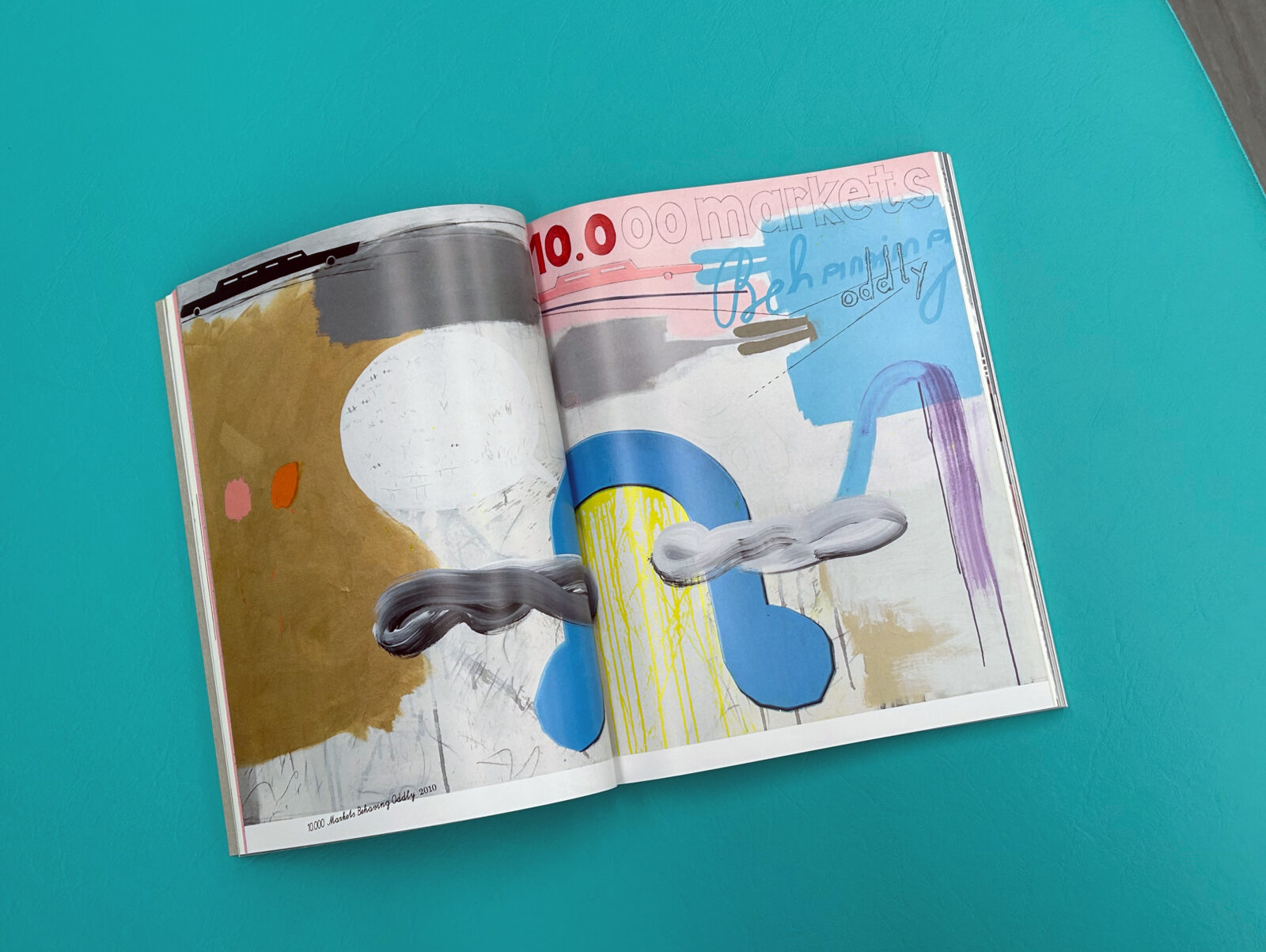
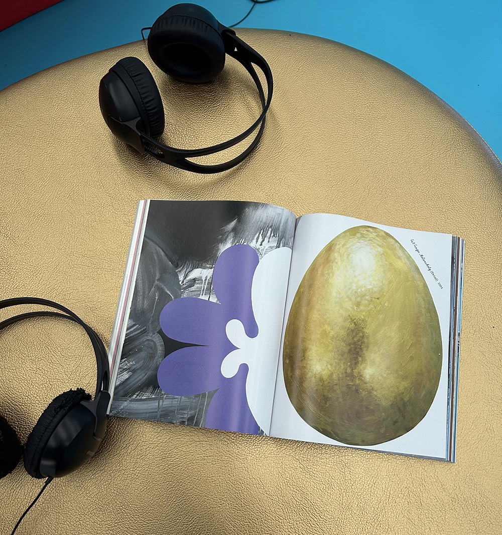
For decades, Ashley Hans Scheirl has shaped contemporary art through a practice that is as political as it is aesthetic. Moving effortlessly between disciplines, her work challenges fixed ideas of gender, identity, and artistic categorisation. Painting, when it takes centre stage, does so with a fearless hybridity, drawing from Abstract Expressionism, Photorealism, Pop Art, Surrealism, and the raw energy of Bad Painting. The catalogue mirrors this refusal of binaries. Rather than imposing order, it embraces multiplicity, offering a sweeping view across more than 120 works while still leaving space for ambiguity, contradiction, and play.
If Scheirl’s work is known for its boldness, the book’s material choices respond in kind.
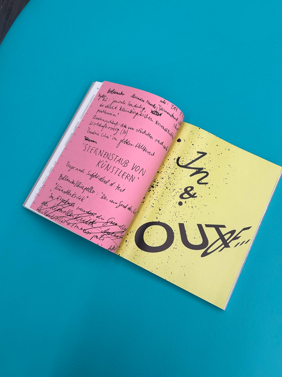
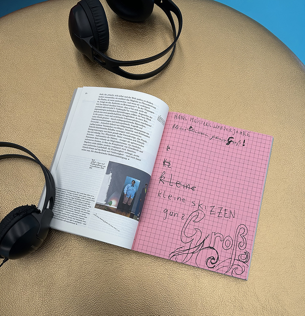
At the catalogues’ core, Munken Pure 100g provides a calm, uncoated foundation for Scheirl’s work, with its soft, natural feel allowing images and text to breathe. But this neutrality is deliberately disrupted by the insertion of vividly colored papers: IQ Color Pink and Medium Blue 80g, alongside the striking Color STYLE Neon Yellow 80g. The effect is immediate and unapologetic.
These color accents do more than structure the book. They energise it. Pages shift suddenly from quiet reflection to saturated intensity, echoing the artist’s own visual language. The palette feels instinctive rather than decorative, aligning with Scheirl’s bold, intuitive approach to image-making.
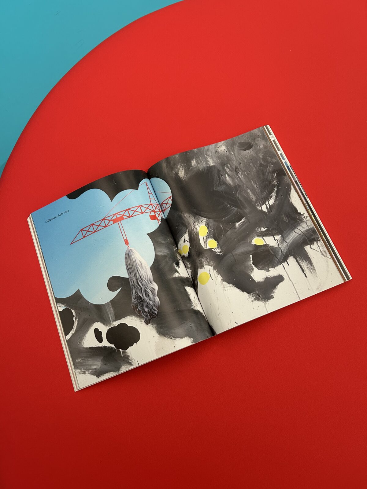
Among these materials, Color STYLE Neon Yellow stands out as a particularly expressive choice. More than just a bright surface, it carries a unique physical presence. Its remarkable lightfastness ensures that the neon intensity remains stable over time, preserving the sharp, almost electric quality of the color.
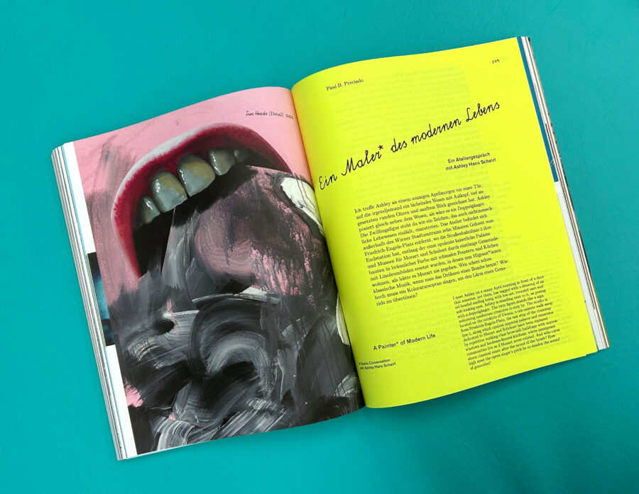 Among these materials, Color STYLE Neon Yellow stands out as a particularly expressive choice. More than just a bright surface, it carries a unique physical presence. Its remarkable lightfastness ensures that the neon intensity remains stable over time, preserving the sharp, almost electric quality of the color. Whether used for section dividers, visual interruptions, or graphic emphasis, it commands attention without apology. There is something inherently performative about neon in print. It does not sit quietly on the page, but insists on being seen. In this context, it feels entirely at home. Scheirl’s work has always embraced visibility, confrontation, and transformation, and the paper follows suit.
At its heart, the In & Out of Painting catalogue is a reminder of how closely material and meaning can align.
The choice of papers is not simply aesthetic, but conceptual. The bold palette reflects a body of work rooted in queer-feminist and transgender counterculture, one that has consistently challenged norms and expanded the possibilities of artistic expression. The shifts in colour and texture mirror shifts in identity, medium, and perspective. It is a book that does not aim to smooth over complexity. Instead, it amplifies it.
In & Out of Painting feels less like a fixed document and more like an extension of Scheirl’s practice — open, fluid, and constantly in motion. It captures not only what has been, but what continues to evolve. In the end, this is what makes the catalogue so compelling for us; it understands that print can do more than record. It can translate energy. It can embody attitude. It can challenge the reader to engage differently. And in doing so, it proves that even within the format of a book or catalogue, there is always space to move in — and out — of painting.