
As 2025 draws to a close, it’s clear to us how many amazing paper and print projects have shaped the past year and continued to evolve the role of paper, far beyond its traditional role. There are, of course, dozens of examples worthy enough to showcase, but we’ve selected our top six most compelling projects that truly reveal a renewed confidence in tactility, material storytelling, and the emotional power of well-crafted paper and print project.
Across mediums, from books and magazines, to professional paper tools and collections, designers and brands have leaned into paper as both medium and message — embracing bold and unique material and print choices, refined minimalism in a new way, and experimented with formats that speak to a growing desire for authenticity and exploration. The following six standout projects exemplify how the paper and print culture in 2025 balanced innovation with craft, and concept with material intelligence.
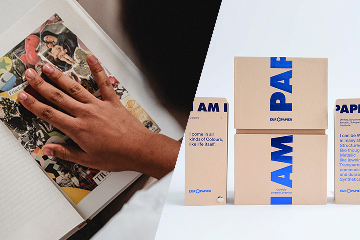
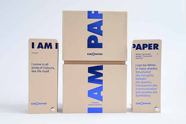
I AM PAPER: Europapier’s 8th Edition Design Papers Collection
With their eighth edition of the Design Papers Collection, Europapier once again demonstrated how a paper collection can function as a creative manifesto. I AM PAPER is more than a sample book, the project was conceived as an immersive exploration of paper’s expressive potential — inviting designers to see each sheet as a personality rather than a substrate. A carefully curated paper collection wrapped in bold graphic design that utilizes thoughtful print techniques works together to highlight contrast, texture, and tone. The collection reflects a broader 2025 trend: paper presented not as a neutral background, but as an active design partner that shapes meaning and emotion from the very first touch. Read more here.
lahnur® in Action: When the Material Becomes the Message
The reimagined lahnur®, a cellulose-based material combining tactile finesse, strength, and sustainability, pushes the idea of material-led storytelling to its extreme by placing the spotlight squarely on the paper itself. A series of striking applications showcase how allowing the distinctive qualities — strength, tactility, and visual depth — of the paper be the driving force of the entire design concept can define both the aesthetic and narrative success ofthe project. In a year marked by growing material awareness and sustainability-minded design decisions, lahnur® stands out as a clear example of how paper can communicate values, not just carry content. Read more here.
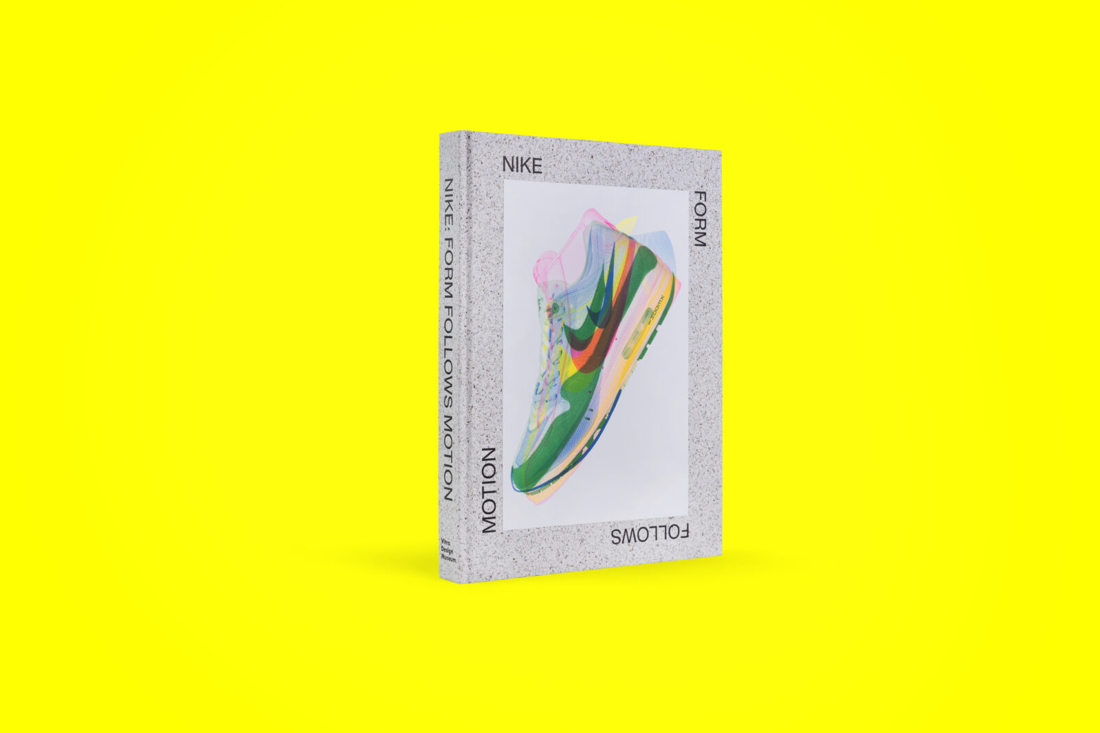
Nike: Form Follows Motion – A Landmark Exhibition and the Catalog That Captures It All
The Form Follows Motion exhibition at Vitra Design Museum catalog translated the dynamism of Nike’s design philosophy into a printed object with remarkable precision. Conceived as a lasting counterpart to a high-energy exhibition, the catalog used layout, imagery, and paper selection to echo movement, innovation, and performance. Layered visuals and tactile contrasts created a rhythm that mirrors athletic motion, proving that print can successfully capture experiences often considered fleeting or digital-first. In 2025, this project reaffirmed the role of print as a powerful archival and interpretive medium. Read more here.
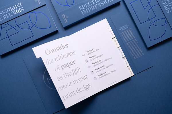
Spectrum of Impressions: Your Pergraphica Go-To Guide for Premium Print
The Spectrum of Impressions: The Print Book functions both as an inspirational guide and a practical design tool in helping you explore the full creative potential of PERGRAPHICA® papers. Built around the idea of showcasing nuance — across color, surface, and print technique — the project celebrates precision and consistency in premium print. Its clean structure and confident visual language allowed the material qualities of the PERGRAPHICA® papers to take center stage. At a time when designers increasingly demand reliability without sacrificing creativity, the Print Book at the heart of Mondi’s Full Spectrum Feels campaign, is all about rediscovering the emotional and sensory power of print. Read more here.
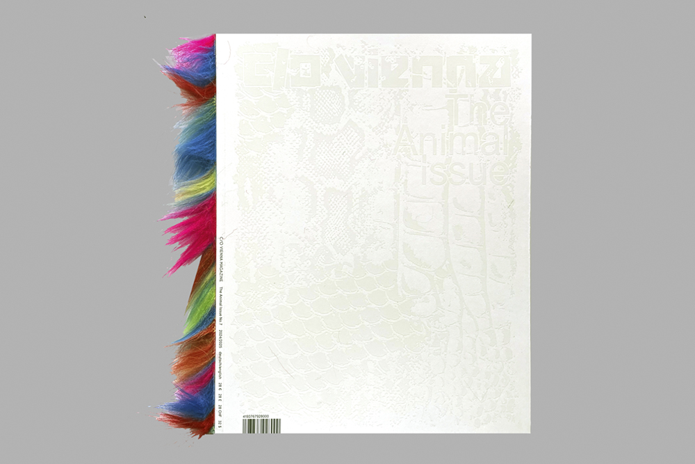
The Untamed Pages of C/O Vienna Magazine’s Animal Issue No. 7
℅ Vienna Magazine’s Animal Issue No. 7 embraced raw energy and visual intensity, translating its theme into a tactile, editorial experience. The publication’s bold imagery, experimental layouts, and material contrasts reinforced its exploration of instinct, nature, and the untamed. Paper choices played a crucial role in amplifying the emotional impact of the content, turning each page turn into a sensory encounter. In a year where independent magazines continued to push boundaries, this issue stood out for its fearless approach to both concept and craft. Read more here.
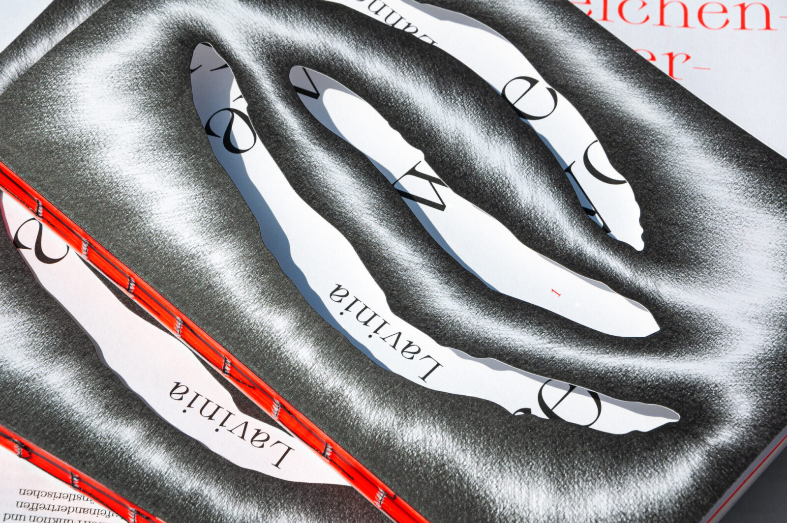
Only Draw When You Are Tired: The Artful Minimalism of Lavinia Lanner
Unique, restrained, and deeply personal, Only Draw When You Are Tired offered a counterpoint to the more expressive projects of 2025. Centered on the work of artist Lavinia Lanner, the publication designed by solo ohne embraced minimalism as a form of intensity rather than reduction. Subtle design decisions, generous white space, and carefully chosen paper created an intimate reading experience that rewarded slow engagement. The project reflected a growing appreciation for softness, slowness, and introspection in print, proving that impact does not always require loud gestures. Read more here.
A year defined by material thinking!
Taken together, these projects tell a clear story about 2025: paper matters more than ever. Whether through bold experimentation or quiet refinement, each project demonstrates a deep respect for the medium, its process, and purpose. As we look ahead, these works serve as benchmarks for what thoughtful, future-facing print can be — rooted in craft, enriched by concept, and made memorable through the intelligent use of paper.