After a dramatic, tumultuous year, we’re all yearning for some tranquility and peace of mind. In graphic design, this means we’re switching the bold and bright color schemes to something more reserved and harmonious, and in fact, the trend forecasters say, in 2021, vivid colors are going to be replaced by more muted color palettes across the board. 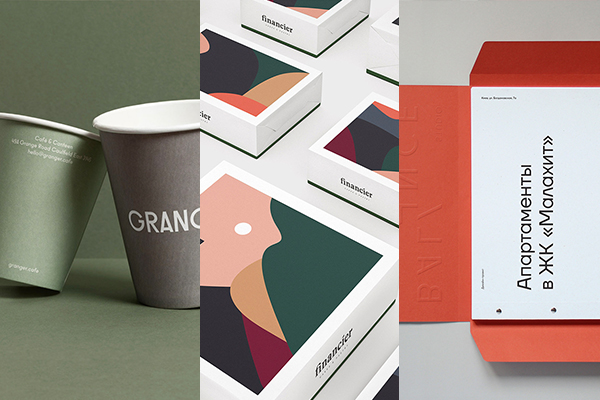
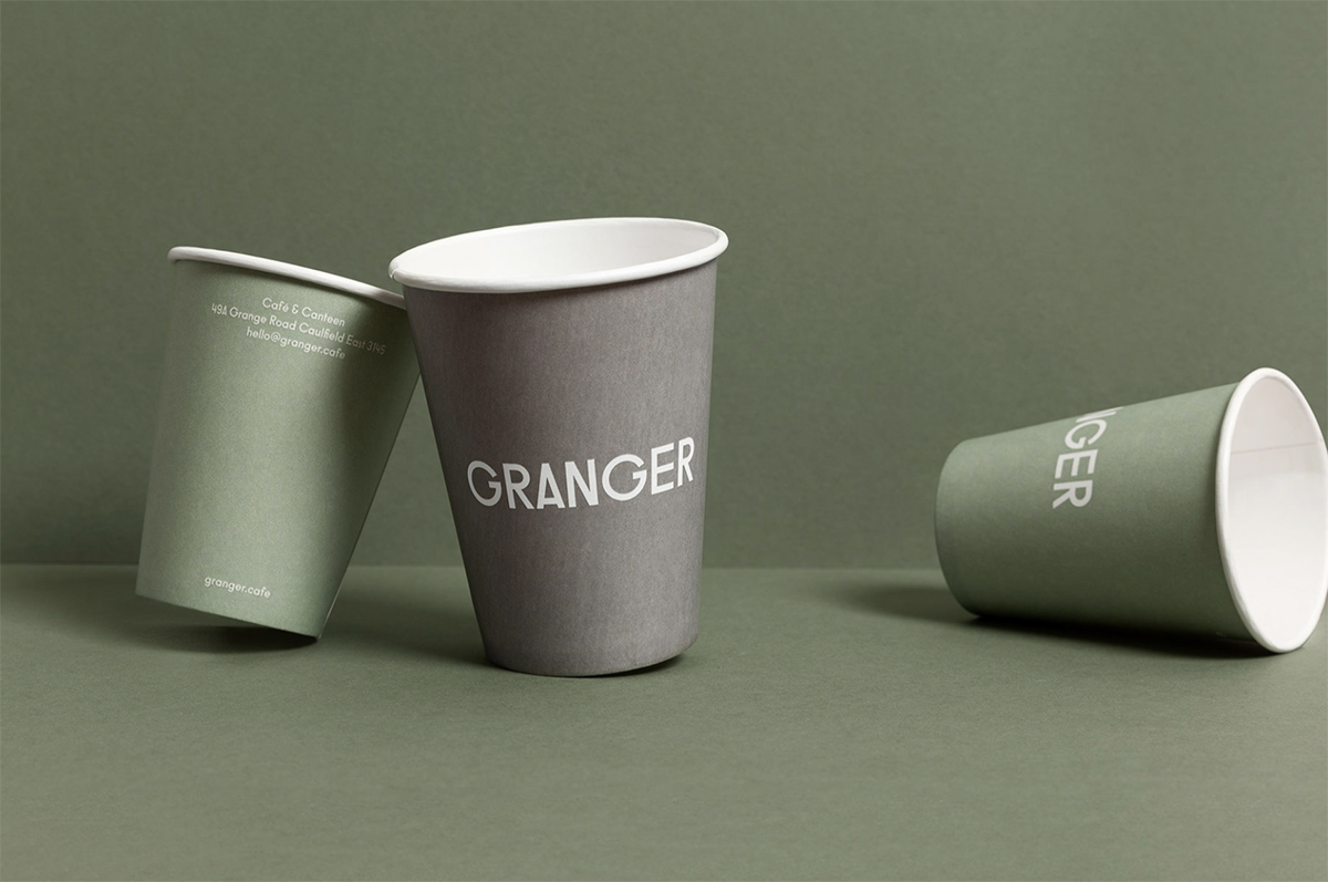
Grayed, dulled, or desaturated colors have a calming, genuine effect
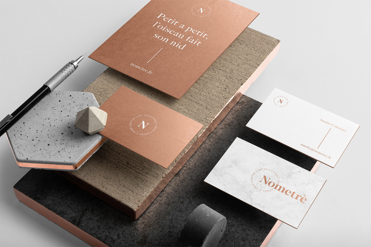
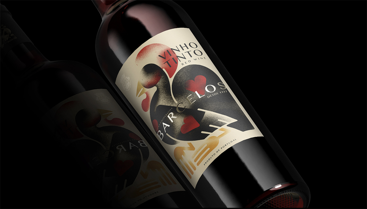
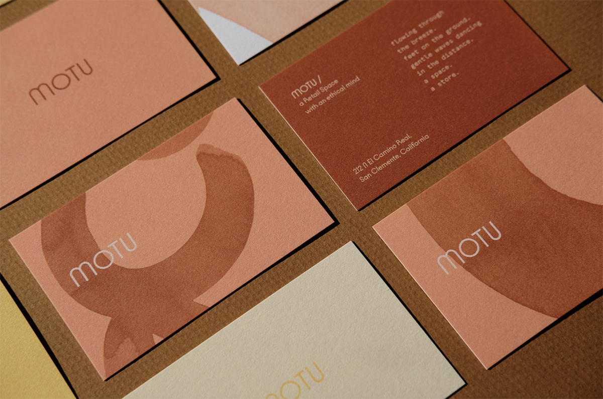
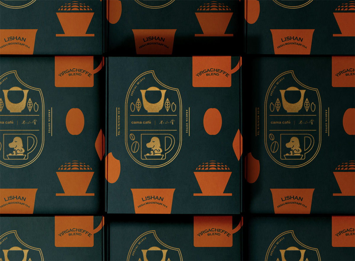
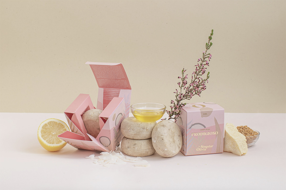
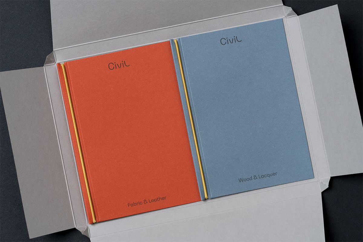
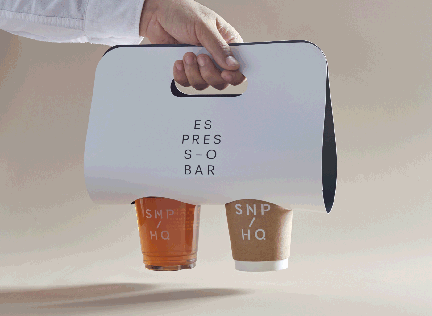
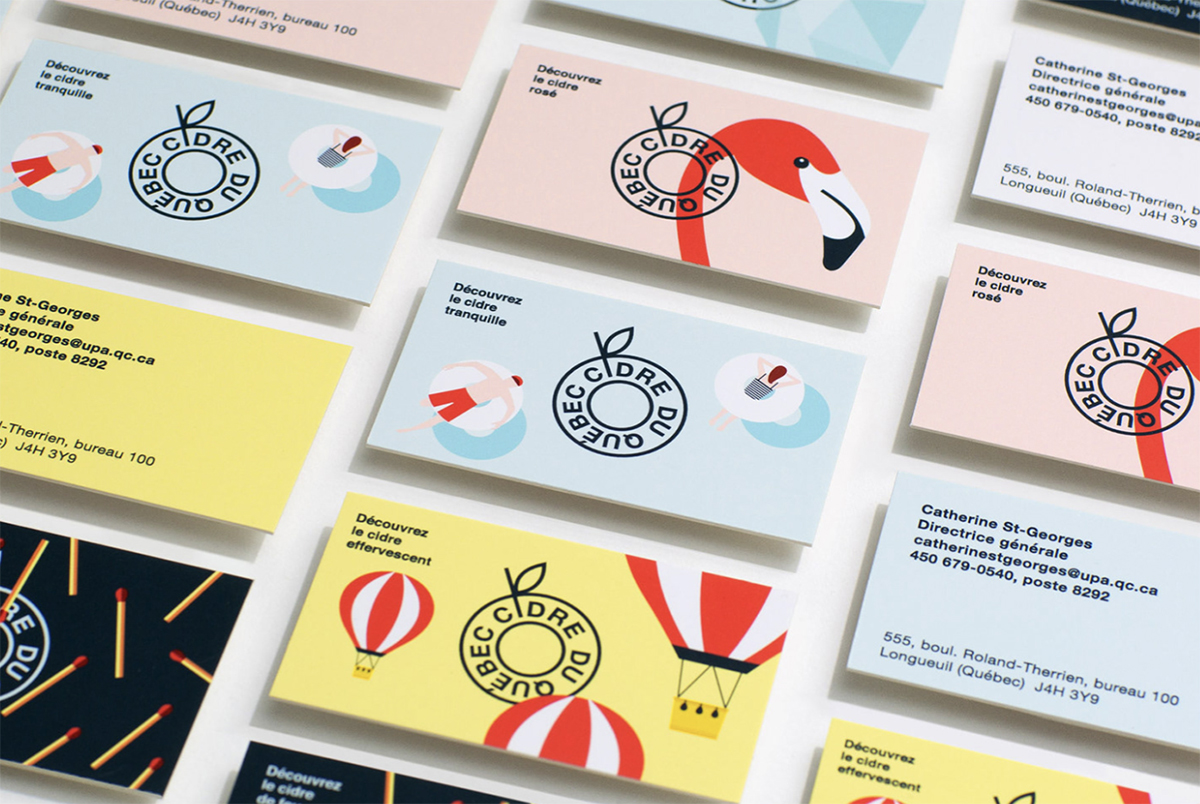
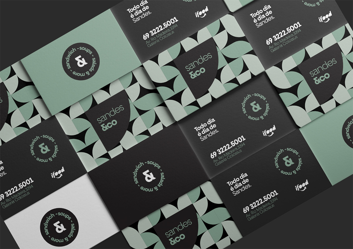
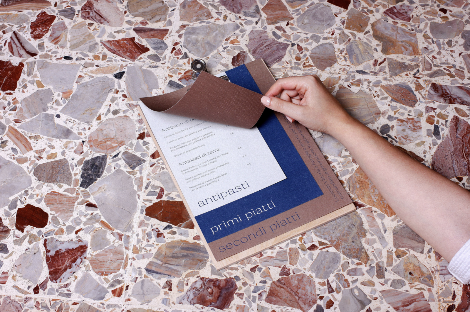
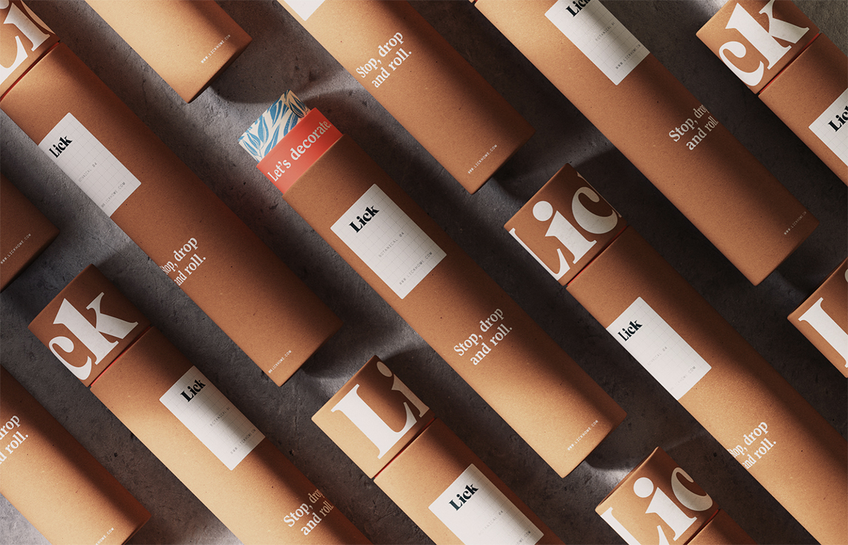
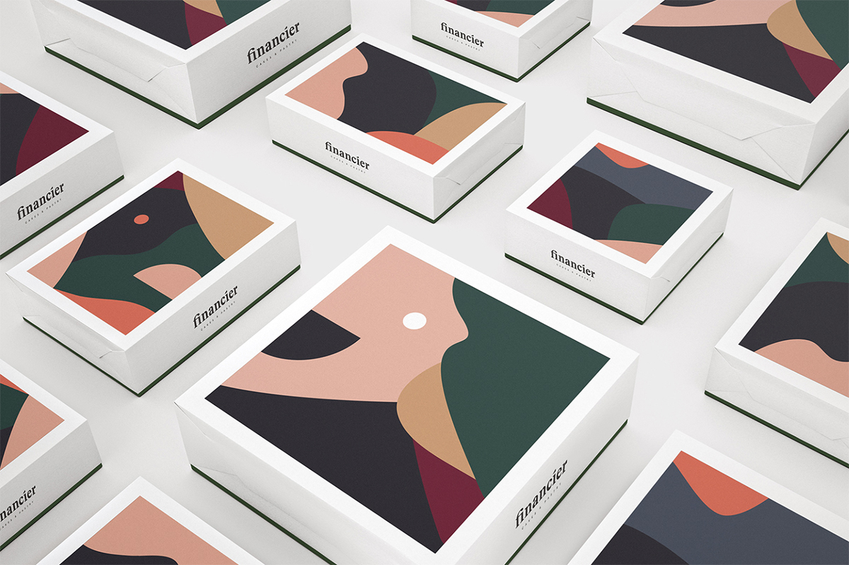
Muted colors are the opposite of vivid colors, and they are created by simply adding black, white, or complementary colors to a base color, making them grayed, dulled, or desaturated. “Muted colors” refers to colors that have a low saturation or chroma. And in contrary to the somewhat boring-sounding explanation, they are everything but. Muted colors do not mean “colorless” or gray – but the range of shades is toned down to have a more calming effect, as muted colors can feel safe, familiar, nurturing, and disarming, while also very modern and genuine.
Muted colors do not mean “colorless” or gray – but the range of shades is toned down to have a more calming effect, as muted colors can feel safe, familiar, nurturing, and disarming, while also very modern and genuine.
And while vivid colors are not totally forgotten, they are far more effective to be used sporadically, in combination with muted tones. When you use a base of muted colors in anything from branding and packaging to illustration, you can have much more control over where you direct the user’s attention, by using a small amount of a contrasting vivid color.
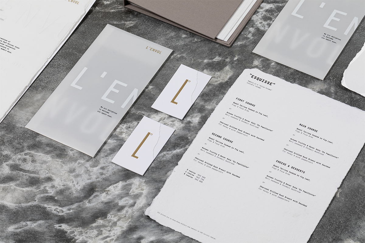
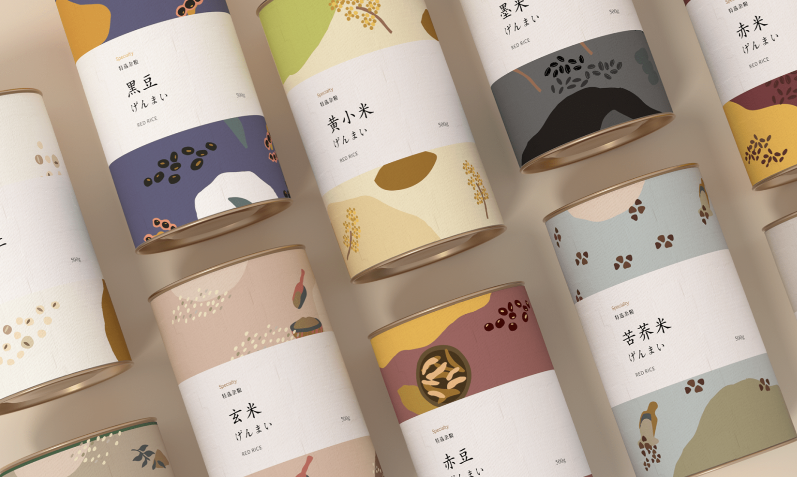
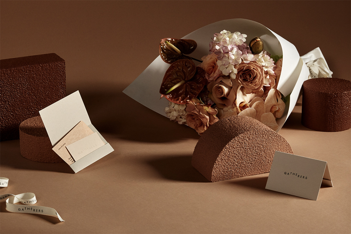
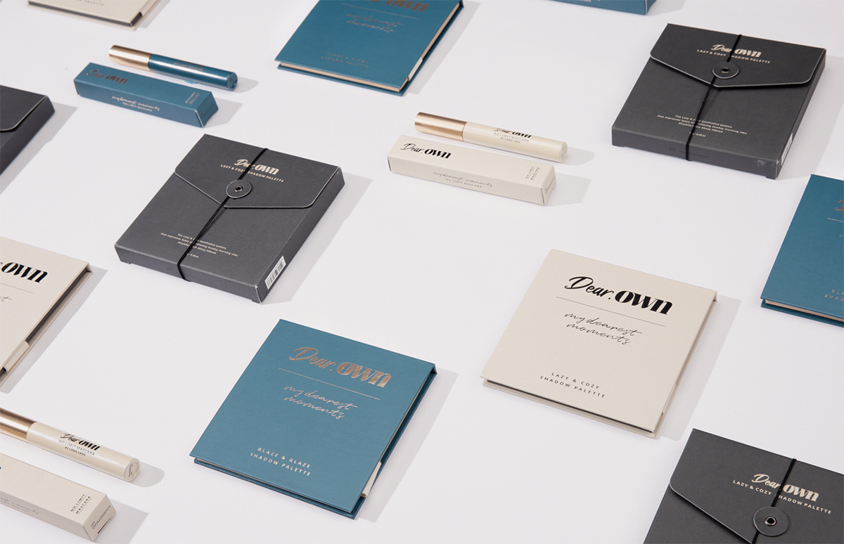
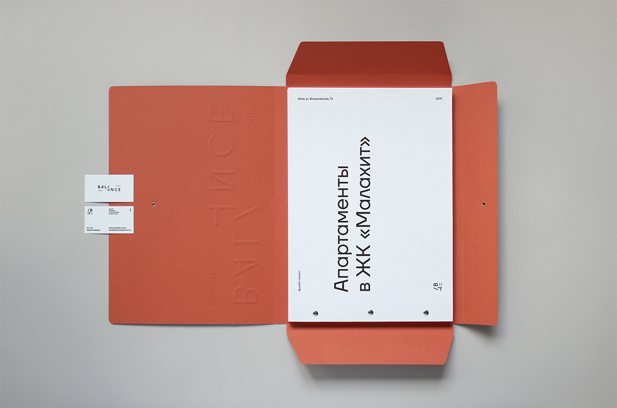
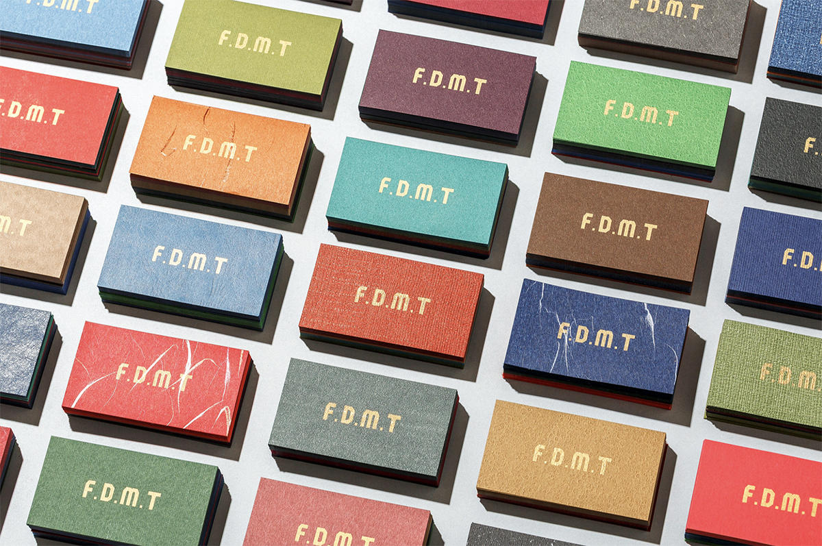
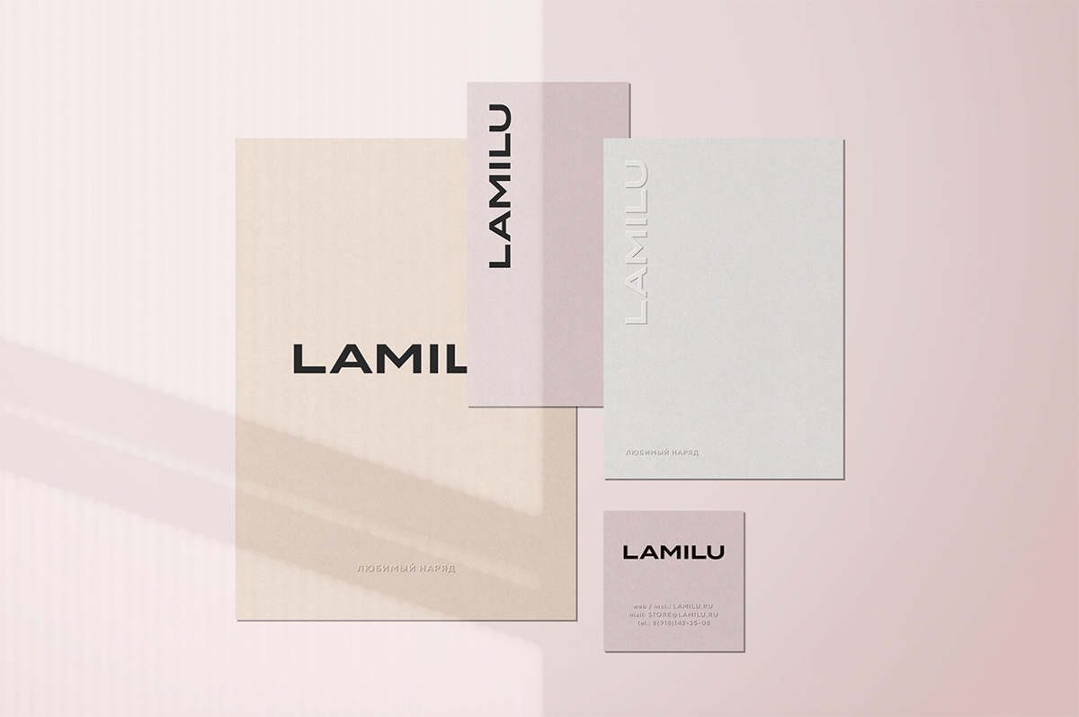
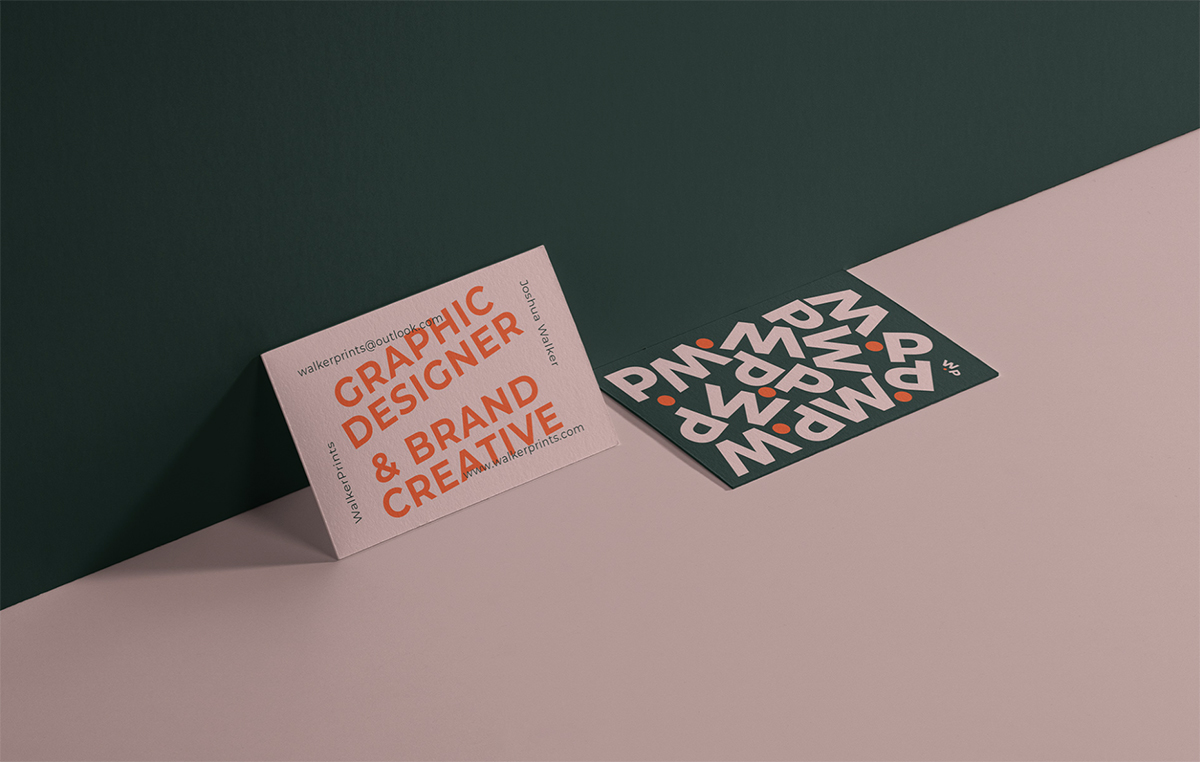
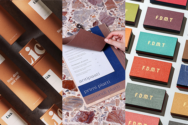
Here are twenty-one branding and packaging concepts realized in harmonious, calm, and collected color schemes, showcasing the power of neutral tones.