How do you know it’s the end of October? Orange rules color palettes everywhere! From branding and packaging designs inspired by the range of reds, yellows, and oranges in full bloom in nature, to the pumpkins turned into glowing jack-o’-lanterns. Inspired by the autumn harvest season, and Halloween of course, we’re taking a closer look at how this vivid – and oh so bold – hue has become a design darling in the branding and packaging world. After all, orange isn’t just in trend right now. It’s fearless all year round!
A color with zest!
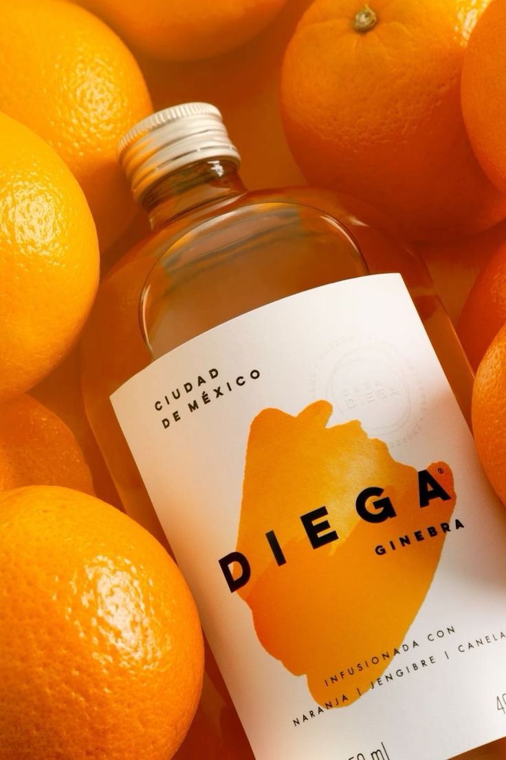
Orange is the chromatic equivalent of optimism. It radiates warmth, creativity, and confidence. It qualities what brands love to embody. In color psychology, it strikes a perfect balance between the passion of red and the joy of yellow, producing a hue that feels both exciting and approachable. Whether it’s a burnt sienna that adds a whisper of sophistication, a bright tangerine bursting with energy and zest, or a soft coral offering gentle modernity, every shade of orange tells a story. It’s the design world’s way of saying: “Let’s squeeze the day. Let’s make the most of it.”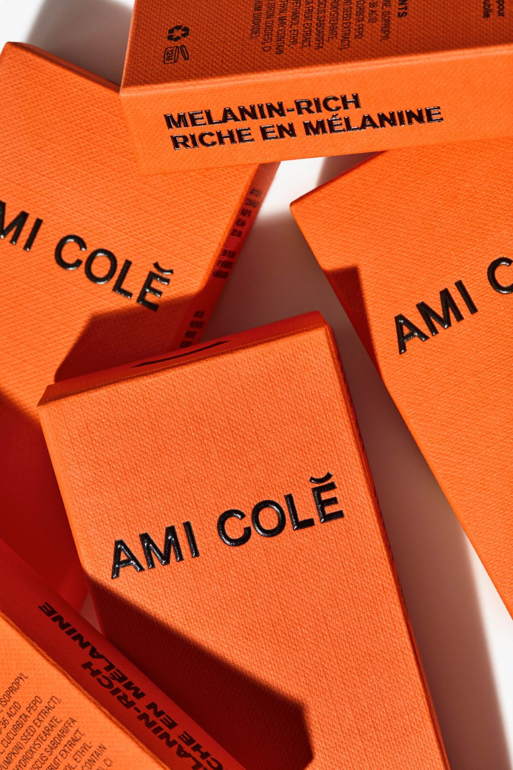
Orange has long been the go-to color for brands that want to make a friendly yet unforgettable impression…It tells your audience, “This brand is alive, imaginative, and ready to play.”
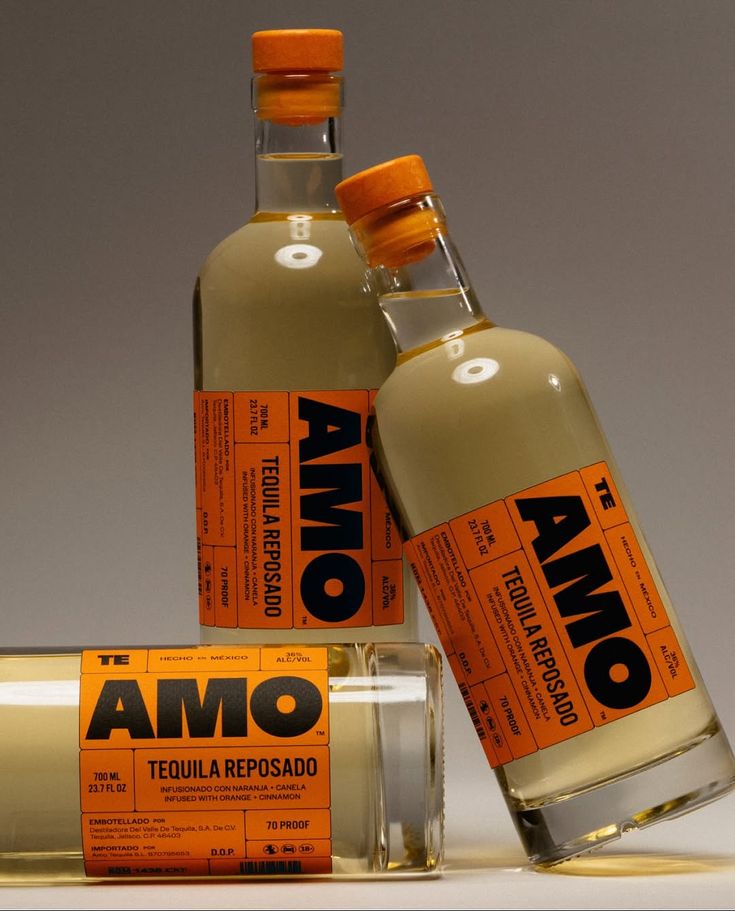
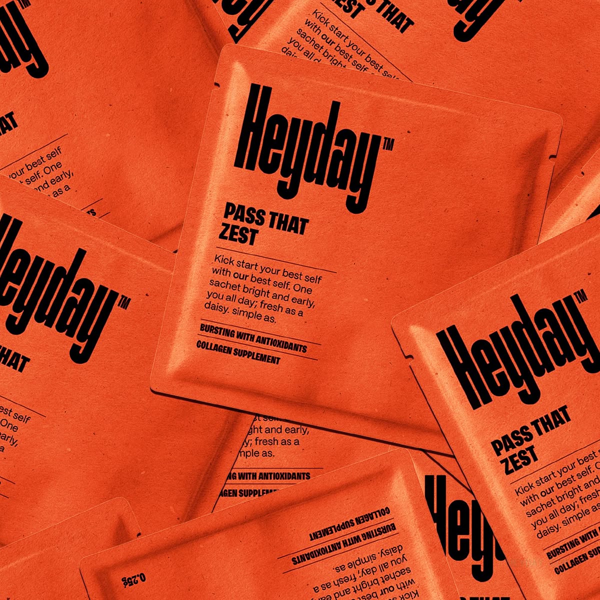
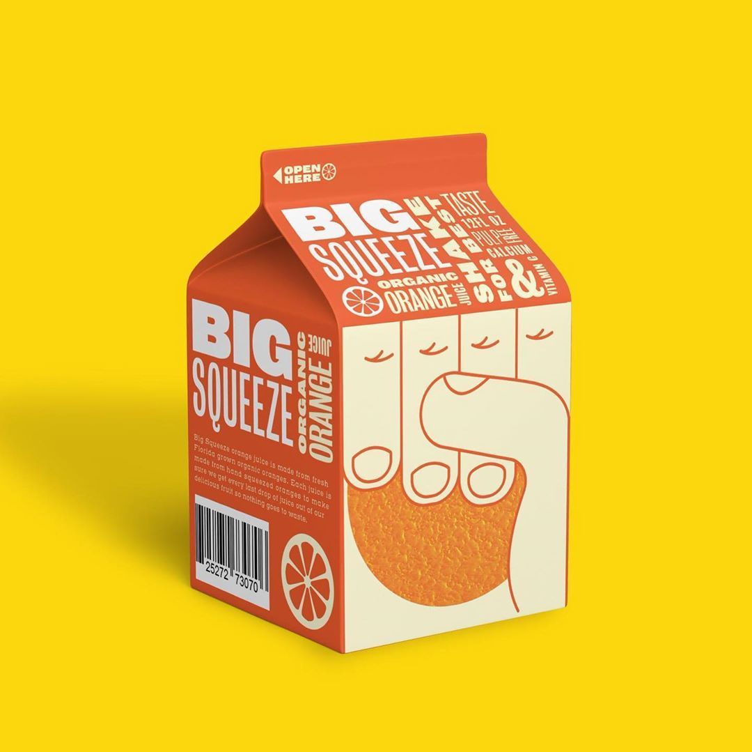
Orange has long been the go-to color for brands that want to make a friendly yet unforgettable impression. Think Fanta’s bubbly exuberance or Harley-Davidson’s gritty confidence. The hue signals creativity, courage, and connection. It’s approachable enough to feel human, but bold enough to stand out in a world full of predictable blues and neutrals. In essence, orange is the extrovert of the color wheel — the color that walks into a room and instantly starts the conversation. It tells your audience, “This brand is alive, imaginative, and ready to play.”
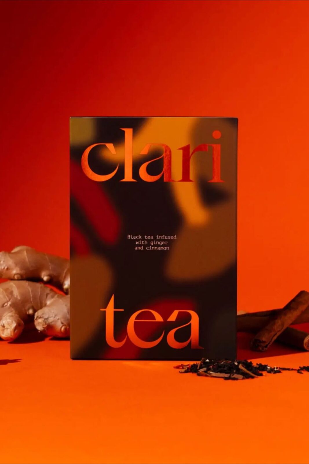
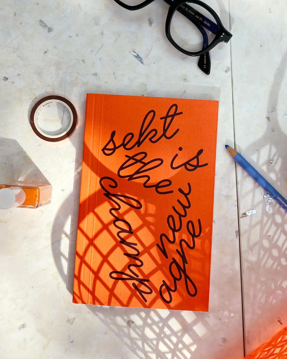
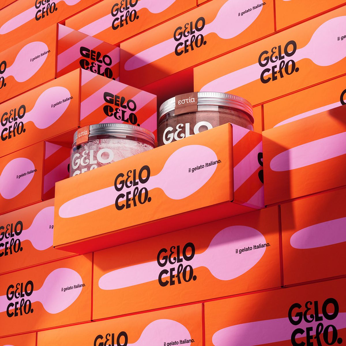
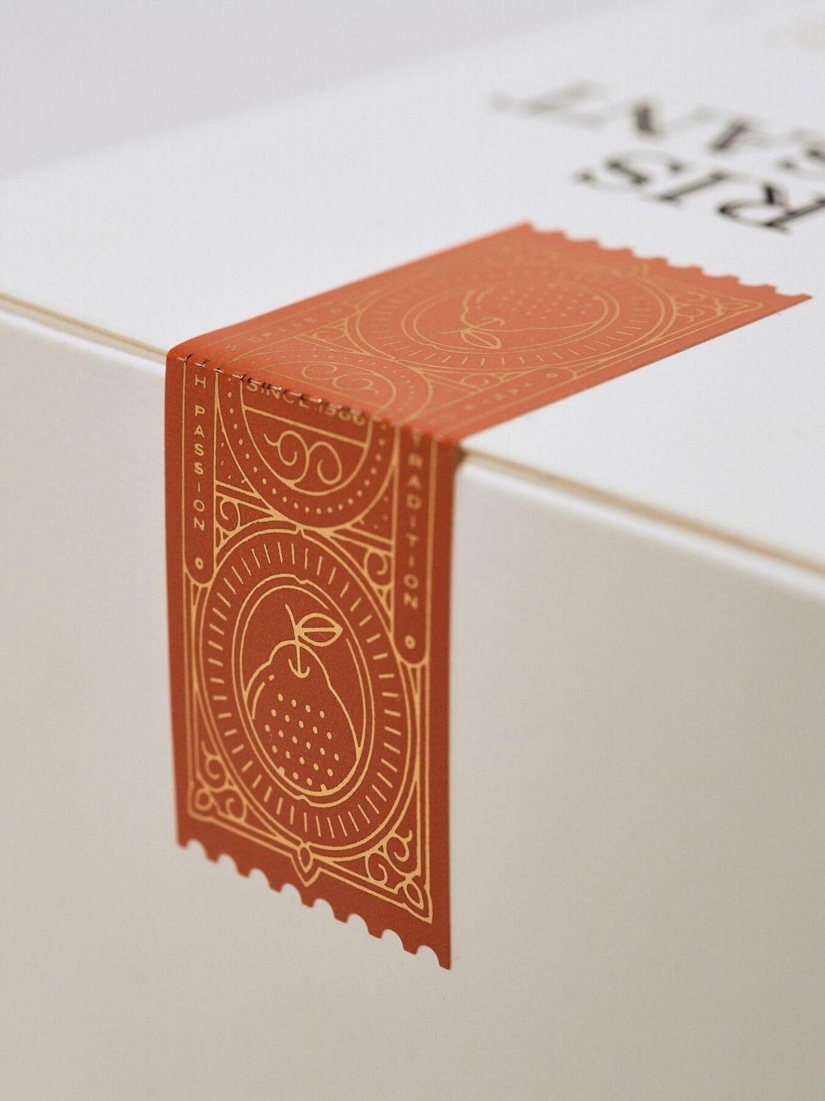
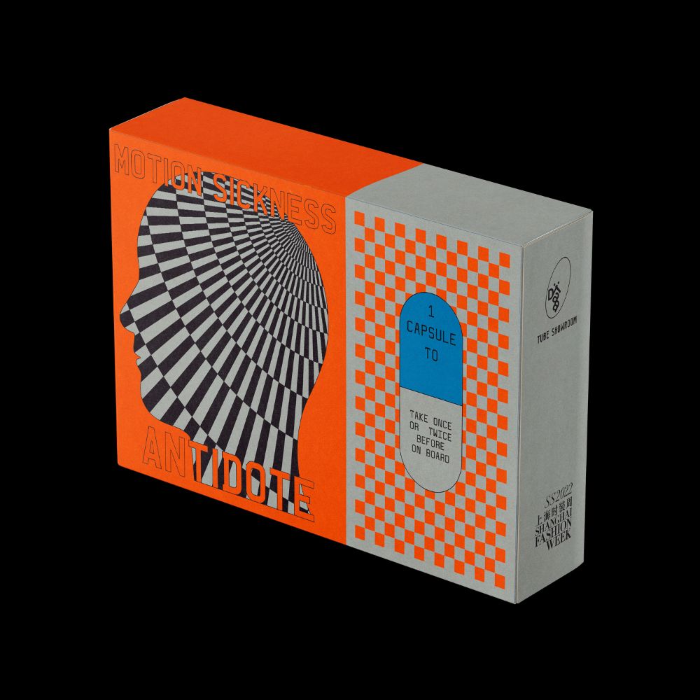
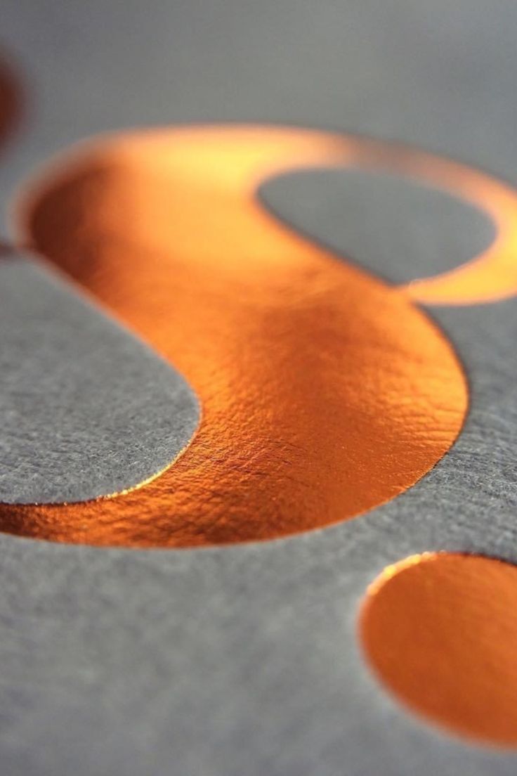
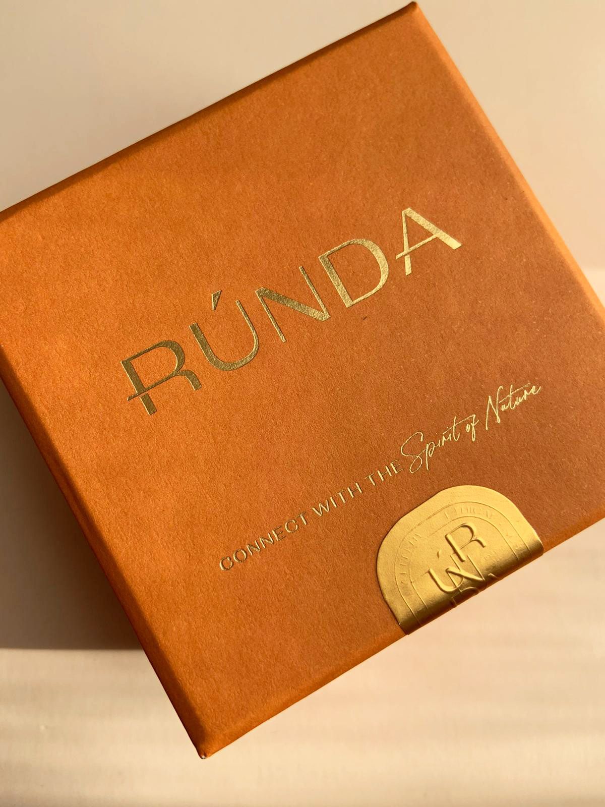
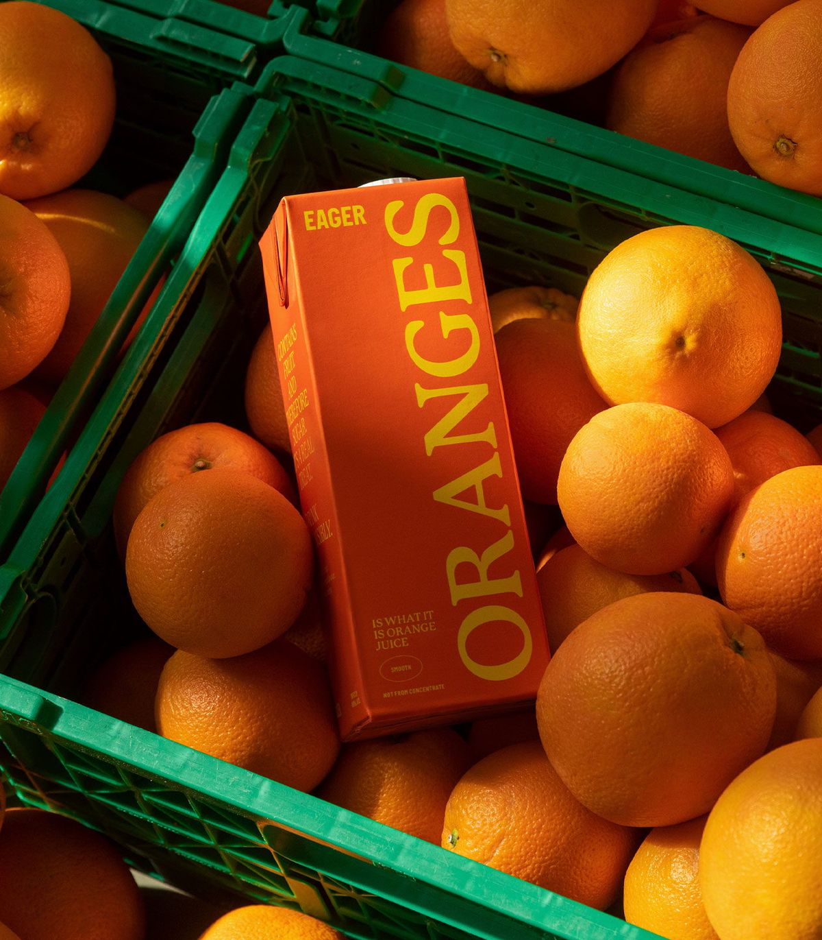
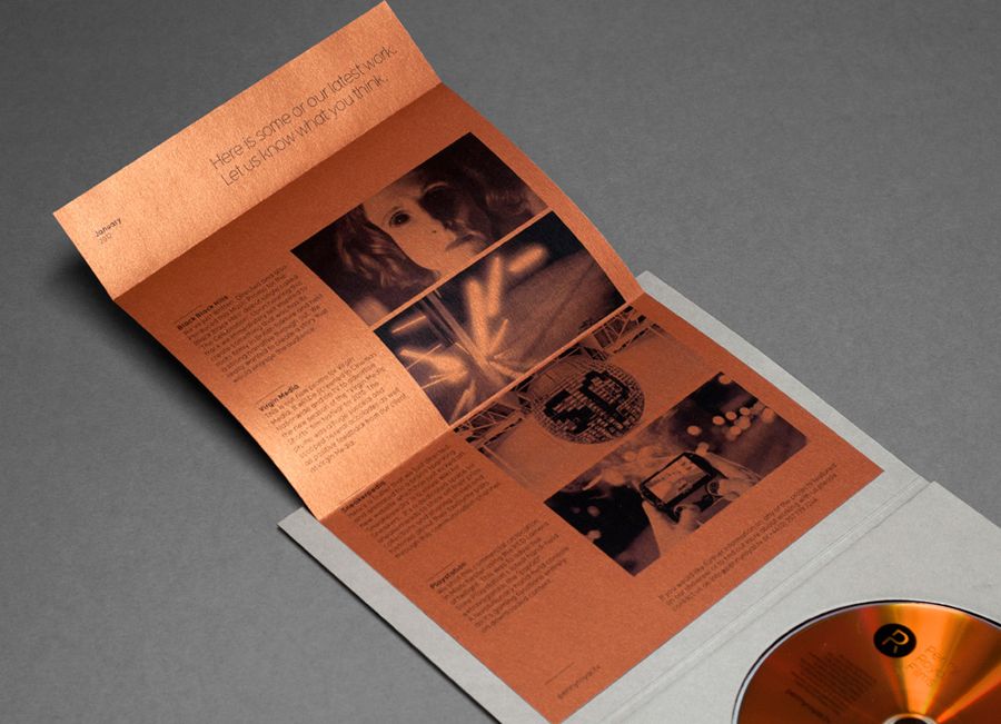
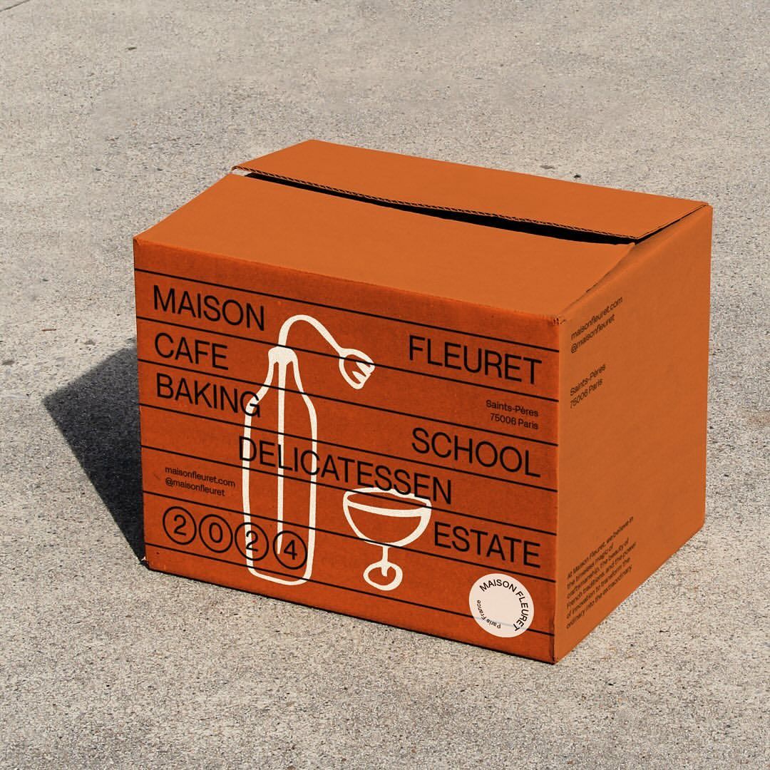
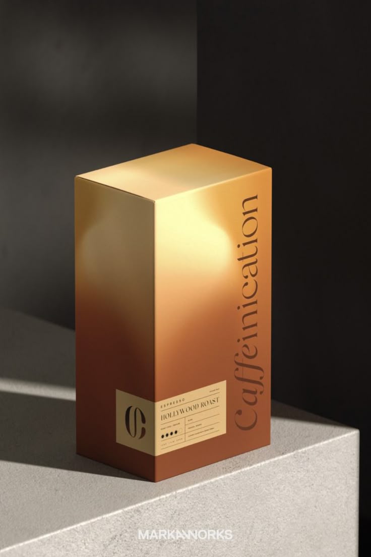
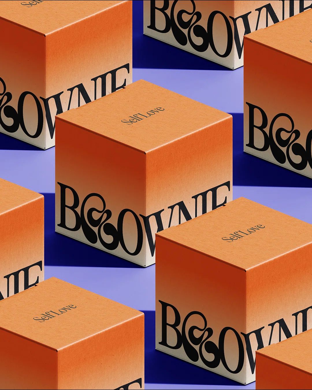
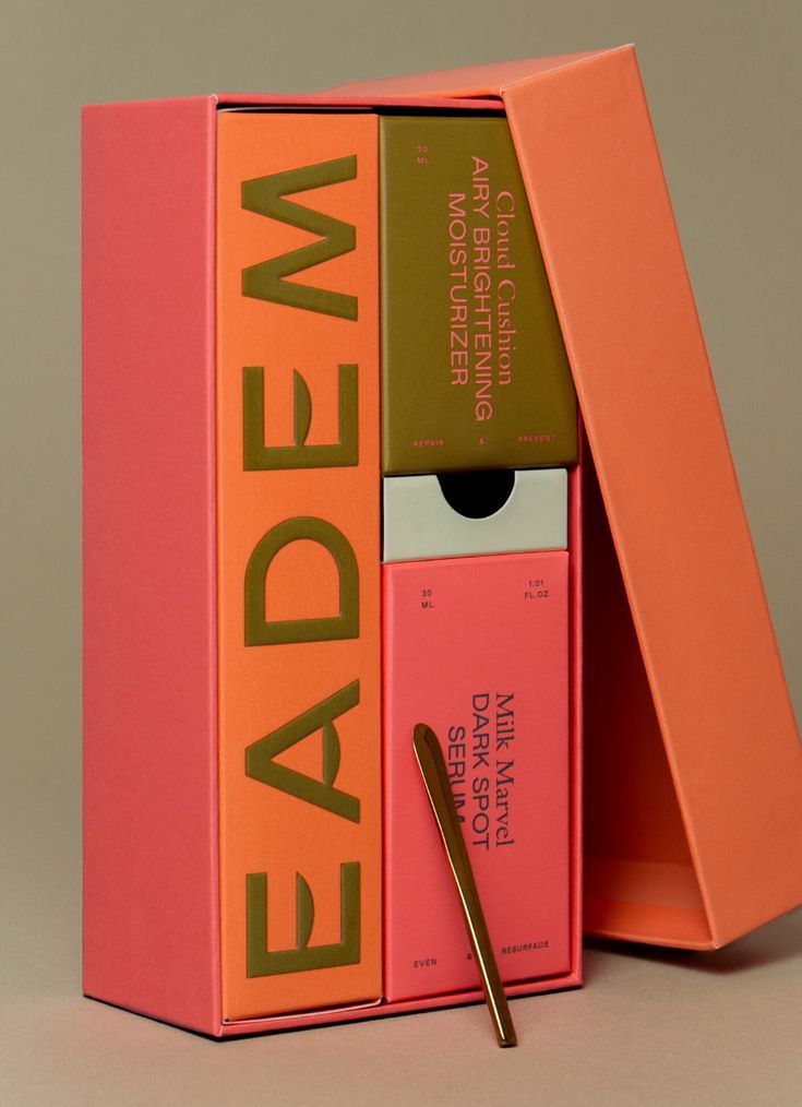
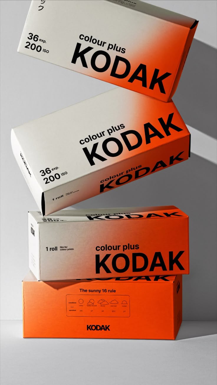
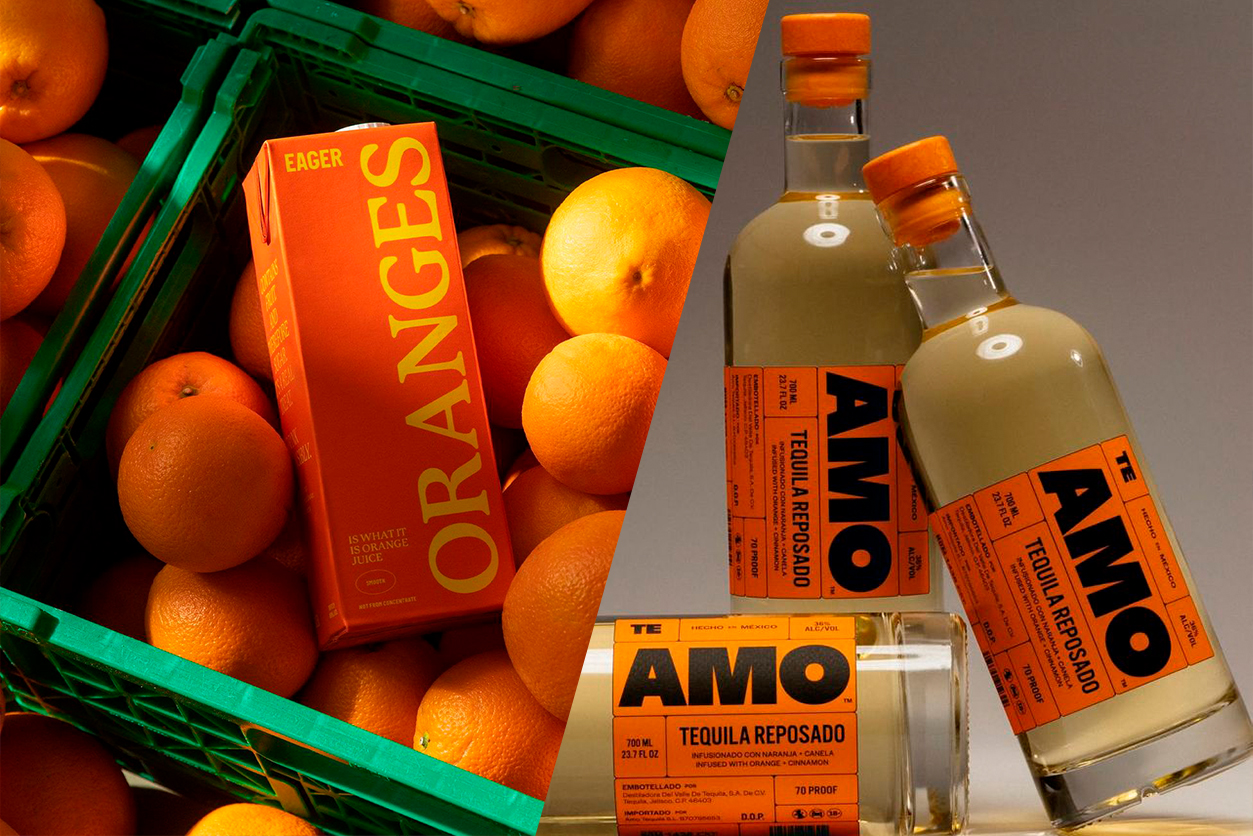
In packaging design, orange can offer both punch and polish. It pairs beautifully with natural papers and matte textures, as it can found in the natural world (look outside your window right now!), making eco-friendly designs feel warm and tactile. Pair a muted orange with recycled craft paper, and you get instant earthy sophistication. Or go glossy or metallic, and suddenly orange transforms into a symbol of contemporary luxury! Copper foils, embossed orangy-gold accents, or peach-tinted varnishes catch the light in just the right way.
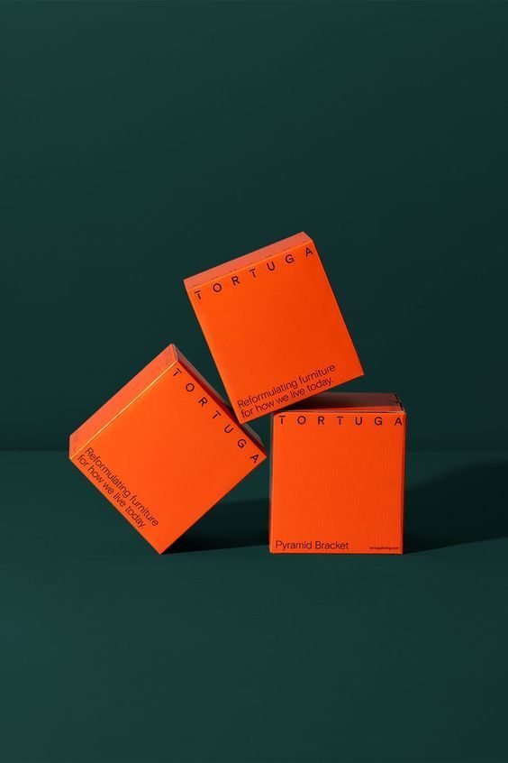
Orange also offers a good companion to many colors. A navy backdrop brings balance, forest green introduces depth, and soft pinks or creams mellow the color’s intensity. Whether it’s a minimalist label with a single orange stripe or a full-surface orange box that dares to dominate the shelf, this color always finds its voice.
As lovers of tactile design, we’ve seen how orange can elevate not just the look of a project, but its emotional resonance. It’s a hue that feels handcrafted and heartfelt, yet undeniably modern. So this Halloween season, as pumpkins glow and palettes warm, let orange inspire your next creative adventure. Let the color of confidence, curiosity, and connection be your reminder that bold design doesn’t have to shout to be seen. Discover our favorite branding and packaging examples that utilize the bold color to its full potential!