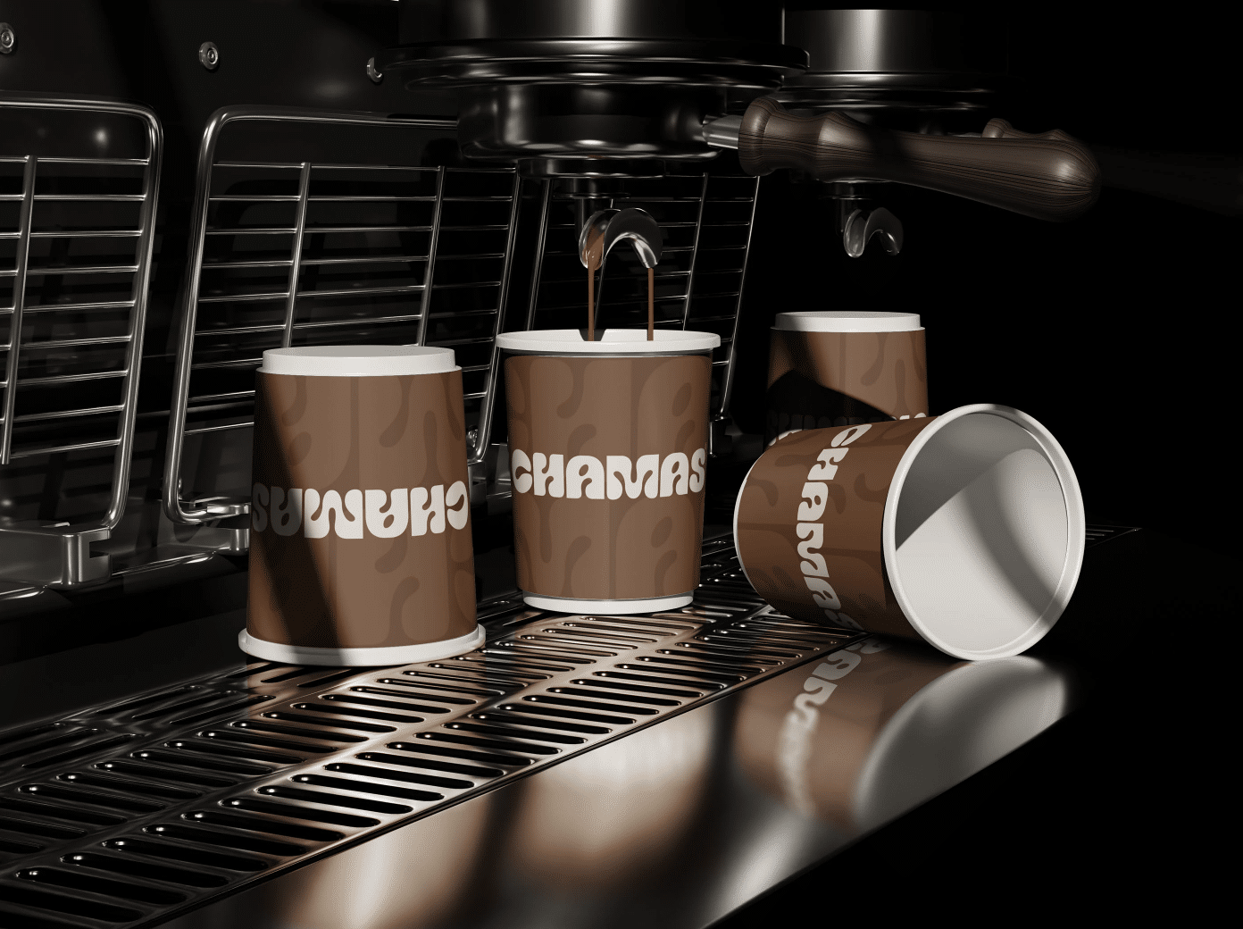
Every January, the design world eagerly anticipates Pantone’s announcement of the Color of the Year — a hue that not only defines visual trends but also reflects the cultural mood of our times. For 2025, Pantone chose Mocha Mousse, a grounded, velvety brown with warm undertones that feels simultaneously familiar and fresh. Drawing inspiration from one of the most universal rituals of modern life: sharing a cup of coffee, Mocha Mousse embodies warmth, comfort, and community. Unlike the sharp, high-energy shades Pantone has chosen in recent years, 2025’s choice is a gentle nod to slowing down and savoring the moment.
Mocha Mousse makes a compelling case for a wider use of brown in branding
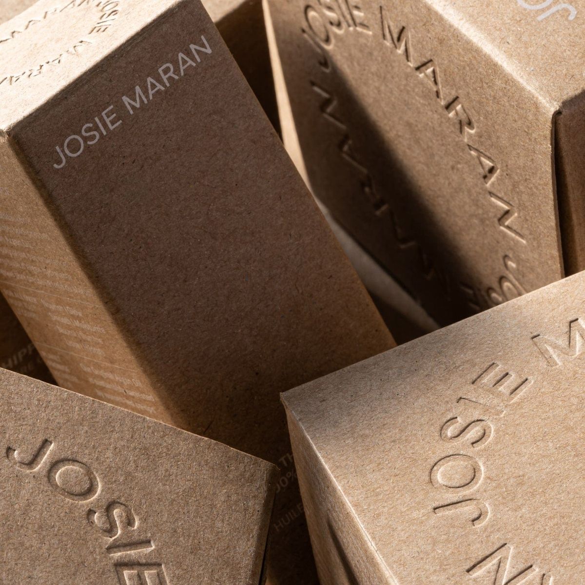
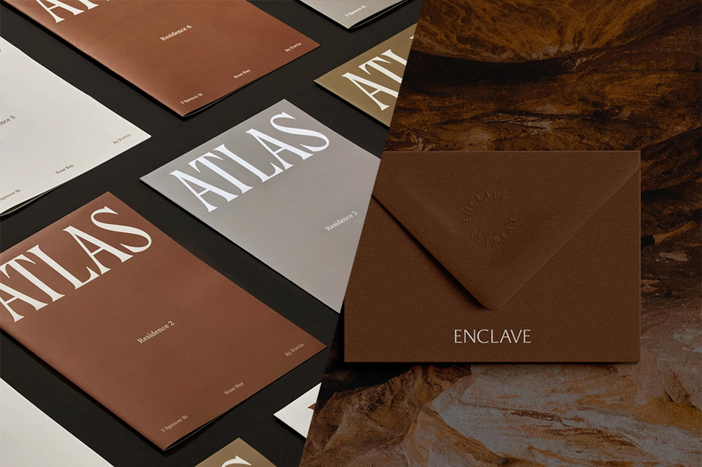
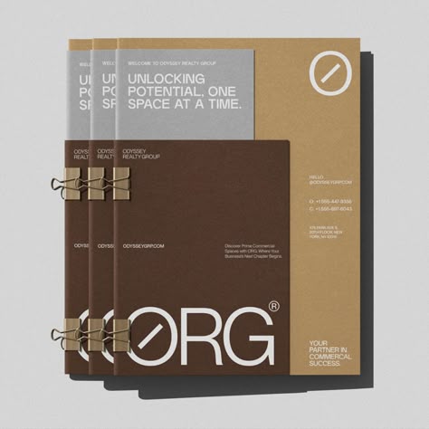
Now, eight months since its reveal, it’s fascinating to observe how designers and brands have welcomed Mocha Mousse into their palettes. Brown tones have long been underutilized in contemporary branding, often considered too heavy or dated. Yet this rich, approachable hue has been embraced with surprising enthusiasm — appearing in everything from artisanal food packaging to luxury skincare, proving its versatility and relevance.
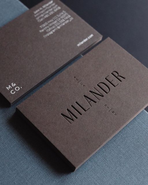
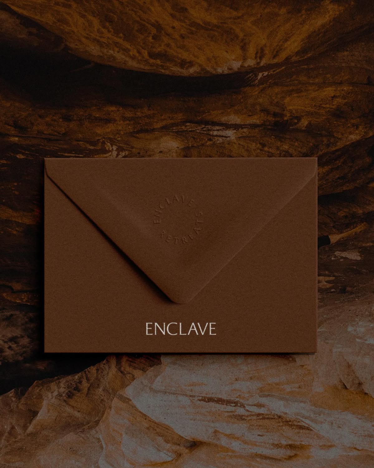
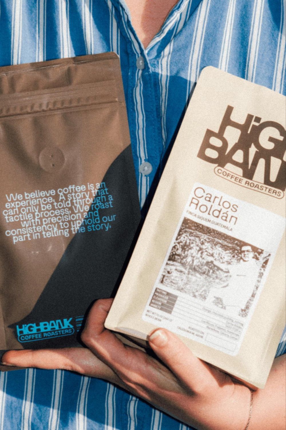
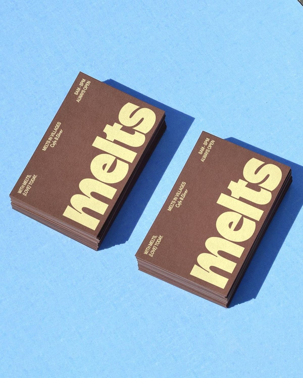
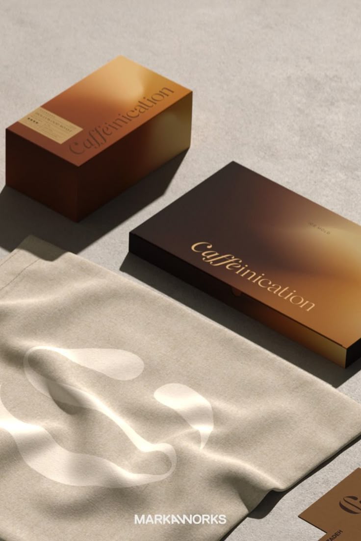
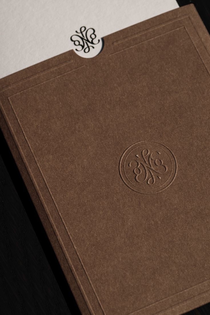
Mocha Mousse truly makes a compelling case for a wider use of brown in branding. It conveys reliability and trust while remaining approachable, making it particularly effective for brands emphasizing craftsmanship, sustainability, or indulgence.
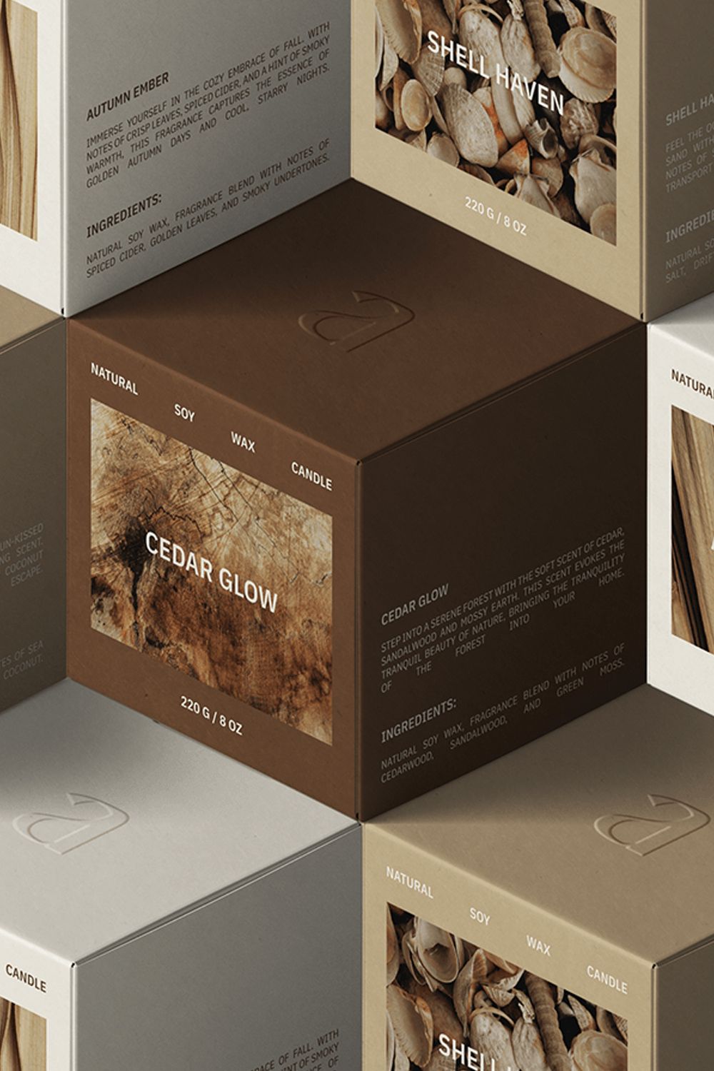
The color’s inherent tactility is central to its appeal. It reminds us of natural and enduring materials like clay, leather, wood, or roasted beans, and connects us to experiences that feel authentic and sensory-rich. This tactileness directly ties into broader themes of calmness and human connection, two values shaping consumer expectations today.
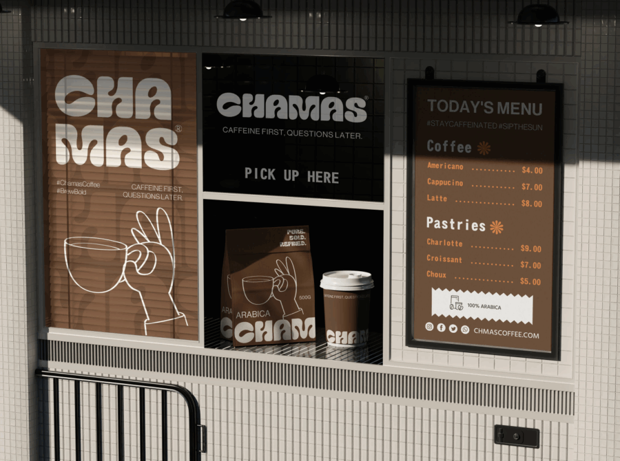
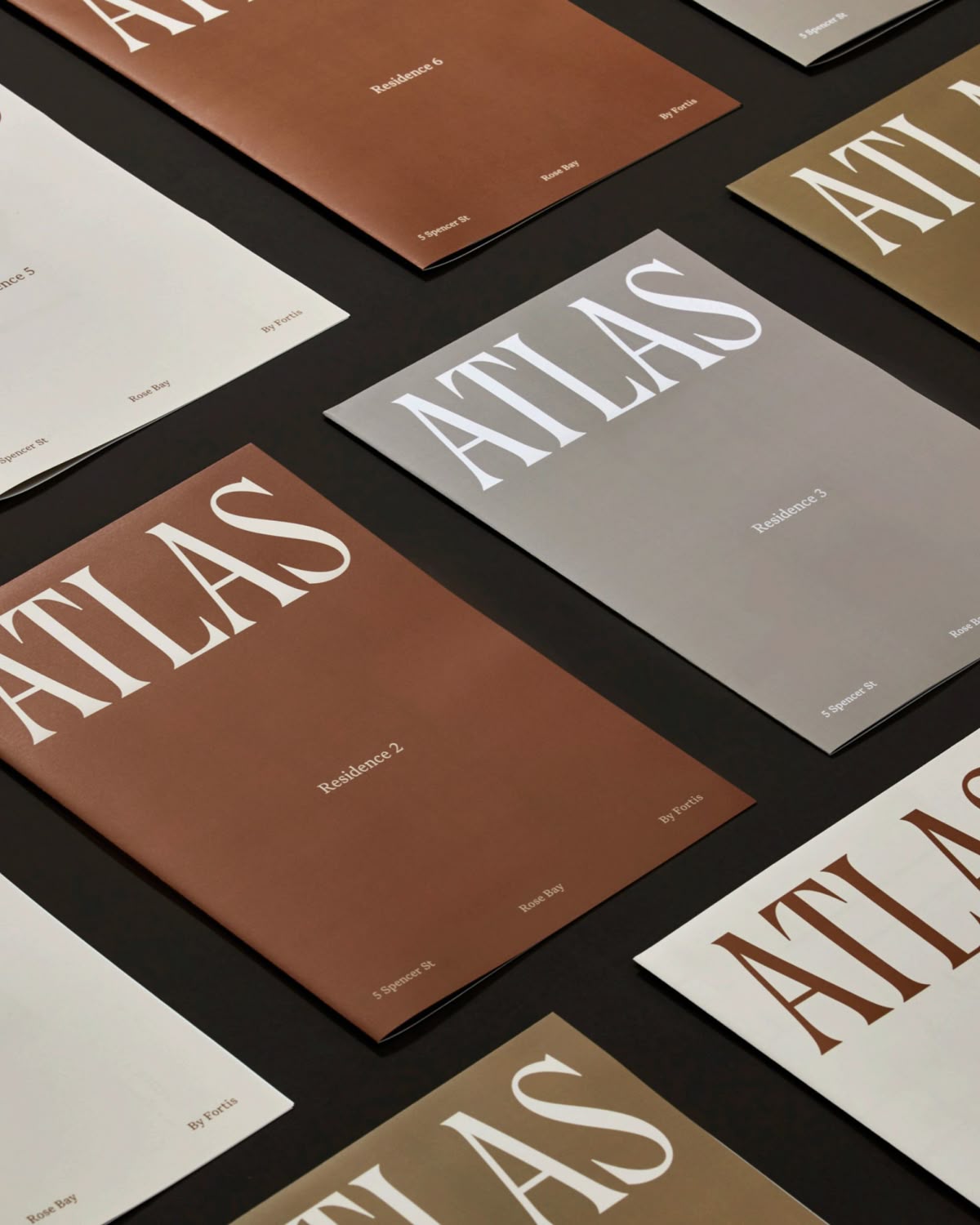
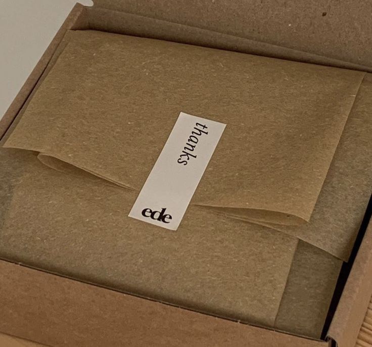
And when applied specifically to packaging, brown tones offer a sense of depth and grounded sophistication. It’s a shade that encourages the use of layered textures: soft-touch coatings, linen-embossed papers, or ceramic-inspired finishes. Paired with neutral creams, muted pastels, or contrasting jewel or neon tones, it allows for endless variation without losing its grounding effect. From food and beverage brands, to cosmetics and lifestyle, and even luxury goods, the warm and rich tone of Mocha Mousse speaks for grounding experiences and self-care. Quiet elegance that gives a timeless feel rather than a passing trend.
Mocha Mousse is a color of presence and permanence in an age of constant change.
The choice of Mocha Mousse also feels emblematic of our cultural moment. As sustainability, mindful living, and a renewed appreciation for craftsmanship continue to shape consumer values, brands are moving toward palettes that feel honest and enduring. Mocha Mousse doesn’t shout — it reassures. It’s a color of presence and permanence in an age of constant flux.
Mocha Mousse feels more than a “color of the year” pick, but more of an invitation to design with depth and human connection in mind. In branding and packaging, it opens the door to more tactile, sensory-rich experiences that echo our collective desire for authenticity. Like the first sip of a well-brewed coffee, it’s a reminder to pause, connect, and savor the moment.