Color has always been one of design’s most powerful storytelling tools. Whether in print, packaging, or branding, the right color combination can shift perception, evoke emotion, and turn a passing glance into lasting recognition. At the core of this magic lies color theory — the framework that helps us understand how hues interact, balance, and enhance one another.
The basics of color theory
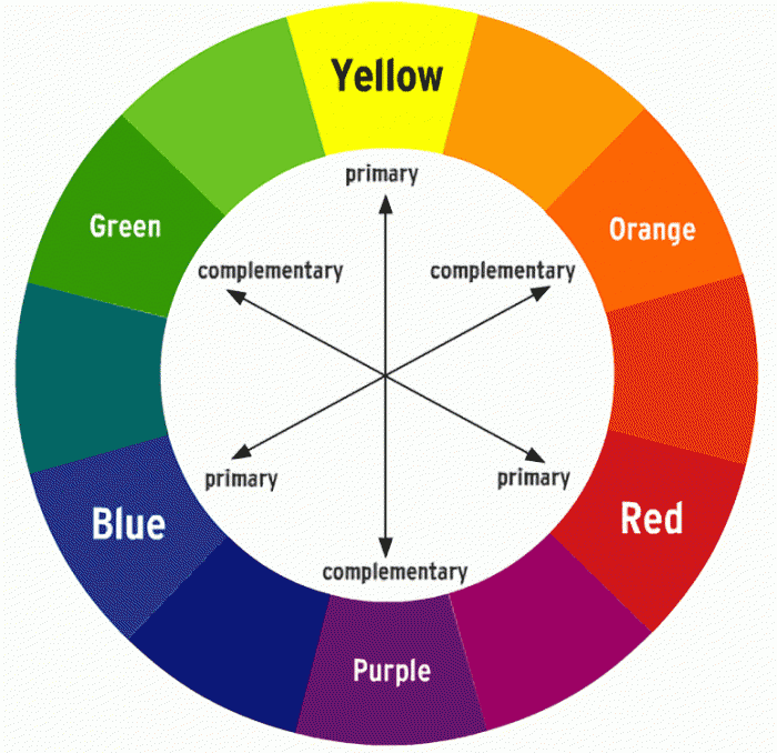
Color theory begins with the color wheel. A circular spectrum mapping the relationships between primary, secondary, and tertiary hues. Understanding this structure helps designers navigate contrast, harmony, and mood. Beyond hue itself, every color also carries a value (how light or dark it appears) and saturation (how vivid or muted it feels). These qualities influence how a color behaves in combination with others, whether it calms or energizes, recedes or commands attention.
Two of the most widely used color harmonies are complementary and analogous
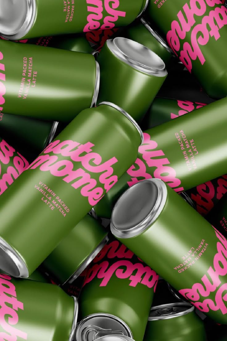
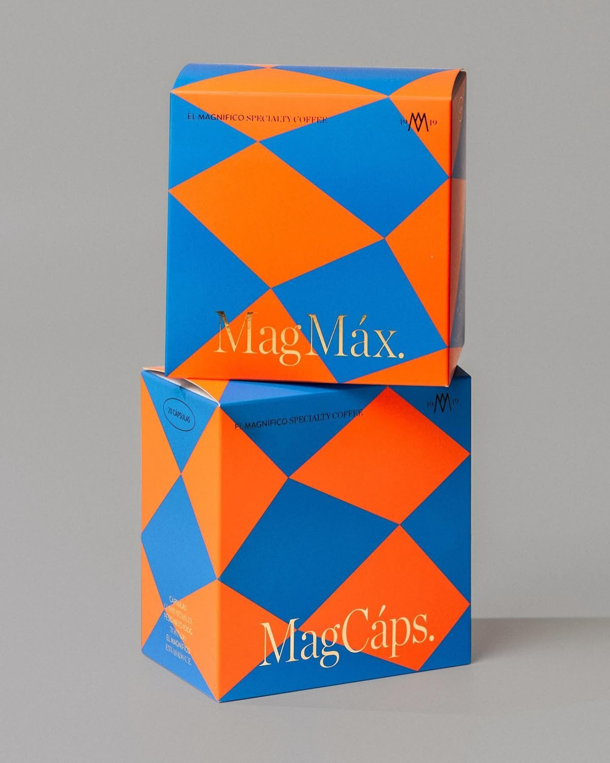
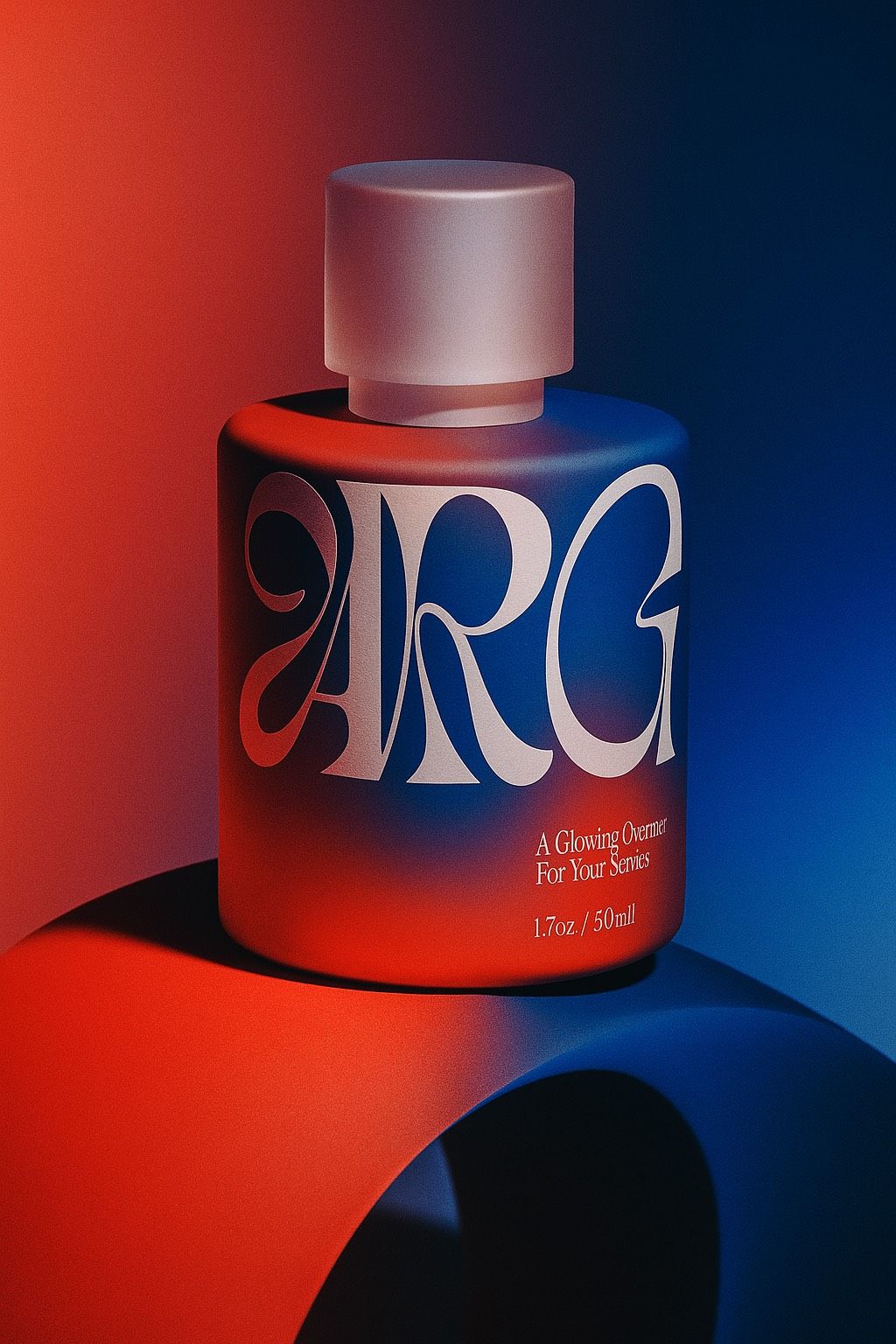
Complementary colors sit directly opposite each other on the wheel: red and green, blue and orange, yellow and purple. When paired, they create a striking contrast, each making the other appear more vibrant. This tension, when balanced, injects energy and focus into a design, guiding the viewer’s eye and amplifying their visual impact. However, too much intensity can also feel overwhelming, so designers often temper complementary palettes by softening one hue or adjusting saturation.
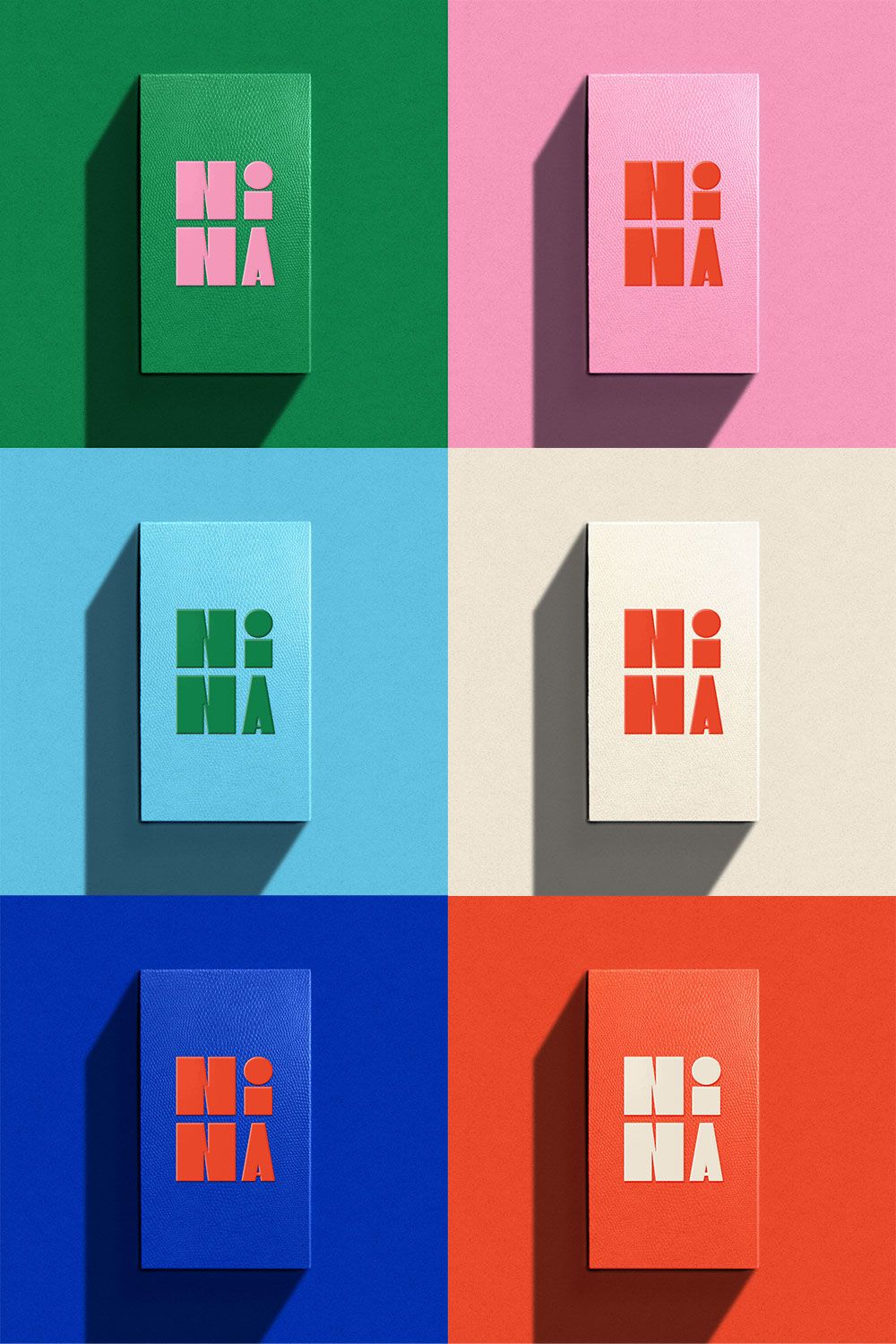
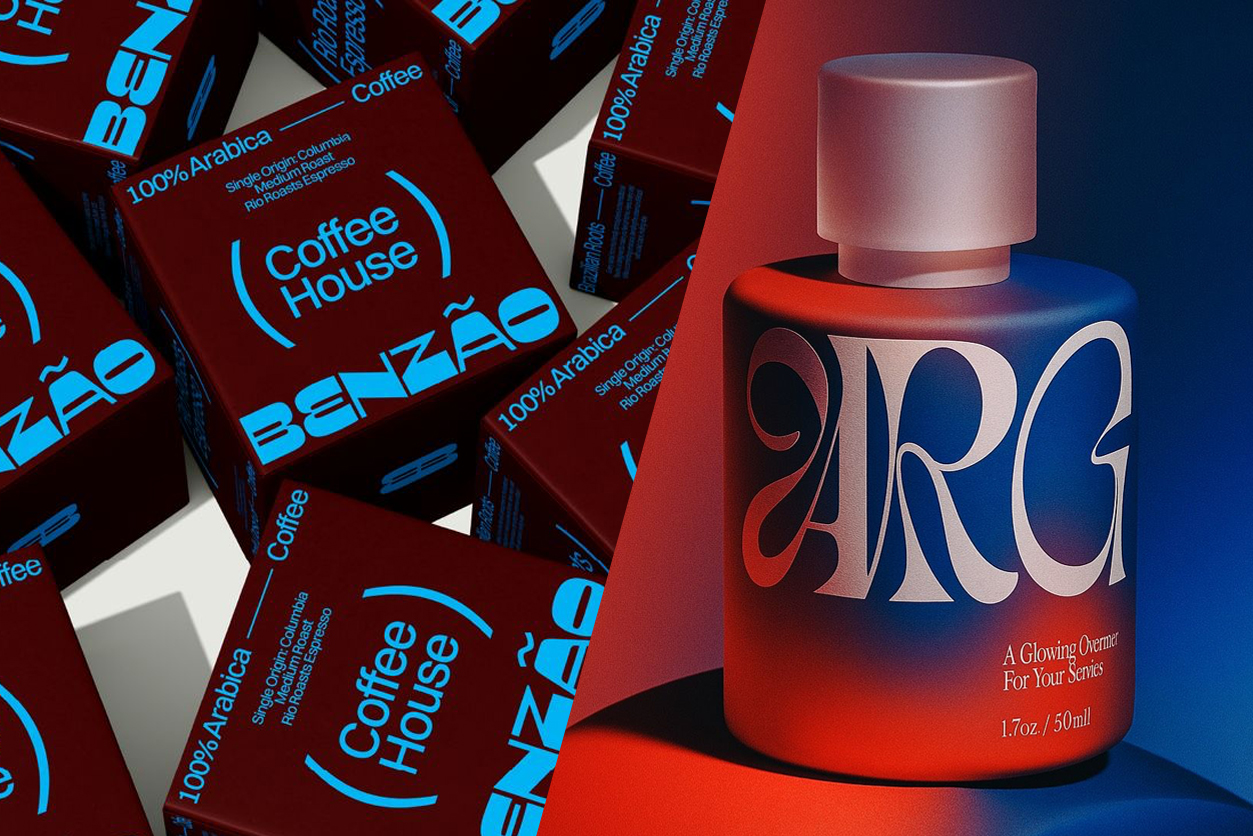
Analogous colors, on the other hand, are neighbors on the wheel, such as blue, blue-green, and green. They share similar undertones, creating smooth, cohesive palettes that feel natural and balanced. Where complementary schemes thrive on contrast, analogous ones rely on subtlety and flow. In many modern designs, these two approaches merge as an analogous base is used for harmony, and then accented by a single complementary hue for drama.

The importance of color in branding and packaging
In branding, color is more than aesthetic. It’s identity. A brand’s palette communicates its tone and personality before a single word is read. A muted primary hue paired with a bold complementary accent can make a logo or package leap from the shelf without shouting. This strategic contrast not only captures attention but reinforces emotion: warmth versus coolness, energy versus calm, luxury versus playfulness.
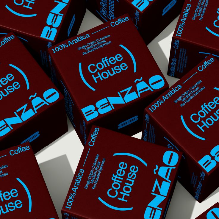
In packaging, complementary colors are often used to attract the eye in crowded retail spaces — think a deep navy bottle with a splash of orange detail, or olive green paired with soft blush pink. Analogous palettes, by contrast, are popular in wellness, beauty, and sustainable brands, where continuity and calm are more important than contrast. Both strategies work when grounded in the story a brand wants to tell.
In the end, it’s about balance and understanding the modern audience
Today, most designers are reinterpreting classic color theory through a modern lens. Rather than pairing pure opposites, many favor toned-down complements. A coral with teal-gray, ochre with dusty lavender — creating depth without harshness. Complementary colors also shine in digital contexts, where vibrant accents guide interaction and emphasize key elements. In print and packaging, their use remains tactile and emotional. A reminder that color still connects us through touch, memory, and feeling.
Complementary colors embody the beauty of opposition — distinct yet harmonious, bold yet balanced. When used thoughtfully, they transform design from decoration into communication. And whether you’re crafting a brand identity or designing the perfect packaging, understanding how colors speak to one another is what turns visual ideas into emotional experiences.