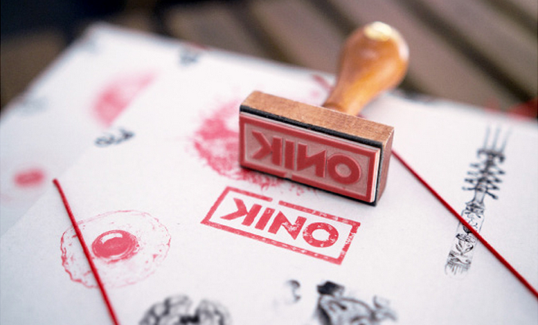
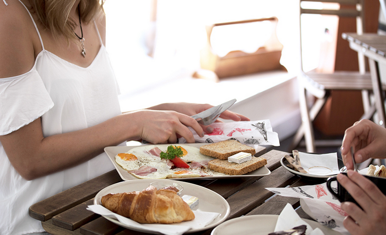
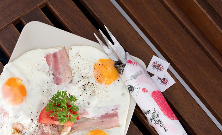
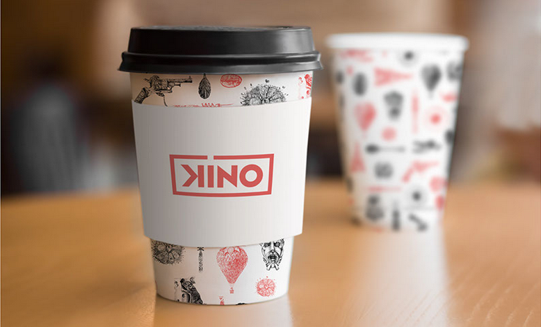
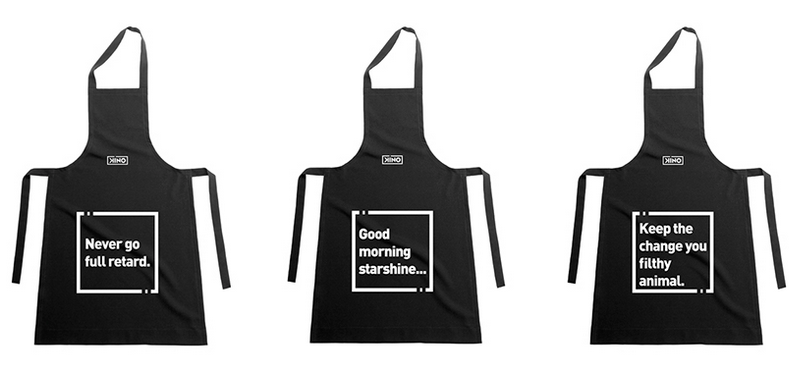
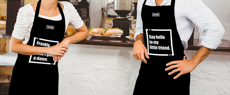
The list of designs I truly wish was made real is becoming longer each day, with the latest addition being the branding concept Szani Mészáros designed for KINO as her graduation project at the Hungarian University of Fine Arts. This white, black and red concept is an eye-catcher with its hand-drawn illustrations, inventive packaging ideas, and beautiful details, that honors the unique atmosphere KINO offers.
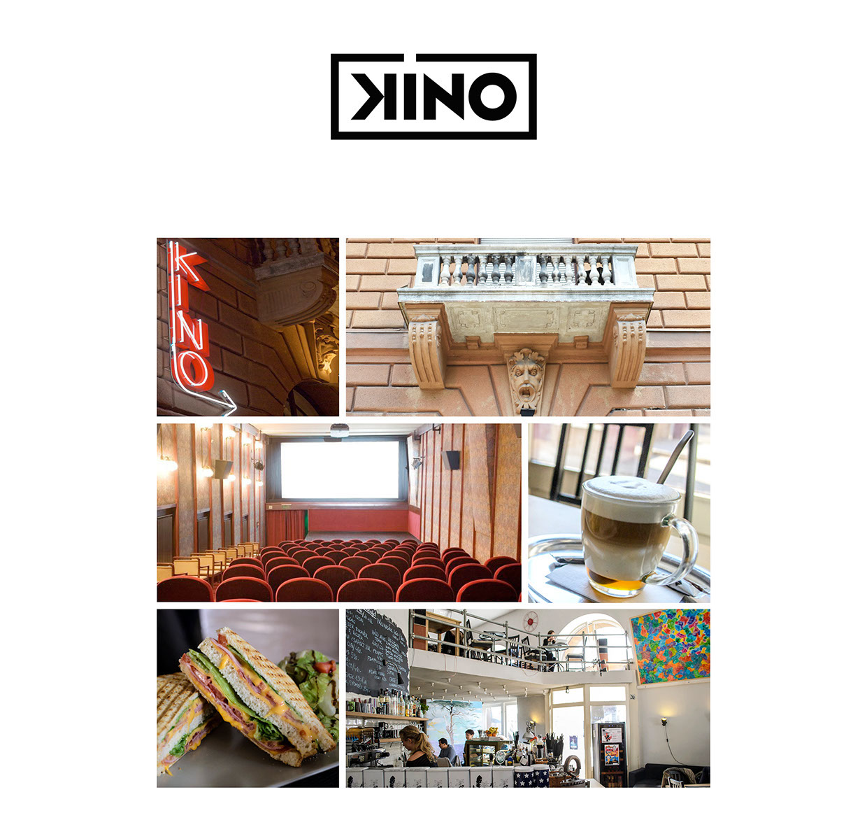
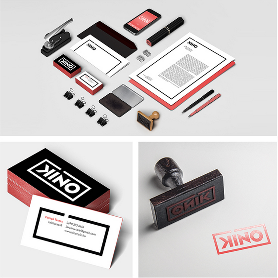
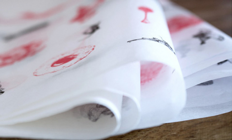
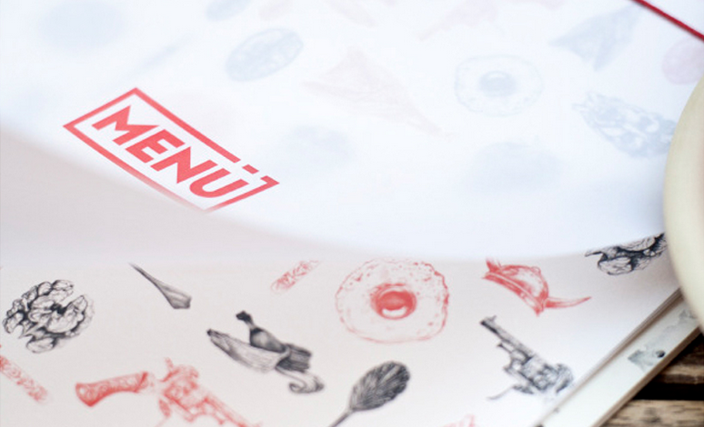
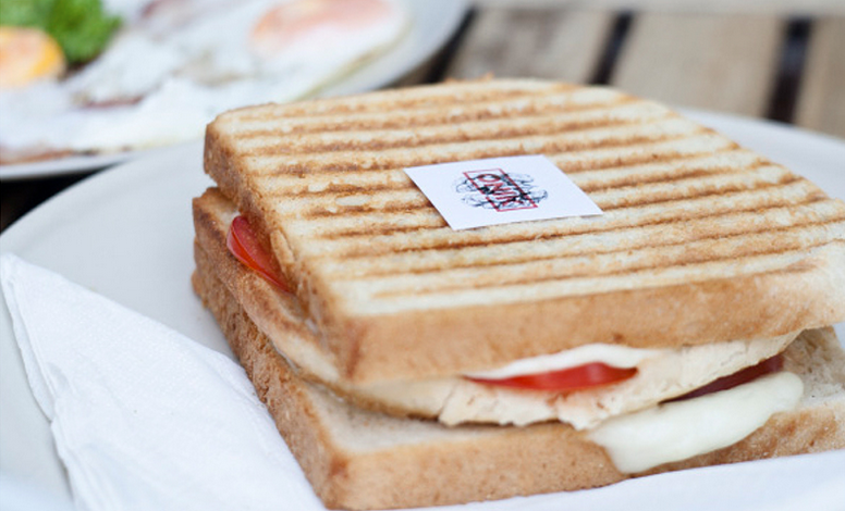
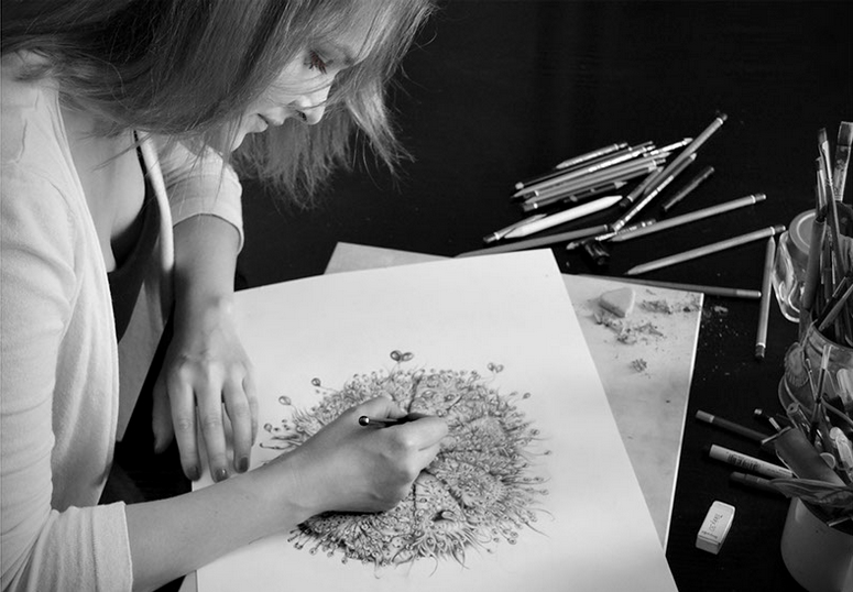
KINO, a friendly café with a cinema located in the heart of Budapest. KINO has a traditional spirit with antique objects everywhere, and it also gives a place to young artists to exhibit their work on its walls. Mészáros’s source of inspiration for the illustrations was the antique feeling that is felt all around KINO. Starting by drawing vintage objects that are related to coffee places (spoons, forks etc.), and then visualizing movie topics, like drama or horror. These illustrations are personal, like the carnivore plant that actually represents the romantic theme for the designer or the strawberry balloon that is for the easier, lighter movies. The charming illustrations are the highlight of the concept, which go perfectly together with the minimal stationery line that heavily relies on the logo and graphic color scheme. With modern techniques mixed with traditional, every detail is carefully executed
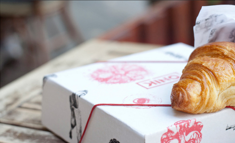
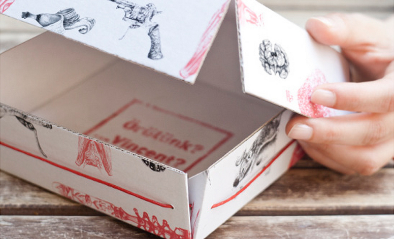
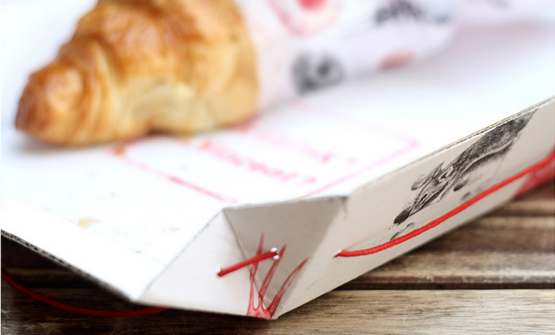
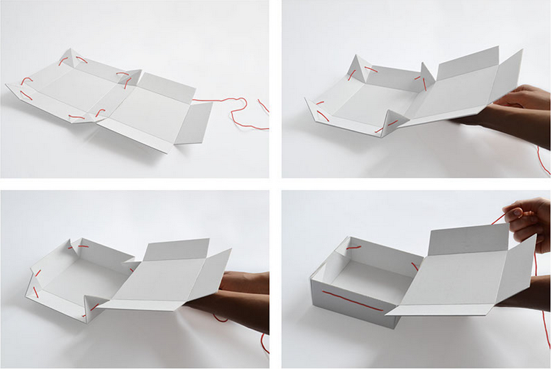
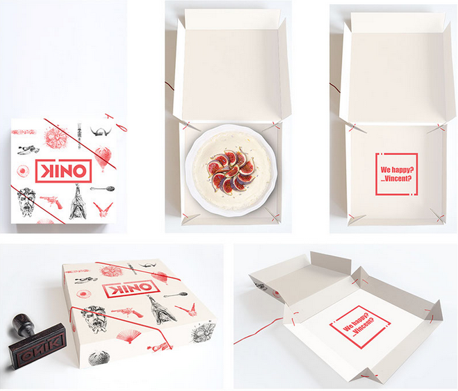
The packaging boxes were designed specially for KINO by product designer Kinga Nyoszoli. The two designers agreed that the essential aspects should be functionality, applicability and it has to be environmentally friendly. The boxes can be cut and fold out of one piece of cardboard paper without using any glue. The only additional material is a string that goes through the box’s sides, which holds it tight whilst looks aesthetically appealing. And if you unloose the string, the boxes can be used as plates as well.
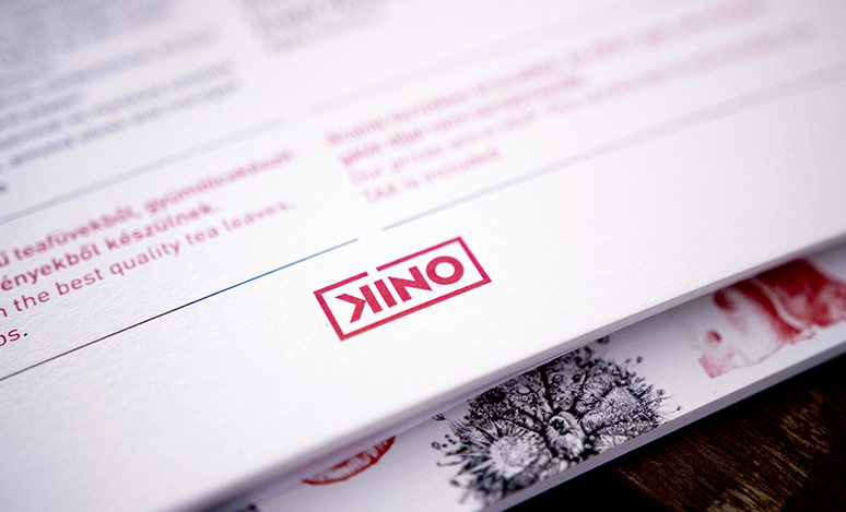
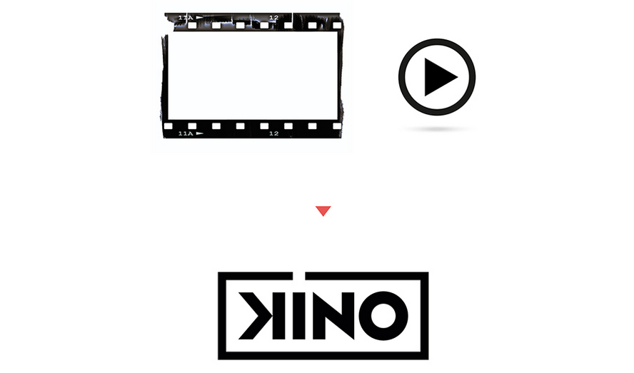 Mészáros’s main goal was to create a simple, minimal, yet smart logo, without using worn-out symbols, like a coffee mug or a camera.
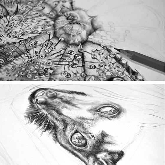
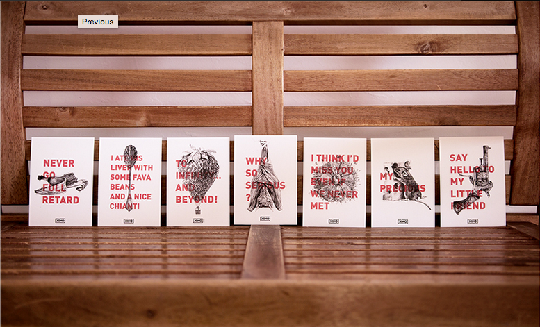
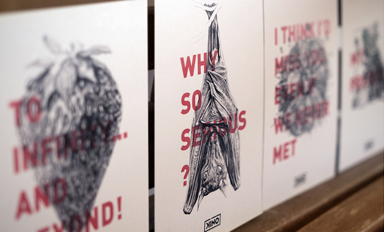
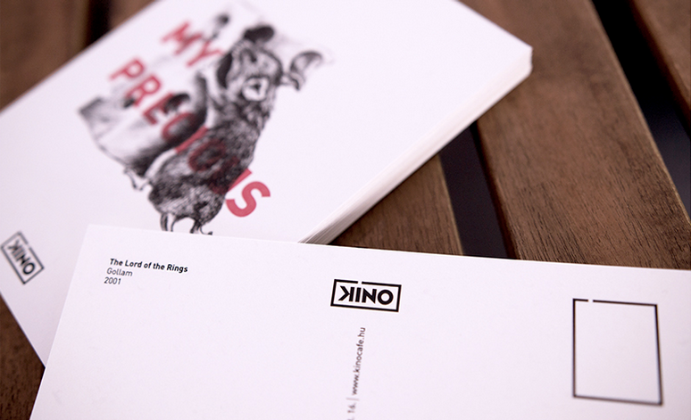
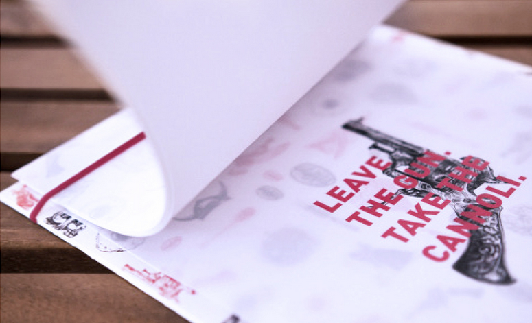
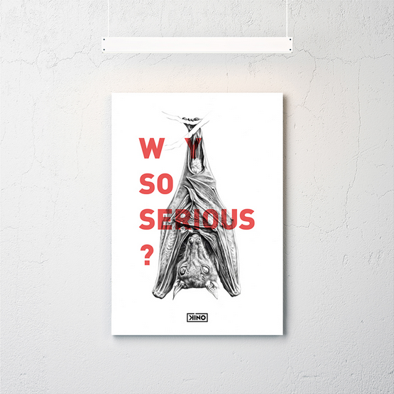
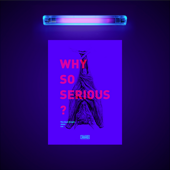
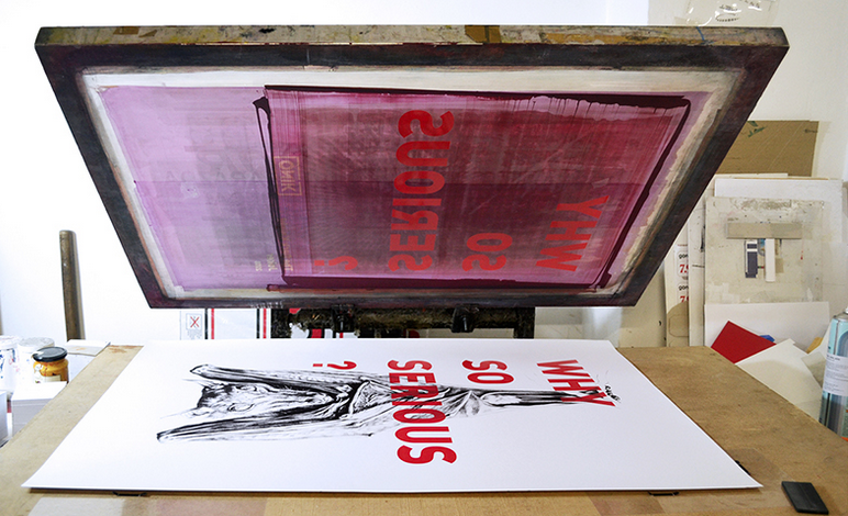
For the posters Mészáros used a special technique that combines the traditional and modern values: printing the illustrations with silkscreen, using special UV paints on the typography, that is invisible in daylight and can only be seen with UV lights in the dark.
Images © Judit Kozma and Szani Mészáros

