UK-based Jamie Clarke is an independent lettering artist and type designer, with an impressive career that spans over 25 years. Known for “weaving text and imagery together to create compelling visual stories”, brands around the globe commission Clarke to add his magic touch to numerous design concepts ranging from branding and packaging to books and more. In addition to his widely-loved illustrated lettering work, the designer also creates original typefaces, with both aspects complementing and influencing each other. But before we dive into examples of both of these practices, let’s take a look at how it all came to be – and what the creative is up to now.
 As a member of the first digital generation, Clarke’s career spans from web design to the Head of Design in EMEA at Microsoft – to founding and running one of the top design agencies in the UK – to becoming an in-demand type and lettering artist
Having originally studied graphic design at university, after graduation in 1995, Clarke fell into a career in web design before following his true passion: type. Clarke writes about the early days of his career: “In 1995 the internet had only been public for a year or so. It was a bit like the Wild West and we were all making things up as we went along. I remember having to explain to family and friends what the internet was.
After working at a few early web start-ups, I joined Microsoft for a few years and then set up my design agency. The company grew fast and was listed as one of the top 100 design companies in the UK (Design Week Top 100 poll), but eventually, the pull to go back to type and lettering was too much.”
I could feel my passion for type and lettering rekindling and I wanted to collect all the amazing work I was seeing. The blog gave me an excuse to reach out to other designers to ask them about their work and process.
 A passion for type sparked an idea for a blog, which then led to a career turn that has taken Clarke to where he is now
While still running the successful design agency in London, Clarke began re-exploring the world of type and lettering which then led to him founding a blog named Type Worship, which grew to have a massive, cult following among type lovers everywhere.
“I was sort of a scrapbook/research aid. I could feel my passion for type and lettering rekindling and I wanted to collect all the amazing work I was seeing. The blog gave me an excuse to reach out to other designers to ask them about their work and process. This eventually grew to become the catalyst for learning how to design type and gave me the confidence to start lettering and illustrating professionally.”
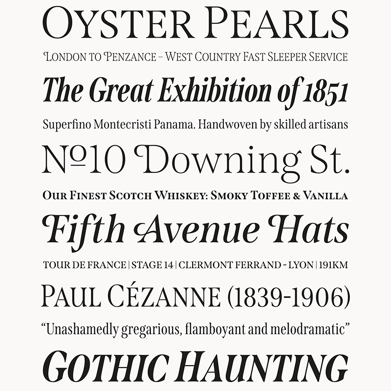
The blog eventually inspired Clarke to make a massive career move and sell the agency in 2013, and begin studying type design at the University of Reading (read his blog post about it here). Only two years later he released his first typeface, Brim Narrow, while the next font Rig Shaded took the designer a couple of years to design, it ended up winning a Graphis Platinum Award in 2019. Clarke has since been designing fonts for notable brands, with over 1,2 million people using his fonts each quarter in Adobe.
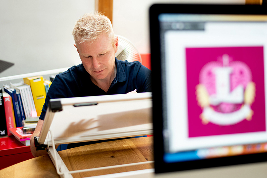
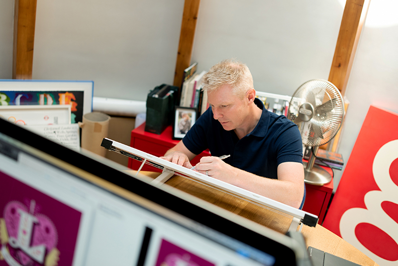
I draw everything by hand initially. Sketching small, over and over again to get the composition right. Then I’ll make A5-size sketches before recreating them in illustrator. I love symmetry, patterns, and hiding little images in the details.
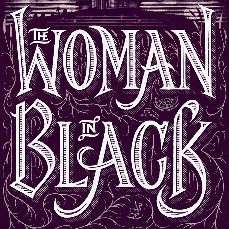
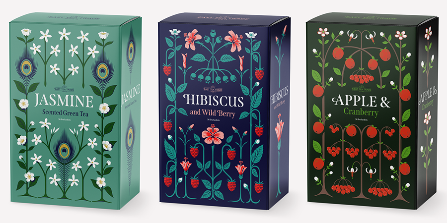
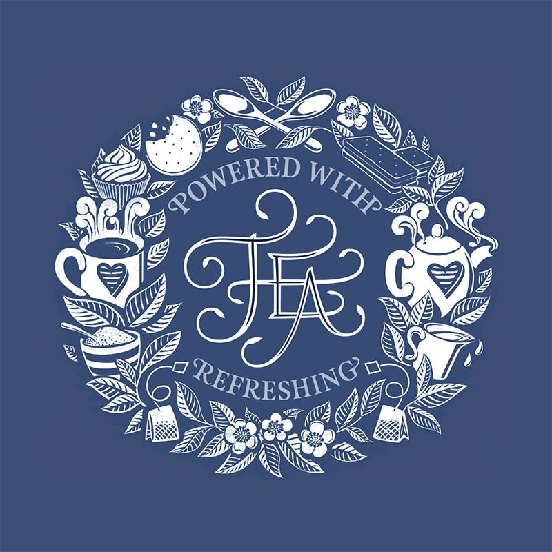
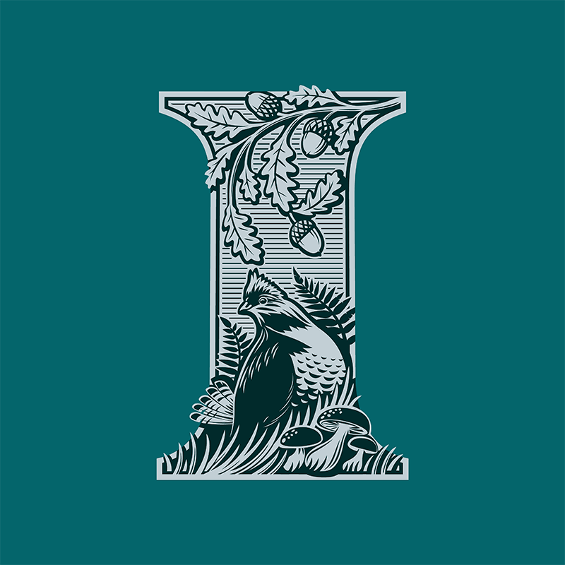
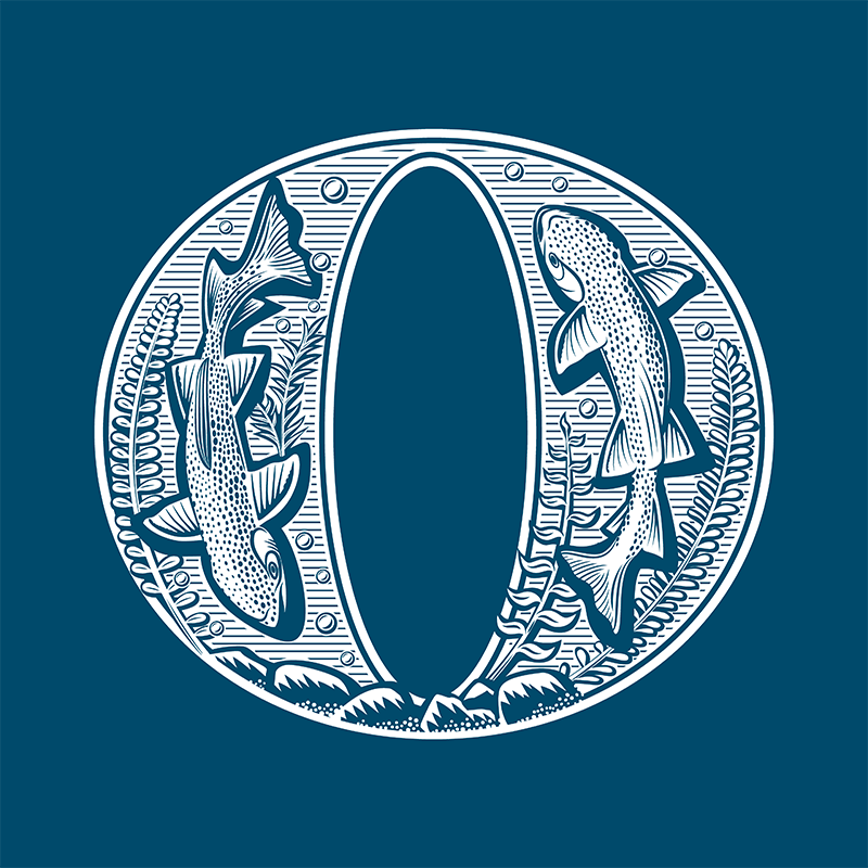
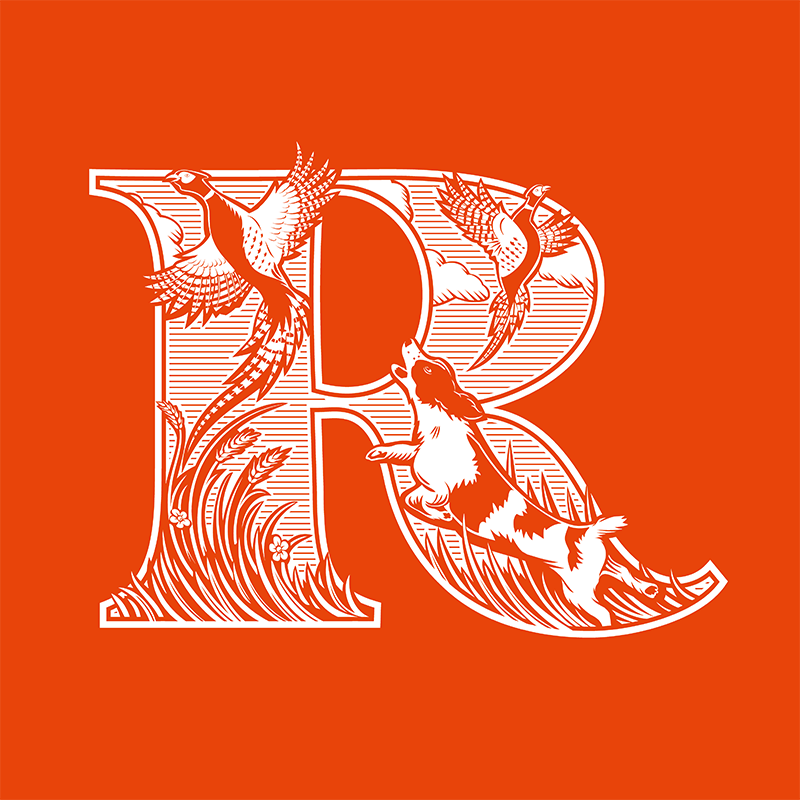
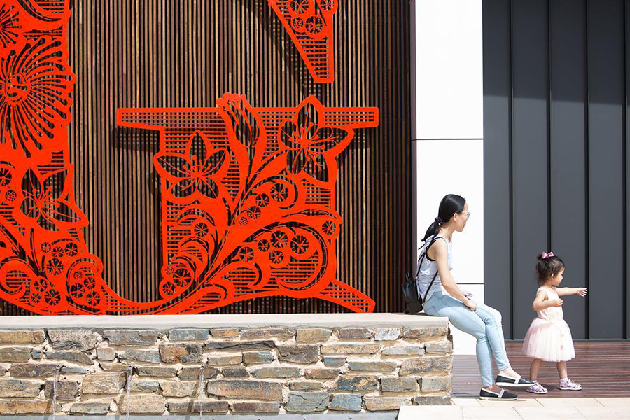
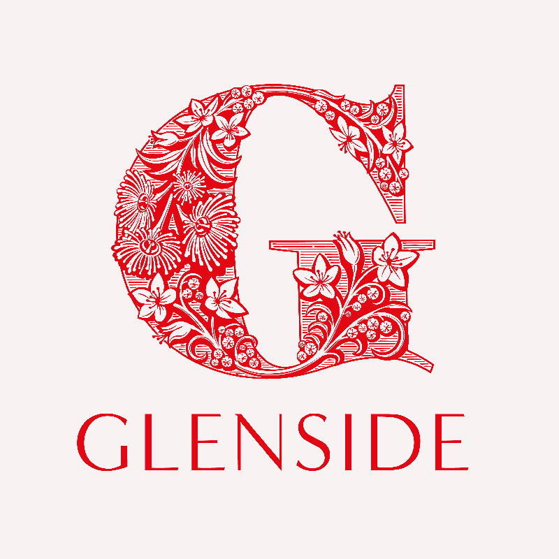
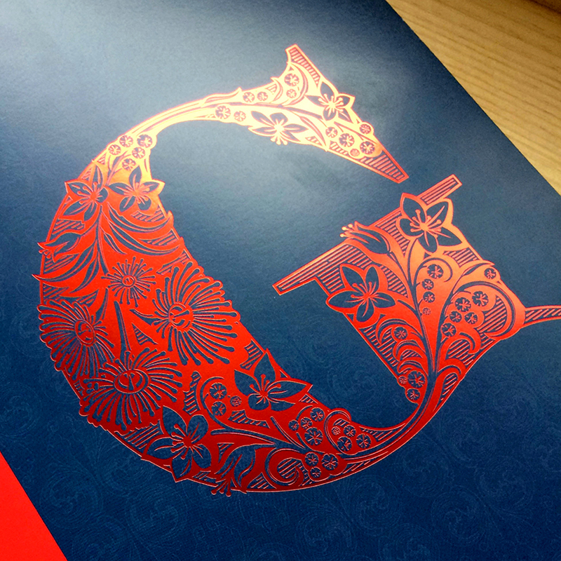
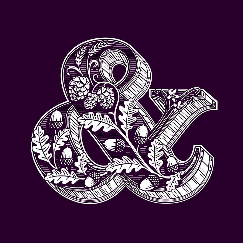
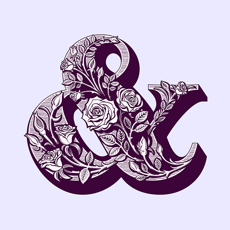
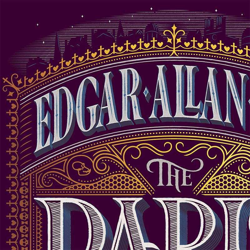
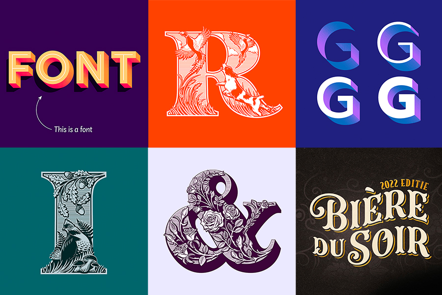 The designer’s notable lettering and illustration projects include his studio project, Tea Patterns, which led to his most popular type family, Span. Glenside Identity, a branding concept for a new community development in Adelaide, Australia. Cover for The Woman in Black, paperback edition (used by British schools, teaching English Literature), Runner-up Academy of British Cover Design. And The Folio Society’s A History of Christianity cover. “I draw everything by hand initially. Sketching small, over and over again to get the composition right. Then I’ll make A5-size sketches before recreating them in illustrator. I love symmetry, patterns, and hiding little images in the details.” You can see some amazing process images of Clarke’s work here and here, that showcase the creative’s passion and dedication to the craft. “I love the Arts and Crafts movement, and love the illustration work of Margaret Armstrong and textiles, and patterns of William Morris, both of whom you can probably see influence my work”, Clarke concludes.
On Type for Illustration, Clarke shares examples of beautifully combined type and illustration, along with tips to help you make great matches of your own.
With a true passion for type, Clarke is constantly searching for new inspiration – and always sharing it with others. His latest endeavor includes a new blog, Type for Illustration, which “came about after I realized that ALL of my fonts had been inspired or shaped by my lettering and illustration work. I decided to pull the two themes together into a blog where I could explore their relationship further.”
Below you can see some of our favorite examples of Clarke’s work, both type and lettering, but make sure to follow the designer on Instagram for more of his work – and check out his blog for inspiration and in-depth analysis and know-how!