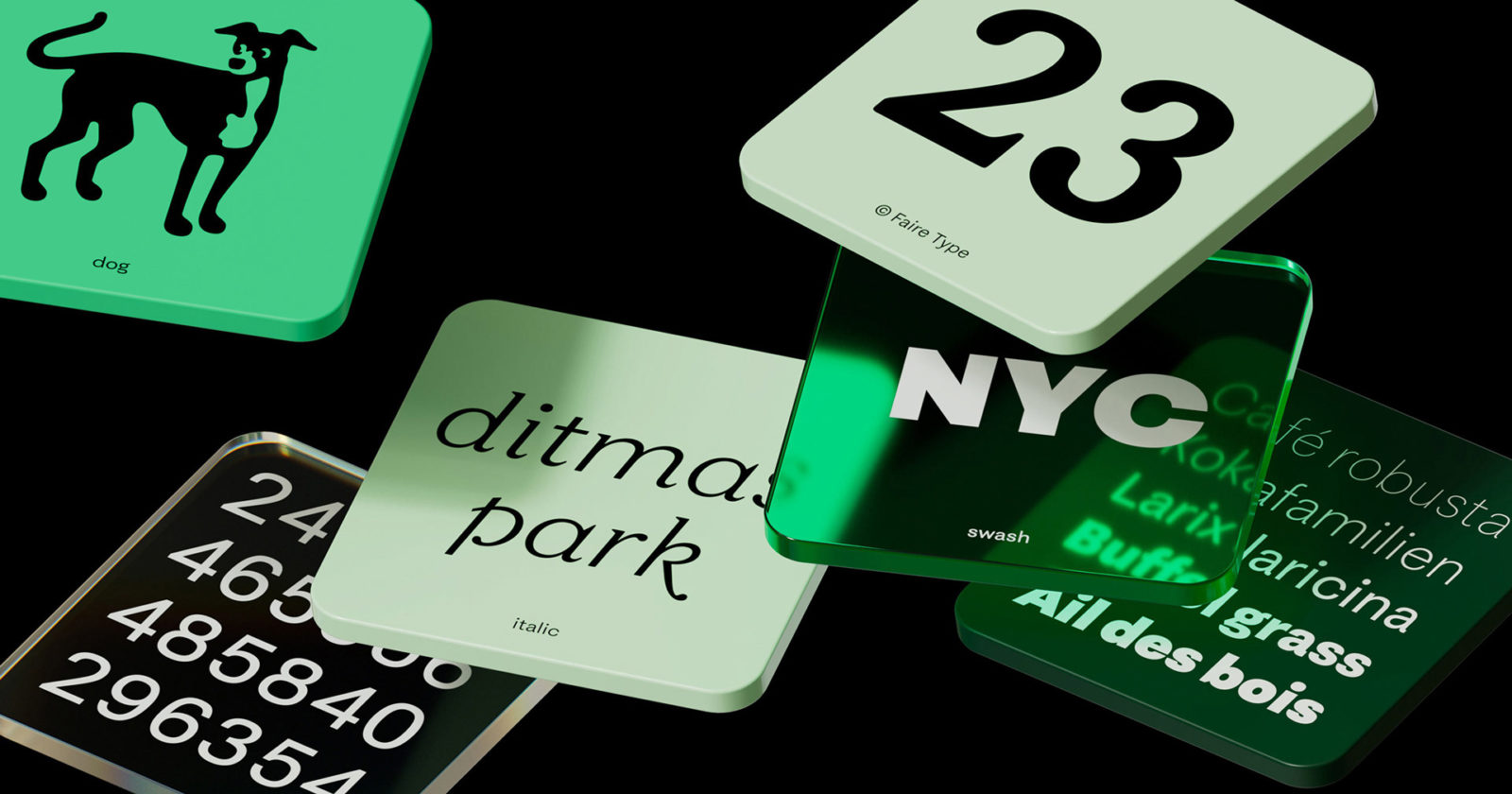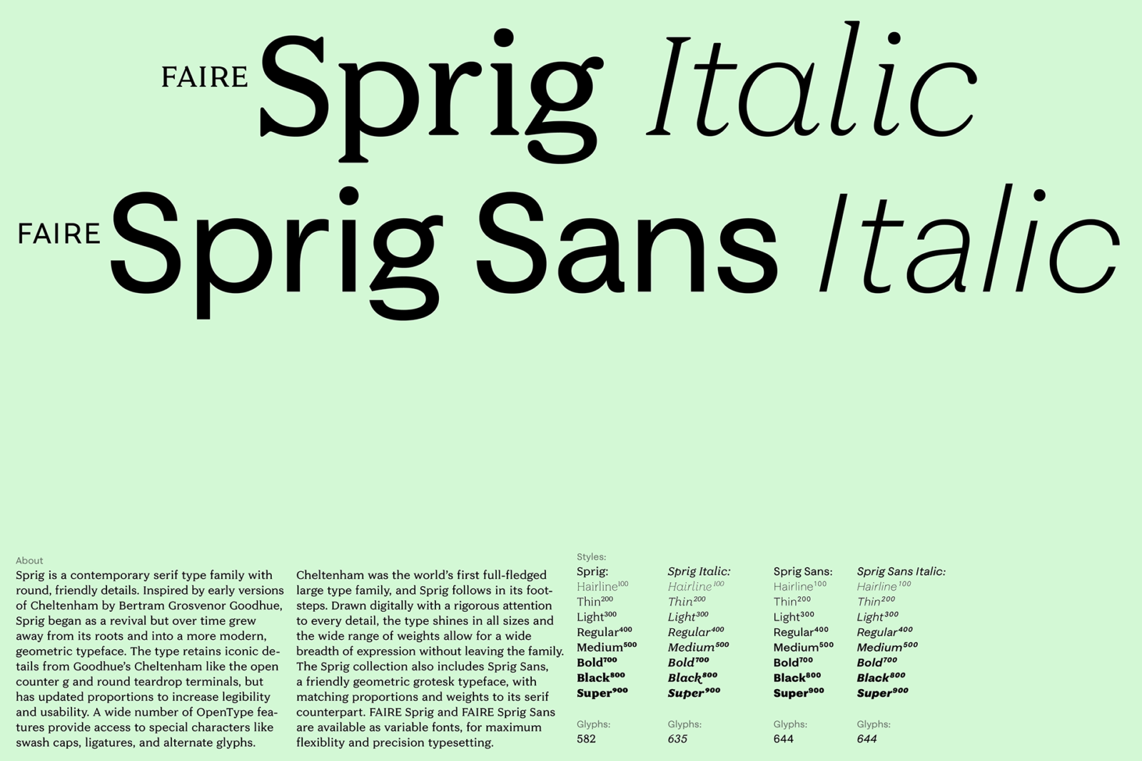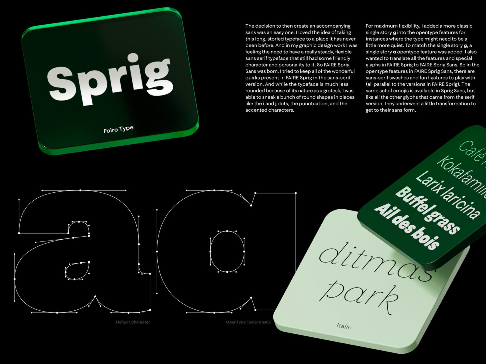
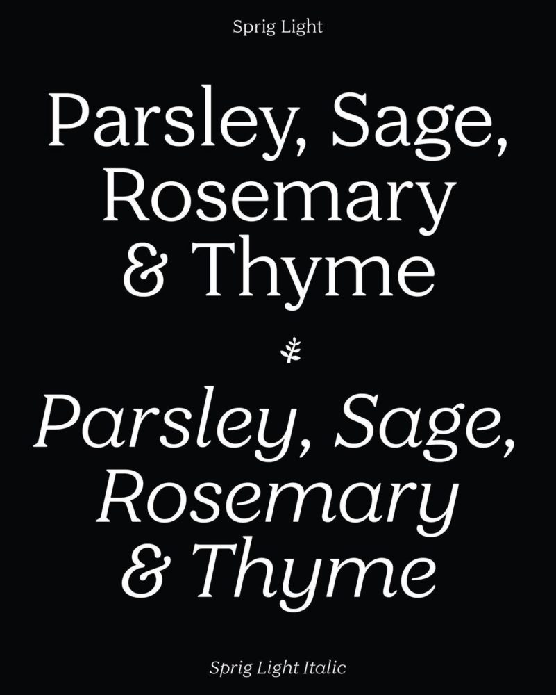
 Sprig is a contemporary type family with round, friendly details – that comes with both a serif and sans versions
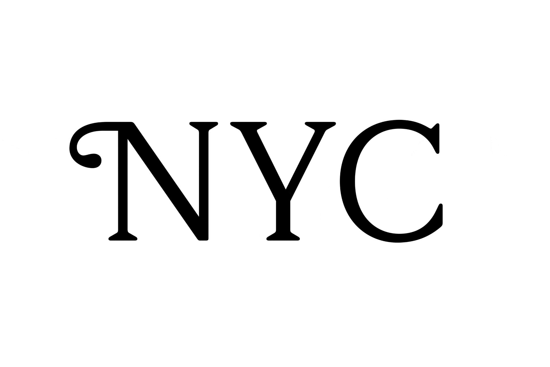
The Cheltenham typeface was the world’s first full-fledged large type family and has been dubbed as the embodiment of type design that is thoroughly American (Anatomy of a Typeface, Alexander Lawson) – and probably is the most widely known type designed in the United States.
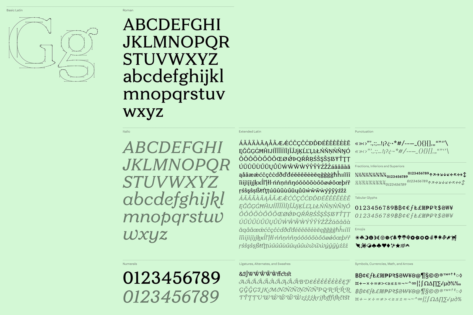
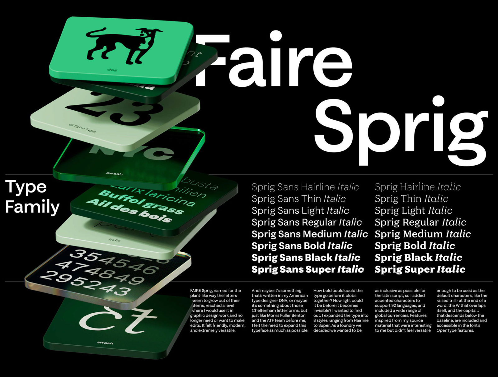
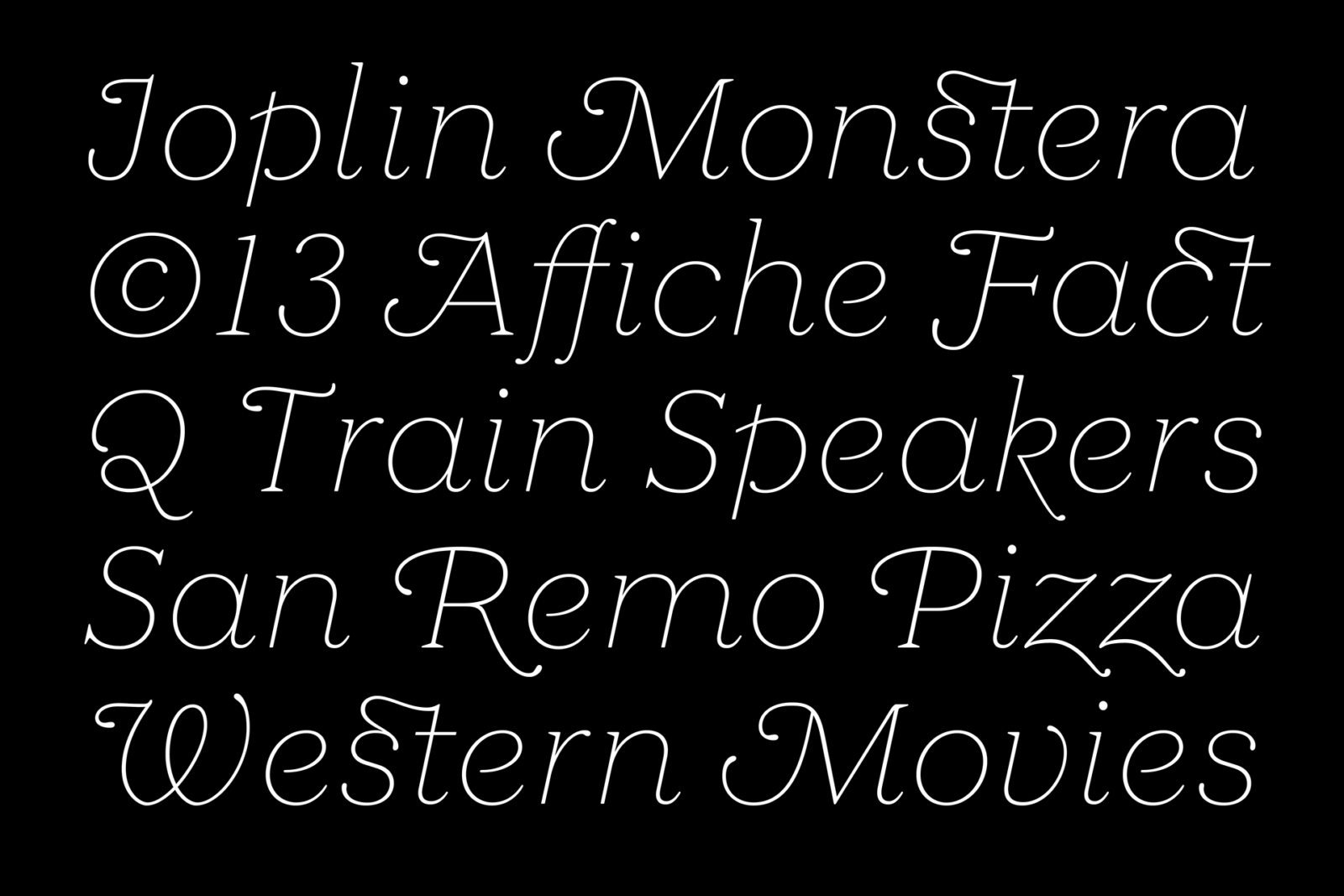
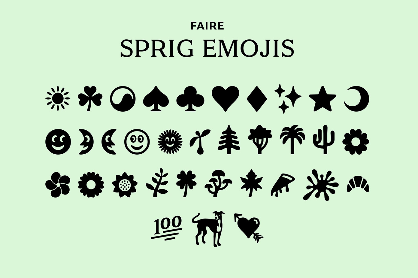
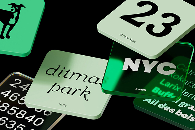
And the Sprig collection follows in its footsteps. Inspired by early versions of Cheltenham by Bertram Grosvenor Goodhue, the creation of Sprig began as a revival project for Sabrina, but over time grew away from its roots and into a more modern, geometric typeface. The Sprig type retains iconic details from Goodhue’s Cheltenham, like the open counter g and round teardrop terminals, but has updated proportions to increase legibility and usability. Drawn digitally with rigorous attention to every detail, the type shines in all sizes and the wide range of weights allow for a wide breadth of expression without leaving the family. The Sprig collection also includes Sprig Sans, a friendly geometric grotesk typeface, with matching proportions and weights to its serif counterpart. A wide number of OpenType features provide access to special characters like swash caps, ligatures, and alternate glyphs.
Sharpening the type in some places left me with a nice looking, well drawn fairly faithful representation of the Cheltenham as it was printed in Collecting Lustre Ware. Goal acheived! But over the years I worked on Sprig, I would always try to use it in client projects or in personal design work and each time I would use it, I would make small edits and adjustments. And over time those edits became more substantial — major updates to letter widths and proportions, updates to the x-height, simplifying some of the more distracting features — until I no longer felt a responsibility to the source material; the project had evolved.
– The Process of Creating Sprig, by Sabrina Nacmias
Read Sabrina’s in-depth article where she writes in detail about the process of creating Sprig and Sprig Sans here and follow the Faire Foundry on Instagram for more typography inspiration and the creative duo’s latest bespoke custom fonts, commercial type designs, and logotypes for brands.