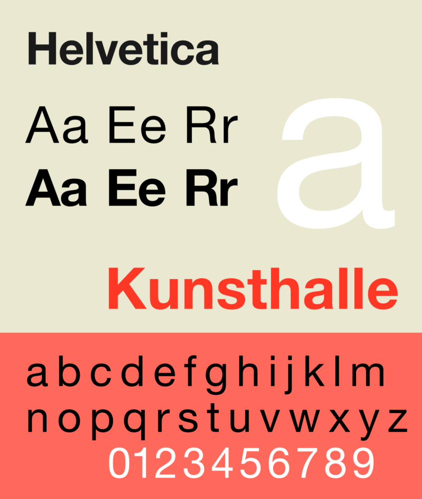
If anyone, regardless of their background, career, or interest in typography, is asked to name a font, any font. The most common answer would most probably be Helvetica. As undoubtedly one of the most famous and popular typefaces in the world, Helvetica is loved for its clean lines, no-nonsense shapes and simple efficiency. The sans serif typeface combines elegance with bold minimalism and is especially loved and appreciated by the design community.
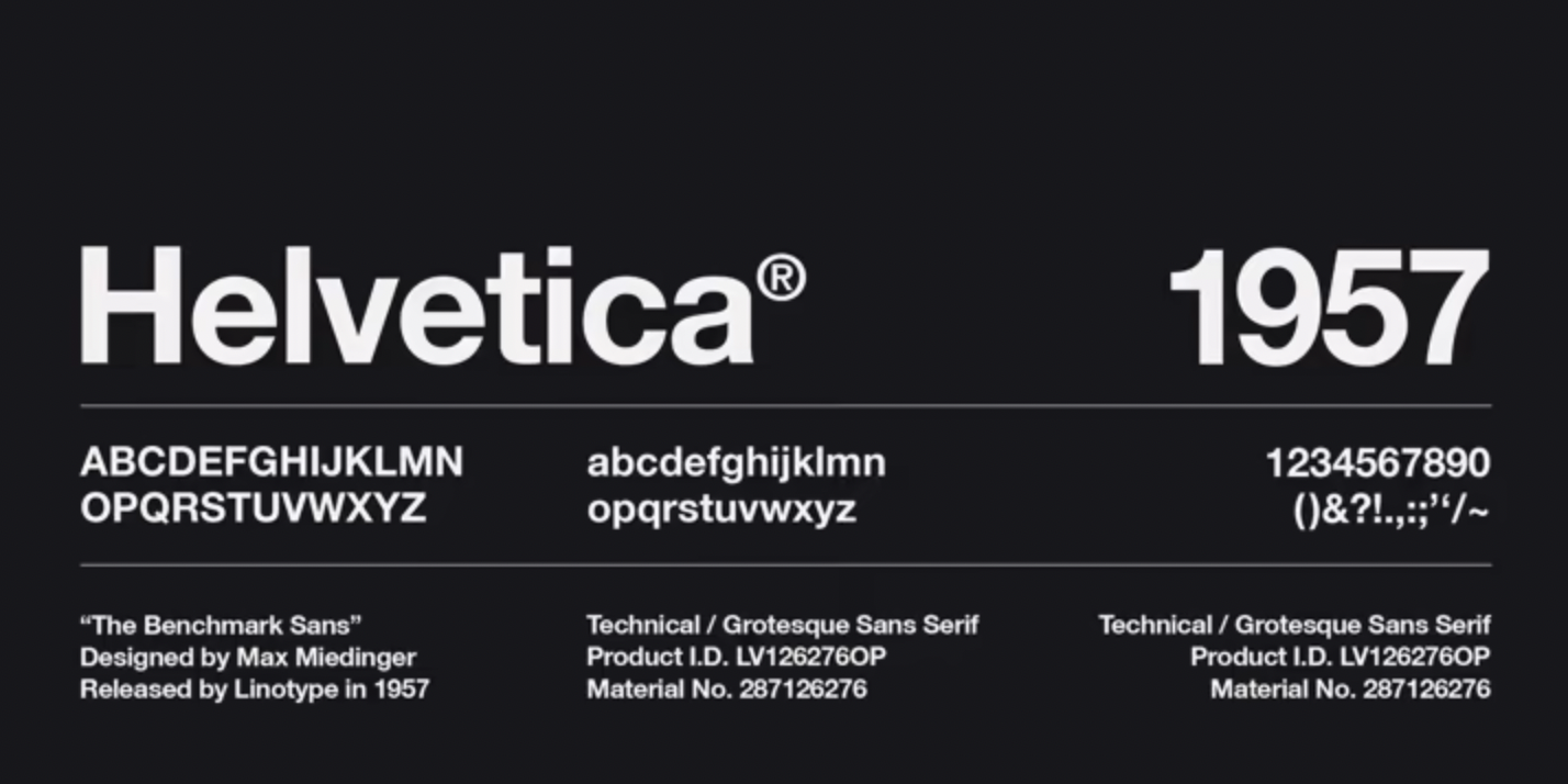
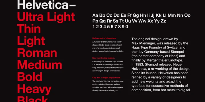
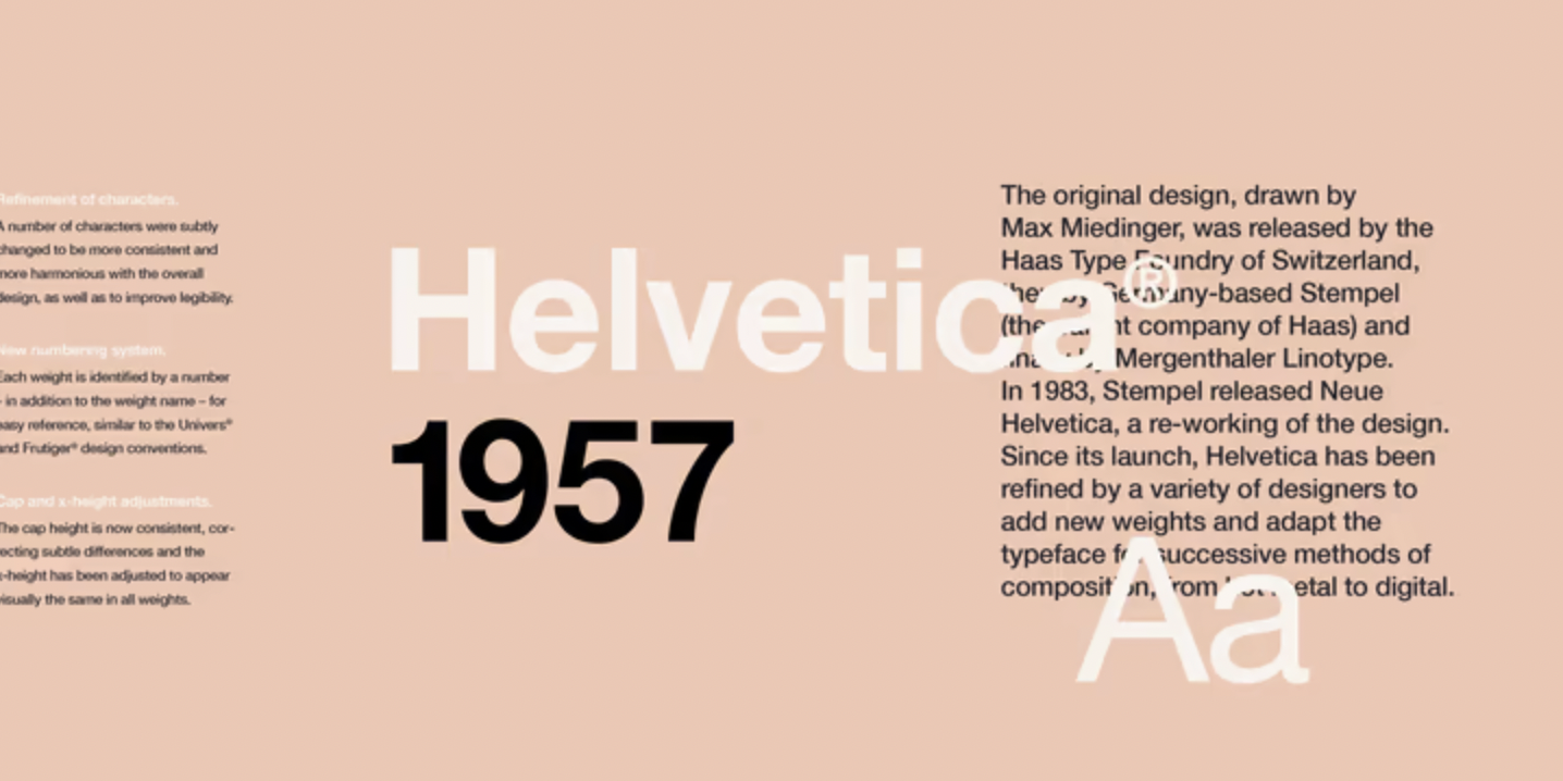
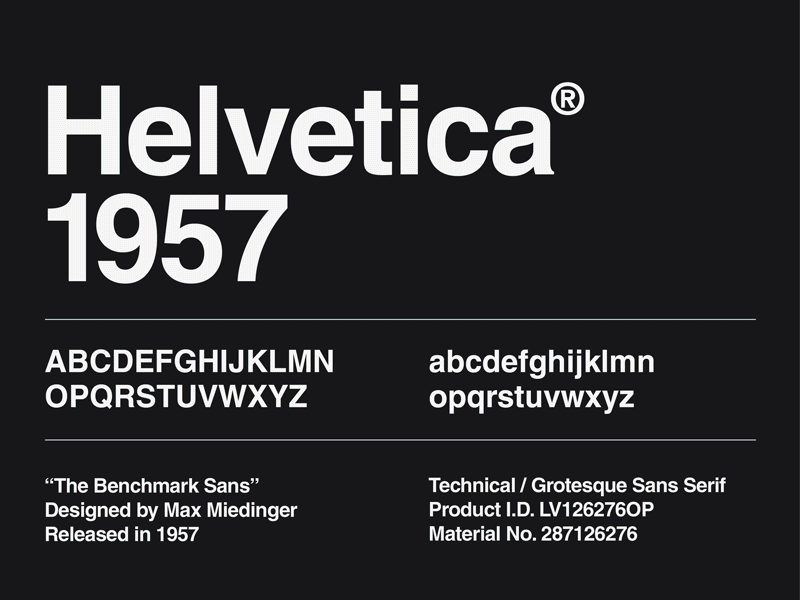
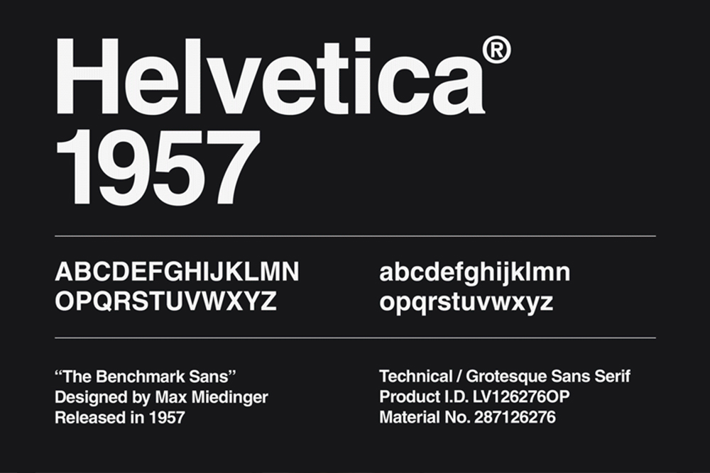
Helvetica was originally called Neue Haas Grotesk and was designed in 1957 by typeface designer Max Miedinger and Eduard Hoffmann, the president of the Haas’sche Schriftgiesserei (Haas Type Foundry) in Basel, Switzerland. Miedinger and Hoffmann set out to create a neutral typeface that had great clarity, no intrinsic meaning in its form, and could be used on a wide variety of signage – and in doing so, ended up designing one of the most popular typefaces of the mid-20th century. Soon after its release, in 1960 when the typeface was licensed by Linotype, the typeface was renamed Helvetica. An adaptation of “Helvetia” (Latin name of Switzerland) chosen to capitalize on Switzerland’s reputation as a center of ultra-modern graphic design.
Inspired by its predecessor, Helvetica’s success is often granted for the same characteristics it is criticized for – its unique tight spacing and dense and bold appearance
Akzidenz-Grotesk (released in 1898 by the Berthold Type Foundry) was the original inspiration behind Helvetica, as recovered notebooks by Hoffman showcase careful comparisons of Helvetica test proofs with parts of the Akzidenz-Grotesk letters. But as it came, Helvetica became such a success, that it ended up superseding Akzidenz-Grotesk which had been the most widely used general typeface for the prior 50 years. Helvetica’s success might be explained by its unique characteristics which include a tall x-height, making the typeface easier to read at distance, as well as the unusually tight spacing between letters that give the typeface a dense, solid appearance, making it perfect for capturing headlines. Yet the narrow apertures limit legibility on screen and in small print.
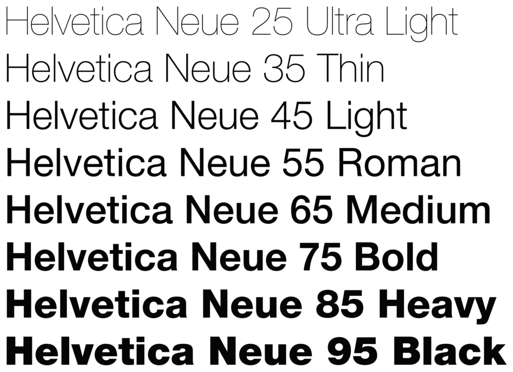
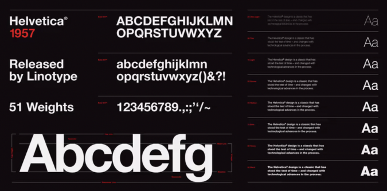
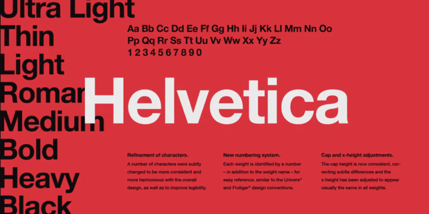
Over the years the typeface has been updated with many weights, styles, and sizes as well as matching designs in wide non-Latin alphabets and Cyrillic. It comes in 34 different font weights, with 20 weights being available in Central European versions, supporting the languages of Central and Eastern Europe. Now also commonly known as Neue Helvetica is a reworking of the typeface made in 1983 with a more structurally unified set of heights and widths, as well as improved legibility, heavier punctuation marks, and increased spacing in numbers.
Nowadays Helvetica is an extremely popular type choice for commercial use, as brands such as BMW, General Motors, Kawasaki, Knoll, Kroger, Lufthansa, Motorola, Nestlé, Skype, Microsoft, and Apple have utilized its versatility. Helvetica is widely used by the U.S. government, as well as NASA, the Canadian government, the European Union, New York City and Madrid Metro, only naming a few examples of the authorities or governmental entities that have relied on the popular typeface.
The full Helvetica typeface family is available for purchase here, and you can find the alternative, Neue Helvetica here.