Before Instagram squares, before collectible packaging, before brands fought for attention on supermarket shelves, there was the humble matchbox. Small enough to fit in a pocket, inexpensive enough to be disposable, and visible enough to be noticed dozens of times a day. This is the story of how the matchbox became one of the world’s earliest and most enduring miniature advertising spaces. Over nearly two centuries, these tiny cardboard boxes evolved into surprisingly rich canvases for graphic design, illustration, typography, political messaging, cultural storytelling, and commercial branding. What was once a simple vessel for carrying fire became a remarkable archive of visual history. And perhaps the most impressive part? Designers managed to communicate entire worlds on a surface often smaller than a business card.
The Birth of the Matchbox and How it Became an Advertising Powerhouse
Matches as we know them began appearing in the early nineteenth century, but early match packaging was far from standardized. Some were sold in paper packets, others in wooden containers. But as the match industry expanded throughout Europe and later across the globe, manufacturers quickly realized that packaging design could help distinguish one brand from another. So by the mid-to-late 1800s, decorative labels had become the defining feature of matchboxes. Improvements in printing technologies made colorful, detailed labels increasingly affordable, allowing manufacturers to transform ordinary packaging into eye-catching marketing tools. For many consumers, the label became the brand. And because everyone needed matches, everyone saw them.
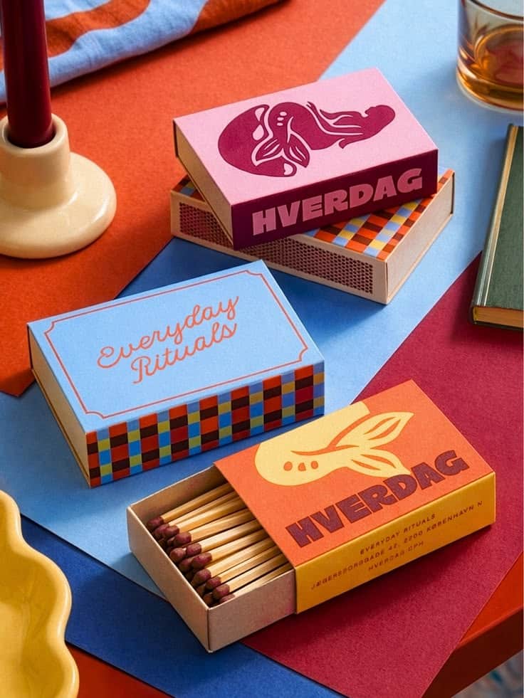
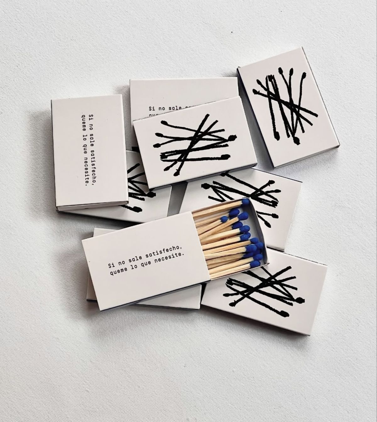
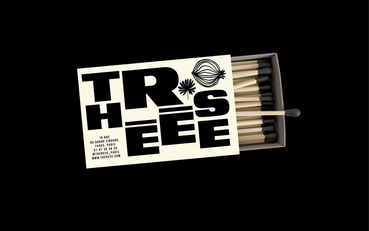
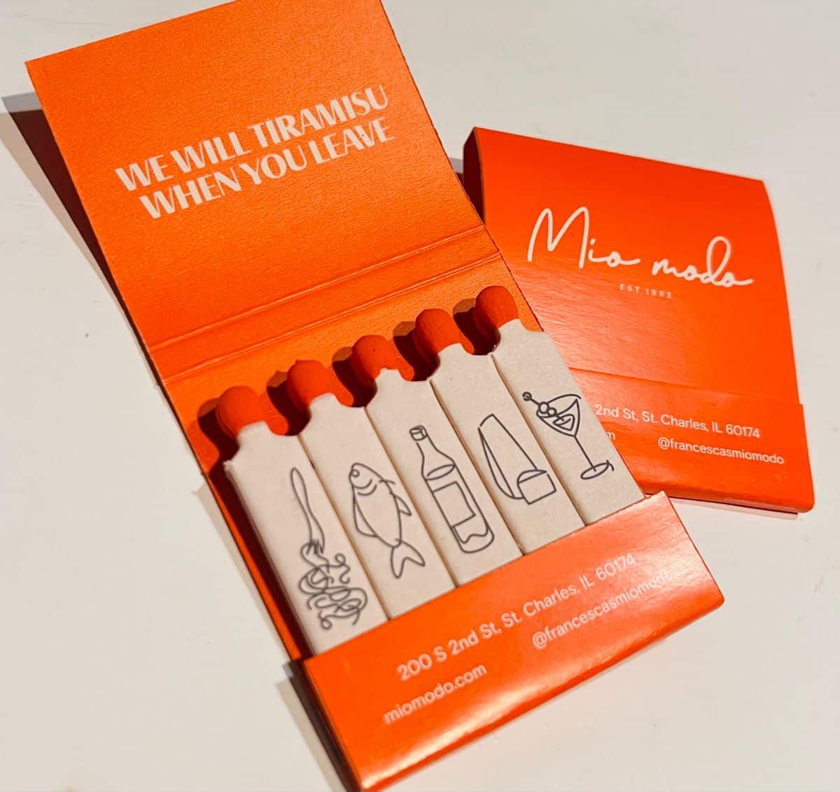
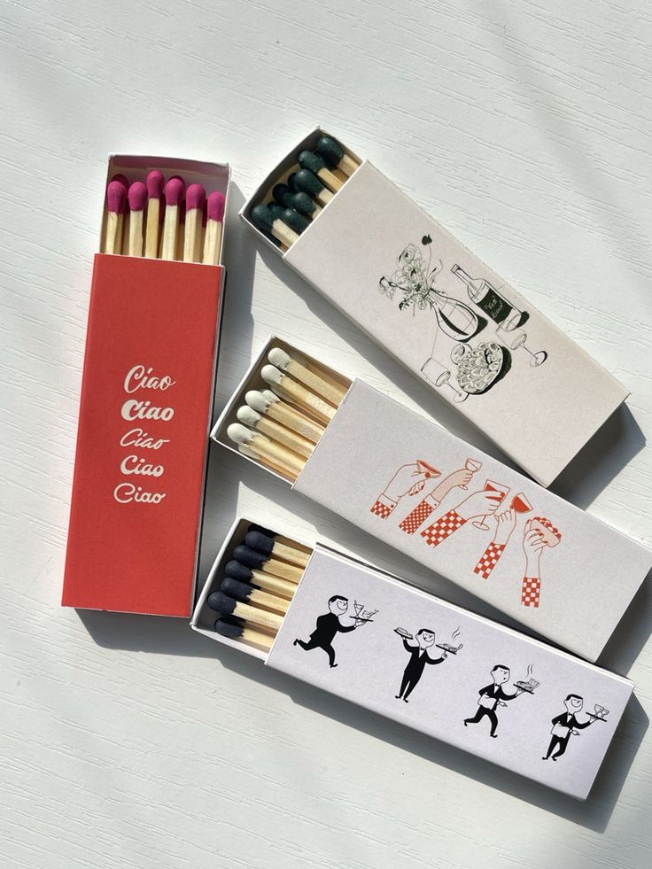
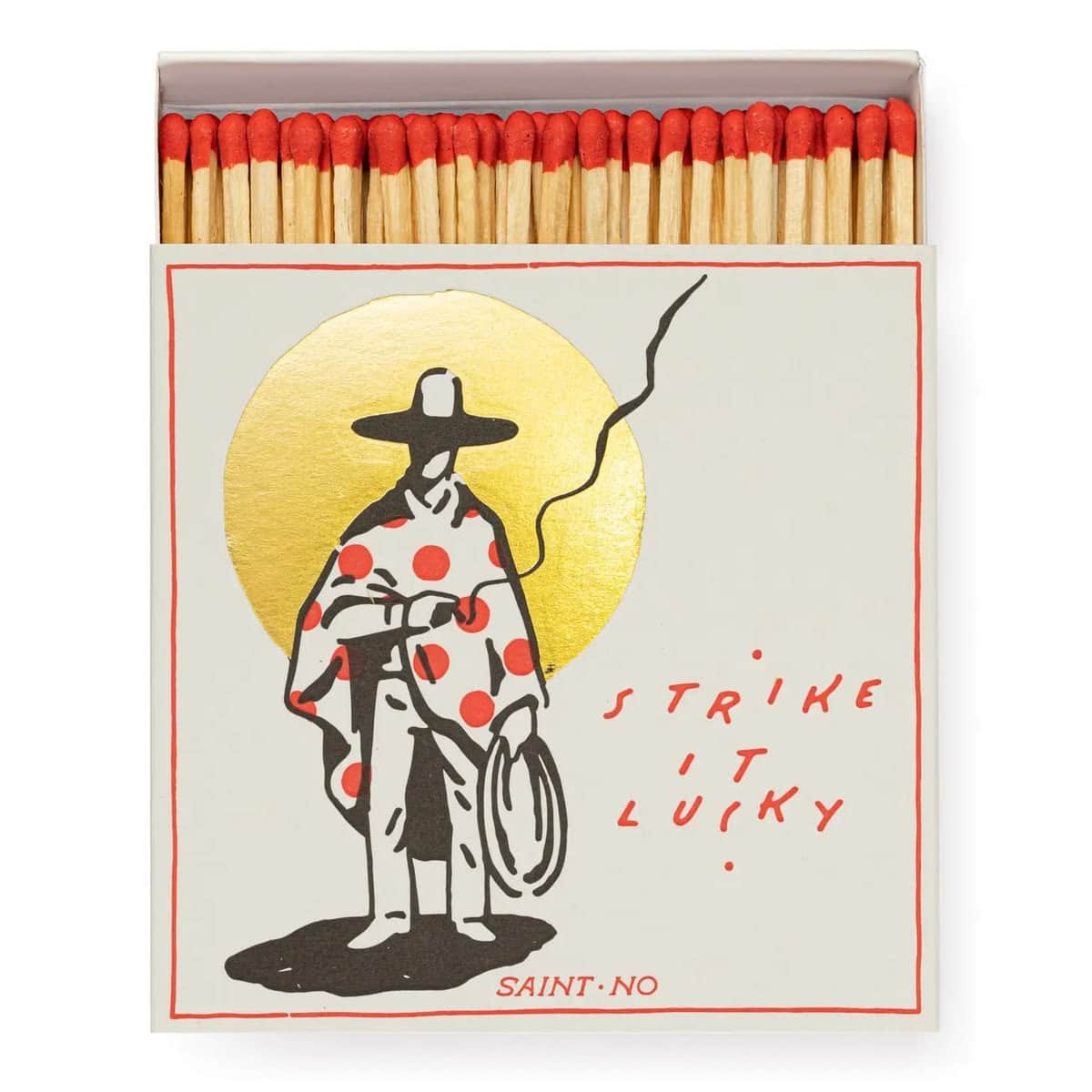
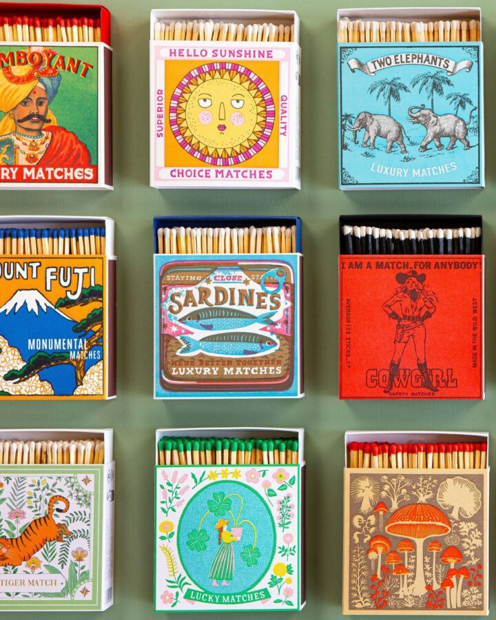
One of the most fascinating aspects of historic matchbox labels is the sheer diversity of their visual styles. Unlike many modern packaging systems that follow strict brand guidelines, early matchbox designs often embraced exuberance. Illustrators filled tiny spaces with animals, mythological creatures, landscapes, royal portraits, industrial scenes, decorative borders, national symbols, and elaborate typography. Some labels resemble miniature posters. Others feel like postage stamps, trading cards, or book covers reduced to an impossibly small scale. For graphic designers today, matchbox collections provide a fascinating glimpse into changing visual trends across decades and continents.
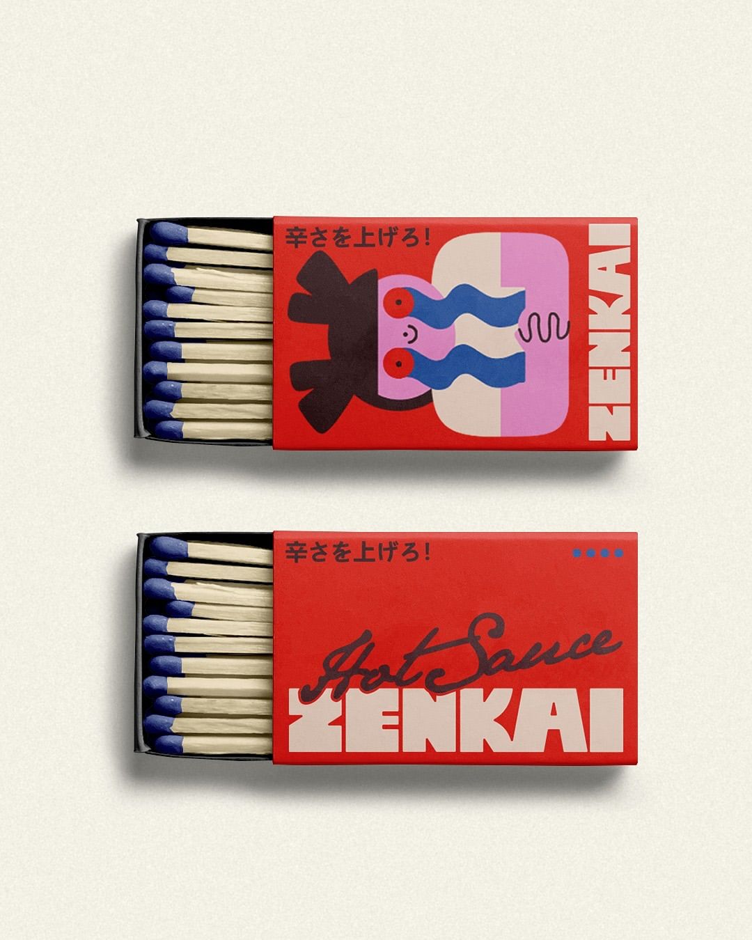
The late 19th and early 20th centuries marked a golden era for matchbox graphics. Advances in printing technology enabled the production of vivid multi-color labels in remarkable detail and consistency. Manufacturers embraced the opportunity. Bright reds, deep blues, gold accents, and intricate illustrations transformed everyday matchboxes into desirable objects. Many companies commissioned unique artwork specifically for their labels, resulting in an astonishing variety of visual identities. In some regions, particularly across Europe, India, Japan, and Russia, matchbox labels became miniature masterpieces of commercial art. The scale may have been small, but the ambition certainly wasn’t.
Long before digital marketing campaigns and sponsored posts, matchboxes were quietly doing much of the same work. A matchbox traveled. It sat on cafe tables, restaurant counters, hotel reception desks, bars, trains, and in people’s pockets. Unlike newspaper advertisements that disappeared after a day, matchboxes often remained in circulation until every last match had been used.
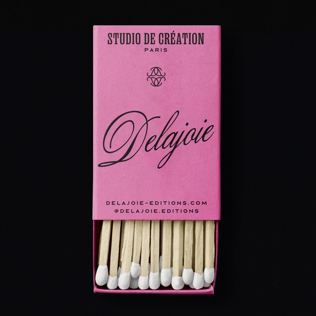
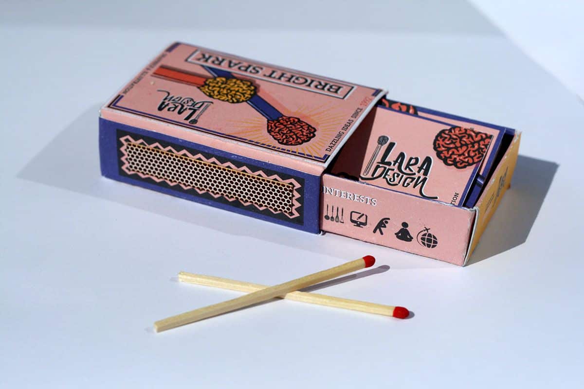
Businesses quickly recognized their promotional potential. Hotels distributed branded matchboxes as souvenirs. Restaurants printed logos and illustrations on custom covers. Tobacco companies, breweries, theaters, and countless local businesses used matchboxes as affordable advertising media. You could even argue that the matchbox was one of history’s earliest branded giveaways. The OG of the promotional product world that most probably didn’t even exist yet. The 19th-century equivalent of leaving a conference with a tote bag full of promotional merchandise — only considerably more useful if your candle needed lighting.
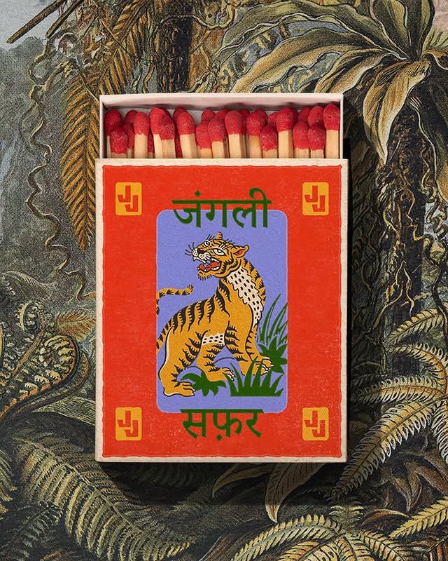
But beyond advertising, matchbox designs also offer an extraordinary record of social and cultural history. Many labels reflected contemporary events, technological achievements, national pride, and popular trends. Airplanes, steamships, automobiles, industrial machinery, sports heroes, political figures, and cultural icons frequently appeared on labels. Some celebrated progress. Others promoted patriotism. Some simply featured a particularly impressive tiger. Together, they form a visual timeline of changing societies and aspirations.
Collectors and historians often study matchbox labels not only for their artistic qualities but also for what they reveal about the periods in which they were produced. In many ways, they function as miniature historical documents.
The Rise of Collectible Matchbox Art
As designs became more elaborate, people began collecting them. By the early twentieth century, matchbox labels were being saved, exchanged, cataloged, and displayed. Entire communities of collectors emerged around the world, preserving labels that might otherwise have been discarded. For designers, this accidental archiving has become an invaluable resource.
Today, collections reveal visual languages that may have disappeared elsewhere. Styles of illustration, typography, ornamentation, and printing techniques survive through these tiny artifacts, inspiring contemporary creatives seeking authentic historical references. Some collections contain thousands of examples spanning decades, countries, and artistic movements. Not bad for something originally destined for the rubbish bin.
One of the joys of exploring matchbox history is seeing how different cultures approached the same format. Swedish match labels often embraced clarity and symbolism. Japanese designs frequently showcased elegant composition and strong graphic simplification. Indian matchbox labels became known for their vibrant colors and rich visual storytelling. Soviet-era labels introduced bold propaganda-inspired graphics, while many European manufacturers leaned into decorative illustration and heraldic motifs.
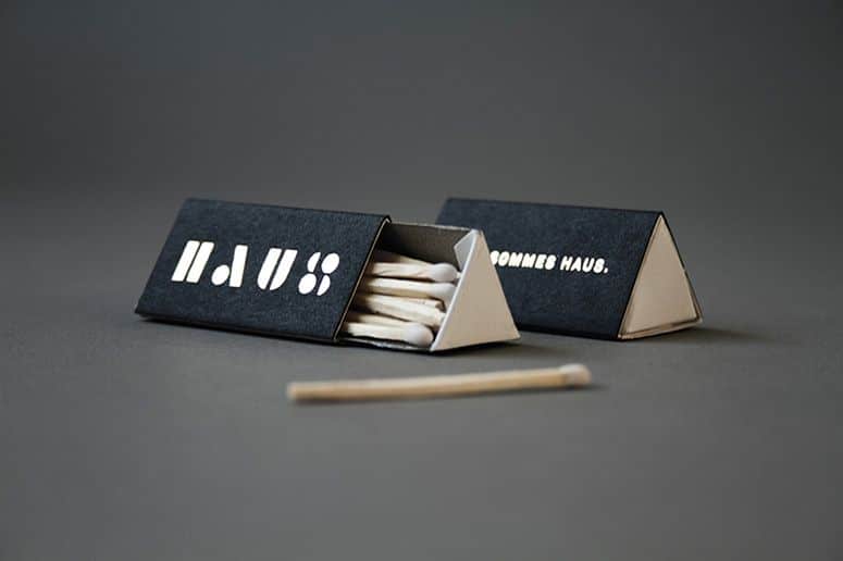
Despite regional differences, certain design challenges remained universal. How do you create impact on a surface barely larger than a postage stamp? The answers varied enormously. And that’s precisely what makes matchbox design so fascinating.
Modern designers can learn a surprising amount from historic matchboxes. Limited space forced designers to prioritize clarity, hierarchy, and immediate visual recognition. Every element had to work hard. Illustrations needed to communicate quickly. Typography had to remain legible at small sizes. Color choices had to attract attention instantly. In many ways, the constraints faced by matchbox designers are remarkably similar to today’s challenges of designing app icons, social media graphics, packaging labels, and digital thumbnails. Different technologies, same battle for attention. The best matchbox designs remind us that strong visual communication doesn’t depend on size. Sometimes the smallest formats demand the greatest creativity.You might be holding a tiny piece of design history—one spark away from disappearing forever.