


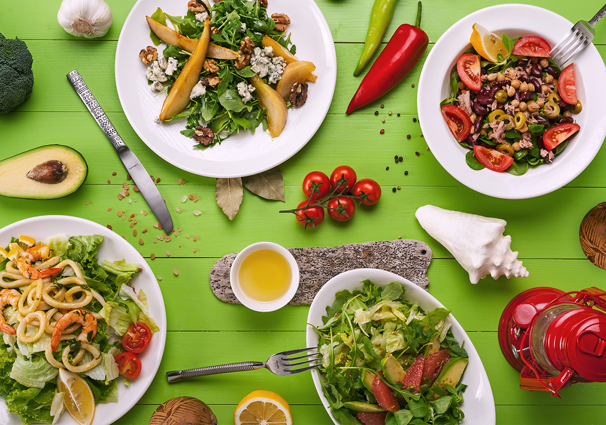

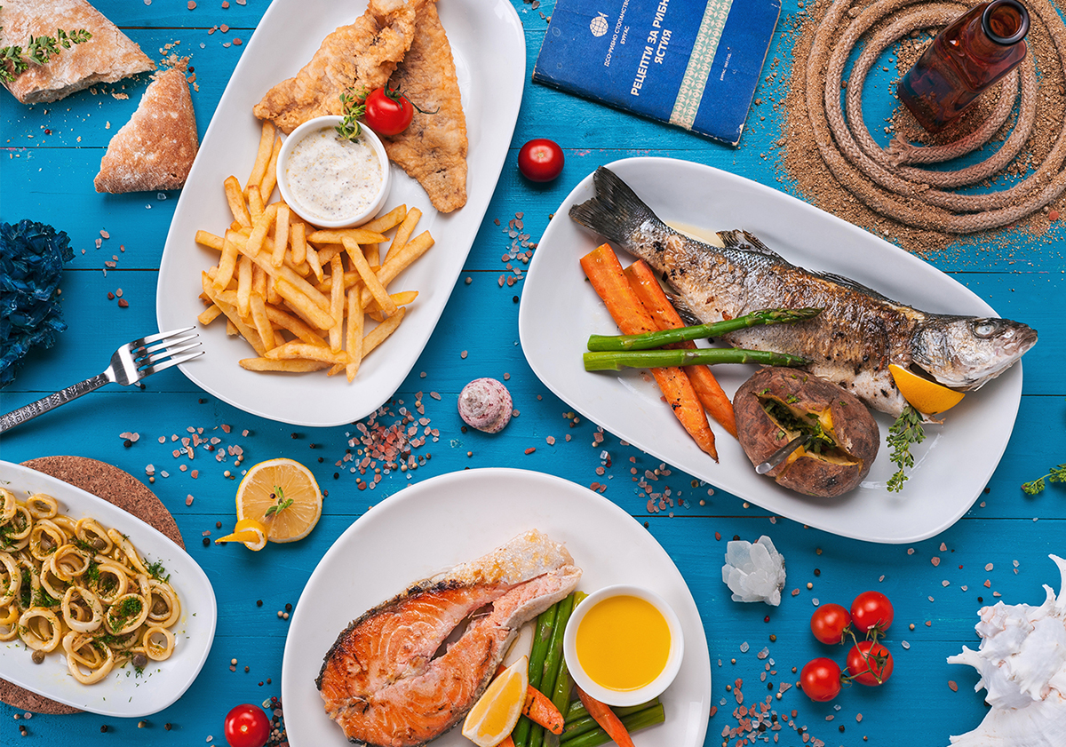

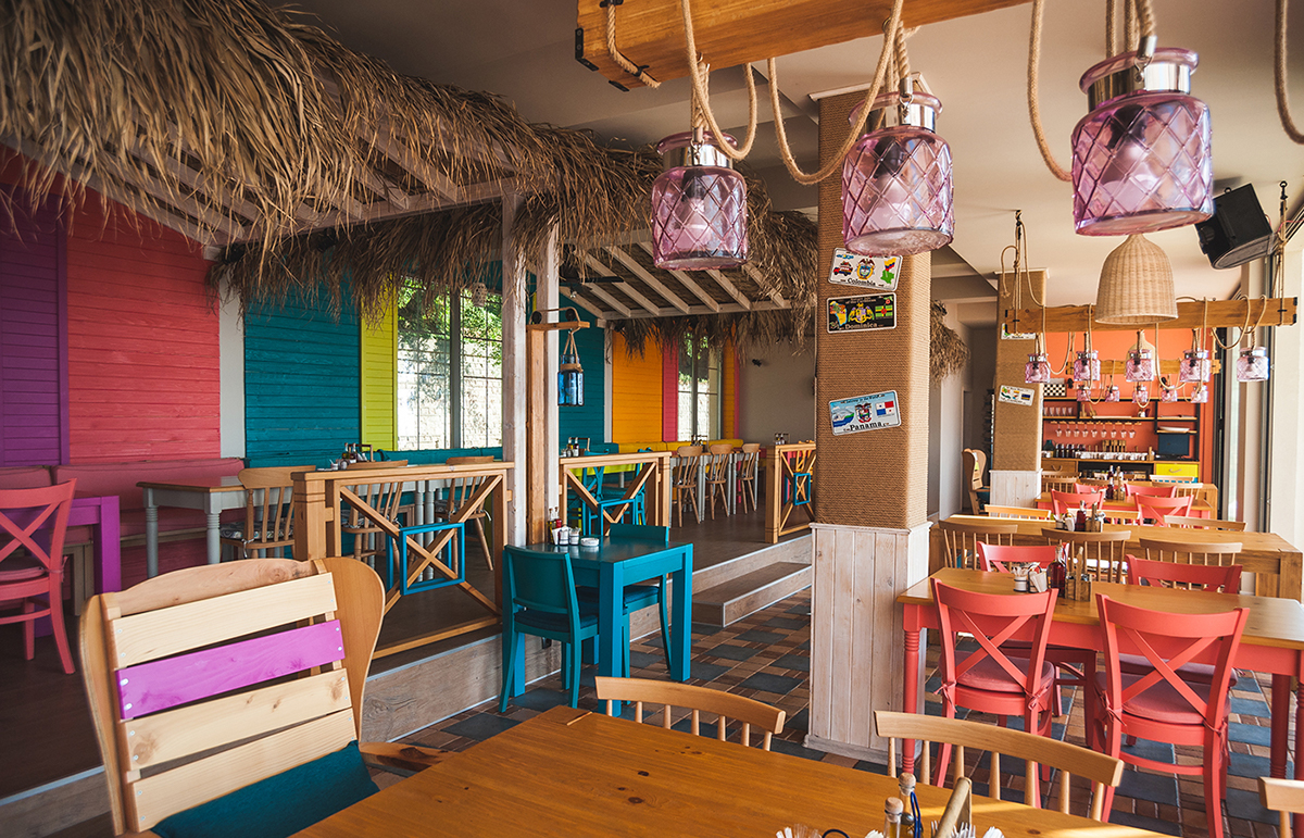
Holy mackarel, this branding of Bulgarian fish and shish restaurant El Kapan is off the hook. Founded in 2016, the popular eatery and hang out spot of the local youth in central beach of Varna combines tasty seafood and bbq with atmospheric music. El Kapan has a colorful and lively interior that swims in endearing and stylish details, definitely a place where I could spend a summer night or two.
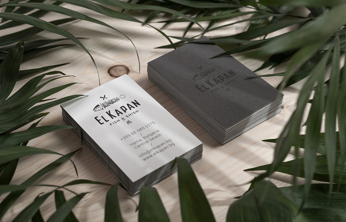
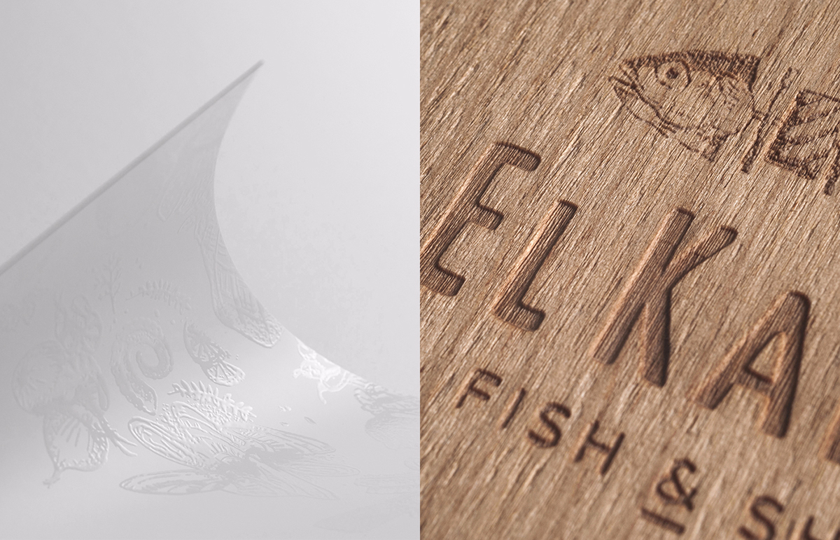
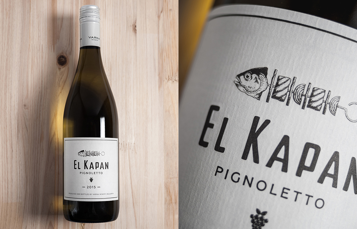
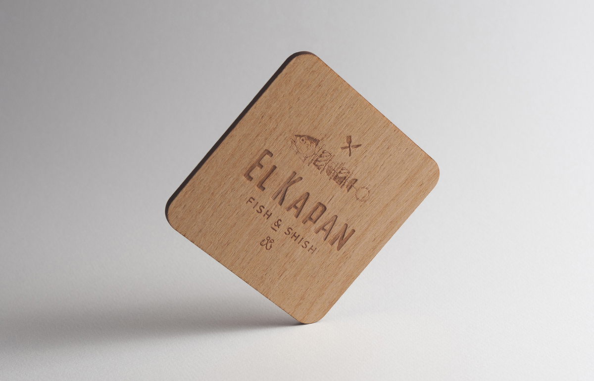
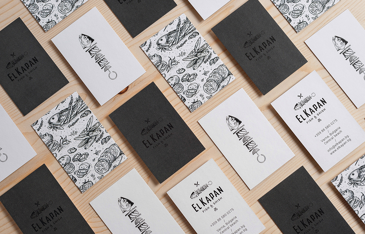
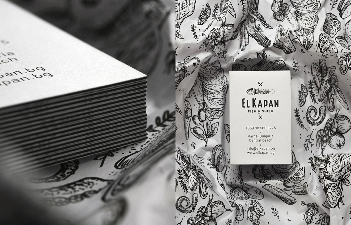
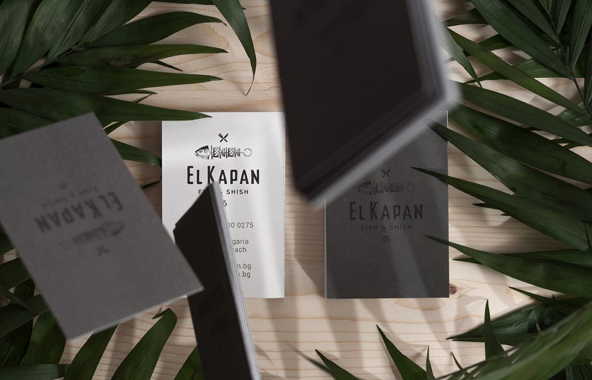
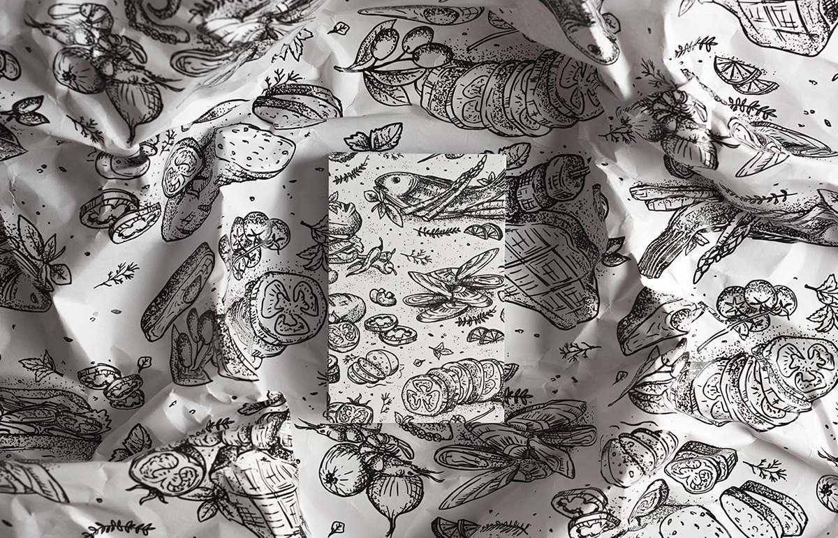
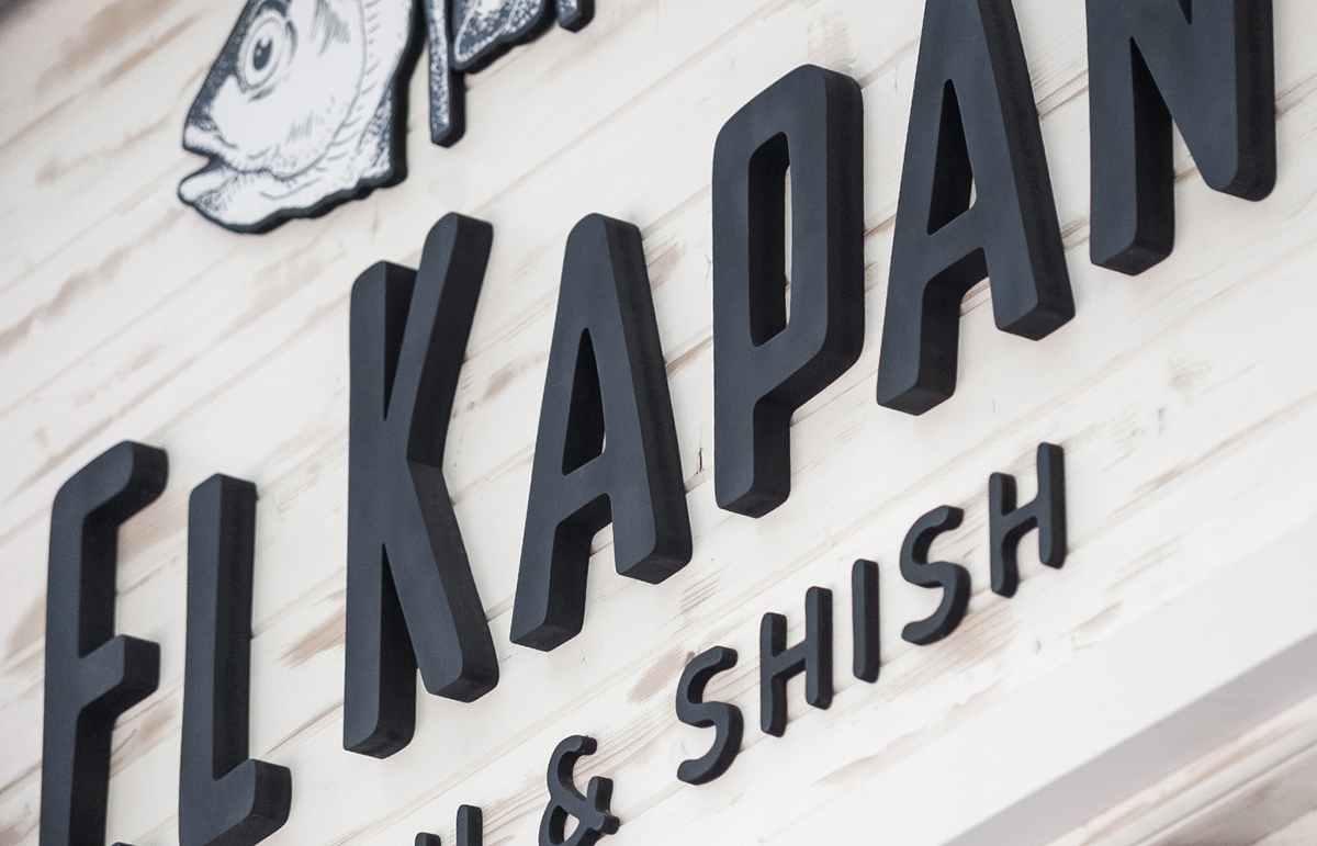
To honor El Kapan’s personality, Creative Collective Marke designed a visual identity that centers around a stylish, eye catching logo of a fish shish – a kebab style barbecue stick complete with a fish head. Done in delicate hand drawn design, the style is repeated in a pattern that is used across the stationery range from the business cards to place mats. Unobtrusive methods like engraving and blind embossing are used along with more traditional techniques. In a somewhat surprising way, the colorful laid back style of the interior is contradicted in the searious yet cool, mostly monochrome identity, bringing quality and class to the over all entirety. The flavour and rhythm of the atmosphere comes from the balance of polished yet trendy design and young, undemanding vibe, only achievable via truly soulful
Images © Marka Collective