


 Bureau Rabensteiner, who hails from the mountainous city of Innsbruck, have alway set themselves a par from the rest in my eyes. Their style is recognisable in it’s simplicity but it’s the skill of staying above the momentary trends but always achieving a cool contemporary edge with a personal twist that elevates their work. Their latest project is a prime example of this.
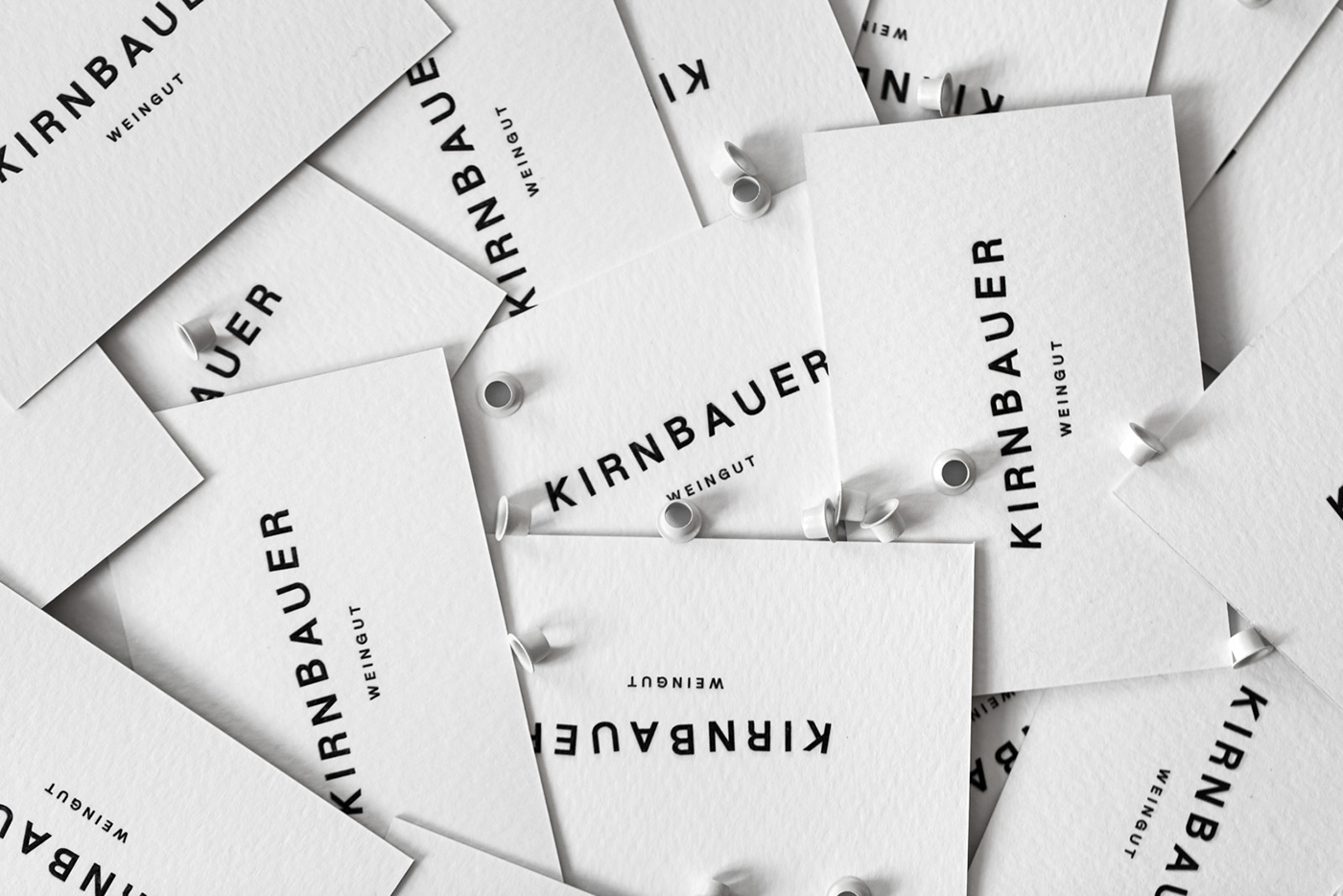
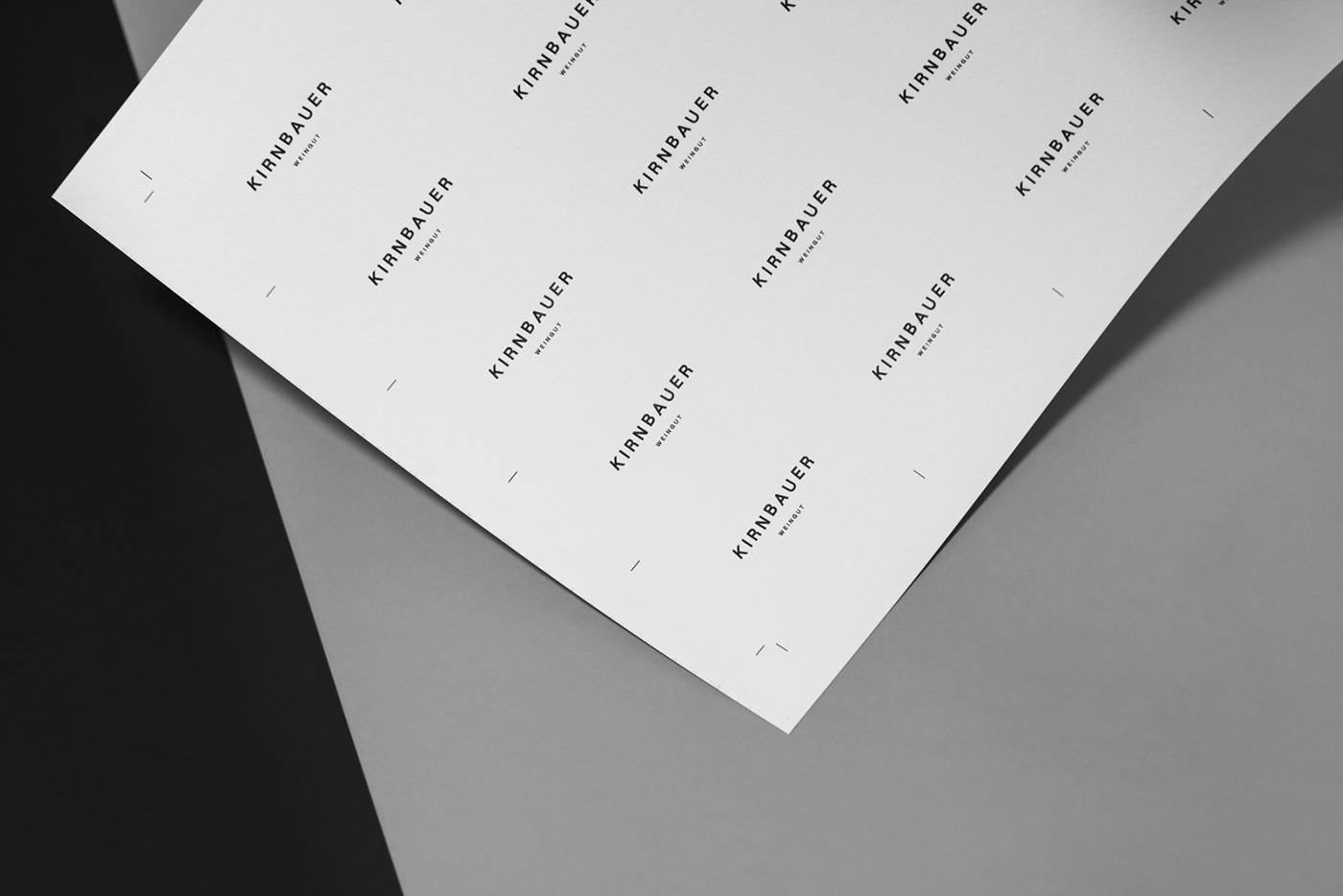
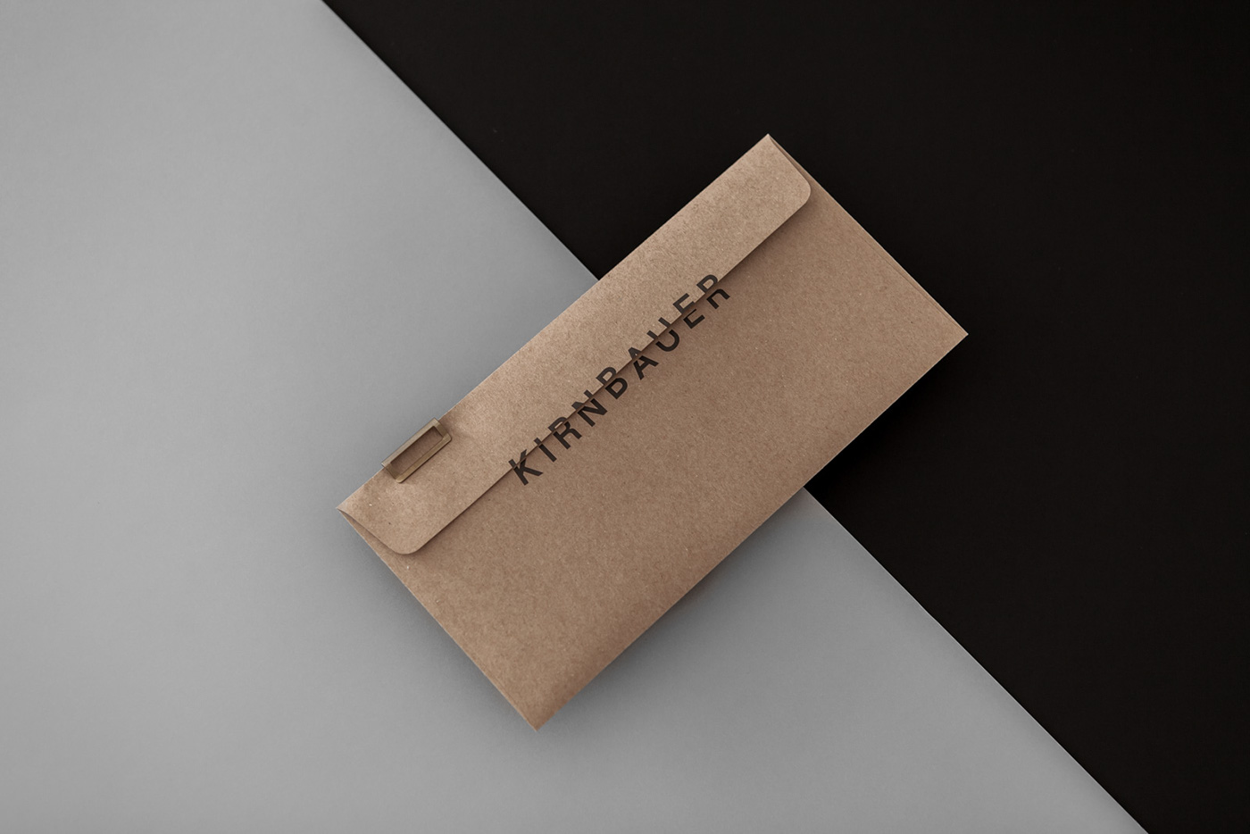
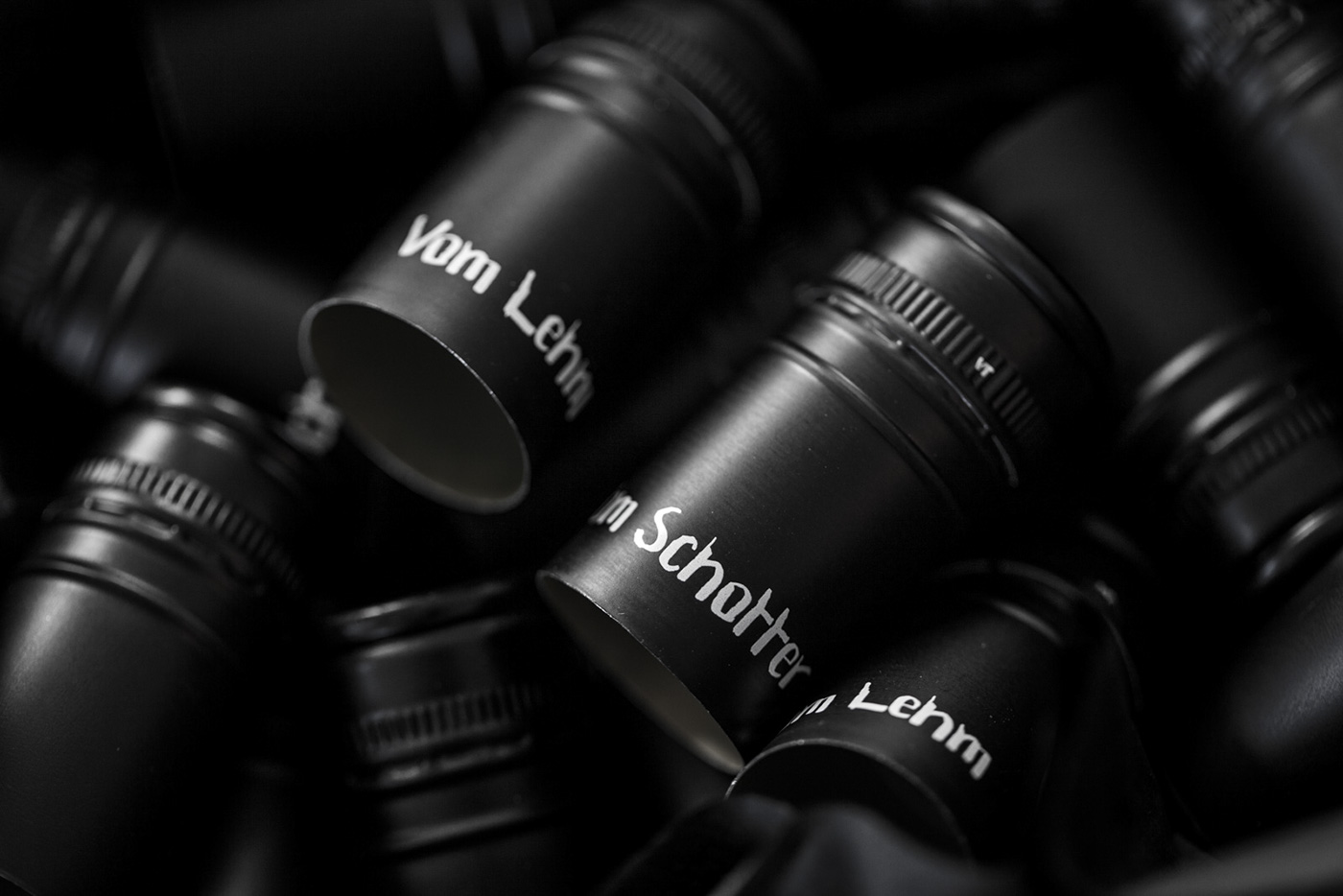
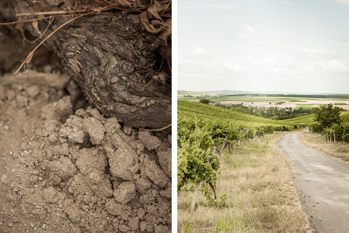
The new branding of Weingut Kirnbauer complements the bold character of their wines. It makes reference to the ornate, split, baroque labels that have served as a sign of quality for so many years. The classic, minimal and slightly off-beat typographic logo is the common thread throughout the concept, combining the characters of the two young wine makers, their values and their wines – they blend opposites.
Wine-making has undergone a transformation. ‘The more, the better’ is no longer relevant. Today, we increasingly pay attention to the ingredients wines do not contain. Higher quality and hygiene standards have produced lighter wines in line with our modern lifestyle. Dusty wine cellars have been replaced by open architecture. This transition is reflected in the Kirnbauer products. And in our labels. We have freed the labels of squiggles, decorations and embellishments. What’s left is a premium wine. Unadorned. – Bureau Rabensteiner explains.
Images © Bureau Rabensteiner