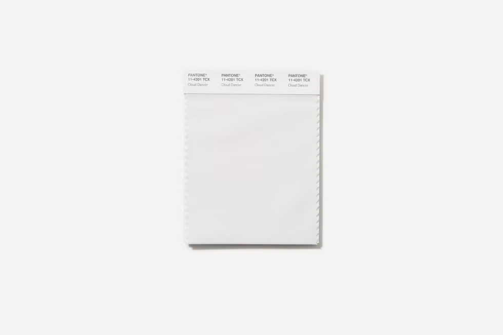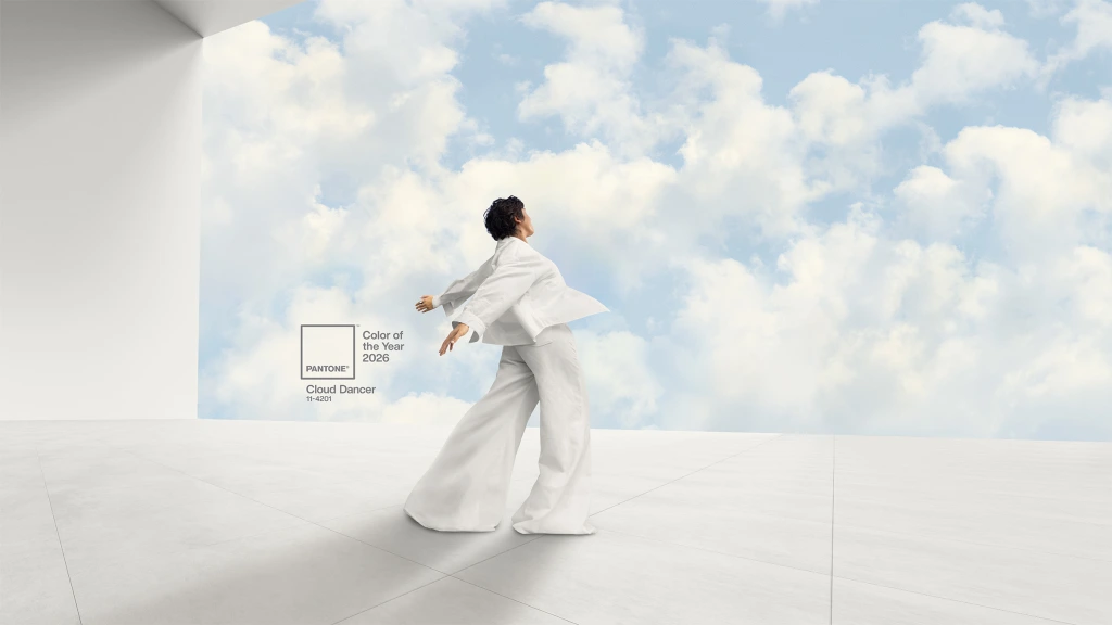
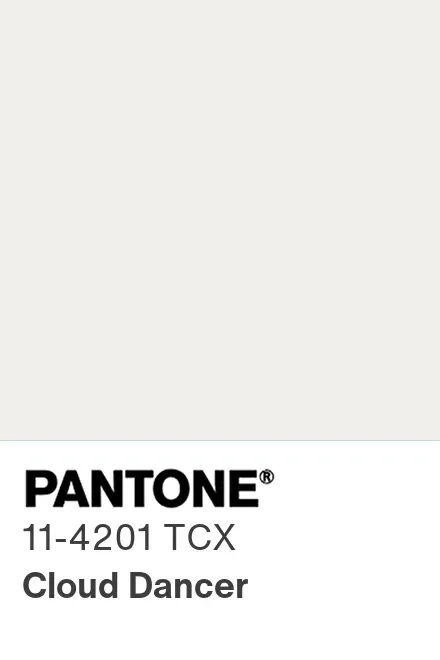
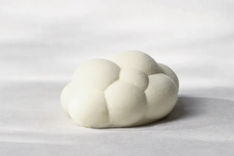
On December 4, Pantone revealed its 2026 Color of the Year: a soft, airy white hue called Cloud Dancer (PANTONE 11-4201). The company describes Cloud Dancer as an “airy white neutral whose aerated presence acts as a whisper of calm and peace in a noisy world.” For Pantone, the shade signals a collective yearning for clarity, renewal, and a fresh start, offering a blank canvas for creativity, introspection, and a break from overstimulation.
2026 marks the first time Pantone has ever chosen a shade of white as its Color of the Year since the program began in 1999.
The practice of naming a Color of the Year began at the turn of the last century, when the Pantone Color Institute selected Cerulean (15-4020), a bright, optimistic sky-blue, to mark the new millennium. What started as a symbolic gesture soon turned into a highly anticipated annual event. Each year, a global team of color experts examines trends in art, fashion, design, travel, social media, and cultural shifts — looking for a hue that captures the mood and aspirations of the moment.
Over the past two decades, the Pantone Color of the Year has moved from vivid blues or energetic reds to soft pastels, bold statements, and earthy tones. For example, the color of 2024, Peach Fuzz, was a gentle, nurturing peach that spoke to human connection and comfort, while the color of 2025, Mocha Mousse, signaled a rich, earthy brown evoking warmth, grounding, and refined indulgence. Now with Cloud Dancer, the trend seems to circle back to minimalism — but with a twist: a white that isn’t sterile or cold, but soft, balanced, and hopeful.
Why a white shade — and why now?
According to the Pantone Color Institute, Cloud Dancer is meant to offer “promise of clarity” at a time when many feel overwhelmed by the pace and complexity of modern life. In this sense, the choice signals a collective yearning for calm, balance, and renewed focus. A minimalistic counterpoint to overstimulation. The 2026 choice reflects a broader cultural turn toward simplicity, introspection, and perhaps even sustainability. In a world marked by rapid change, noise, and uncertainty, Cloud Dancer evokes a gentle return to clarity, grounding, and open space.
And while white is often thought of as “nothing”, a non-color, in design, it can act as a powerful backdrop or a tool for strong messaging. Pantone itself calls Cloud Dancer a “living calm that invites renewal, vision in serenity and creative release.” And whether used in interior design, packaging design, or branding, this airy white can harmonize with bold or pastel palettes alike — giving creators freedom to let textures, shapes, or other colors shine.
A choice that divides. Some call it a rejection of color, while others call it a statement.
Not everyone has welcomed Cloud Dancer with open arms. The decision to pick a white shade, especially amid culturally loaded debates over color, identity, and representation, has ignited controversy and debate. Some critics argue the move is “tone-deaf,” questioning whether white can adequately capture the diversity of our complex global culture in 2026. Others view the choice as the beginning of a minimalist – even rebellious — movement, rejecting overstimulation and embracing restraint. Regardless of stance, the debate underscores that color is rarely “just a color”. It carries cultural, psychological, and emotional weight.
For designers and creatives, this tension is precisely why the annual Color of the Year matters. It prompts conversation — not just about aesthetics, but about values, context, and cultural climate. What do you think? Will 2026 be the year of gentle whites, thoughtful designs, and mindful simplicity – or a black canvas, ready to be explored?