The Pantone Color of the Year is an annual announcement by Pantone, a company best known for its Pantone Matching System (PMS), which is widely used in the design and printing industry. The Color of the Year is a symbolic representation of the current cultural climate, expressed through a specific color that Pantone believes will have an impact on design, fashion, and various other creative industries.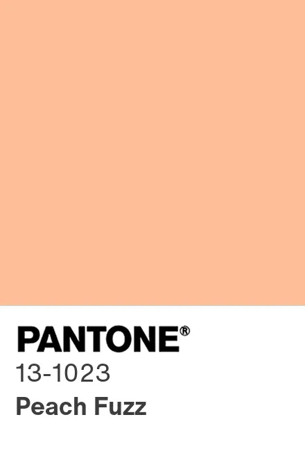
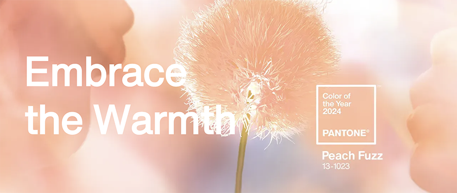
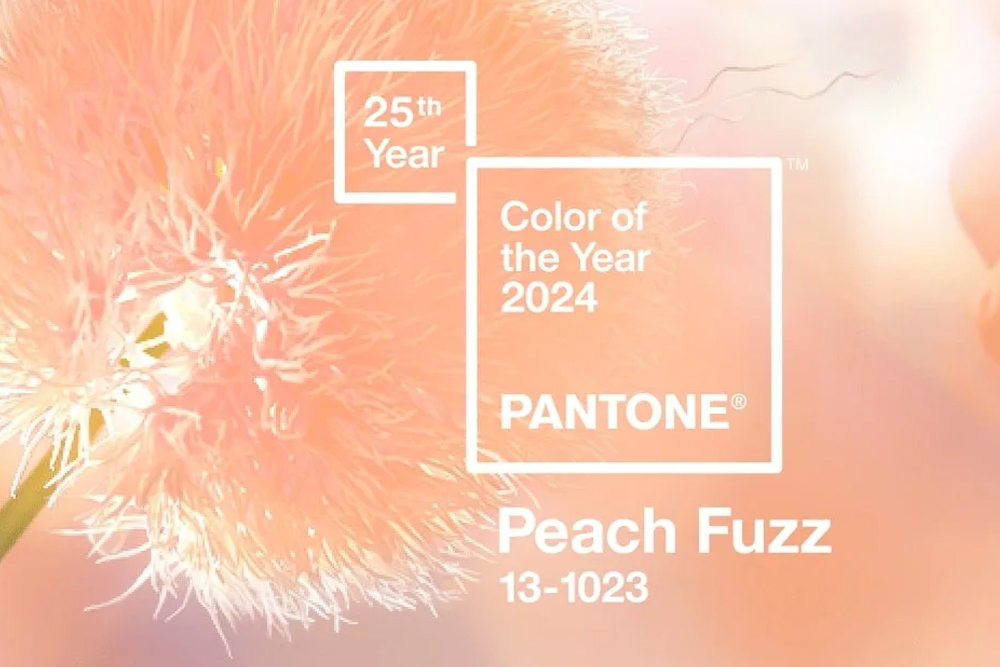
PANTONE describes their chosen color of the year for 2024: 13-1023 Peach Fuzz, as “a velvety gentle peach whose all-embracing spirit enriches mind, body, and heart”. The warm, fuzzy tone was seemingly chosen for its ability to capture our desire to nurture ourselves and others, while its velvety gentle peach tone embraces the spirit and enriches our soul.
Subtly sensual, PANTONE 13-1023 Peach Fuzz is a heartfelt peach hue bringing a feeling of tenderness and communicating a message of caring and sharing, community and collaboration. A gift to the senses, which allows it to create a symbiotic relationship between our sense of taste, sight, touch, and scent. – Pantone writes.
“In seeking a hue that echoes our innate yearning for closeness and connection, we chose a color radiant with warmth and modern elegance. A shade that resonates with compassion, offers a tactile embrace, and effortlessly bridges the youthful with the timeless”, says Leatrice Eiseman, the Executive Director of the Pantone Color Institute.
What does the Pantone 13-1023 Peach Fuzz color mean in branding and packaging?
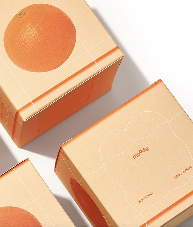
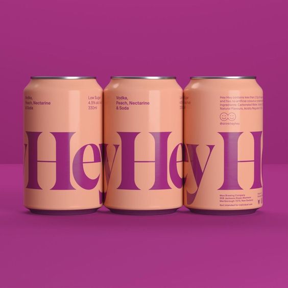
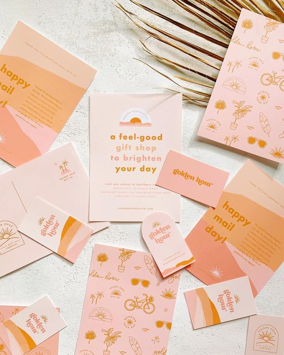
The colors a brand chooses to represent its product, values, or ethos, can affect the mood, feelings, and behaviors of its target consumers. Based on the psychology of color, the color peach is often seen as sweet, pleasant, and friendly, making a brand relatable and easily approachable. While attributes such as vitality, energy, playfulness, and encouragement can also be tied to the soft and gentle hue, Peach can be thought of as a therapeutic color that brings harmony – all the while reducing fear and tension. Making it popular among skincare, self-care, and other wellness brands. When combined with another color, a stronger, bolder shade, the mood changes, and even the peach color seems to grow stronger. On its own the color is warm and welcoming, almost like a hazy summer morning, but when in contrast with another shade, the mood changes to a bolder, more playful scene.
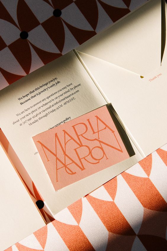
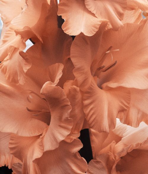
It’s traditionally believed that darker color perceives the brand as more serious and conservative, while a lighter shade, like the soft fuzzy peach color, signals a softer, more creative brand, creating a distinction between younger and more mature audiences. But have you ever thought about why and when you choose a brand or a product? Could it be the color of its branding and packaging? We for one are looking forward to seeing how the Pantone Color of The Year: Peach Fuzz will be welcomed by the creative scene. Below you can see a few examples of the color in use.