Alessia Oertel’s Modern Branding For An Avant-Garde Exhibition Space Buzz Soundart Galerie

Kiel-based designer Alessia Oertel creates unique, simple, and timeless design solutions and strategic assistance for international brands in the personal products, education, leisure, fashion, and tourism sectors. With an eye for details that amplify the message to target customer groups, the designer’s skills lie in creating engaging and desirable brand experiences.

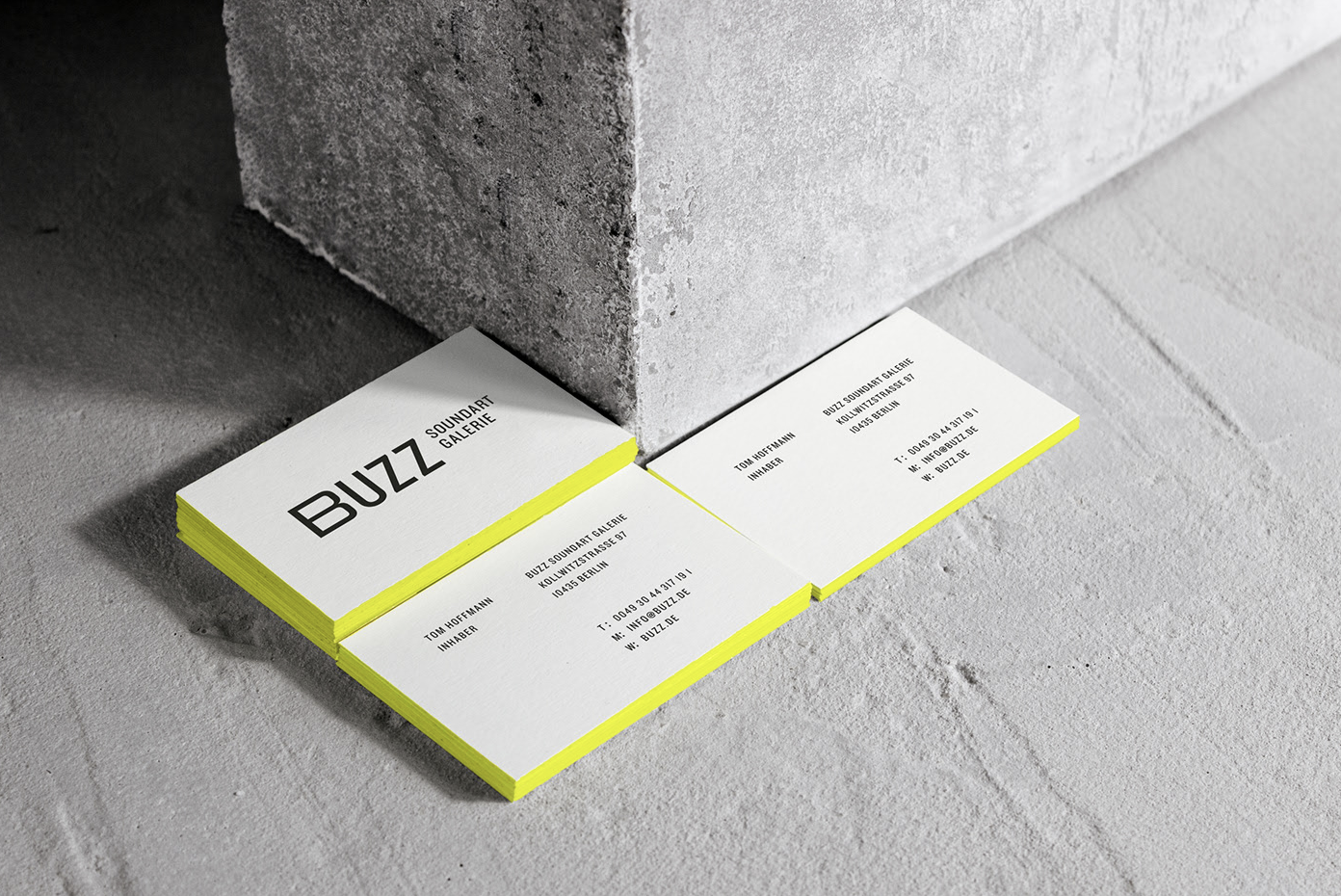
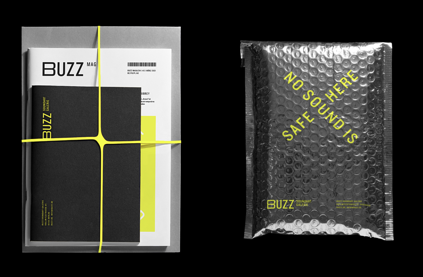
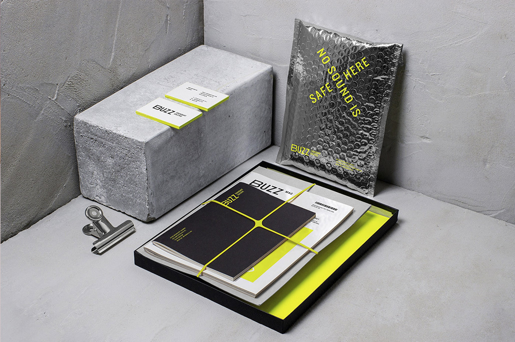
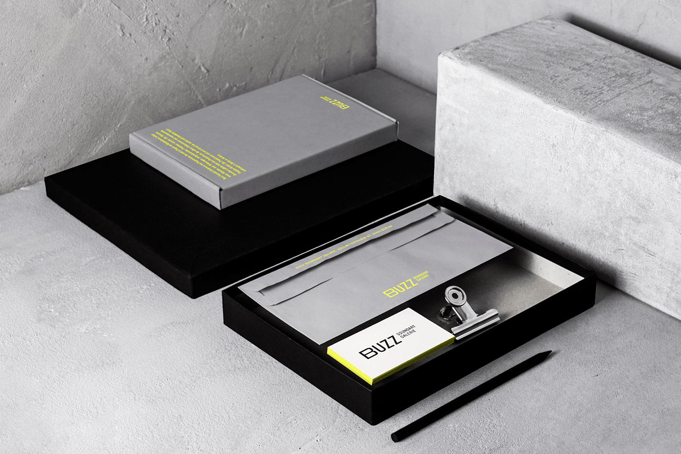
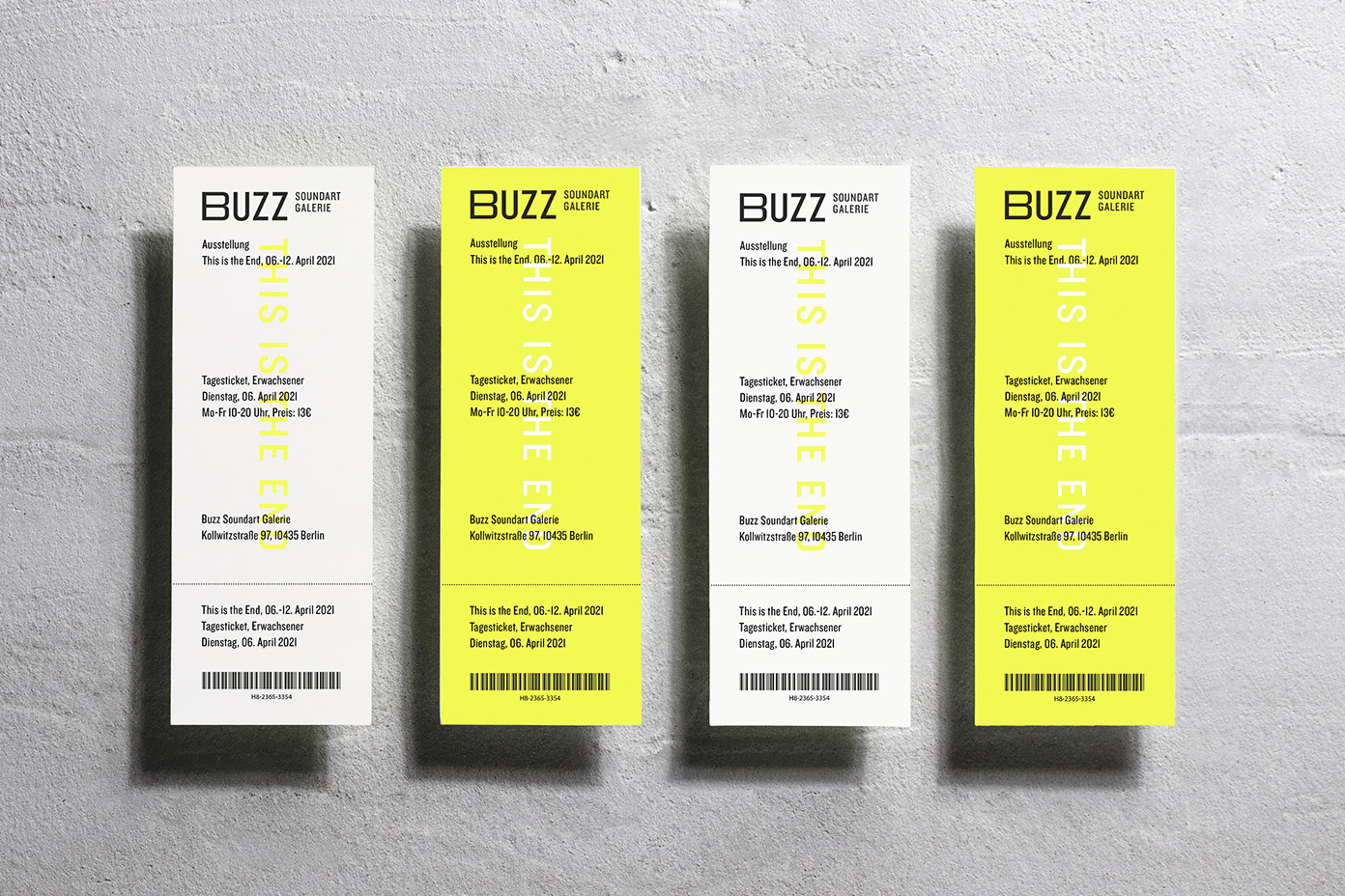
Tasked with the brand positioning of an avant-garde exhibition space Buzz Soundart Galerie in Berlin, Germany

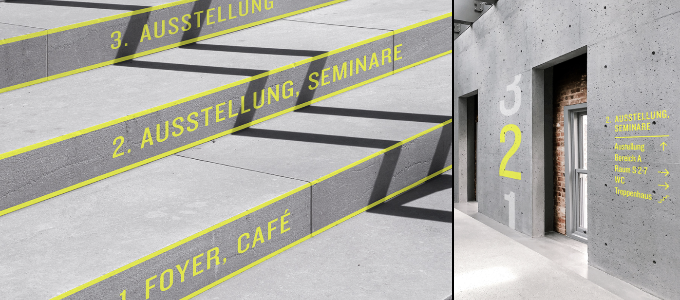
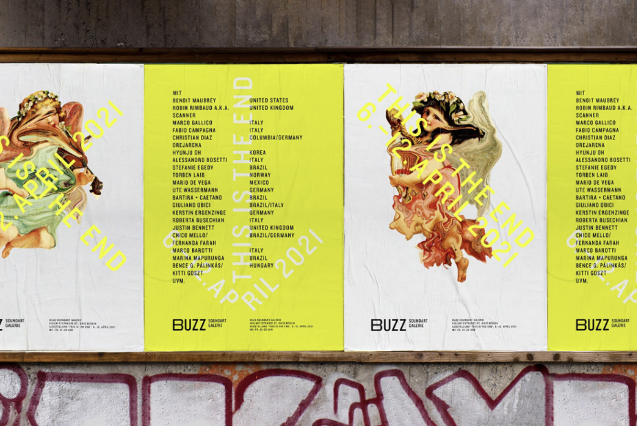
The Buzz Soundart Galerie’s plan is to host sound installations, live performances, and workshops from leading sound artists from around the globe. Most of the exhibitors are provocative and instil a multisensory experience. The owner’s mission is to make society more self-aware and start a dialogue with a very young generation.
 
When the client asked Oertel to work on the naming, visual and verbal identity, environmental design, and other branding essentials for the emerging establishment, it became obvious that one important goal became to change the perception that traditionally exhibition spaces across Germany attract affluent middle-aged audiences. 
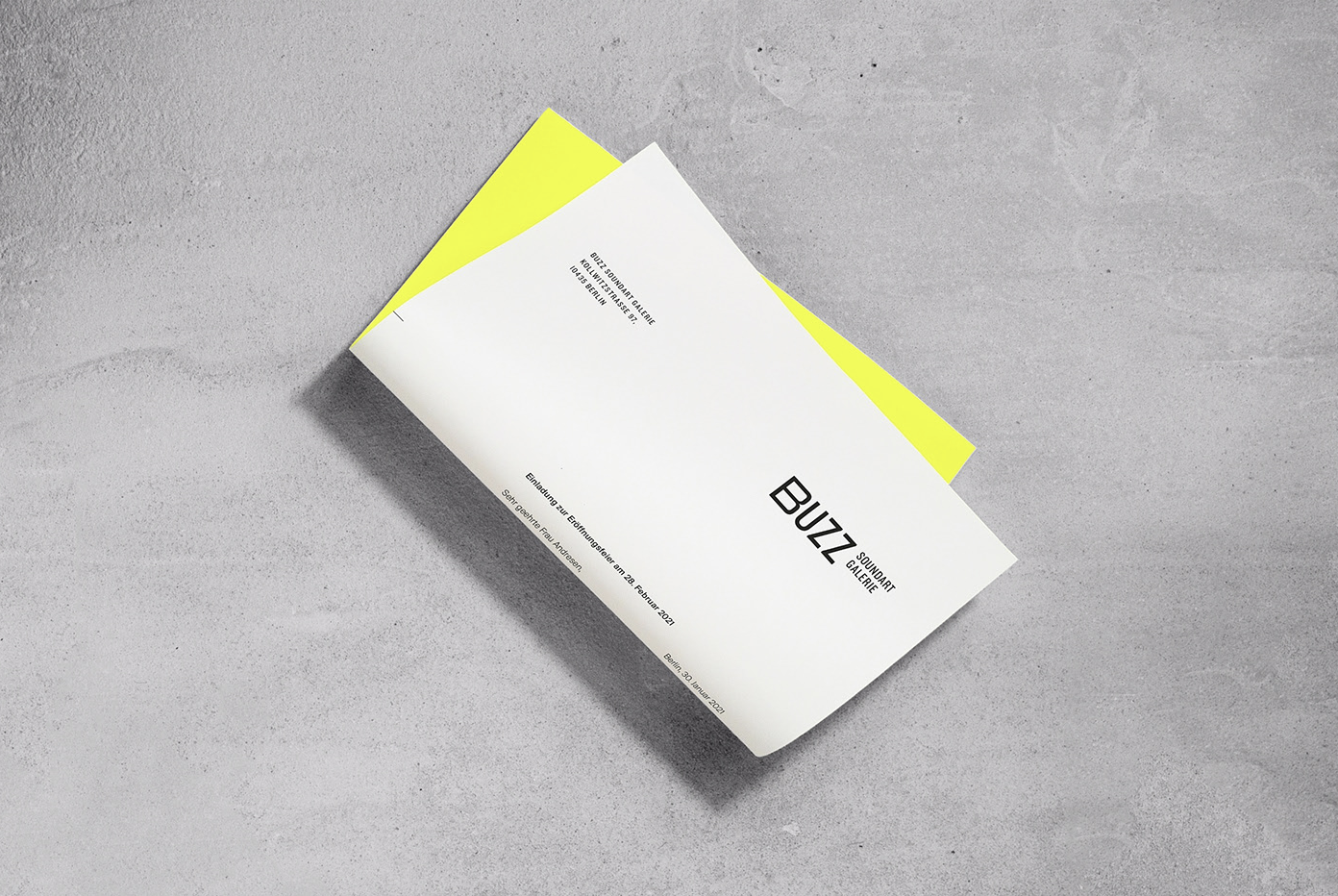
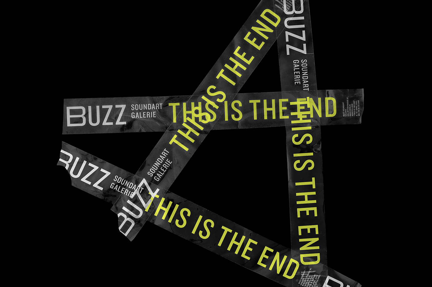
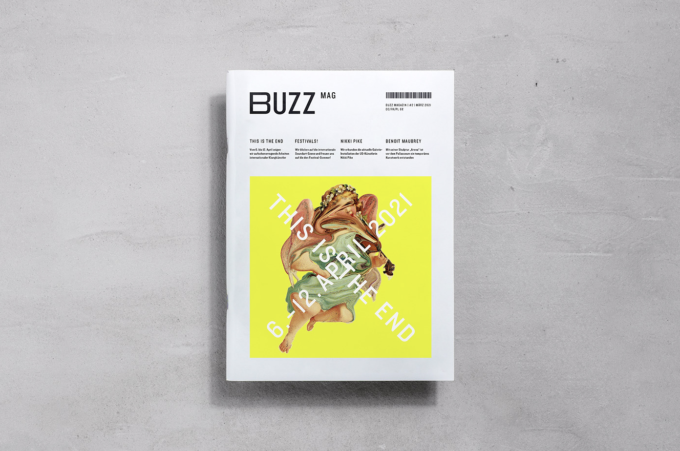
To best capture what was happening at the gallery, we decided to name the brand “Buzz Soundart Galerie”. This name represents the low humming of sound art and a vibrant atmosphere.
“We wanted to eliminate the intimidating factor that comes with the traditional galleries. As a part of the verbal identity, we want the brand to be provocative and funny. Hence the slogan No sound is safe here. Exhibition names take a similar approach. The first exhibition is named This is the End“, Oertel explains.

The visual identity feels bold and contemporary, relying on classic and modern typographic and graphic elements

Type is central to the visual identity system Oertel developed. Words and phrases form simple shapes serving both as signages and pattern systems on both the printed materials and interior elements. Humans, wires, and machines each have their unique sounds. Oertel developed a series of noise patterns to represent the relationship between these elements in the concrete jungle.

Choosing bold Neon Yellow as the gallery’s primary brand color, which has both an industrial and loud presence, it reinforces the intensity of these noises. The printed materials daringly utilize silver, neon, black, white, and textured greys reminiscent of the concrete materials in the gallery space. To reiterate the ambitious intentions of the space, unique, warped illustrations embellish the otherwise almost monochromatic identity.  “To create an uneasy feeling, we chose to show kitschy images of singing angels. We distorted these images based on the sounds from the installations”, Oertel writes about the visual elements used in the identity.

Follow the designer on Instagram for more contemporary communication and brand strategy design inspiration.
Subscribe
Get the latest articles and news delivered straight to the comfort of your own inbox!
Subscribe
X
Subscribe
Get the latest articles and news delivered straight to the comfort of your own inbox!
Subscribe