Sav Taj Glumac is a newly established Serbian casting agency working with both established actors and new talents, who April Studio, a strategic design and development studio based in Belgrade, Serbia, designed a fresh visual identity for. Run by a team of experienced strategists, creatives, and art directors, April Studio is dedicated to the creation and progression of brands with a focus on brand positioning, visual identity and branding, print and digital comms, web design and development.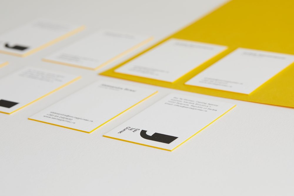
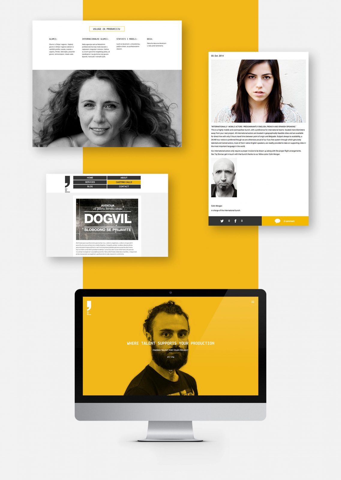
April Studio’s aim in the project was to develop the visual identity and interactive web site for the Sav Taj Glumac agency, that is equally appealing to those looking for the job and those looking to hire.
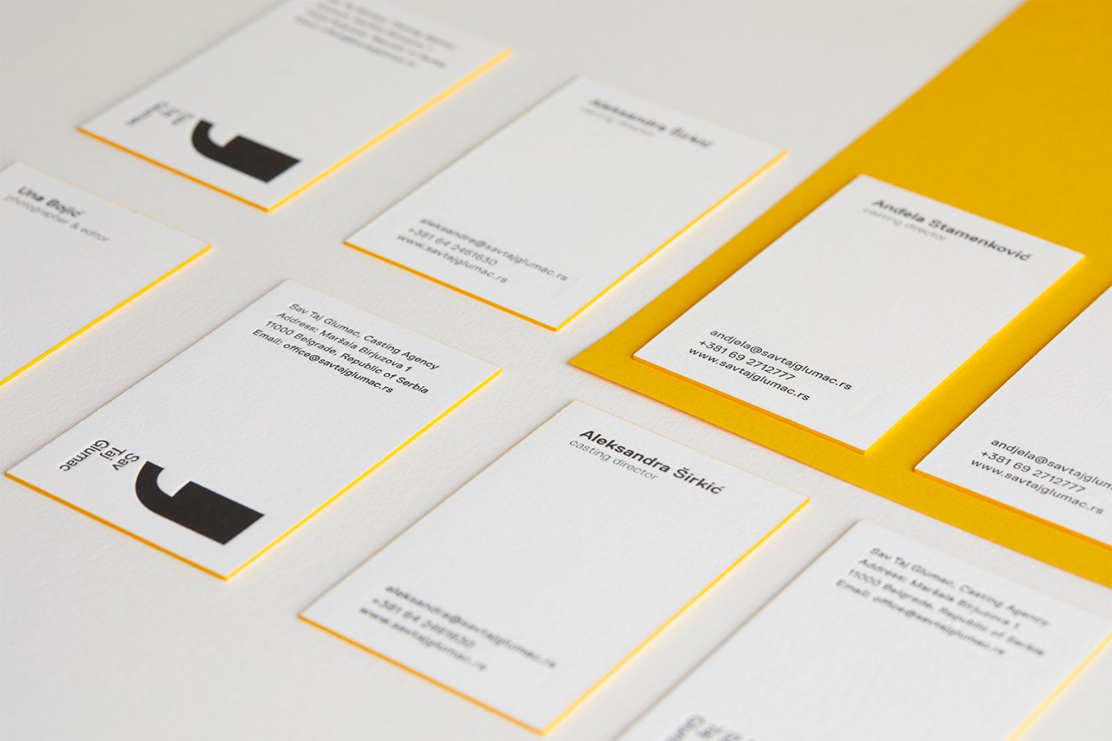
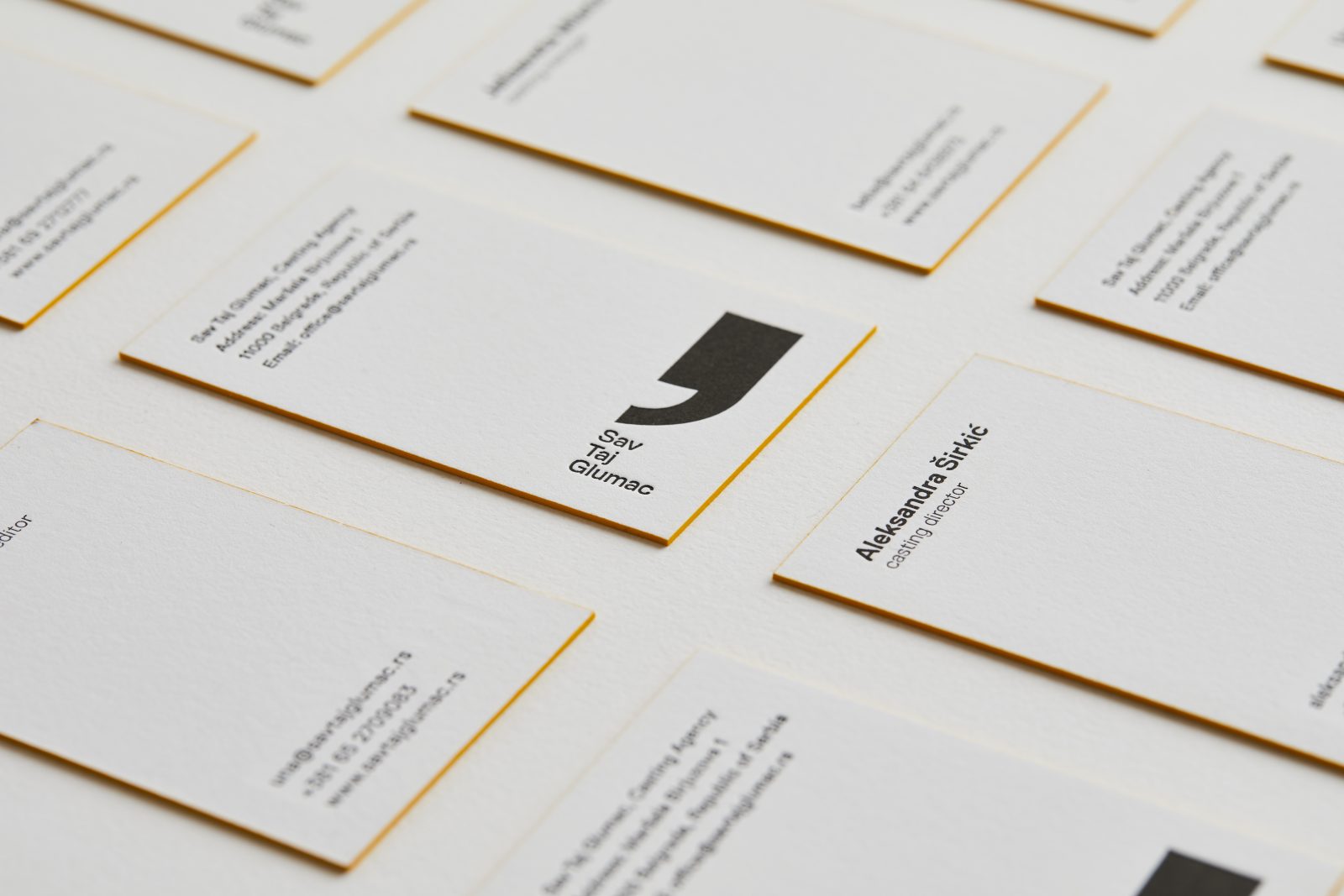
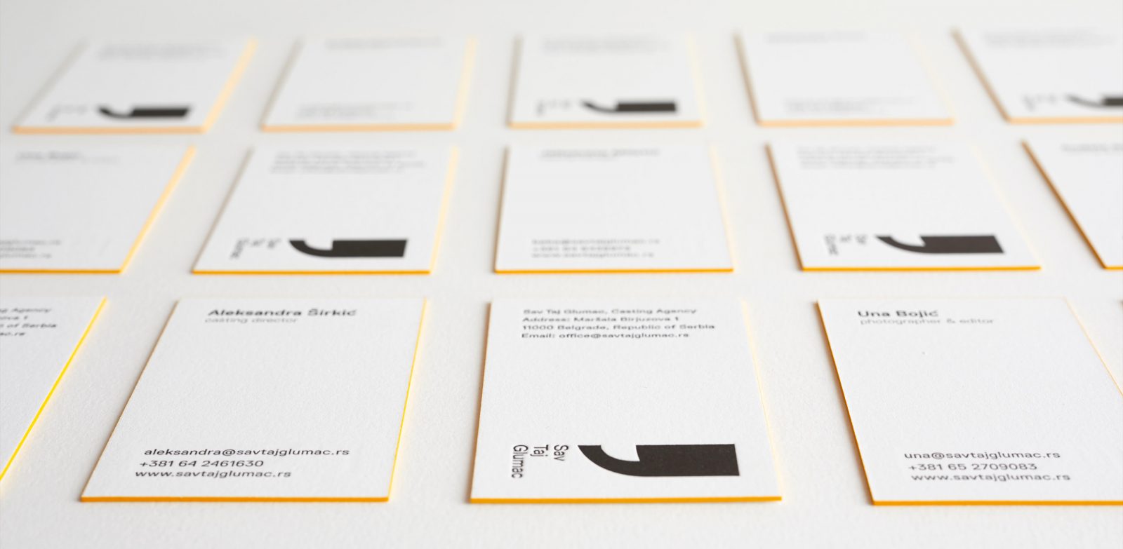
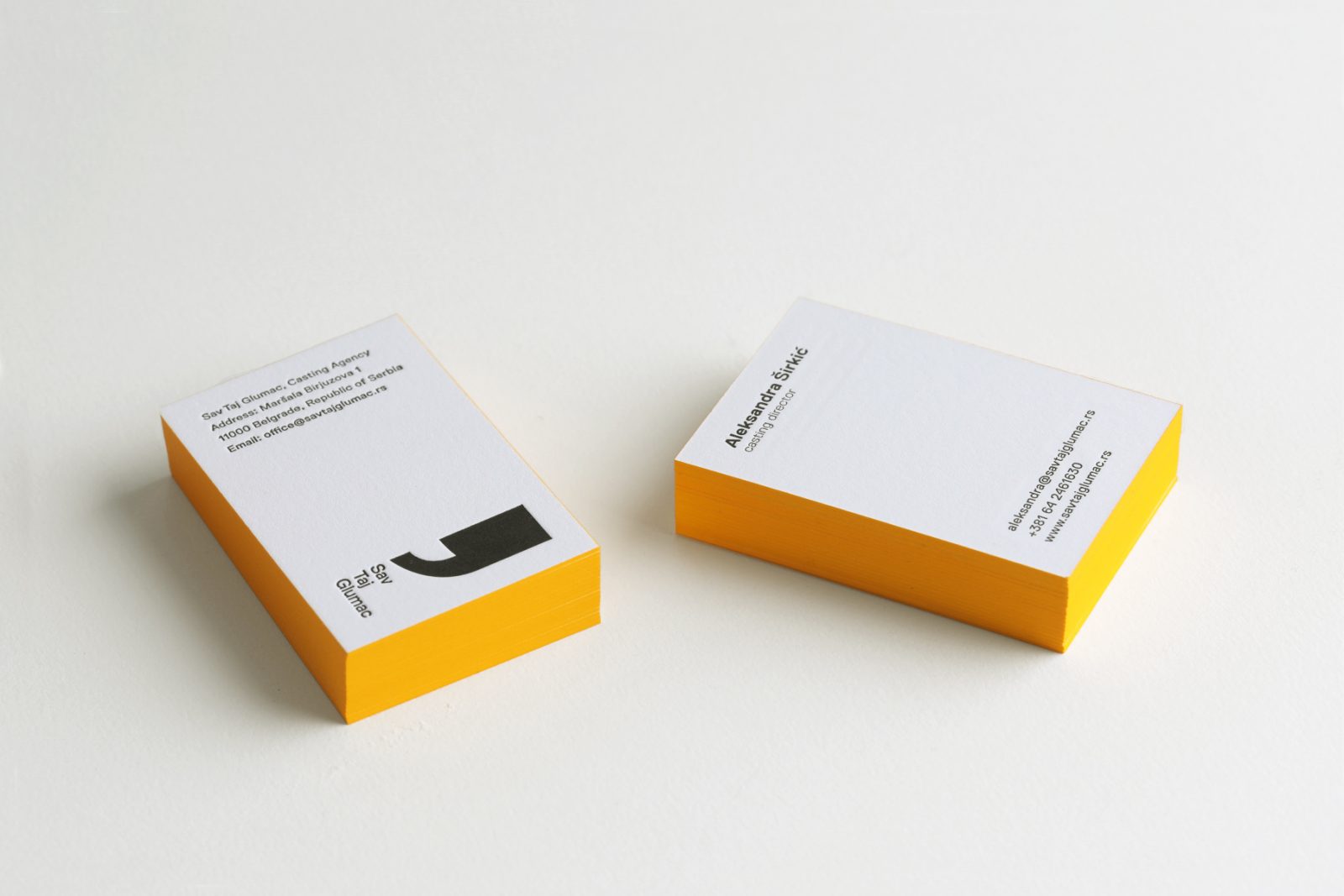
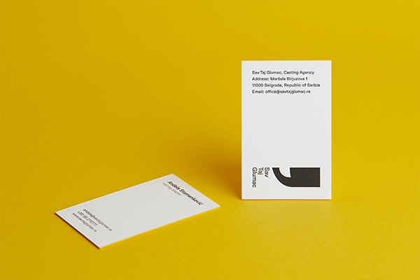
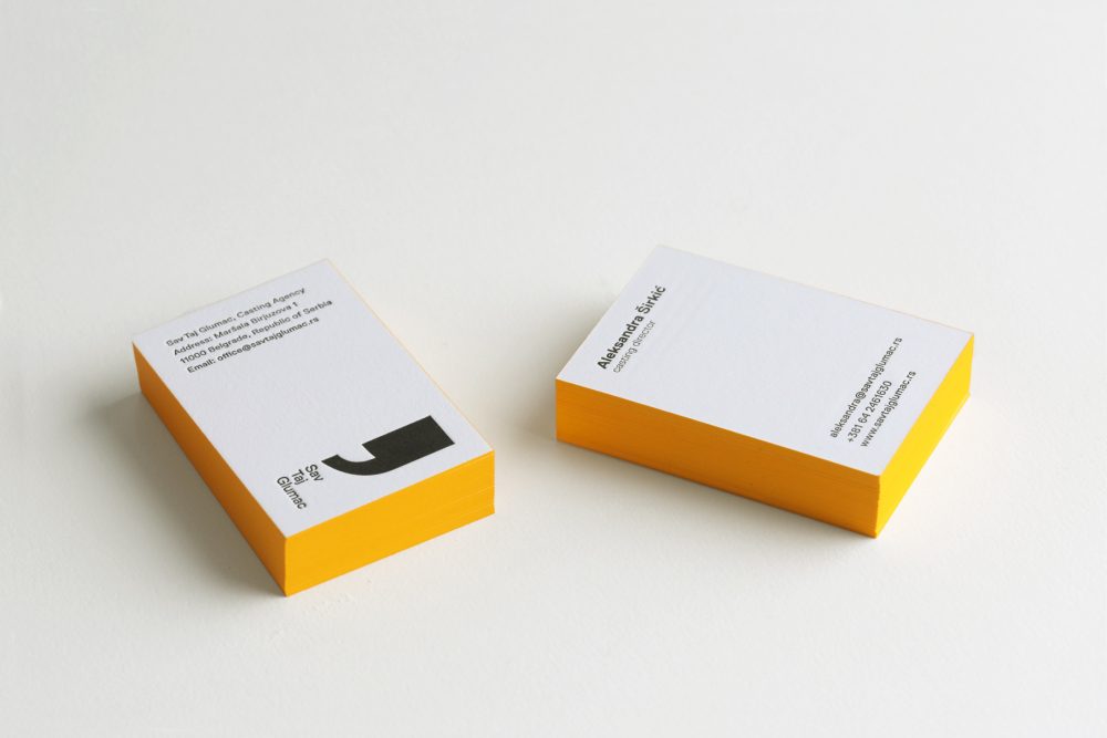
Utilizing the apostrophe symbol, bright yellow accents, and Pur Cotton Absinthe paper for a characterful identity
The identity concept for Sav Taj Glumac (meaning “All That Actor”) includes the brand groundwork design, the visual identity system, and web site. The creative concept of the identity puts the spotlight on the very art of acting, using the multiple symbolic layers of the apostrophe as the brand sign. The light atmosphere around central black elements and intentional use of yellow, representing the limelight, make the whole overall tone positive and appealing both to those looking for the job and those looking to hire.
The creative concept of the identity puts the spotlight on the very art of acting, using the multiple symbolic layers of the apostrophe as the brand sign.
April Studio chose to utilize Pur Cotton Absinthe 710gsm – exclusively available at Europapier – in the identity for several reasons; its pleasant structure and higher thickness were ideal for striking letterpress accents, aimed at adding more character to the brand, one that itself deals with characters and acting talents.
Pur Cotton Absinthe paper’s soft cotton quality in combination with a robust feel due to the high weight helps convey both the attributes of great professionalism and the brand’s human values and approachability, while the free space on the edges of the business cards called for yellow coloring and made the whole design captivating.