Today we would like to present you the magnificent print edition showcasing the exclusive Bogenhouse development project by LexionDevelopment, created by the professionals from the creative printing house Smith & Hartman.
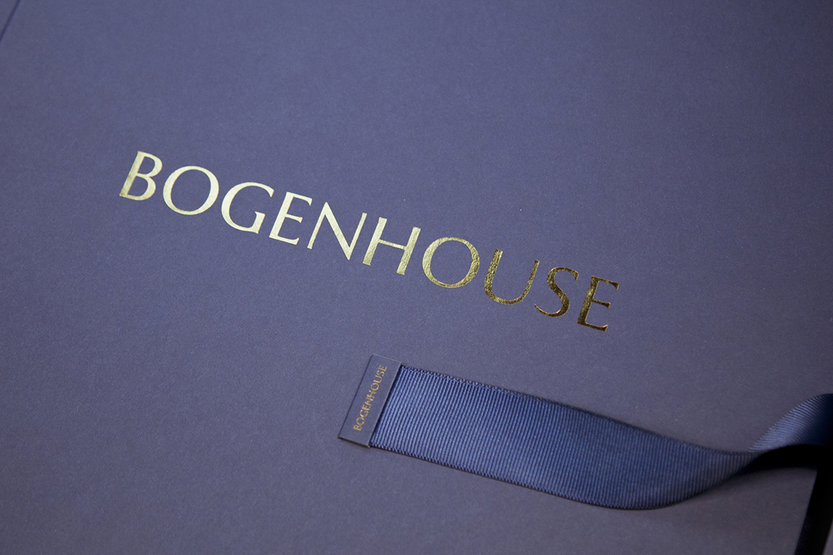
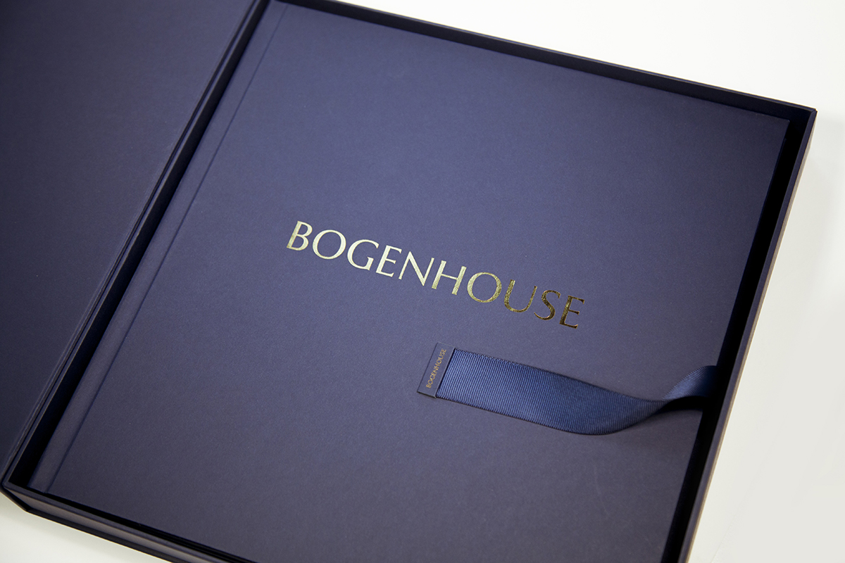
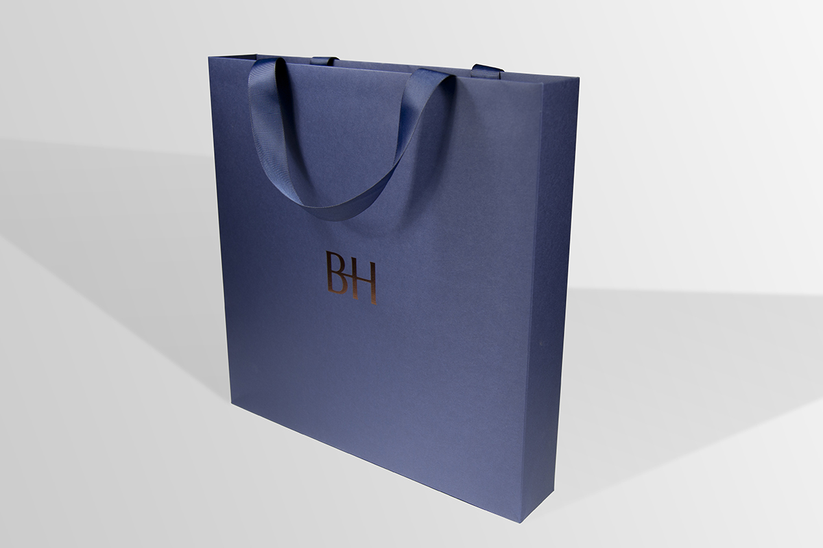
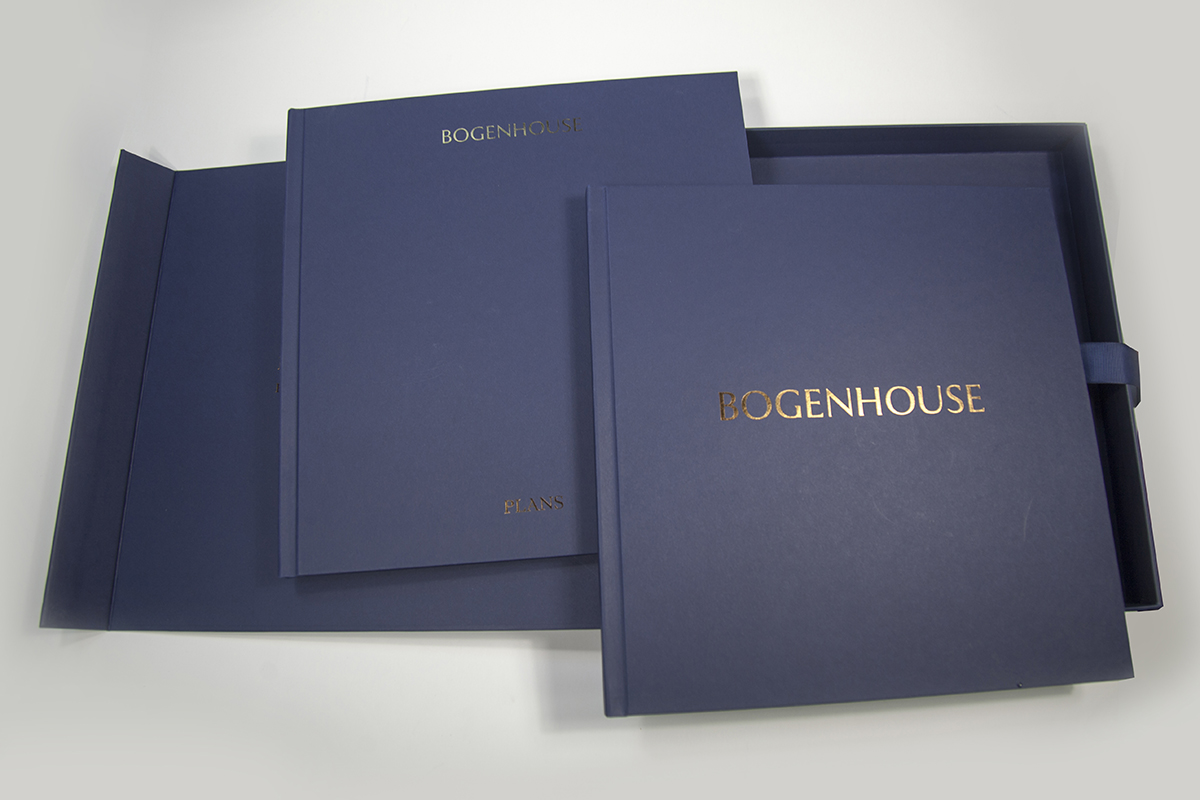
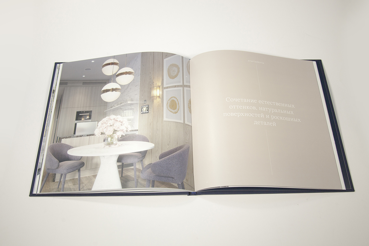
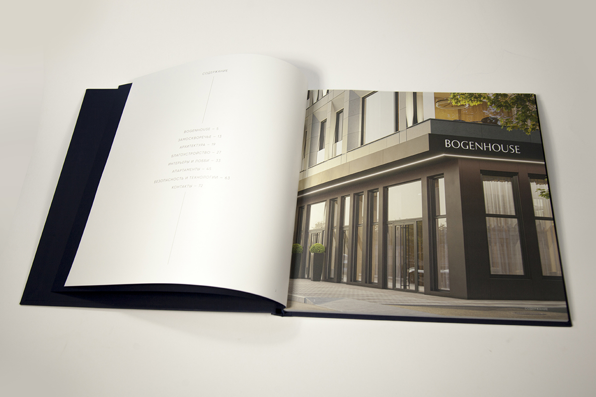
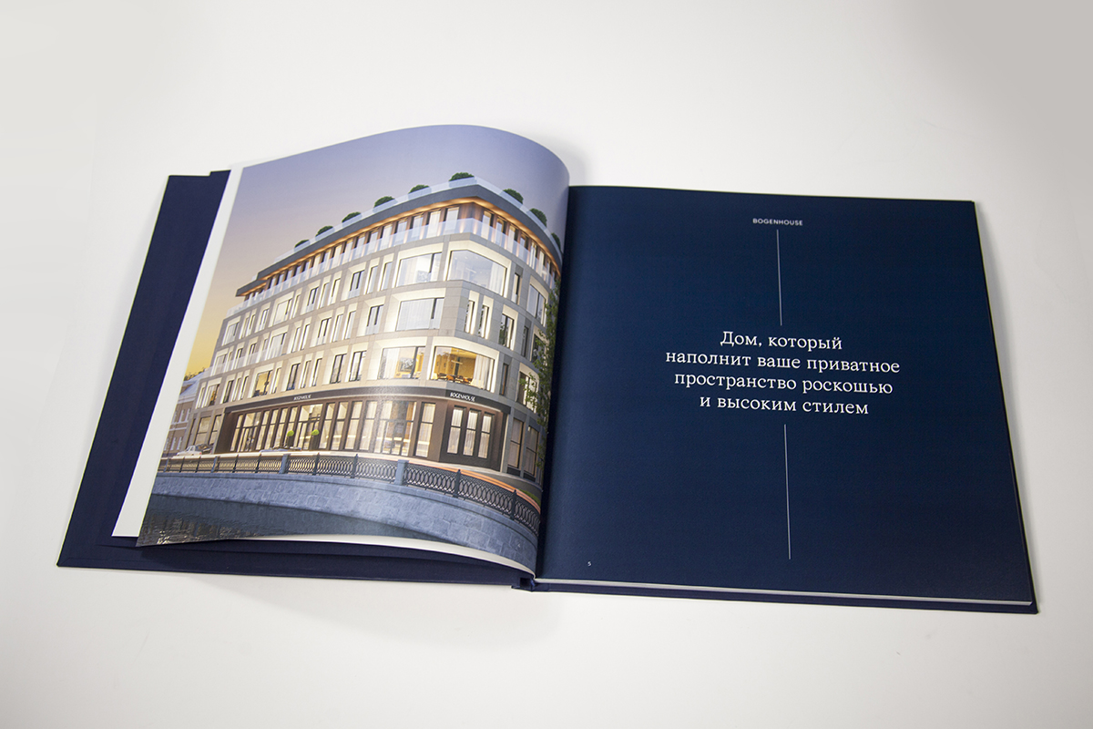
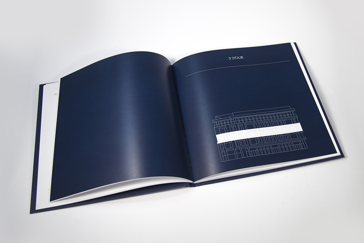
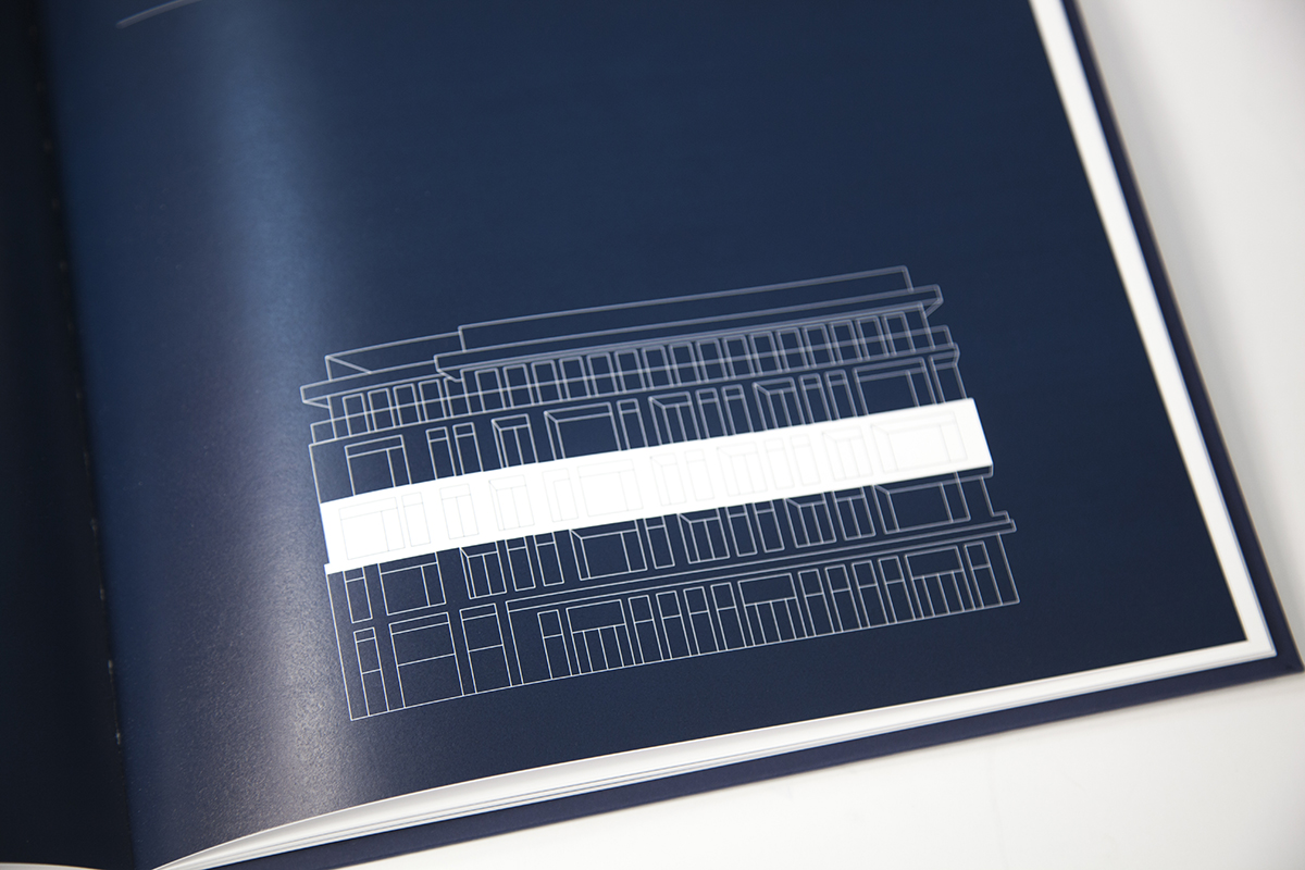
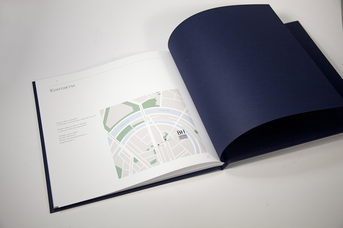
At the core of this luxurious design and printing project is the meticulous attention to detail that gives the edition its unique look and status: the depth and luxury of the blue color, the nobility of the gold embossing, the rigor of the lines, and the conciseness of the design. Included in the edition are two books describing the Bogenhouse apartment complex, a case with an elegant satin ribbon, and the bag.
…the depth and luxury of the blue color, the nobility of the gold embossing, the rigor of the lines, and the conciseness of the design.
“After a meeting in March 2020 with representatives of the LexiconDevelopment we outlined the next steps of our collaboration and immediately known circumstances interfered with our plans, but in June the talented Moscow-based communication agency SmartHeart, which developed the concept and design of the project, provided us with its presentation, in response to which we proposed materials, application techniques and a possible design of the kit. Then there were new meetings, a lot of experiments to work on media design and making print samples on different materials” – Yana Ereshova, project manager of Smith & Hartman, explains how the project came to fruition.
Swedish Arctic Volume White 150 gsm fine coated paper was selected specifically for the project – a paper exclusively available at Europapier – for its unique tactile matte surface that complements the books just right
“We wanted this edition to look representative and emphasize the elite status and high level of the object, at the same time without excessive pretentious elements. This is due in no small part to the materials we carefully selected,” says Sergey Konstantinovich Kamshilin, a technologist at Smith & Hartman, in regards to choosing to use the premium Arctic Volume White paper for the project.
We wanted this edition to look representative and emphasize the elite status and high level of the object, at the same time without excessive pretentious elements.
“We’re glad when we get jobs like this, even though they sometimes leave us feeling exhausted. But when we do something like this, we realize that once again we’ve accomplished a task that at first seemed impossible. It is necessary to set just such goals in order to become stronger, to grow!”, emphasized Yana Ereshova in the end.