
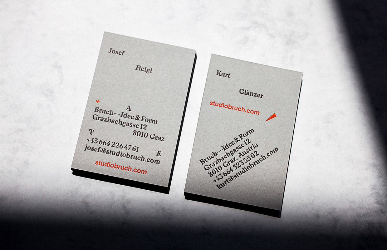
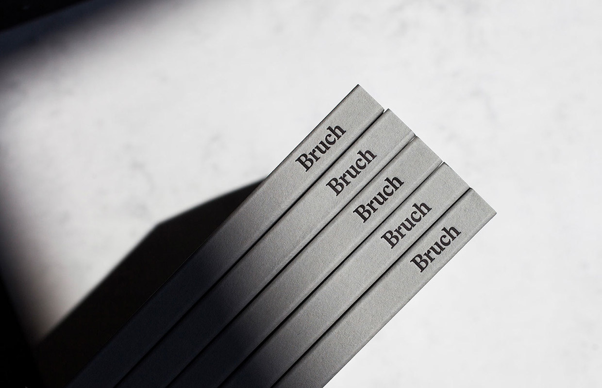
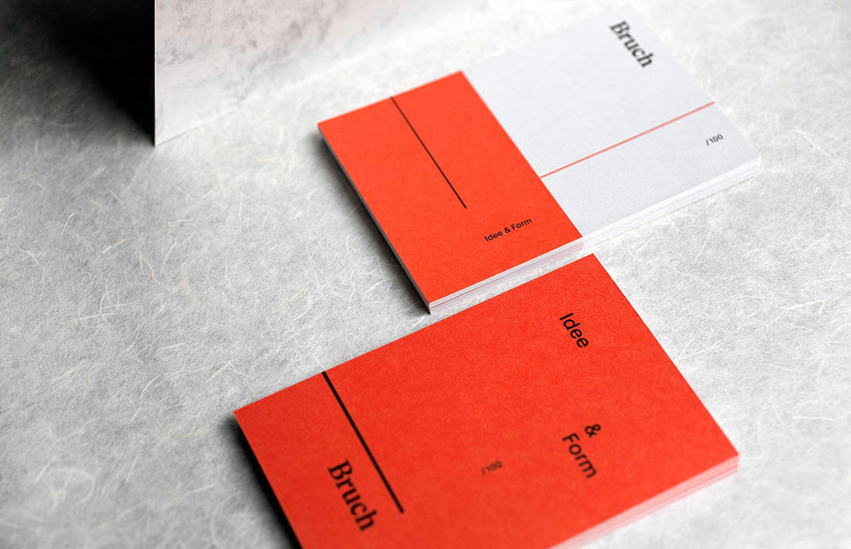
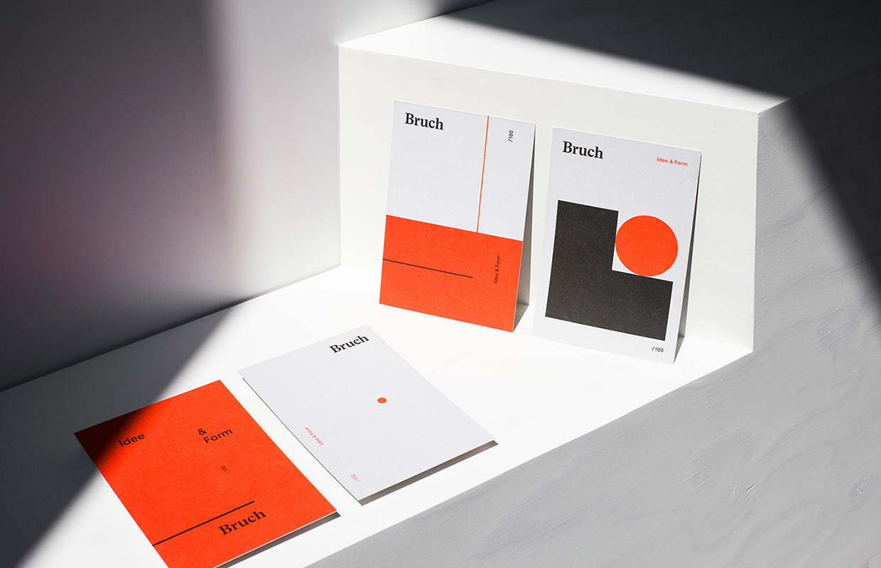
Young design studio Bruch—Idee&Form is the brainchild of Josef Heigl and Kurt Glänzer that focuses on branding, editorial design, packaging, and web design. Only having founded the company about a year ago, they’ve managed to make their name known by winning the golden CCA Award in the corporate branding category with their own studio’s branding.
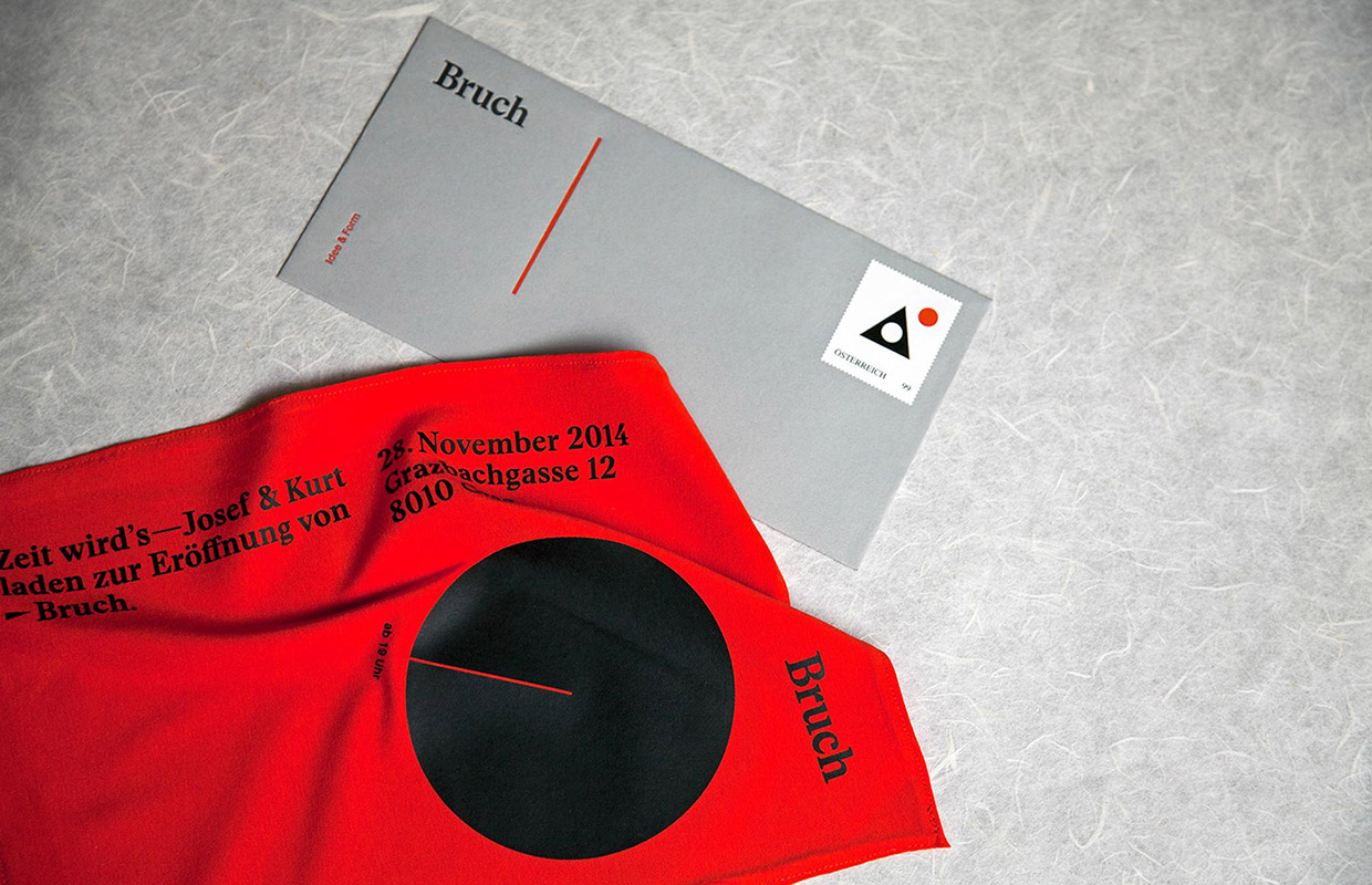
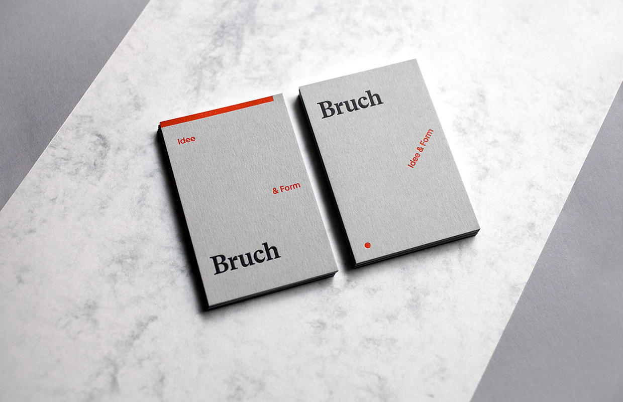
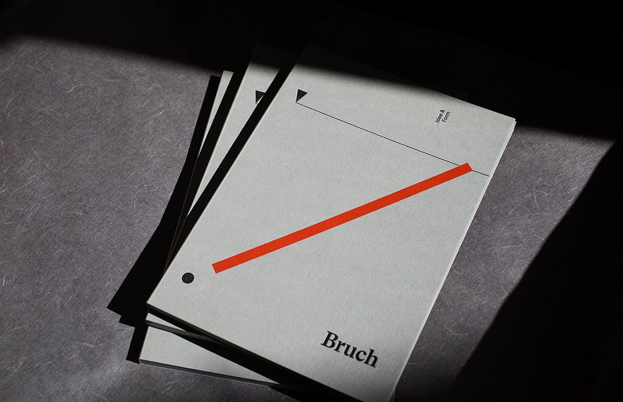
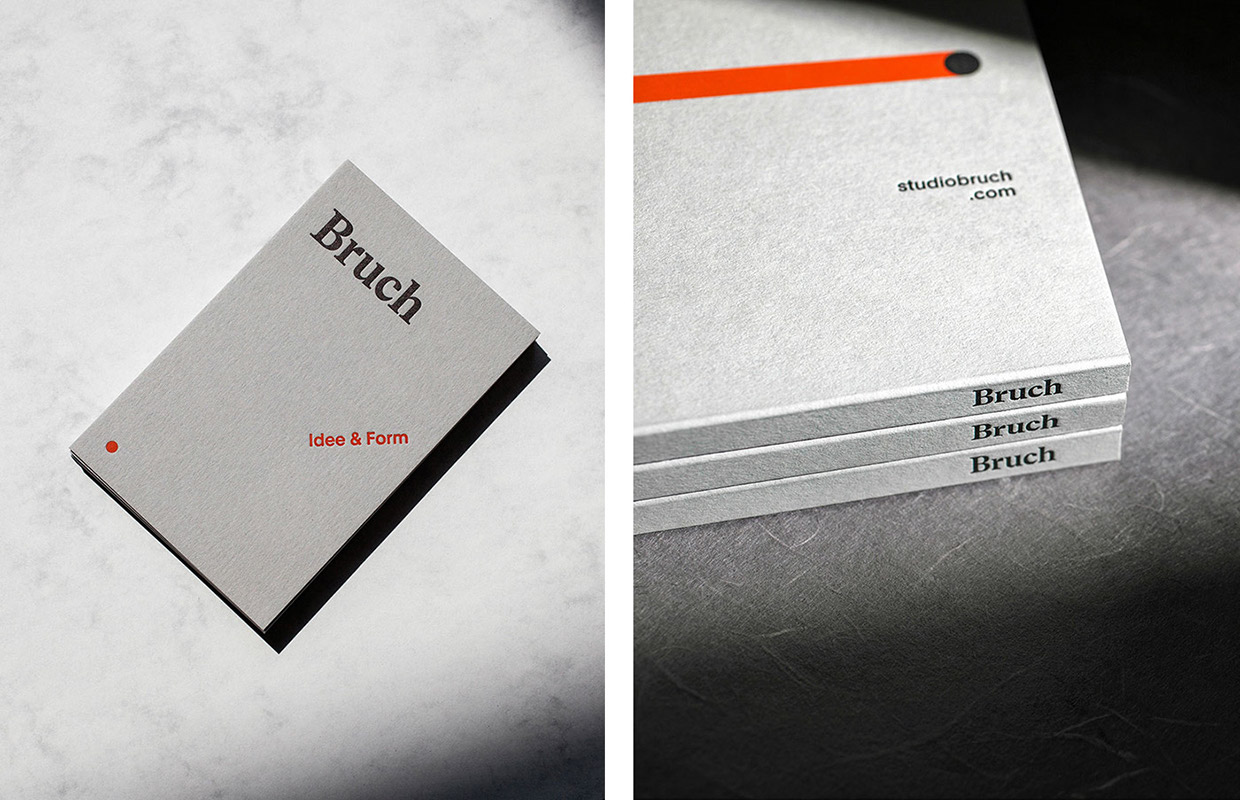
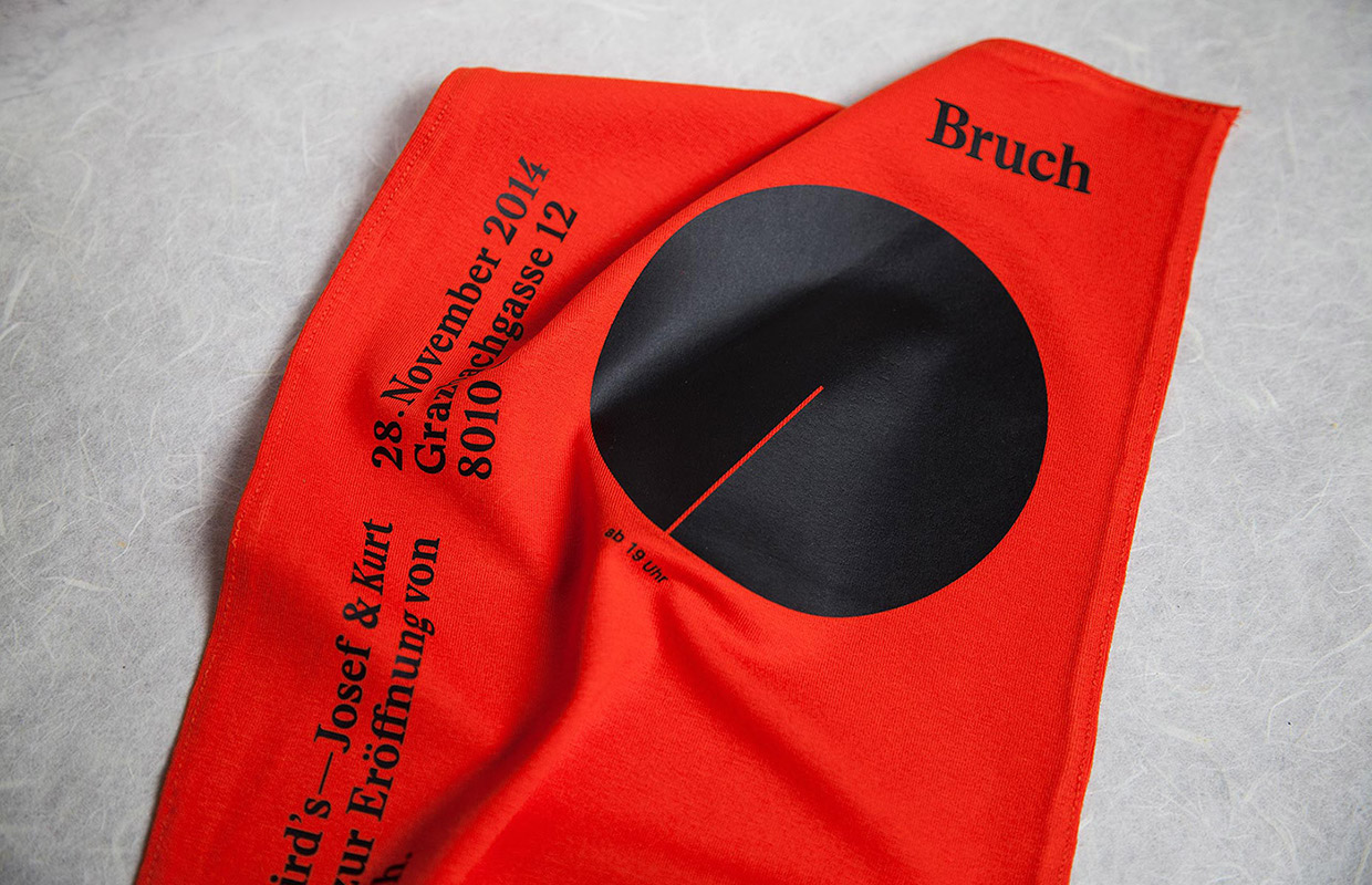
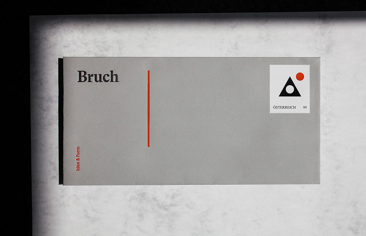
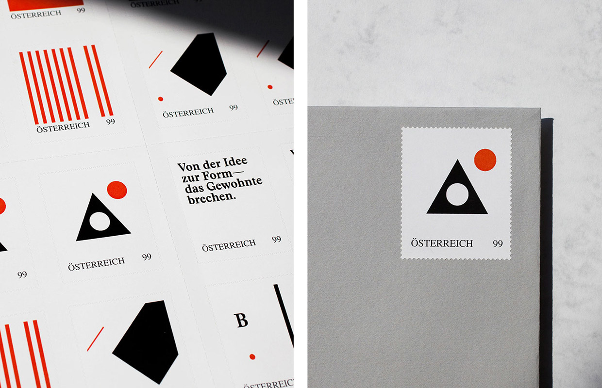
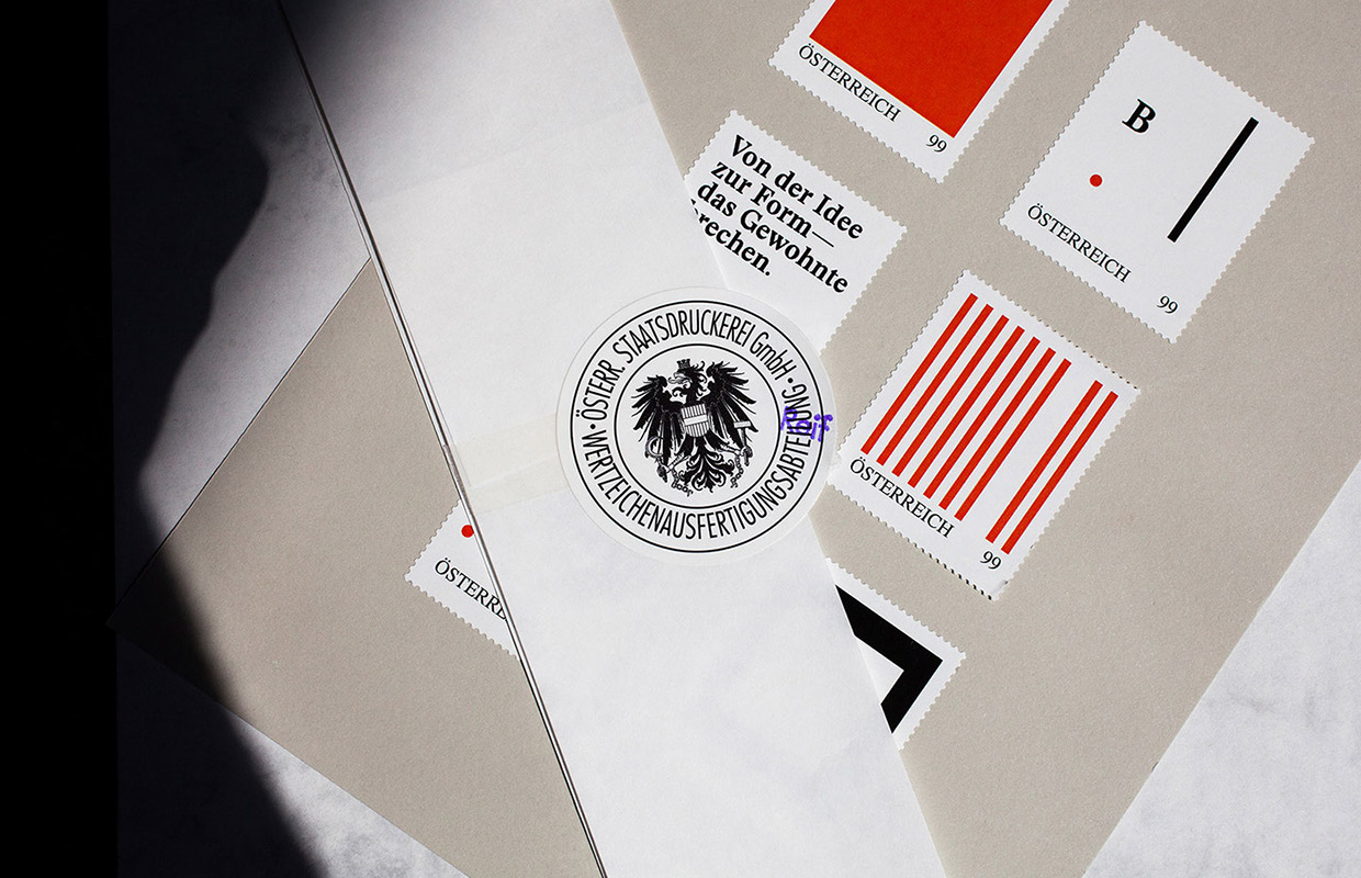
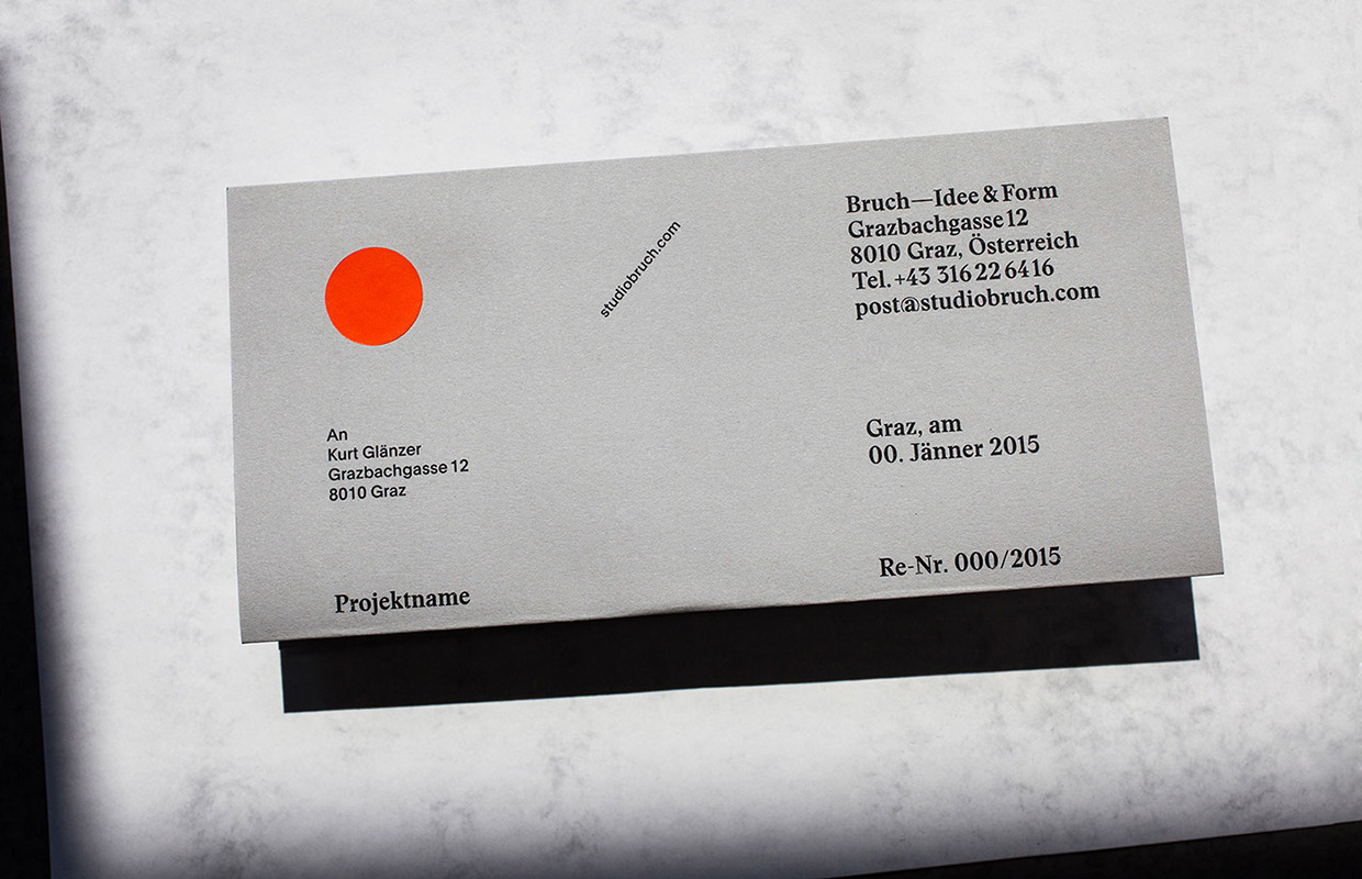
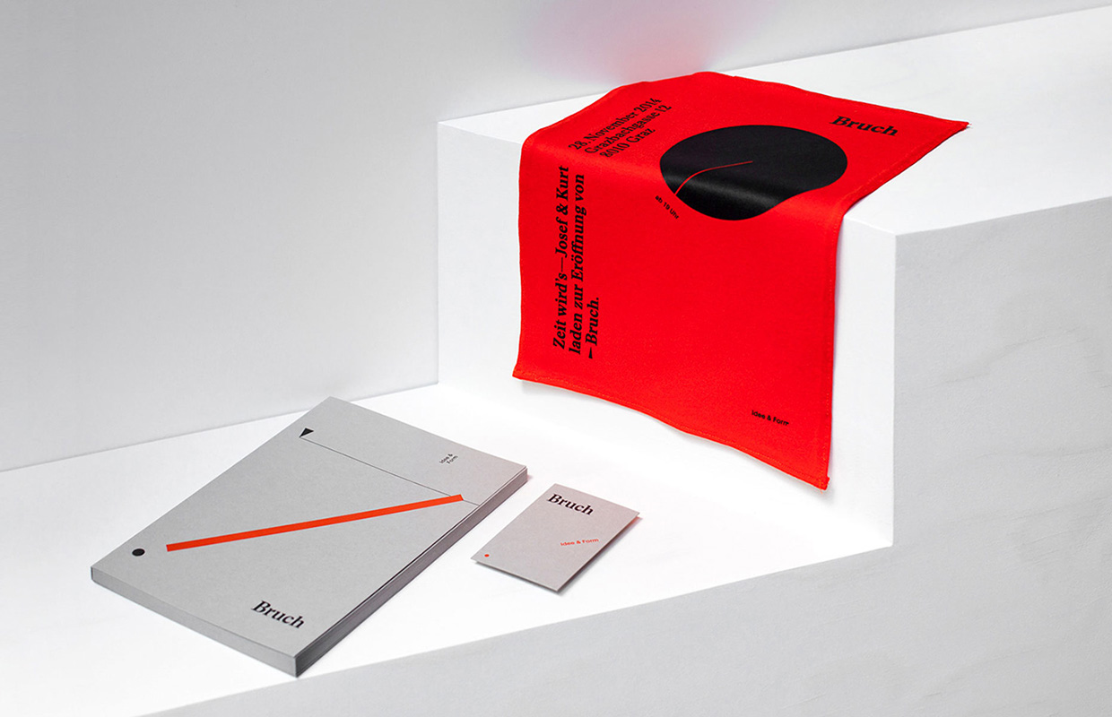
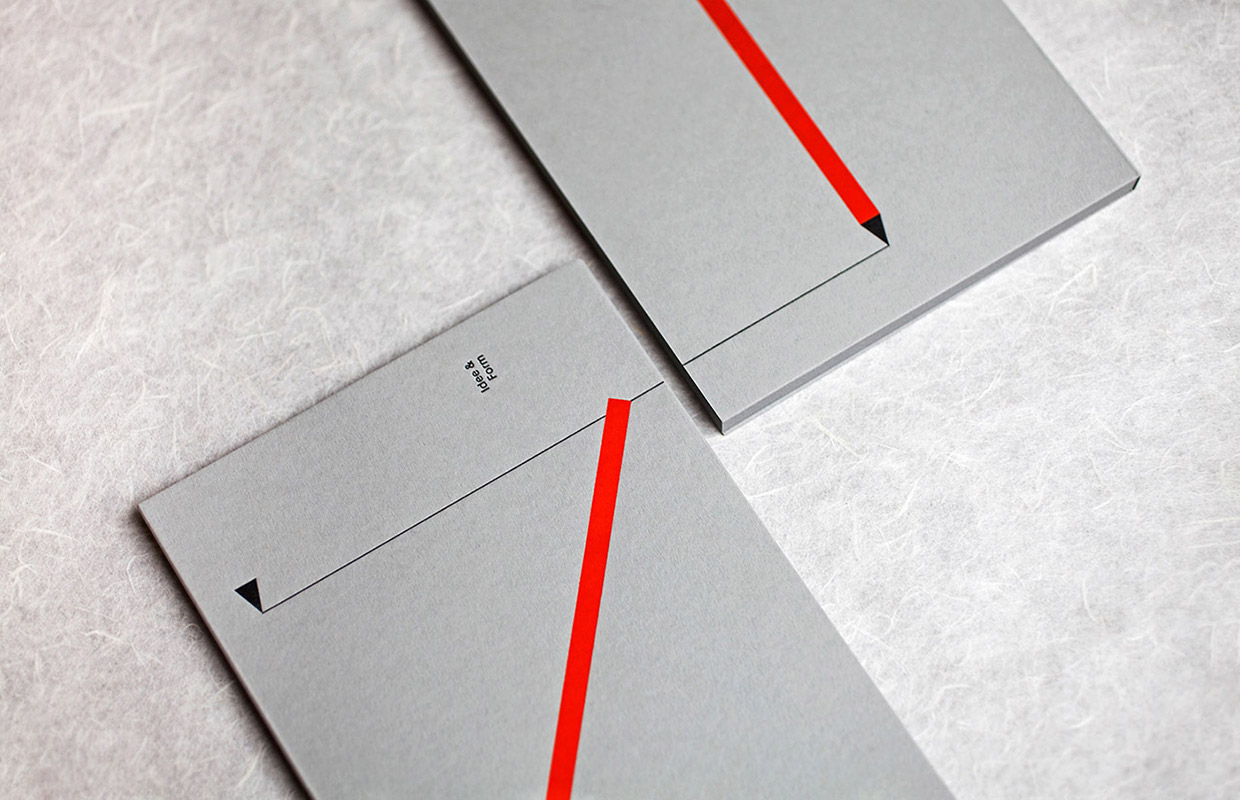
The branding for Bruch—Idee&Form is a reference to their name and the tagline „Idee&Form“. Defined shapes, strong color, and well-structured typography are arranged according to an idea and communicates the name Bruch which means “breaking” in English, in a subtle way. The vivid and unique arrangements are also a reference to the studio’s client projects – each aims to be individual.
The design duo takes great pride in their work, as they should, giving each project the authenticity, passion and care it deserves. Not shying away from a challenge they often encourage clients to trust them while exploring new, undiscovered ways, off the beaten track. Their signature look is something more than visual, as they work towards breaking the rules and norms of the industry, differentiating the brand in question with it’s strong, clear visual language.
See on facebook what they’ve been up to lately with their most recent work.
Images ©Bruch—Idee&Form