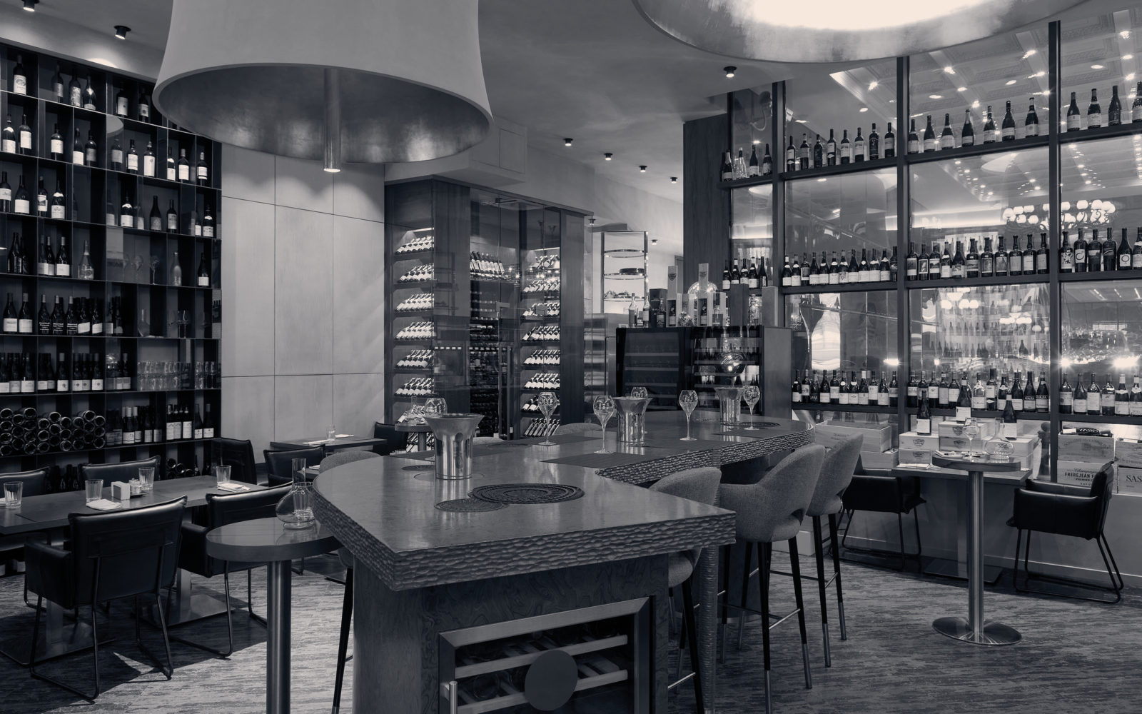
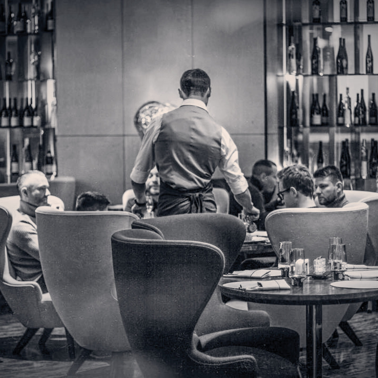
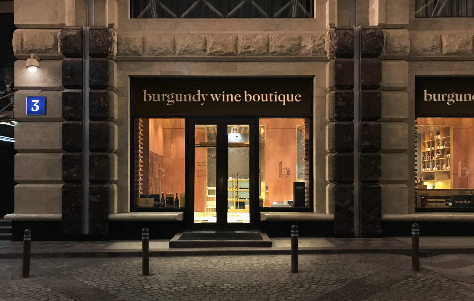
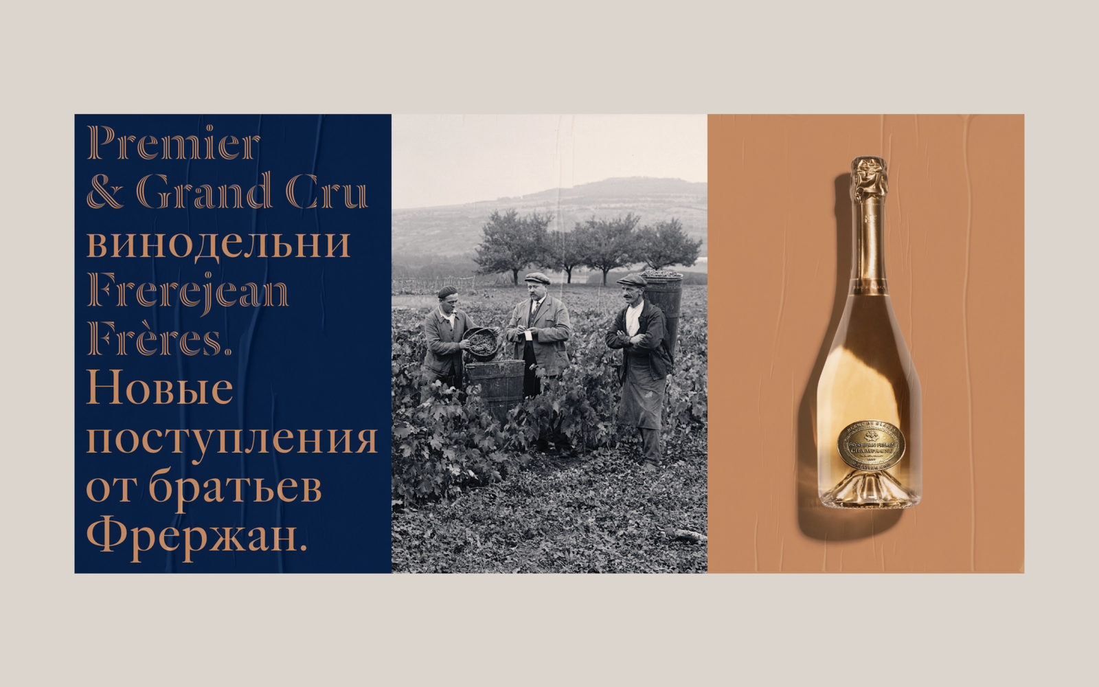
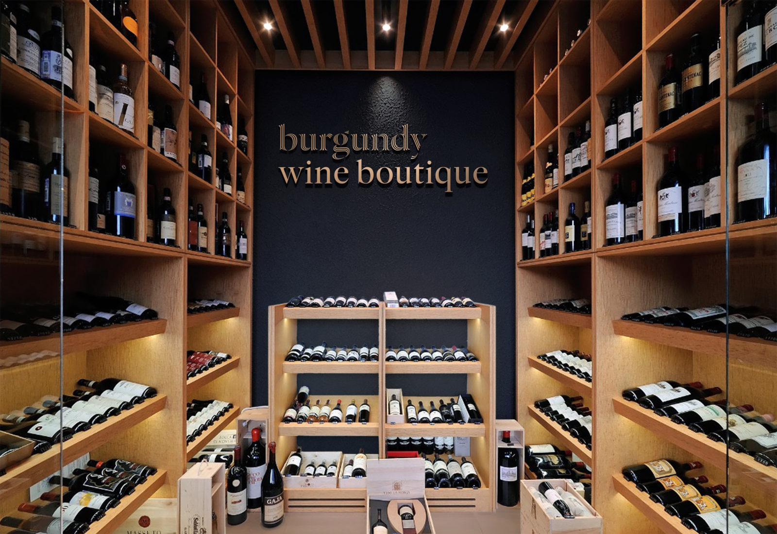
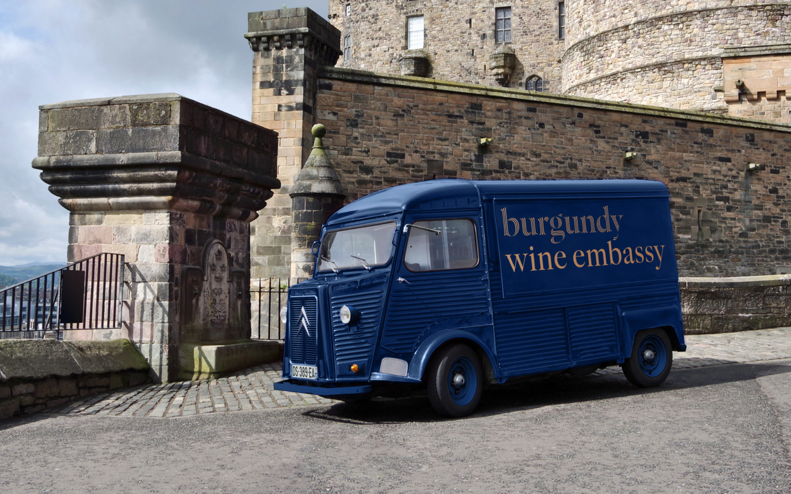
The Burgundy company imports wines to Russia from Burgundy and other equally famous winemaking regions in France, with the goal to offer a unique and irresistibly stellar presentation of quality wines to collectors, restaurants, boutiques, and wine aficionados. The company masters several areas of the industry, from distribution to retail as well as has its own Burgundy Wine Space restaurant, where specifically guests can sample wines from the Burgundy and Champagne regions accompanied by professional sommeliers. Meanwhile, the Burgundy Wine Boutique offers wine lovers and connoisseurs an exquisite range of wines and sells rare and unique labels.
Steering away from cliches and banality, Tomatdesign created an identity that relies on minimal elements and premium material choices and printing methods
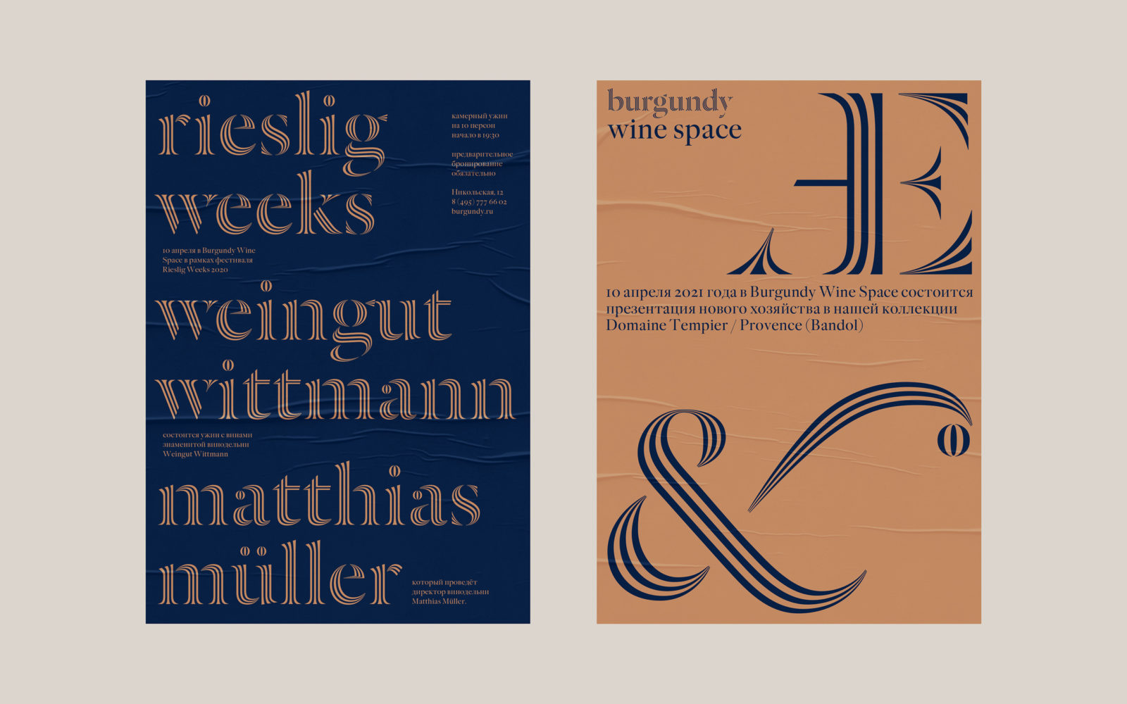
When the time came to create an umbrella identity for the brand, the company believed the most important aspect was to convey an intimate and exquisite image containing subtle references to the history and traditions of winemaking without deterring the clients by being too smug. “We had to steer away from the cliche solutions such as wine glasses, bottles, bunches of grapes, claret color, and other stereotypes while staying within the specific category”, writes Tomatdesign, the creative agency that was chosen to design the new visual identity for Burgundy.

Founded in Moscow in 2005, Tomatdesign is a creative branding agency with a vast history of creating compelling and successful brand strategies and integrated design solutions for the corporate and consumer markets. Truly understanding the importance of market analysis, strategy identification, and quality in both concept and design execution, the agency has won numerous awards on both the national and international stages. Their main goal in creating the Burgundy brand identity was to bring together various business units of the brand under a single visual style.
Burgundy’s corporate identity, like an expensive wine, does not need prettification and visual exaggeration
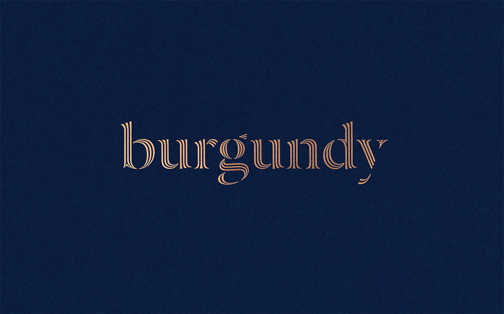
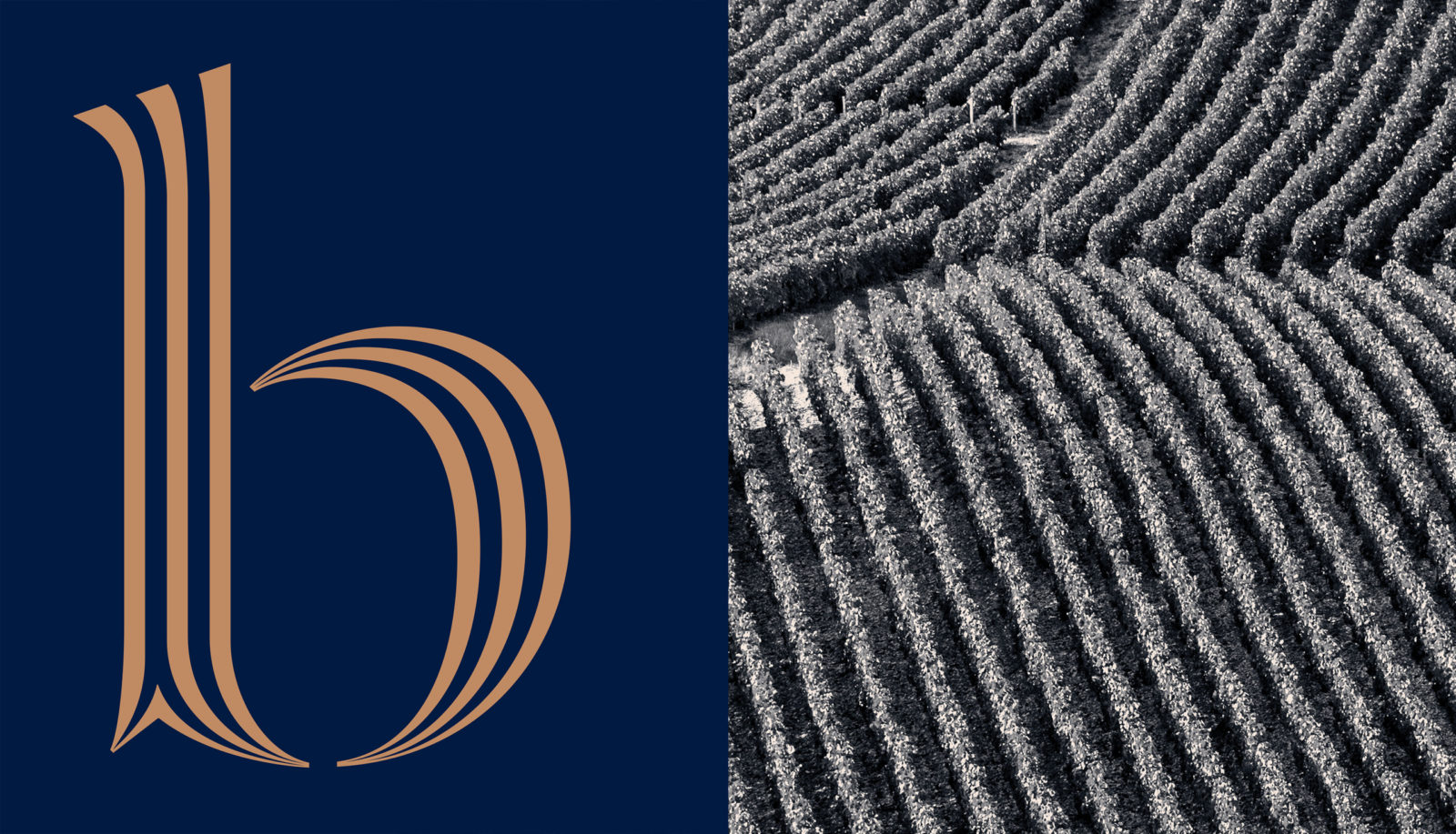
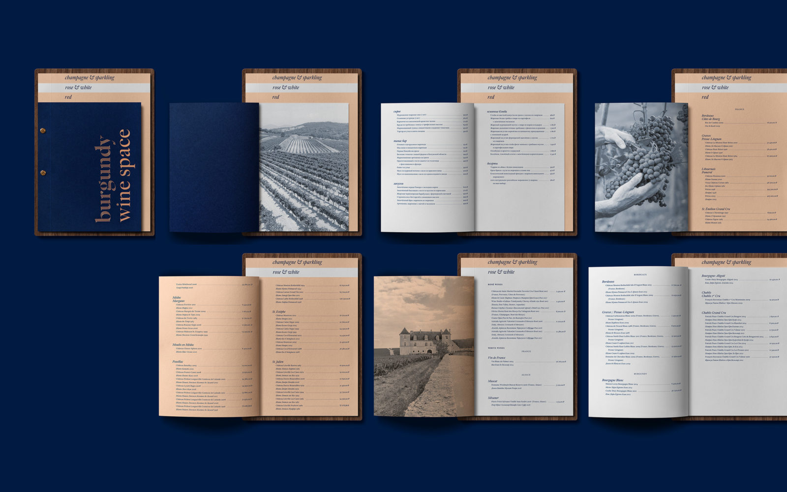
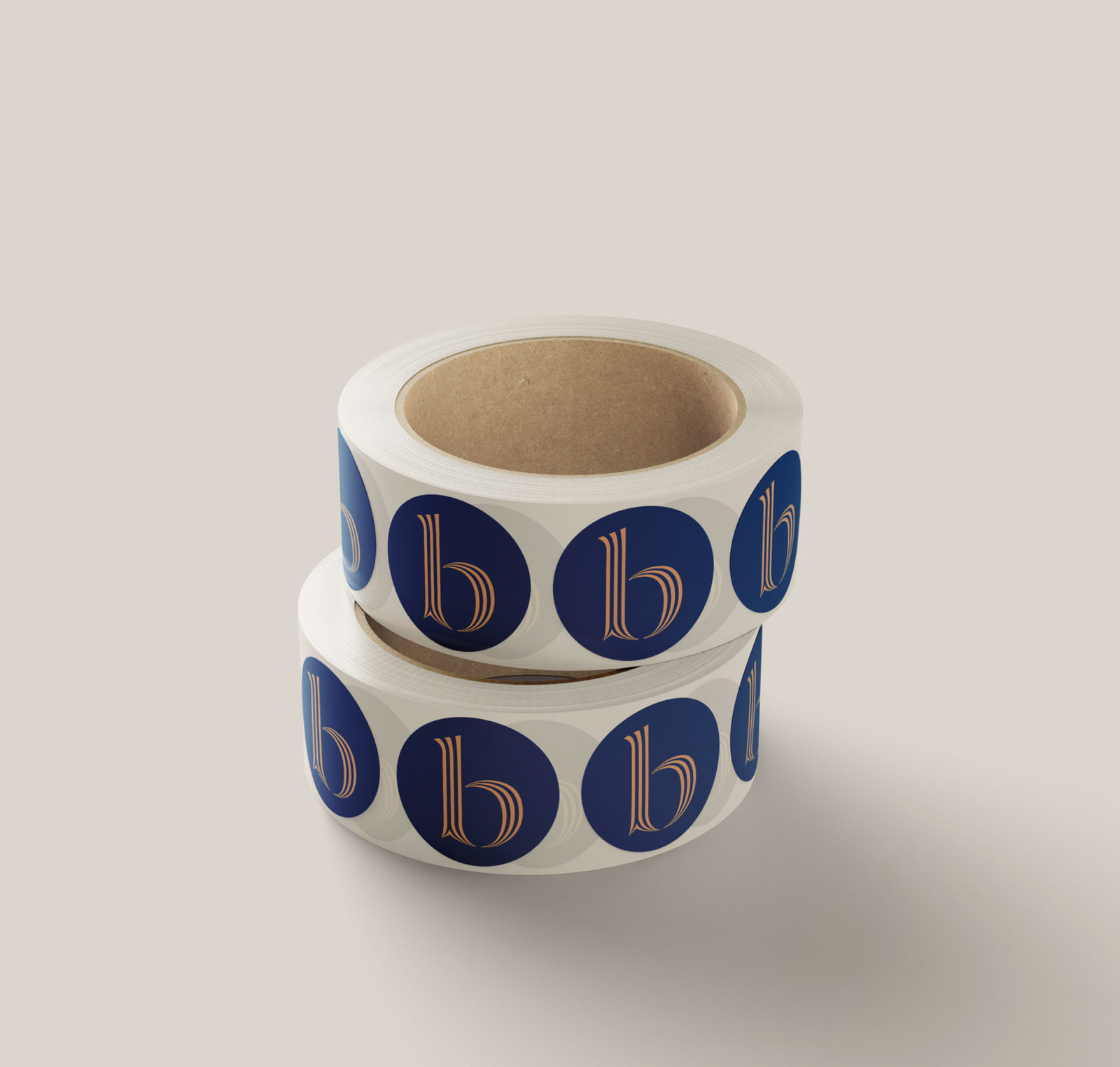
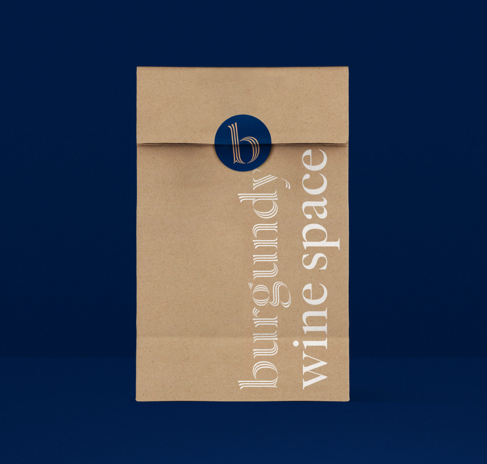
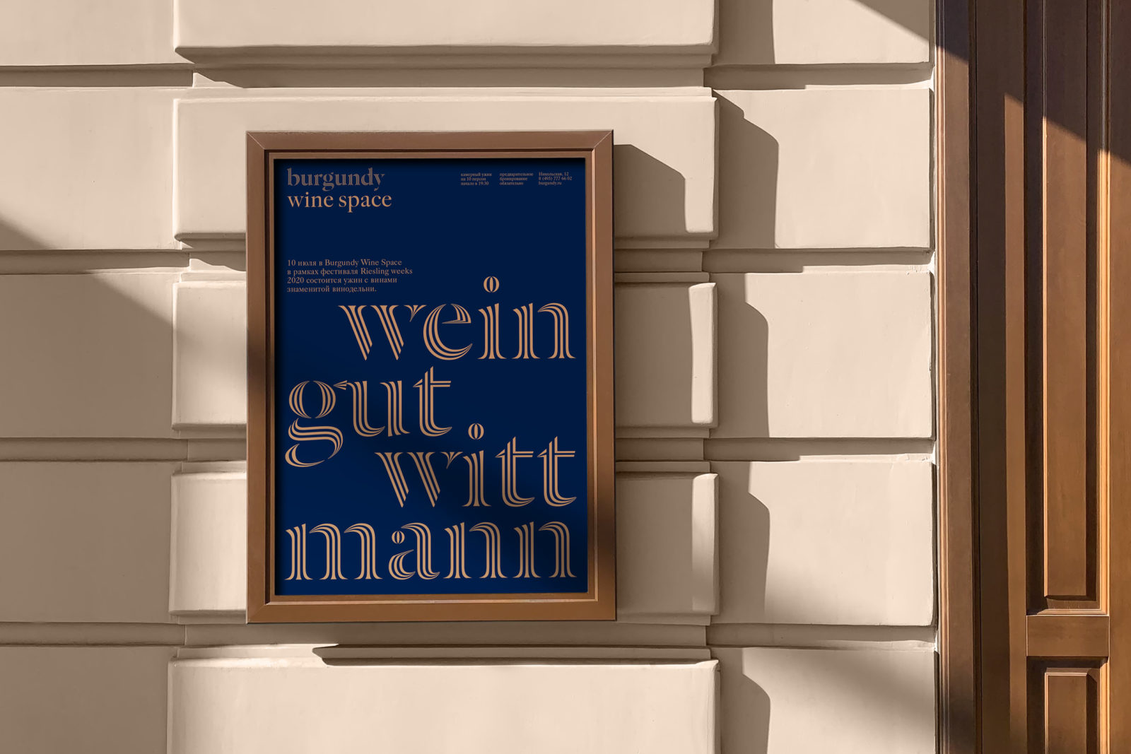
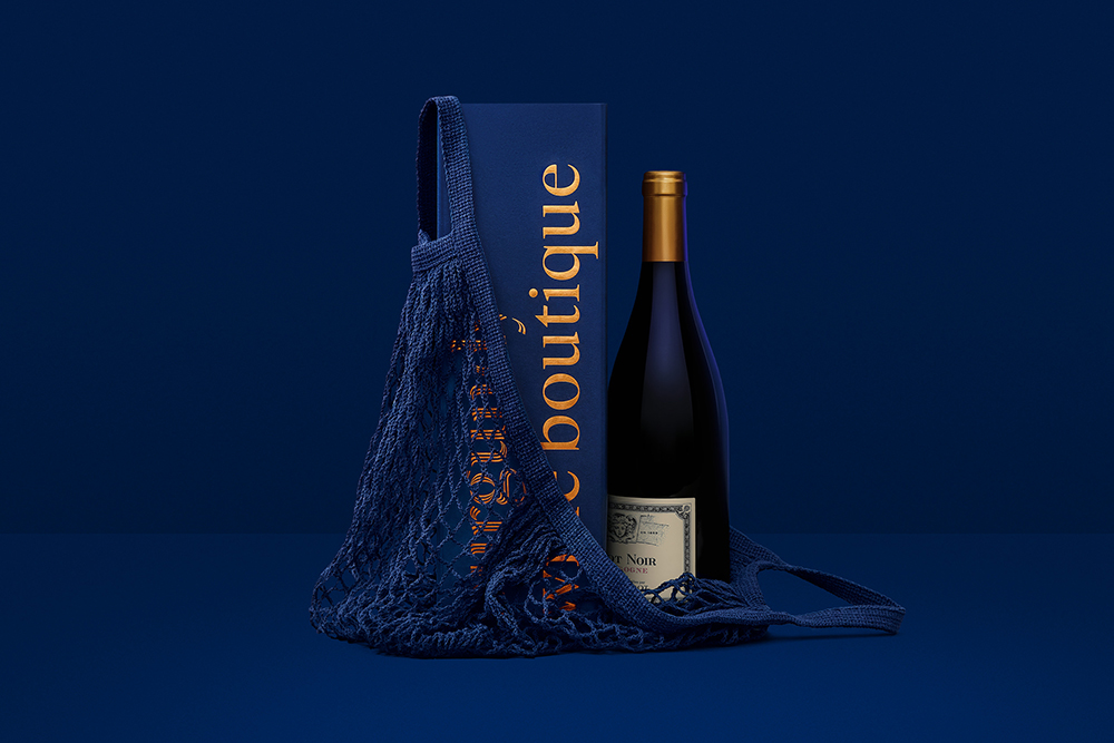
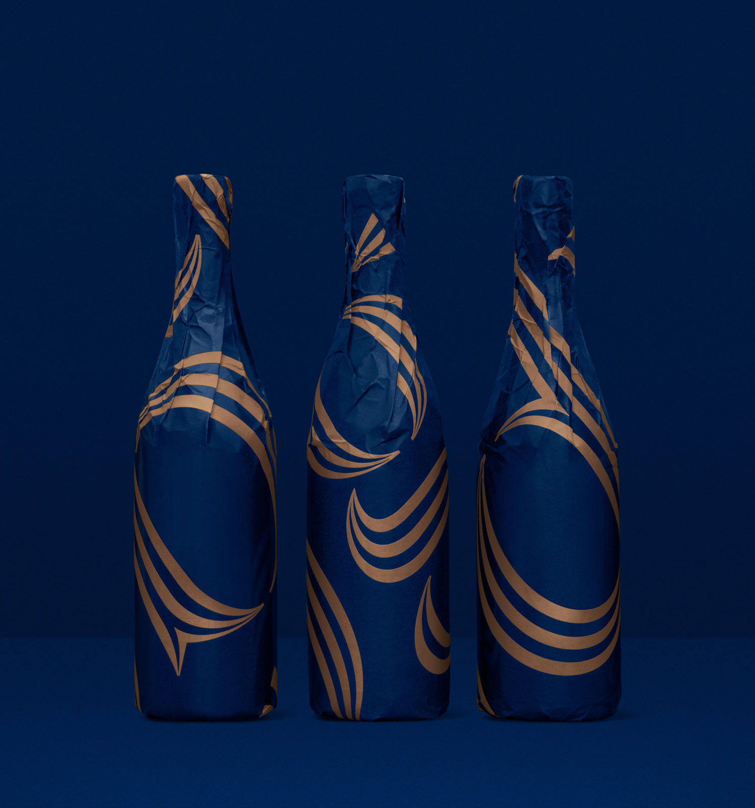
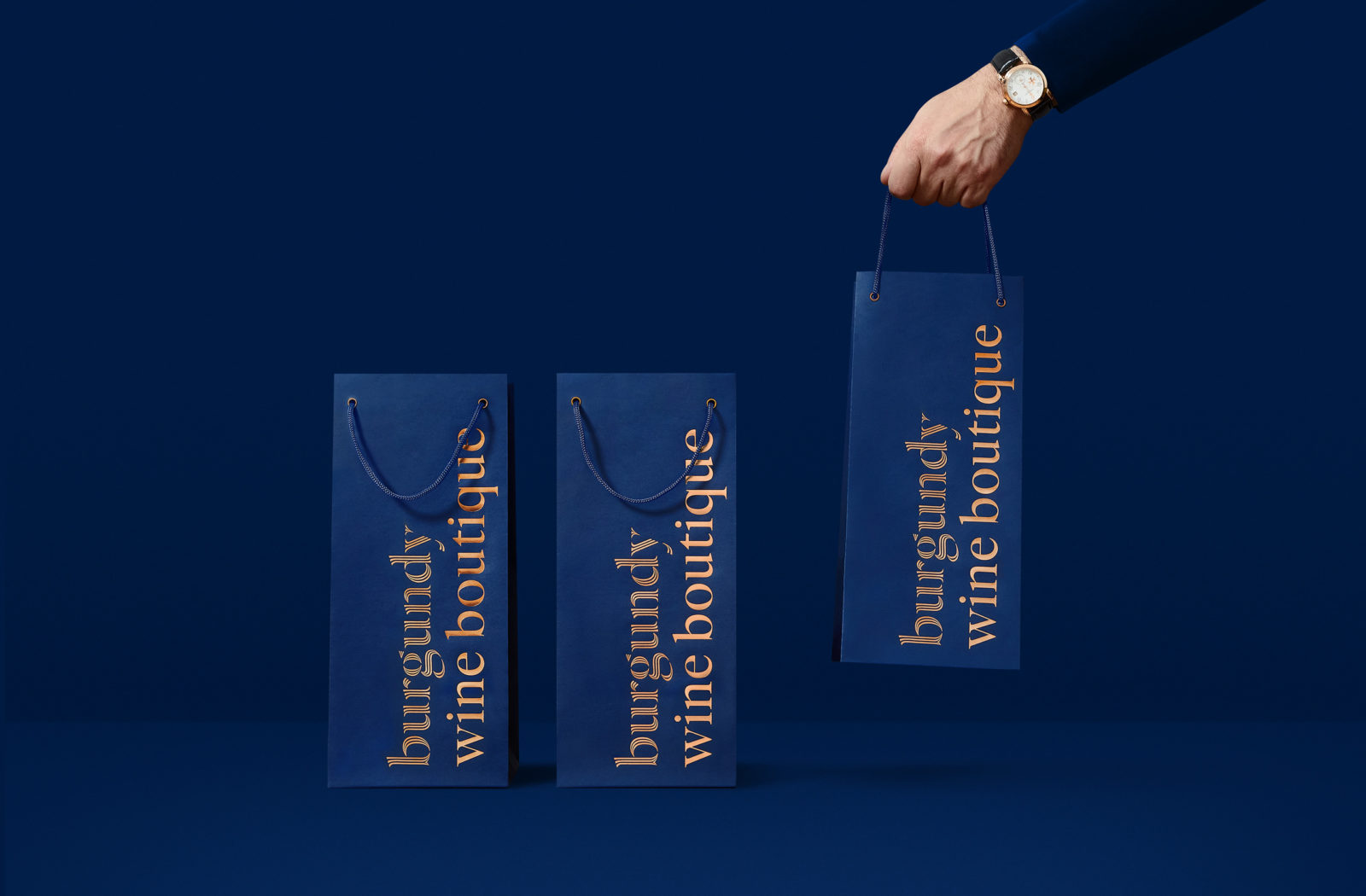
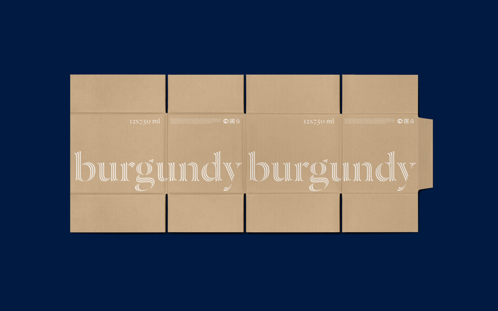
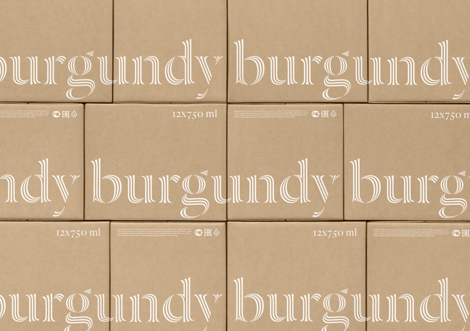
By building a solid foundation for the brand architecture, which includes each sub-brand having its own recognizable logo, an idea of a cohesive and multilevel brand was achieved that both seduces the buyer, as well as creates a trustworthy and noble overall character. By reducing the elements to a minimum, Tomatdesign found an interesting and clever way of bringing the core and heart of the industry — the vineyards — into the visual identity without underlining it. “We found the solution in the simple image of a vineyard — more precisely, in its texture, which can be seen from birds-ey view. The Dala Prisma font has become a key design element that embodies this idea of identity. Its fluid striped shapes create an effect reminiscent of endless orderly rows of vines”.
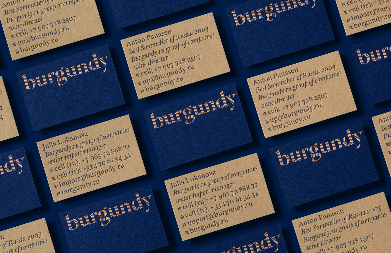
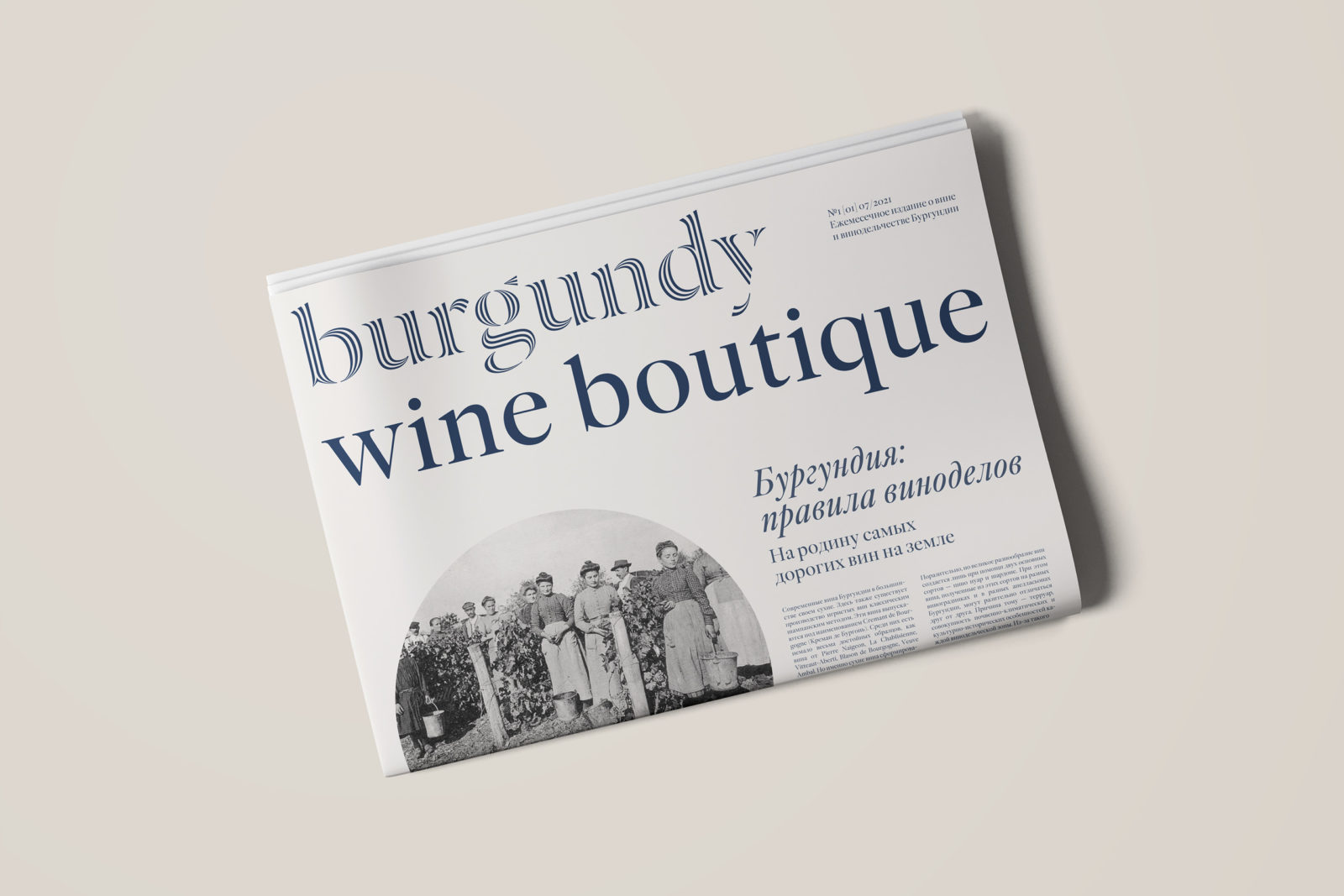
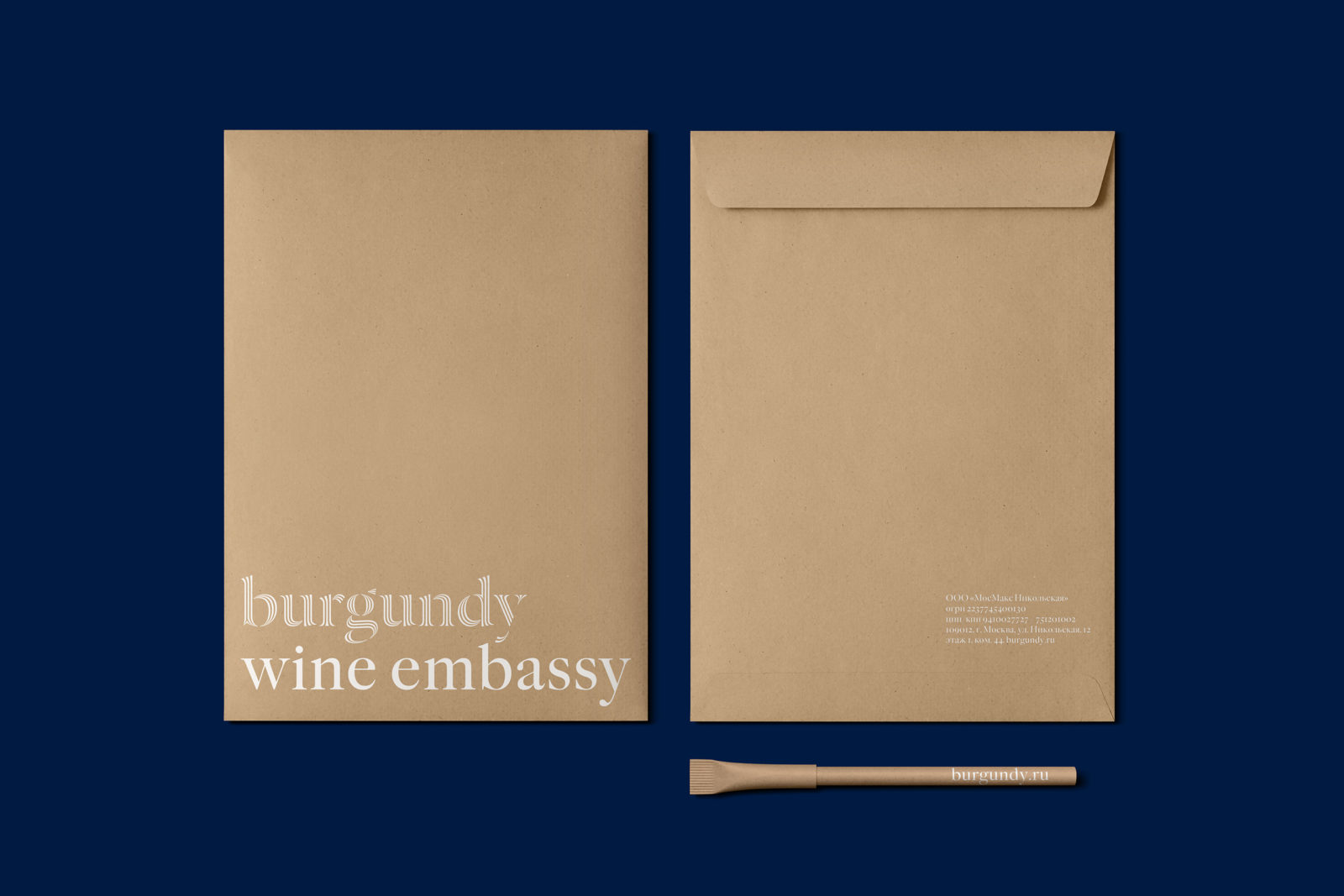
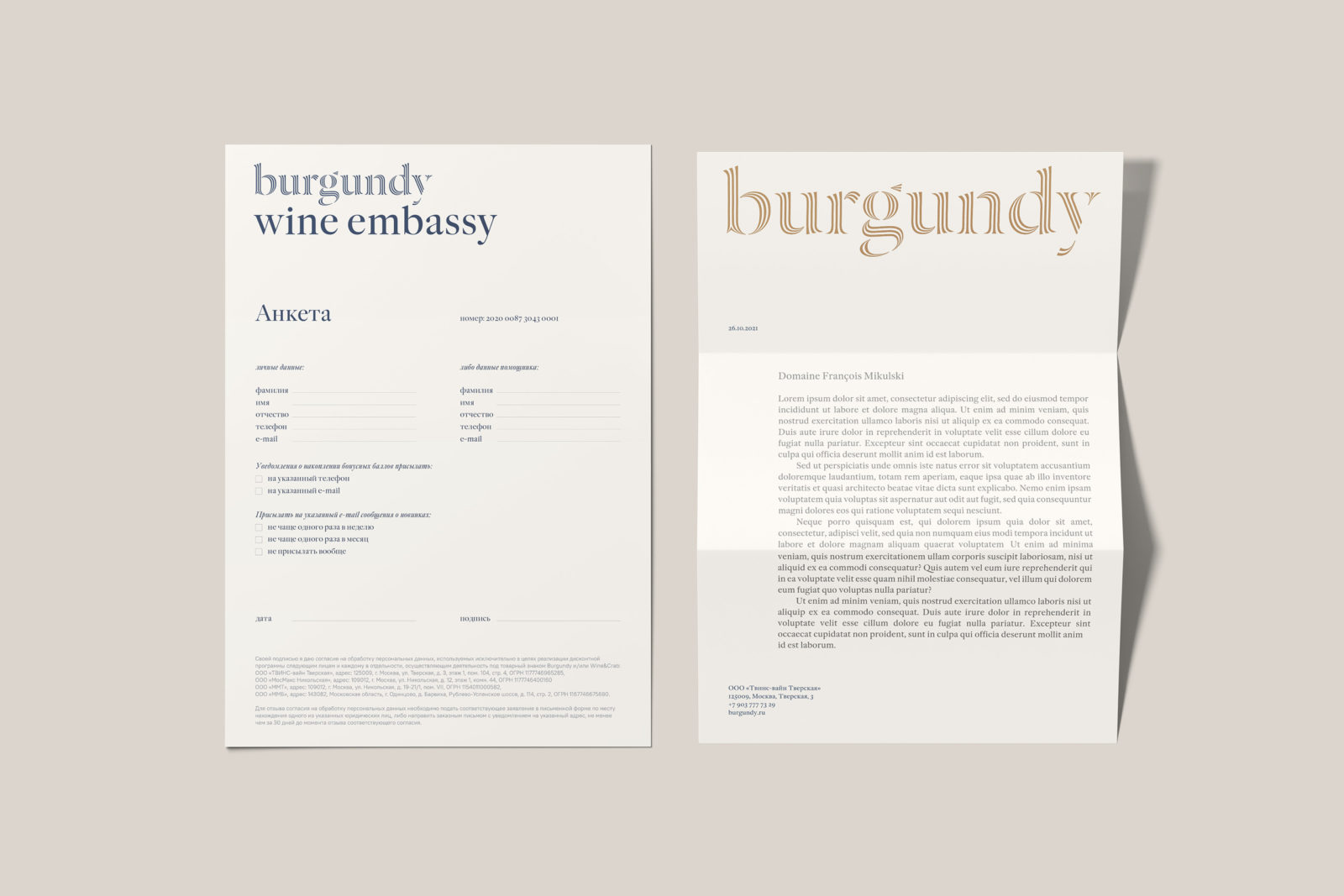
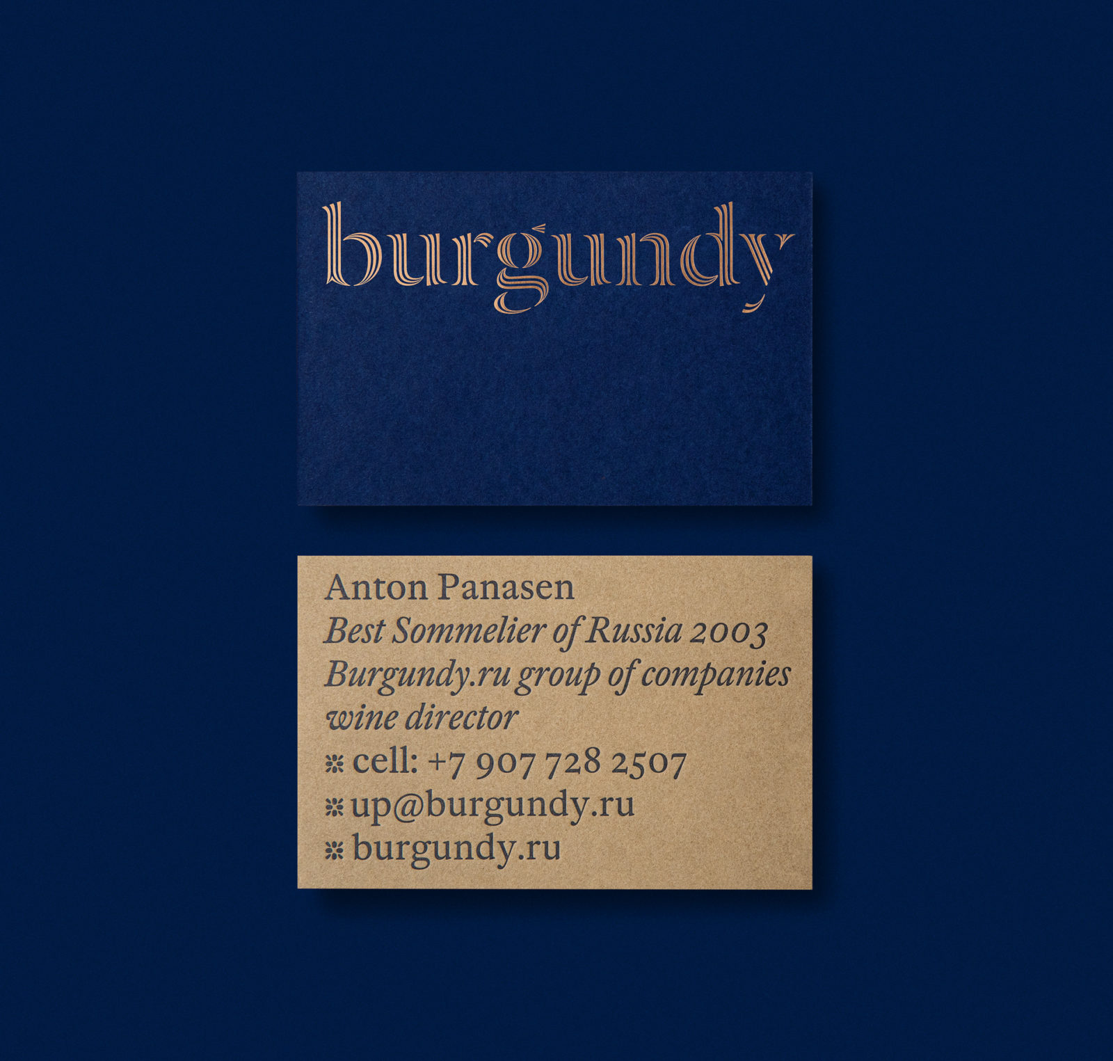
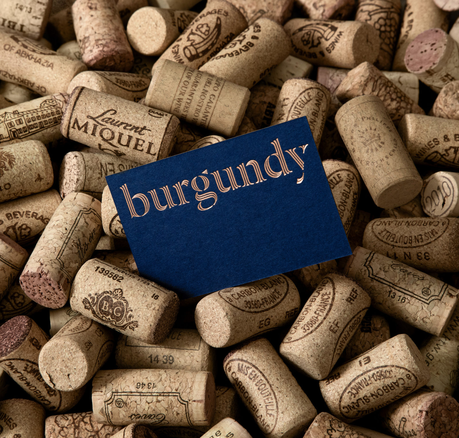
The concept uses only typographic tools, noble colors, and a descriptive photographic style to tie a feeling of contemporary elegance to the brand. The almost royal color palette — deep blue and bronze — creates the wanted associations with the product and gives the brand a solemn touch. The discreet design reveals itself fully through the applications: the tactility of the chosen materials and embossing, engraving, and embroidery printing methods add gloss and splendor to the Burgundy brand identity.