“CEL is what you know, but also what you would like to explore. CEL does not exclude, it connects. CEL learns, but also allows you to draw on yourself. CEL is the place you are striving for, though it is coming towards you on its own. CEL is a club, which is a result of the history, but also of the future of electronic music. CEL is for you, and you are for it” – these are the words that pull you into the electronic world of music club CEL, the home of electronic music lovers and party-goers who feed on the pulse of the beat. The raw and minimalist emotion that music awakens in people acts as the starting point for not only the boldly monochrome and modular visual identity by graphic designer Kasia Olejarczyk but CEL’s interiors which are carefully crafted around sound systems and acoustic arrangements.
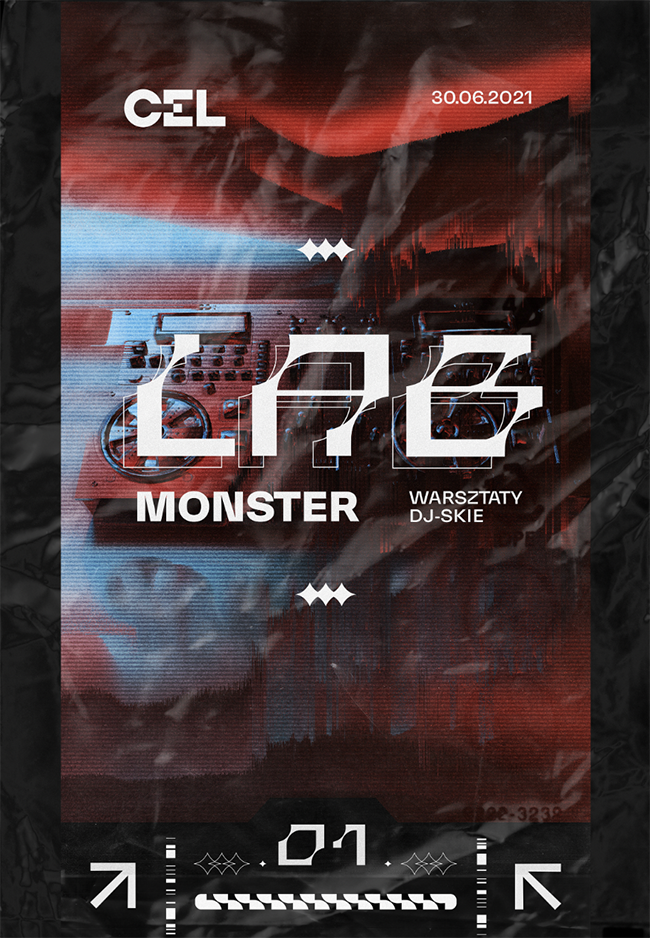
Located in the basement of an old railway station in Katowice, Poland, CEL is the home of daily meetings, music workshops, and the local music community that constantly explores the farthest corners of the electronic world. CEL also aims to offer a step-up to young DJs starting out with their CEL LAB program where they can learn side by side with some of the greatest and most successful professionals in the country.
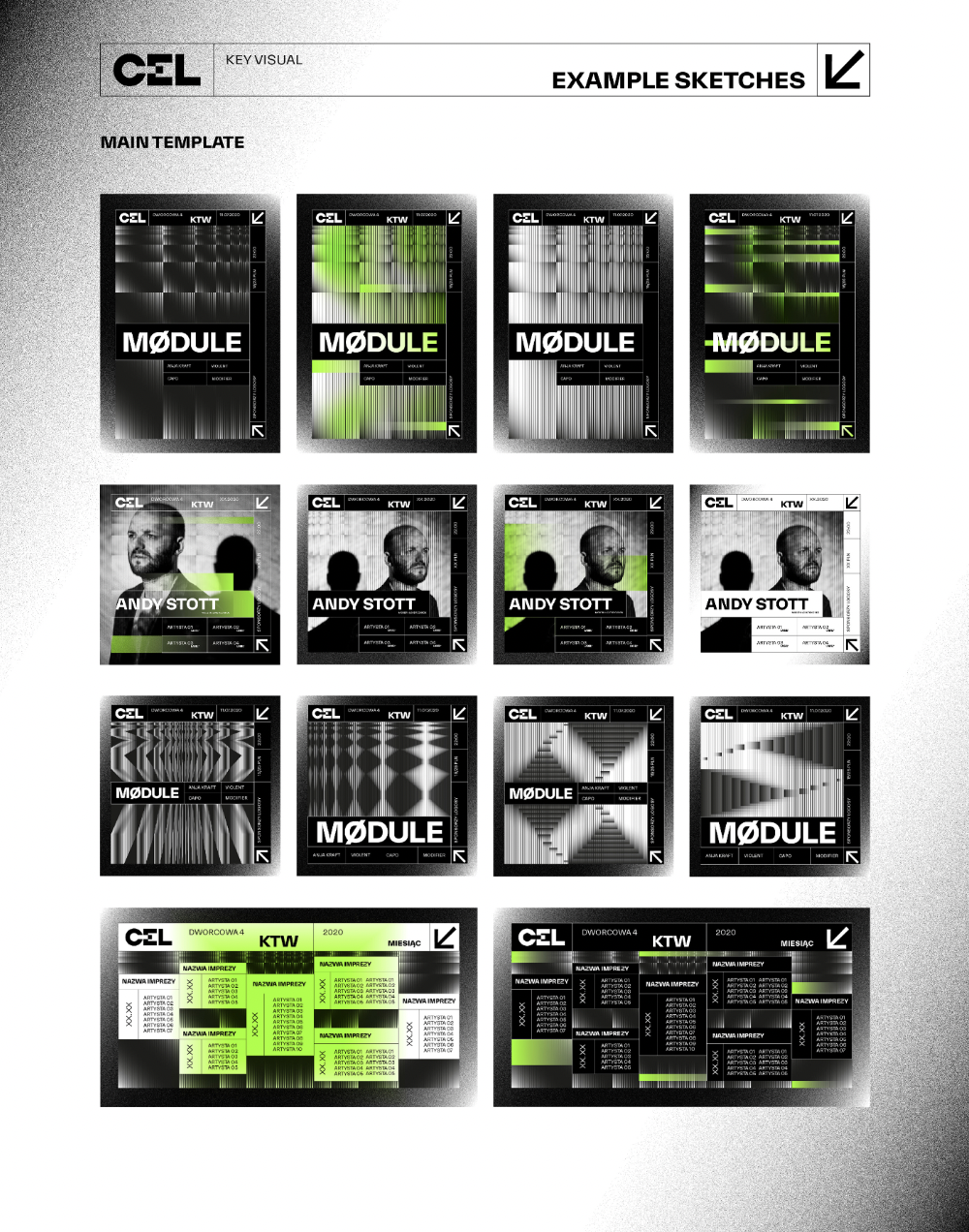
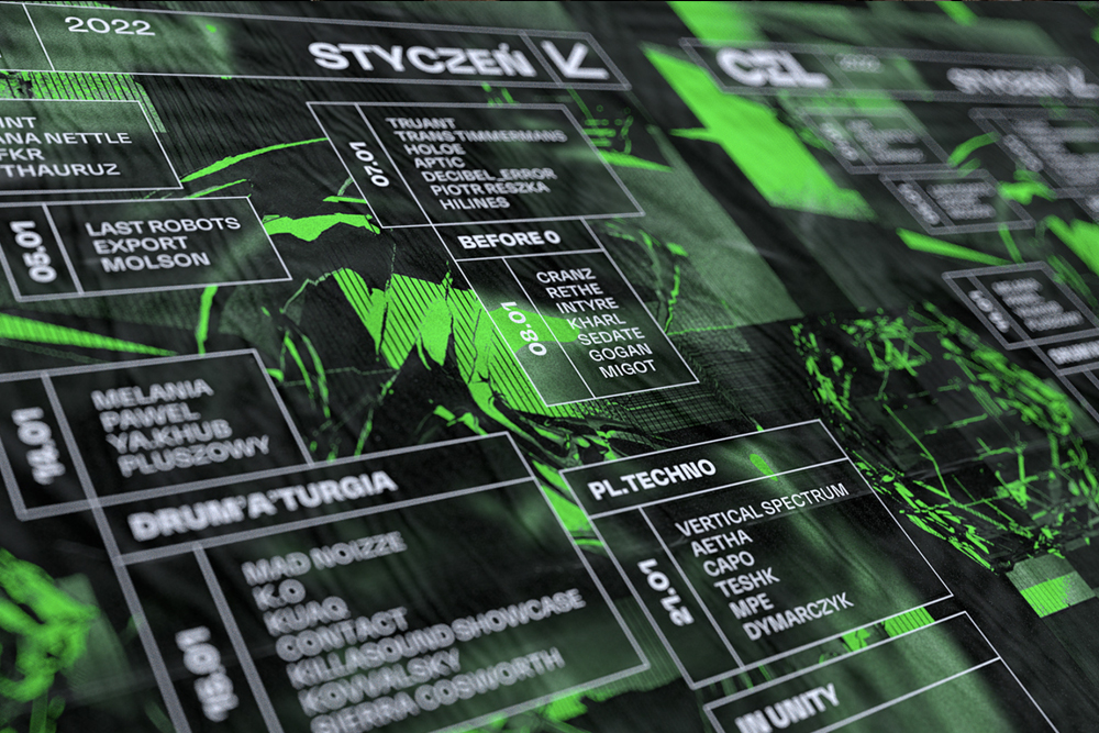
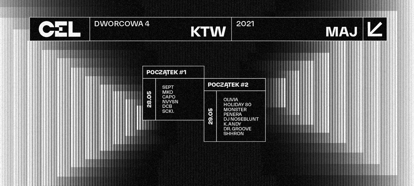
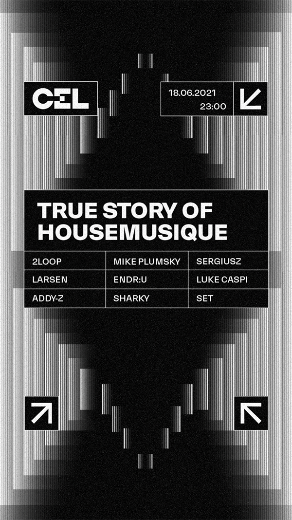
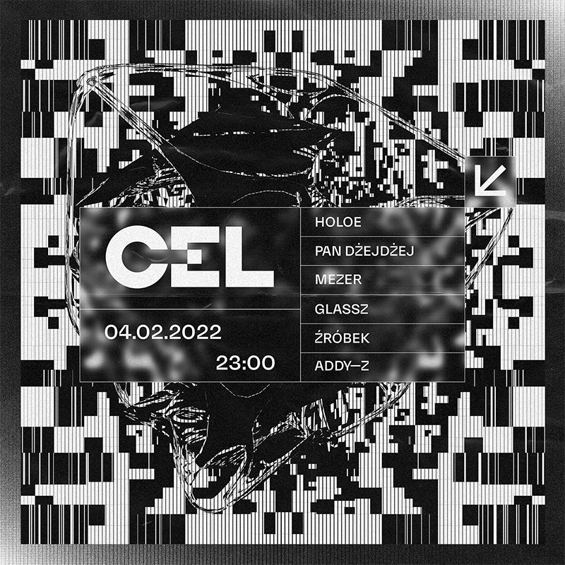
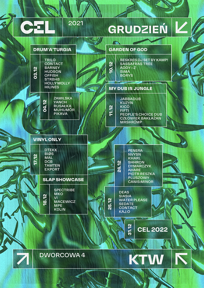
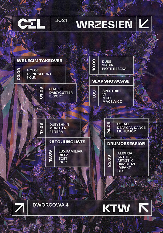
Visualizing the physicality of music and the emotions it arises act as the inspiration for the grid-like visual identity that draws inspiration from techno-culture
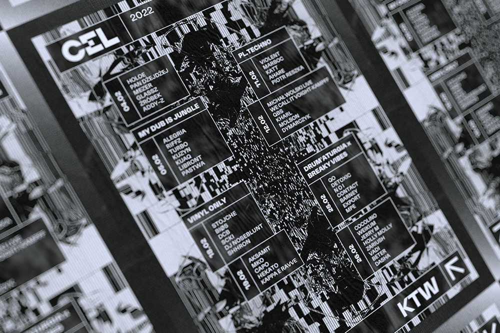
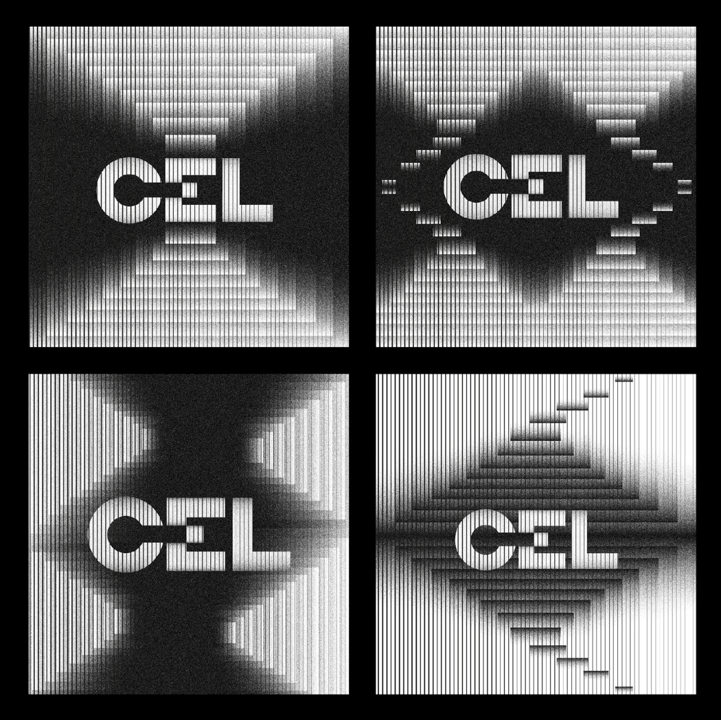
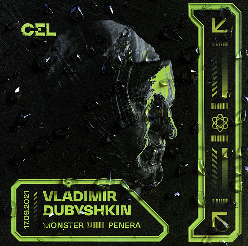
Following the passion and beat of CEL, the visual identity aims to visualize what visitors, guests, and artists feel at CEL, as well as the experimental nature of the event place. “The main objective of the visual identity was to generate modular 2D graphics as a basis for animation and 3D aesthetics, complementing the experimental approach in the form of algorithms that disrupt the perception of images”, Kasia Olejarczyk writes of the concept of the visual identity.
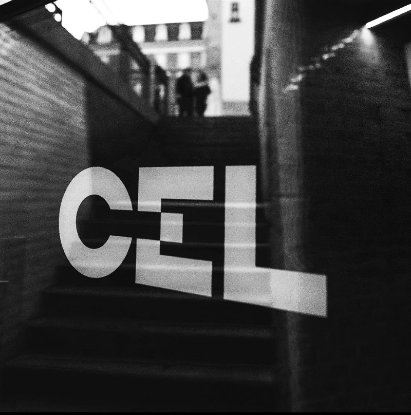
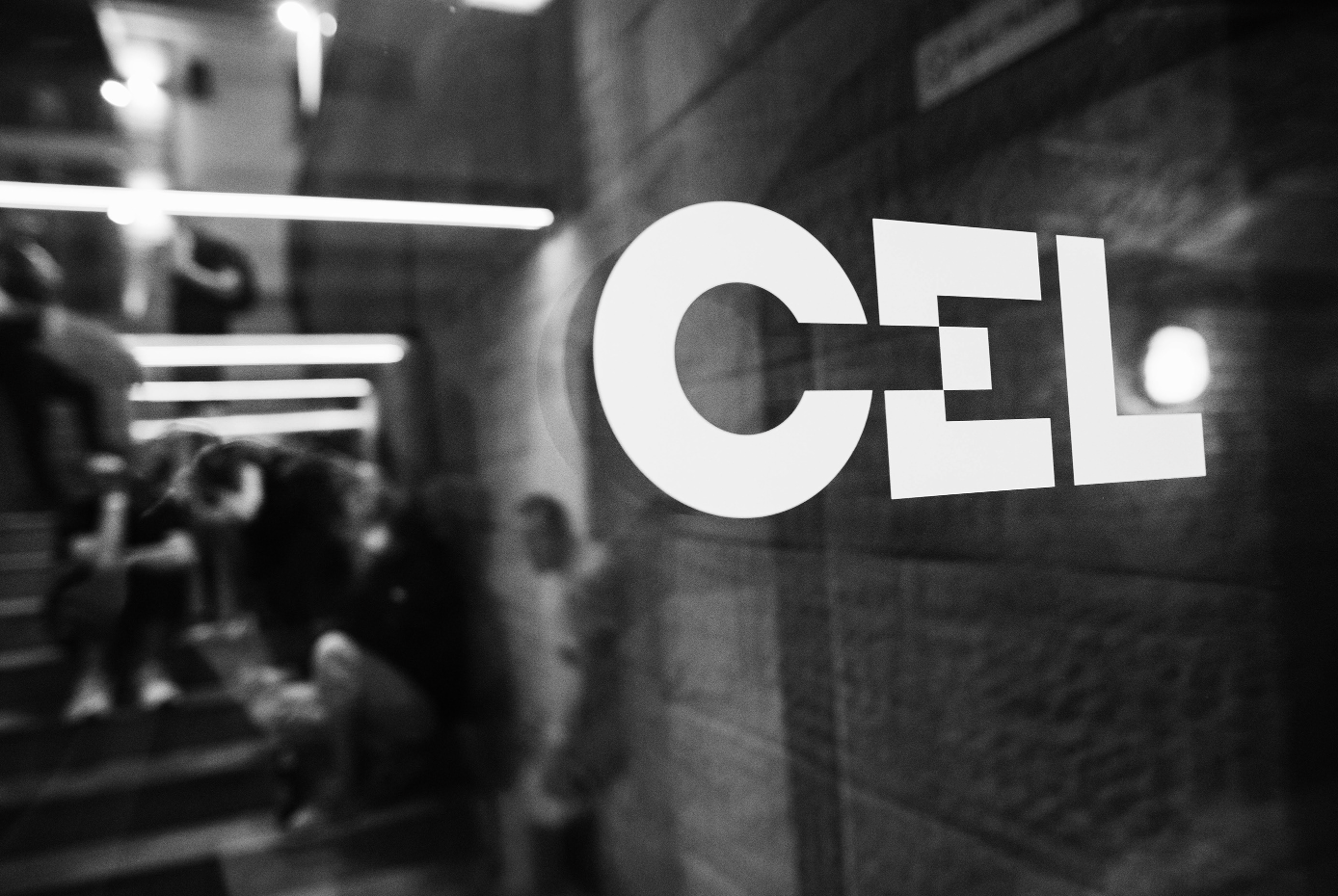
The point of reference for the creation of the key visuals is geometry, more specifically the square, which is used in the logo as a metaphor for the target (CEL in polish) – the composition and elements of the modular grid are based on it.
The concept of visualizing the patterns forming from a range of sounds, which constantly change in the background connecting with the audience, acts as a kind of a metaphor for the inspiration and diversity that can be found and experienced at CEL. The most crucial goal of Olejarczyk was to create a coherent and orderly visual identity that reflects both – the electronic sounds and beats of the music, and the community around CEL, through images, typography, logo, animation, and video.
This was achieved by creating strong graphic elements that follow a clear linear system. Modularity, simplicity, geometry, and minimalism are strong visible inspiration sources for the concept, as well as techno culture. “The point of reference for the creation of the key visuals is geometry, more specifically the square, which is used in the logo as a metaphor for the target (CEL in polish) – the composition and elements of the modular grid are based on it”, Olejarczyk concludes.


Photos © Mateusz Pławski
