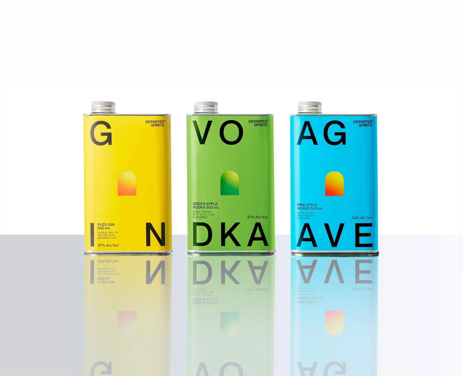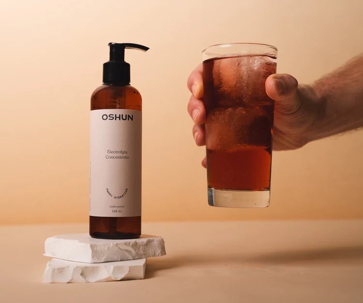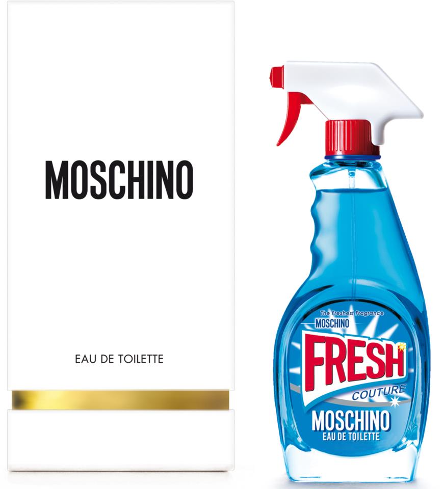
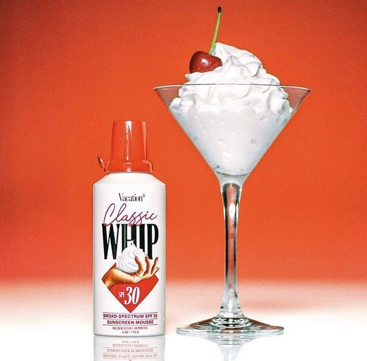
In the ever-competitive world of branding and product design, standing out on the shelf has become a high-stakes game. Enter Chaos Packaging — the latest trend turning heads and disrupting convention with a simple yet radical idea: confuse, surprise, and delight through packaging that defies expectations. Whether it’s a beverage in a motor oil container, pasta boxed like tech hardware, cosmetics wrapped like instant noodles, or sunscreen packaged like an 80’s whipped cream bottle, Chaos Packaging is about challenging norms and sparking curiosity through deliberate visual misdirection.
A new wave of disruption for brands to utilize in their power
Rooted in the idea of anti-design and experimental marketing, Chaos Packaging leverages shock value and irony to elevate brand awareness. It’s a reaction to minimalism and overly polished branding — a way to embrace clutter, contradiction, and playful confusion. Brands are choosing chaos to make consumers look twice, both on shelves and social media feeds. This isn’t just novelty for novelty’s sake. The trend speaks to the modern consumer’s craving for authenticity and surprise in a marketplace oversaturated with sameness and clones. It’s clever, it’s bold, and it’s wildly Instagrammable — exactly the kind of visual disruption that sparks online virality that brands crave.
Brands are choosing chaos to make consumers look twice, both on shelves and social media feeds. This isn’t just novelty for novelty’s sake. The trend speaks to the modern consumer’s craving for authenticity and surprise in a marketplace oversaturated with sameness and clones.
Chaos Packaging thrives on contradiction
Chaos Packaging taps into the cognitive dissonance between what we see and what we expect. This momentary confusion becomes a memorable interaction for consumers, automatically forging a stronger brand impression. It also plays into broader visual culture trends like “weirdcore” and “anti-aesthetic,” offering a breath of fresh – and weird – air in an otherwise uniform branding landscape. It also mirrors the rise of debranding — where companies remove logos and embrace brutalist, text-heavy packaging. But where debranding strips down, chaos adds layers of irony, absurdity, and sometimes even narrative.
Chaos Packaging taps into the cognitive dissonance between what we see and what we expect. This momentary confusion becomes a memorable interaction for consumers, automatically forging a stronger brand impression.
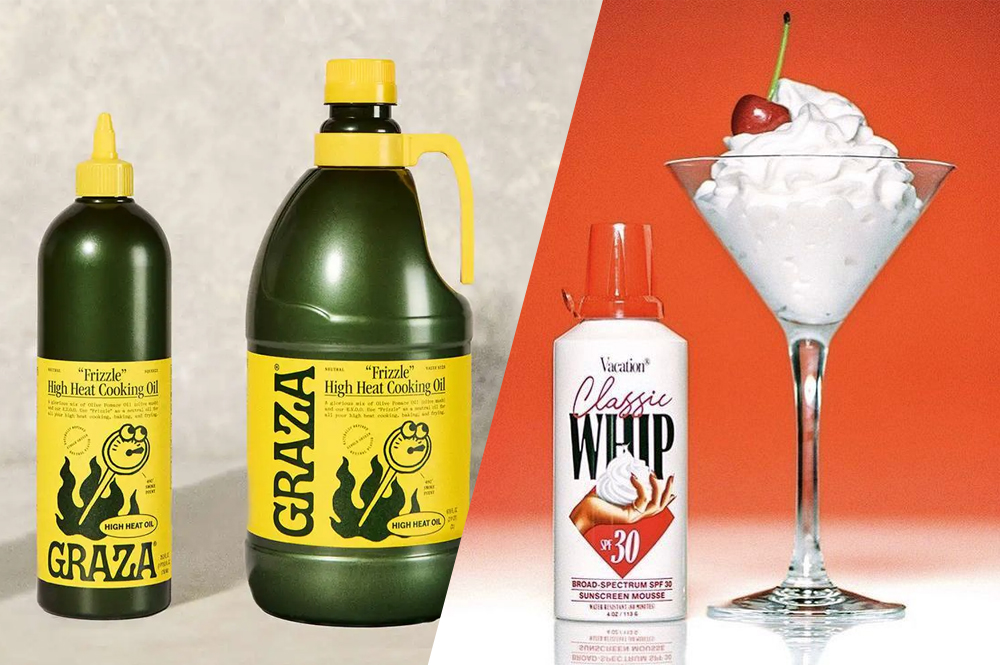
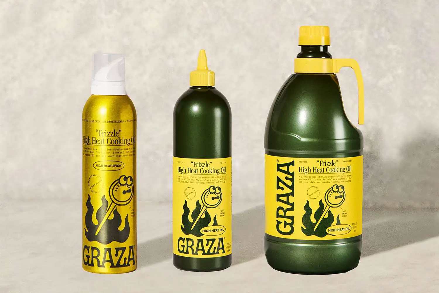
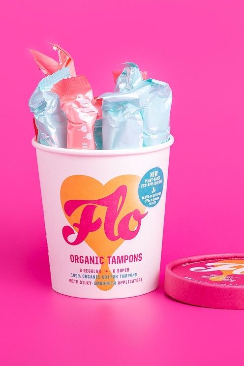
One striking instance of chaos packaging is Flo, a menstrual health brand that packages its tampons in vibrant ice cream tubs. This unconventional choice not only grabs attention but also challenges societal taboos surrounding menstruation, making the product more approachable and conversation-worthy. Also, Graza revolutionizes olive oil packaging by offering it in squeezable plastic bottles akin to condiment containers. This practical and playful design enhances user experience and sets the brand apart in a market dominated by glass bottles.
But while chaos can be charming, it also demands a delicate balance. If a brand misleads consumers too far, and the packaging feels gimmicky — or worse — deceptive, the reaction is the opposote of what is desired. The most successful executions of Chaos Packaging maintains clarity once inspected, often with smart typography or clear secondary labeling that assures users of the product’s true purpose.
Whether a short-lived viral trend or a lasting strategy for bold brands, Chaos Packaging represents a broader shift from silent minimalism to expressive maximalism
As the consumer market becomes more crowded and digitized, packaging that speaks loudly — visually and conceptually — may be the key to being remembered. And as for designers, it challenges them to rethink what packaging can be, and how far they can push visual language while still serving clarity and function. After all, in a world where everything blends in, chaos might just be the clearest way to stand out!