A Vienna-based interdisciplinary consulting and design-studio KR8 Bureau creates holistic brand identities and customer experiences for companies with strong visions, thriving on problem-solving and challenges. With expertise in positioning new brands to the market, the KR8 Bureau creates unique and attractive visual identities full of character and personality – which stand out and on their own.
Working analytically and conceptually, heavily influenced with tools from sociology and neuropsychology, KR8 Bureau sees and realizes the needs and wants of the modern, ever-changing world.
Working for a wide range of clients from government organizations, large-scale industry to product branding, KR8 Bureau has learned to confront a new set of challenges with each of them. Creating holistically flexible brand systems leave room for potential change, grow and relevance – and a legacy. The visual identity of an Austrian beverage brand Jus(t) is a grand example of their future-oriented approach, with incredibly stylish results.
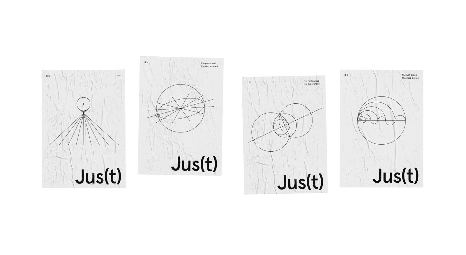
Jus(t) beverage branding full of symbolism and dose of magic
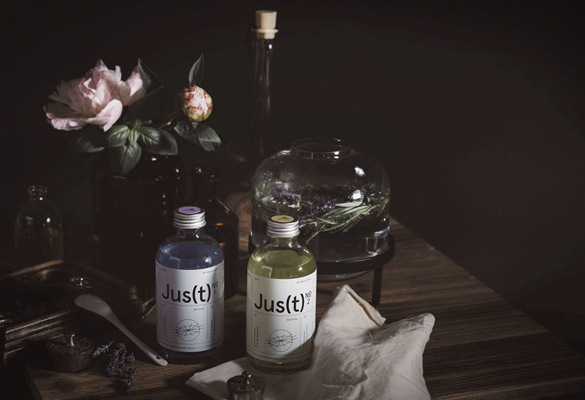
When entrepreneur and winemaker Werner Hauser first approached KR8 Bureau in 2017, the task included just the design of a logo and label for his new drink invention, which would be mixing gin or vodka with soda and verjus, a juice made of unripe grapes. But after seeing the potential of the product, KR8 Bureau convinced Hauser to take part in a holistic process of strategic branding in order to create a scalable business for current European markers.
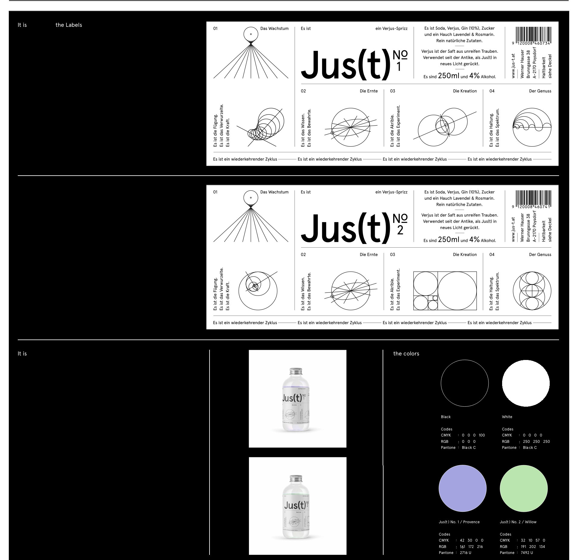
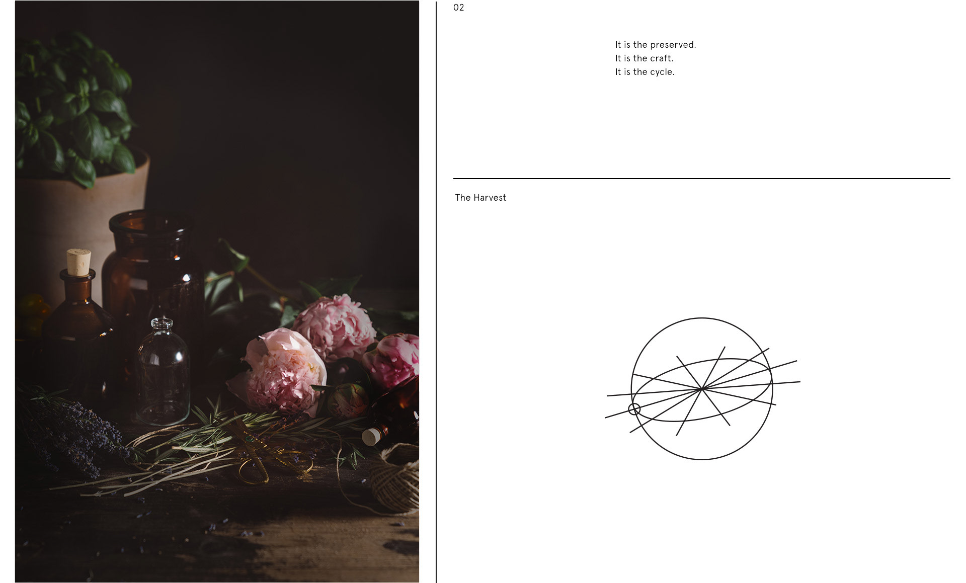
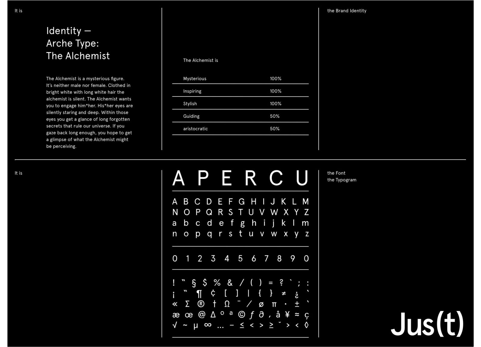
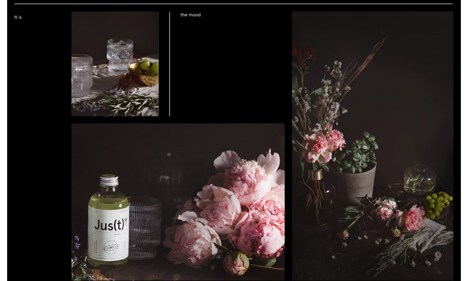
 Verjus, a drink known since the Middle Ages has recently enjoyed a bit of a renaissance in the culinary arts. Known to be used as a medicine, home remedy as well as an ingredient in cooking, it disappeared when citrus fruit came to Europe. Realizing the potential of the product’s mysterious history, KR8 Bureau based the branding on the natural curiosity it sparked in people. An identity was born full of symbolism and magic, with references to astrology and alchemy.
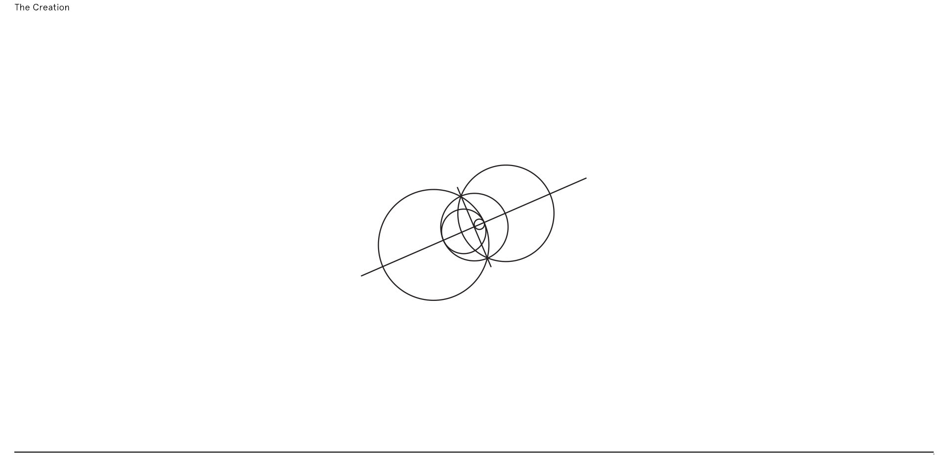
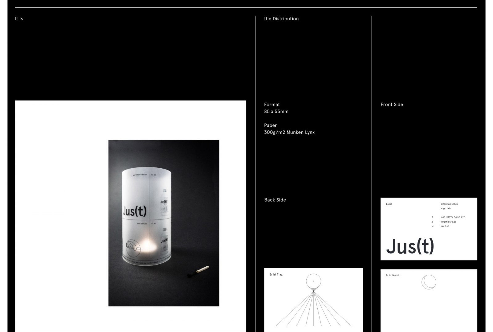
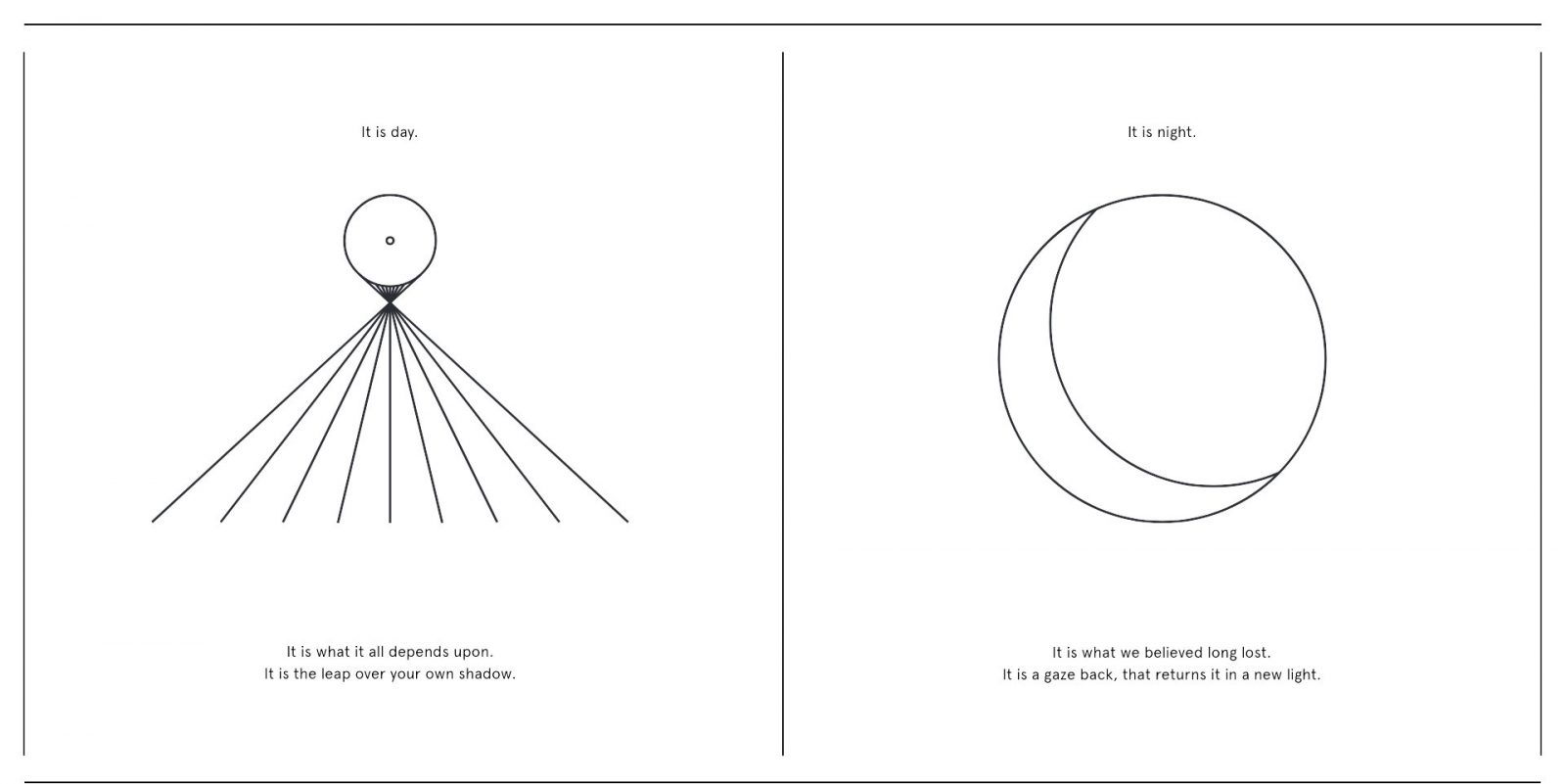
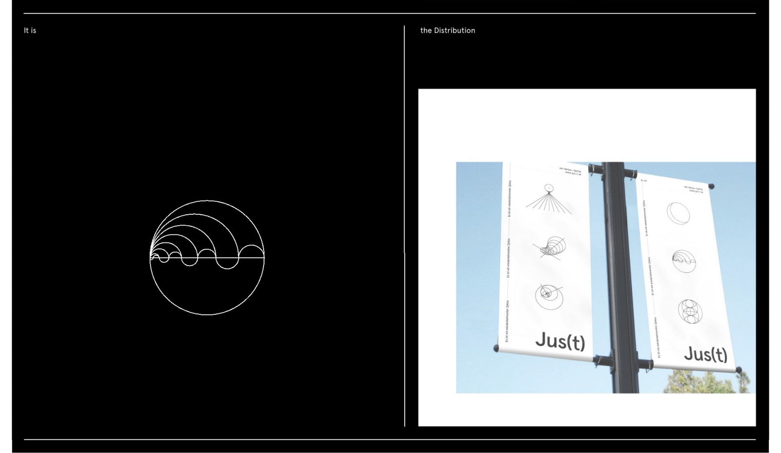
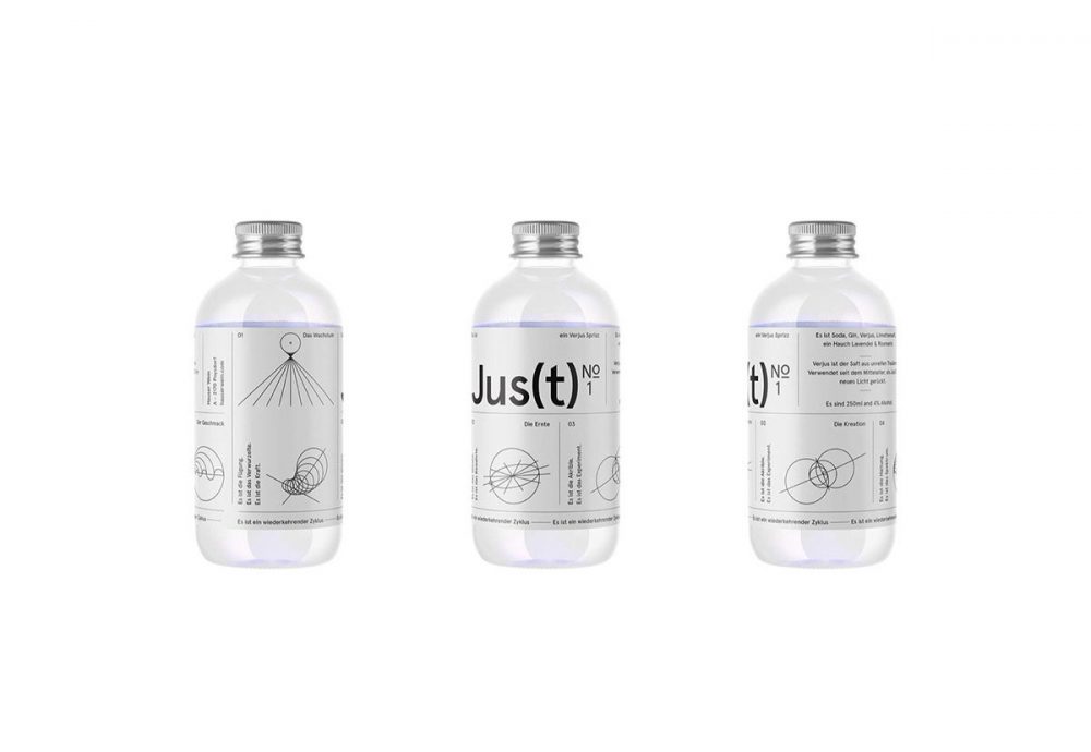
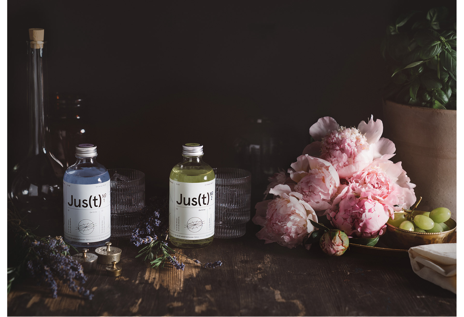
The branding utilizes concepts such as the Golden Cut, the Fibonacci number, mysterious laws of nature, such as tides, and the alchemical beliefs of the past. The mainly monochrome visual language is build of line-illustrations of geometric forms, and a simple sans-serif logo. The design manages to capture the viewer’s eye, draw it in, almost hypnotize – with extremely simple means. A detail worth noting is the coloring of the inside of the label, which tints the otherwise transparent drink to reflect the flavor – Provence purple for Lavendel and Rosmarin, and Willow green for Rose and Basilikum.