


After a hard day – or a lazy day for that matter – nothing feels better than a cool glass of wine. And, as a wine maker, you want the bottle that people choose at the end of that day to be yours. But the means to make that happen, to make your wine rise above the rest and be the one thirsty people reach for is not always an easy task. The label carries a large weight of that duty by being the face of the product, while needing to show all the necessary information including whether it’s a red, white, sparkling or a rose, what varietal it is, what type of flavor to expect, what kind of occasion it’s best for etc. But as all these can be told in writing, the personality and spirit of the wine are told through design.
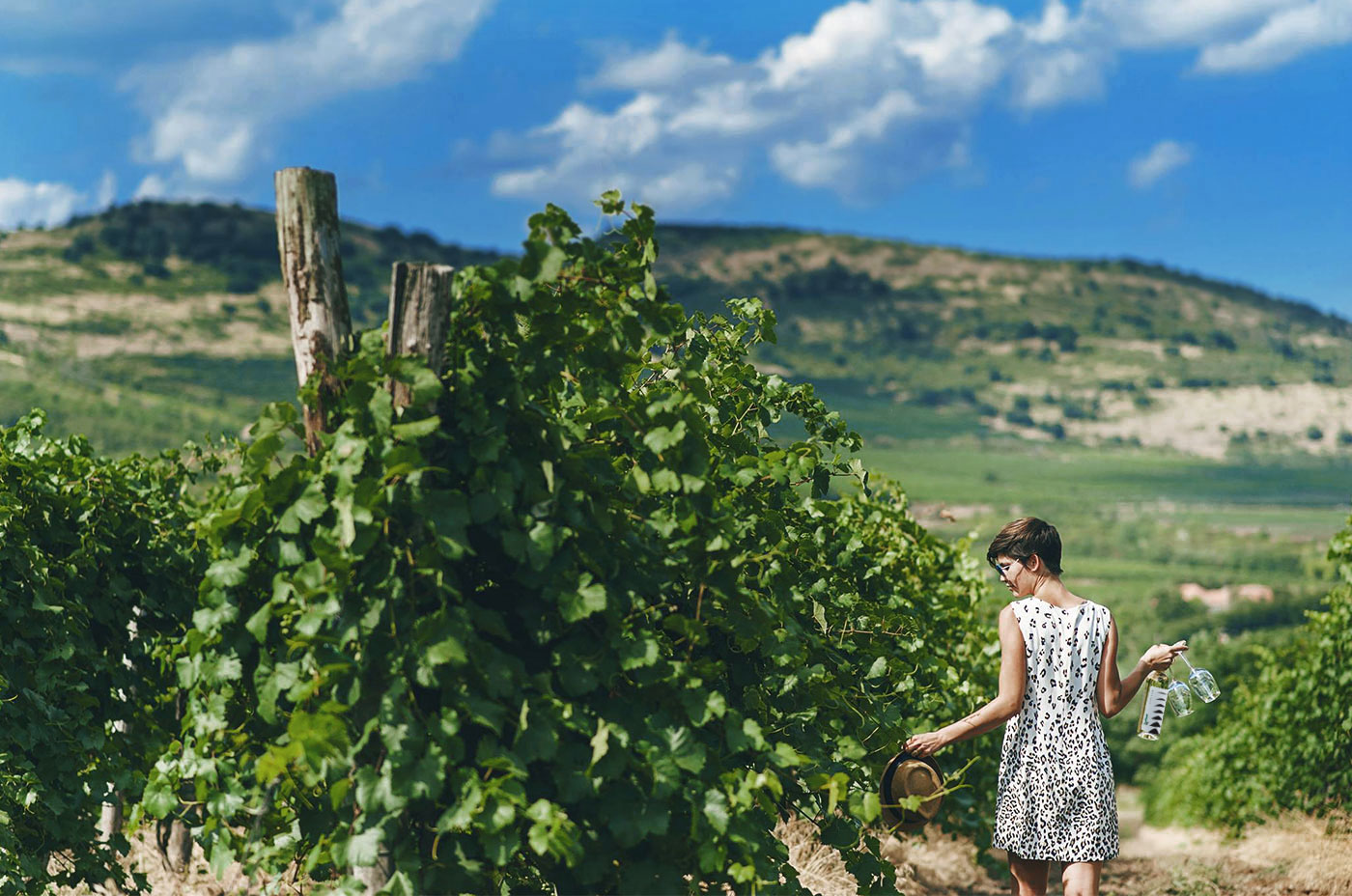
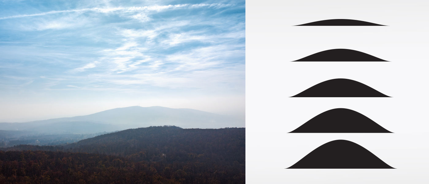
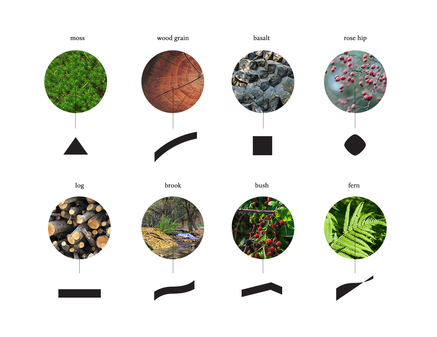
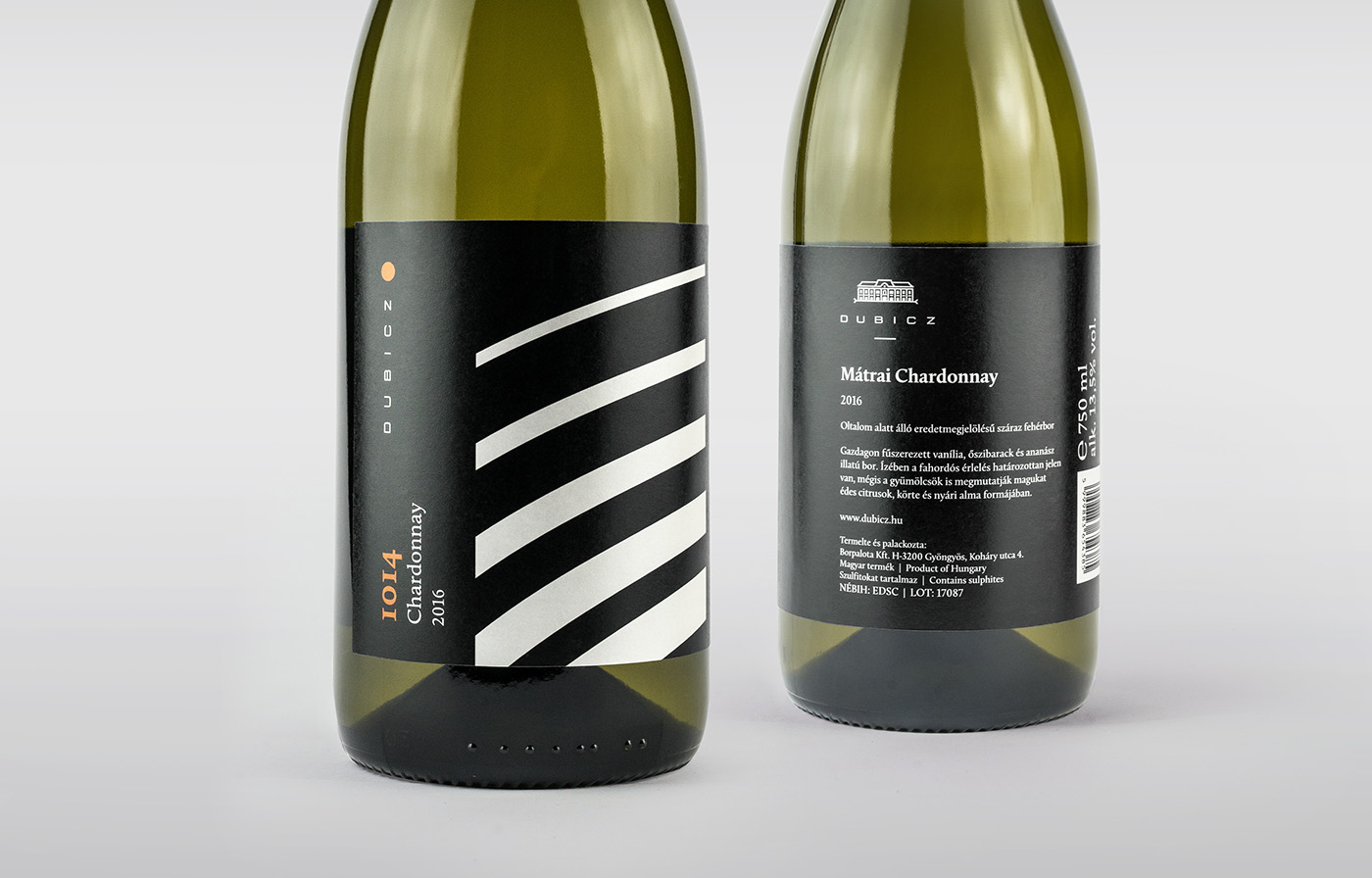
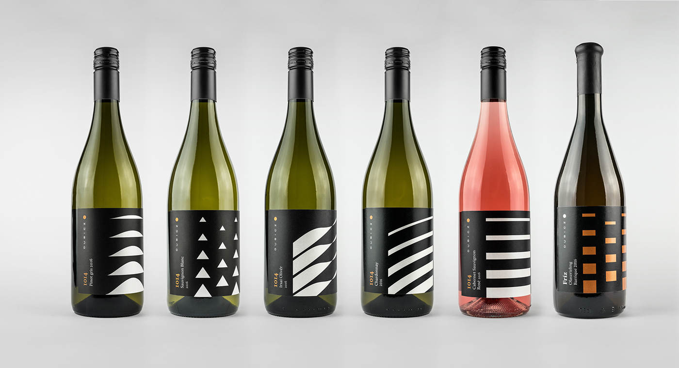
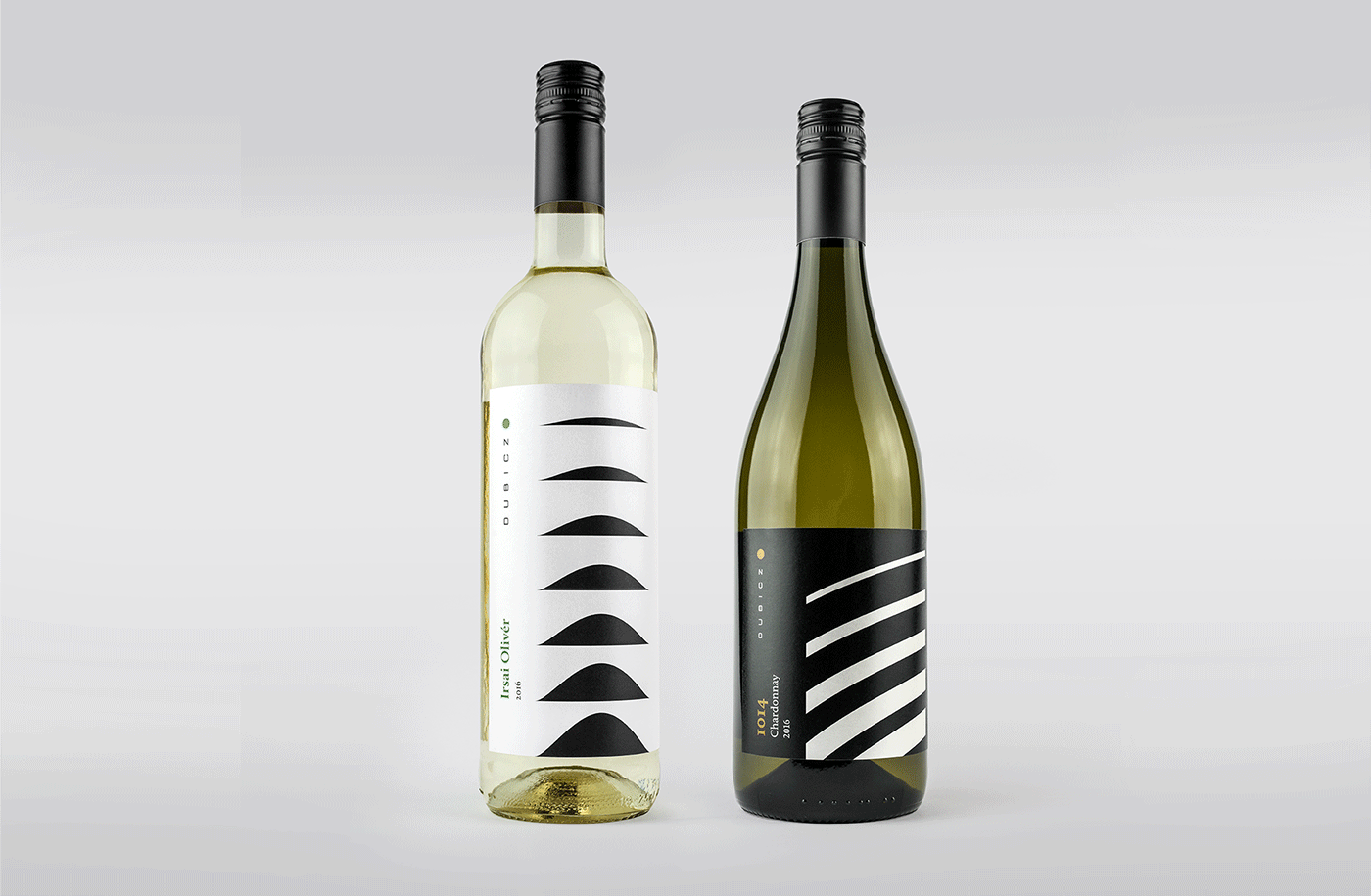
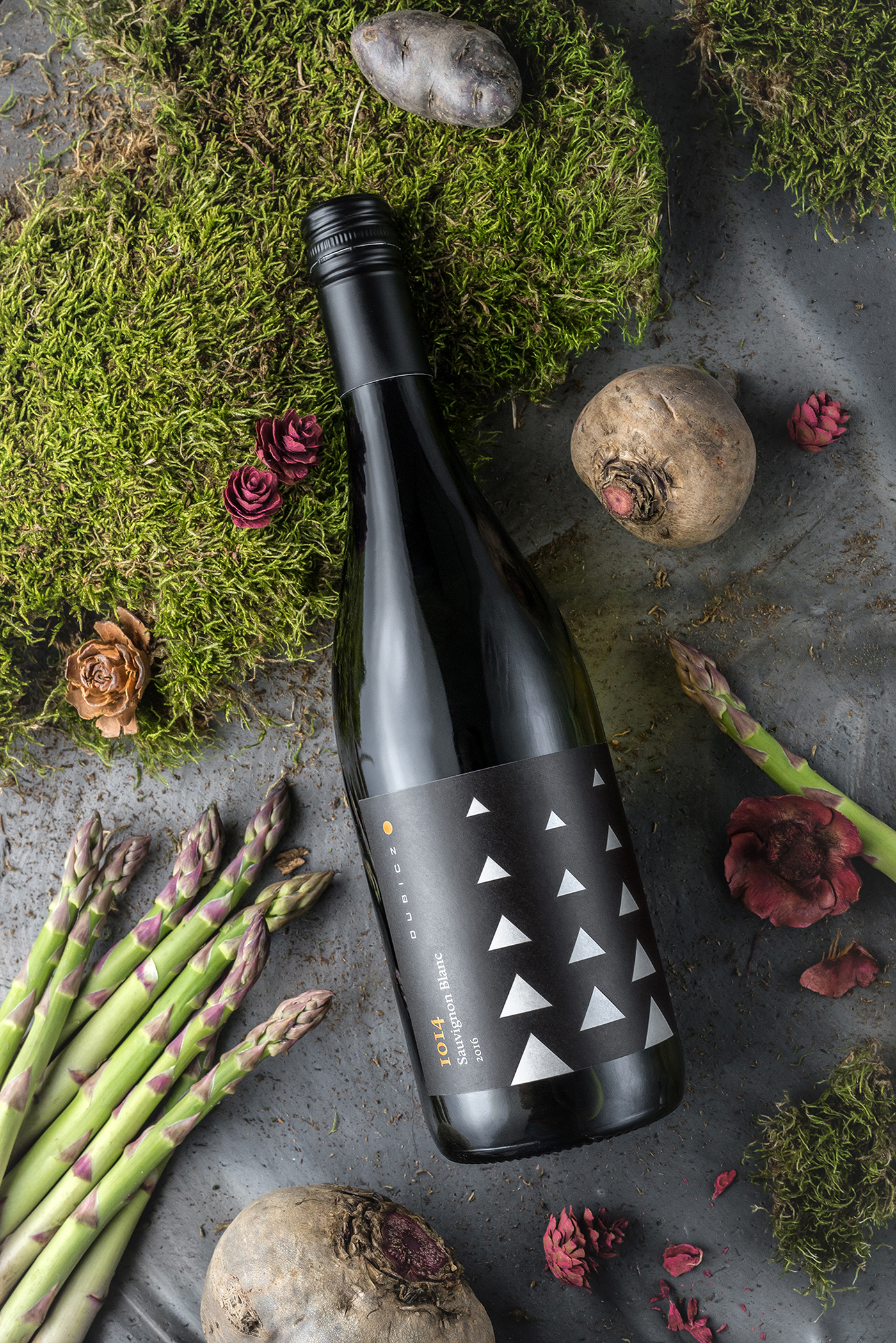
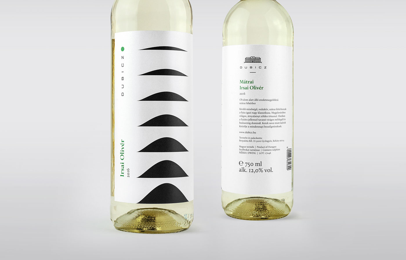
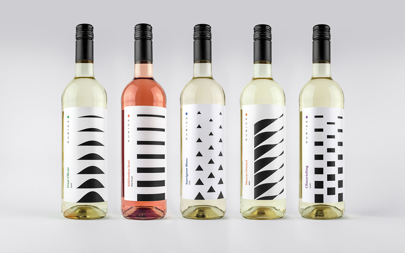
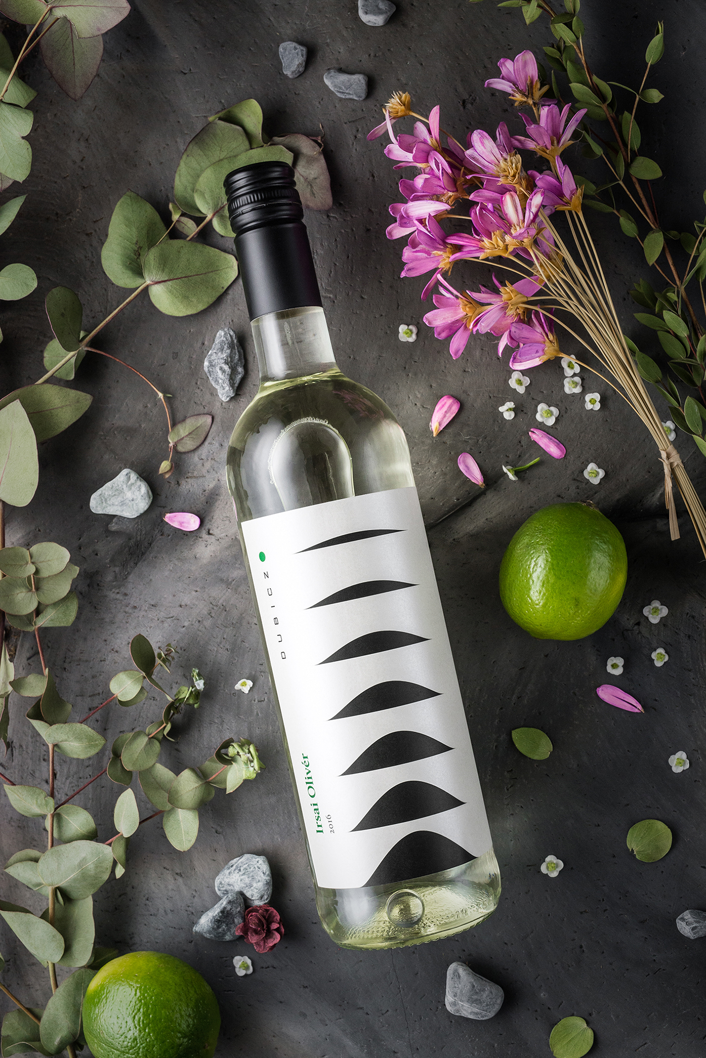
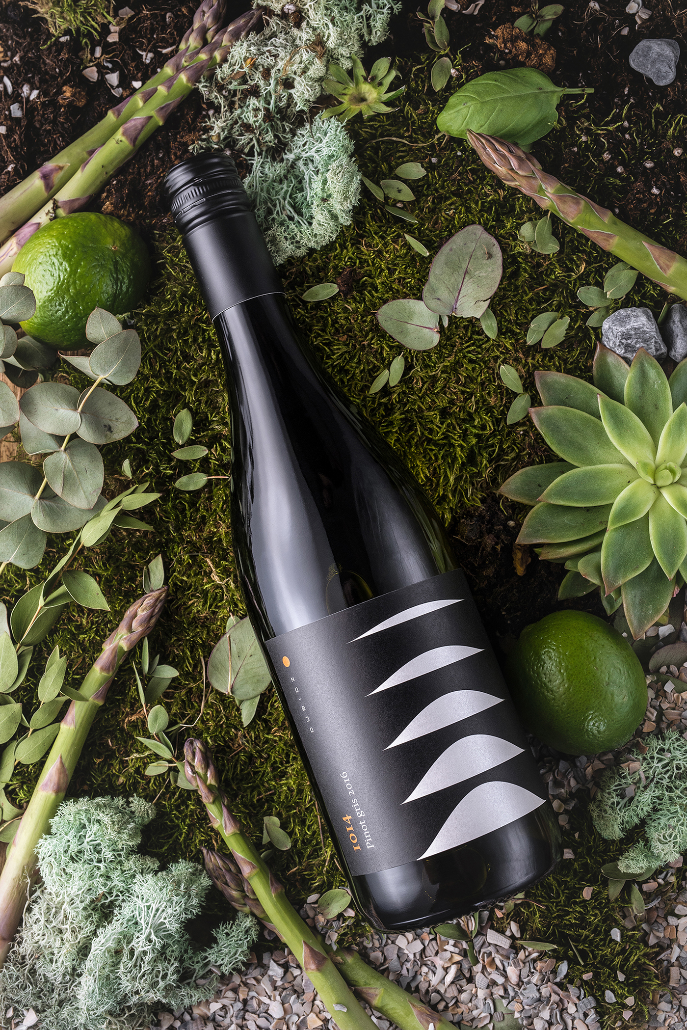
The character of the new range of wines from the Hungarian Dubicz Winery and Vineyard was brought to life by Graphasel Design Studio. The design is inspired by a natural phenomena of the region, when due to the relatively large differences in altitude and temperature inversion the Mátra slopes melt into the stratus clouds appearing above the land. This unique condition gives the wine a specific set of characteristics. Each wine has its own symbol depicting a characteristic natural treasure of the wine region reduced to a geometric form, which then fades away vertically, much like the slopes of the Kékes mountain in the fall. The concept is based on black and white patterns and their complementary colors. This creates a uniform, symbol-based label line that is easy to identify.
Images © Graphasel Design Studio