
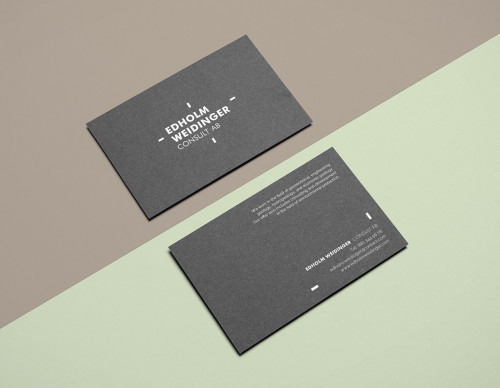
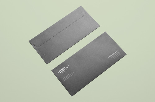
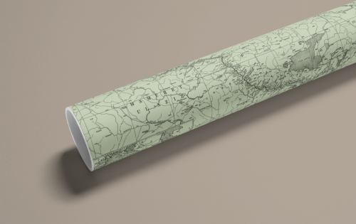
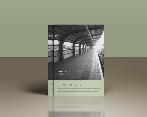
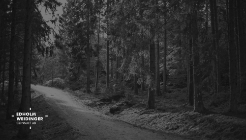
Polish graphic designer Anna Warda has a talent of building relaxing and harmonious color palettes for her clients when designing branding and visual identities. Her latest project involved an identification for a young Swedish consultant Edholm Weidinger, a geodesic company specializing in forest management, documentation, geodetic (full range) and digital maps.
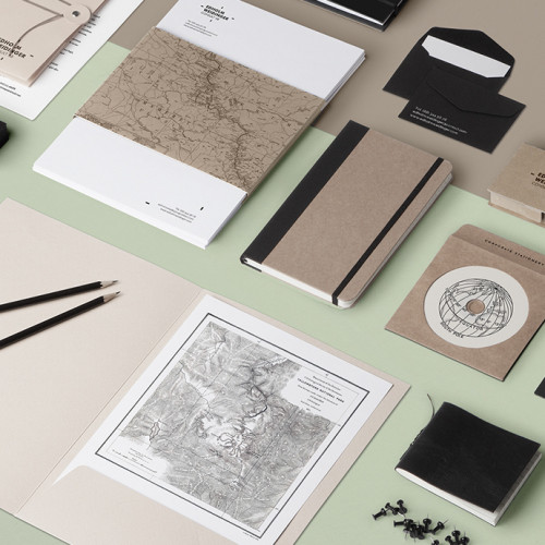
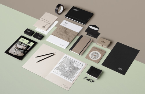
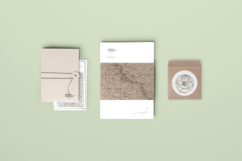
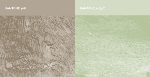
Edholm Weidinger’s company performs work in the field of nature and landscape protection: protection plans for national parks, nature reserves and parks, documentation to create them, and inventories of natural and nature conservation programs in a forest. The visual identity is created around the theme of geographic visuals and mapping illustrations. Keeping the color range simple: beige, light green, white and black, Warda creates a timeless design that fits to the field of expertise offered by Edholm Weidinger. Kraft paper, natural tones, black and white photography and classic typography all communicate quality and passion towards ecological issues and sustainable progress. All aspects worth respecting.
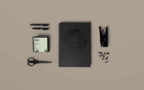
The logotype was designed previously by Polish Auch Studio and is the main typographic element in the design. Other supportive visuals include line drawn maps and a globe as well as textures and patterns familiar in nature. All in all a very coherent design, made with consistently high-quality materials.
Images via Anna Warda