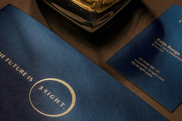
Wrocław based OMI Media House is an award-winning combination of a creative agency and a production house, working for a vast range of clients in the international market. With a talented team, OMI Media House creates designs refined to the fingertips, and idea which is perfectly executed in their latest endeavor, a new branding concept for a Spanish luxury realty developer Bright.
We asked OMI Media House about the process and development of the project and why and how they chose the papers and printing methods used in the project, that oozes of elegance and style – from the gold embossed logo to the carefully chosen papers. 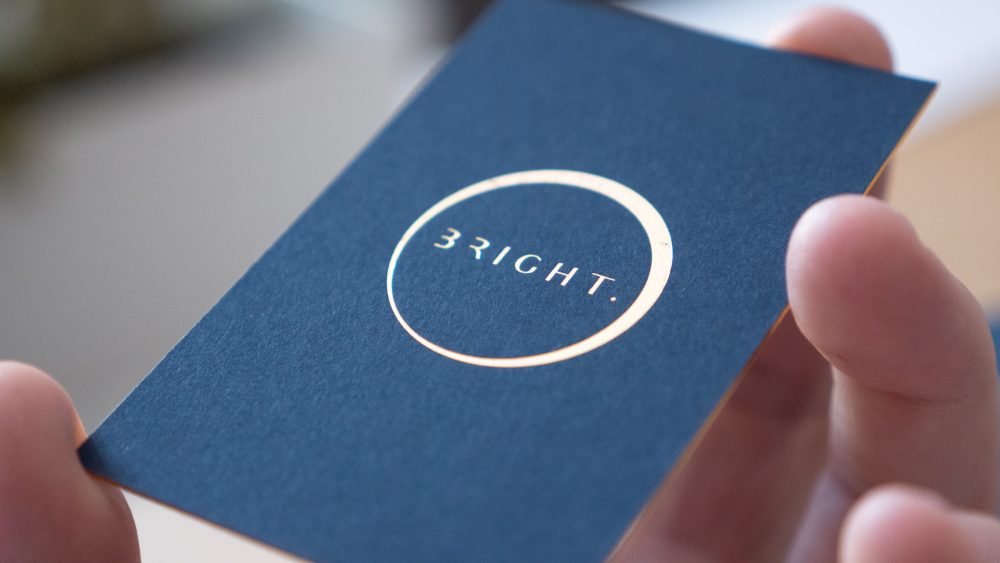
Can you explain to us what Bright is, and what the branding design process entailed?
OMI Media House: Bright is a luxury developer who designed exclusive villas for the most demanding clients. But its sustainable background is as important as the highest quality.
At OMI Media House, we were responsible for the comprehensive branding — from naming, logo, and color palette to website, ephemera, and stationery. Now we look at it with pride, knowing we took care of every little detail. In this case, the exceptional quality was key.
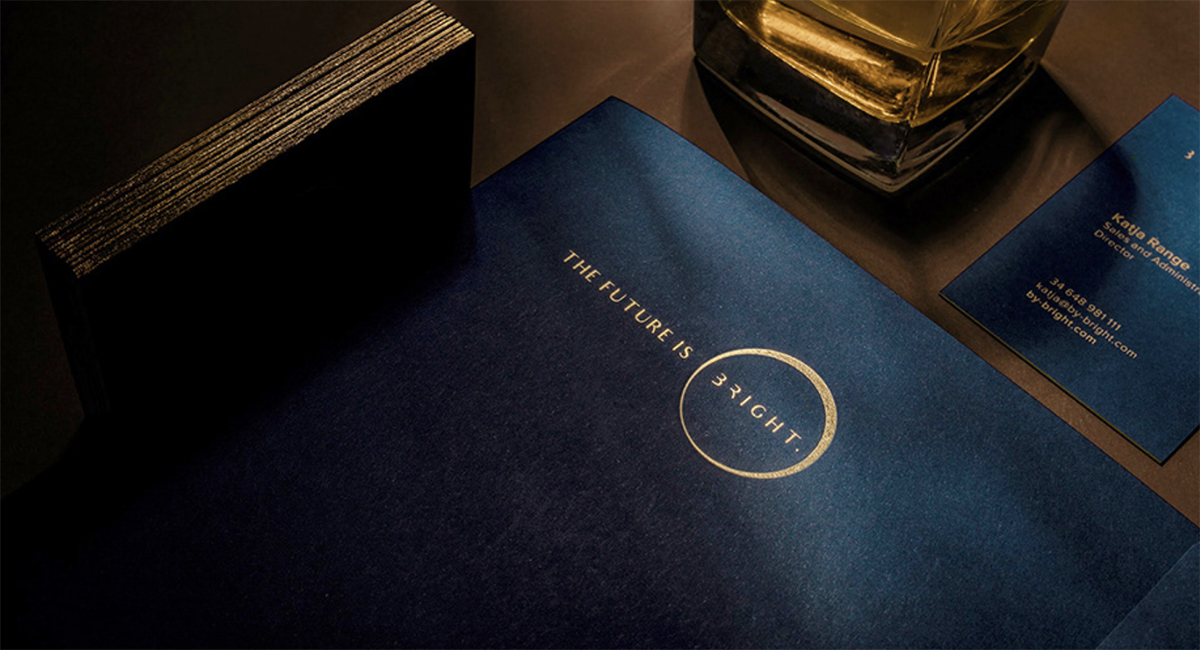
The logo is based on a circle with an uneven rim. It symbolizes a Sun eclipse, which happens only in a specific place and time.
The logo is based on a circle with an uneven rim. It symbolizes a Sun eclipse, which happens only in a specific place and time. Just like exclusive Bright investments – the potential clients are ready for them to become their places on Earth. And with the same, new way of designing, Bright sets future standards.
The branding design is exquisite, and we especially love the luxurious feel and color choices. Can you tell us a little more about the thought process behind these?
OMI Media House: We wanted to make the stationery as sophisticated but also as sustainable as we could. When thinking of the best possible materials in designing homes, we had to transfer this idea to paper. That’s why Crush and Burano were our choices.
Making compromises was out of the question. It’s clear, then, that this project went precisely with Bright’s assumptions. The medium was a message. And we kept that in mind.
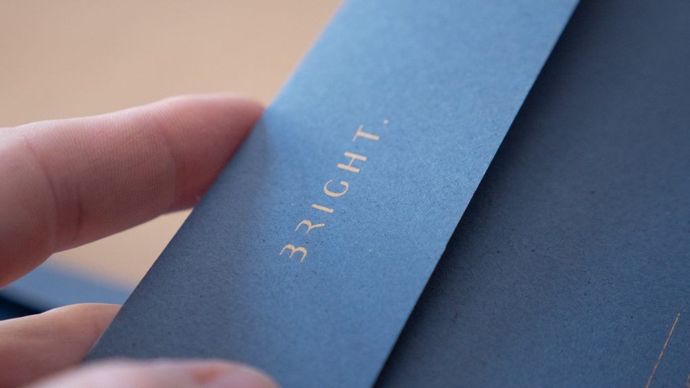
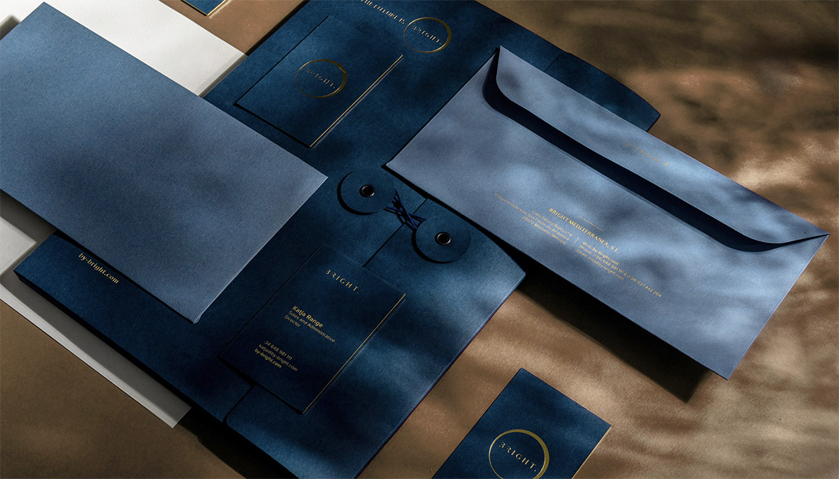
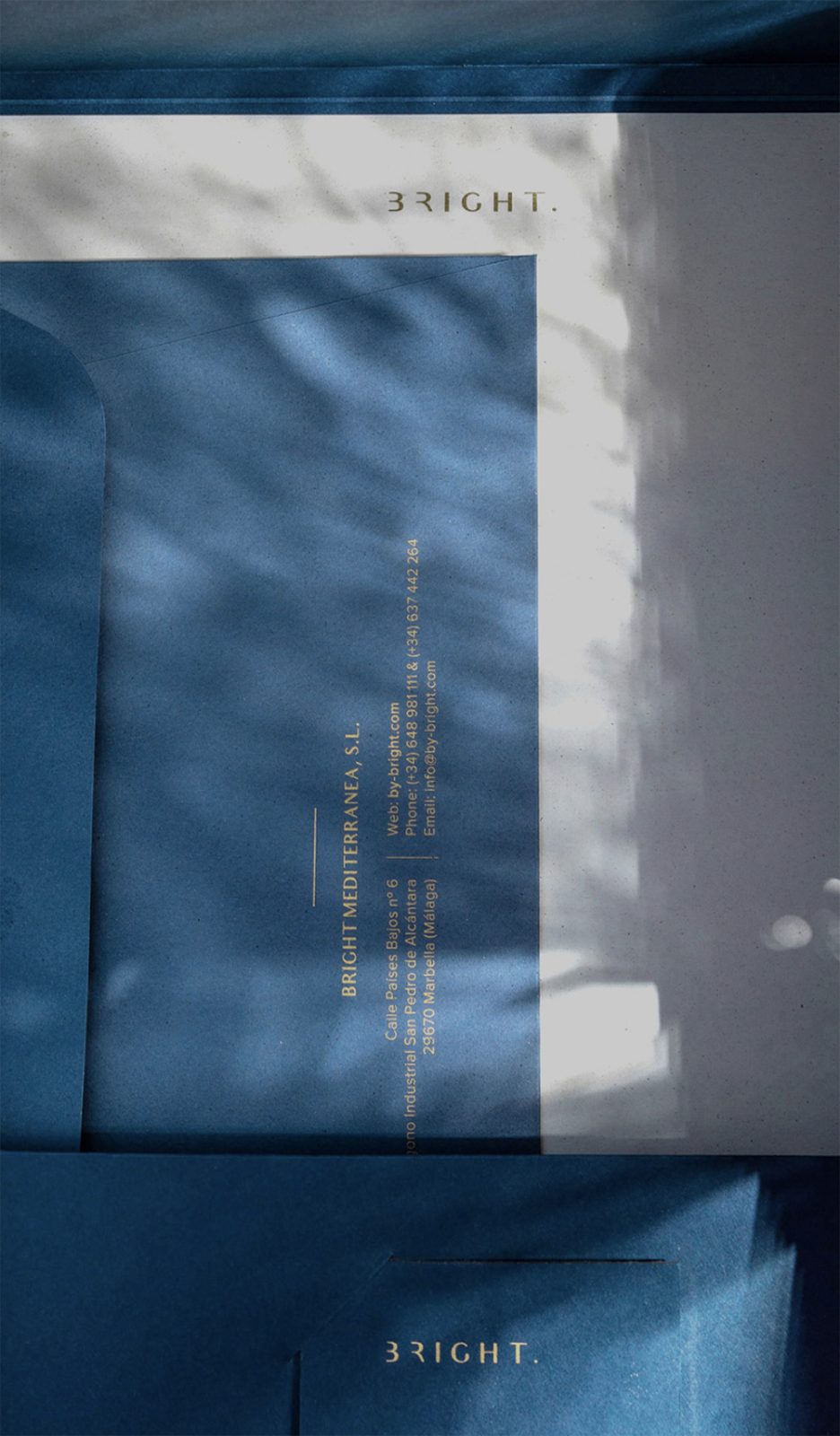
Starting from choosing papers for the envelopes and letterhead – we went for Favini Crush in Lavender (envelope) and Citrus (letterhead). And even though it’s said Lavender is not the most popular choice, it made an astonishing background for a gold logotype, making it subtle yet precious in its minimal design.
And what specifically made you choose these papers?
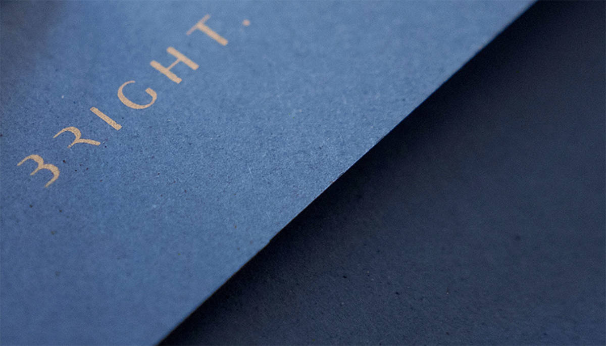
OMI Media House: What we really love in Crush is its texture. It created a wonderful contrast between the natural finish and shiny print.
Crush let us show Bright’s attachment to nature as well. The eco-friendly Crush paper range which is made using process residues from organic products proved a luxury developer doesn’t have to give up fancy stationery when it comes to ecology. A luxurious effect is preserved, yet the papers are produced with 100% green energy and the carbon footprint is reduced by 20% compared with papers made with the standard recipe. The up-cycling assortment Crush, produced with 15% raw by-products is exclusively available at Europapier.
The eco-friendly Crush paper range which is made using process residues from organic products proved a luxury developer doesn’t have to give up fancy stationery when it comes to ecology.
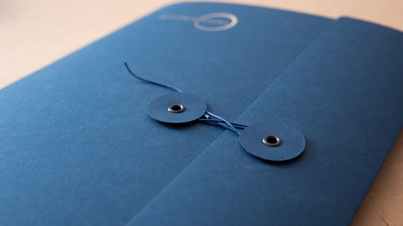
Burano wasn’t a very different story. We used this classy paper for business cards and folders in a shade Cobalt Blue. It’s slightly darker than Crush Lavender but stays in the same color palette.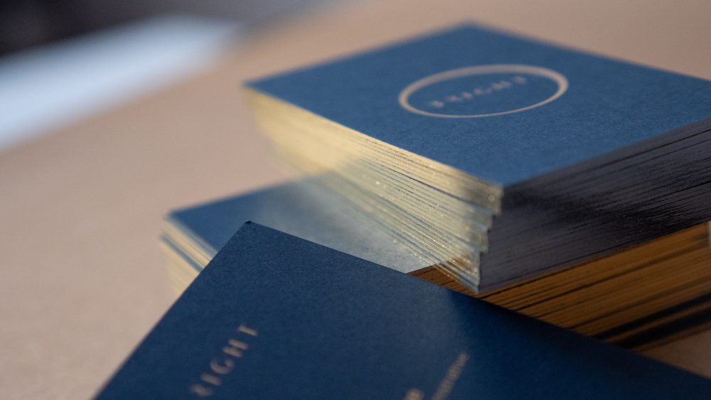
It seems that careful thought went into every stage and details of the project. How did the printing and converting process look like?
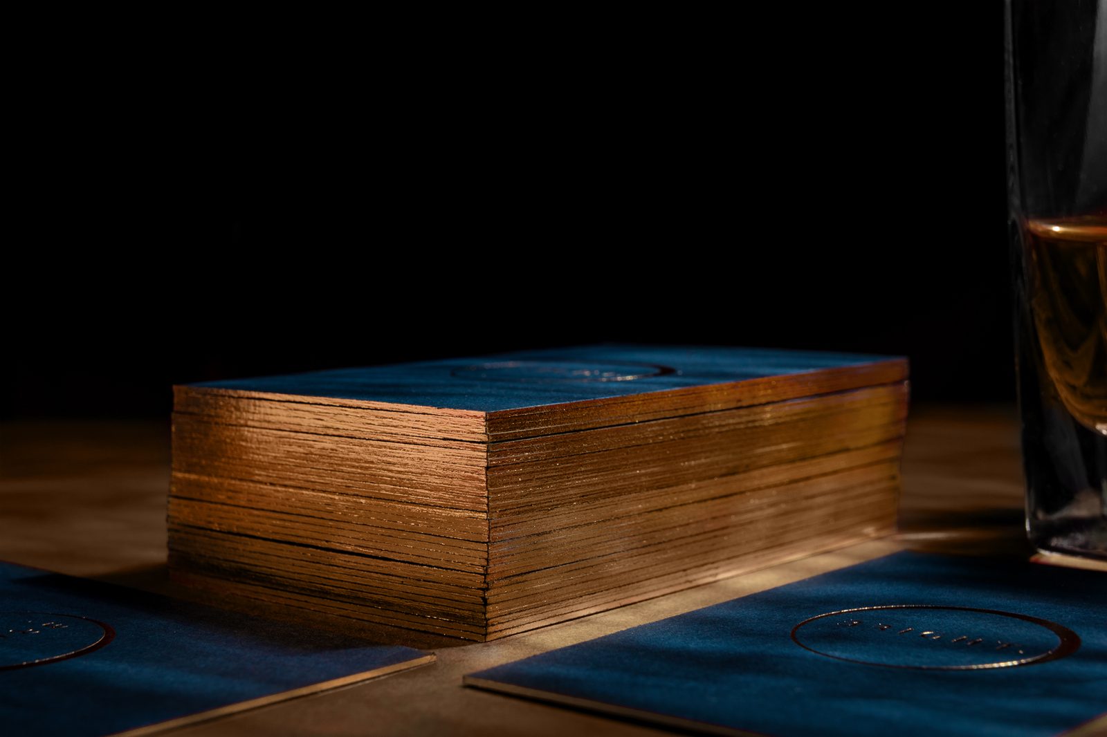
OMI Media House: There’s one word that can describe every Bright process – custom. Every little detail was treated individually. The envelope and folder were designed to the last detail – starting with a form, finish with buttons and strings. We’re super proud of the business cards that required laminating two layers of paper – to make it harder, more durable, and more luxurious. We let ourselves to screen printing with a very small font. We knew our printing house would cope with that perfectly. And they did!
A technique that took a big part in Bright’s final look was hot stamping which – again – showed beautiful contrast between textures. It was used on the business cards as well as on folder.
A technique that took a big part in Bright’s final look was hot stamping which – again – showed beautiful contrast between textures. It was used on the business cards as well as on folder. Thanks to a proper thickness you can’t see it on the other side of the paper but still, it made a great contrast on a printed page. And because of the houses’ location (Marbella, South of Spain), the golden shade perfectly catches the Spanish sun.
Lastly, but probably the most geek-ish last touch is gold foil on the business card’s edges – you can’t deny its elegance. As a whole – the stationery made the customer feel delighted and filled with a tactile experience.
Images © Omimediahouse

