
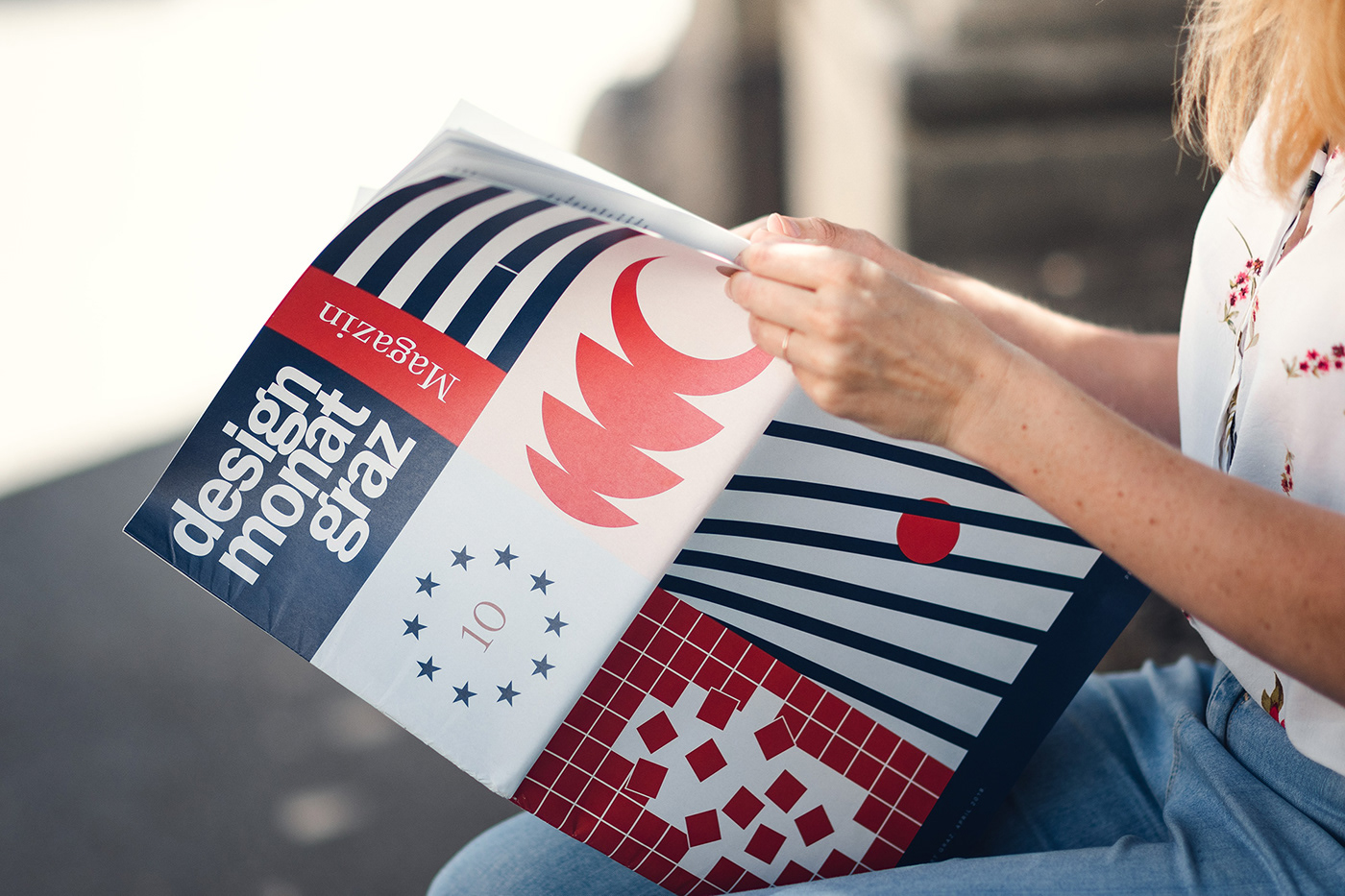
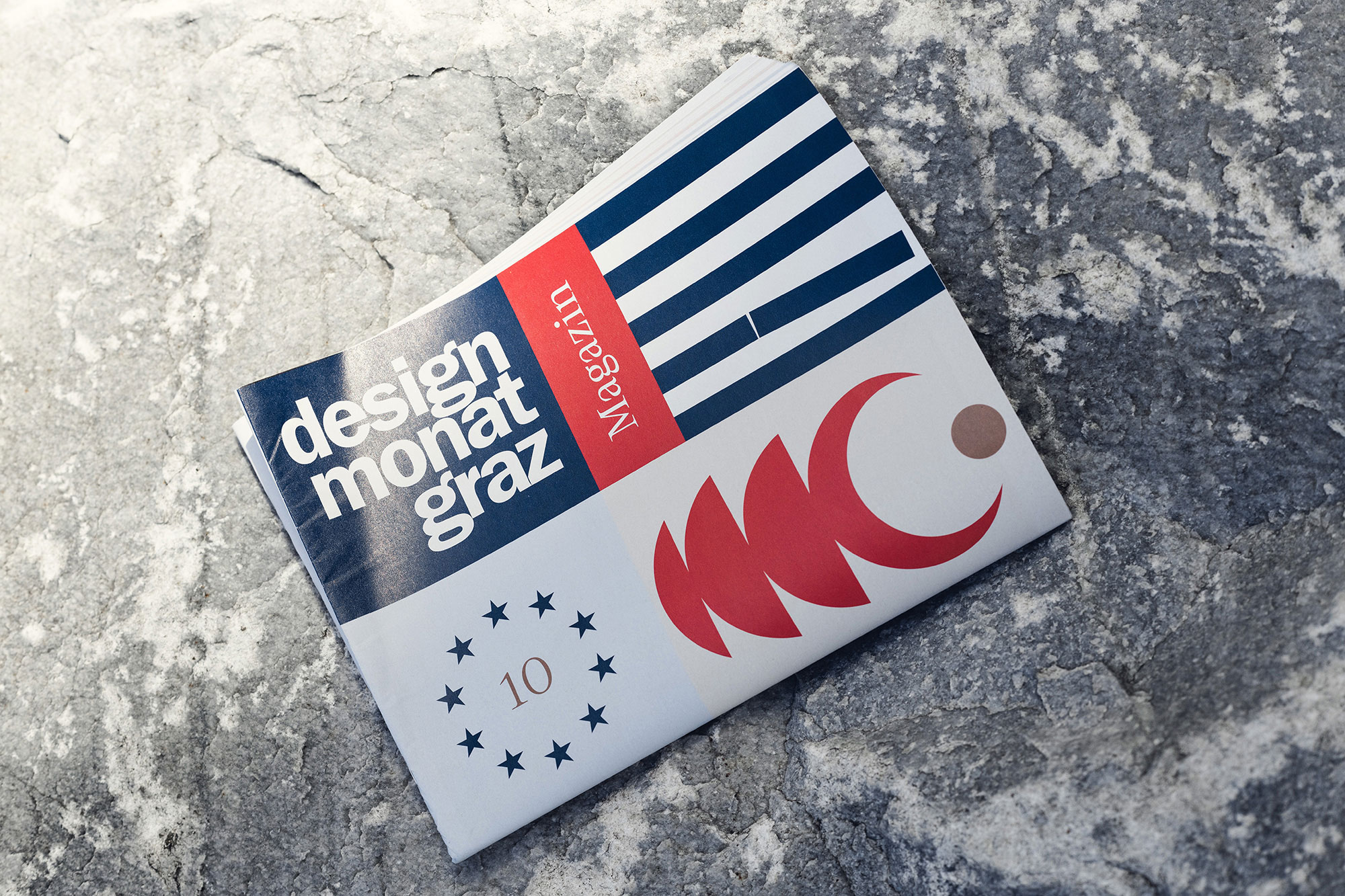
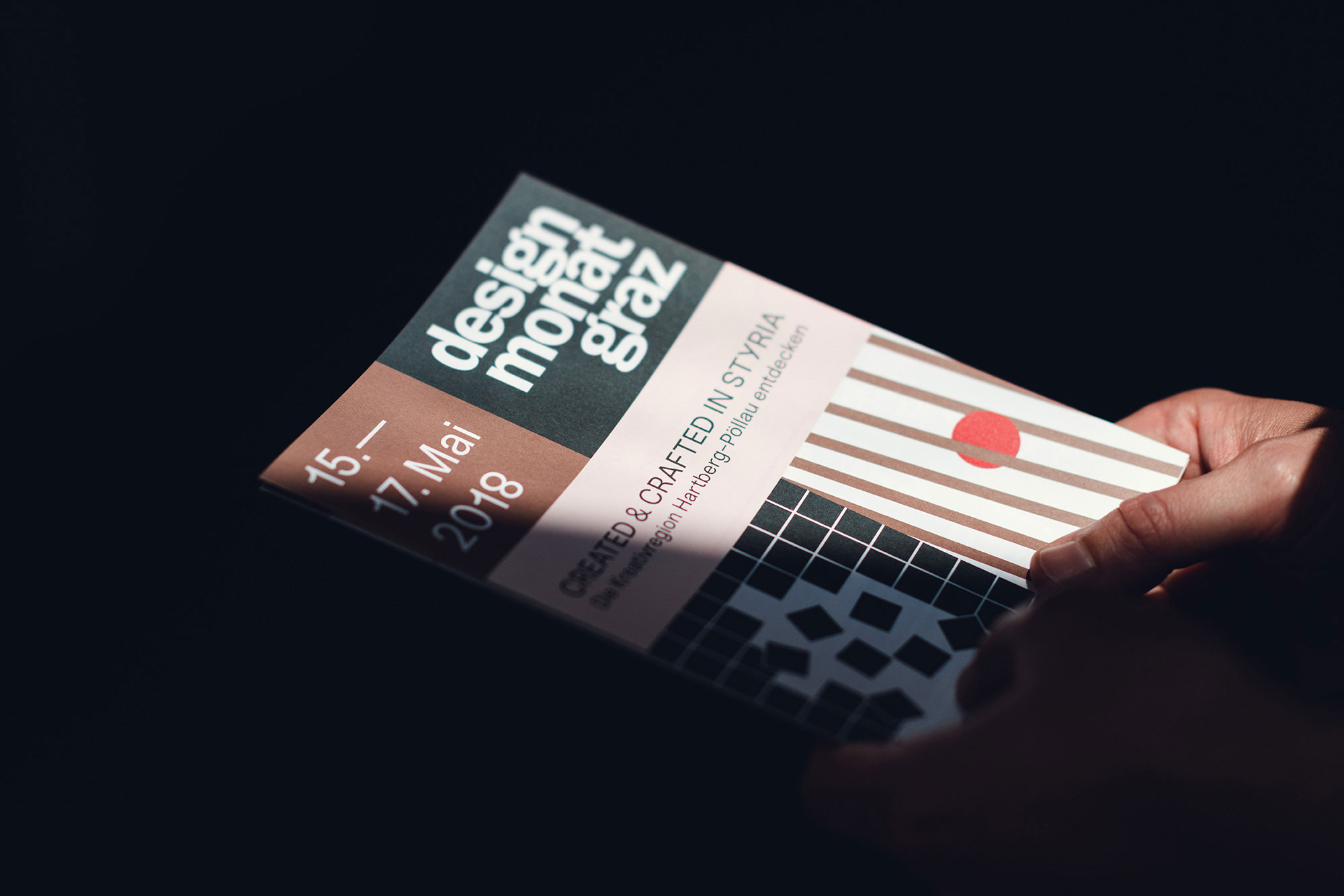
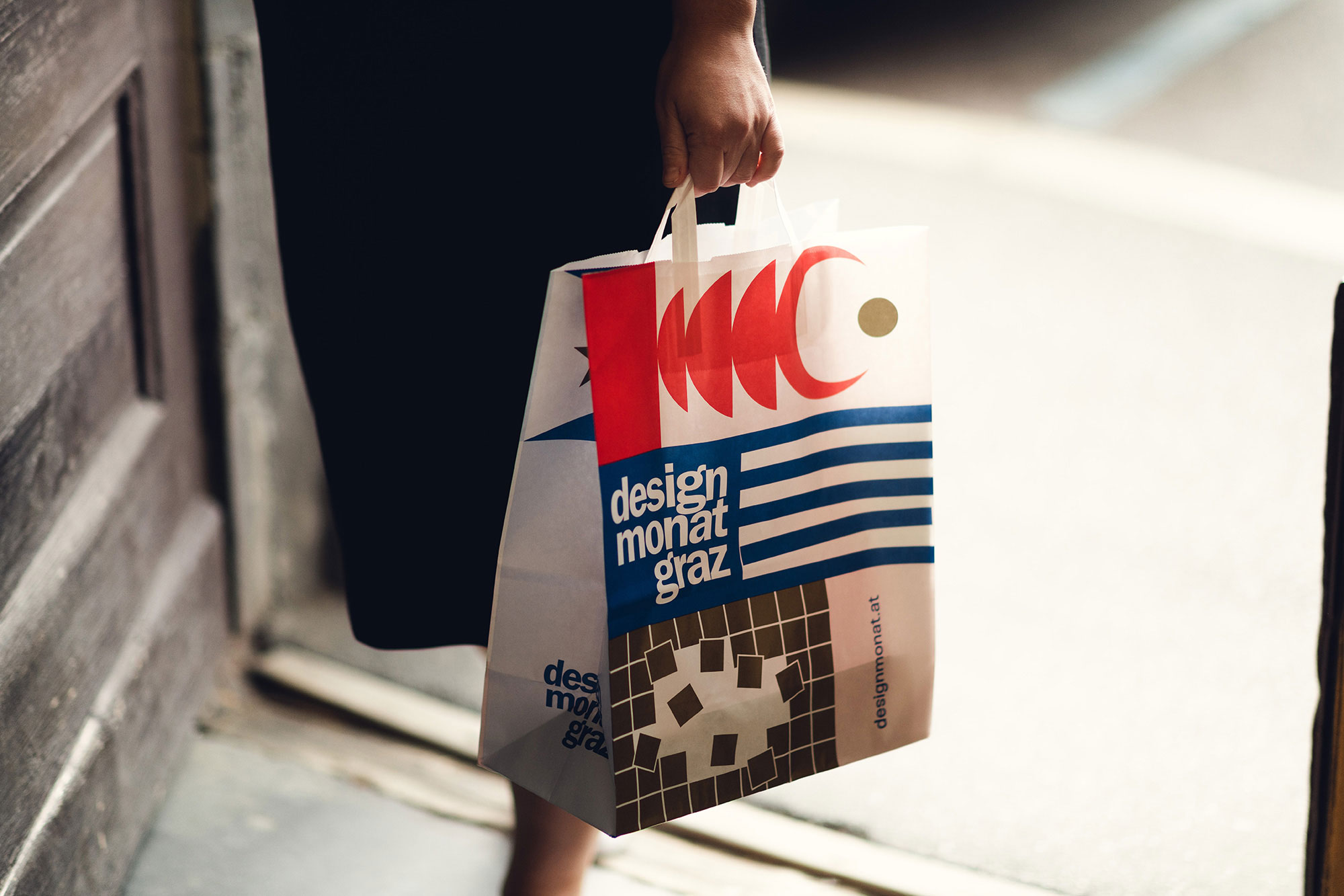
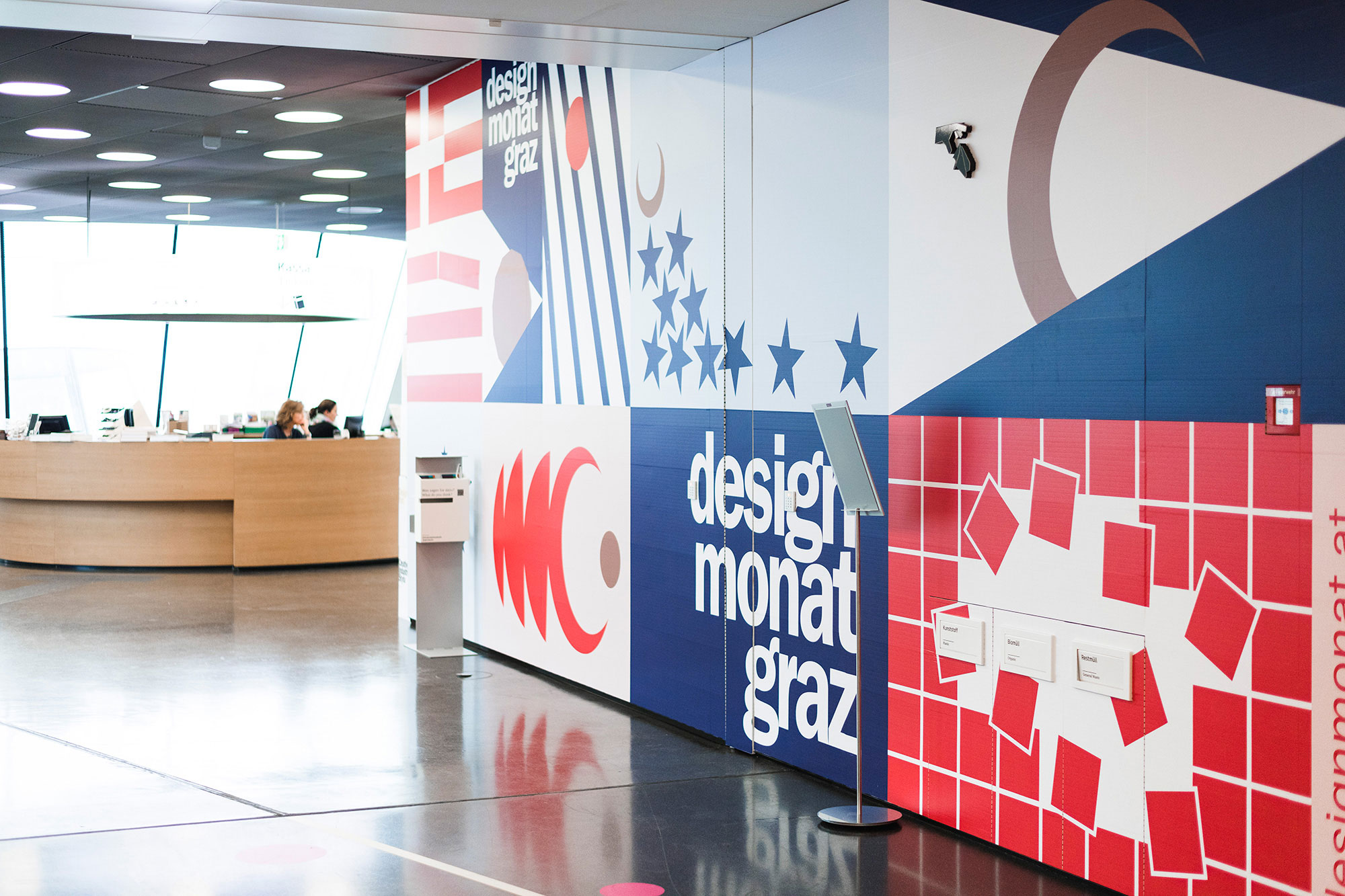
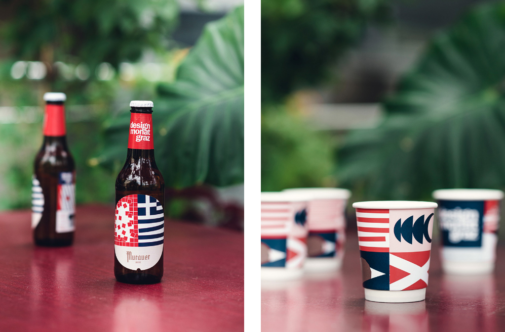
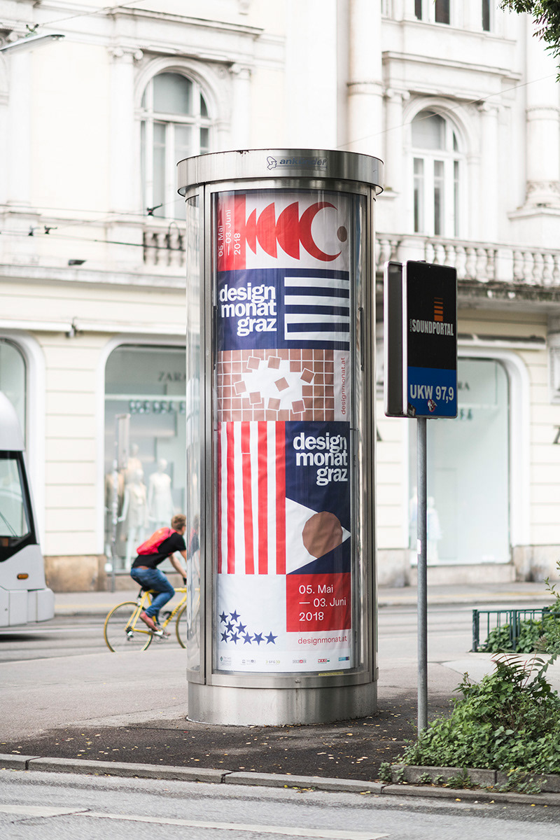
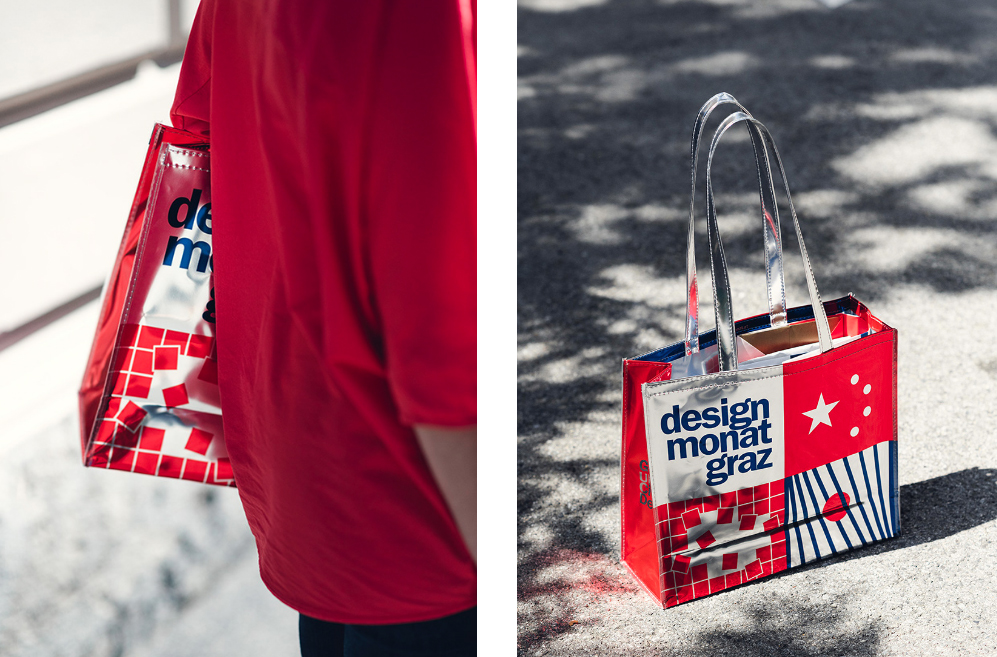
The Design Month Graz gives insights into the current state of design in the form of exhibitions, workshops, and lectures, welcoming over 100,000 people to network in the UNESCO city of Graz every spring. This year’s motto dealt with the theme of tolerance and design, which was realized in the visual identity by Studio Zwupp together with Paul Leichtfried – with rule breaks, mixtures, and country flags.

Design triggers emotions which are located between aversion and approval, enthusiasm and disappointment, outrage and indifference. Yet, who is the one to say what is beautiful? Who says what works for whom and why? And who judges good taste – and why? These were the questions on center stage for the four-week-long festival last May. Design Month Graz celebrated its 10th year with a dense 4-week long program of thought-provoking events.

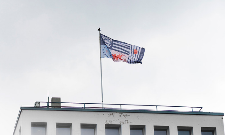
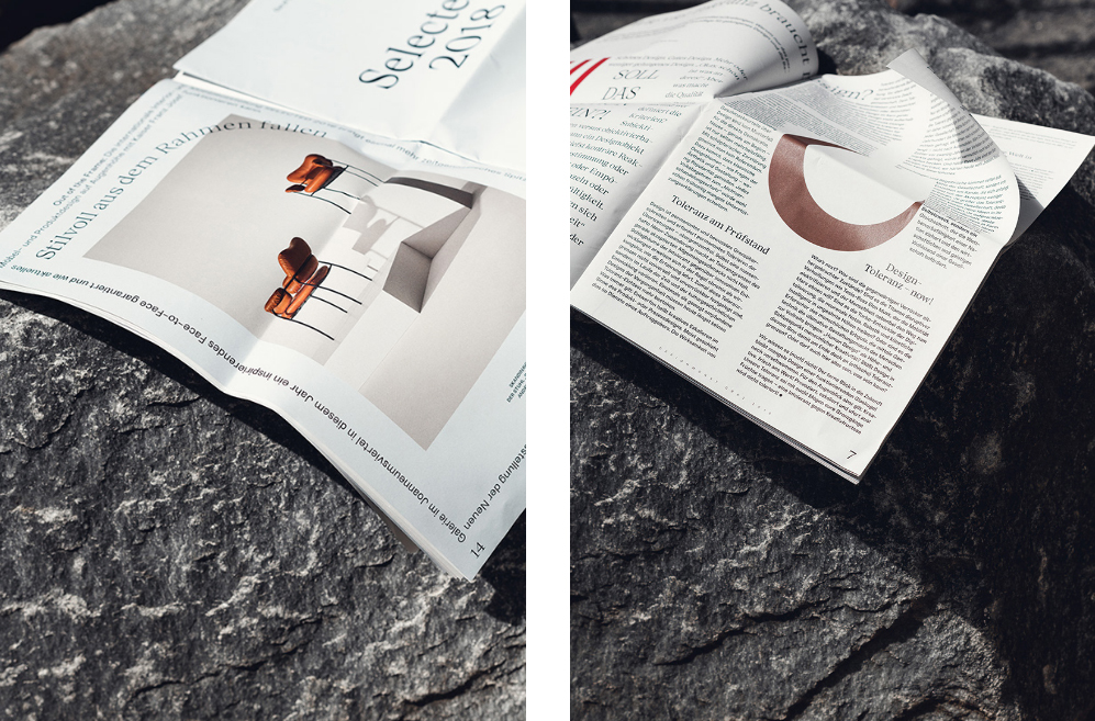
With serious questions and issues at the core of this years theme, Studio Zwupp created an adaptive, modular graphic language to support it, with patterns mimicking the breaking of order. Covering everything from coffee cups to beer labels and animations (see on Design Month Graz facebook page) to a printed newspaper, the graphic design follows a minimalistic three-color theme with geometric patterns being the red thread.
The clever repetition of bold patterns in primary colors and the thoughtful use of borrowed imagery from flag symbols, together with order-breaking animation create tension, which further creates an exciting, provocative visual identity.

Images © Studio Zwupp