
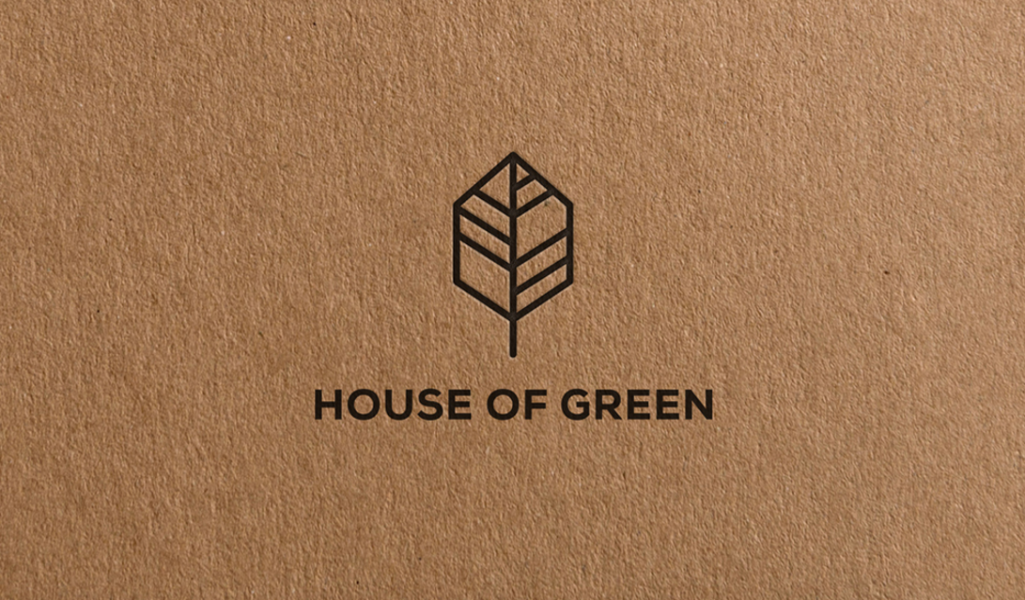
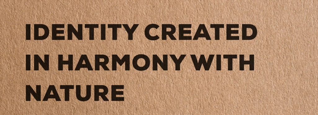
Poland based graphic designer Kamil Piatkowski created a visual identity for House of Green – a store that sells houseplants and other greens. The starting point was to present the brand as modern and ecological using only one color and a classic material choice – black and kraft paper, which is associated with nature and ecology. The logo is built of a symbolic leaf in a geometric shape, referring to Piatkowski’s own style and previous projects. The identification maps the philosophy of the brand and shows the place as the place to go for people who wants to live in harmony with nature.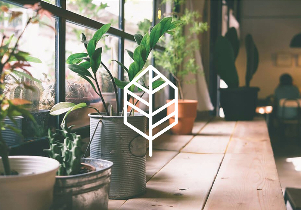
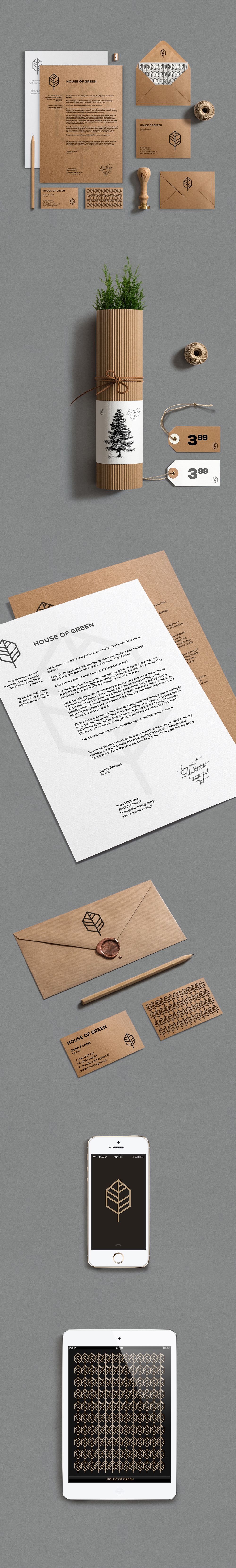
Kraft paper is, and will be, the chosen paper material when wanting to covey ecological green values, recycling or down to earth ideologies. The rough, unfinished surface with no un-natural color additives reflects an honest, down-to-earth approach with no need for flashy, eye catching details. Usually combined with minimal, often geometric patterns or logos, the material is bold yet refined enough on it’s own to be the base of a great, stylish visual identity. Some might argue the material has flown its course, but why dismiss such a great thing for it’s simplicity?
Piatkowski perfectly understands the age-old saying less is more with combining classic elements that together create a new, modern whole. Creating a pattern from the logo is great idea and creates an interesting balance for the otherwise minimal look. But my favorite aspect of the project is the use of corrugated board as packaging material for the plants: so cool!

Images © Kamil Piatkowski