Branding and packaging design Studio Maba uses empathy and their multi-faceted pool of knowledge to create and build brand strategies that embody the essence and values of its clients. Relentlessly searching for the right answers and most beautiful and worthy solutions, the studio is their client’s biggest advocate and support system. Their stunning work has brought the studio numerous awards, especially in their work in the wine and spirits packaging design industry.
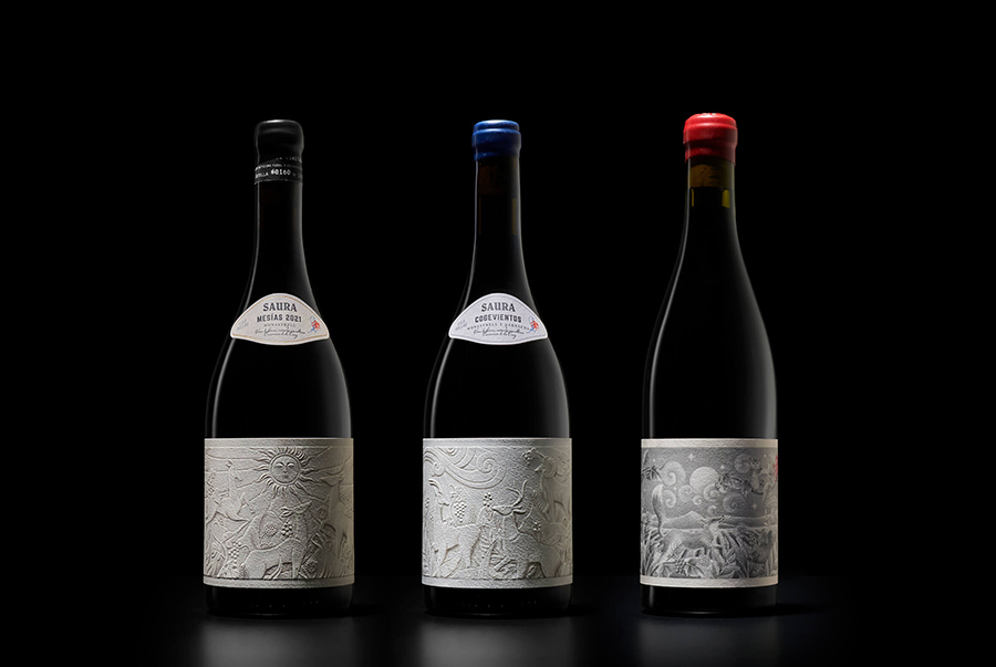
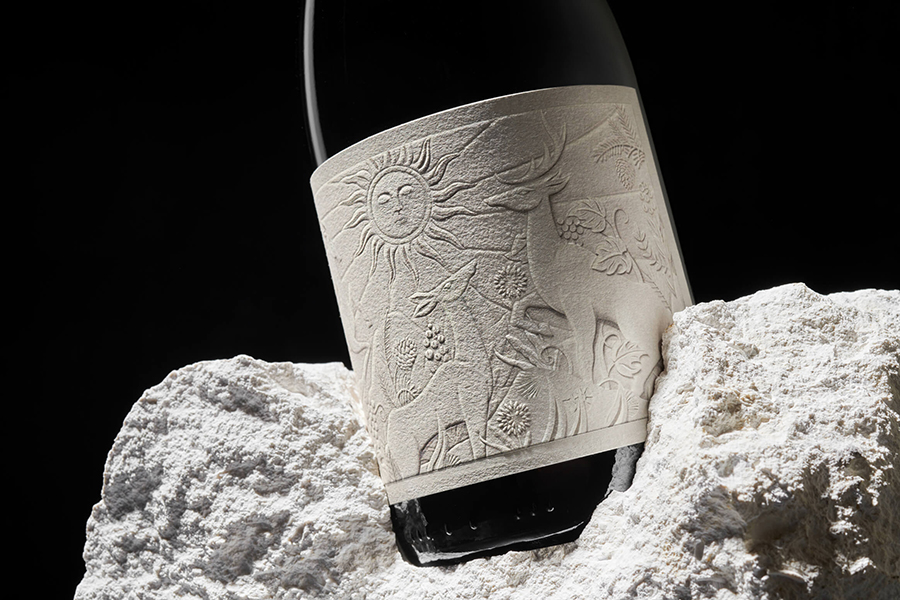
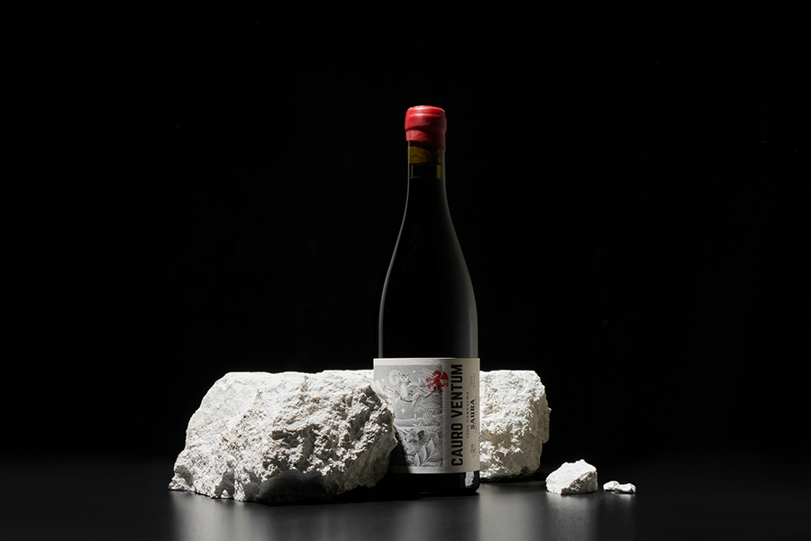
The wine born from the stone – fermented in fossil stone tanks, and wrapped in labels reflecting the untamed surroundings of the Bodegas Saura winery
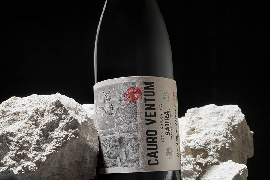
The studio has created a uniquely beautiful branding concept for the Spanish Bodegas Saura winery, that echoes the brand’s value proposition which goes far beyond just the wine, as it relies on the surrounding nature as the driving force behind its production. The small winery is located in a unique place, on a farm in the mountain of the municipality of Caravaca de la Cruz. The territory is famous for its numerous species of fauna and vegetation, which coexist with small terraces of vineyards immersed within the forest. The winery’s coat of arms features the heraldic symbol of the Saura surname, which shows a dragon emerging from a cave, inspired by the numerous caves found on the estate, including La Cueva Negra, an archaeological and anthropological site of great value.
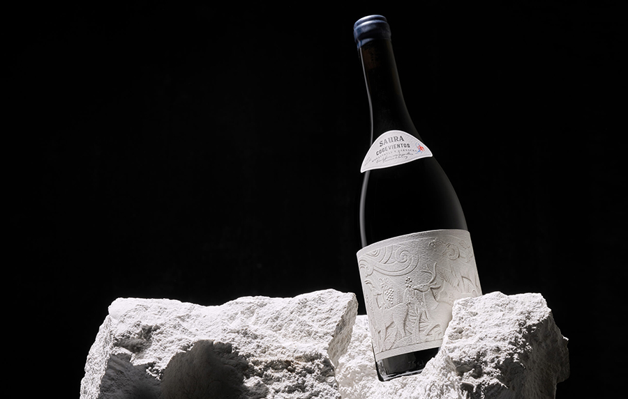
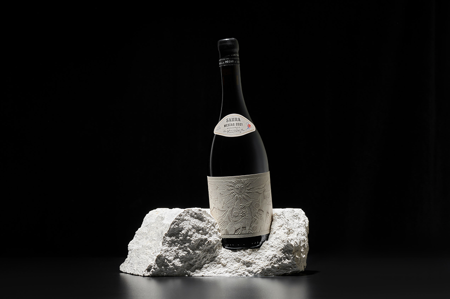
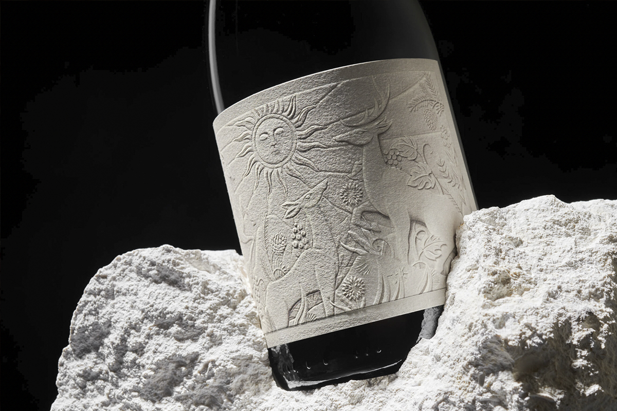
Inspired by the winery’s significant location where the wine is fermented in fossil stone tanks, the label designs reflect the untamed surroundings as if it were a bas-relief sculpted in stone – uniting the wine, process, and environment forever.
 Inspired by the winery’s significant location where the wine is fermented in fossil stone tanks, the Studio Maba designed labels that mirror the untamed surroundings as if it were a bas-relief sculpted in stone – uniting the wine, process, and environment forever – and creating one of the most stunning wine label concepts we’ve seen.
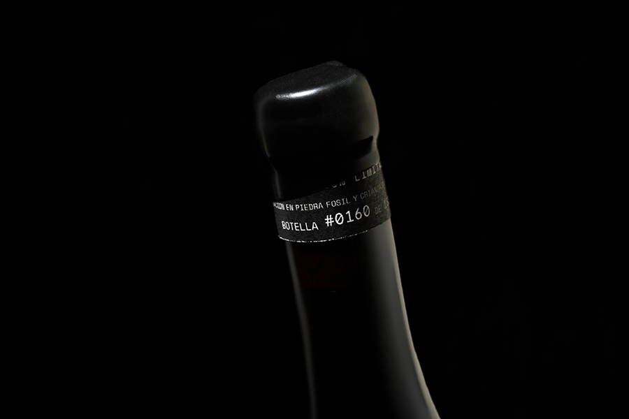
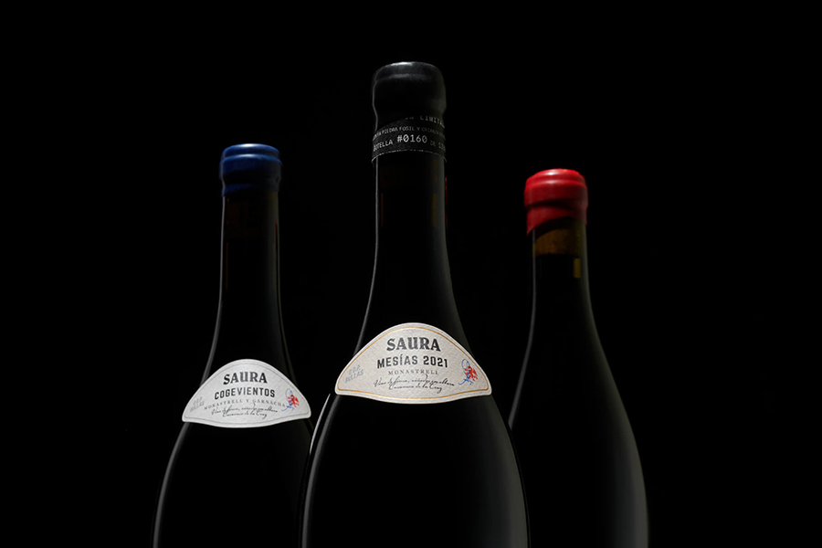
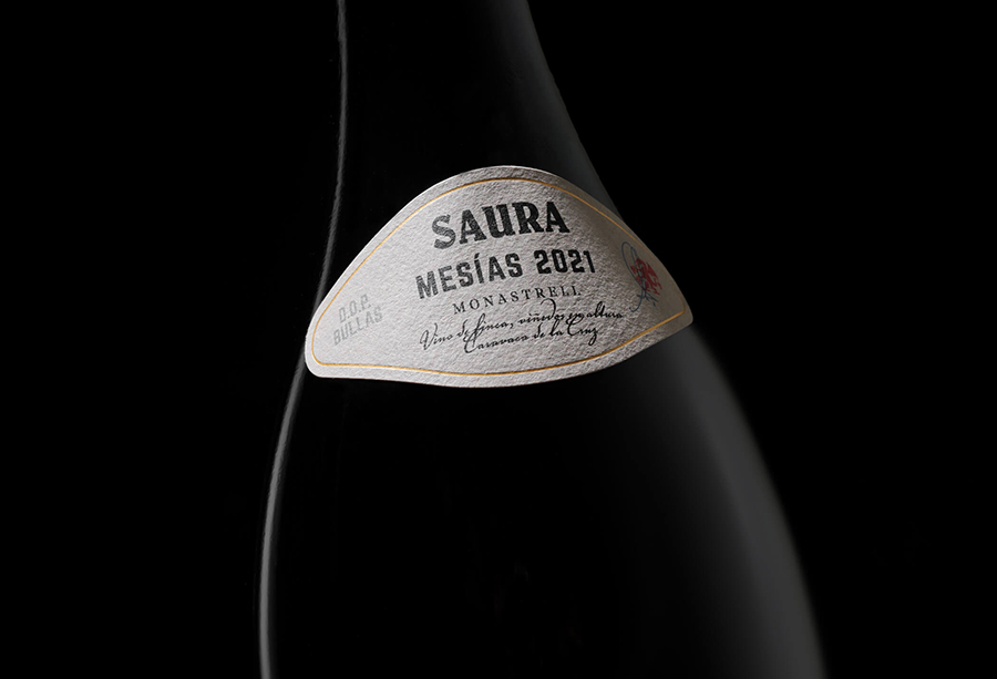
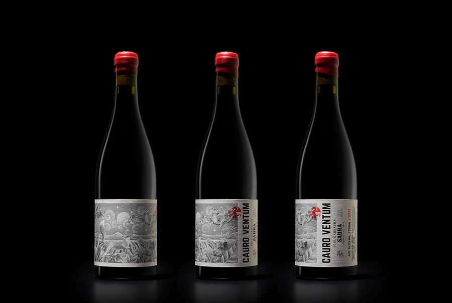
The family consists of three wines, Mesías, Cogevientos, and Cauro ventum. The differentiation of the range is marked by the color sealing of the cork, as well as a slight darkening of the tone of the “stone” on the label. The most special and limited edition, named Mesías, has each bottle numbered on its band, sealing the cork with sealing wax in a traditional way. While the Cauro Ventum, the entry wine of the range, reflects its freshness in a more illustrated narrative, abandoning the reliefs without losing the magic of the place.
Watch the video below which shows the intricate illustrated details and the immaculate printing work of the labels. Follow Maba on Instagram for more branding and packaging inspiration.