Designer and art director Mariela Mezquita runs her own small creative agency in Mexico City, with a team full of inspiring creatives that share her pragmatic way of solving communication problems in a unique way – all the while having fun doing so. Mezquite provides receptive solutions for projects requiring visual systems or languages across print and digital applications, while always actively encouraging “conscious use of durable materials, local processes, community making, and keen, quality communication.
Mezquita and her team were commissioned to create the branding and packaging for a supplement brand Prajna Dose, which is made with a mix of adaptogen mushrooms, aiming to achieve a clear mental state while managing both mental and physical stressors. The product has the goal to help bring back a peaceful and happy existence to anyone that takes them.
These elements, as well as the natural but vibrating color palette and the selection of materials, make the main elements of the brand – creating a cohesive, warm-hearted, and easy-approachable brand experience.
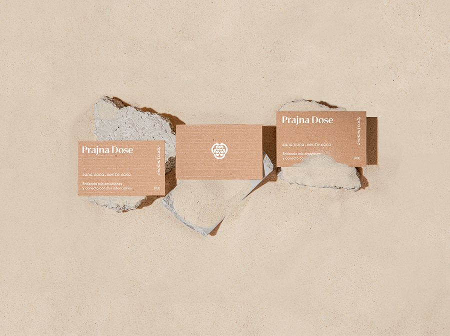
The designed logotype is comprised of a sans-serif typeface that looks both structured and reliable while having a lightweight spirit. The brand icon was inspired by an ancient Mayan symbol used for mushroom healing ceremonies. These elements, as well as the natural but vibrating color palette and the selection of materials, make the main elements of the brand – creating a cohesive, warm-hearted, and easy-approachable brand experience.
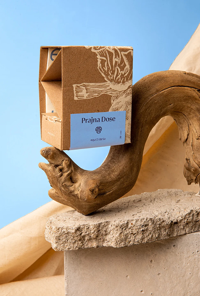
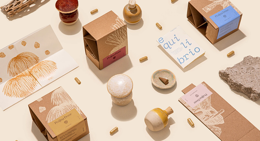
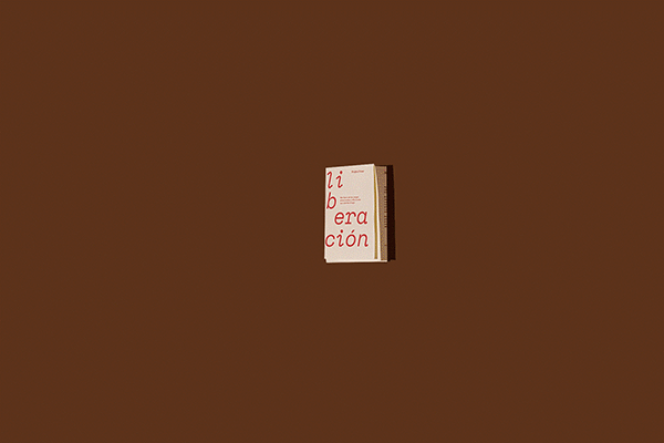
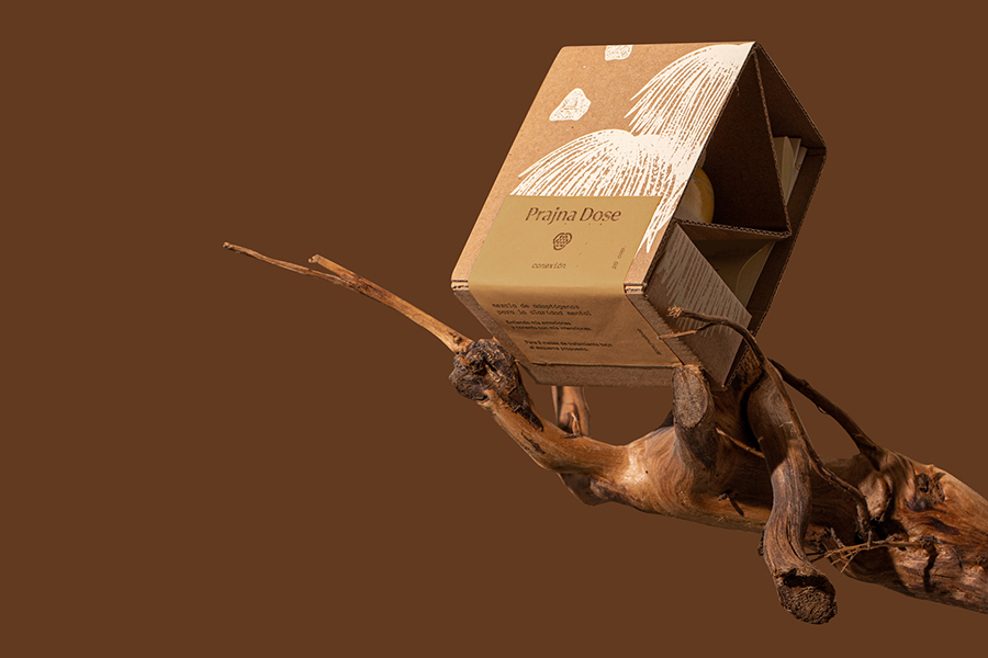
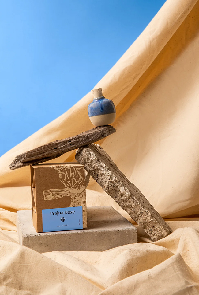
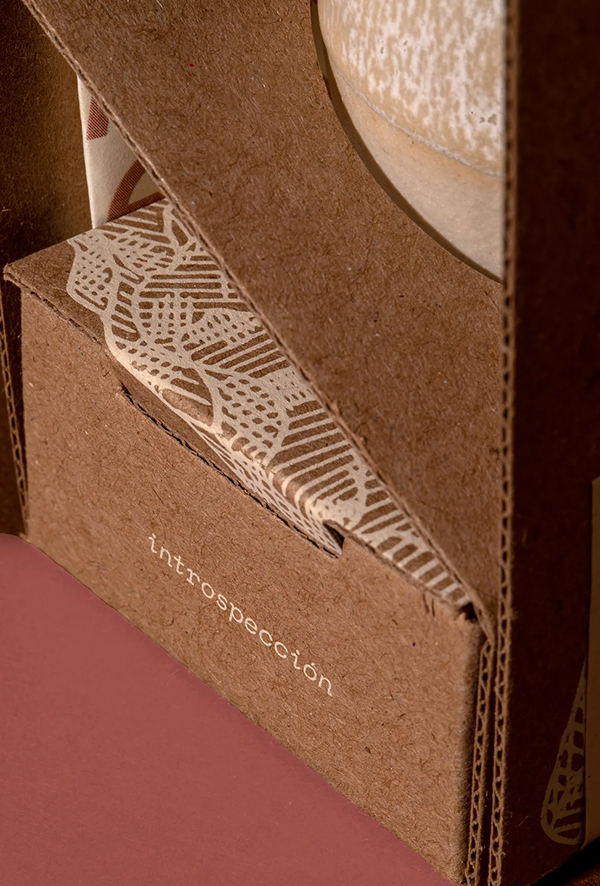
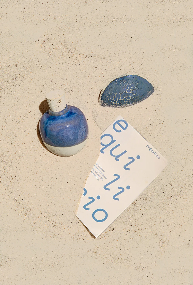
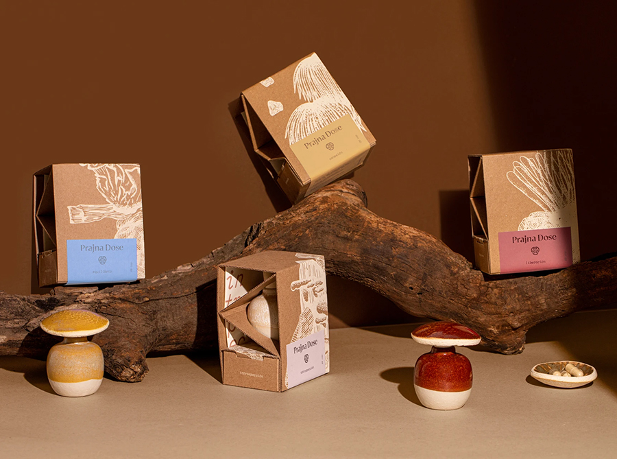
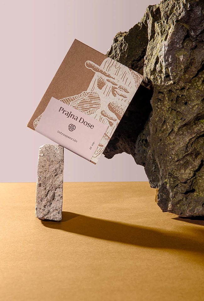
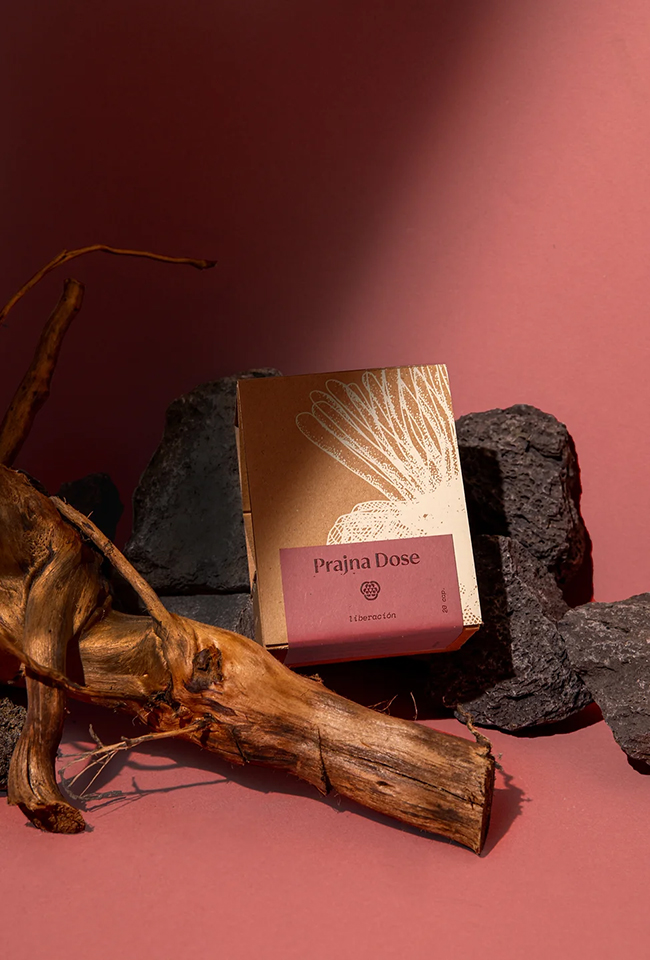
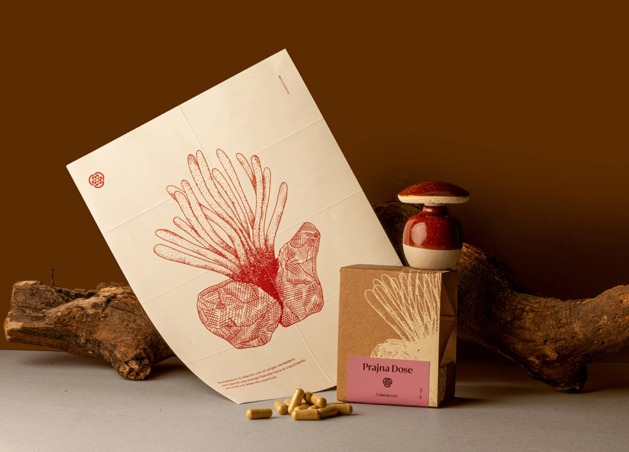
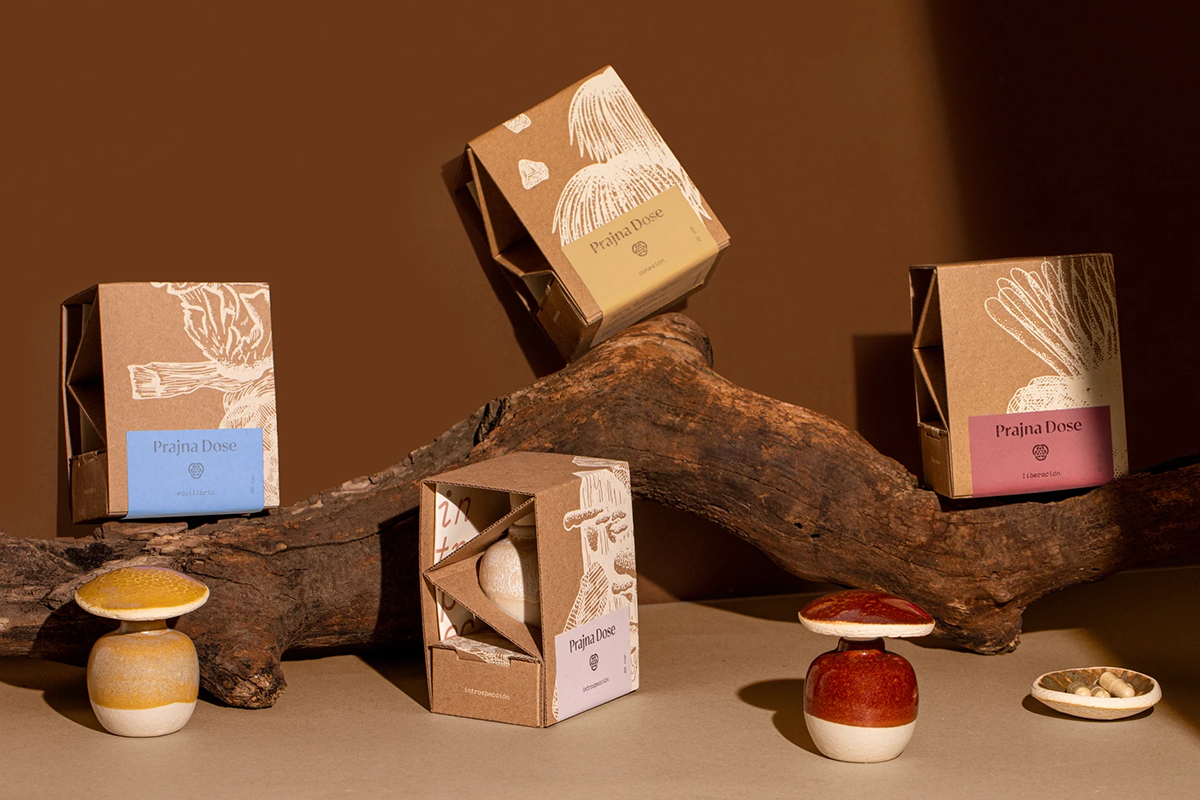
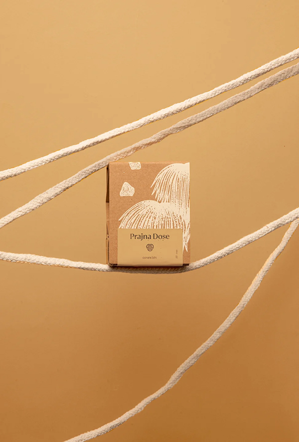
Each supplement type of Prajna Dose is named after a different intention: “connection”, “balance”, “freedom” and “introspection”, with a unique illustration dedicated to representing each type. The illustrations showcase the specific mushroom used as the main ingredient in a thoughtful composition that includes additional natural elements such as wood and stone, to represent the corresponding intention.
While providing unique packaging solutions for unique needs, the cohesively pragmatic branding concept echoes Prajna Doe’s ethos to a tee
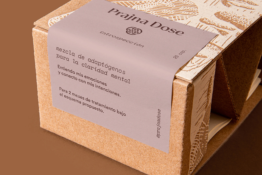
The packaging of the brand product is the most intriguing part of the concept, and according to Mezquita, it was also the most difficult part of the design process. “The packaging Dieline was, without doubt, the most challenging aspect of the project. We wanted the beautiful clay jar to be visible but protected for shipping. The packaging also needed to have a closed section to store complementary items included in the purchase such as the booklet and the clay tray for incense. We took inspiration from traditional lightbulb packaging and designed a structural cardboard box with exposed laterals and a tiny compartment on the bottom.” – Mezquita writes. The packaging made of cardboard with simple light-colored line illustrations and color-coordinated labeling represents the brand ethos to a tee. The concept showcases how the smallest of details are important in creating an elevated branding experience.
You can enjoy more of Mariela Mezquita and her team’s work over at Instagram.