Lange & Lange, a design office based in Warsaw Poland specializing in visual identity, branding, and product design, was tasked with designing a new brand image for Luxury Resort & Spa Narie. The re-branding concept was based on the idea of bridging the gap between nature and man, establishing a home-away-from-home feel for the visitors while drawing inspiration from the surrounding nature and country style.
Narie Resort & Spa is perfect for anymore who loves nature untouched by men
Narie Resort & Spa offers a magical isle of peace in the fast-paced modern world. It is located on lake Narie, in the intimate, picturesque town of Wilnowo, on a beautiful 100-hectare lot.
The time seems to stop in Masuria while watching swans, wild ducks, cranes, and cormorants flock freely or when following the footsteps of deer, roes, hares and wild boars in the nearby meadows and forests. There is even a special silent-zone near the lake, which not only offers the opportunity to enjoy wild animals undisturbed but regain one’s inner balance. Narie seems to be not just the most restful, but beautiful places in Poland, with crystal clear water, fresh air, and the omnipresent silence interrupted only by singing birds and a quiet splash of a gentle wave on the lakeshore.
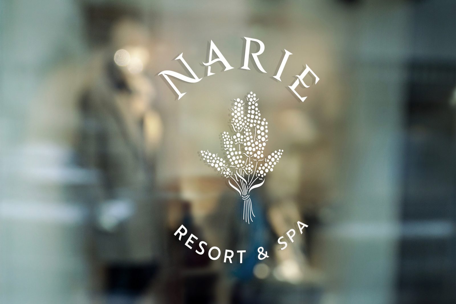
Combining nautical and botanical visuals
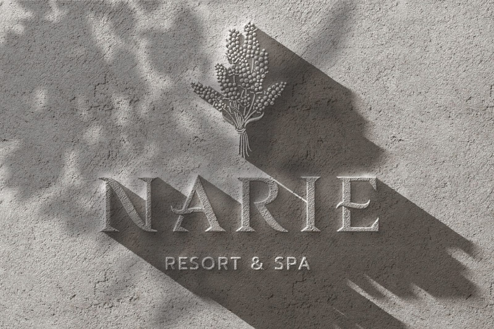
The concept for the rebranding comes from the peaceful co-existence of nature and man. Combining visual details from both nautical and botanical origins, Lange & Lange creates a peaceful, cohesive design which beautifully represents the aim of the resort: to be a haven that offers accommodation of the highest standard, serenity, and contact with unspoiled nature.
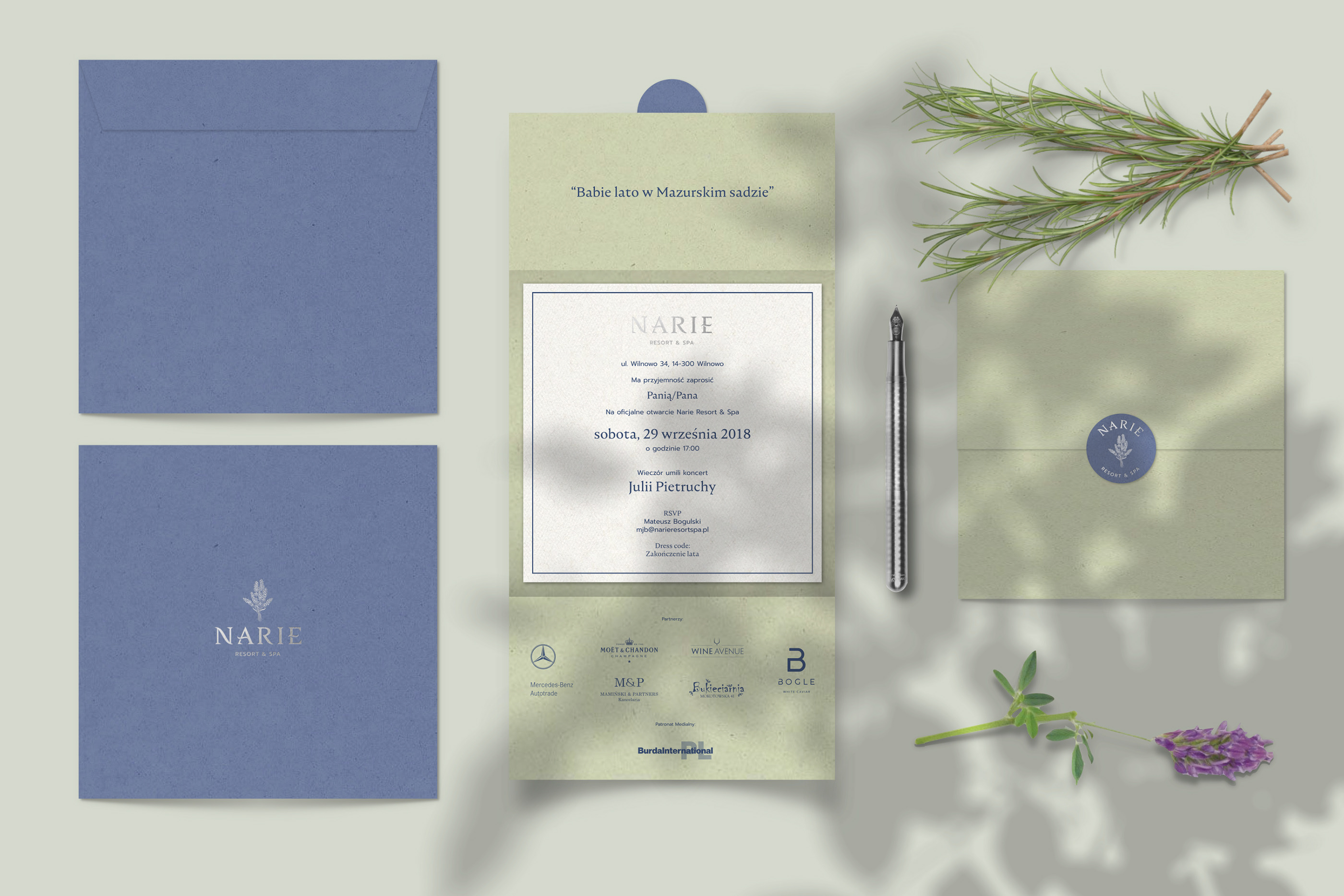
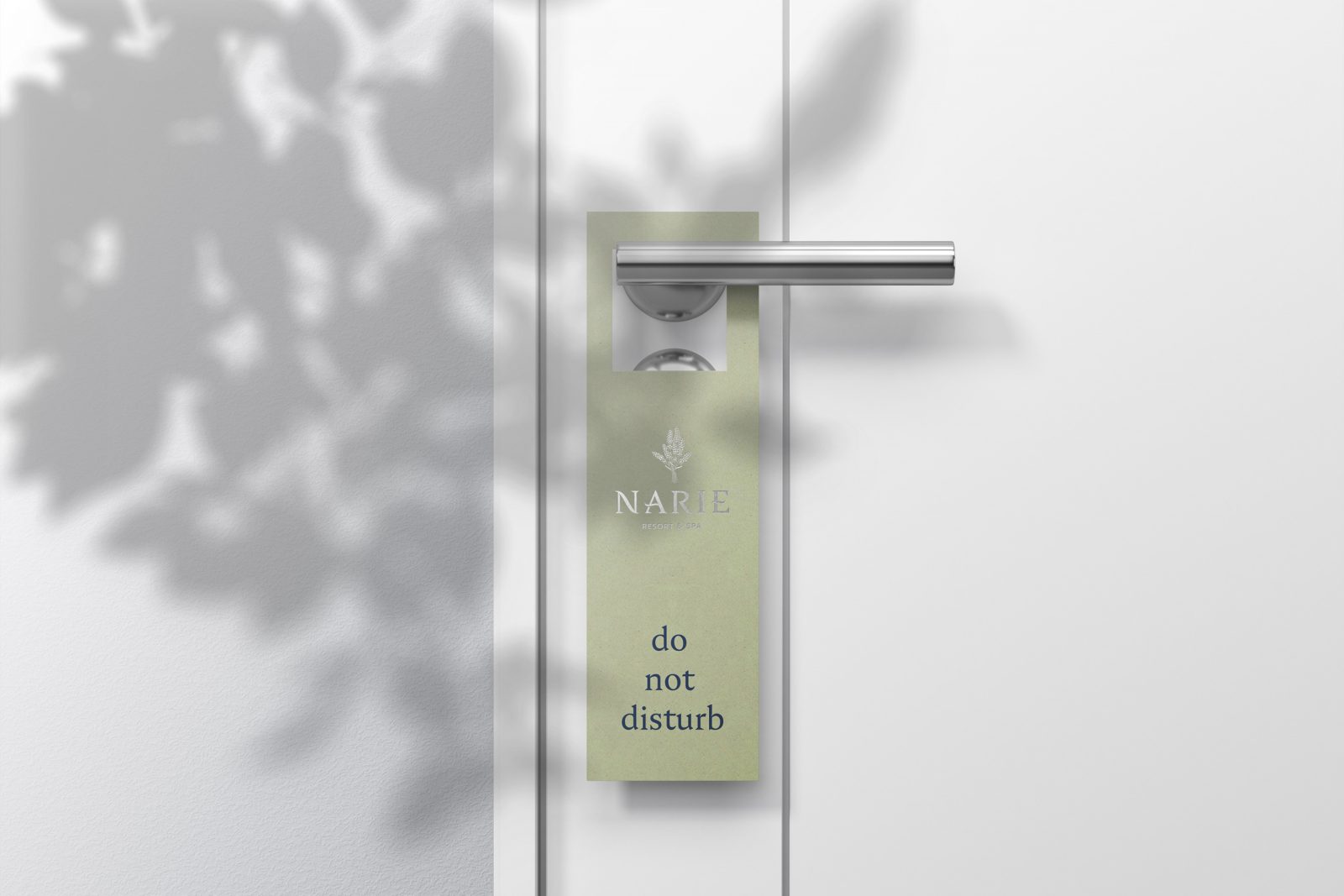
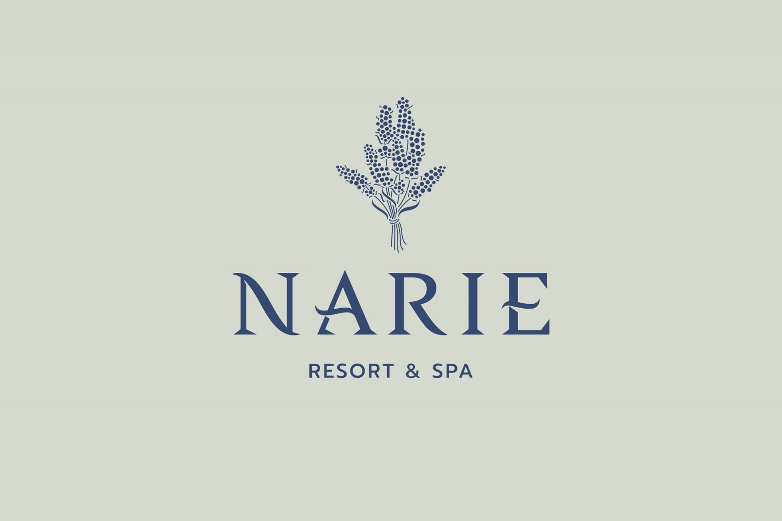
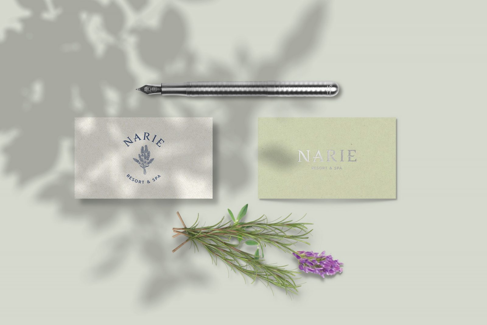
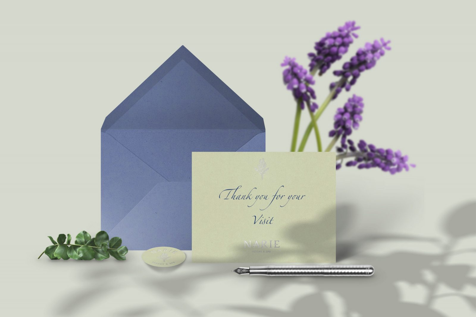
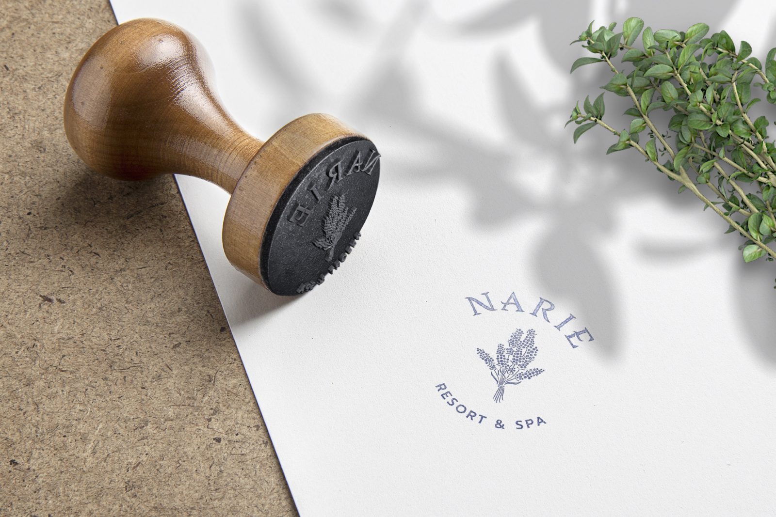
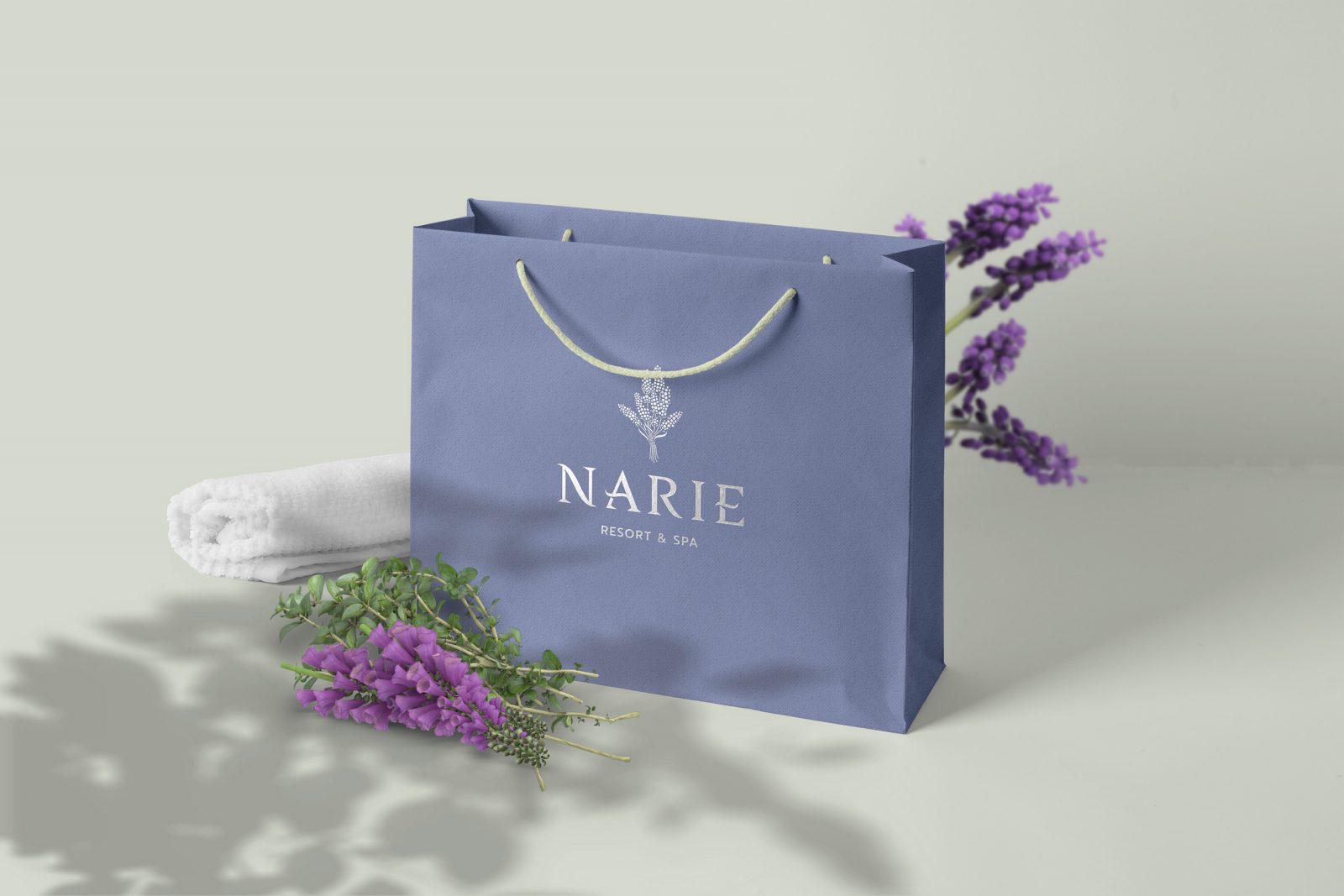
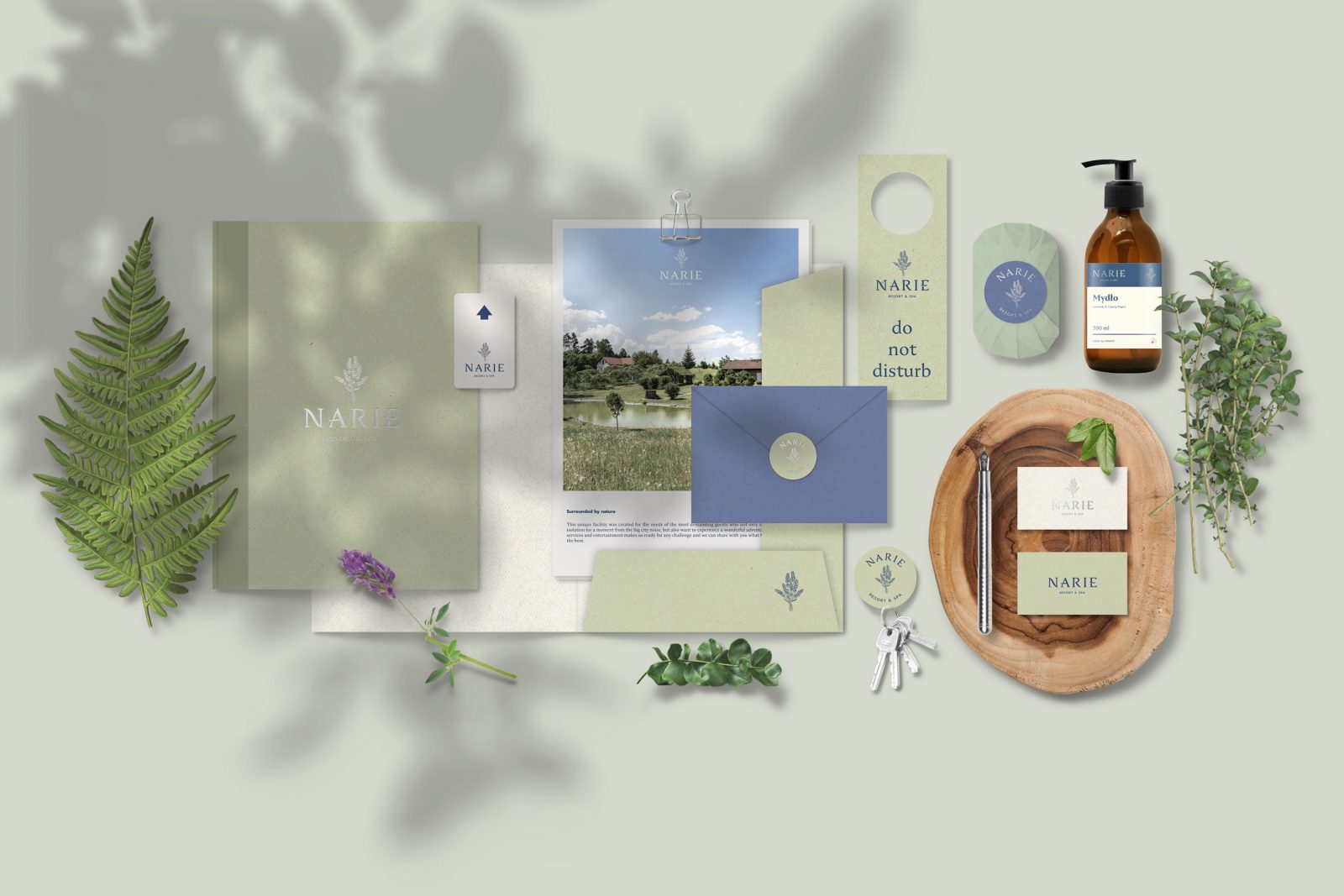
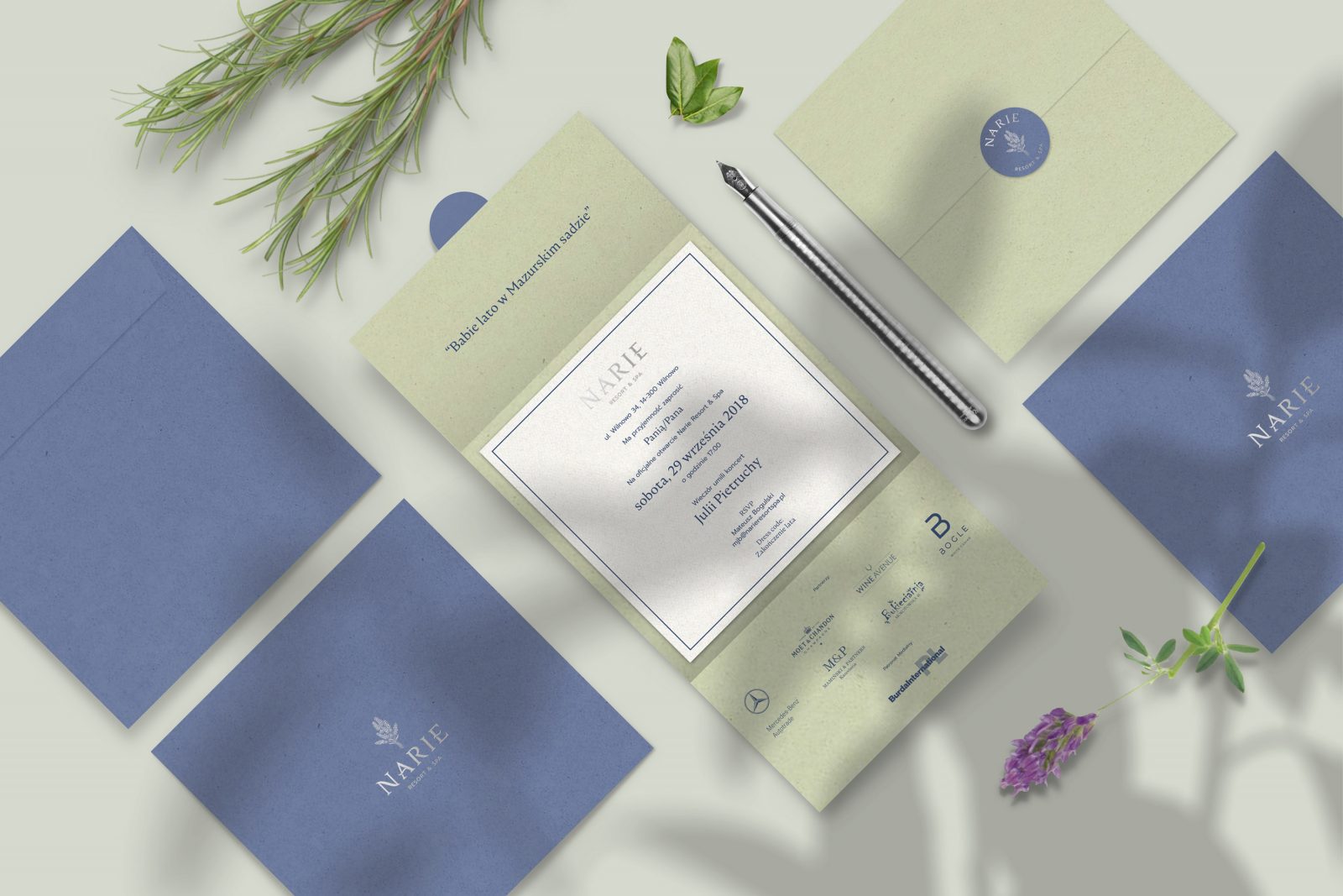
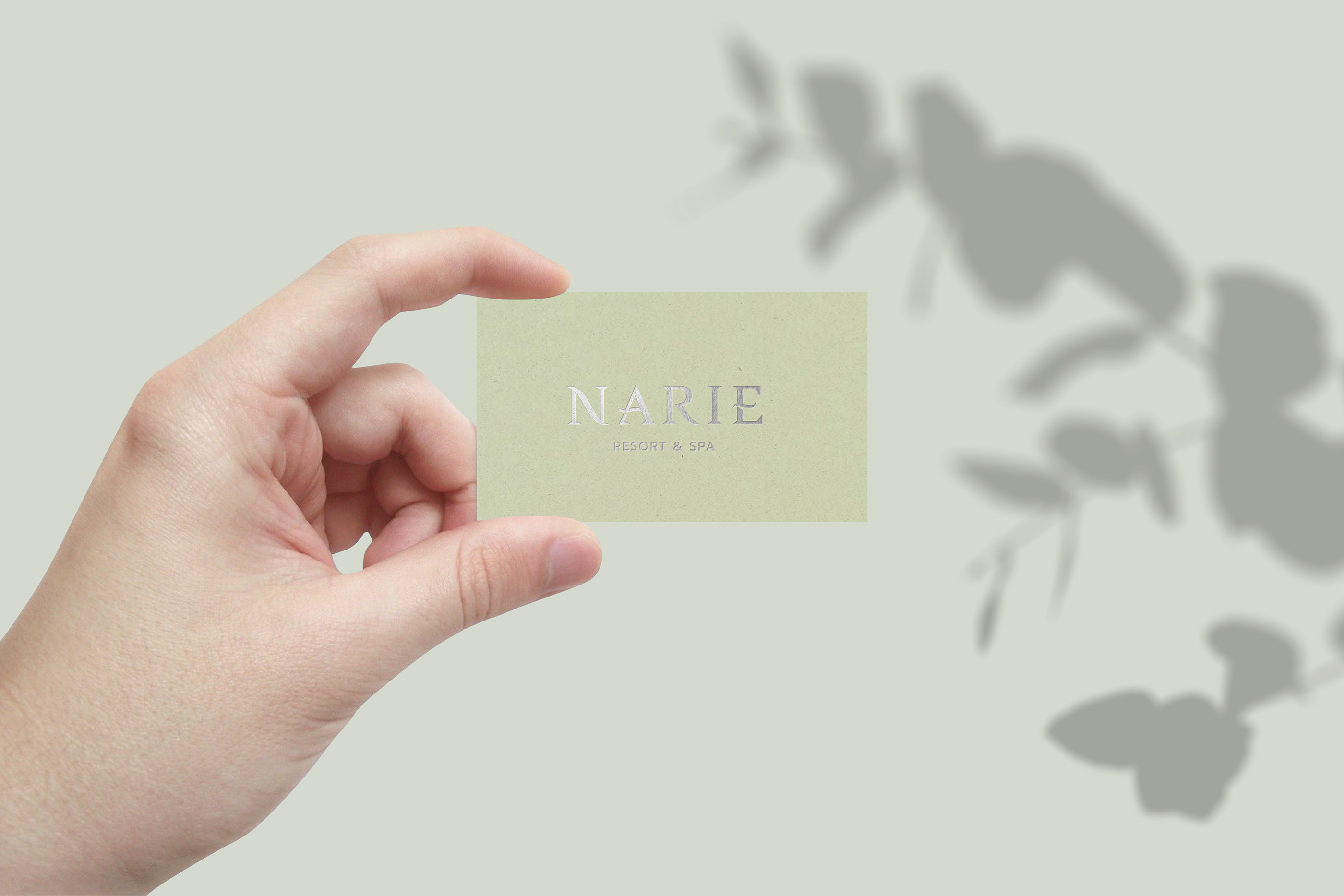
The delicate serif logo with unique aquatic elements and lavender brand illustration is especially stunning when printed with hot stamp technique on the resort stationery. The color scheme is subtle enough to match the surroundings, yet has a luxuriously exclusive feel to it.
Crush Kiwi and Lavender to match the natural surroundings
To achieve a cohesive natural look, Lange & Lange chose to use Crush papers to correspond with the serene countryside feel. Choosing Crush Kiwi and Lavender specifically – papers exclusively available at Europapier – because these exact colors can be found in the surrounding fields and grass areas around the Resort.
Images © Narie Resort