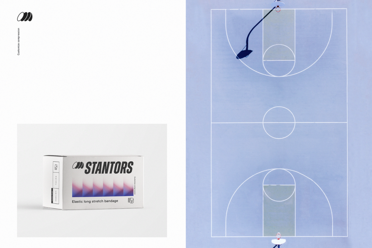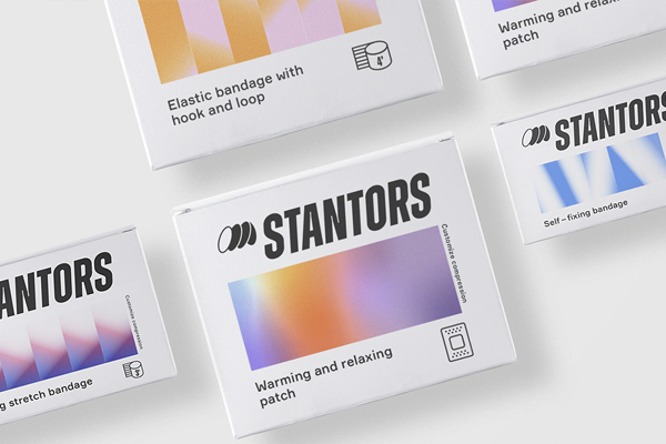
Gradients have been having a huge moment in the brightest trend spotlights in graphic design over the past few seasons, and I for one, am loving it. There’s something ethereal and intriguing about the shady color blend which has proved to be extremely versatile and functional. Gradients add dimension and depth to any design while giving a unique, contemporary feel, especially when used in sparse color combinations. Used to its best potential when combined with minimal typography and less-is-more design thinking, and a great example of this is the fun 80’s inspired STANTORS branding and packaging concept by Ukrainian graphic designer Elina Kobylianska.

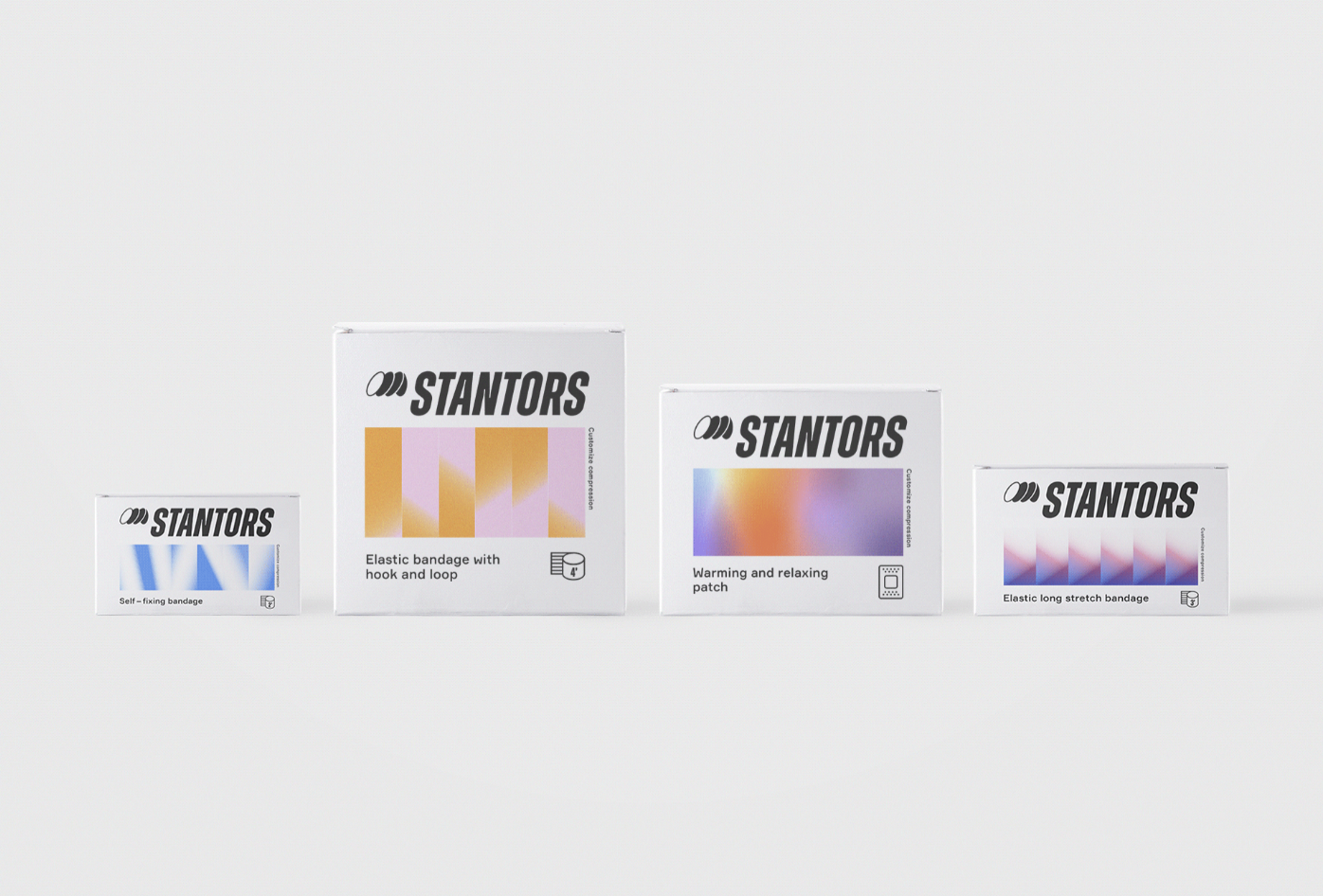
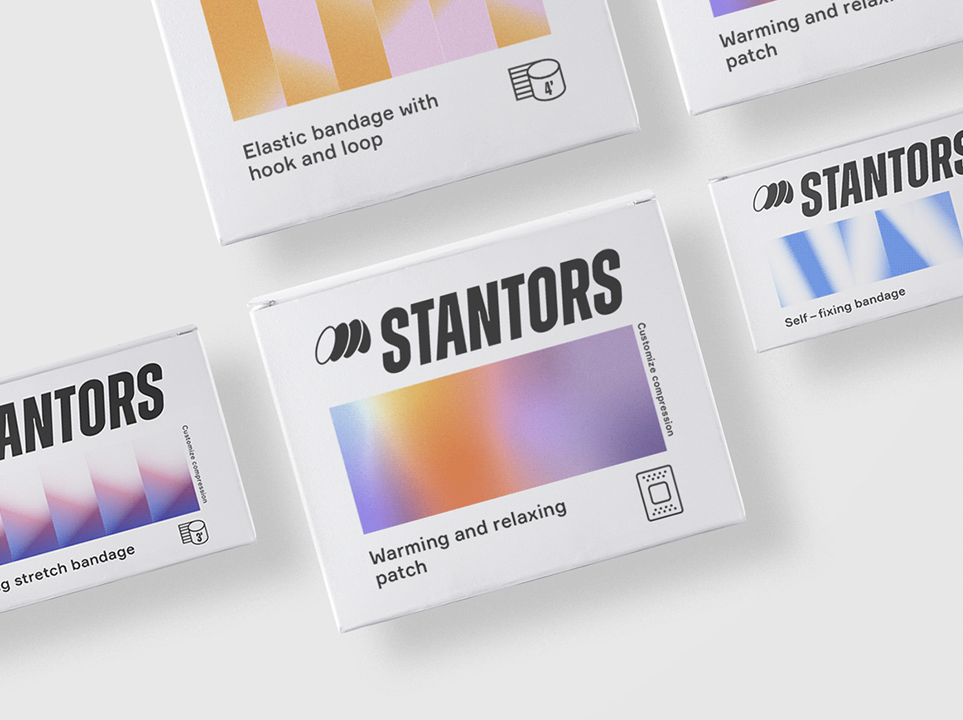
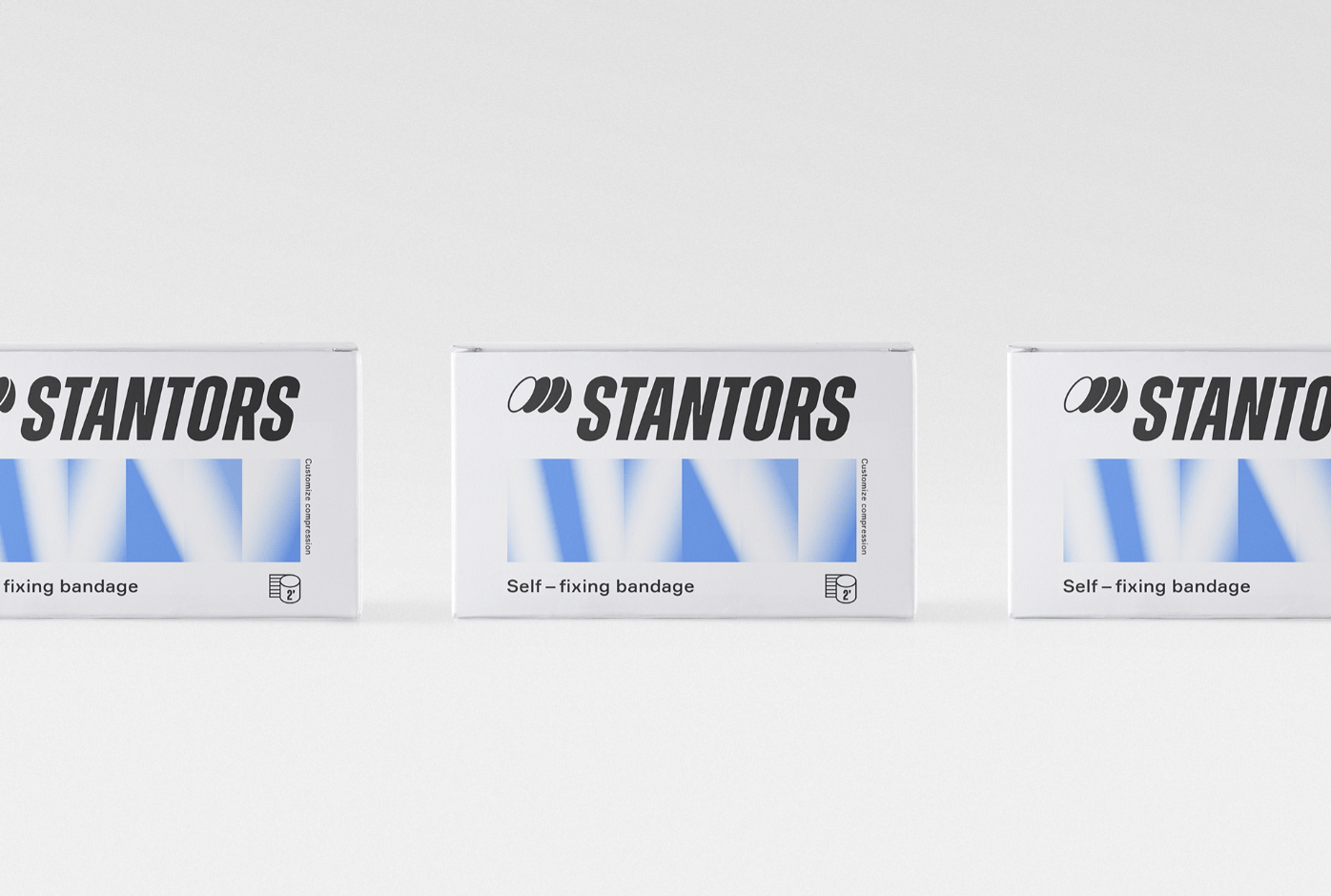
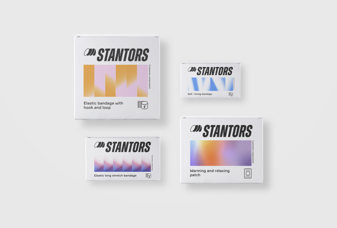
Brightly colored gradient patterns used to eliminate diverse pain symptoms in various ways
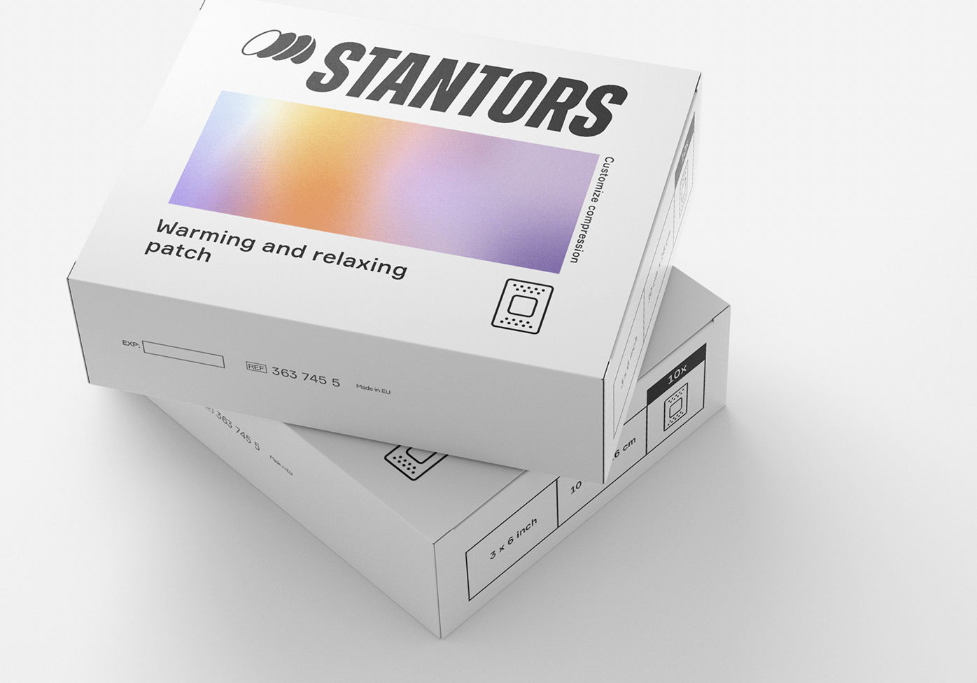
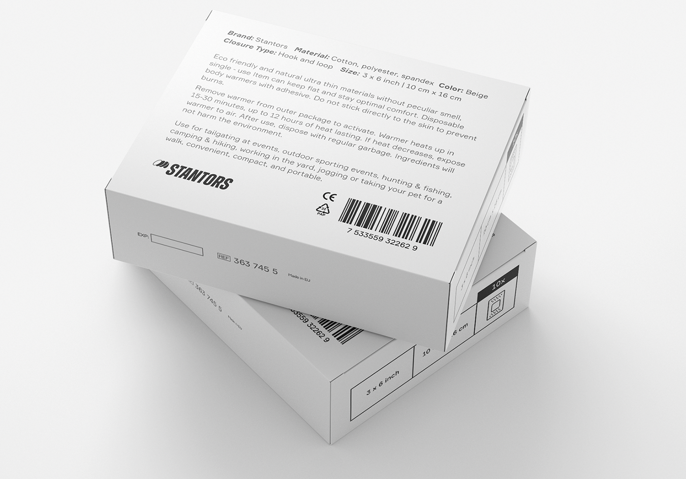
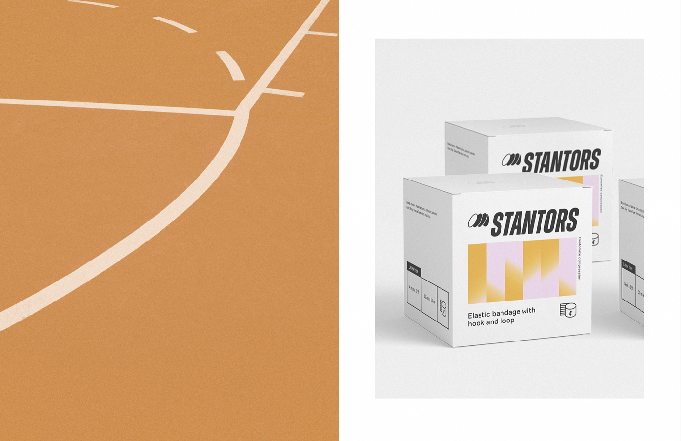
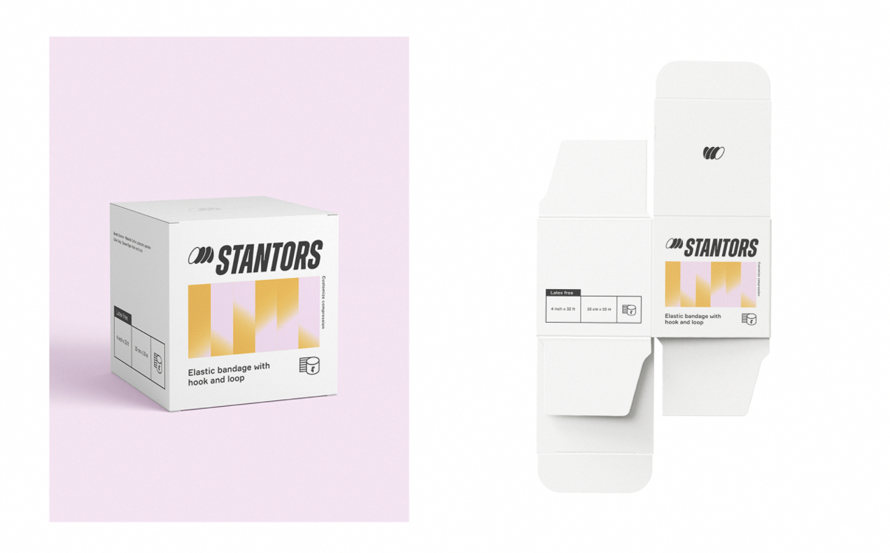
STANTORS is a brand of sports compression products, producing durable, comfortable, and portable elastic bandages, compression sleeves, and athletic tapes to relieve the pain and discomfort of professional sportsmen and sports fans, as well as people who prefer active recreation and tourism. In the design of the packaging and identity concept, Kobylianska used abstract gradient patterns that eliminate diverse pain symptoms in various ways. This allows the Stantors brand to stand out in the challenging environment of the medical market. The brightly colored gradient design is eye-catching, and memorable, leaving a pleasant emotion from using the product.
Read more about our passion for gradients in the article Crazy Over Gradients and see plenty more examples of stylish design concepts utilizing the contemporary color effect.