Acute, a Vienna-based design and branding studio founded by Isabella Thaller (previously featured here), creates brand identities and visual communication across various media, from conception to production. With a truly holistic approach, Acute aims to include all aspects of a brand in their design process, allowing them to create lasting design systems that function across many different applications. This also means that, while looking at the big picture, Acute never lets even the smallest details out of sight, including paper choices in their projects. Working with clients of all sizes, both locally and internationally, their attention to detail is proven in their work in redesigning the branding of SERA.
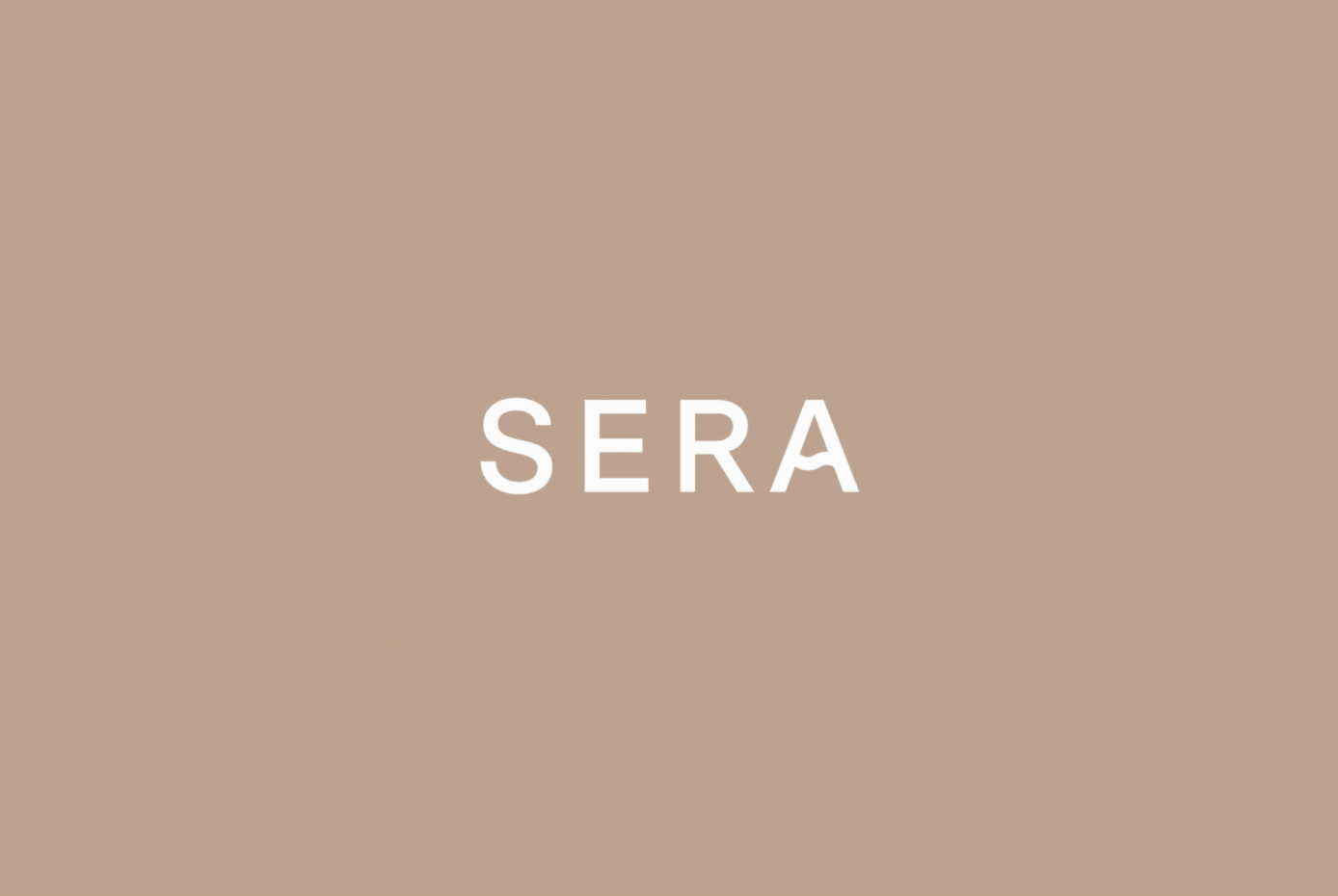
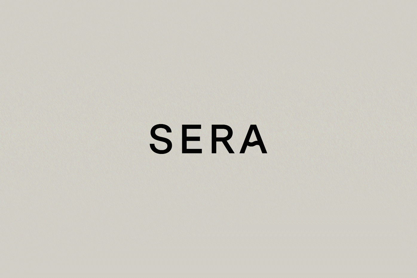
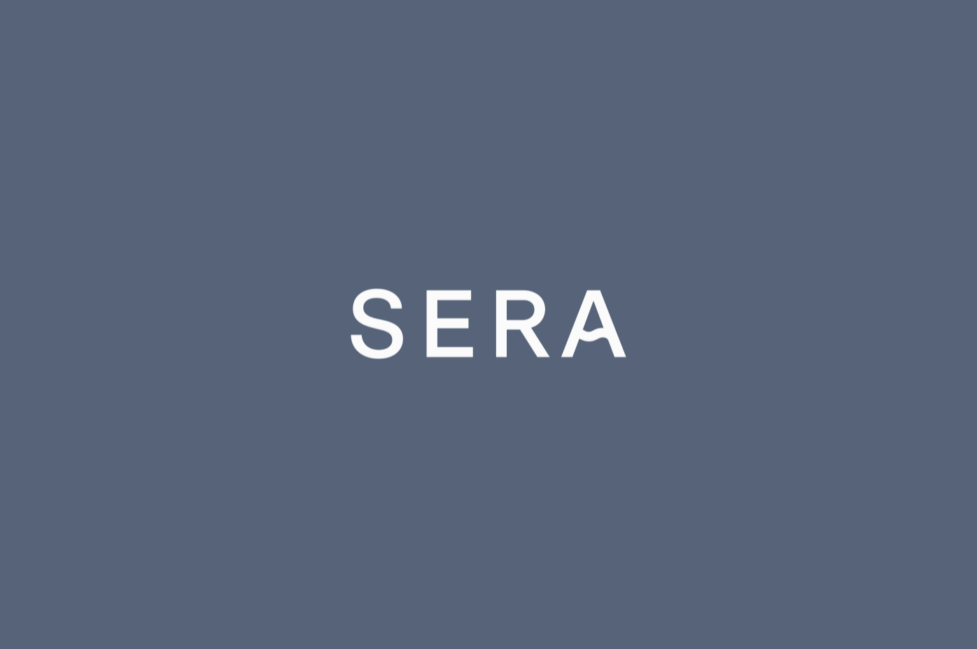
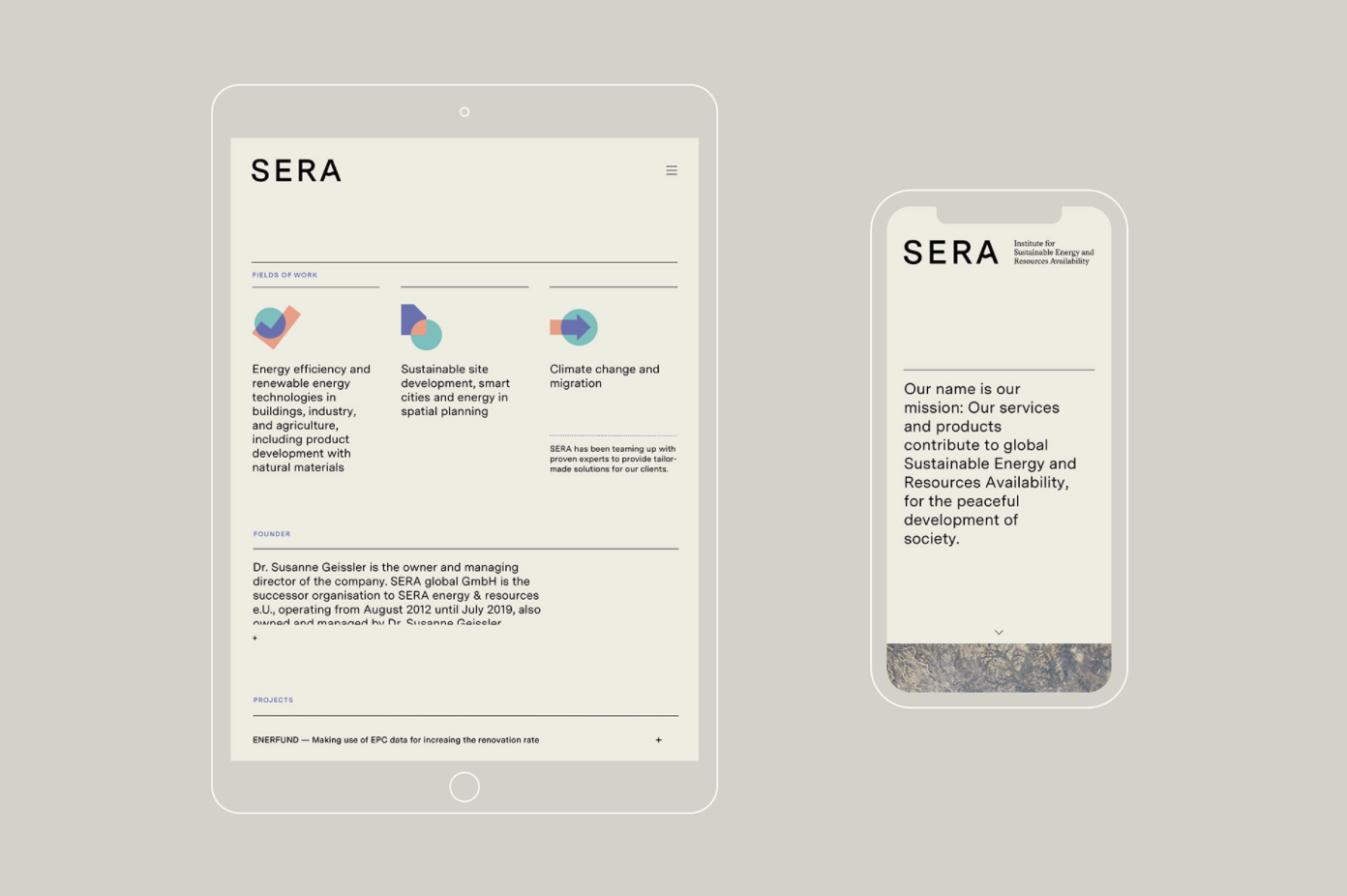
The new SERA visual identity conveys the institute’s scholarly background and competencies while feeling contemporary
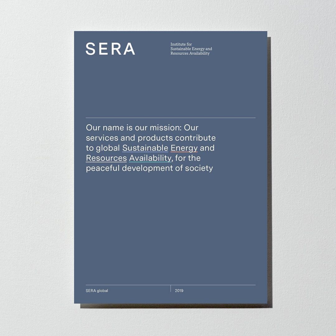
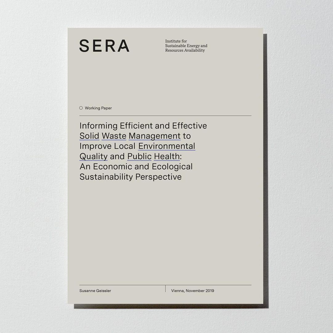
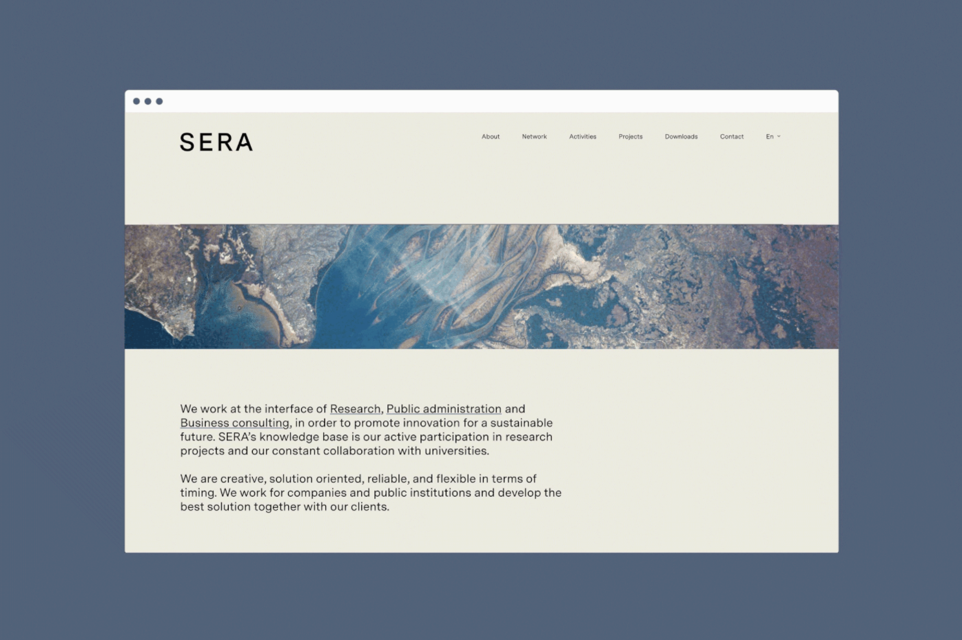
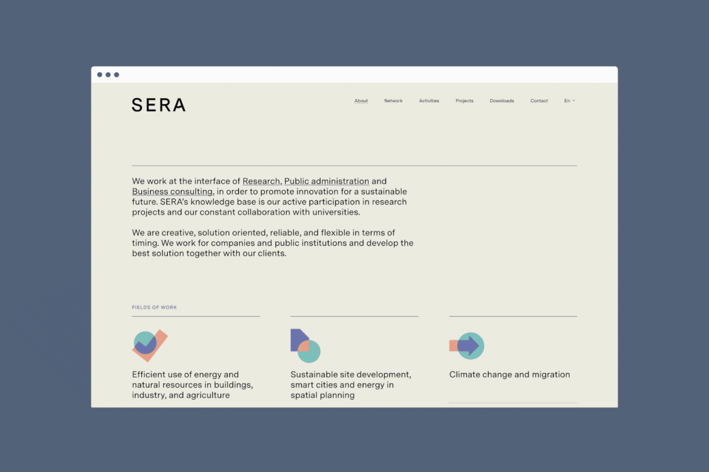
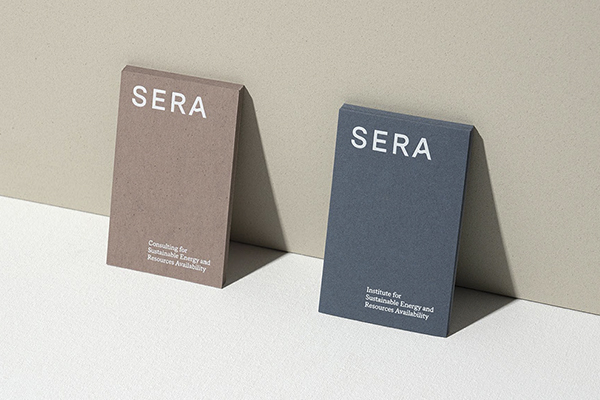
As SERA, the ‘Institute for Sustainable Energy and Resources Availability, expanded its task field it found itself in the need of a visual redesign. Working at the interface of research and public administration in the fields of energy efficiency, sustainable site development, climate change, and migration, the institute needed a visual identity that conveys its scholarly background and competencies while feeling contemporary.
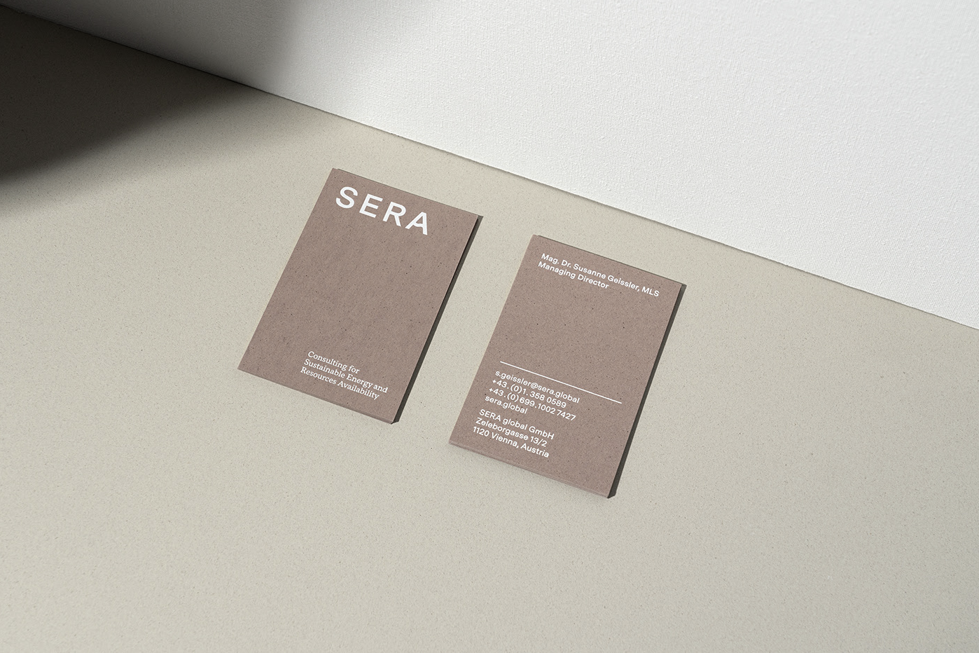
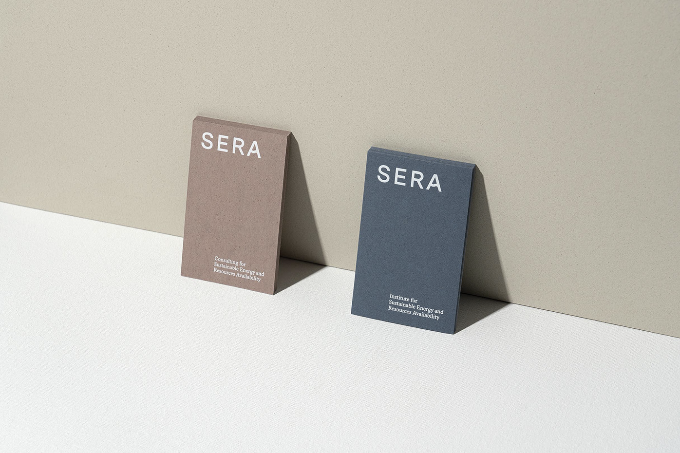
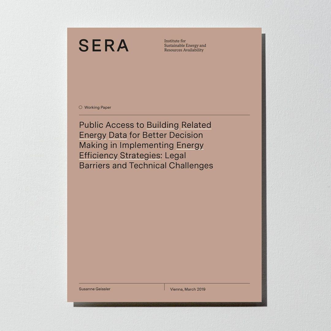
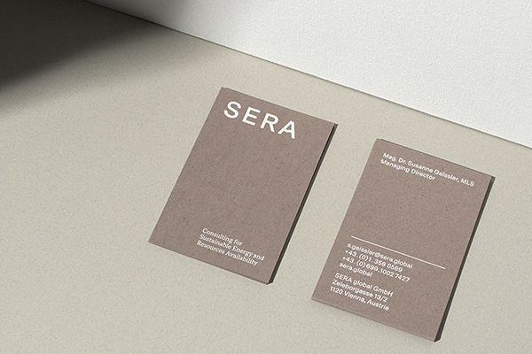
“We created a simple yet characteristic logotype that gives a hint to the matters at hand. The determining elements for the new brand identity are a strong use of typography and color. All stationery is printed on upcycled Crush paper that uses organic produce waste”, Thaller writes about the strategy of the design.
We created a simple yet characteristic logotype that gives a hint to the matters at hand. The determining elements for the new brand identity are a strong use of typography and color. All stationery is printed on upcycled Crush paper that uses organic produce waste.
Crush Lavender and Almond – papers exclusively available at Europapier Group – were chosen not only because of their great colors, which Acute based the entire color scheme of the project on, but also because of how the sustainable paper range is made. The field and focus of the ‘Institute for Sustainable Energy and Resources Availability’, and the eco-friendly paper made out of agro-industrial waste, made the brand and paper choices a perfect fit. “White foil printing was chosen for the business cards because it gives a lovely contrast to the colored Crush papers”, Thaller further explains the choices made in the design.
Follow both, Acute Studio, as well as its founder Isabella Thaller on Instagram for inspiration and enjoyment.