St.Petersburg, Florida based Hype Group is an award-winning full-service creative communications agency, focusing on brand building and revitalizing. Living up to their name, Hype Group creates hype for brands with fanatical, design-obsessed, process-driven, and unexpected ways. Approaching each task with a fresh point of view and fearless attitude, Hype’s skillset lies in creating memorable visual stories and brand experiences. A recent client, The Breadbox Apothecary, is a tremendous example of this.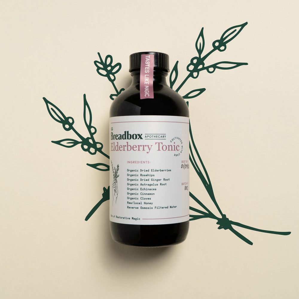
Hype Group creates hype for brands with fanatical, design-obsessed, process-driven, and unexpected ways.
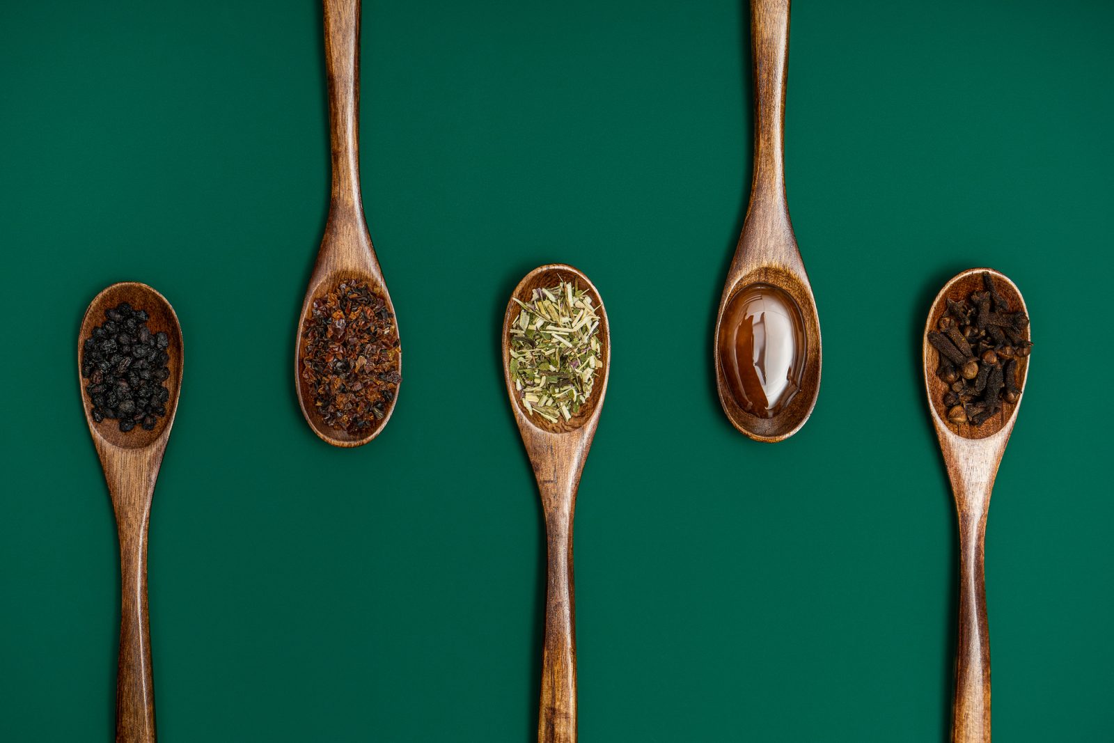
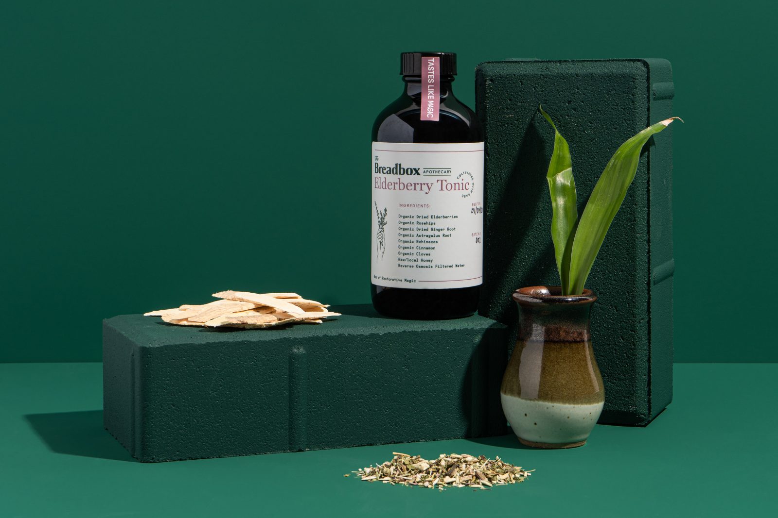
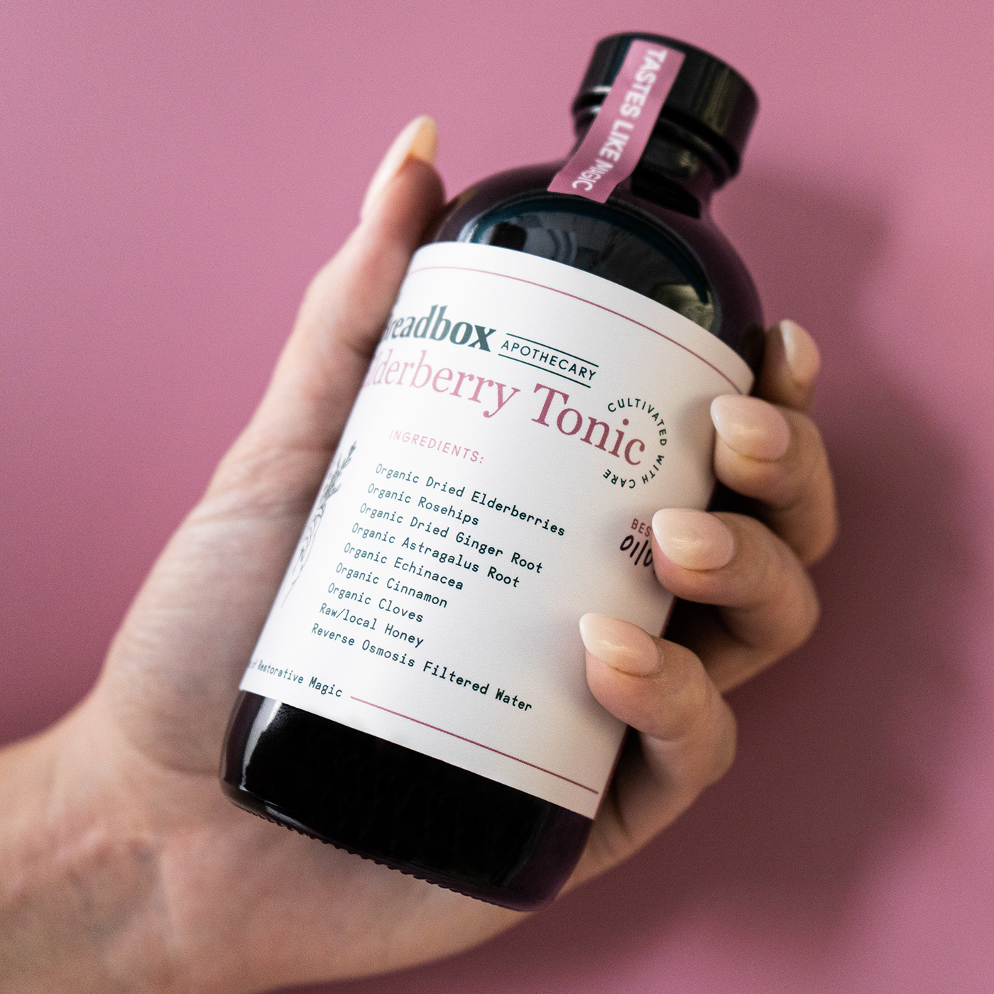
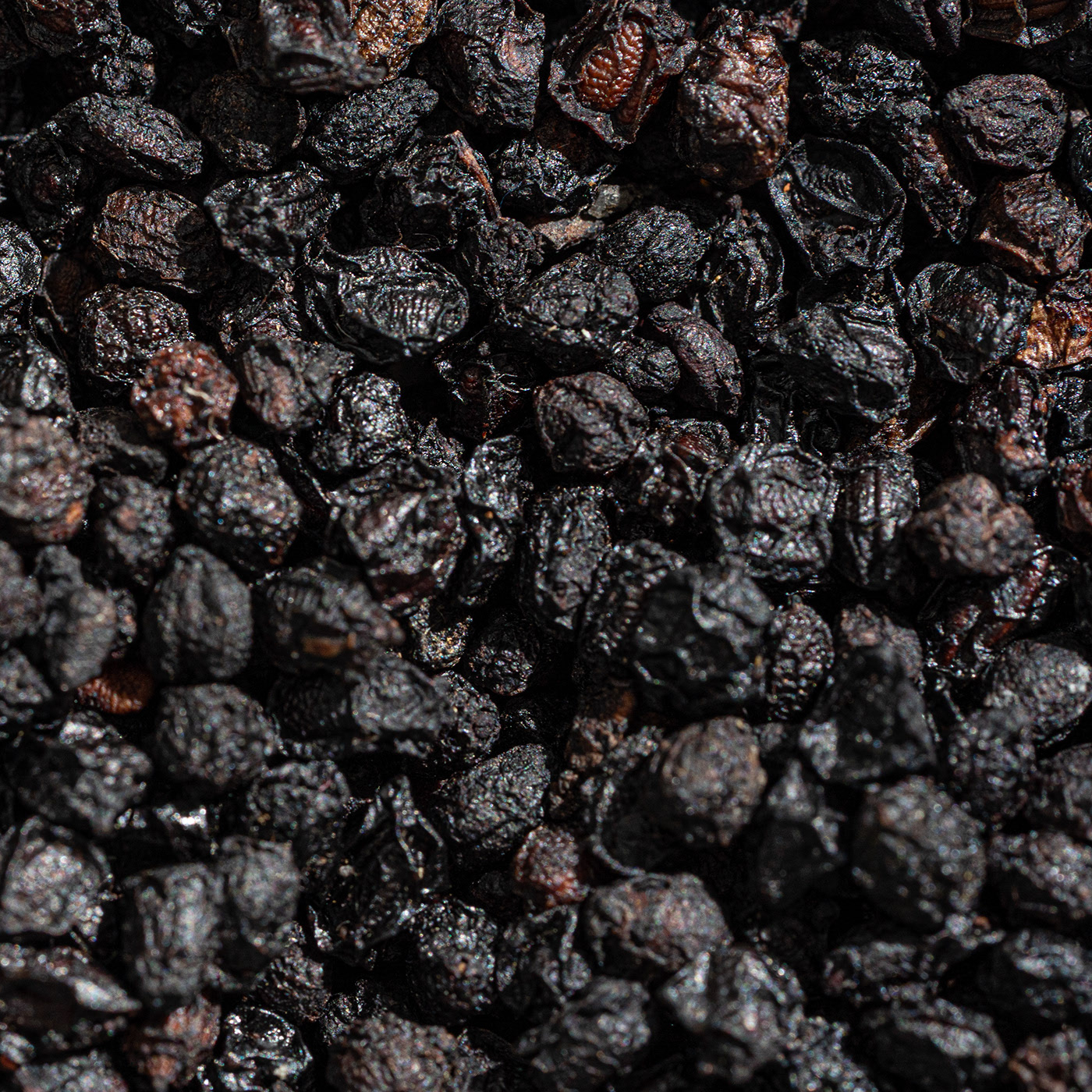
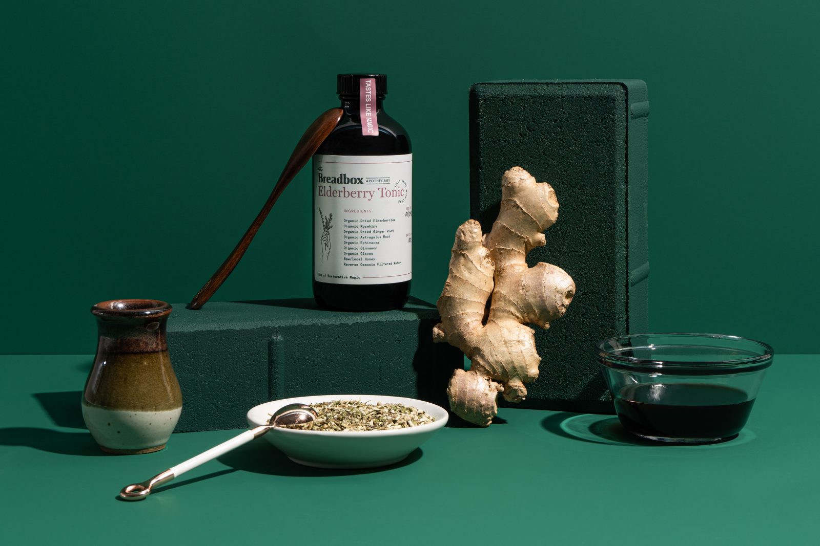
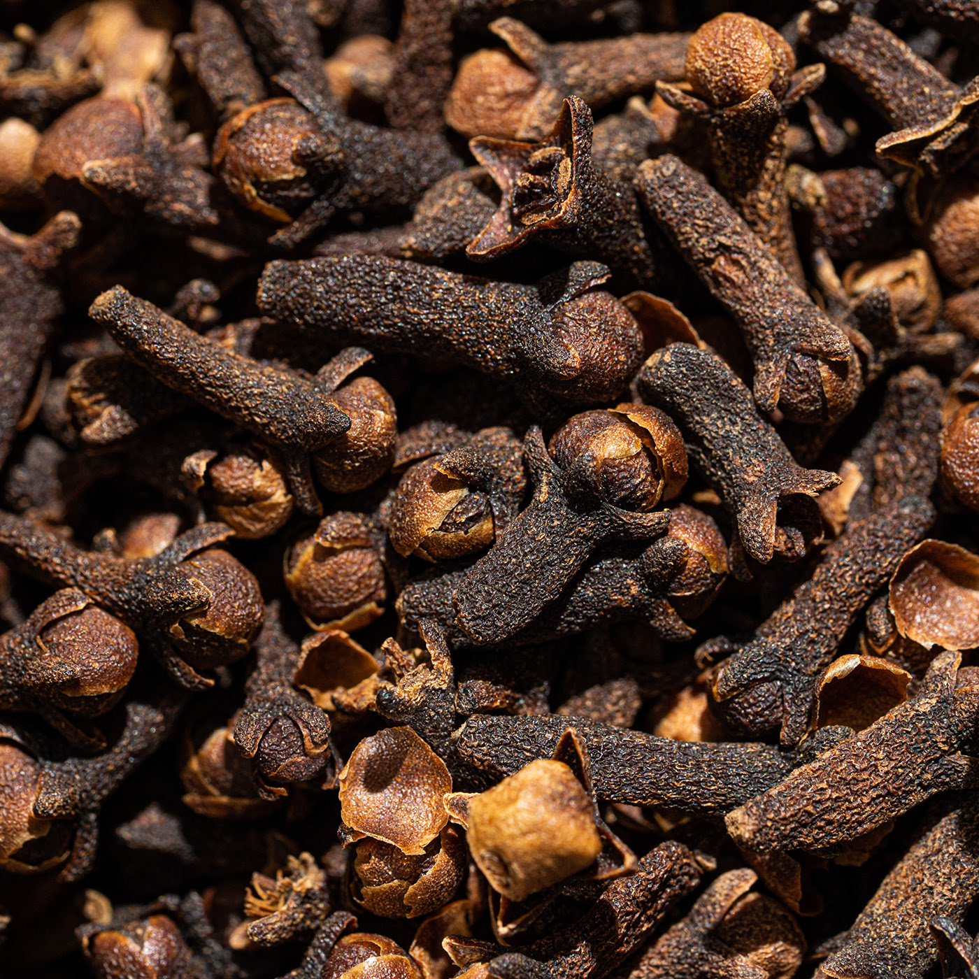
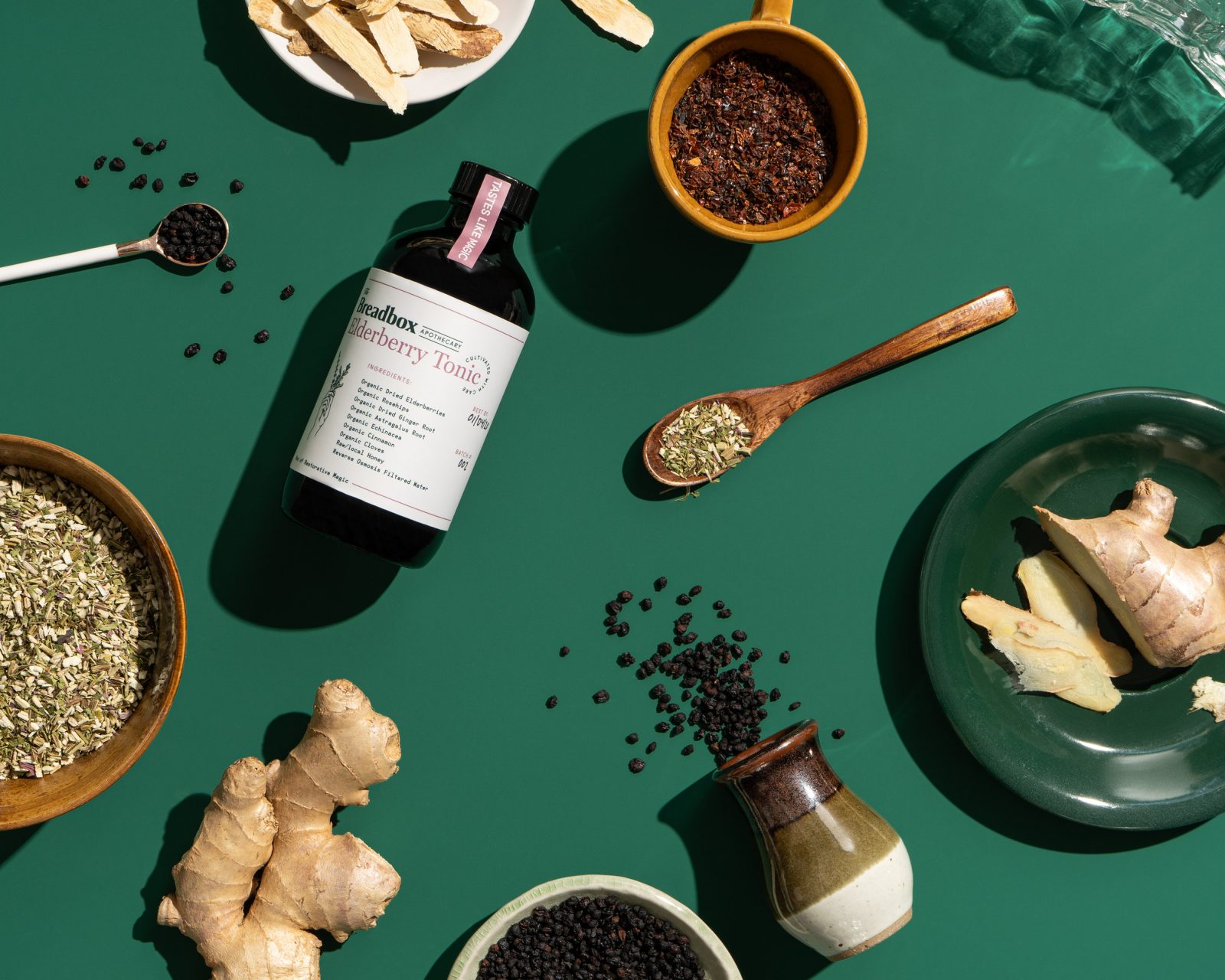
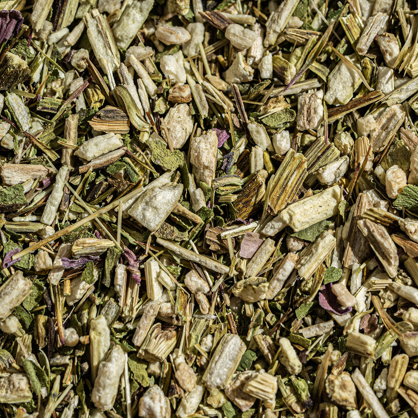
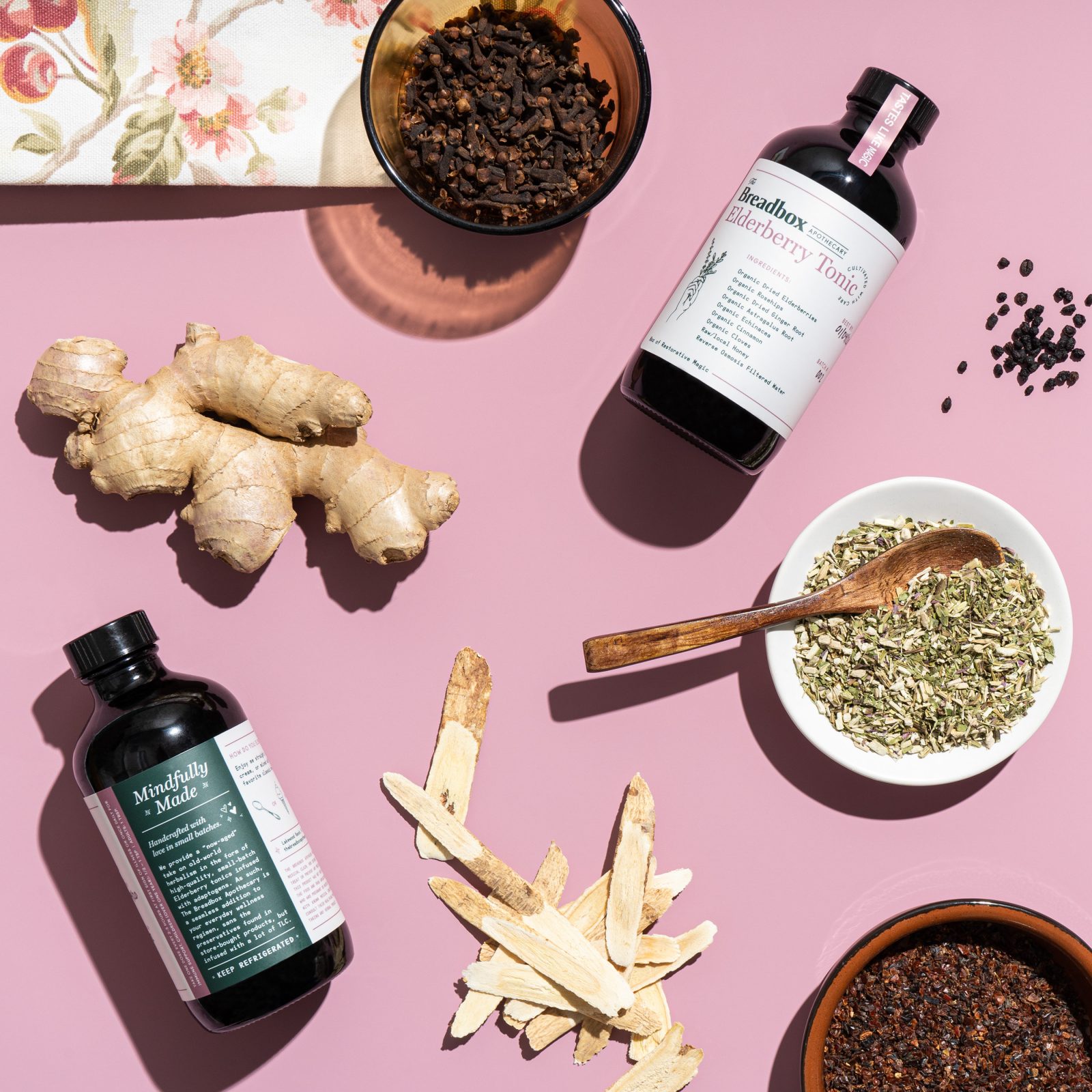
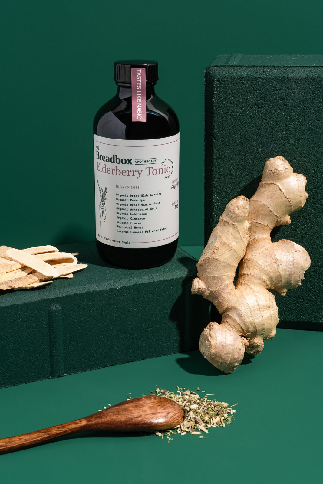
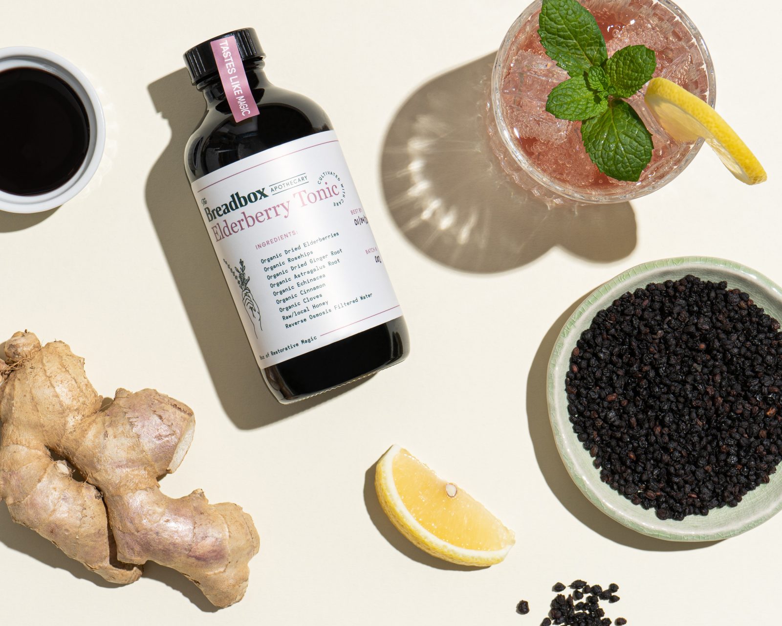
The Breadbox Apothecary provides high-quality wellness supplements for mindful users who value traditional solutions to enhance their well-being while embracing the modern advancements in the industry. Their products are a balanced combination of science and old world herbalism, with core ingredients, like elderberry, being sourced from a first-rate purveyor of sustainable organic herbs cultivated in the Pacific Northwest USA.
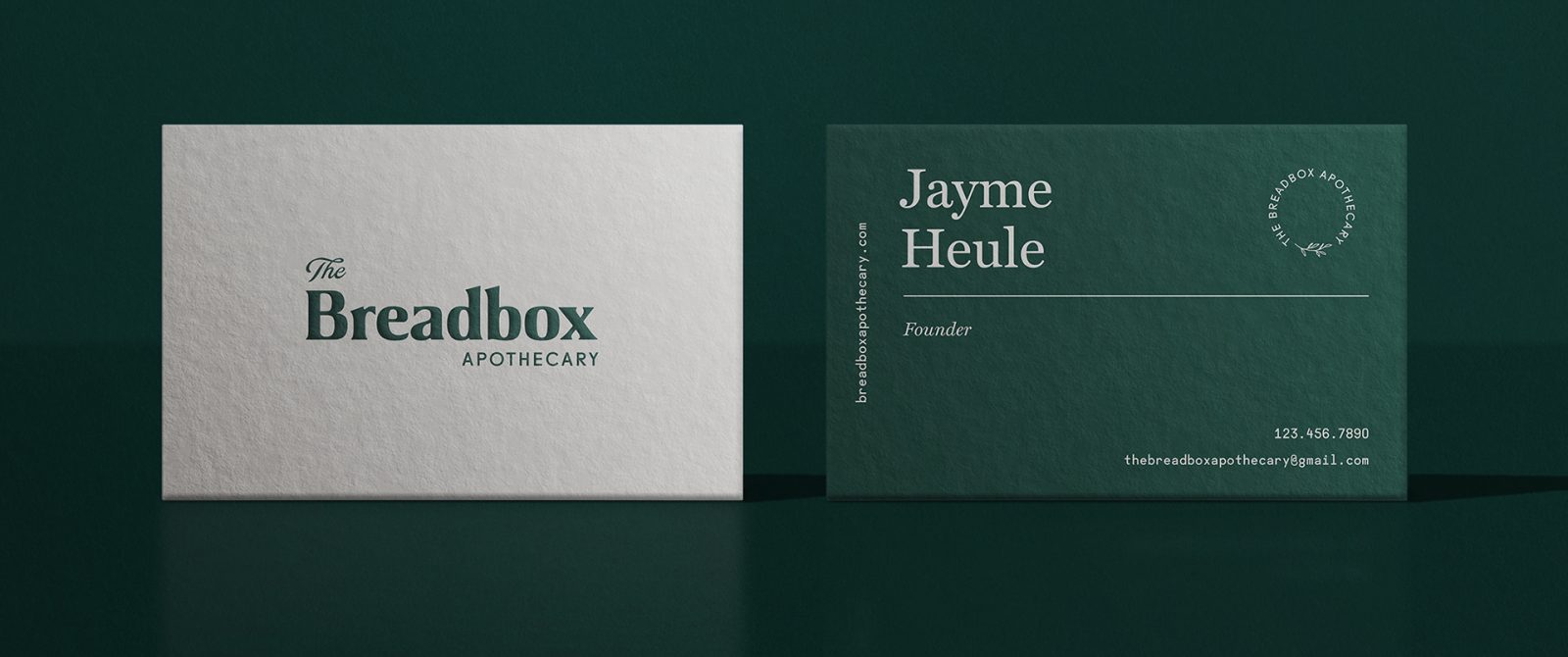
Verbal and visual solution for The Breadbox Apothecary to match the brand’s holistic values
The Breadbox Apothecary tasked Hype Group to create a verbal and visual solution for the brand that would match their holistic values and appeal to the growing audience. Hype began by establishing who The Breadbox Apothecary was at its core, its tone of voice, and its consumer promises. Once that foundation was established, Hype moved into creative exploration and began crafting a unique visual identity system that Breadbox could thrive with.
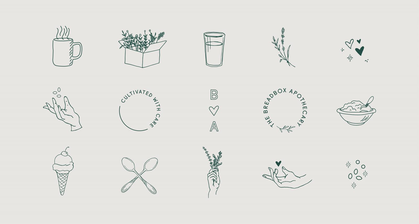
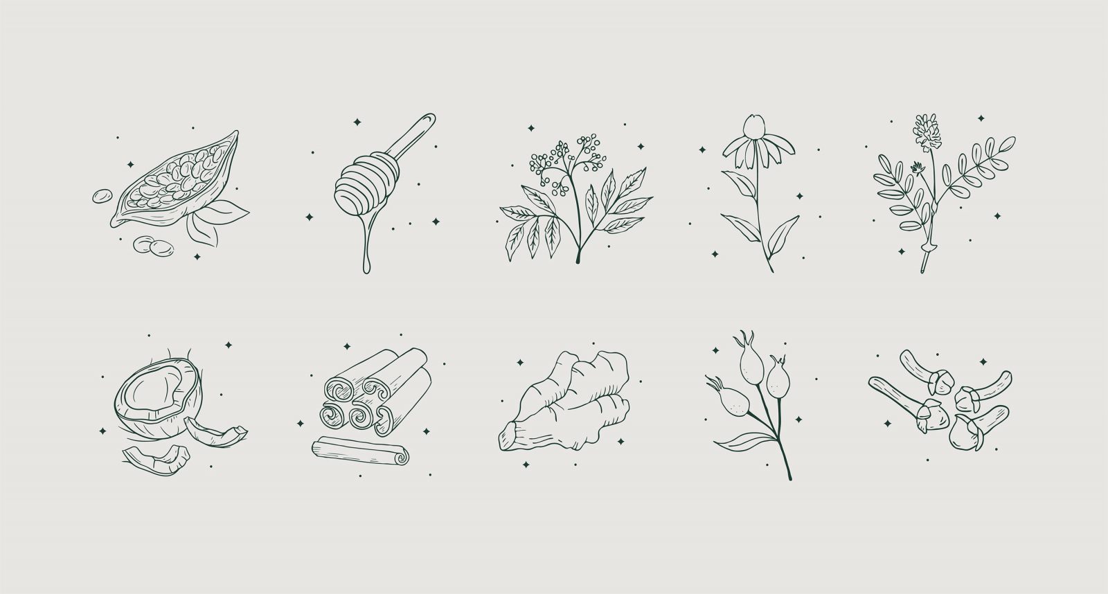
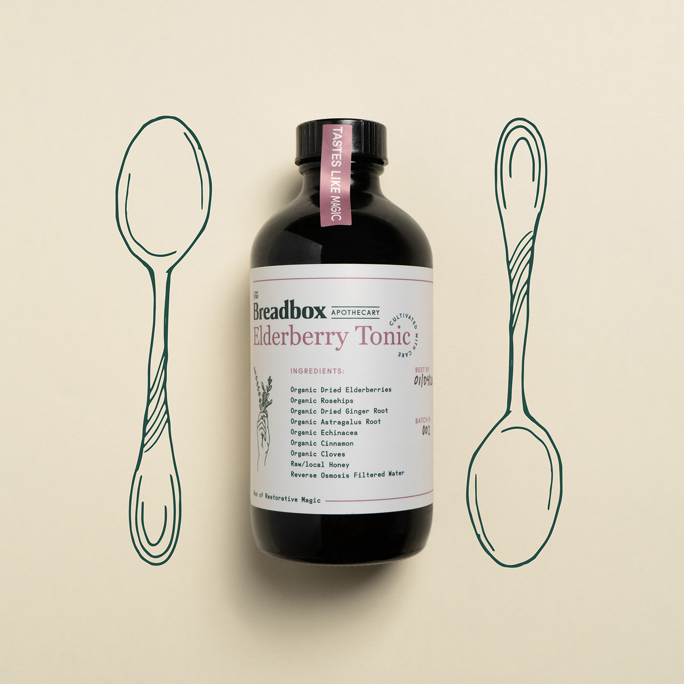
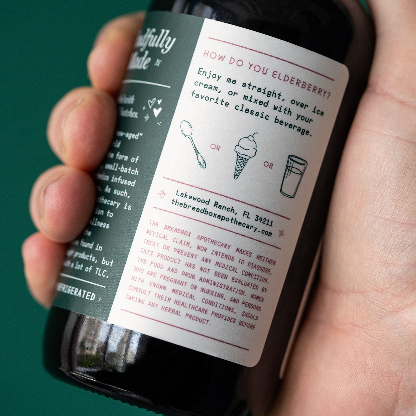
From the hand-drawn illustration of unique ingredients, cheeky details, and an attractive color palette of deep green and stylish rosa, a cohesive concept was born which looks as good as it tastes.
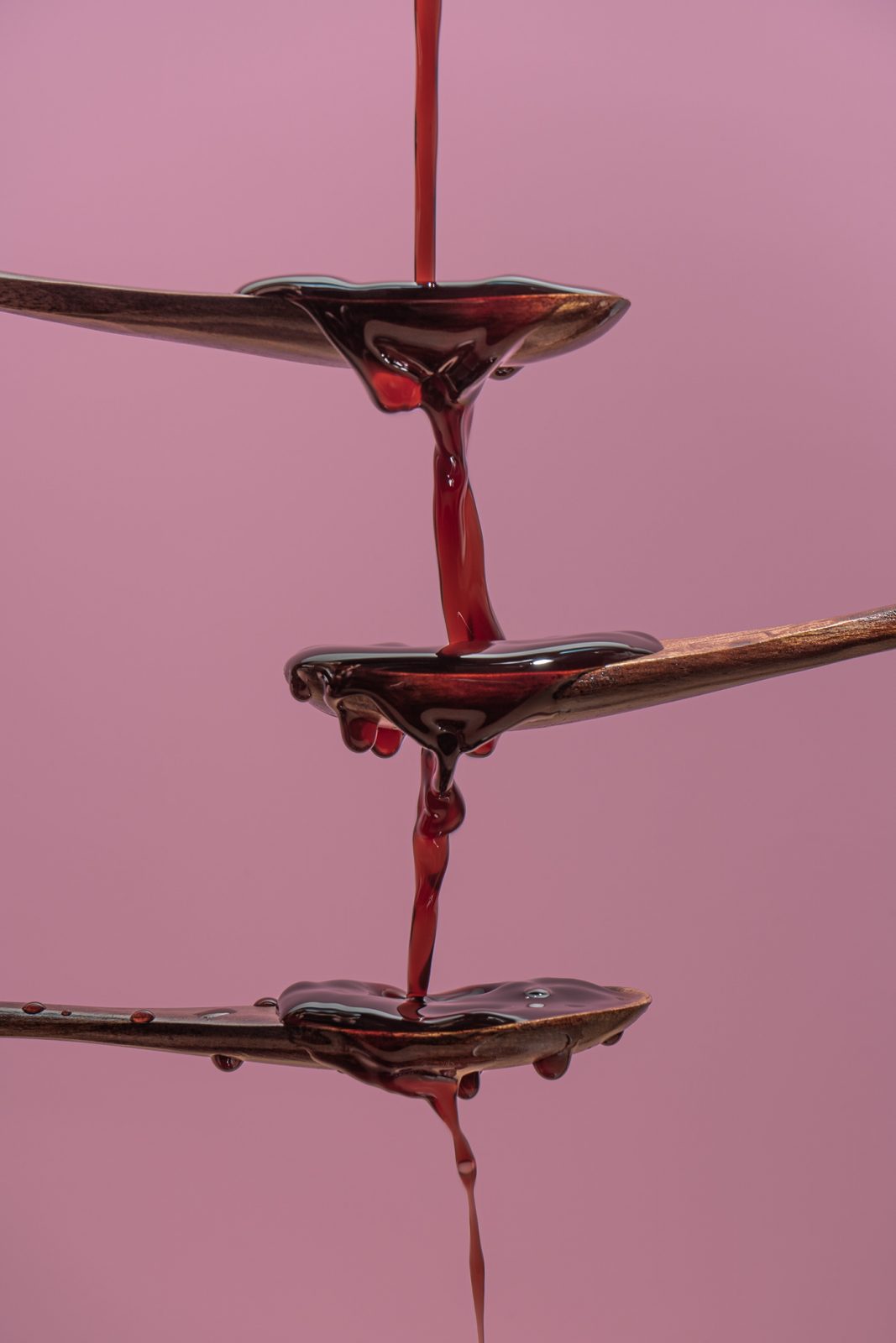
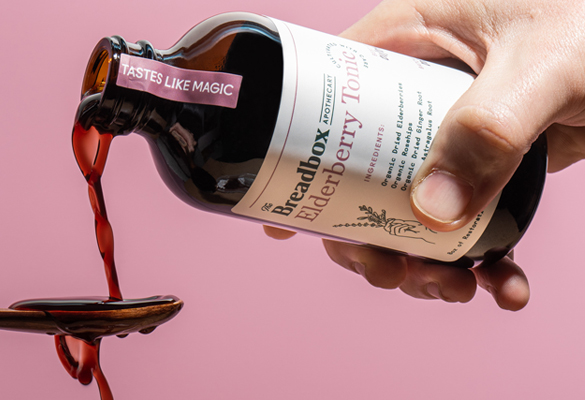
An Elderberry Tonic – an all-natural, organic elderberry syrup with enough nutrient-rich ingredients to kick your immune system into overdrive, was chosen as the hero product of the brand and the focus of the concept while a well-rounded brand system was built, allowing for flavor and product extension. From the hand-drawn illustration of unique ingredients and consumption instructions to stylish serif typography, and an attractive color palette of deep green and stylish rosa, a cohesive concept was born which looks as good as it tastes.