A small but successful Lithuanian honey brand Kilkų ūkis is run by a family of beekeepers named Kilkų. In a need of a rebrand, the Kilkųs tasked two local creatives, graphic designer & illustrator Evelina Baniulyte and packaging designer Gabija Platukyte to create a new, refreshed brand identity including a new more suitable name for international markets, as well as new packaging for their line of honey. So Gyvas Medus was born. And along with it, a more modern, minimal, and attractive visual identity including new, innovative packaging solutions – which were awarded at the NAPA Baltic 2019, 3rd place in the prepared food category.
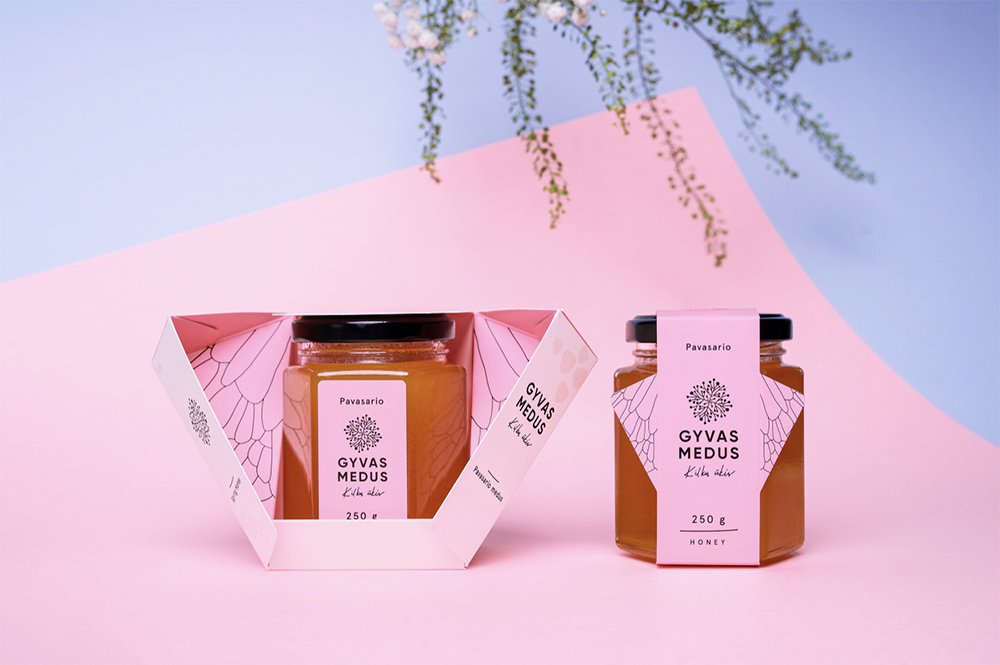
Inspired by the products natural ingredients, and the queen of honey, the bee itself, an innovative & stylish packaging solution was born
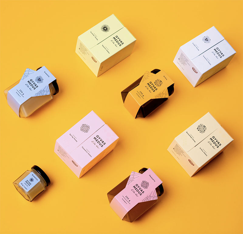
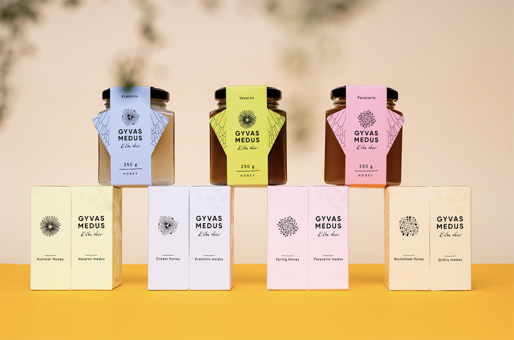
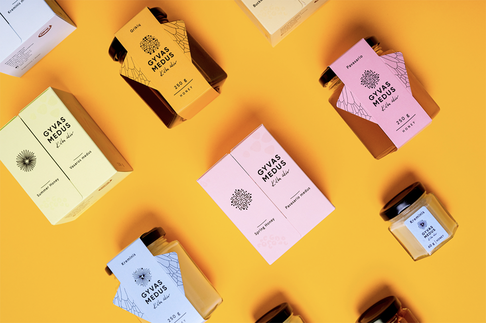
The new harmonious identity is presented in a palette of bright and light colors mixing soft pastels and a bolder honey orange tone, naturally inspired by the product itself. The new name, Gyvas Medus, which means “Live Honey”, is given a new contemporary type logo that is accompanied by an illustration of various flowers. The subtle and tactile details such as UV lacquer printing enrich the design, giving a polished and classy finish.
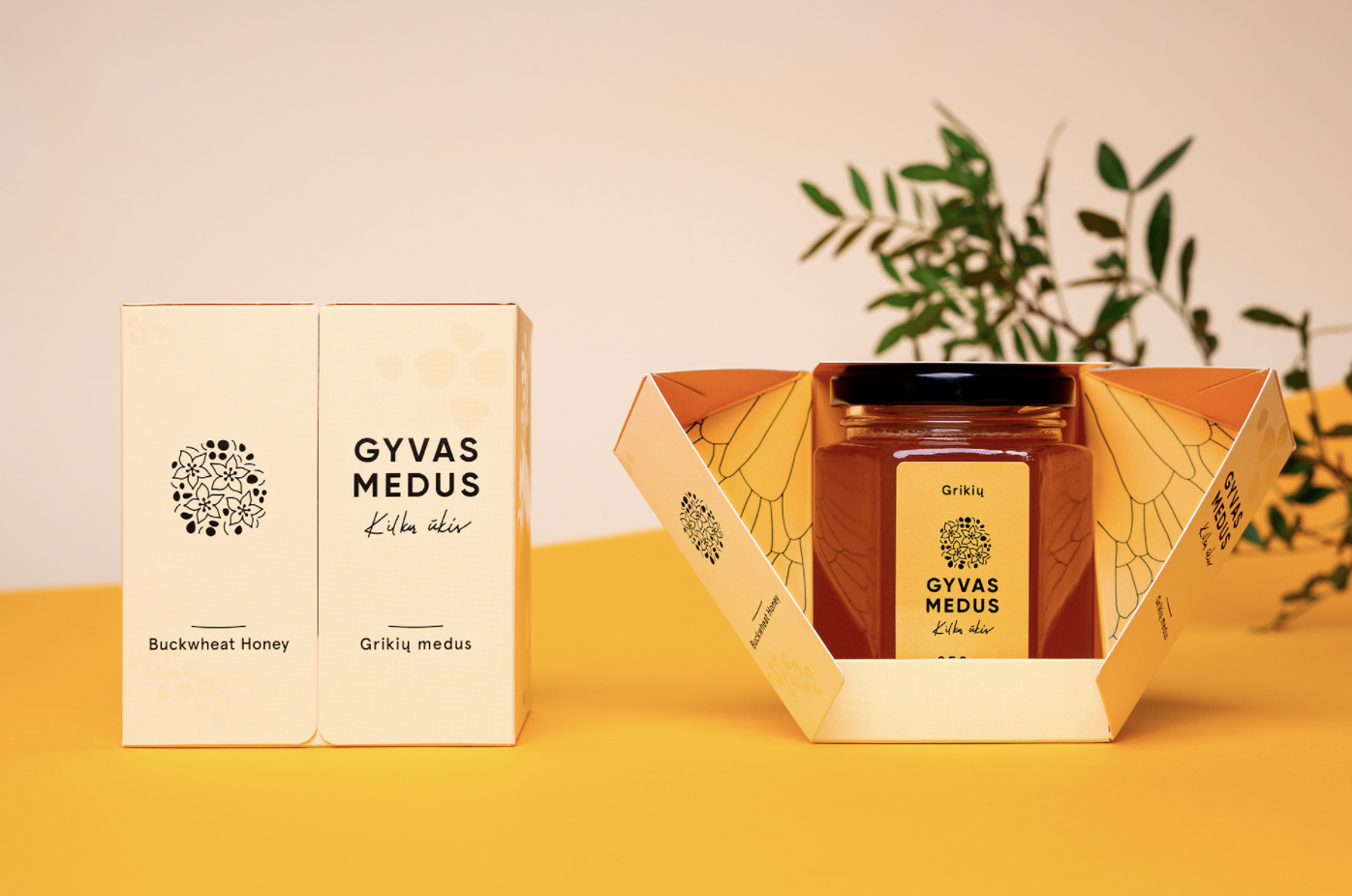
“We developed a unified system of boxes and paper wraps to match every size of jar used by Gyvas Medus. The four types of honey produced are identified with distinctive colors, while four symbols for the logotype were created to portray the flower commonly used in this particular honey”, the designers write.
To help the brand stand out among the competition, new, innovative packaging with a specially created structure was created. With only a few gluing parts the whole protective packaging for a single jar is cut from a single sheet of paper that is folded to form a structure that is simultaneously light, yet suitable for holding the weight of the product.
“We aimed to depict a bee as a symbol of honey, though not too straightforward. Therefore wings appear in the construction of the box, while the body is represented as the product itself. Paper wraps were also created as the economical version of the boxes. To keep everything in one line, they also have the wings of a bee, the construction is foldable for better transportation”.