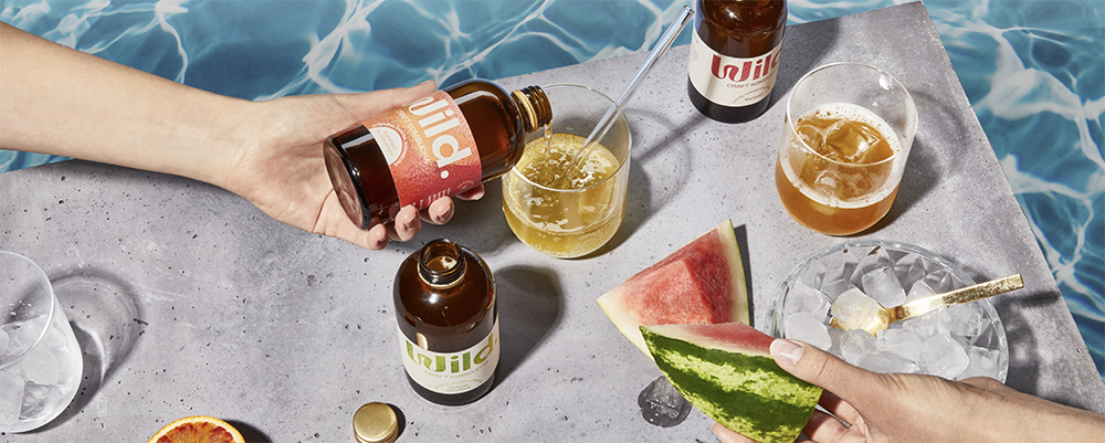
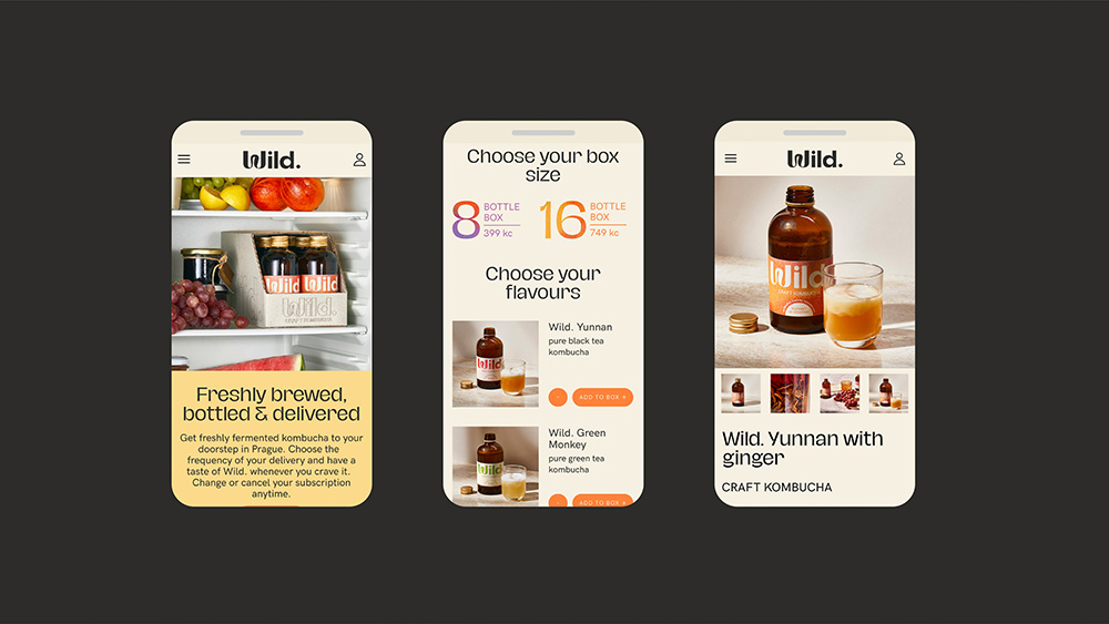
Wild. is a fermentation brand that set out to change the landscape of commercialized kombucha with a craft product that is 100% natural, taste-forward, with no additional flavorings or artificial carbonation, and delivered fresh to the consumer’s door on a subscription-based model. Marlon, a Prague-based boutique creative studio focusing on branding and packaging design, was tasked with creating a full visual identity for the new brand, that matched the quality of the product and communicated modernity, freshness, sustainability, and playfulness.
Marlon studio’s superpower is turning ordinary into extraordinary, and by not just focusing on the aesthetics, but truly understanding and solving the problems and building ideas on insights. “Our goal is to create work that is beautiful, not just in appearance but also in substance – both effective and attractive.”
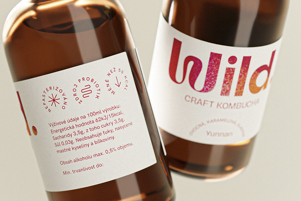
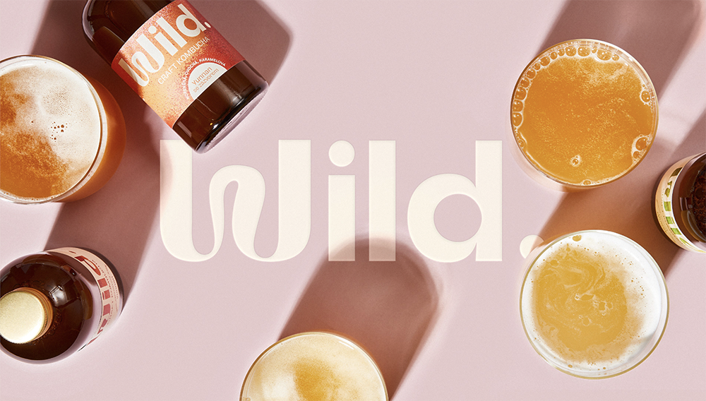
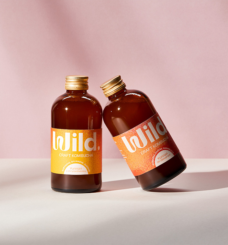
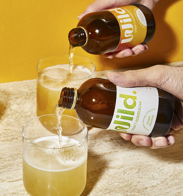
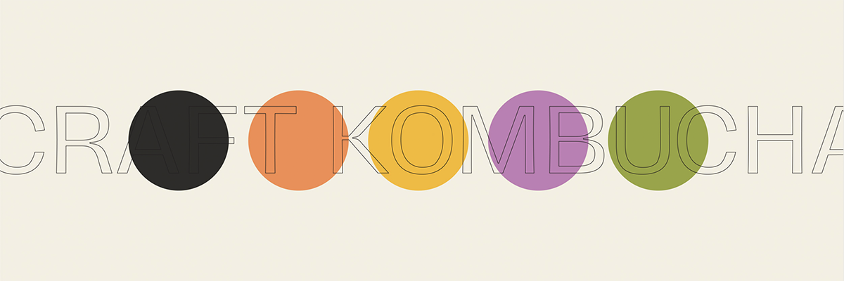
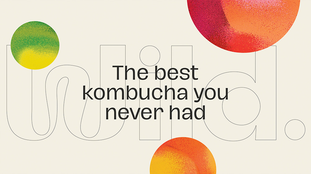
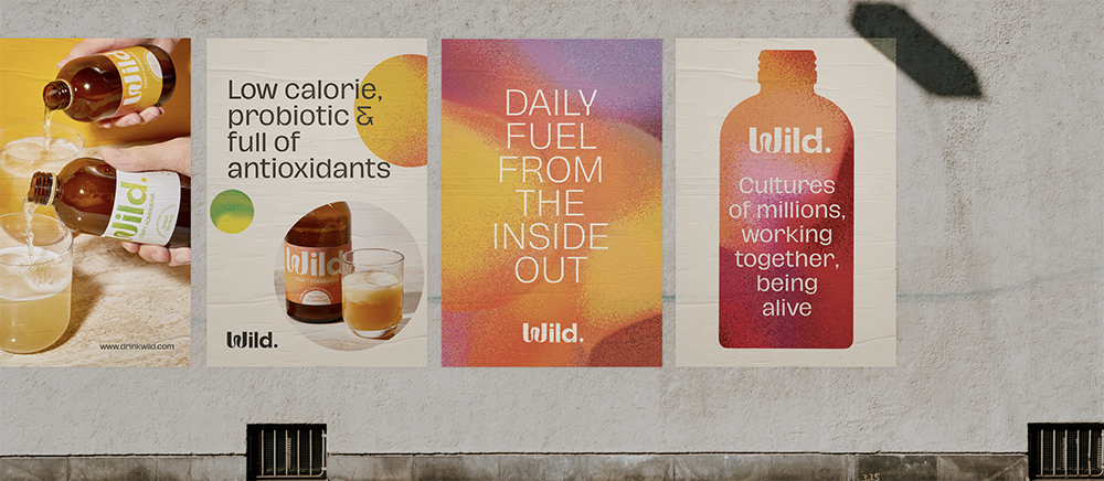
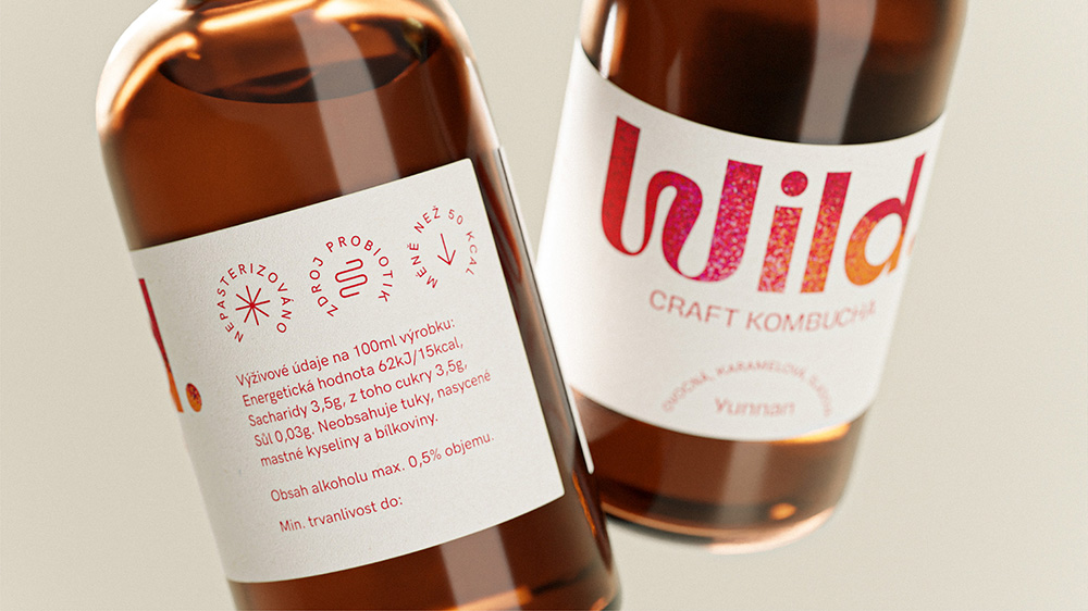
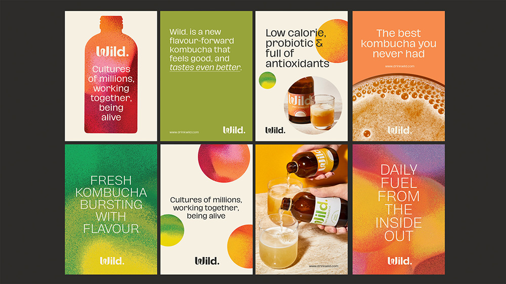
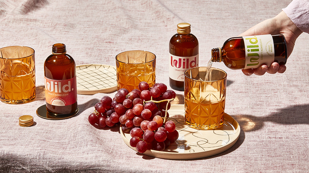
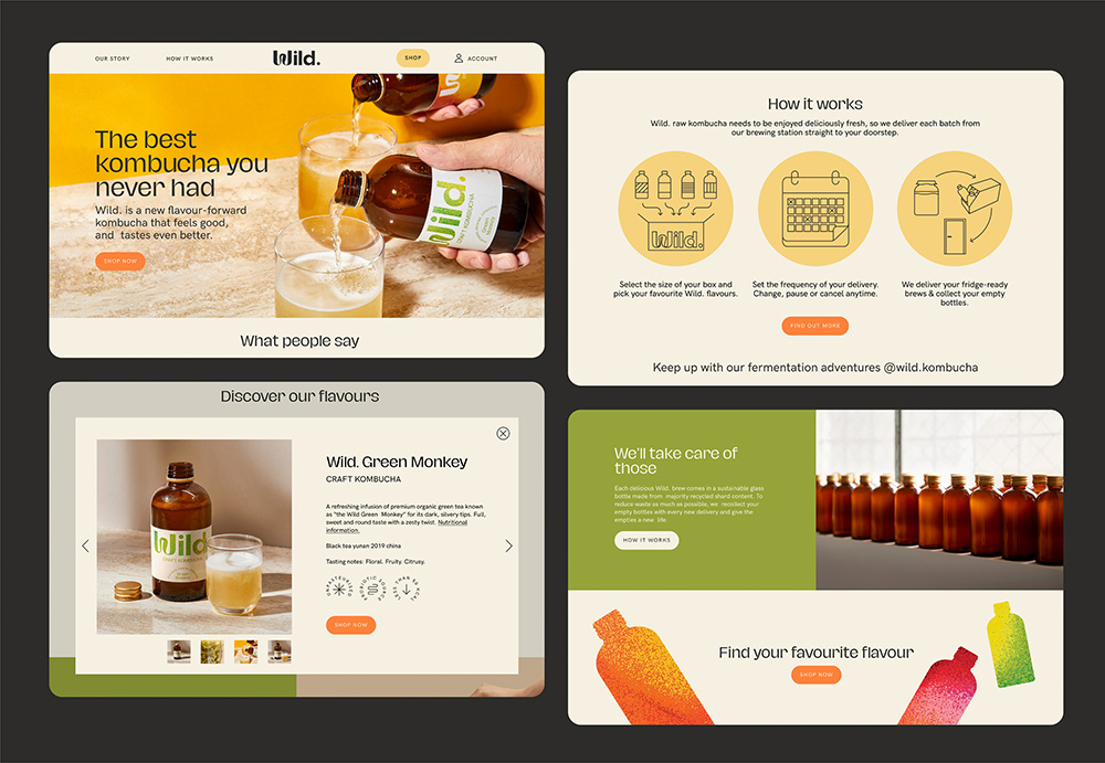
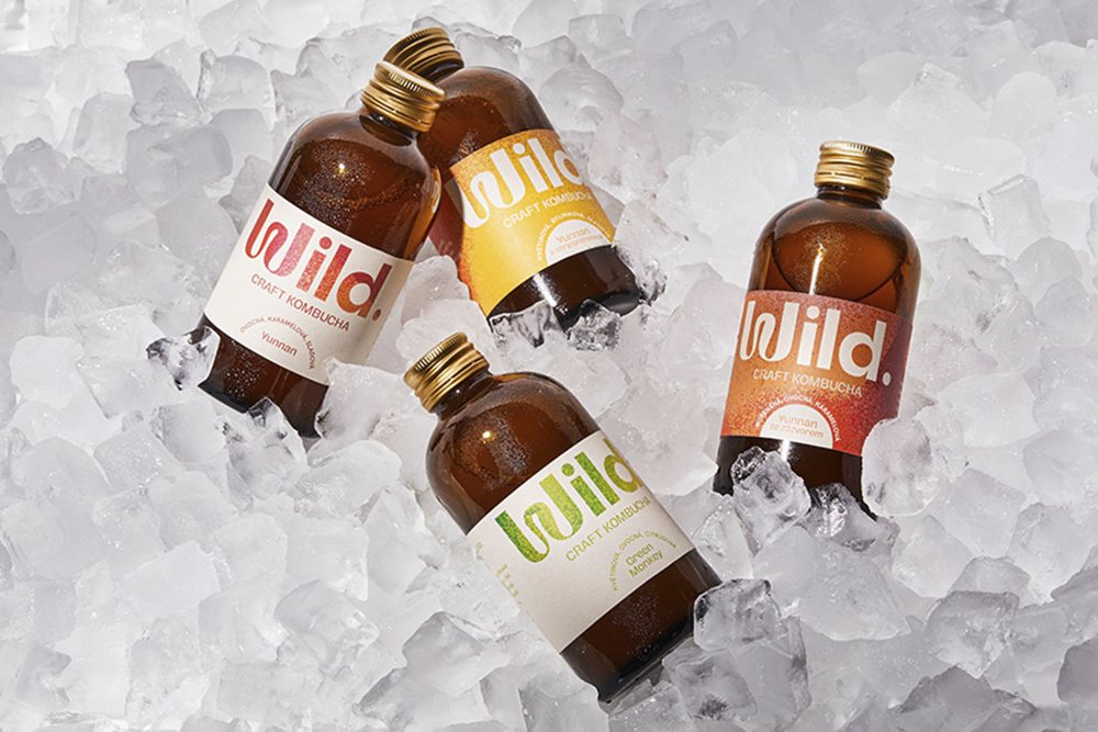
Combining textured gradients that reference the fermentation process necessary in creating Kombucha, with contemporary typography and beautiful contrasting colors, the Wild visual identity catches the eye in all the right ways
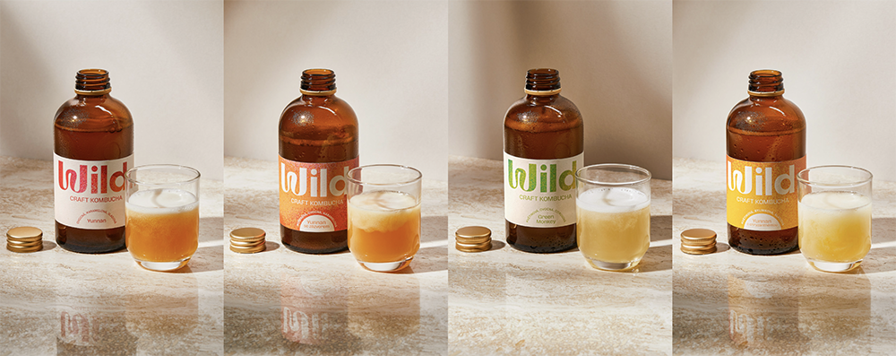
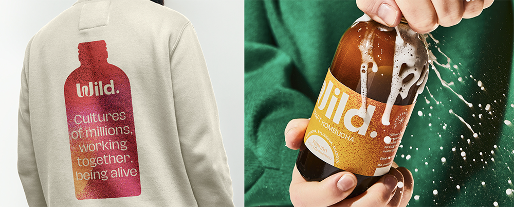
When working with Wild, the studio’s challenge was to create an identity that is both accessible for new shoppers – as Kombucha is still relatively niche – and yet also feels authentic to a small yet passionate group of heavy users. The phrase “Fermentation is a culture of billions, working together, being alive“ became the starting point of the visual identity concept. “With this idea in mind, we developed a series of dynamic textured gradients that reference the cultures of bacteria responsible for the miracle of fermentation. These textures became the backbone of the brand identity, to which we added a strong wordmark logo with hints of organic dynamism, a minimalistic packaging design system, a beautiful sustainable outer case design, and clean layout systems based on contrasts, and layering, and bubbles!”
These textures became the backbone of the brand identity, to which we added a strong wordmark logo with hints of organic dynamism, a minimalistic packaging design system, a beautiful sustainable outer case design, and clean layout systems based on contrasts, and layering, and bubbles!
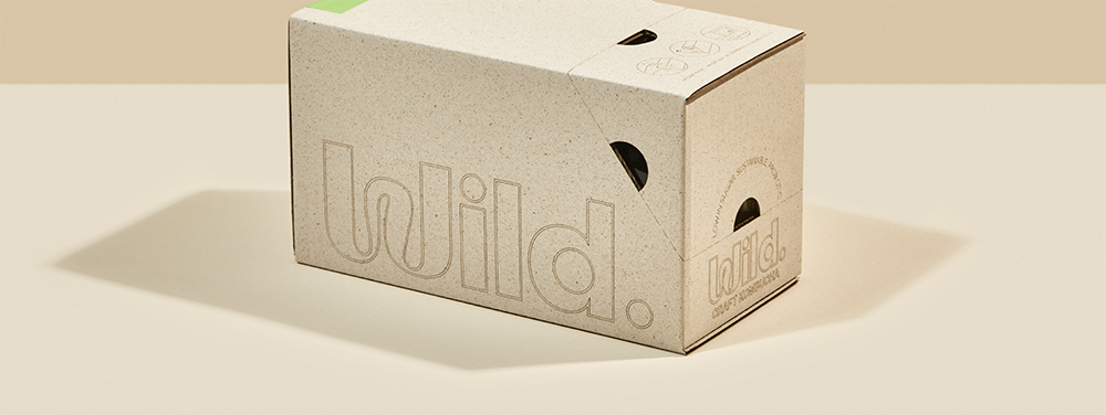
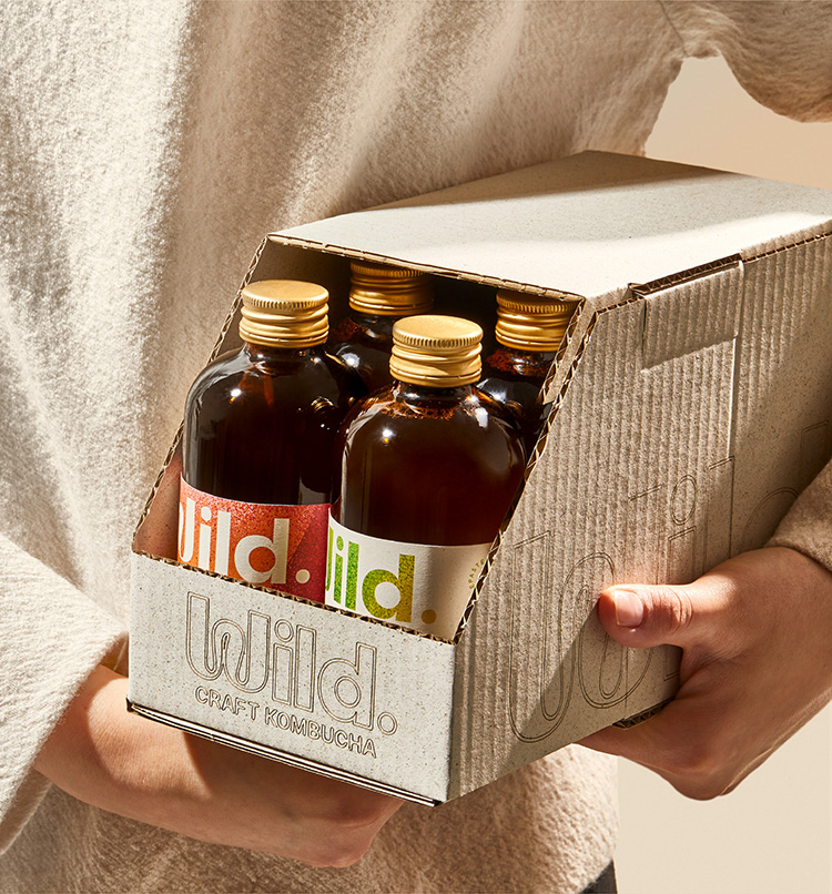
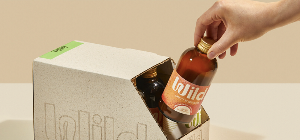
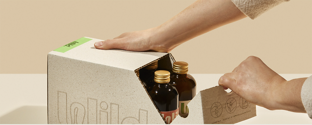
Every step of the project was developed in collaboration between Marlon and the client. And sustainability, a core value of the brand, is reflected from the used ingredients and manufacturing process to the packaging, which is made of recycled materials, and has no printing on it, and is made entirely with laser cutting on the surface of the cardboard. “It (the project) is a testament to what good collaborations between studio and client can produce and we are very grateful that the client trusted us and took the risks necessary to reach this final look”, Marlon writes.
Marlon studio Instagram
Photography: Marek Bartoš
Copywriting: Salwa Benaissa