

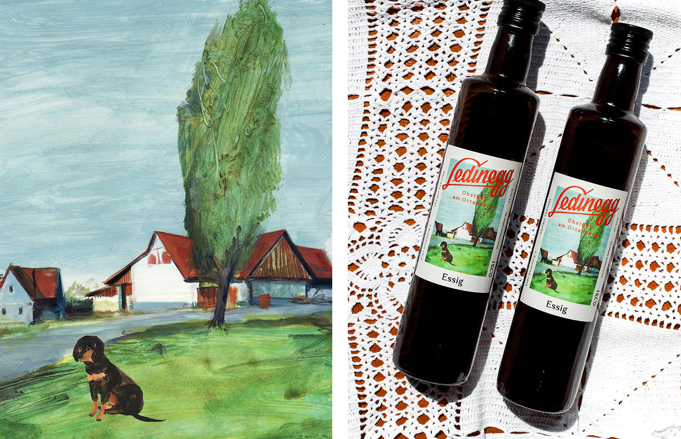
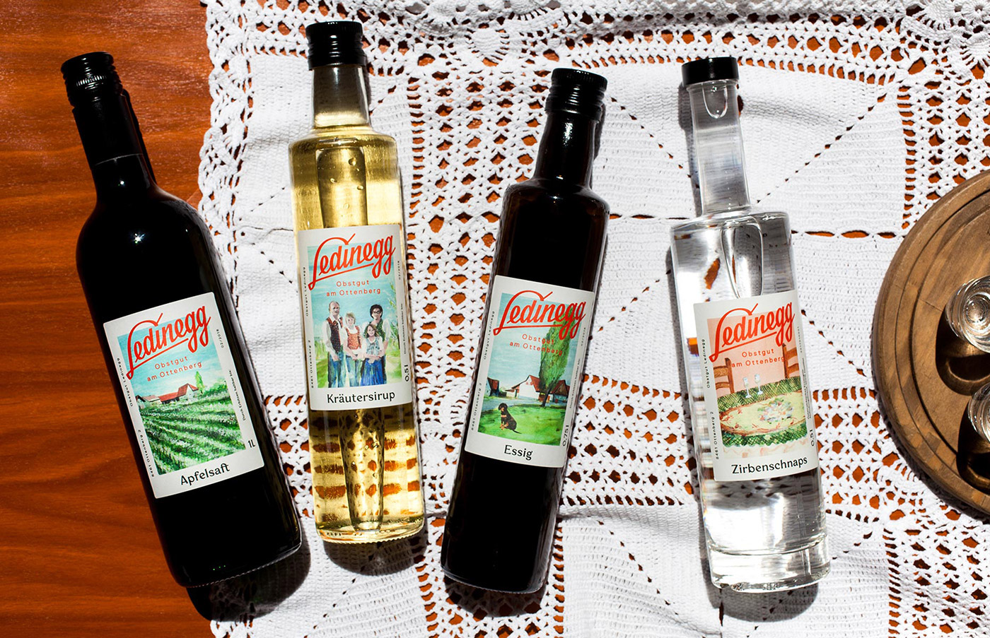
Deep in the South of the Styrian hills lies the Ledinegg family farm, full of fruity goodness in the form of plums, cherries, peaches, kiwis, apples and of course grapes, ready to be made into all kinds of culinary delights from jams and juices to spirits and liqueurs. The Ledinegg Obstgut am Ottenberg are well known and loved in the region and beyond, now with the help of their brand new packaging by no other than awarded Graz based design studio Bruch Idee & Form. 
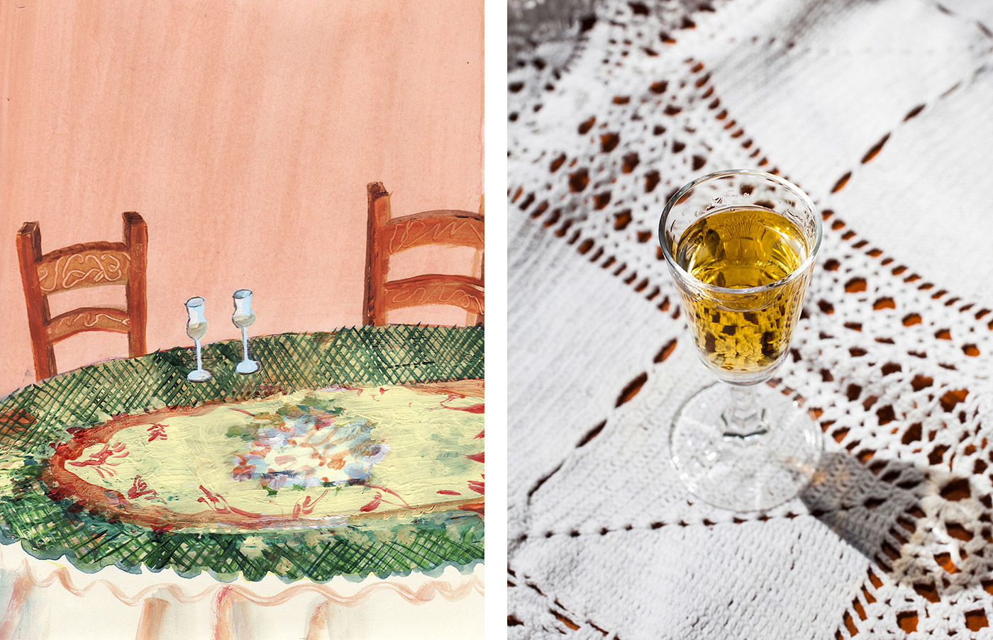
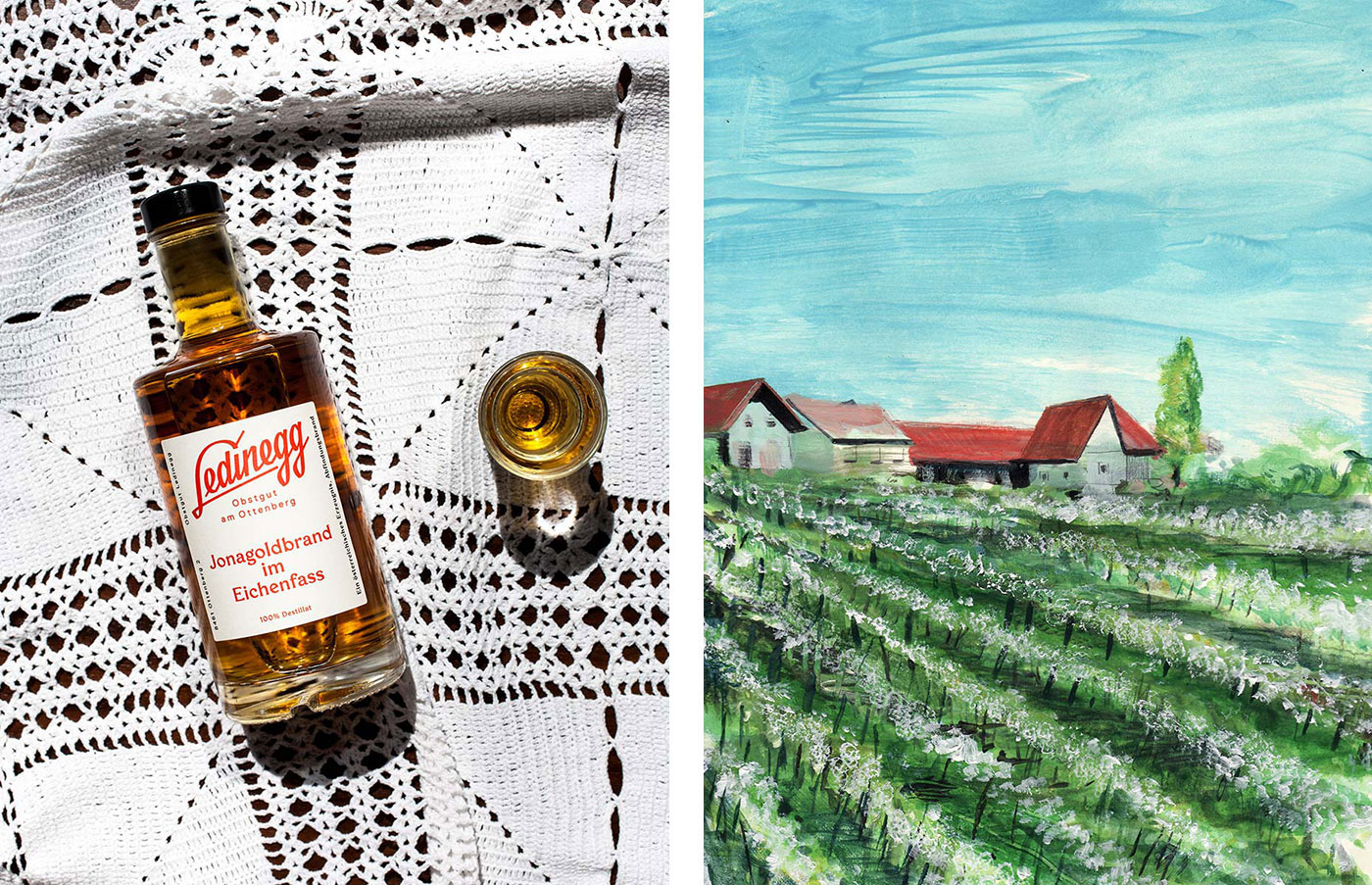
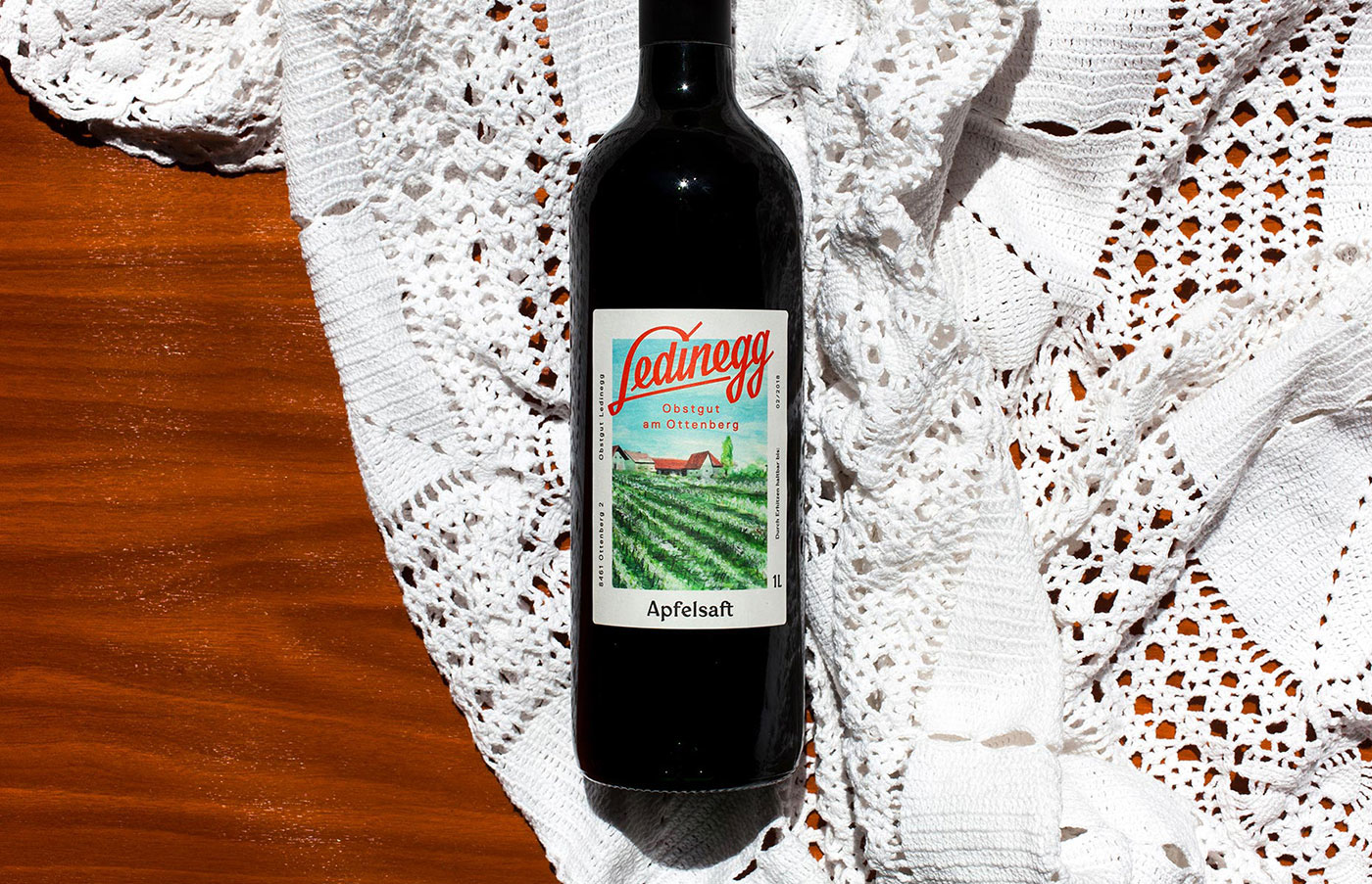
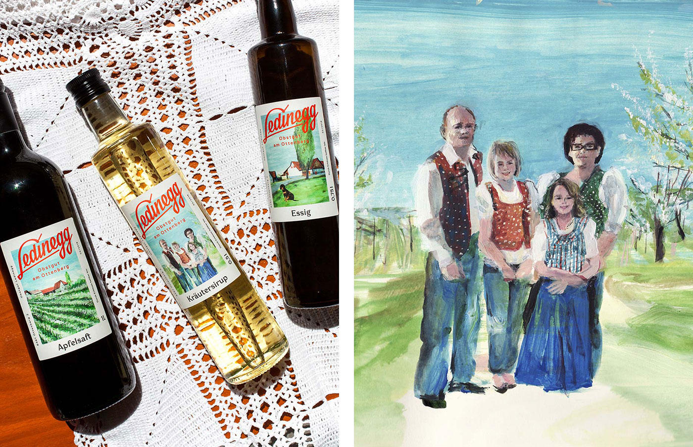
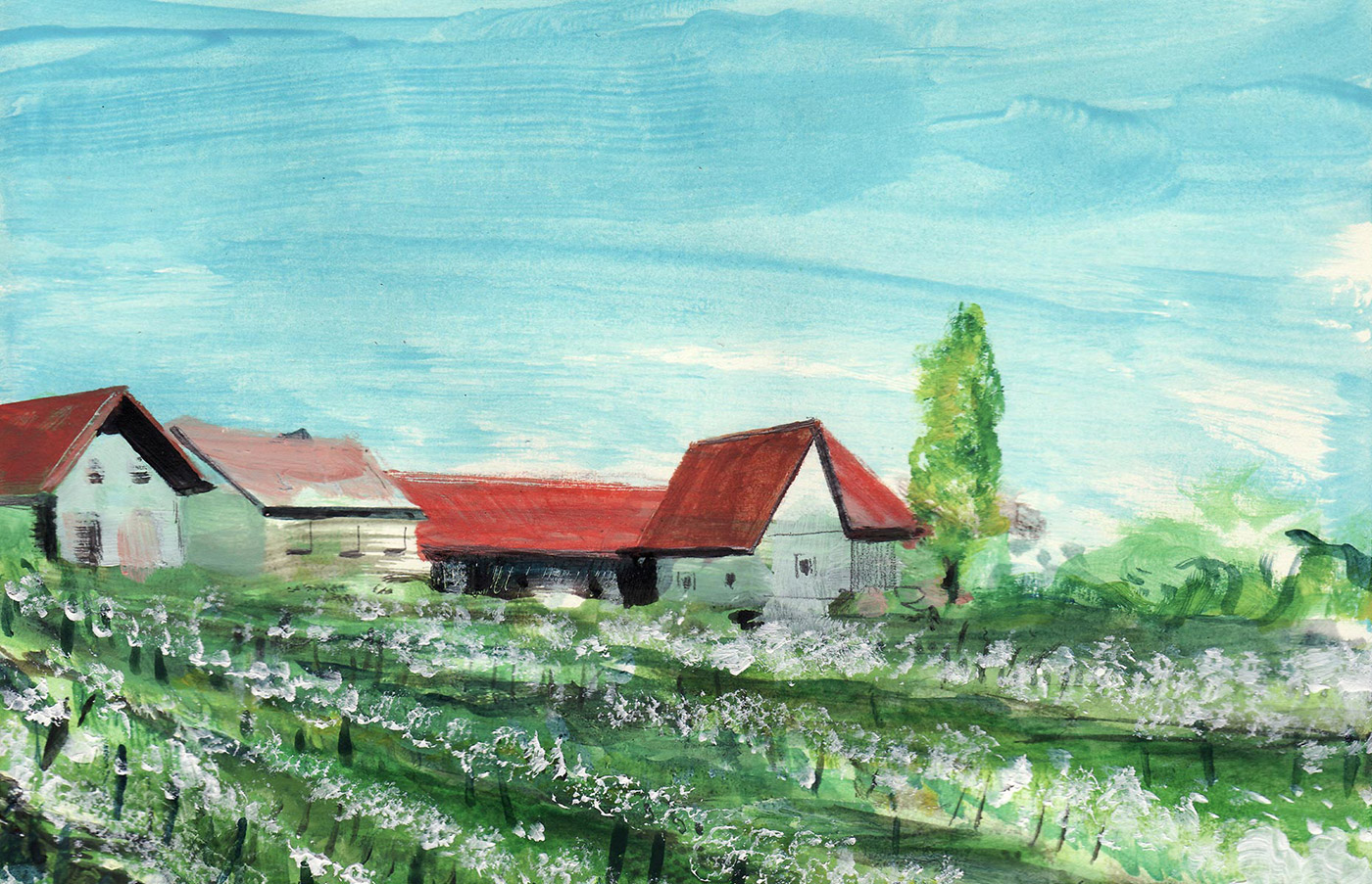
Bruch Idee & Form, specializing in branding, packaging, editorial, and web design, is often praised for their authentic and out-of-the-box approach, while truly understanding and utilizing the under-currents and drifts of the visual world and it’s fickle trends. For the new Ledinegg branding and packaging they focused on strong lettering and individual appearance that communicates the families values, the hillside situation and their main focus on fruit. The bright, red typography splendidly frames Viola Nicolai’s colorful, friendly and native watercolor illustrations which show the family, their dog waiting on the access road, the yard surrounded by steep hills or just a table with glasses waiting to entertain new customers. A marriage between traditional and contemporary, with values and aspirations.


Images © Bruch—Idee&Form