
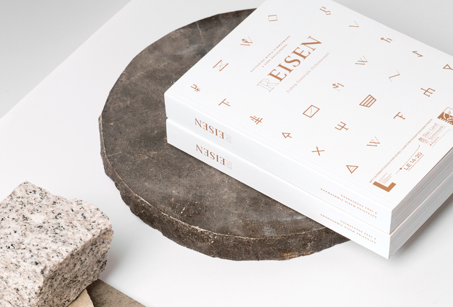
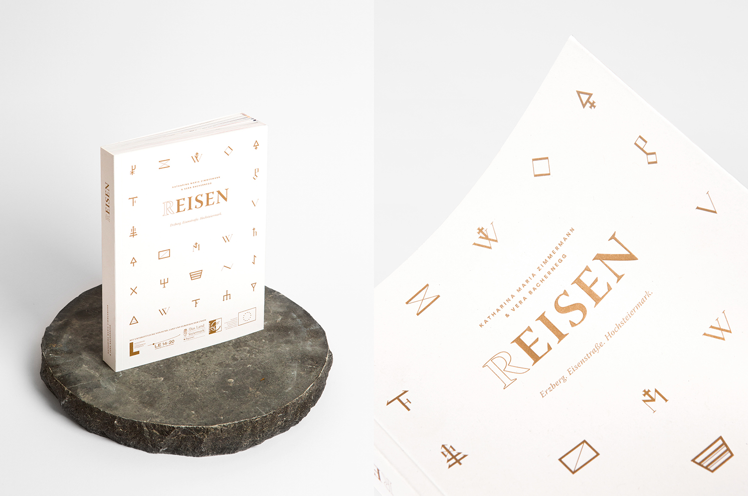
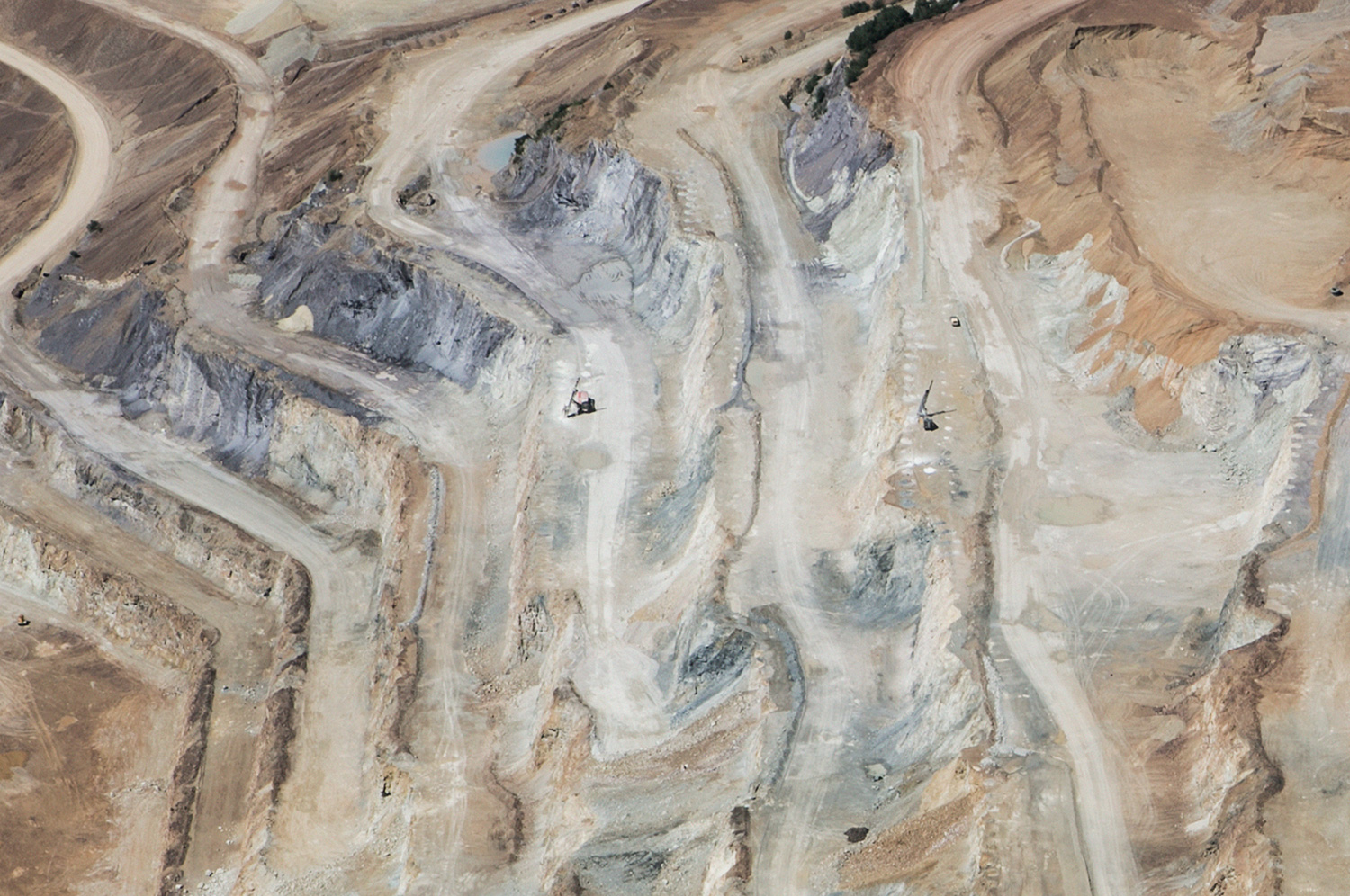
The Erzberg, the cities of Eisenerz, Leoben or Mariazell – places full of history in the heart of Austria. Until today this area was mostly known for its steel production sites, now the focus slowly shifts towards tourism. To showcase the rich variety of traditions and places of interest, Eat Write Live travel book authors Vera Bachernegg & Katharina Maria Zimmermann was asked to write about the hidden treasures above and below ground. They partnered with Studio Marie Zieger for art direction & editorial design.
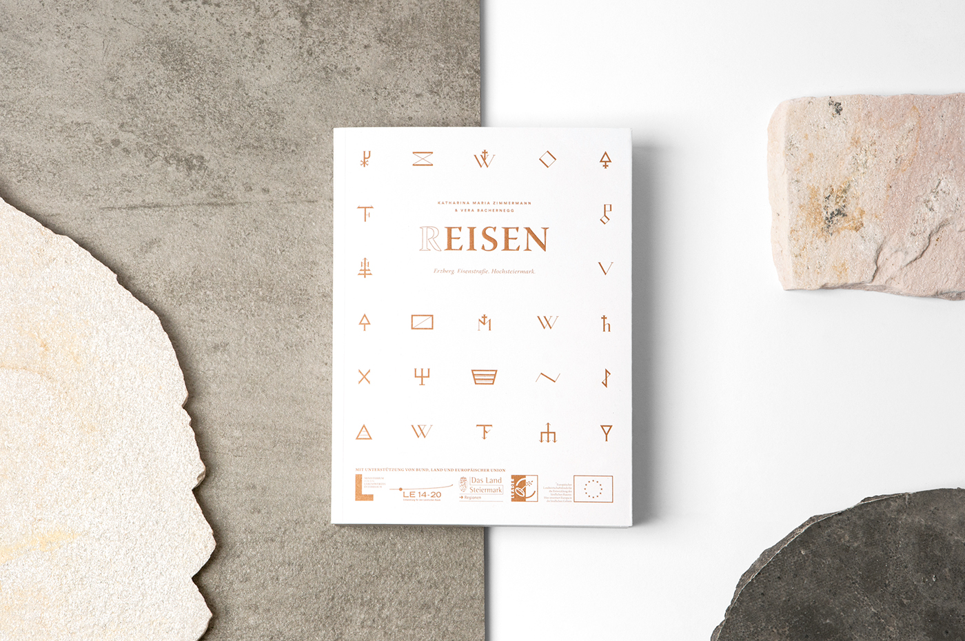
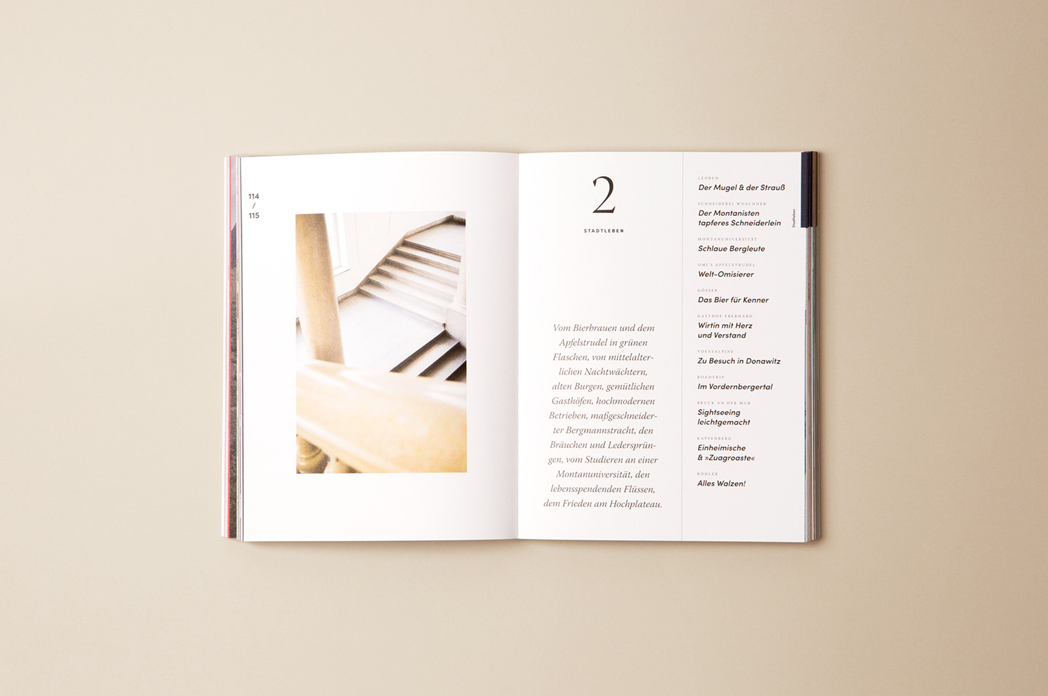
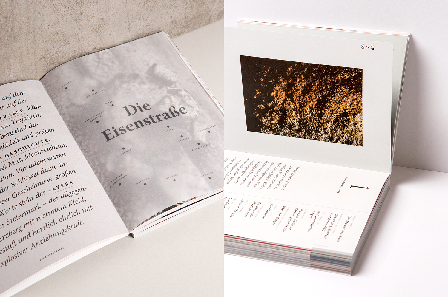
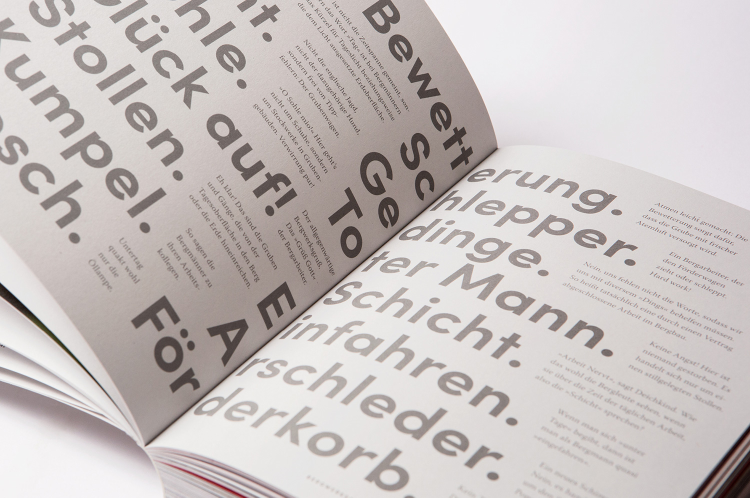
The inspiration for the editorial design originated in typical symbols and characteristics of iron mining. The diverse color palette pays homage to the various conditions of iron itself – steel grey, rusty red or shiny silver. Rough around the edges, the chosen typography gives the book a classic yet contemporary feel, its serifs reminiscent of the infamous symbol featuring hammer & pick. (R)EISEN takes its readers on a journey around the complex topic of iron production and processing. But time doesn’t stand still – an emerging baker, an innovative beer brewer or a young Lederhosen-fabricant embellish the book with their unique stories and anecdotes.


Images © Katharina Maria Zimmermann & others