

Viennese master calligrapher Natascha Safarik, better known as Tintenfuchs, works for clients across the globe from Chanel to custom made wedding invitations. Learning from the best in Germany, Italy, and the US, she is always perfecting her skill at the interplay of ink, paper, and pen.
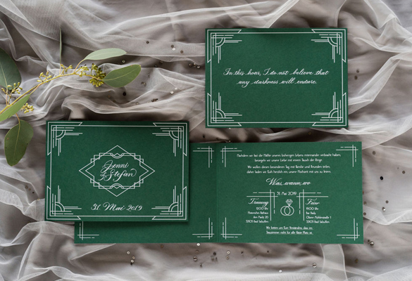
For the wedding of Jenni & Stefan, she was asked to take over the design of the invitations, from the design details and printing to the paper selection, opting for a combination of emerald green and elegant white.
The bride and groom wanted an invitation with touches of Art Deco, which led to the frame and icon design. The handwritten calligraphy subtly underlines the elegance of the white print and the smooth curves contrast beautifully with the sharp corners of the frames. The invitations were printed in white, which gives the ink a slightly raised effect. It stands out against the dark background and makes the delicate lines stand out.
This project is a personal favorite of mine because I love designing in the style of the 20s. Also, white on dark is always a looker! What I love is that the clients chose to give my calligraphy its own page! Everything just came together beautifully, says Tintenfuchs.
The used paper, Color STYLE Ivy Green (read article: Color STYLE – Get Inspired By the New Colors) in 300gsm, paper available at Europapier, is a daringly unique choice for wedding invitations, which are conventionally done in lighter colors. It’s refreshing to see courageous designs, beyond the traditional choice. Tintenfuchs, together with the client, chose the Color STYLE Ivy Green because the color reminded them of emeralds. Lush, high end and noble – fitting for the 1920s theme of the invitation.


Images © Barbara Wenz Fotografie