CIN CIN is a multidisciplinary studio for motion, print, and web design based in Vienna, Austria. The studio, founded by Jasmin Roth and Stephan Göschl in 2015, has worked with numerous prominent Viennese institutions, creating custom concepts for each project, many visible in the Viennese landscape. “Because we believe that design improves life in many ways, our goal is to provide sophisticated solutions for both clients and collaborators. Our work, as well as our way of working, should make a meaningful contribution to society and contemporary culture,” CIN CIN writes. 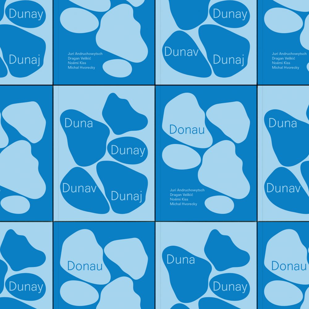
Additionally to video production, original short films, and web design, CIN CIN is passionate about print, and it shows. Truly understanding the value of excellent typography and high-quality design papers, the studio not only appreciates a well-designed book or magazine but is the creative force behind many stylish print designs themselves, from art and exhibition catalogs to art books and other editorial projects, all designed with original concepts.
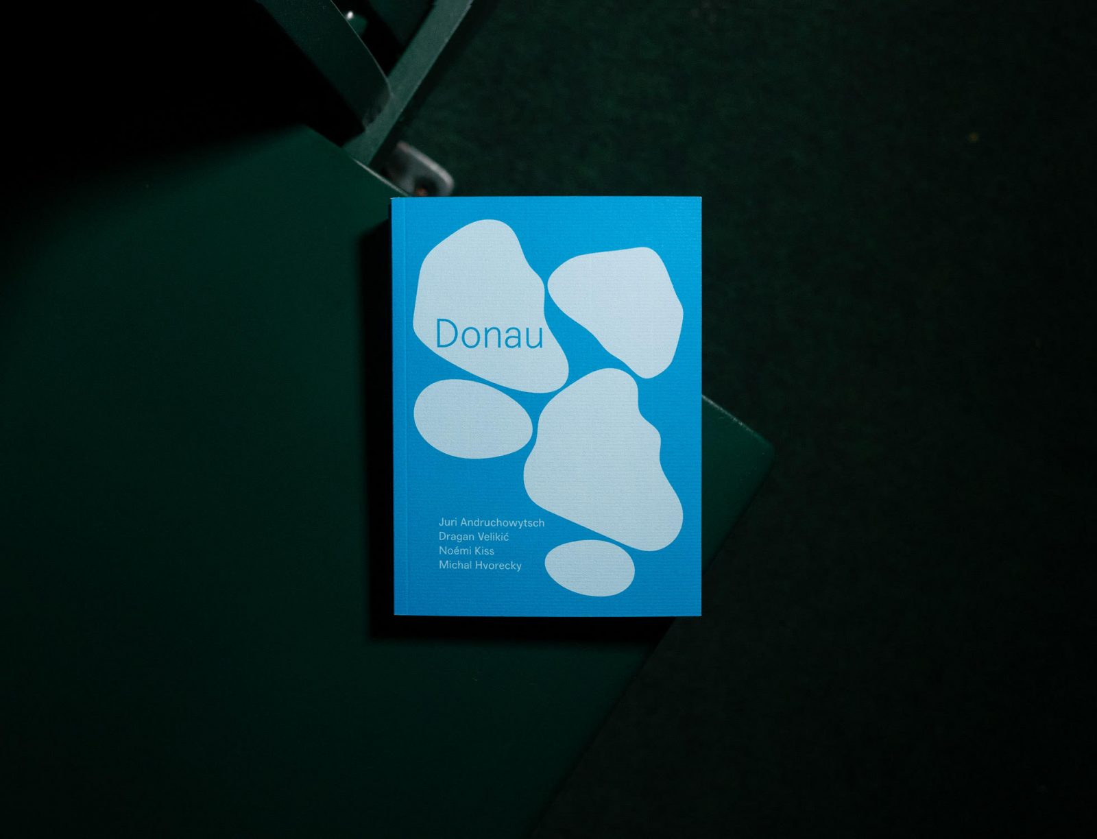
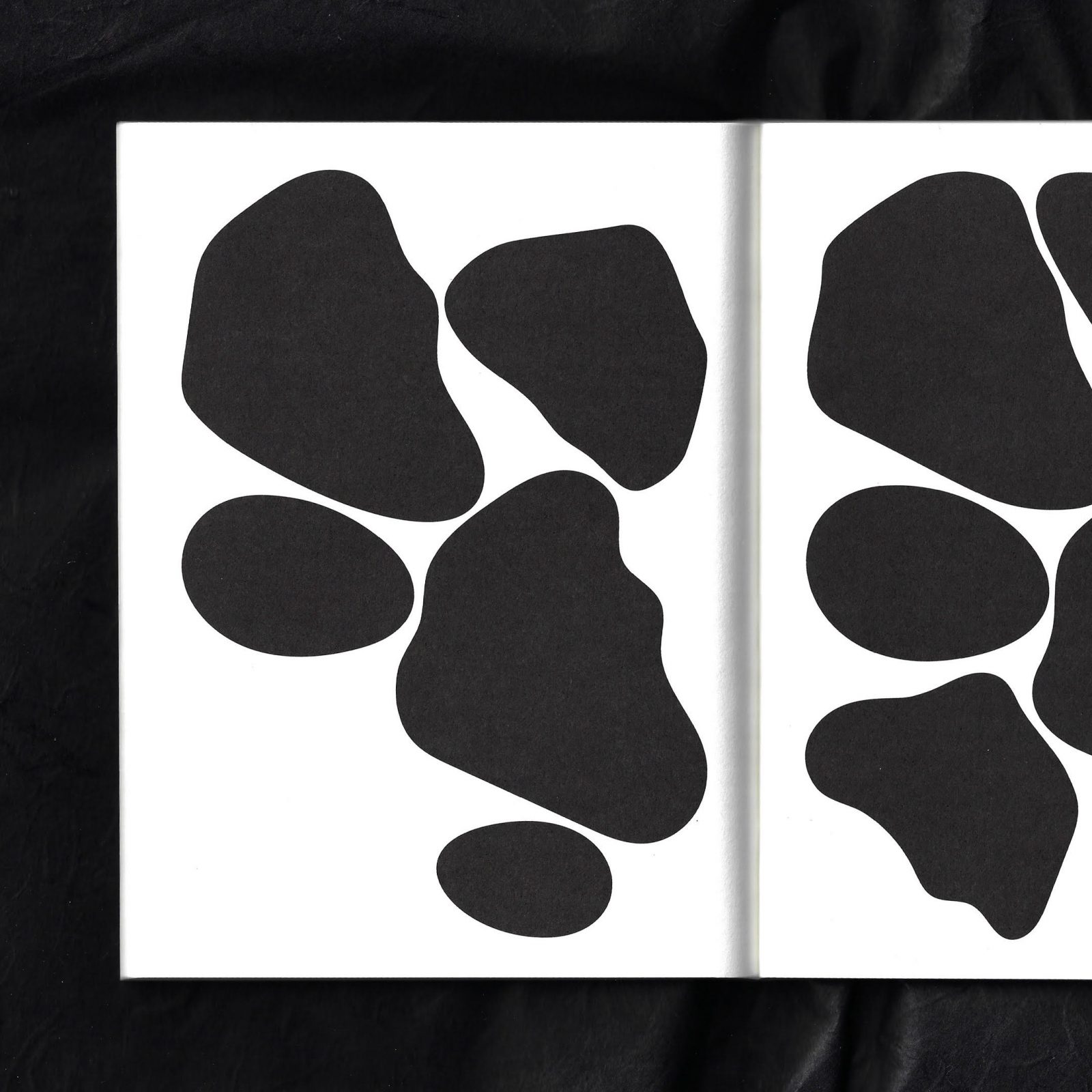
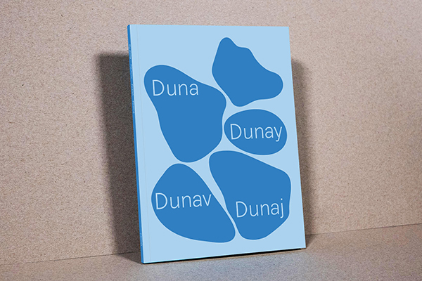
The book Donau by CIN CIN for Unabhängiges Literaturhaus Niederösterreich captivates the viewer with its minimal and abstract design
CIN CIN’s latest endeavor includes a beautiful book titled “Donau” (Danube in eng) which is the first project of ongoing cooperation between the studio and the Unabhängiges Literaturhaus Niederösterreich. The Independent Literature House Lower Austria advocates and publishes contemporary literature from local and international writers, and is located in the idyllic Danube Valley in Wachau, making the place attractive for both the invited authors and the public.
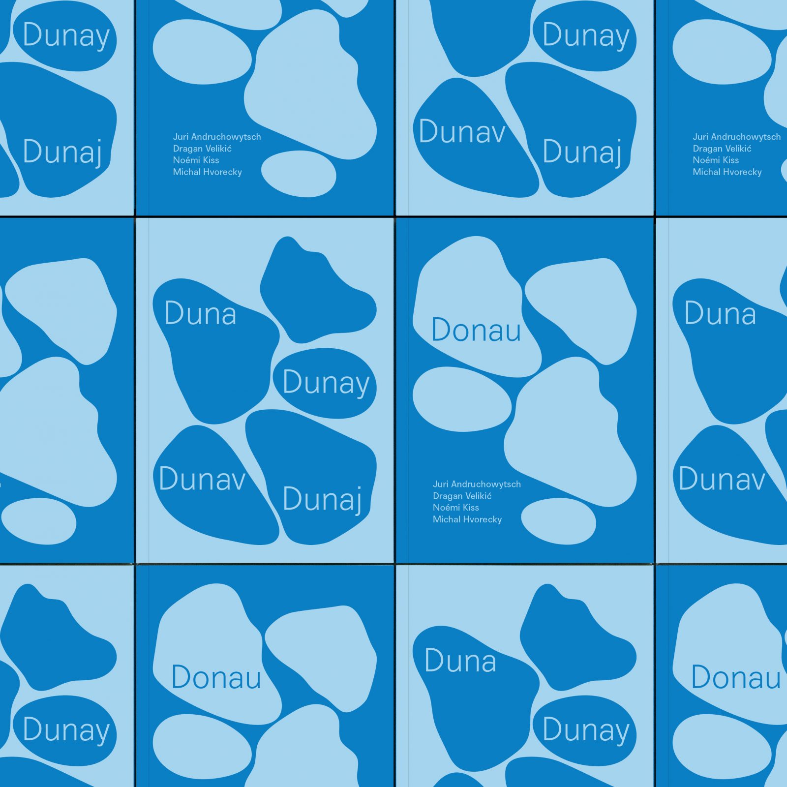
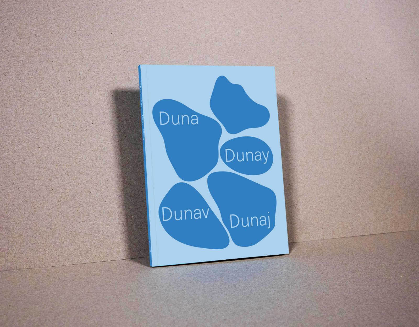
The eye-catching cover, printed on Via Laid Natural 220g with Pantone Process Blue to create a haptic experience, presents an abstract illustration, representing the river Donau, inspired by the title of the book.
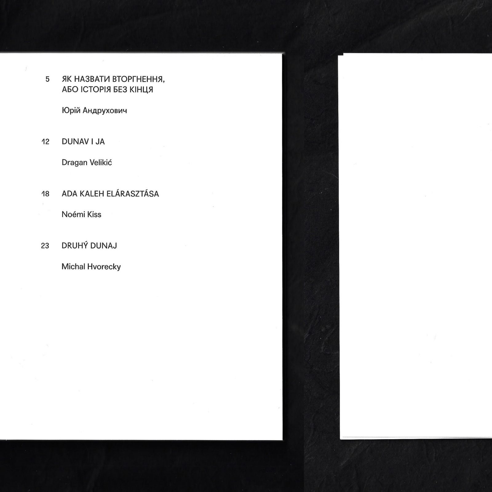
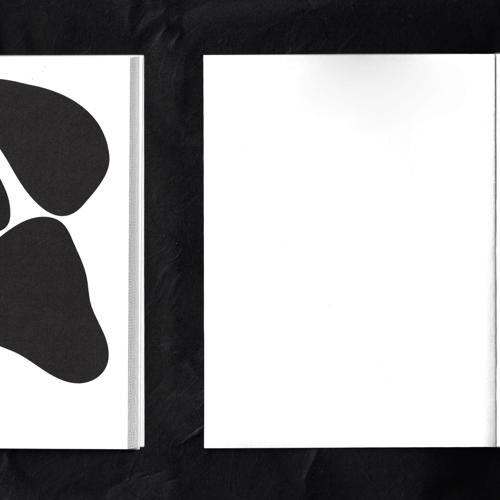
The 80-page book, printed on high-quality Munken Pure 100 gsm, features four essays in an impressive five languages – which required the studio to find the perfect typeface to use that includes all the necessary glyphs. A sans-serif typeface called Agipo by Radim Peško ended up being the perfect choice for the job. The eye-catching cover, printed on Via Laid Natural 220g with Pantone Process Blue to create a haptic experience, presents an abstract illustration, representing the river Donau, inspired by the title of the book. The minimal design of the book is a beautiful ode to the blue Danube river we all in Austria love and cherish.
Both papers used in the book are exclusively available by Europapier.